1. Forearm Octopus With Teal-to-Navy Gradient Tentacles
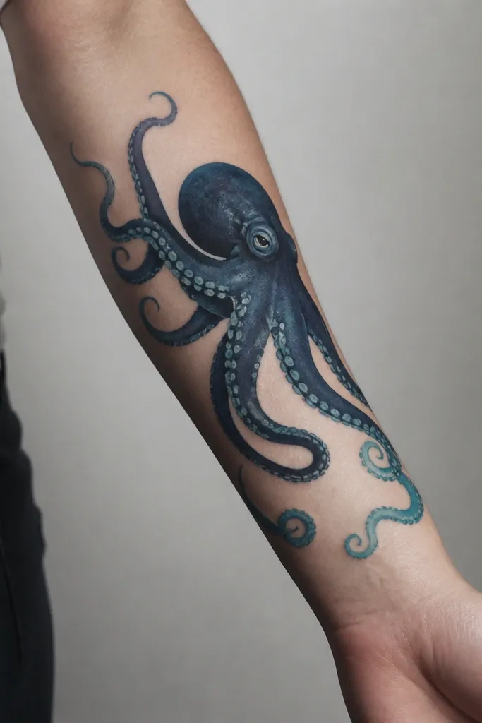
This design works because the tentacles read like motion instead of ropes. The navy body anchors everything, while the teal gradient gives you that "water depth" feel without needing a ton of extra colors. The suction cups get tiny highlight dots so they look wet, not flat. Negative space around the tentacles keeps the colors crisp as they heal.
Place the octopus so the head sits near the inner forearm and the tentacles extend toward the outer forearm. Keep the widest tentacle spread around mid-forearm, then taper each tentacle slightly as it moves away. If you want extra clarity, ask for light teal highlights only on the top edges of the tentacles - that's where light would hit.
Pro tipWear rolled-up sleeves for the first year - the healed highlights show up way better in daylight.
AvoidAvoid adding too many extra sea creatures - they steal focus from the gradient.
2. Rib Cage Octopus Wrapped Around a Pearl
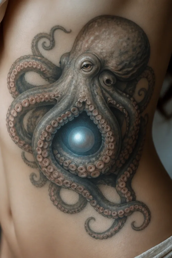
A rib placement makes the wrap-around pose look alive, because your body curve does the "hugging" for you. The pearl gives a clean focal point, and the coral-pink suction cups add warmth against the cooler ocean blues. The bluish glow around the pearl makes the whole thing feel dimensional rather than sticker-like. This one looks best when the tentacles overlap in a controlled way, not random crossing.
Use a design where the head sits slightly lower than the pearl so the tentacles have room to arc upward and outward. Keep the pearl small - about the size of a dime - so it stays sharp after healing. Ask for the tentacle highlights to be lighter blue near the pearl side, then fade to darker teal farther out.
Pro tipSchedule this when you won't need tight waistbands for a few days; ribs get irritated fast.
AvoidAvoid heavy black fill under the pearl - it makes the glow look dirty.
3. Black-and-Blue Base With Coral Tips on Full Tentacles
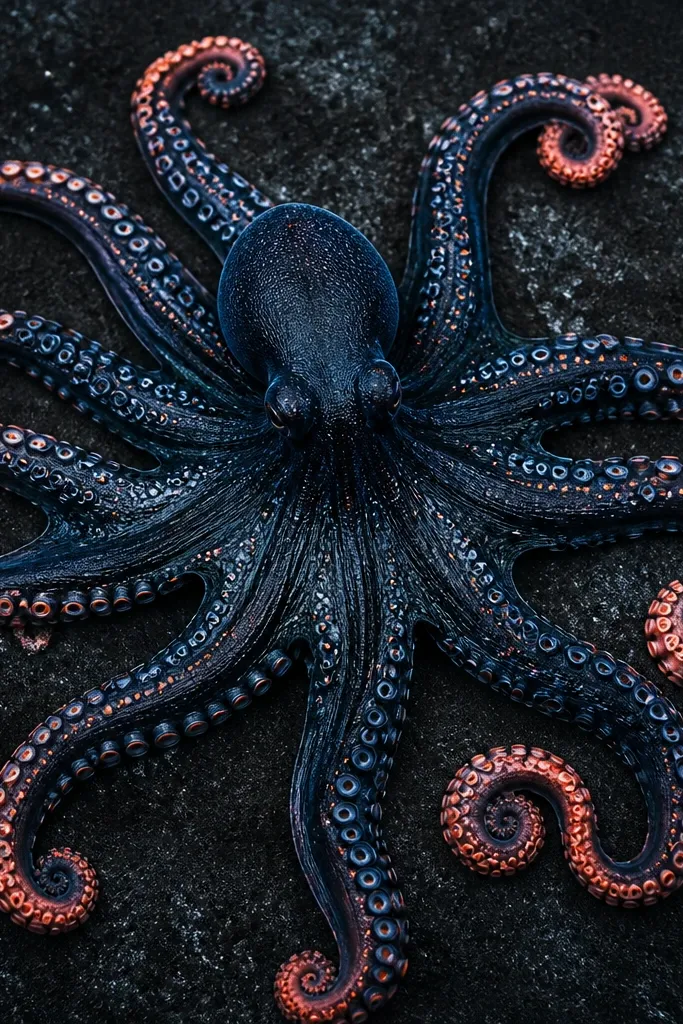
This is the color octopus look I keep recommending because it stays readable years later. The black-and-blue foundation gives contrast, and the coral tips act like little signals in the design. When the coral is limited to the tentacle ends and suction cups, it heals with less muddiness. You also get a clear hierarchy - ocean first, coral accents second.
Ask for a composition that has at least 70% dark base tones, then coral accents in the last third of each tentacle. Suction cups should get a thin outline, with a small coral dot inside or at the top edge. This works great on the upper arm or thigh where you can see the full sweep.
Pro tipPick coral that's not neon - think salmon-pink and muted orange, not highlighter.
AvoidAvoid coloring every suction cup the same bright coral - it turns into a uniform blob.
4. Small Wrist Octopus With Cyan Glow Suction Cups
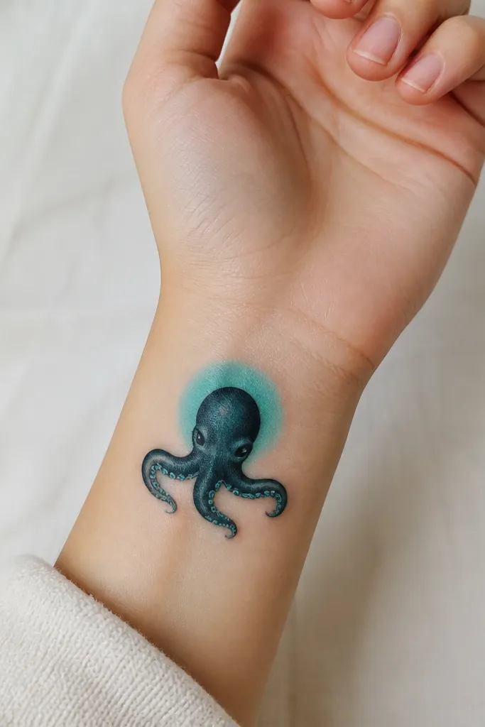
Wrist pieces look best when they're controlled and simple. This one uses a dark teal base so the cyan highlights pop without overloading the tiny space. The faint glow behind the head makes it look like it's lit from within. It's "cute" without being childish because the tentacles are clean and the suction cups are precise.
Keep the octopus compact: about 2.5 to 3 inches across. Place it where you can see it when your hand is relaxed - inner wrist reads better than top wrist for color. Ask for the cyan highlights to be tiny dots or short strokes, not filled blobs, so they stay crisp.
Pro tipUse sunscreen every day on the wrist. Color fade is faster there.
AvoidAvoid thick black lines on tiny cups - they blur faster than you think.
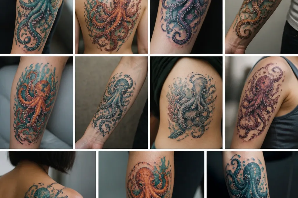
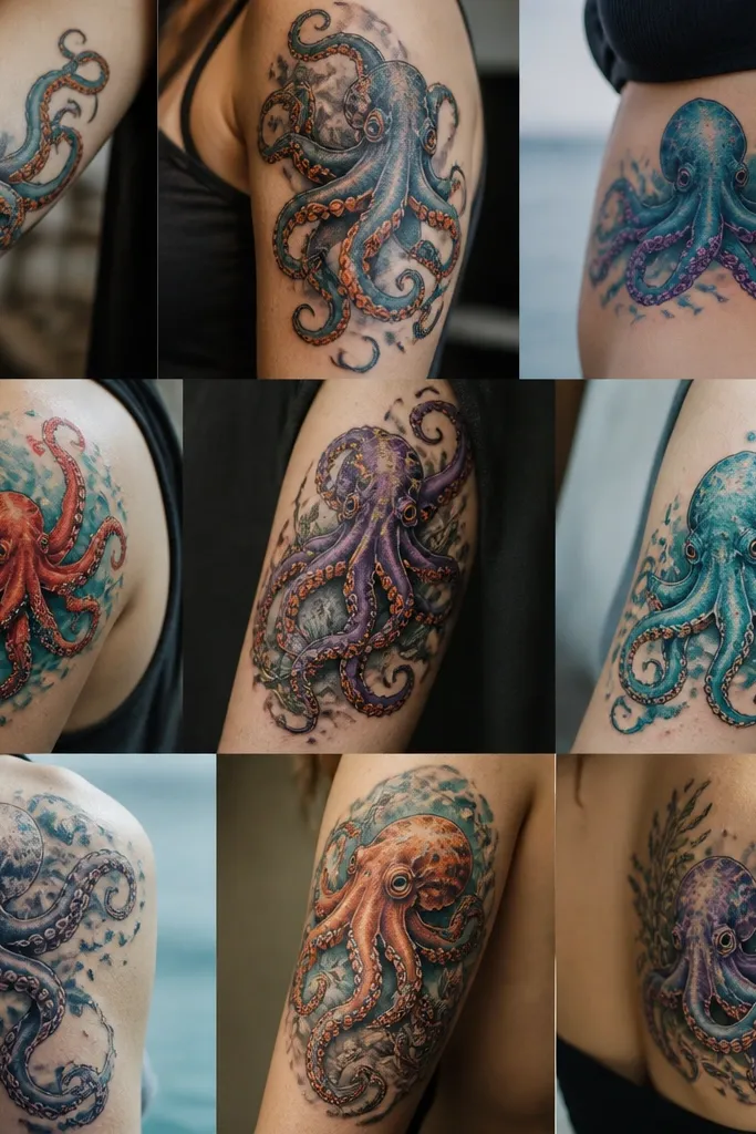
5. Upper Arm Octopus With Seaweed Green and Blue Smoke Background
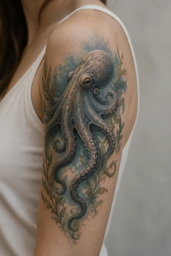
The seaweed green gives you a second color family that still feels oceanic. The blue smoke background creates depth without needing a full scene. When the octopus stays sharply outlined and the background stays soft, the whole tattoo looks layered rather than busy. This is a great option if you want color but you don't want a full underwater mural.
Put the octopus head near the outer upper arm so the tentacles can curl toward the bicep and outer shoulder. Keep the seaweed accents smaller than the tentacles - think thin fronds that frame the octopus, not equal-sized elements. Ask for the blue smoke to be feathered at the edges so it doesn't look like an aura sticker.
Pro tipChoose a background that's mostly teal-blue, not purple - purple smoke heals muddy on many skins.
AvoidAvoid hard shading inside the tentacles if the background is smoky; it makes the piece fight itself.
6. Chest Octopus With Waterline Coral Framing
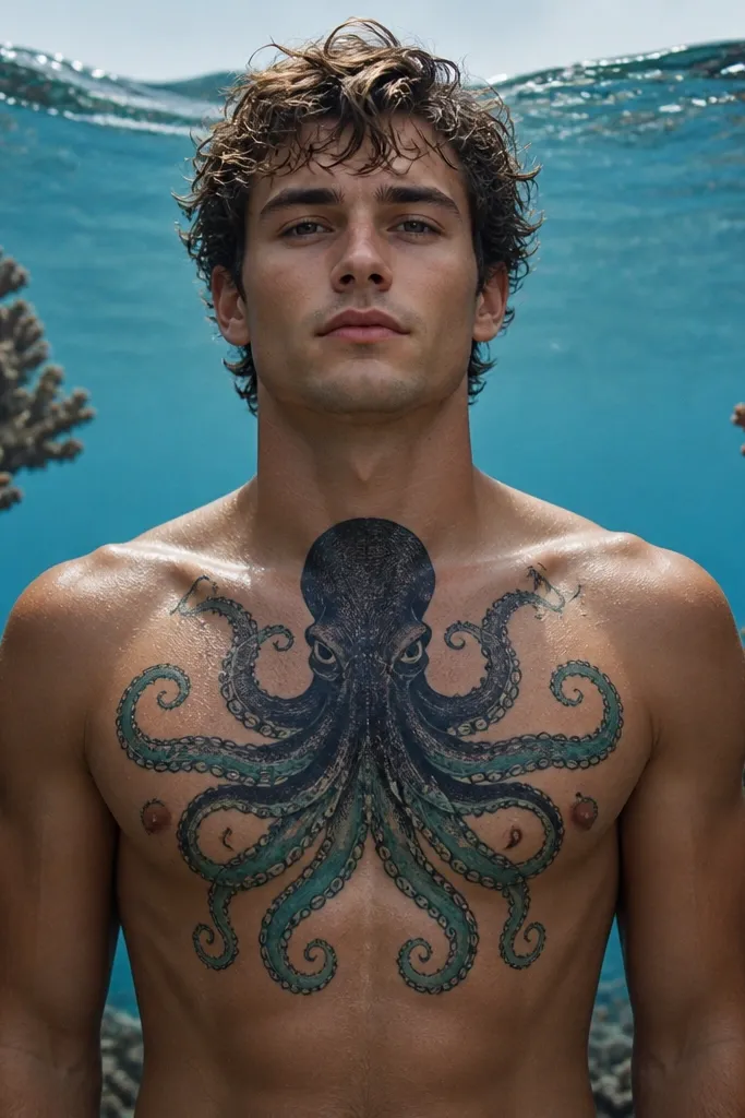
Chest placement lets you do a "waterline" effect - darker above, brighter below - and it looks intentional. Coral framing makes the octopus feel like it belongs in a reef, not floating in space. The waterline wave gives the eye a path, so your brain reads it as a scene even if it's not a full background. Color stays balanced because coral sits at the edges, not scattered everywhere.
Position the octopus head just below the collarbone line so the waterline sits across the upper chest. Keep coral branches thin and varied - some in muted coral pink, some in coral-orange, with tiny white highlight flicks. For the tentacles, use teal on the underside and navy on the top edges to mimic light from above.
Pro tipIf you have a hairy chest, shave the area the day before appointment; it helps the artist get clean color edges.
AvoidAvoid placing coral directly behind the octopus head; it flattens the silhouette.
7. Hand and Finger Octopus With Minimal Color Dots
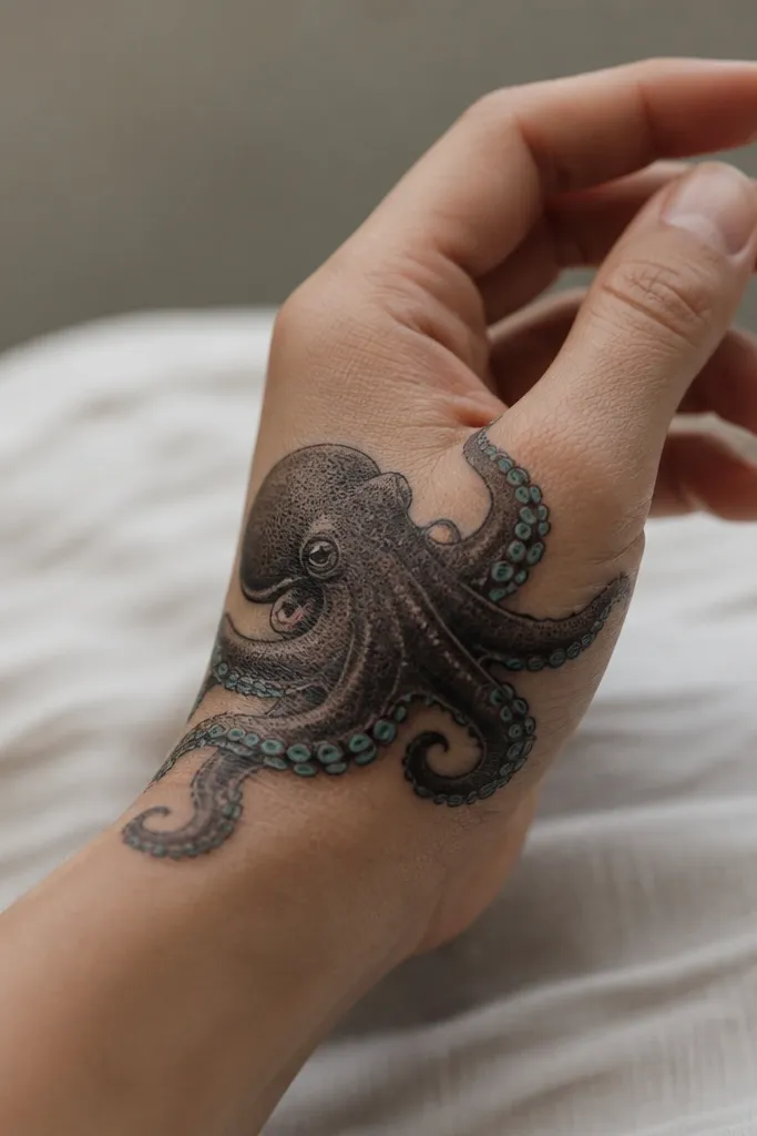
Hands and fingers are where color can disappear fastest, so this design uses color sparingly. Dark grey-black holds the shape, while turquoise dots bring sea-life energy. The coral-red accent acts like a heartbeat focal point. This tattoo looks good even when color fades because the structure stays solid.
Place the octopus around the thumb web area and let tentacles wrap toward the side of the hand. Keep color to suction cups and one or two mouth highlights so you don't end up with patchy spots later. Ask for slightly softer shading on the body so it blends with hand movement.
Pro tipGet a thin film of your aftercare ointment and don't overapply; hands get sweaty and the ink can look dull if it's too wet.
AvoidAvoid full-color fills on fingers - you'll lose them and the tattoo will look unfinished.
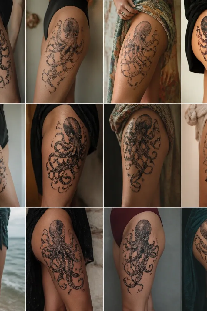
8. Thigh Octopus With Sunset Coral and Indigo Depth
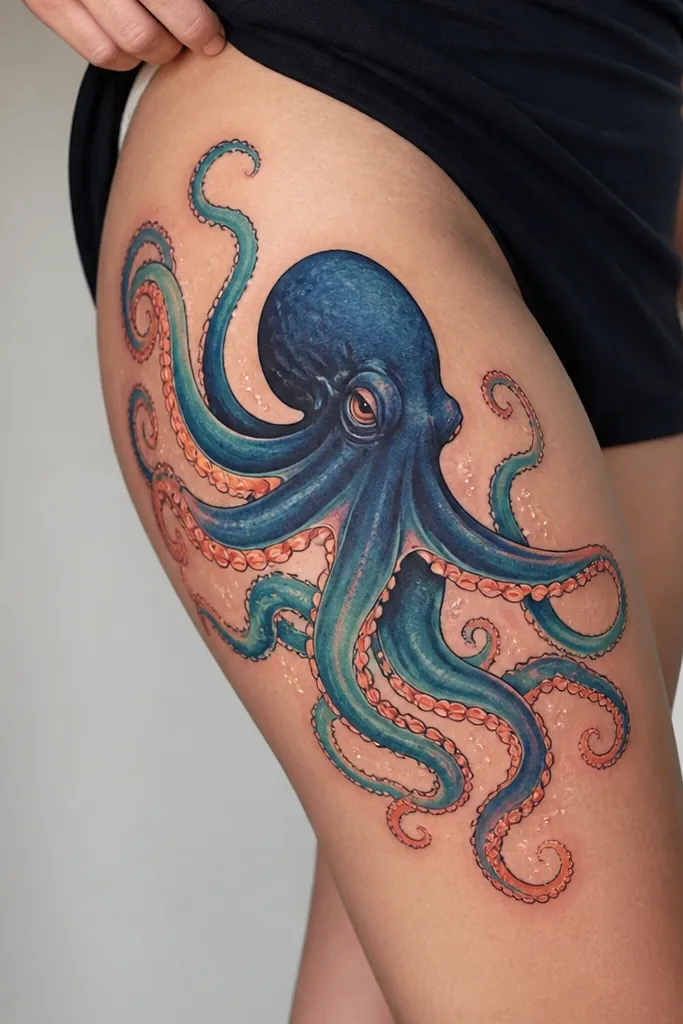
Thigh space lets you do a bigger gradient without crowding. Indigo gives depth, teal keeps it ocean-clear, and sunset coral adds that warm contrast that makes the whole piece feel alive. Tiny white spark dots imitate sun reflections on water. The sunset accents are controlled to the outer edges, so it still reads as an octopus first.
Aim for a design that's taller than wide so it fits the thigh's vertical flow. Put the head toward the upper outer thigh, then let tentacles angle downward. Keep the coral-orange mostly on the outer rim of tentacles and suction cup highlights, not in the core shading.
Pro tipChoose a stencil that follows your stride line; if it looks wrong when you walk, it'll look wrong healed.
AvoidAvoid adding spark dots all over the body - it turns into glitter noise.
9. Shoulder Octopus With Aqua Halo and Fine Line Suckers
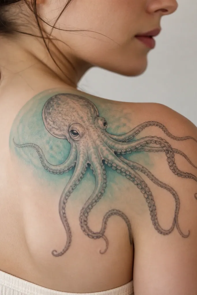
A shoulder halo makes color feel intentional, even if you keep the rest simple. Fine line suction cups keep the texture airy, and the aqua wash adds a glow without turning into a thick background. The eyes with tiny highlights make it look glossy, which matters on healed tattoos where colors can dull. This is a clean, modern look that still feels sea-inspired.
Place the head near the center of the shoulder cap, then angle tentacles slightly forward so they sit on the deltoid curve. Ask for suction cups to be outlined thinly with minimal fill, then add tiny highlight specks. The halo should fade outward, not have a hard ring.
Pro tipWear a breathable shirt after your session; shoulder friction is real.
AvoidAvoid thick black halos; they kill the glow and age poorly.
10. Back Octopus With Octave Waves and Color-Blocked Tentacles
Back placement makes it easy to control the composition, and color-blocked tentacles stay crisp because the bands create separation. Stacked wave lines give context without turning into a full illustration. Coral near the base adds warmth where the design is heaviest. This tattoo looks better than a messy gradient because you can see each color band even after healing.
Position the octopus so the head sits around the upper-mid back, not too low. Use 3 main tentacle color bands max: navy, teal, turquoise. Wave lines should be thinner than the tentacles and should stop before they collide with the octopus edges.
Pro tipDuring the appointment, ask the artist to show you the stencil from two angles - standing and slightly hunched. You want it to sit right on your natural posture.
AvoidAvoid turning the waves into a dense background; it makes the octopus look buried.
11. Calf Octopus With Sea Glass Greens and Tiny Bubble Highlights
Sea glass green is the secret color that makes octopus tattoos feel fresh instead of typical. The bubbles add movement and give the eye small breaks between tentacles. Deep blue keeps it grounded, while sea-glass green gives that translucent reef vibe. The bubbles with white highlights look like light catching on water, which helps the tattoo feel dimensional.
Place the octopus so the head sits higher than the widest tentacle spread, matching calf anatomy. Keep bubble sizes small - mostly pinhead to pea size - so they don't overwhelm the octopus. Ask for bubble outlines to be faint, with highlights placed on the upper left side to match light direction.
Pro tipMoisturize the calf extra for the first week. Calf dryness can make color look patchy while healing.
AvoidAvoid big bubble circles - they steal space and make the tattoo look like a cartoon sticker.