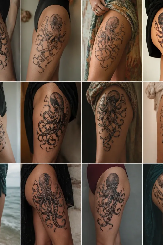
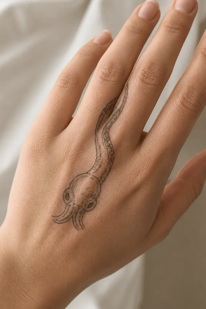
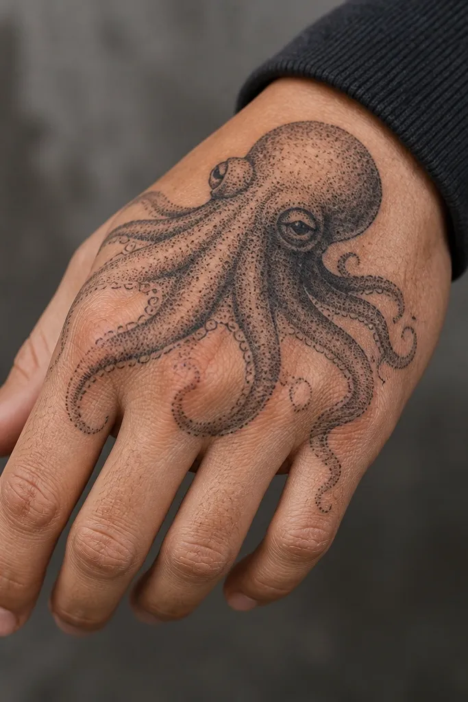
1. Thumb Web Octopus with Sucker Dot Gradient
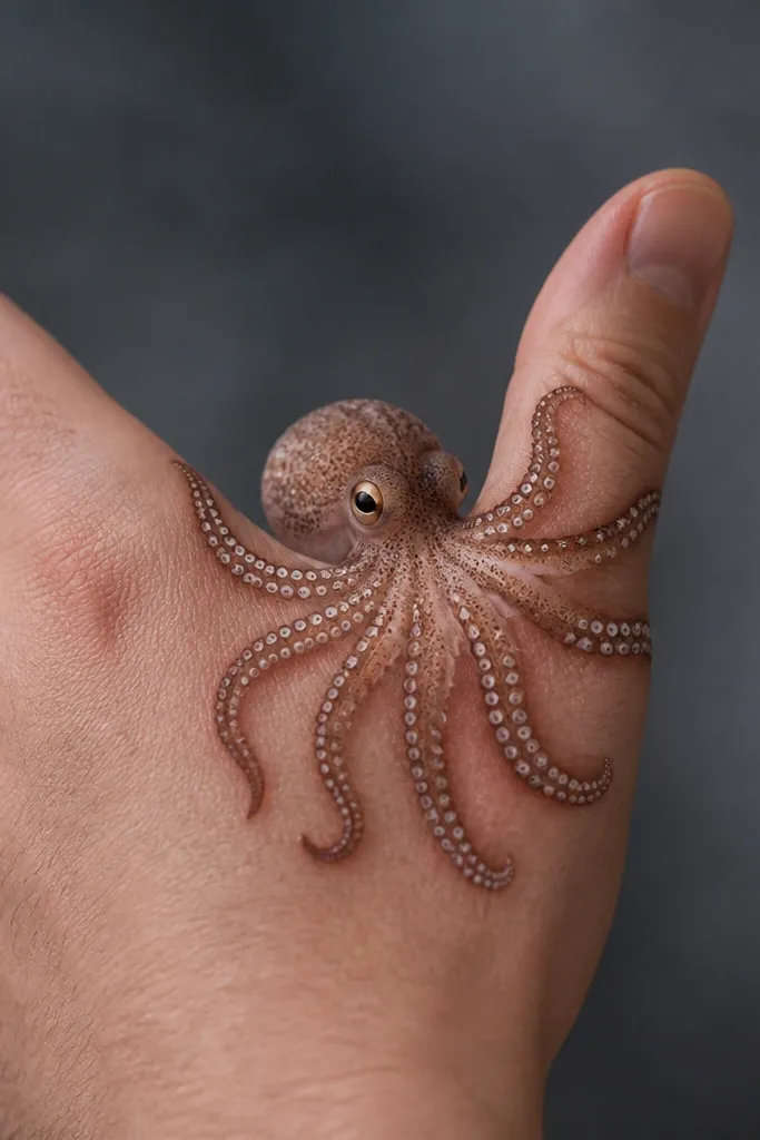
This placement makes the octopus look like it's "reading" the hand - it's centered where your fingers splay. The dot gradient gives you a realistic texture without needing heavy black. I like a deep black head with softer gray dot fields on the tentacles so the suckers stay legible when the skin moves. The fan-like tentacles also frame the thumb, which makes photos look sharp even at an angle.
Ask for the head to be about 1.2-1.6 inches wide, leaving 2-3mm of breathing room from the thumb crease. Keep tentacle lines thin and stagger them so no two tentacles overlap tightly. Color stays mostly black and gray; if you want one accent, add a muted teal wash only on the head's underside.
Pro tipBefore you book, mark the thumb web with a pen while you open and close your hand. The best design is the one that doesn't stretch across the tightest fold.
AvoidDon't run the tentacles straight across the thumb crease - that's where the detail blurs first.
2. Back-of-Finger Octopus Wrap (Two Tentacles Only)
Hands look cleaner when you restrict the composition. Two tentacles give you movement and realism without crowding. The back-of-finger area takes shading well because it's relatively flat compared to the palm. I've found that fewer elements keep suckers distinct instead of turning into one dark texture. A thin head outline with gray wash under the chin makes it read like an illustration, not a sticker.
Use a vertical layout: head at the knuckle side, tentacles traveling 2-3 inches up. Keep sucker dots spaced - think 1-2 dot diameters apart. Line weight should stay light; pack shading only in the tentacle bends where the octopus "folds."
Pro tipChoose a finger you use the most for gripping. If it's always flexing, keep the tentacles shorter so the ends don't smear.
AvoidAvoid shading the whole finger evenly - it makes the tattoo look gray and flat after a few months.
3. Knuckle Octopus with Negative-Space Highlights
Knuckles need contrast and clean edges because the skin texture is already busy. Negative-space highlights keep the tentacles separated, so the suckers don't collapse into a single mass. I like a bold head outline paired with lighter tentacle shading that fades toward the tips. This design reads strong in daylight and still looks detailed in low light because the highlights break up the black.
Place the head centered over the knuckle with tentacles splitting left and right. Keep the highlight gaps consistent width - around 1-2mm. If your hands run dry, tell your artist to avoid overworking the same spot; extra passes can make black look raised and cloudy.
Pro tipTake a photo of your knuckles with your hand relaxed and then slightly clenched. Show both to your artist so the tentacle spacing stays readable in both positions.
AvoidDon't place the main black mass directly on the highest bump without a clear highlight plan - it can look like a blot.
4. Mini Octopus and Seaweed Side-by-Side
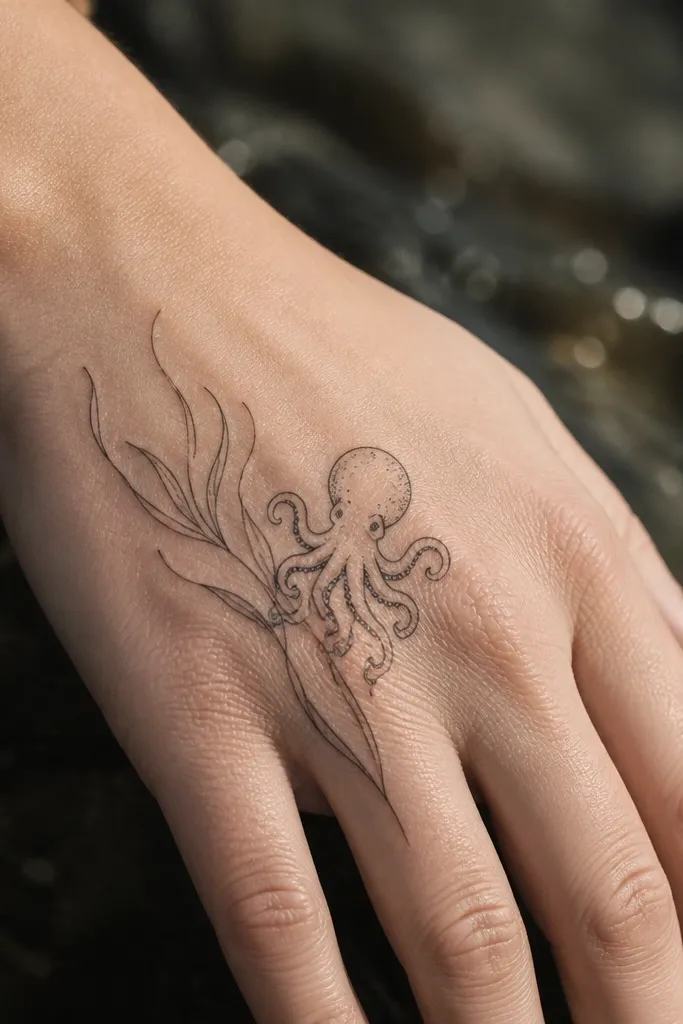
This is one of the prettiest "hand-friendly" compositions because it gives your eye a path. The seaweed lines add motion and make the octopus feel part of a scene without covering too much skin. Thin tapered lines age better than wide fills. I like gray wash on the octopus head and crisp linework on the seaweed so one stays soft and the other stays sharp.
Size the octopus head to about 1 inch across. Keep seaweed strokes narrow (roughly the width of a hair line) and vary length so they don't look like a barcode. If you want color, use a tiny hint of olive-green only in the seaweed bends.
Pro tipChoose an outer-hand placement where your palm doesn't touch walls or bags. Less friction means the fine seaweed line stays crisp.
AvoidSkip solid black seaweed stems - they thicken with healing and swallow the octopus detail.
5. Octopus Sucker Row on Index Finger Side
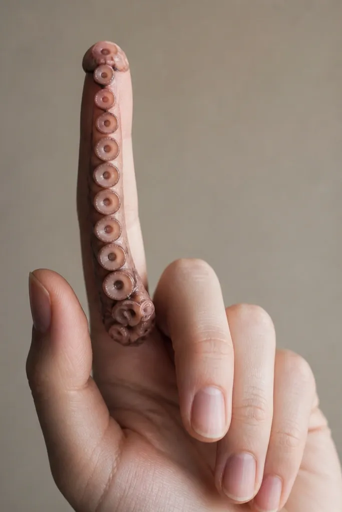
This design is a detail-first tattoo. It looks intentional even when it fades slightly because the sucker pattern stays patterned. The side of the index finger is a good spot for a vertical motif because it doesn't smear as fast as the palm. I love using dot shading between suckers so the negative space remains clean. The tiny head cap at the top makes it feel like the tentacle belongs to something bigger.
Keep the sucker column height around 2.5-3 inches. Maintain consistent spacing: each sucker dot group should have a clear gap. Ask for dot shading only in the "shadow" side of the column, not full coverage.
Pro tipIf your index finger knuckle flexes a lot, shorten the column by half. The top area ages better than the lower area.
AvoidDon't turn it into a full tentacle wrap. The more it crosses joints, the sooner the pattern blurs.
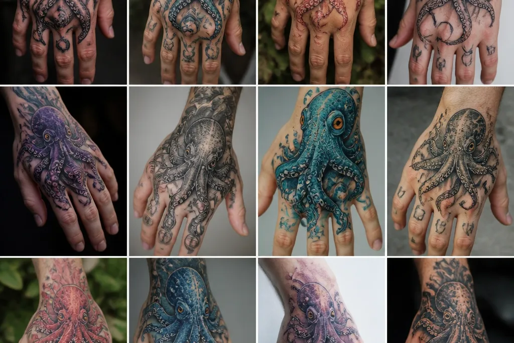
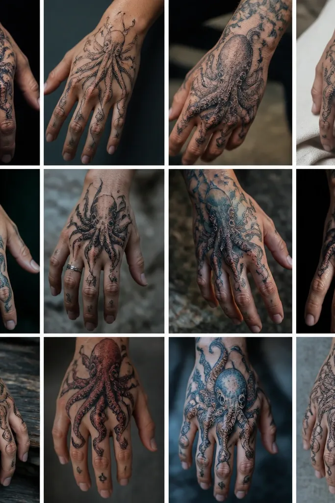
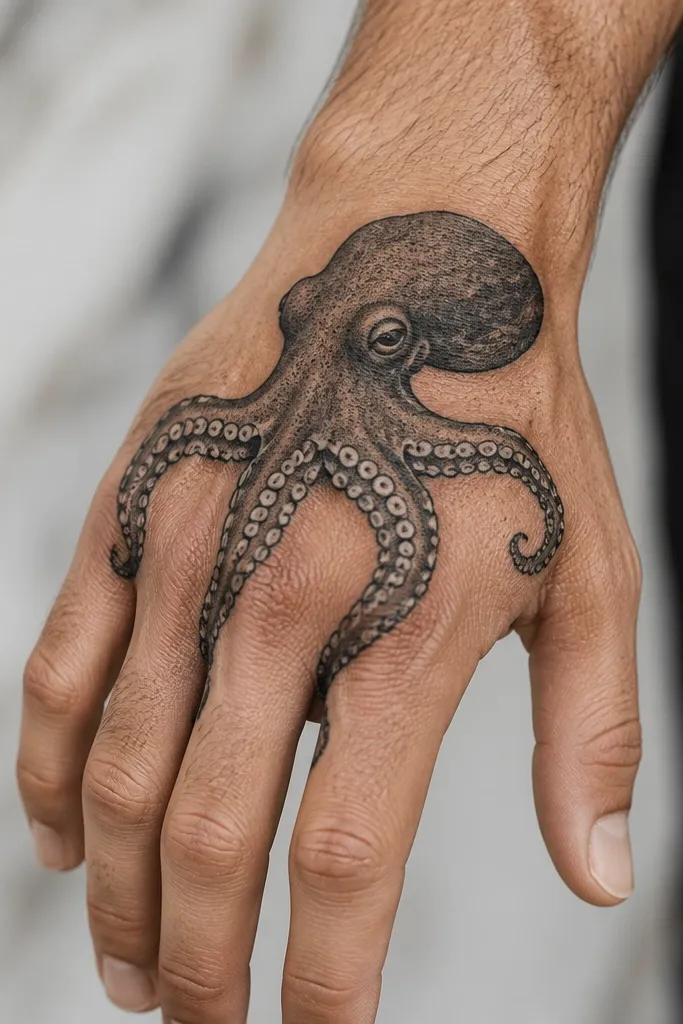
6. Blackwork Octopus Head with Micro Dot Tentacles
Blackwork can look stunning on hands if you keep the tentacles short and the dots controlled. The head anchors the design, while the micro dots add texture without thickening. I've seen this style age better than full-realism on hands because it hides minor blur in the dots. The key is crisp separation between tentacle strokes so it doesn't become a single dark shape.
Place the head around the center of the back-of-hand, then let tentacles reach only 1-1.5 inches. Use micro dot clusters for suckers, and keep dot size consistent. If you want a twist, add one thin gray shadow line under the chin for depth.
Pro tipRequest a stencil placement test: have your artist place a dot guide first, then confirm sucker spacing before they ink.
AvoidAvoid large areas of solid black on the back of the hand - it can heal uneven and look shiny or patchy.
7. Watercolor-Style Octopus in Soft Gray Wash
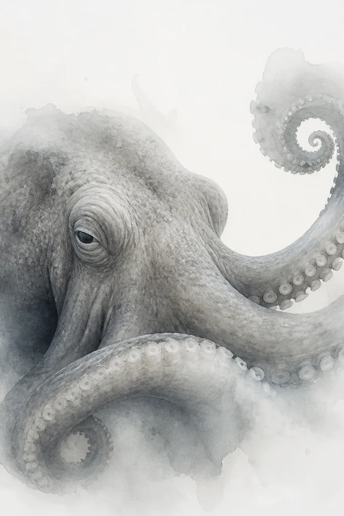
Watercolor vibes work when you control the bleed. I prefer soft gray wash rather than bright color on hands because it fades gracefully. The defined suckers keep the piece readable. The "bloom" effect adds a hand-drawn softness that makes the octopus look alive without needing heavy realism.
Keep the wash inside a roughly 2-inch area on the outer hand. Use crisp dots for suckers and let the gray wash feather outward 2-3mm beyond the tentacle line. If you add color, use a tiny diluted ultramarine accent under the head.
Pro tipTell your artist you want feathering only at the perimeter, not across the tentacle interiors. That keeps the detail from getting fuzzy.
AvoidSkip saturated color floods - they heal patchy on hands.
8. Octopus Tentacle Across Ring Finger and Knuckle

Diagonal placement gives you flow and makes the hand tattoo look intentional rather than pasted on. The ring finger area gives you a clear photo shape because the knuckle highlights the tentacle's curve. Even sucker spacing keeps it graphic. I like using a light gray shadow on one side of the tentacle so it looks round, not flat.
Plan a diagonal from the knuckle edge to the upper third of the finger. Keep the tentacle width consistent - around 2-3mm at the thickest point. Suckers should be small enough that they don't merge when your finger bends.
Pro tipWear a ring for a week before your tattoo. If the ring rubs your skin there, place the tentacle slightly above the rub line.
AvoidDon't let the tentacle cross the finger crease directly. It smears with bending.
9. Octopus Head Under the Little Finger Side
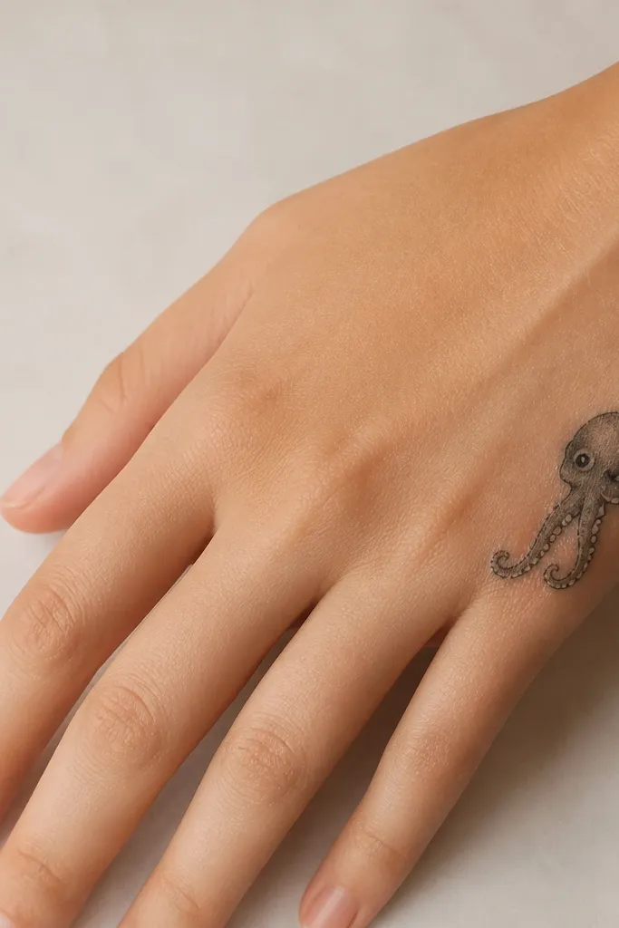
This is a sneaky-good placement because it stays hidden in daily life, but it looks great when you pull your hand out of a pocket. The outer edge of the hand is a firm surface, so fine detail can hold. The short tentacles prevent the design from stretching over multiple joints. I like a darker outline around the head plus light gray stipple under the eyes.
Size it to about 1 inch tall. Position the head so the eyes sit level with the knuckle line, then let tentacles reach no farther than 2 inches. Use stipple shading rather than heavy gradients on the tentacles.
Pro tipAsk for a stencil on your actual hand while you hold your phone. That's the angle you'll see most often.
AvoidAvoid putting it too close to the wrist crease - that area creases hard and makes the edges blur.
10. Octopus with Broken Linework Tentacles
Broken linework looks artsy, and it hides aging. When a hand tattoo fades or softens, sketchy lines still read as texture. The suckers at the ends give the eye something to latch onto. I've used this style to keep tattoos looking "intentional" even after a year of handwashing. Keep the head outline clean so the octopus doesn't look like random scratches.
Place the octopus on the back of the hand where you have a bit of flat space. Keep tentacles shorter than you think - broken lines already create visual length. Dot suckers should be clustered, not scattered across the entire tentacle.
Pro tipHave your artist test line thickness on a small area first. Broken linework needs a consistent stroke width or it looks choppy.
AvoidSkip heavy black fills with broken lines. It turns into a muddy patch on healing.
11. Octopus and Pearl Highlights on Back of Hand
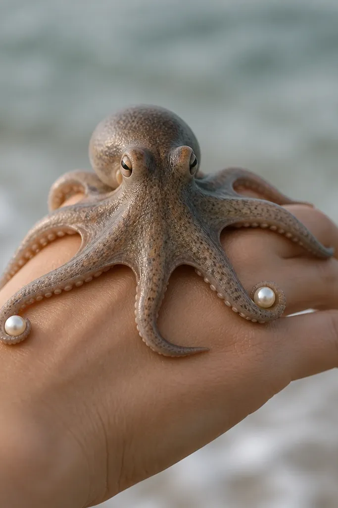
Pearl accents make the tattoo look polished without adding a full-color scene. The pearls also give you a break in the black so your eye doesn't get overwhelmed by tentacle texture. This design works because the pearls are placed near the ends where the tattoo is easiest to read in photos. I like black and gray shading on the octopus, then crisp highlight rings on the pearls for a "gloss" effect.
Use a back-of-hand placement with enough room for a 2-2.5 inch octopus. Keep pearls about 3-4mm each. Highlight rings should be very thin and placed slightly off-center to mimic light catching.
Pro tipIf you sweat a lot at work, ask for slightly lighter gray on the pearls so they don't look too stark after healing.
AvoidDon't add pearls close to the knuckle where the skin flexes - the highlight ring smears first.
12. Octopus Tentacle Fingerboard Style (One Continuous Curve)
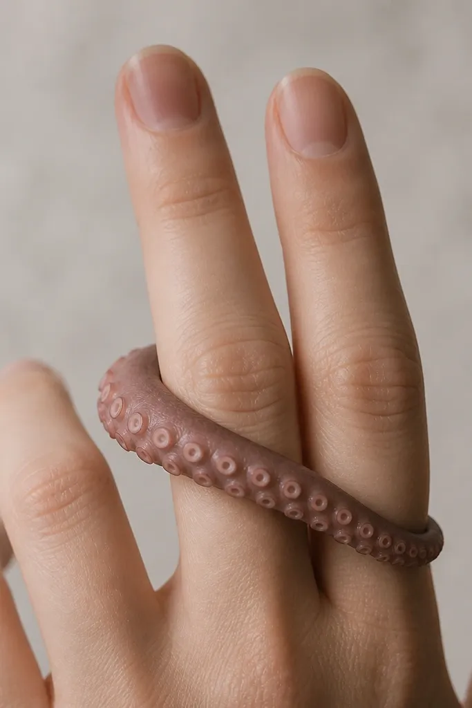
A single curve makes the tattoo look like it was designed for your hand shape. Ovals for suckers read more dimensional than perfect circles when the skin stretches. This style also avoids clutter - it looks clean even when the tentacle is partially covered by a glove or sleeve. I like soft shading on the inner edge of the tentacle so it looks like it's pressed against the skin.
Place it across two fingers at the base, not mid-finger. Keep the curve wide enough that the fingers can move without snapping the sucker rows. Use oval suckers sized consistently, and shade only one side of the tentacle.
Pro tipTry on a glove or fingerless sleeve before the appointment. If fabric rubs the exact curve spot, move the design slightly.
AvoidAvoid multiple tentacles competing in the same space. It looks busy and ages faster.