1. Spine-Swoop Octopus With Teal Haze Waves
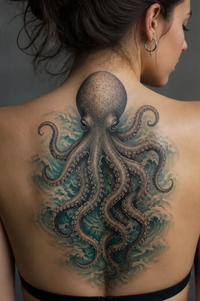
This placement reads like a slow tide pulling you in. The spine-centered head gives symmetry, and the tentacles taper as they descend so the silhouette stays smooth when the tattoo settles. The teal haze behind the tentacles creates depth without making the octopus look flat. I like the effect because it looks dreamy in daylight and still has drama under indoor light.
Ask the artist to place the head about 2-3 inches above your bra band and start the main tentacles from the sides of the head, then angle them so they hug the left and right shoulder blade lines. Keep the teal limited to background wave bands, with most of the octopus in black and gray. If you want color realism, use a muted teal wash rather than bright cyan.
Pro tipBring a photo of your favorite low-back outfit and mark where the bra line hits on your back. The design should peak just above that line so it always looks intentional.
AvoidAvoid thick, uniform shading on the tentacles; it heals heavy and makes suction cups blur.
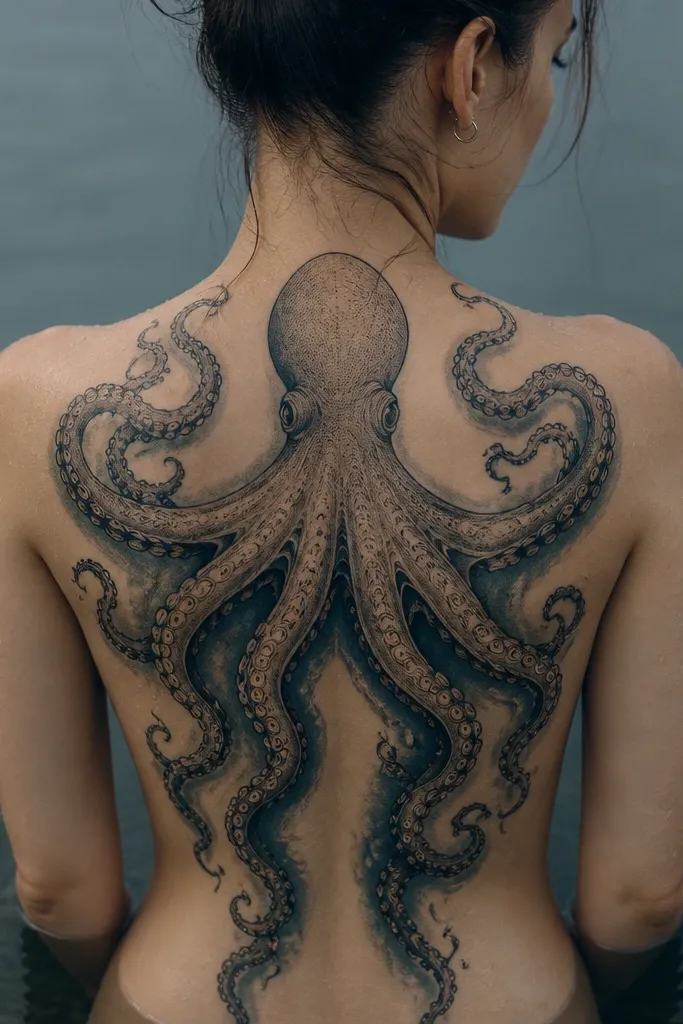
2. Shoulder-Blade Octopus With Shipwreck Silhouette
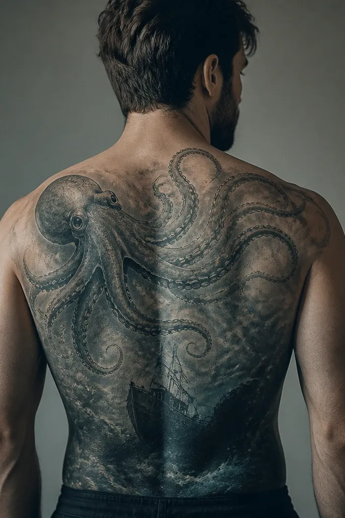
This one looks cinematic because the shipwreck gives you an anchor point at the bottom of the composition. The shoulder-blade placement makes the tentacles look like they're grabbing the scene from the side, not just hanging down. I use a strong black silhouette for the ship and then fade it into blue-gray mist so it feels underwater. It's dramatic without needing neon color.
Position the octopus head so it sits over the upper outer curve of the shoulder blade, not dead center. Have the tentacles fan outward across the mid-back, then concentrate the shipwreck shape around the lower back zone. Keep the bubbles small (dotwork size) so they don't turn into blobs during healing.
Pro tipIf you wear strapless tops, ask for the tentacles to extend toward the armpit line by about 2-3 inches for a clean peek effect.
AvoidSkip tiny, high-detail ship elements; they blur and you end up with a dark patch instead of a readable wreck.
3. Dotwork Octopus With Starry Water Background
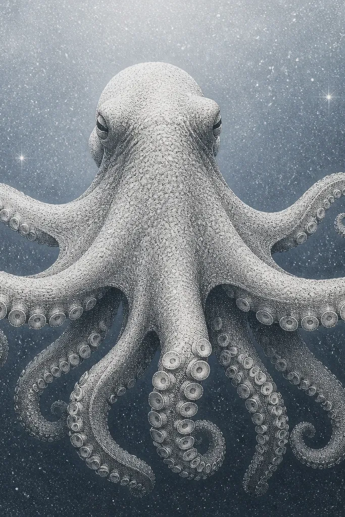
Dotwork makes the whole piece feel like it's suspended in water. The suction cups stay sharp because the artist can vary dot density instead of overworking solid ink. The starry background reads dreamy and gives you texture even when the octopus is in black and gray. I like this style for clients who want something moody and not overly literal.
Ask for dotwork gradients on the water behind the octopus, with the densest dots near the tentacle edges and lighter dots outward. Keep the octopus outline clean with a slightly thicker line weight than the shading. For 20 Octopus Back Tattoos sizing, plan for a composition that spans shoulder to lower back but leaves a narrow "breathing" gap around the spine so it doesn't look glued on.
Pro tipChoose a graywash range that includes a true mid-gray, not only near-black and light gray. That mid-tone is what makes the dotwork look dimensional after it heals.
AvoidAvoid over-filling the entire back with dots; it can look speckled and flat when healed.
4. Realistic Suckers With Ocean Spray Smoke
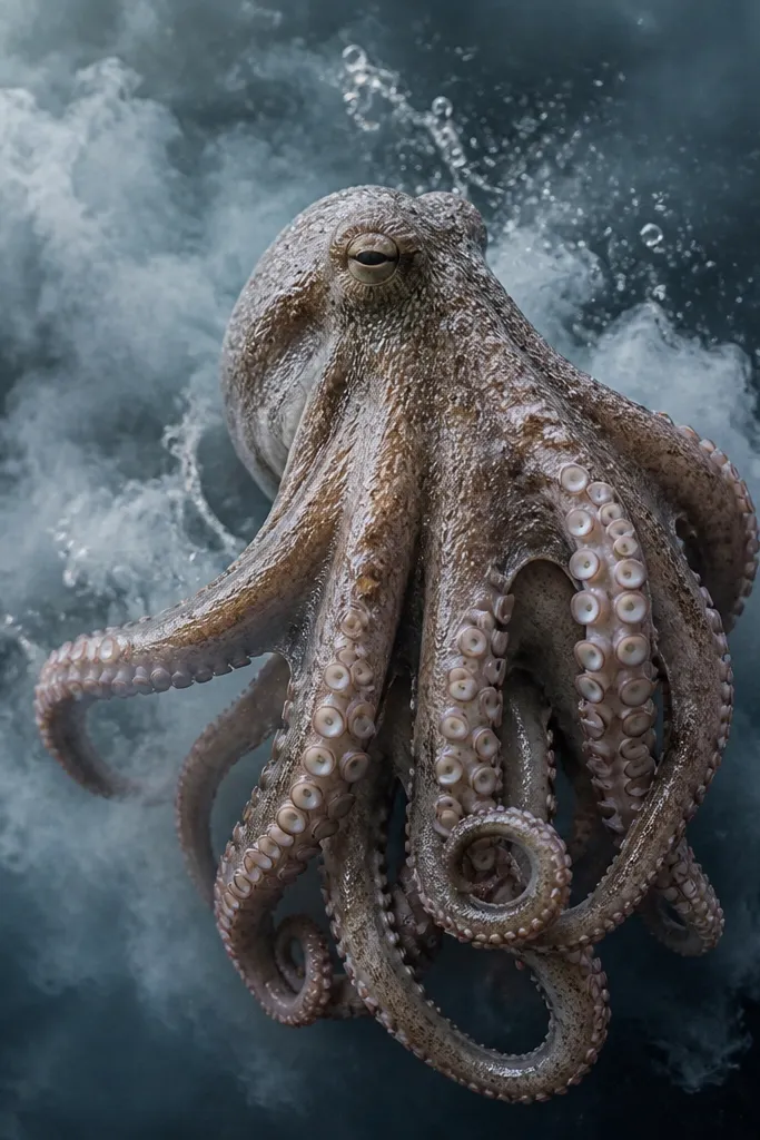
This is the "close up" tattoo. The suction cups are the star, so realism and consistent line taper matter. Ocean spray smoke behind the octopus makes the tentacles look like they're emerging from current. The contrast between crisp suction detail and soft background haze keeps it from feeling too busy.
Tell your artist you want suction cups drawn with a consistent spacing and a slight highlight ring on the top edge of each cup. Have them place the brightest highlights on the side facing your shoulder curve. Keep the spray effect mostly behind the tentacles, not across the suction cups themselves.
Pro tipIf you want this to look sharp for years, ask for fewer micro-lines inside the octopus texture and more controlled shading. Fine lines fade faster than bold contrast.
AvoidDon't let the artist turn suction cups into tiny solid circles; they turn into peppery dots.
5. Koi-Style Octopus With Wave Calligraphy
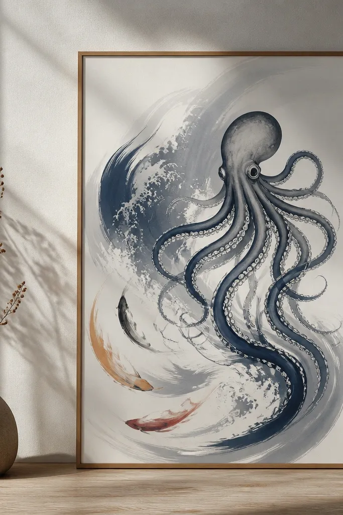
This gives you motion without literal realism. The wave calligraphy strokes act like a visual rhythm, guiding the eye across the back. It's dreamy because the lines move in a single direction and the shading stays soft. I like it for people who want ocean drama but don't want a full-on "stamp" of realism.
Ask for tentacles that end in tapered curls, especially near the lower back where you'll see them most in fitted clothing. Use one accent color only - deep navy ink with a faint indigo wash - so the calligraphy reads crisp. Keep the octopus head more detailed than the tentacles so the design has a focal point.
Pro tipBring a reference of Japanese-style wave patterns and ask how they'd simplify them for healing. Clean, thicker strokes age better than thin hairline waves.
AvoidAvoid layering too many thin wave strokes over the same area; it heals muddy.
6. Octopus Crown With Pearl Highlights
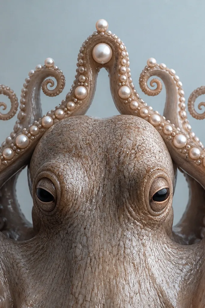
The crown shape makes the tattoo feel regal without losing the ocean theme. Pearl highlights add dreamy sparkle, especially against a soft blue-gray background. The tentacle curls create a clear silhouette that holds up even when the tattoo stretches with movement. I've seen this style look best on backs because the upper curve of the shoulder blades makes the crown read naturally.
Place the "crown" so it spans from one shoulder blade inner edge to the other, with the head centered. Use pearl circles about the size of a small coin, then add tiny bead pearls around them. Keep the pearls in light gray with a subtle blue tint - not bright white - so they don't look like stickers.
Pro tipAsk for a background fade behind the pearls, then leave a little negative space around the pearl highlights so they pop.
AvoidSkip pure white ink for pearls; it can heal chalky and lose definition.
7. Blackwork Octopus With Razor-Wave Edges
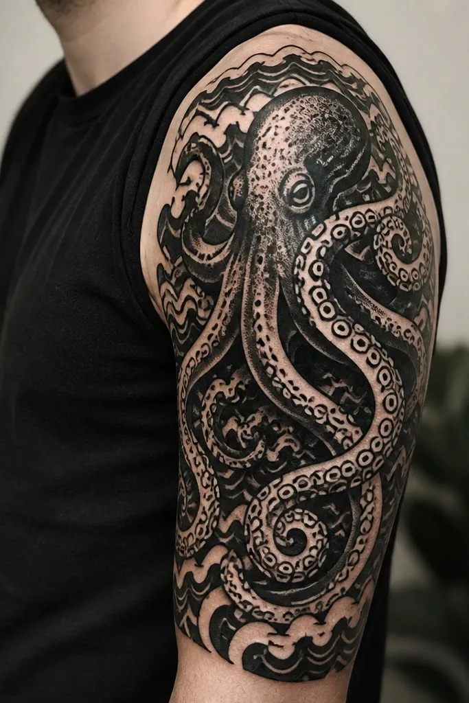
Blackwork reads strong and graphic, especially on a back where you can see the whole flow at once. The razor-wave edges give you drama without needing color, and the negative space keeps it from feeling like a full black blob. I like it for people who want octopus energy but don't want realism.
Ask for a solid black base only in the wave bands and around the octopus head, not across every tentacle. Use negative space gaps to define each tentacle segment. Keep the suction cups geometric - consistent rings - so they look intentional even after settling.
Pro tipIf you want it to look crisp longer, ask for clean line weight and fewer tiny dots inside the black fields.
AvoidAvoid filling entire tentacles with solid black; it makes the suction detail disappear after healing.
8. Watercolor Wash Octopus With Coral Accent
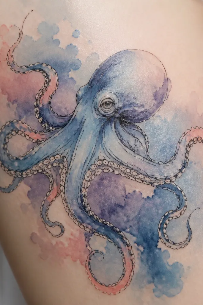
Watercolor wash makes the whole scene feel dreamy because the edges look like ink in water. The black outline keeps the octopus readable, and the coral accents add warmth without turning it into a bright rainbow. I've found this style works best when the color is used in patches, not sprayed evenly everywhere.
Tell your artist you want watercolor blooms behind the tentacles, with most of the tentacle structure still in black and gray. Use coral-pink only at the tentacle tips and around a few wave crests. Keep the purple muted so it doesn't overpower your skin tone.
Pro tipAsk for the watercolor to start farther from the suction cups, so those crisp details don't get softened by the wash.
AvoidAvoid full-coverage watercolor across the whole octopus; it blurs the form and looks faded faster.
9. Two-Tone Octopus With Deep Navy Shadow
Two-tone work looks expensive because it has "real" shadow logic. The deep navy under-tentacle shading creates depth and makes the tentacles look raised from the skin. It still reads as ocean drama because the navy feels like deep water. This is a solid choice if you want color but hate the idea of a lot of bright pigment.
Ask for navy shading only in the underside of tentacles and around wave depth lines, not on the top highlights. Keep the octopus outline crisp and slightly thicker than the shading. For a back placement that flatters, have the tentacles follow the spine curve - not a straight vertical line.
Pro tipBring a fabric swatch of what you wear most (black, navy, or gray). Two-tone tattoos look best when your clothing color matches the ink undertone.
AvoidAvoid using navy as the main outline; it loses contrast and the tattoo can look washed out in low light.