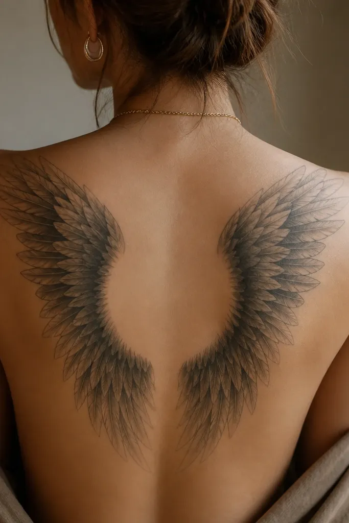
1. Emerald-Accent Illyrian Wing Panel on Upper Back
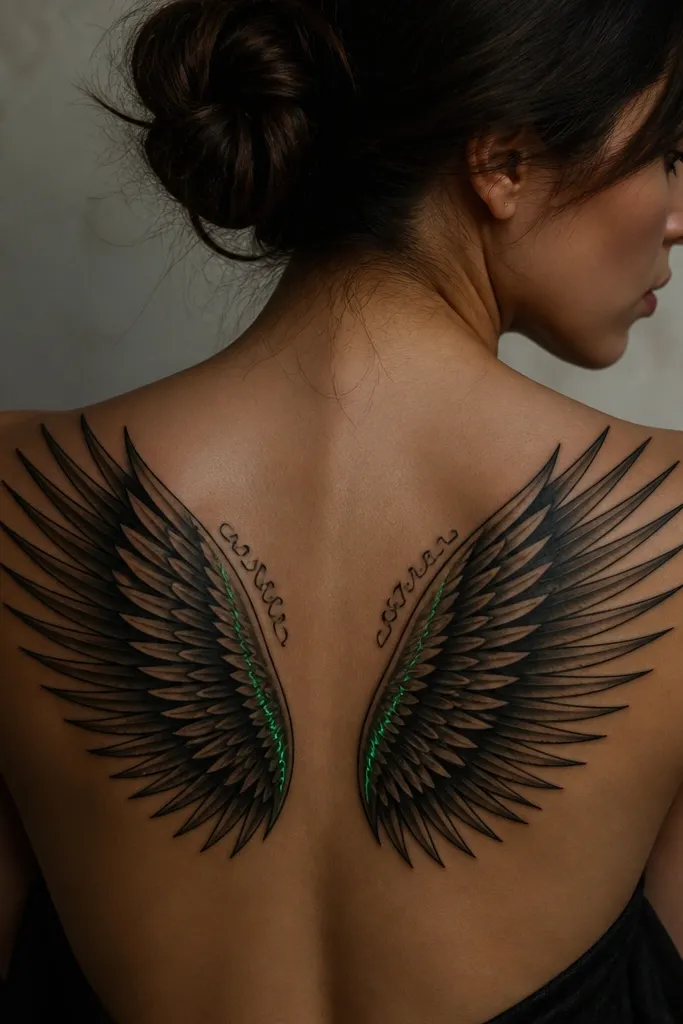
This design works because it treats the wing like armor plating: each feather row has its own shadow pocket. The emerald accent is placed where you'd expect magic - near the inner wing - so it looks intentional, not like a sticker. I like the cool contrast of emerald against deep black because it stays clean as the tattoo fades.
Place it across the upper back from just below the shoulder blade toward the spine, leaving about a finger-width gap between the wings at the center. Keep the green limited to thin highlights or a narrow band, not a full color fill. Ask for smooth gray transitions between feather rows so the wing doesn't look like it's been airbrushed.
Pro tipBring a reference that shows feather tips with sharp edges; if the artist can't replicate crisp tips in a stencil test, pick someone else.
AvoidAvoid dumping green into the whole wing - it looks muddy after healing.
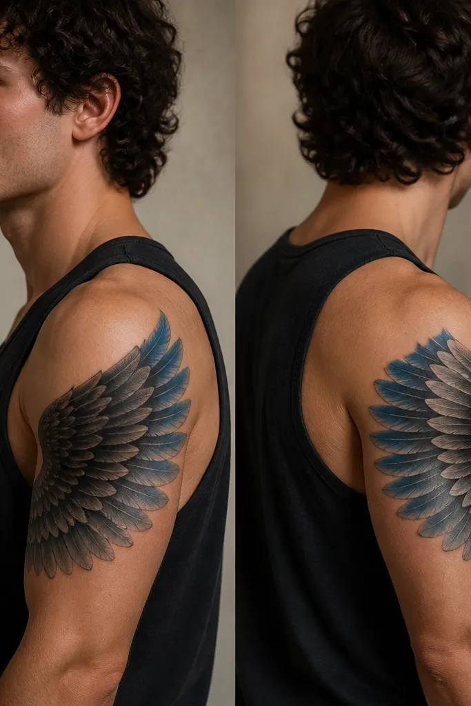
2. Storm-Blue Wing Outline with Soft Inner Feathers
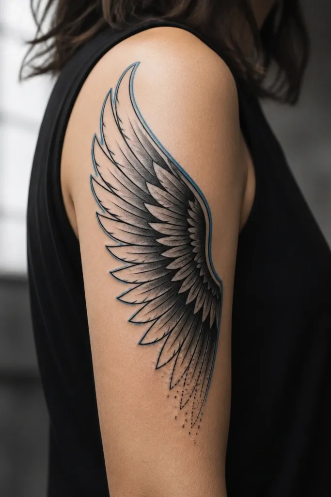
The storm-blue outer contour gives you that ACOTAR "night sky" feeling without over-coloring the piece. The interior feathers being softer makes the wing look like it's moving instead of sitting flat. I've found outline + subtle blue accents age better than fully colored wings because the black handles most of the readability.
Wrap the wing so it sits along the outer upper arm, with the highest feather tips near the shoulder and the lowest points toward the triceps. Keep the blue to a single line - about the thickness of a fine pen. Use dot clusters sparingly at the wing base to suggest magic residue.
Pro tipAsk for a test patch on the inner forearm or a small area first if you're unsure about how blue will heal on your skin tone.
AvoidAvoid thick blue borders; they blur fast and look like a marker line.
3. Gold-Leaf Illyrian Wing with Micro-Runes
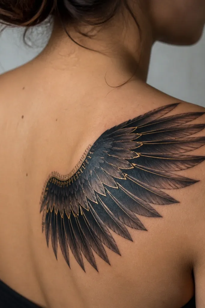
Gold-leaf accents read like "sunlight trapped in metal," which fits ACOTAR vibes better than bright yellow. The micro-runes give you that book-specific feeling because they add character marks without turning into full comic-book lettering. This style looks expensive because the gold is used as a highlight, not a fill.
Place it on the shoulder blade where the skin stretches but doesn't move as much as the ribs. Keep gold limited to feather edges and a few central strokes. Micro-runes should be tiny and spaced - think single-line marks, not a dense wall of text.
Pro tipIf your artist offers a gold that's actually a warm ochre, use it instead of neon yellow. Warm ochre heals more naturally.
AvoidAvoid packing micro-runes too close together; they turn into a gray blob.
4. Blackwork Feather Storm on the Side Rib
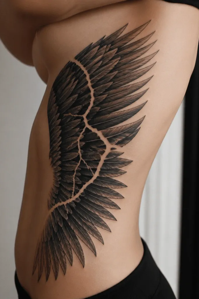
This is the "ACOTAR but make it wearable" version. Blackwork feather storms hide well under clothing, and the negative-space lightning crack gives it a story element without needing color. The side rib placement also makes the wing feel like it's reacting to movement.
Start the top of the wing under the armpit area and let the bottom angle toward the waist. Use heavy shading under feather rows, but keep the separators white in the stencil (so they stay clean). The lightning crack should be a single sharp shape, not branching everywhere.
Pro tipAsk for a stencil with a few oversized feather rows first; if the scale feels right in the mirror, you're good.
AvoidAvoid tiny feather rows on ribs - they blur and you lose the layered look.
5. Two-Tone Gray Wings with Negative-Space Halo
Negative-space halos make wings feel supernatural without adding extra symbols. Two-tone gray keeps the feather rows readable even when the tattoo softens with time. I like this for people who want ACOTAR wings but don't want any color at all.
Place it centered on the spine over the mid-back so the halo sits at shoulder-blade height. Keep feather edges crisp and avoid over-blending. The halo oval should be consistent width, about the size of a small egg, so it doesn't look random.
Pro tipUse a reference where the halo is clearly defined; if the halo is too wide, it looks like a missing patch.
AvoidAvoid full gray wash over everything - it kills the feather separation.
6. Wraparound Arm Wing with Feather Tip Gradients
Wraparound wings look best when the feather tips follow the arm curve. The gradient tips make the tattoo feel airy, but the black separators keep it readable. The pale blue at the outermost feathers adds just enough "Illyrian sky" without dominating the piece.
Schedule it so the stencil can be tested with your arm relaxed and slightly bent. Place the wing so the highest point lands on the outer bicep and the lowest feather tips reach toward the elbow crease. Keep the pale blue to the very edge only, like a highlight stripe.
Pro tipWear a sleeveless shirt to your appointment and ask the artist to mark how it looks in that lighting. It changes the contrast.
AvoidAvoid placing the wing too flat on the arm; it turns into a blob when you bend your elbow.
7. Raven-Black Feather Wing with Smoke Shading
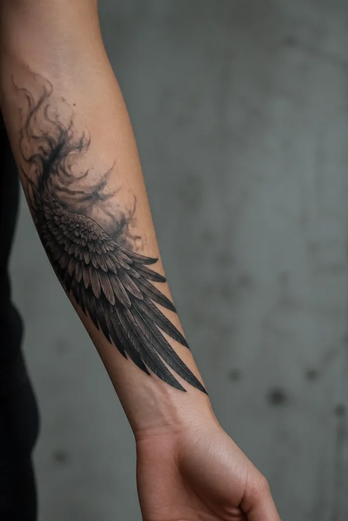
Smoke shading around the base makes the wing feel like it's emerging from darkness, which matches ACOTAR mood. The raven-black approach keeps everything consistent - no accidental color shifts. I like it for people who want a dramatic wing but don't want it to look like a decorative sticker.
Keep the wing in the outer forearm or inner-bicep side area where you can see it in motion. Use smoke shading only around the base - not over the entire feather field. Each feather row should still have a clear shadow pocket so it doesn't flatten.
Pro tipAsk for the smoke to be darker near the wing base and lighter as it spreads. That gradient is what reads as "smoke," not "smudged ink."
AvoidAvoid smoke shading over the feather tips; it makes the design look blurry.
8. Illyrian Armor Texture Wing with Thin Black Filigree
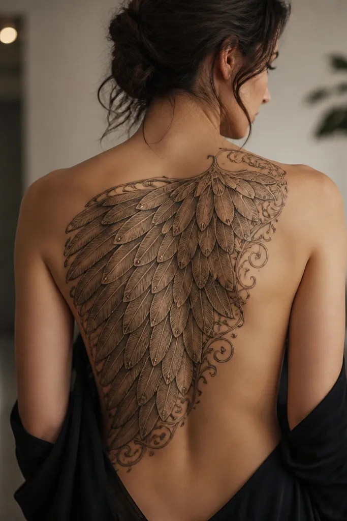
Armor-texture feathers scream Illyrian because the surface detail feels crafted. The thin filigree gives a delicate border so the wing doesn't look too heavy. This combo works best when the filigree is sparse; it should frame, not cover.
Place it across the upper back so you have enough straight space for the armor texture lines. Keep texture consistent across the feather rows and avoid random scribbles. Filigree should live on the outer edge and a few spots near the center, leaving most of the interior feather field plain-black and gray.
Pro tipBring a reference of armor scale patterns you like. Texture direction matters - horizontal reads plated, diagonal reads wind-blown.
AvoidAvoid mixing armor texture with heavy gray blobs; the tattoo loses clarity.
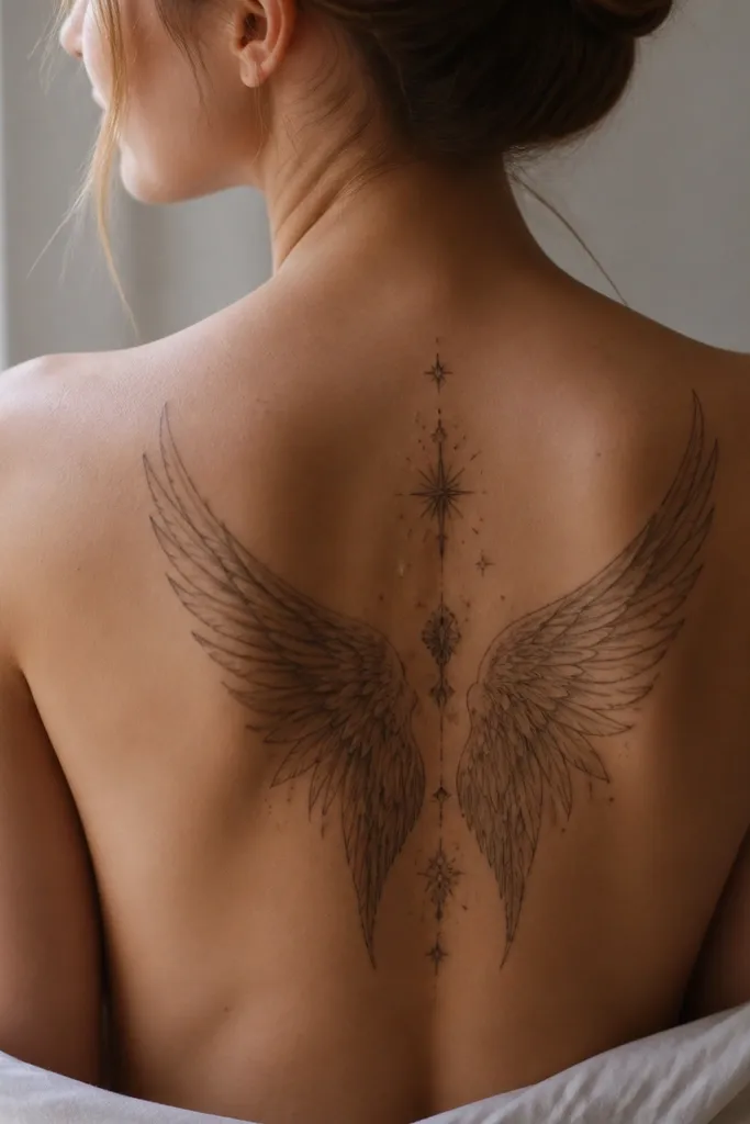
9. Center Spine Wing Split with Starry Dot Constellations
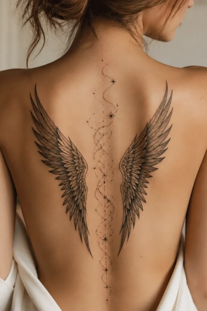
A spine-split wing gives you a clean, ACOTAR-feeling symmetry without needing a big horizontal back piece. Dot constellations add story mood and keep the composition light. The key is dot spacing so it doesn't turn into a single gray cloud.
Place the split over the mid-to-lower spine, with the wing tips stopping around the upper buttock line. Keep dot clusters small and concentrated near the center gap. Use thin curved wind strokes - just a few - to connect the dots visually to the wing feathers.
Pro tipAsk the artist to map the dot clusters first, then add feathers around them. This prevents the stars from getting swallowed by shading.
AvoidAvoid dense dot fields; they blur and you lose the constellation shapes.
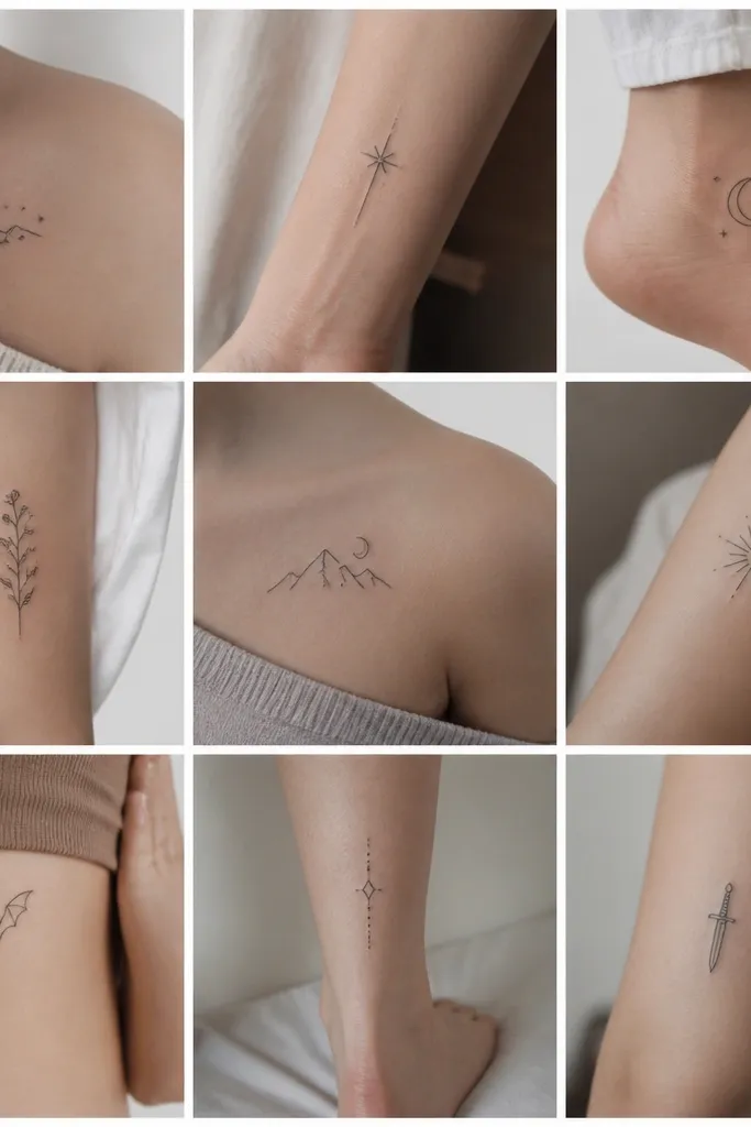
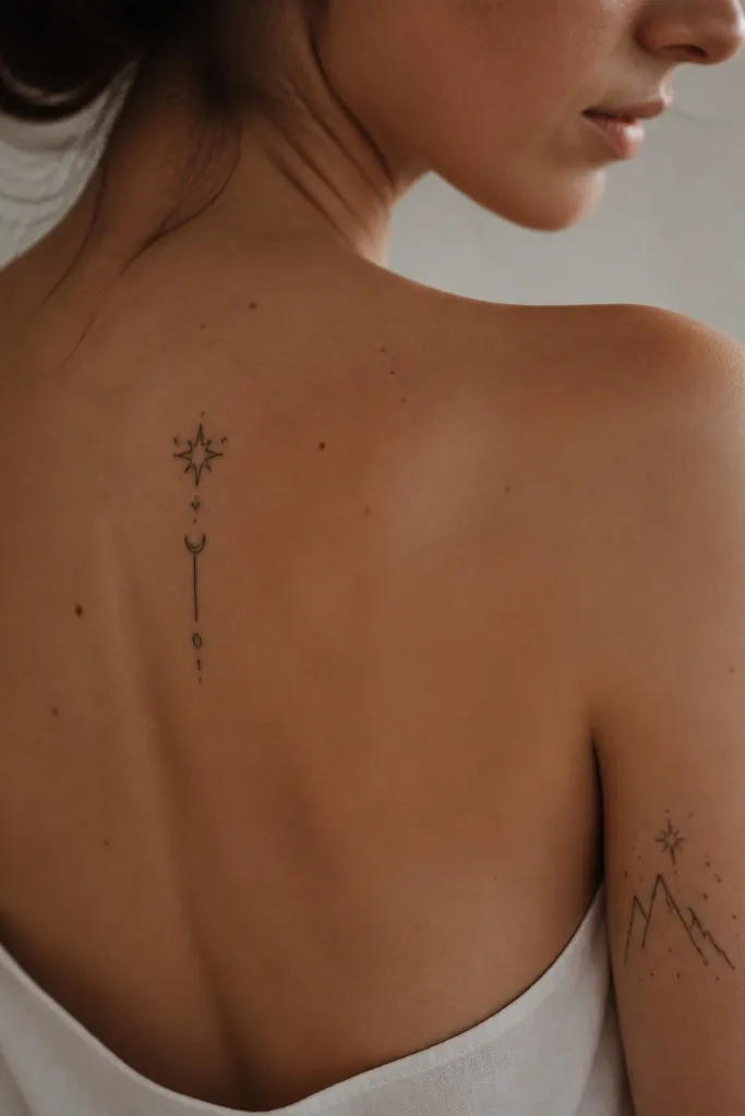
10. Minimal Outline Wings with One Red Thread Tie
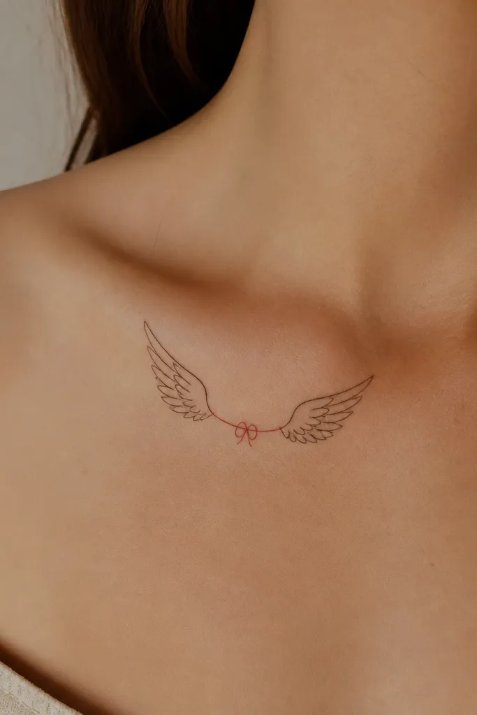
Minimal outlines look great year-round because they don't depend on large shading that can blur. The one red thread tie gives you a specific, emotional ACOTAR vibe without turning into a full scene. It also ages well because fine line work stays crisp if it's not overworked.
Place it on the upper chest near the collarbone or slightly below it. Keep the wings small enough that the feather tips stay sharp - around 3 to 4 inches across each side. The red thread should be a single continuous line with a knot, not scattered red dots.
Pro tipUse a stencil with lighter line weight than you think you need; fine lines settle and look bolder after healing.
AvoidAvoid heavy shading on minimal outline wings; it makes them look like a smudge.
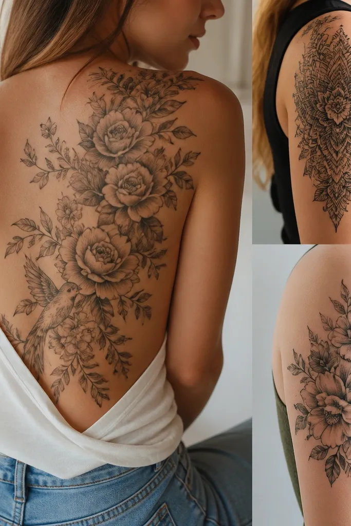
11. Color-Blocked Ember Inner Wing with Charcoal Outer Feathers
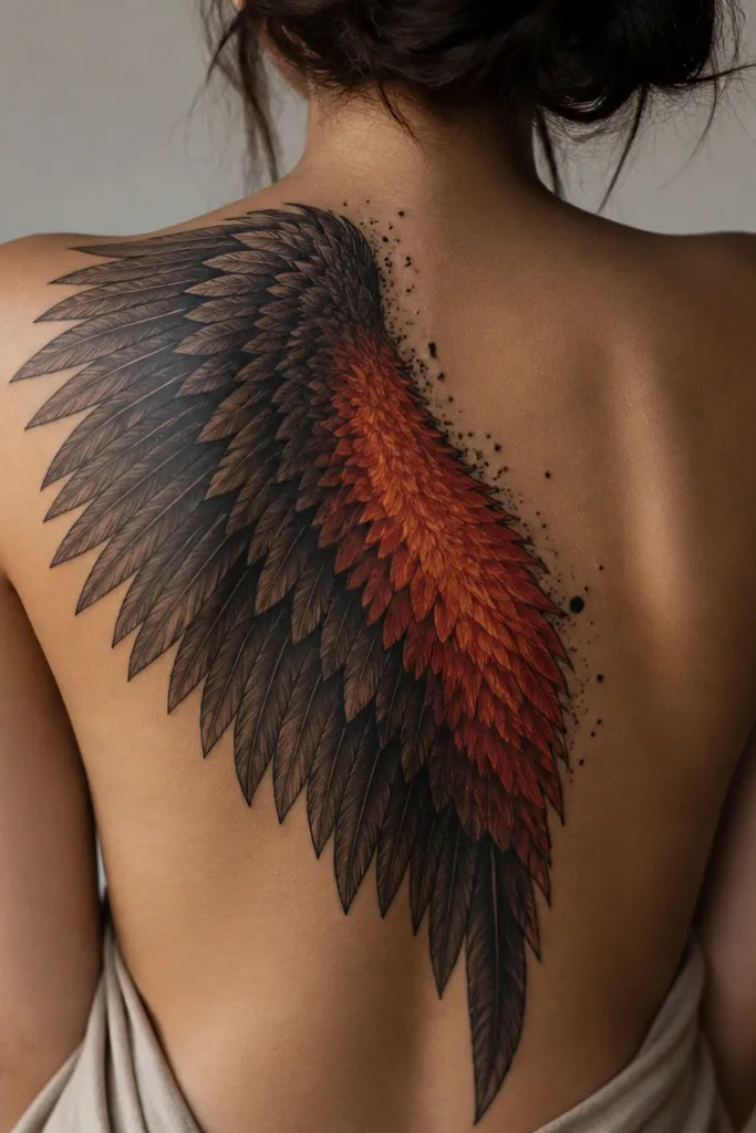
Color-blocking keeps the ember effect controlled so it doesn't bleed across the feather rows. Charcoal outer feathers anchor the design, and the ember inner section reads like ACOTAR fire energy. I like this version because it looks intentional even in low light and doesn't look random when you're wearing darker clothes.
Place it on the mid-to-lower back where you can fit the defined ember shape. The inner color area should be a clear section - like a wedge - not a full wash. Keep sparks minimal: a handful of tiny black dots or short streaks along the edge of the ember block.
Pro tipAsk the artist to do a tiny color test on a skin-safe area or a small practice swatch if they're using a new orange/red ink brand.
AvoidAvoid letting ember color touch the feather separators; it muddies the layering.