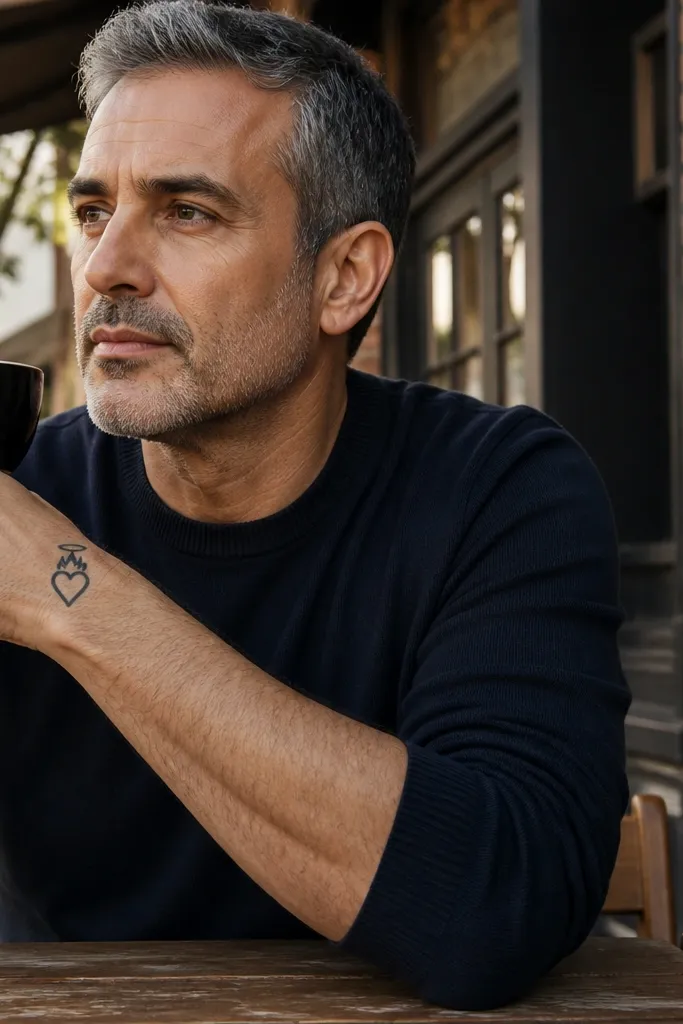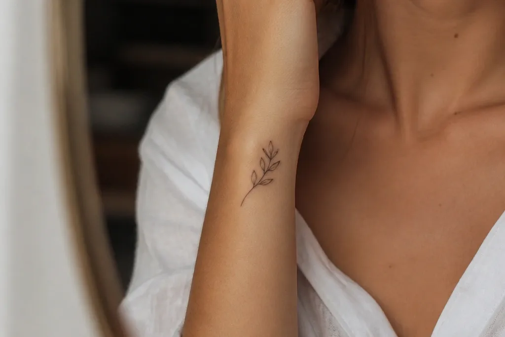

1. Side Wrist Single-Curve Branch
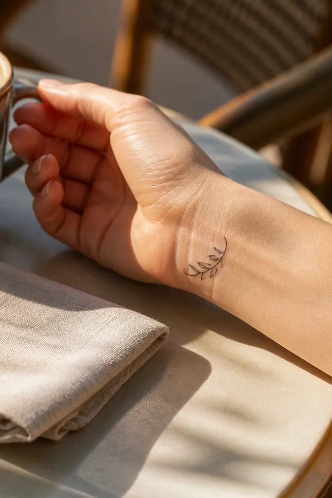
This design is the one I recommend when you want “peace” without looking like you’re wearing a sticker. The branch is a single smooth curve, so your eye reads it instantly even at 2 cm. Leaves are spaced so each one has a clean outline, and the tattoo keeps that minimalist calm. It looks especially good on the side of the wrist because the natural skin contour helps the curve feel intentional, not stamped on. If you like tiny tattoos that still look like art, this is the direction.
Editor's noteBring a photo in a long-sleeve cuff position so your artist can match the tattoo to how your wrist actually looks in motion.
Start by placing the stencil on the outer wrist so the curve runs from the lower outer wrist toward the thumb side. Keep it small — about 2 to 2.5 cm long — and let the leaves sit about 4-6 mm apart. Ask for black linework only with no gray wash, and keep the leaf tips slightly pointed rather than round. Aftercare is normal: wash gently, pat dry, and avoid soaking for a week. If your wrist skin stretches a lot, ask the artist to slightly thin the line weight so it doesn’t thicken as it heals.
One warningDon’t pack the leaves too close together or the spacing will disappear after healing.
2. Collarbone Vertical Micro Branch
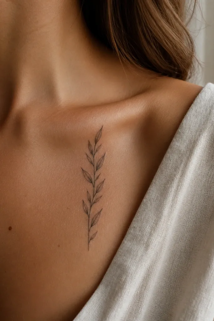
A vertical branch on the collarbone reads delicate and intentional, like a small line of handwriting. The leaves act like punctuation — each one is a tiny almond that turns slightly left or right to follow the body line. Because the piece is short and vertical, it stays photogenic in front-facing photos and doesn’t fight necklaces. I like this for people who want an olive branch symbol that looks feminine and not overly “tattoo-y.” It’s also easy to keep covered with a thin layer when you need it for work.
Editor's noteChoose a leaf size that matches your collarbone width — if the leaves look too big on your skin, the tattoo will feel heavy.
Start by marking the placement 1-2 cm below the end of the collarbone where your skin is smooth and doesn’t crease. Scale it to 2 to 3 cm tall with 3-5 leaves total, and keep the stem line thin. Ask for crisp black outlines and no shading; the collarbone already gives you a natural light-and-shadow effect. For healing, avoid tight straps and rubbing for the first week. If you tan easily, plan for the ink to fade slightly faster in sun, and use SPF once it’s fully healed.
One warningDon’t center it too low on the chest where it starts to look like a random scribble in photos.
3. Behind-the-Ear Whisper Branch
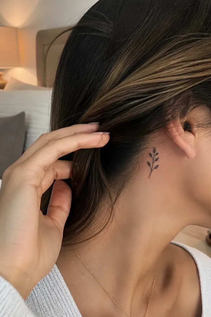
This placement is private and sweet. The whisper-branch works because it’s tiny enough that it looks neat even when your hair shifts, but still readable when someone leans in. The design uses only two to three leaves, so it doesn’t overcrowd a small area. I’ve seen this style age well because it relies on clean outlines rather than dense detail. It also looks great with a minimalist aesthetic — small hoops, simple studs, and clean hair styling all make it pop.
Editor's noteAsk your artist to do a quick stencil placement with your hair tucked the same way you wear it daily.
Start by choosing the flat area just behind the ear where the skin isn’t too bumpy. Keep the tattoo around 1.2 to 1.8 cm long and use a single gentle hook curve. Ask for black linework with no gray and leaf tips that are slightly elongated for a sharper look. Aftercare includes extra caution with hair products; keep conditioner off the tattoo for at least a week. If you’re sensitive to friction from glasses or masks, plan the placement so it’s not constantly rubbed.
One warningDon’t add too many leaves behind the ear or the detail becomes unreadable fast.
4. Minimal Olive Branch Wreath Half-Moon
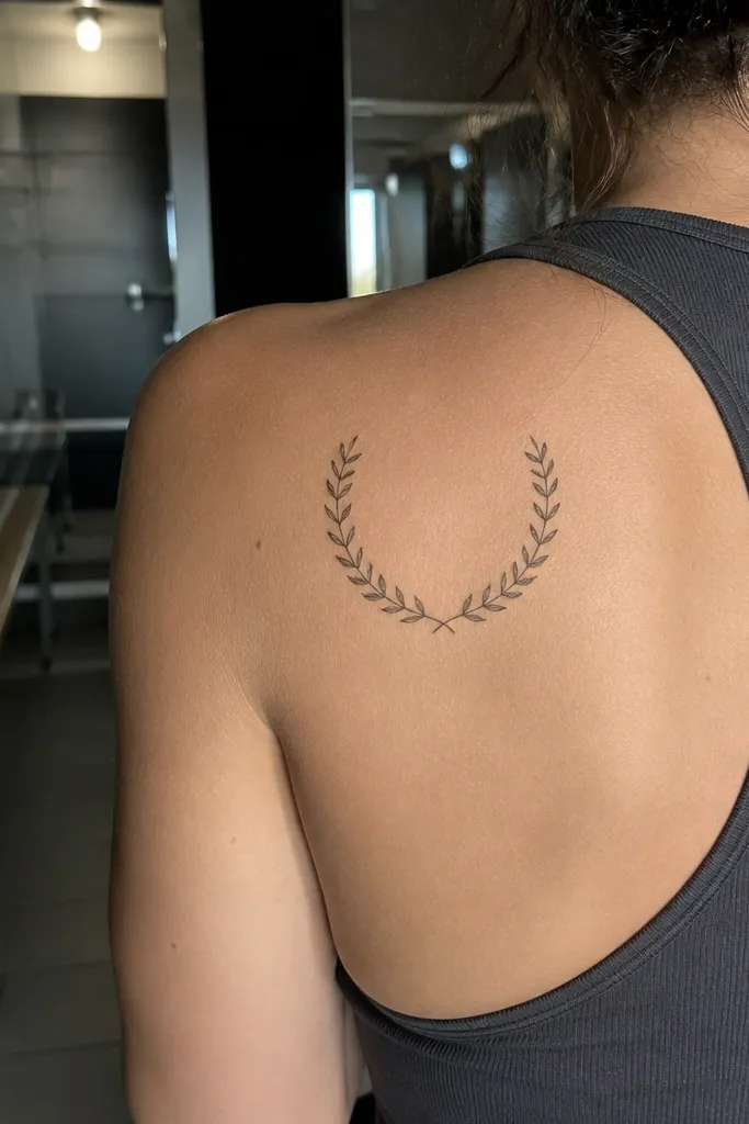
A half-moon branch looks timeless because it frames the body without wrapping too tightly. The minimalist version keeps the leaves uniform and the arc clean, so it reads like a symbol instead of a busy pattern. On the shoulder blade, the curved skin helps the wreath feel natural. I like that it looks good from multiple angles — side shots show the arc, back shots show the spacing. This is a great choice if you want an olive branch that feels more “symbolic” than “tiny doodle.”
Editor's noteBring a fitted top photo so your artist can scale the arc to where your clothing sits.
Start with a stencil arc that follows the shoulder blade curve, usually around 4 to 6 cm across. Use 7 to 10 small leaves total and keep them evenly spaced to protect readability. Ask for black outlines with light negative space between leaves, and skip shading. Then, during healing, avoid tight bras or straps that rub the top edge of the shoulder blade. If you want it to look crisp longer, ask for slightly lighter line weight than you’d get on a thicker-skinned area like the forearm.
One warningDon’t make it a full wreath unless you’re going bigger — small full wreaths turn into a leaf blur.
5. Single Leaf + Stem Minimal
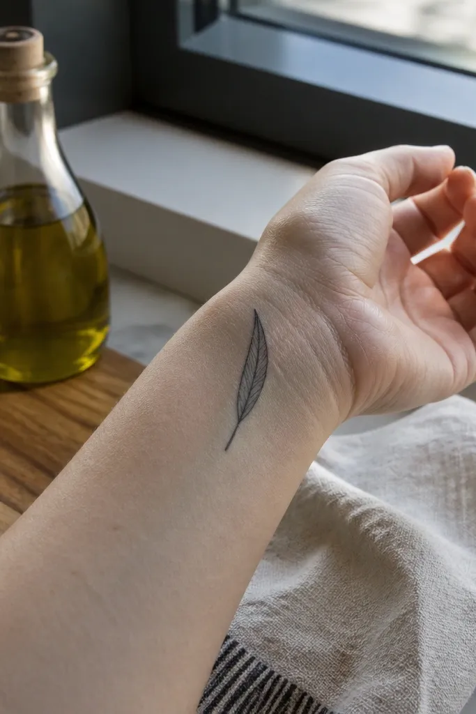
Sometimes the most timeless olive branch is almost nothing. This design uses one main leaf and a tiny stem segment, so it reads instantly as the symbol even from a distance. The key is proportion: the leaf is the focal point, and the stem is just enough to connect it to the idea of a branch. I like it for people who want meaning but don’t want a visible cluster of leaves. It also works beautifully on forearm because it looks like a fine line drawing.
Start by placing the leaf where your skin is relatively flat, usually inner forearm near the wrist. Keep the total length around 1.8 to 2.5 cm, with the leaf occupying about half the space. Ask for black linework with a crisp outline and no shading. Aftercare is straightforward, but protect it from constant watch-band friction if you place it near the wrist. If you’re tattooing over a slightly bumpy area, ask for a slightly thicker outline to maintain clarity.
Choose a leaf shape that’s slightly pointed at the tip so it doesn’t look like a generic leaf clip-art.
Don’t add extra micro leaves — it defeats the minimalist purpose.
6. Two-Leaf Branch with Diagonal Stem
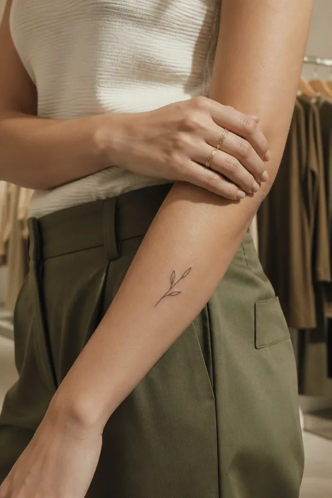
This is the minimalist sweet spot when you want movement but still want it to stay clean. The diagonal stem gives the tattoo energy, and the two leaves read like a simple promise. On the outer forearm, the angle matches how your arm naturally sits, so photos look flattering even without special posing. It also works for first-timers because it’s small and doesn’t require complex leaf detailing. The symbolism stays clear without turning into a full branch.
Editor's noteAsk for the leaf bases to be slightly narrower than the tips so the leaf silhouette stays sharp.
Start by drawing a diagonal line on the forearm where the skin is smooth and not too close to bone. Make the tattoo about 2 to 3 cm long, with two leaves spaced along the stem. Ask for black outlines only and keep the leaf veins out or very minimal — tiny veins blur. For aftercare, avoid sleeve friction for the first week and moisturize with a thin layer. If your forearm gets sun exposure, plan SPF once healed because forearm ink fades faster in heat.
One warningDon’t thicken the stem too much or it will look like a marker scribble.
7. Micro Olive Branch with Three Dots Accent
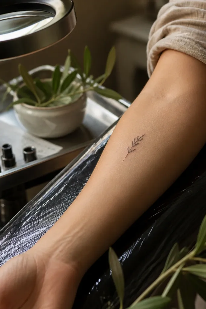
This one adds a little personality without adding clutter. The three-dot accent acts like a subtle highlight and gives your brain an extra focal moment, which makes the tattoo feel styled rather than plain. The branch stays minimalist with just a few leaves, and the dots are tiny — think 1 mm circles, not decorative beads. I like this on the ankle because the contrast between the fine lines and the skin texture makes it pop in photos. It also looks good with summer outfits where the ankle is visible.
Editor's noteIf you’re worried about dot aging, ask for the dots to be slightly smaller than you think — tiny dots hold up better than larger ones.
Start with placement on the ankle where the skin is relatively smooth, usually slightly above the highest bump. Keep the branch around 2 cm long and use 3 to 4 leaves max. Add three dot accents no bigger than the leaf vein line thickness and keep them on one side of the branch. Ask for solid black dot and linework only. Aftercare matters here: avoid tight socks for a few days and keep the area dry to prevent irritation.
One warningDon’t place dots too far from the branch or they’ll feel random after a year.
8. Fine-Line Olive Branch with Negative Space Leaves
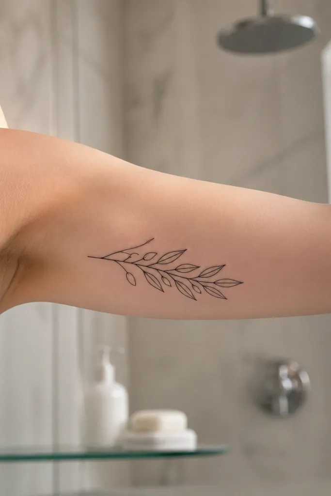
This style is all about negative space. Instead of fully filled leaves, the leaves are outlined and the center stays skin — so the tattoo stays airy and readable. It looks crisp because the design avoids dense fills that can blur. I like it on the inner bicep because the skin is flatter and the tattoo catches light nicely when you flex. This is the option I’d pick if you hate the look of tattoos that feel “ink-heavy.”
Editor's noteAsk for leaf outlines to be slightly thicker at the base — it keeps the leaf from looking like a thin outline after healing.
Start by choosing a placement with smooth skin, like inner bicep or outer upper arm. Make the branch about 3 cm long and plan 5-7 outlined leaves with open centers. Ask for a fine, consistent line weight and no shading inside the leaves. During healing, keep the area moisturized lightly; over-lotioning can make fine lines look cloudy for a few days. If you have very dry skin, mention it to your artist so they can plan line depth that won’t fade unevenly.
One warningDon’t use heavy line weight for negative-space leaves or the design turns into a solid blob.
9. Olive Branch Tip-Only Sprig
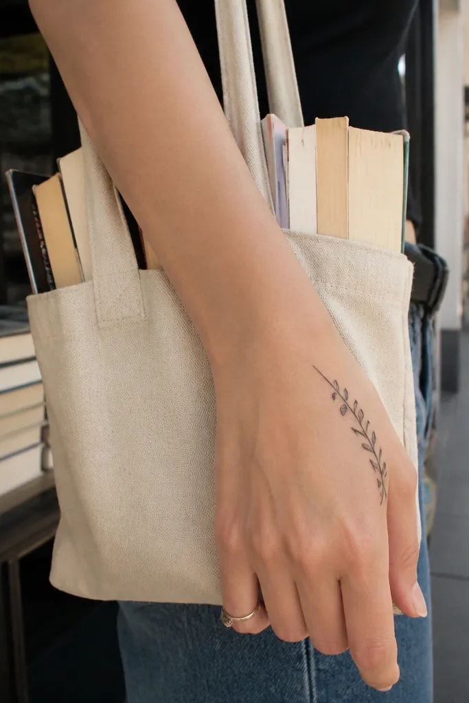
This is minimalist in a way that feels modern. The tattoo shows only the tips — the smallest leaves and the outer curve — so it reads as an olive branch but doesn’t demand attention. It’s perfect if you want your tattoo to look “there” without being a full statement. On the hand, it’s also easier to keep clean lines because you’re not packing too many details into a high-movement area. Photos look sharp because the ink sits on a visible contour and the design is short.
Start by placing it on the side of the hand near the thumb web area where skin movement is moderate. Keep size tiny, around 1.2 to 2 cm, and use only 2-3 leaves. Ask for crisp black outlines and a short stem that curves toward the wrist. Aftercare is extra important on hands: wash gently, avoid soaking, and keep it protected from friction. If you work with water a lot, plan for touch-ups because hand tattoos fade faster.
Use a stencil that shows how it looks when your thumb is slightly bent — placement changes the readability a lot.
Don’t add tiny leaf veins on the hand — they disappear quickly.
10. Olive Branch with Thin Ribbon Bow
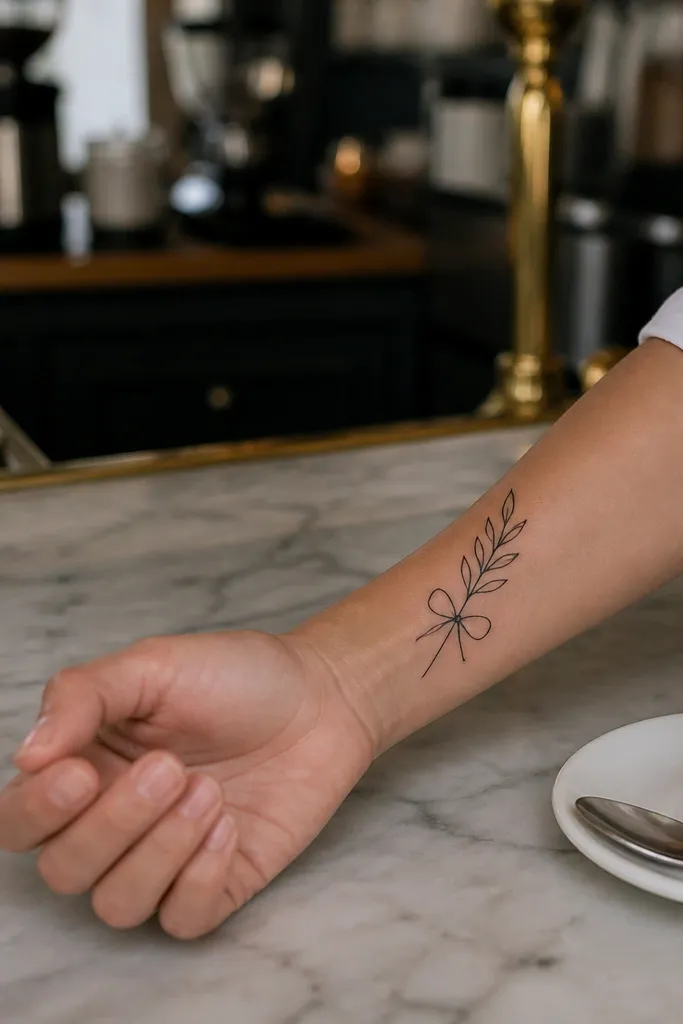
This design adds a soft “finish” to the branch without turning it into a cartoon. The ribbon bow is drawn with thin lines and short tails, so it looks like a delicate accent rather than a big graphic element. The branch sits above it, creating a balanced stack that looks good in profile photos. I like it for people who want symbolism but also want the tattoo to look styled. It’s still minimalist because the ribbon is tiny and the leaves stay simple.
Editor's noteTell your artist you want the bow lines to be slightly thinner than the branch stem for visual hierarchy.
Start by placing the tattoo on the upper outer arm where there’s enough room for a small vertical stack. Keep it around 3 to 4 cm tall total. Ask for the ribbon bow to be under 1 cm wide with thin, clean linework and no shading. For the branch, use 4-6 leaves and keep them evenly spaced along a gentle curve. Aftercare includes avoiding tight sleeves and friction; moisturize lightly and keep the area clean.
One warningDon’t thicken the bow lines or it will compete with the branch.
11. Minimal Olive Branch with Micro Vines
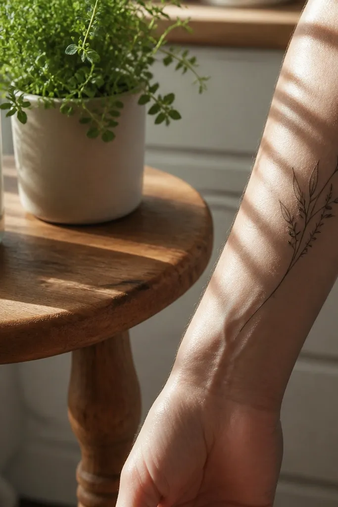
This one looks timeless because it adds movement without adding more leaves. The micro vine line runs alongside the stem like a second thread, so the tattoo feels drawn rather than assembled. It’s a subtle detail that photographs beautifully because it creates fine contrast against your skin. I like it for people who want something minimalist but not boring. The olive branch still reads clearly, and the extra line makes it feel more personal.
Start by placing it on the outer forearm where you have a clean line of sight in photos. Keep the branch around 2.5 to 3.5 cm long with 4-6 leaves. Ask for the micro vine line to be thin and slightly offset from the main stem, with no extra vine loops — just a straight-and-curved follow. Keep shading out; rely on linework. Aftercare is normal, but protect the fine line from heavy rubbing by choosing breathable clothing.
Ask for the micro vine to stop before the last leaf so the design doesn’t feel tangled.
Don’t add extra leaf clusters to “fill space” — the lines will blur.
12. Olive Branch with One Shaded Leaf Base
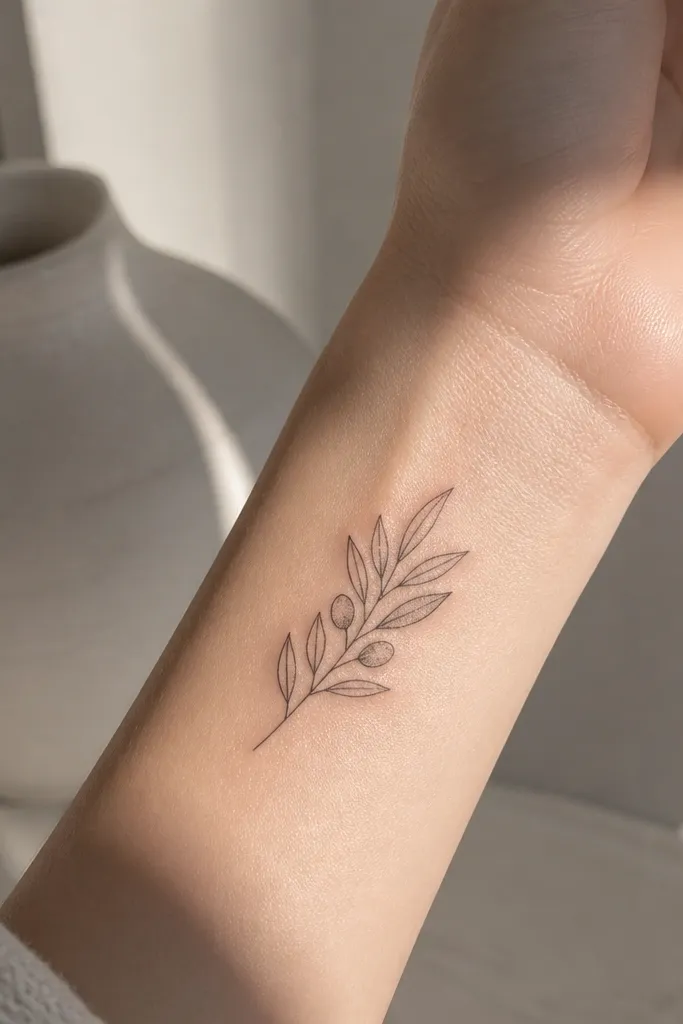
If you want depth but still want the minimalist look, shade only the leaf base. This design uses mostly solid black outlines, then adds a small gray dot cluster under one leaf so it looks dimensional. The tattoo stays readable because the shading area is tiny and controlled. I like it on the inner wrist because the contrast looks delicate, not heavy. It’s also a good compromise if you’re unsure about whether you want fully black ink or gray.
Editor's notePick one leaf as the “hero” and shade only that one so the design doesn’t look mottled.
Start by placing the branch on the inner wrist where the skin is smooth and the tattoo can be seen when you wear short sleeves. Keep size around 2 to 2.8 cm long and use 4-6 leaves. Ask for dot shading only at the base of one leaf, about the size of a pencil eraser tip, and no shading on the rest. Aftercare should include strict sunscreen later; gray tones can fade into a patch if you sun it early. If you’re prone to ink spreading, ask the artist to keep the dot shading more sparse.
One warningDon’t shade multiple leaves across the branch — tiny dotwork turns into gray haze.
13. Olive Branch with Minimal Thorns Detail
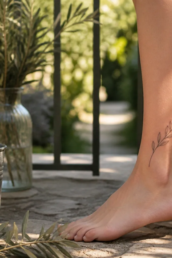
Thorns make the symbol feel honest. This minimalist design includes just a few tiny notches along the stem, not big spines, so the branch still reads as olive and peace. The little detail adds character and makes the tattoo feel hand-drawn. On the ankle it looks bold enough to be visible but small enough to feel subtle. If you like tattoos with meaning that isn’t purely soft, this is a great option.
Editor's noteLet the notches be subtle — if they look like a barbed wire line, the minimalist vibe is gone.
Start by placing the tattoo on the outer ankle where you can keep it away from the most bony pressure points. Keep length around 2 to 3 cm and use 3-5 leaves. Ask for 3-5 tiny thorn notches — basically micro zig-zags — along the stem, spaced out. Keep everything black and crisp, and avoid heavy shading. Aftercare is important because the ankle gets friction from shoes; wear looser footwear for a few days post-tattoo.
One warningDon’t add thorns to every segment of the stem.
14. Olive Branch with Tiny Bud at the Tip
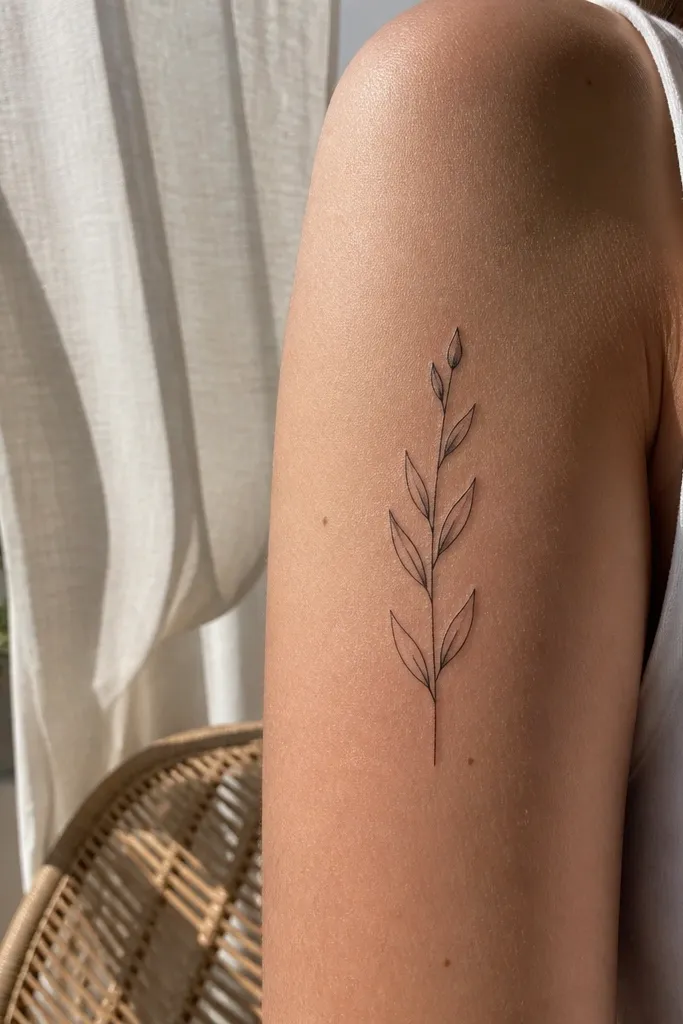
A bud at the tip gives the tattoo a sense of growth. The minimalist bud is a tiny teardrop or small oval attached to the branch end, and it makes the whole design feel complete even with only a handful of leaves. I like it on the upper arm because sunlight makes the fine lines look sharp. It’s also a good conversation piece without being loud — people notice the detail when they get close. This design still feels timeless because the shapes are simple and consistent.
Start by placing the branch on the outer upper arm or near the shoulder where it won’t constantly rub against a bag strap. Keep it around 3 cm long with 4-6 leaves plus the bud. Ask for black linework only, with the bud drawn using the same line thickness as the leaves. For healing, protect it from sun exposure and keep it clean after showers. If your skin has a lot of freckles, ask for slightly bolder line depth so it stays visible on contrast.
Ask for the bud to be smaller than the top leaf so it reads as an accent, not a second focal point.
Don’t make the bud too large or the branch stops looking minimalist.
15. Olive Branch Micro Cluster on Upper Rib
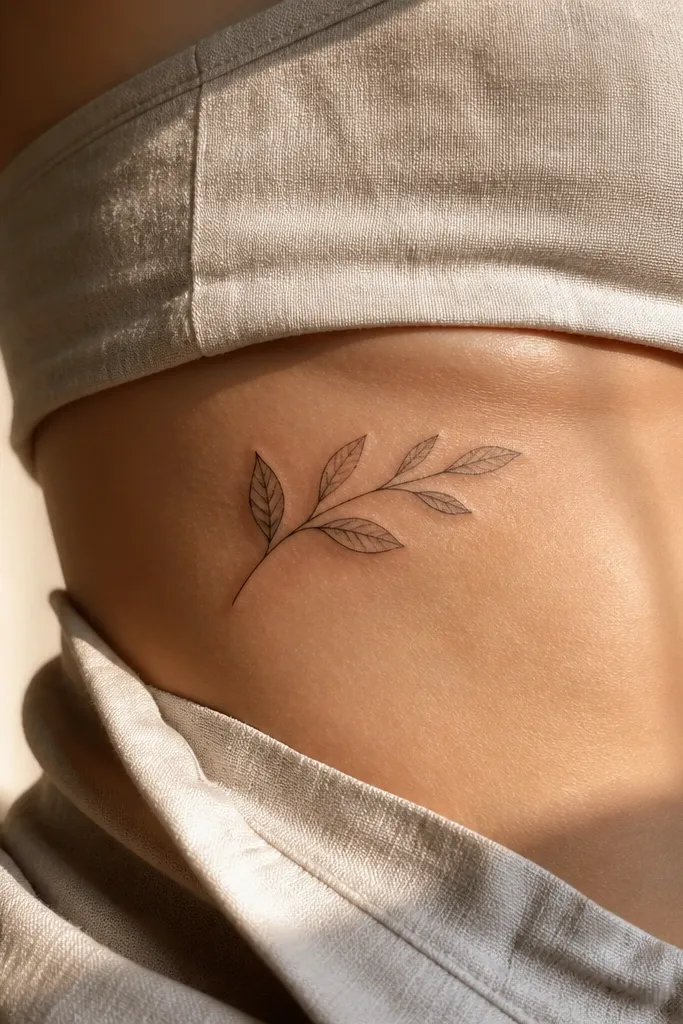
Upper rib skin curves with your body, so a micro branch there looks natural and elegant. This design uses a cluster of 6 leaves but keeps big negative space between them, so it doesn’t turn into a leaf blob. I like it for people who want a tattoo that looks especially good in photos where your pose shows a bit of rib curve. It also hides easily under clothing but pops when you wear something fitted. The olive branch symbol looks less “generic” when it’s drawn to the body’s curve.
Start by placing the stencil on the upper rib where you can see a smooth curve when you exhale. Keep size around 3 to 4 cm long and use 5-7 leaves total. Ask for black linework with no shading and leaf outlines that are slightly thicker at the base. Aftercare includes being careful with clothing rubbing — choose soft fabric and avoid tight waistbands for a week. For aging, ribs can fade with friction, so plan for a touch-up if it’s in a high-contact spot.
Do a quick test photo in the exact bra or top you’ll wear most so your artist can scale the design to your body.
Don’t pack leaves right up against each other — the curve makes it harder to read.
16. Olive Branch Minimal on Outer Shoulder
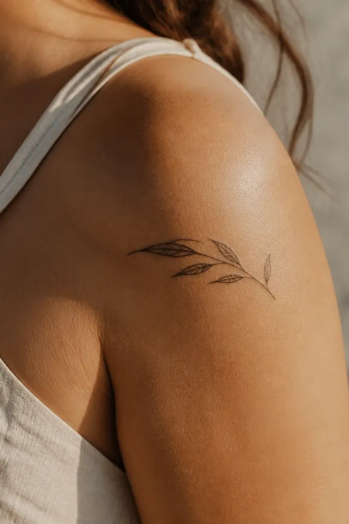
Outer shoulder placements look clean because the skin stays fairly smooth compared to joints. This design uses a gentle arc and leaf spacing that lets the branch read as a single unit. It’s a great option if you want something that looks good from the front and the side. I like the way it frames the shoulder without adding bulk. It also heals well because it’s not constantly stretched like some wrist placements.
Start by positioning the stencil on the outer shoulder where the sleeve seam would sit. Keep the branch 3 to 4.5 cm long with 5-7 leaves, evenly spaced along the arc. Ask for crisp black outlines and no gray shading. During aftercare, keep it protected from backpack straps and rough towels. If you sweat a lot, use a thin moisturizer and change any damp clothing quickly.
Ask your artist to test the stencil from two angles — shoulder tattoos change shape depending on how your arm rests.
Don’t place it too close to the armpit crease where it gets stretched and fades unevenly.
17. Olive Branch with Two Leaf Stems Crossing
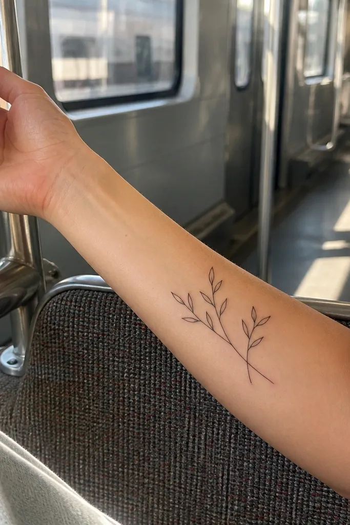
Crossing stems add structure while still staying minimalist. This design uses two thin stems that cross slightly, then each stem carries a small set of leaves. The crossing point gives the tattoo visual interest without needing shading or thick fills. On the inner forearm, it looks intentional and clean because the skin shows the crossing clearly when you flex. It’s the kind of tattoo that looks simple at first glance but rewards closer looks.
Editor's noteTell your artist you want the crossing to be subtle — if the stems overlap too much, it looks messy.
Start by placing the tattoo on inner forearm with enough room for the stems to cross without hitting veins too close to the surface. Keep total length around 3 to 3.5 cm and use 4-6 leaves total. Ask for consistent line weight and crisp leaf outlines, with the crossing point slightly offset so it doesn’t look like a knot. Skip shading, and keep leaf spacing airy. Aftercare includes gentle washing and avoiding tight sleeves that rub the crossing area.
One warningDon’t add extra leaves to “balance” the crossing.
18. Olive Branch Minimal with Feathered Leaf Tips
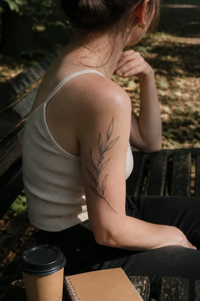
This design stays minimalist but adds softness at the leaf tips. The leaves have sharp bases and slightly tapered ends, almost like a hand-drawn brush stroke, so the branch looks fluid. I like it on the back of the upper arm because the tattoo moves with you, and the tapered tips keep it from looking too geometric. It also photographs well in side poses because the leaf silhouettes catch light. The symbolism reads as calm and gentle, not aggressive.
Editor's noteLook at a reference sketch with tapered tips before you commit — it’s easy for artists to draw leaf ends too blunt.
Start by placing the stencil on the back of the upper arm where the skin is smooth and not too bony. Keep it around 3 to 4 cm long with 5-8 leaves. Ask for black linework with tapered leaf tips and no shading inside the leaves. If your artist offers gray feathering, decline it for tiny pieces; keep the softness in the line shape instead. Aftercare is normal, but avoid tight sports bras or backpacks that rub the area.
One warningDon’t make the tips too long and thin or they’ll fade into the skin texture.
19. Small Olive Branch Minimal with Single Dot Vein Lines
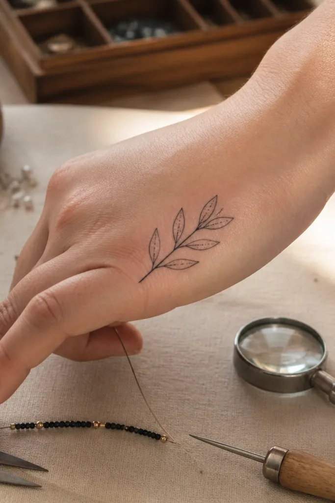
This is a clever minimalist trick: one tiny dot line suggests a vein without adding detail that blurs. Each leaf stays a clean almond outline, then the vein is indicated with one short line made of dots. It gives the tattoo a hand-drawn feel and makes it look more realistic than plain outlines. On the side of the hand, simplicity matters, and this design keeps the detail limited so it still reads after healing. It’s a great option if you want slightly more character while staying within minimalist rules.
Start by placing the tattoo on the side of the hand or outer thumb-side area where the skin isn’t too bumpy. Keep total size around 2 cm long and use 3-5 leaves total. Ask for leaf vein indication as 2-3 tiny dots only, no full-line veins. Keep shading out and use consistent black line thickness for the outlines. Aftercare: protect from friction, avoid soaking, and keep hand sanitizer off the fresh tattoo for the first few days.
Ask your artist to dot the vein by hand, not stamp it with a thick needle pattern, so it stays delicate.
Don’t draw full vine veins on the hand — they smear as the hand moves.
20. Olive Branch Minimal with Tiny Cross-Leaf Accent
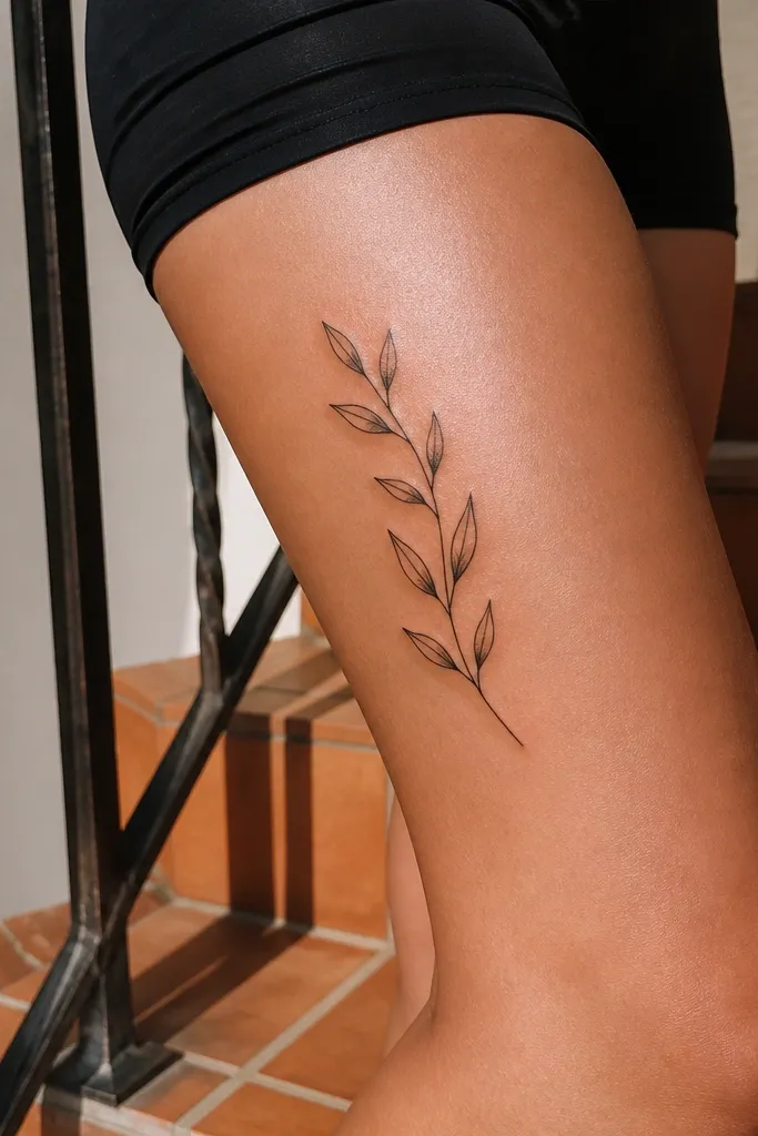
This design adds one angled leaf as a compositional accent. The rest of the branch follows a clean curve, but that one leaf breaks symmetry just enough to keep it from feeling copy-paste. It looks great on the upper thigh because movement makes the tattoo look alive without changing the ink. I like it for people who want minimalist but still want a design that feels custom. The olive branch meaning stays intact — the accent just makes it more interesting.
Start by placing the stencil on the outer upper thigh where you have space for a short branch. Keep it around 3 to 4 cm long and use 5-7 leaves. Ask for one leaf to be rotated about 30-45 degrees compared to the others, and keep its outline crisp. No shading, just black ink. Aftercare: avoid tight leggings for a week and moisturize lightly because thigh tattoos can get irritated from sweat.
If you’re unsure about the angled leaf, ask for a stencil with it both ways and choose the one that looks best on your thigh curve.
Don’t angle more than one leaf or the branch starts to look accidental.