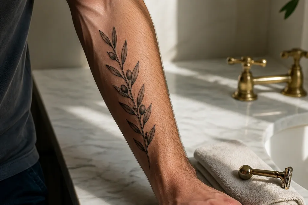
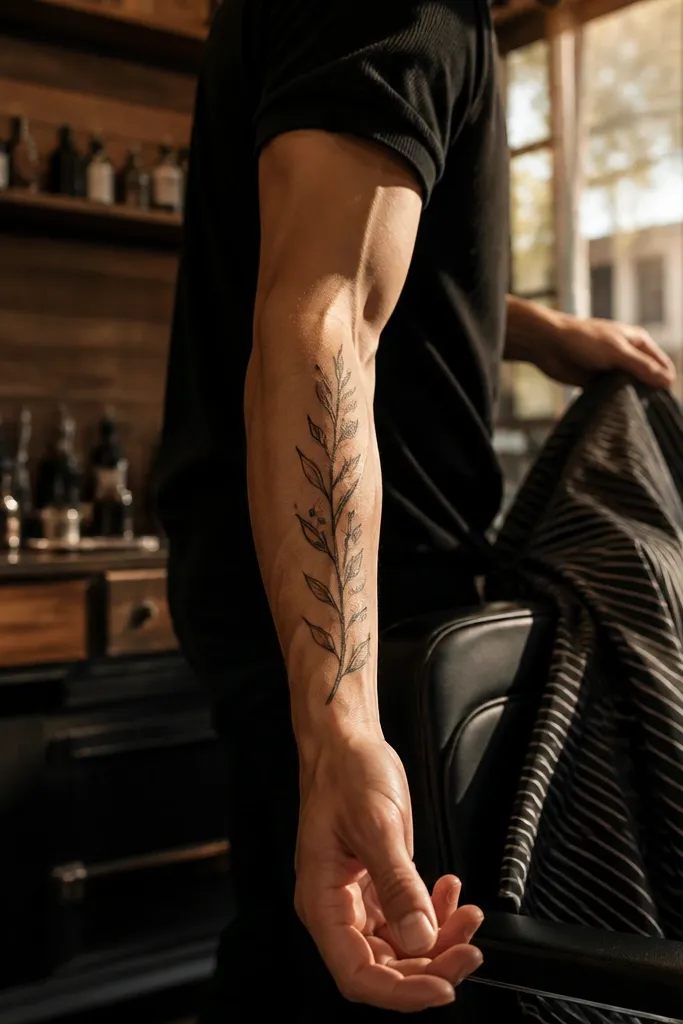
1. Minimal forearm stem with two leaf clusters
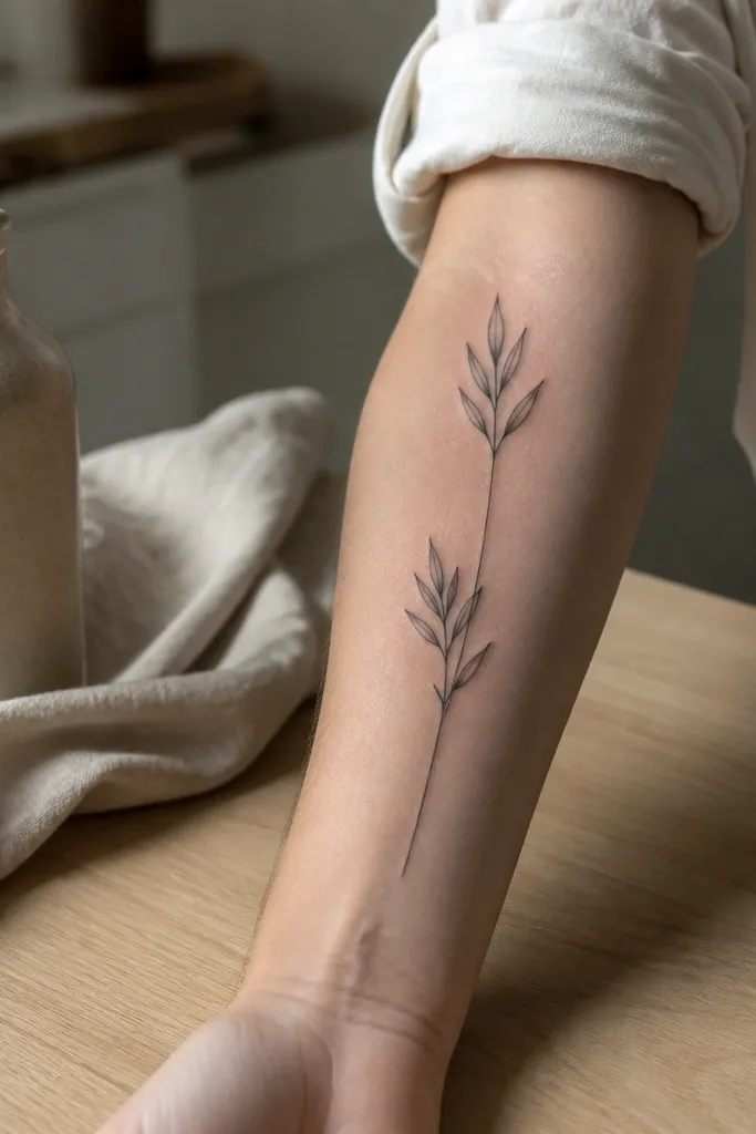
Start by marking a vertical line along the outer forearm — roughly the radius side — and keep the whole piece around 10-12 cm long. Ask the artist for fine-line blackwork leaf outlines with light black-and-grey fill, leaving white highlights in 2-3 leaves so it stays crisp. Then place the first leaf cluster at mid-forearm and the second near the wrist crease, keeping at least 2-3 cm of stem visible between clusters. Aftercare is standard: wash with fragrance-free soap, pat dry, and use a thin layer of ointment for the first few days. For healing, avoid long sleeve friction for a week, because fine line can get scuffed and look patchy if it rubs.
This design looks stylish because it reads instantly. The thin central stem keeps the composition calm, and the two leaf clusters give you that olive-branch silhouette without turning into a busy wreath. I like it for men who want symbolism but don’t want their tattoo to shout. It also flatters the forearm’s shape since the leaves align with the natural line of your arm when you look at it straight on. The negative space between leaves makes it look clean in photos.
One warningDon’t add extra leaves to “fill space” — it ruins the clean read.
Editor's noteIf you’re worried about fading, keep the leaves smaller than you think and let the stem do the work.
2. Classic olive wreath arc with a small date ribbon
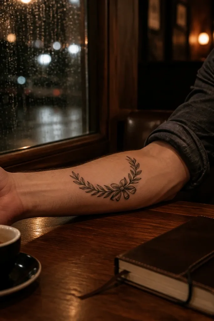
Start with an arc layout: place the widest point around the middle of your forearm, then taper the ends toward the inner edge. Ask for a black-and-grey wreath with mid-tone shading under each leaf vein so the leaves have shape but still look graphic. Keep the ribbon short, about 3-4 cm long, and use crisp lettering or skip text entirely if you’re not sure about legibility. Plan your session so the ribbon gets the freshest ink while you’re still comfortable with line work. Aftercare matters for the ribbon: avoid soaking and keep it covered from sun for at least two weeks, then use SPF daily once healed.
This one looks stylish because it frames the arm like a medal but stays controlled. The arc creates movement, and the leaves are packed evenly so the wreath silhouette stays obvious. The small date ribbon keeps the symbolism personal without adding clutter across the whole forearm. I’ve seen this heal better than larger full circles because the ribbon area gives the eye a focal point when the tattoo is photographed at angles. If you want “meaning” with a clean look, this is the sweet spot.
One warningDon’t choose tiny font for the ribbon — it will blur faster than the leaves.
Editor's noteUse a date format with clear spacing, like YYYY-MM, so the numbers don’t smear visually as they age.
3. Bold branch with thick stems and bold leaf outlines
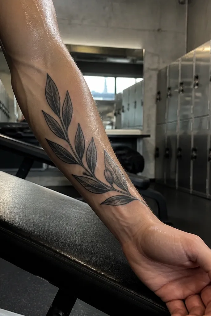
Start by sizing it to 12-14 cm on the outer forearm, with the thickest part at mid-forearm. Ask for a stencil that includes leaf spacing you can count — no random clusters — then request thicker outlines (heavier than you’d expect for fine-line). Use only light black-and-grey under-leaf shading, keeping the leaf centers mostly clean. For aging, this style does best with solid outline consistency, so avoid overly thin needles. Aftercare: keep it lightly moisturized and don’t pick flakes; thick outlines can trap dry skin if you over-wash.
This design is stylish because it looks built for real lighting, not just studio flash. Thick stems and heavier leaf outlines hold their shape as the years go by, and the minimal shading keeps it from turning muddy. It also looks masculine because the linework has weight. When you flex your wrist, the leaf angles catch light differently, so it looks lively rather than flat. If you like tattoos that look like they were always meant to be there, this is the direction.
One warningAvoid full color for this one — heavy color can dull the contrast over time.
Editor's noteTell your artist you want “graphic contrast,” then bring one reference of bold leaf outlines you like.
4. Olive branch with a tiny compass rose at the top
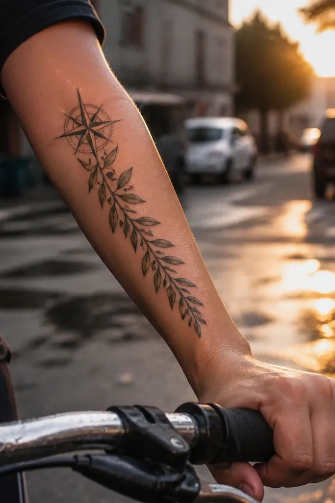
Start by placing the compass rose about 2-3 cm below where your forearm meets the elbow line, then let the branch split and travel downward. Ask for fine-line blackwork for the compass with no heavy shading, then use black-and-grey leaves with a light gradient on the underside. Keep the compass small, around 1.2-1.8 cm in diameter, so it doesn’t compete with the leaves. For aftercare, protect the compass area from friction because thin lines can scab and look uneven if rubbed. Once healed, use SPF on it because the compass lines show fading quickly compared to shaded leaves.
This looks stylish because it turns the olive branch into a “direction” tattoo, not just a symbol. The compass rose adds structure at the top, so the whole piece feels intentional and balanced. I like it for men who want meaning that feels active — moving forward, finding your way — without turning into a full scene. The compass lines also photograph well because they create crisp geometry against the softer leaf shapes. It works especially well on the outer forearm where the vertical alignment stays clean.
One warningDon’t make the compass too large — it turns the tattoo into a map instead of an olive branch.
Editor's noteIf you want it to feel more modern, keep the compass without color and add just one tiny highlight dot in the north point.
5. Realistic olive leaves with soft smoke shading
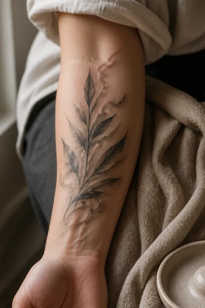
Start with a stencil that focuses on leaf veins and a believable branch curve, then size the piece around 14-16 cm. Ask for soft black-and-grey shading that fades out behind the leaves rather than a hard filled background. Keep the smoke gradient light and controlled so it doesn’t blur the leaf edges while healing. Plan the session carefully because realistic leaf textures need time; schedule a longer appointment if your artist offers it. Aftercare: avoid heavy sweating for 48 hours, since gradients can get patchy if you irritate the skin. Once healed, touch-ups are sometimes needed on the faintest smoke — plan for it instead of being surprised later.
This design is stylish because it mixes symbol and atmosphere. The realistic leaf texture gives it depth, while the smoke-like shading keeps it from looking flat or sticker-like. I’ve seen this work well for men who want something more detailed but still clean enough for daily wear. The smoke gradient also photographs well because it creates contrast behind the branch, especially in side lighting. It’s the type of tattoo that looks different when you tilt your arm.
One warningDon’t request a dark full background — it makes the branch look buried.
Editor's noteChoose real leaf references for the artist so the vein pattern looks natural, not generic.
6. Olive branch with geometric frame lines
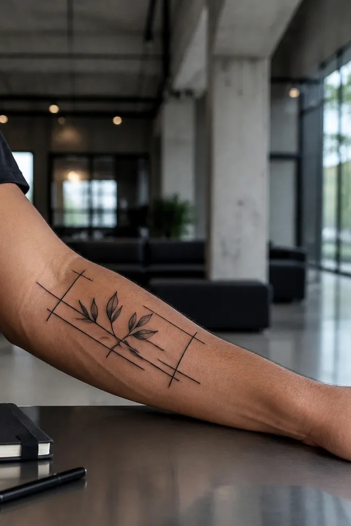
Start by mapping a long frame on the outer forearm — about 12-15 cm long and 4-5 cm wide. Then place the olive branch so the stem runs through the center and the leaves sit just inside the frame edges. Ask for crisp black outlines on the frame and leaves, with light shading on leaves only. Keep the frame lines thin enough that they don’t dominate, but thick enough to stay solid after healing. Aftercare is simple, but be extra careful around the frame corners; corners dry and crack if you over-apply ointment.
This looks stylish because the geometry makes the olive branch feel modern and intentional. The straight frame lines counterbalance the organic leaf shapes, so you get that clean design language that looks good in photos. I like it for men who prefer graphic tattoos over realism. The frame also helps the tattoo stay readable as it fades, since the crisp lines give it structure. If you wear watches or bracelets, the frame lines line up nicely with those hard edges.
One warningDon’t add extra symbols inside the frame — it makes the design feel cramped.
Editor's noteIf your forearm has a lot of hair, consider a slightly bolder outline so the frame stays visible.
7. Half-wreath with a subtle ribbon knot on the inner forearm
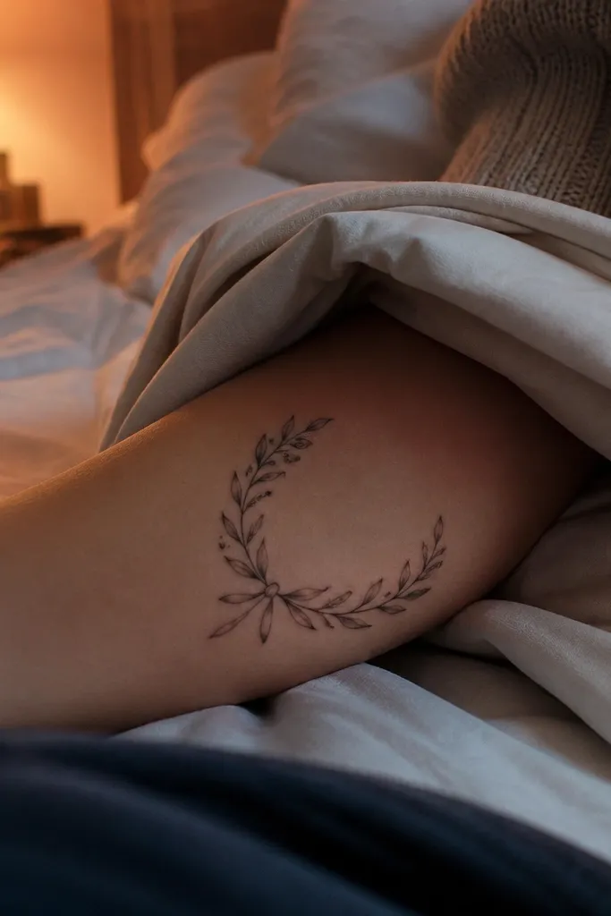
This is stylish because the inner placement makes the tattoo feel private until you move your arm. A half-wreath keeps it from looking like a full costume wreath, and the ribbon knot gives it that “done” finishing detail. I like black-and-grey here because it looks classy against skin and doesn’t scream green. When you roll your wrist, the ribbon knot catches light and becomes the focal point. It’s a good choice if you want an olive branch that feels personal, not decorative.
Start by placing the bottom of the half-wreath around 2-3 cm above the wrist crease, then let the top reach about 12 cm upward. Ask for the ribbon knot in the center so the tails curl along the forearm curve without crossing too many leaves. Use medium line weight on the leaves and light shading beneath each leaf so the wreath has depth without turning dark. Inner forearm pain can be higher, so plan a shorter session and split if needed. Aftercare: keep it clean and dry, and wear loose sleeves for a few days since inner forearm rubbing is real.
Use a ribbon knot with simple folds — too many thin lines fade fast on the inner forearm.
Avoid placing the wreath too high near the elbow — it will distort when you bend your arm.
8. Olive branch wrapped around a vertical dagger silhouette
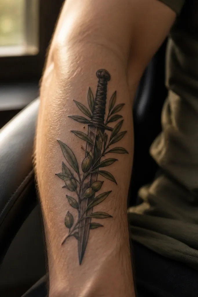
Start by placing the dagger along the forearm length — usually outer or center — and size the whole piece to 13-16 cm. Ask your artist to outline the dagger first, then wrap the olive branch so leaves overlap the blade edges in a consistent direction. Keep leaf shading light and use stronger contrast on the dagger so it stays the focal point. For aging, this design works because even if some fine leaf details soften, the dagger outline stays readable. Aftercare: don’t scrub the overlap areas; overlapped ink can scab unevenly and look patchy if you irritate it.
This design looks stylish because it creates tension and contrast — the olive branch softens the hard shape of the dagger. The wrapping effect makes the tattoo feel dimensional, not flat, and it photographs well when your forearm is angled. I’ve had men pick this when they want the olive symbol but want it to feel tougher. The dagger silhouette gives strong vertical structure, so even if leaves fade slightly, the overall read stays clear. It also looks good with a watch because it sits in the same visual column.
One warningDon’t let the leaves cover the dagger completely — you need clear negative space to keep it readable.
Editor's noteRequest a slightly rounded dagger tip so it stays classy, not aggressive.
9. Single olive branch with dotwork leaves and clean stem
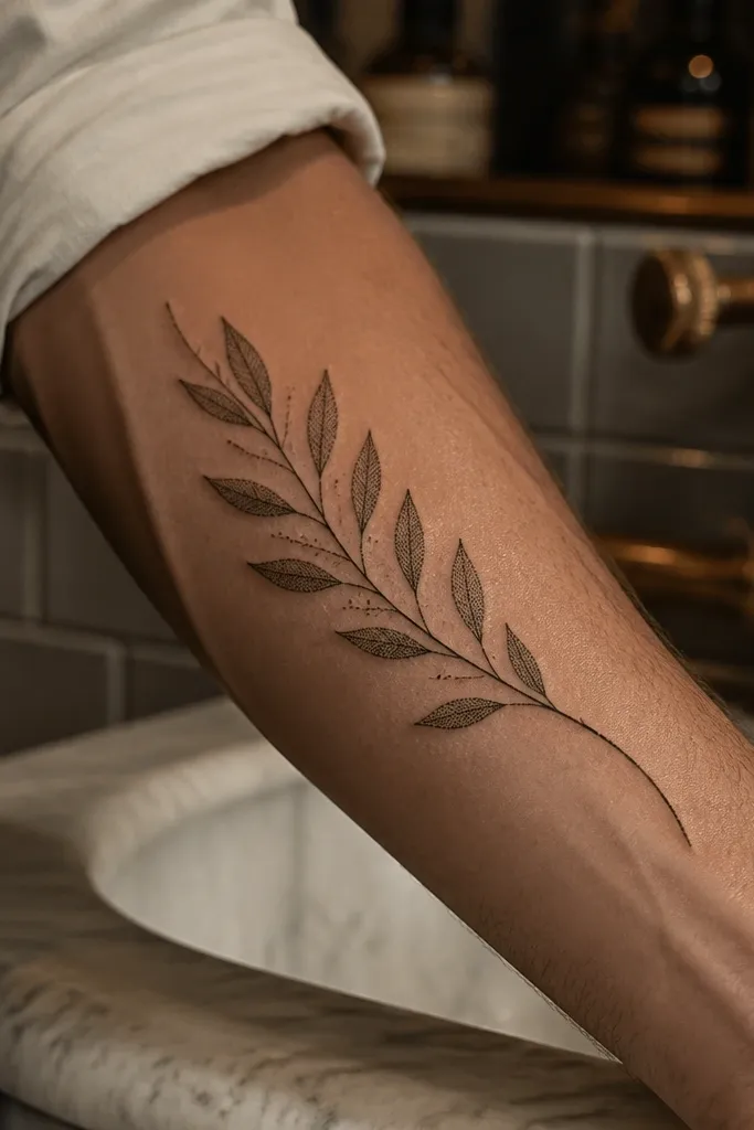
This is stylish because dotwork creates a soft texture without heavy gray blocks. The stem stays clean and the dots add depth in a way that looks good in close-up photos. I like this for men who want something subtle but not invisible. The dotwork also ages more evenly than dense shading because it’s distributed across the leaf surface. When you’re wearing rolled sleeves, the leaf texture shows as a gentle pattern rather than a dark smear.
Start by sizing to about 11-13 cm so the dotwork doesn’t get too crowded. Ask for a thin stem with leaf outlines, then request dotwork fill that stays lighter toward the leaf center. Place the branch so it runs slightly diagonally on the outer forearm, matching the way your arm naturally looks in photos. Aftercare is key for dotwork: keep it moisturized but not glossy, and avoid scratching the scabs because dotwork can heal with uneven gaps. Sun protection is non-negotiable after healing since dots fade faster than solid outlines.
If you’re sensitive to pain, ask for fewer leaves and bigger spacing — less time in the same area.
Avoid thick dotwork borders — they can turn into a dark outline blob.
10. Olive branch with watercolor-style leaf edges (controlled color)
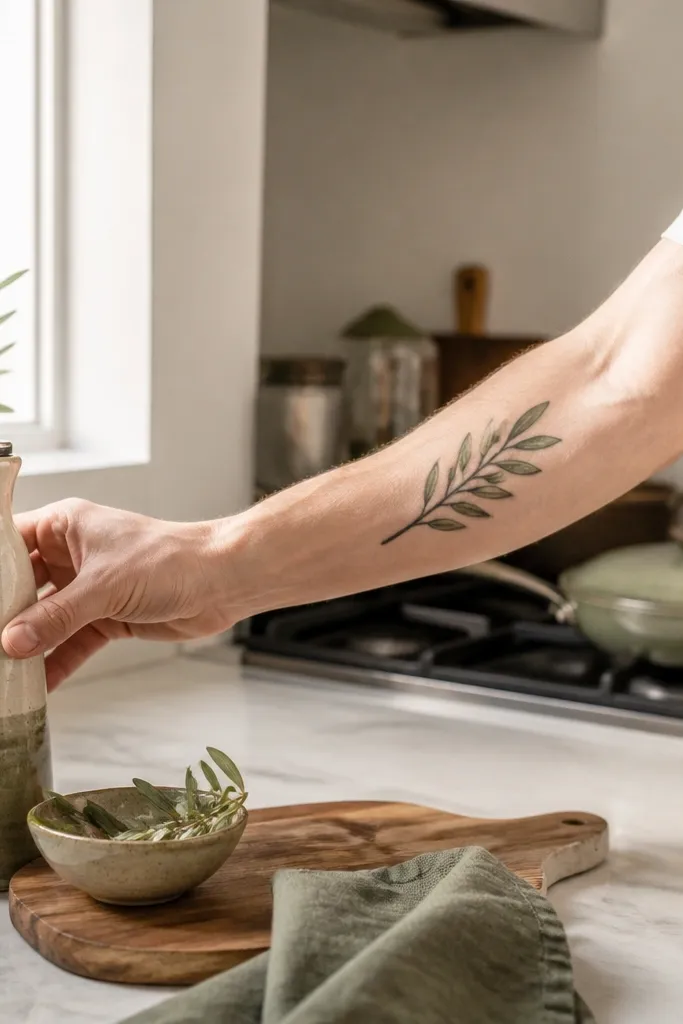
This looks stylish because the color is restrained. Instead of filling the leaves with solid green, the design uses soft wash at the edges, so it reads as modern watercolor without turning into a blot over time. I’ve seen this look great on men with warmer skin tones because the olive green matches the natural undertone. The black outline keeps it readable, even after the color fades a bit. It also looks good in daylight — the wash catches light and gives that “ink with texture” vibe.
Start by choosing a small palette: ask for olive-green wash plus a tiny touch of muted yellow-green, and keep it at the leaf edges only. Size it to 12-15 cm and keep the stem linework crisp. Make sure the artist uses black-and-grey shading underneath so the leaves still have form even if the color lightens. Aftercare: follow your artist’s plan closely, and avoid soaking while the color is healing. In the long run, you may want a color refresh to keep the wash crisp, but the black outline usually holds strong.
Bring a reference that shows watercolor edges, not full watercolor fills, so you get the controlled look.
Don’t go heavy on bright green — it turns neon and looks off on forearm skin.
11. Olive branch with micro linework leaves and a thin chain border
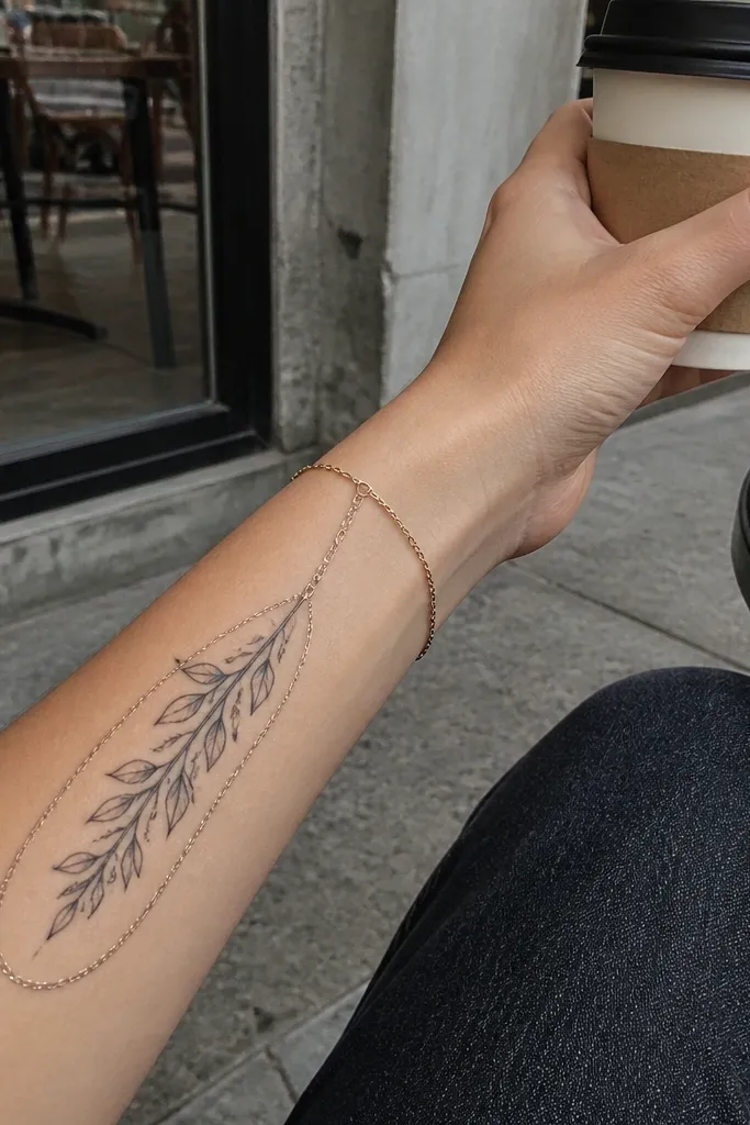
Start by placing the tattoo along the outer forearm and sizing it to about 10-13 cm. Ask for micro line leaves with very light black-and-grey shading only where the leaf would fold. Then add a thin chain border line that runs parallel to the stem on one side — don’t wrap it fully around or it gets busy. For aftercare, keep the tattoo out of sweat for a day or two and use a breathable wrap if your artist recommends it. Micro linework can look slightly patchy during healing, so don’t panic if it looks lighter at day 3-5.
This design is stylish because it feels delicate but still sharp. Micro linework keeps the leaves crisp, and the chain border adds a subtle “jewelry” effect. It looks especially good on the forearm because the chain line can echo the way bracelets sit on your wrist. I also like that it stays clean — there’s no big shaded areas to muddy. In photos, the micro leaves show up as texture while the chain border gives it structure.
One warningAvoid heavy shading — micro linework needs clean edges to stay readable.
Editor's noteIf you want it to last, keep the chain border line slightly thicker than the micro leaves.
12. Olive branch with Roman numerals in a vertical strip
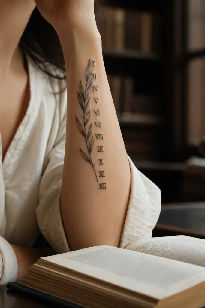
Start by drawing a vertical placement line on the forearm and deciding where the numeral strip sits — usually mid-forearm. Size the numeral panel around 2.5-3 cm tall and 0.8-1.2 cm wide, then wrap the olive branch so the stem runs beside or through the strip’s edge. Ask for crisp black outline on the panel and light shading on the leaves only. For aging, use a font style with thick strokes; thin serifs fade faster. Aftercare: avoid sun and friction on the numeral panel, since lettering shows fading first.
This looks stylish because the numerals bring a clean, linear element that matches the forearm’s shape. The olive branch stays organic, while the Roman numerals keep it structured and readable. I like the contrast because it makes the tattoo look intentional and not like a random symbol. It’s also easy to personalize without adding a full scene. When you flex your arm, the vertical strip stays aligned and the leaves frame it.
One warningAvoid tiny lettering — the leaves will survive but the numbers won’t.
Editor's notePick Roman numerals that fit the space — if it’s too long, it will squeeze and blur.
13. Olive branch with negative-space leaves (no fill)
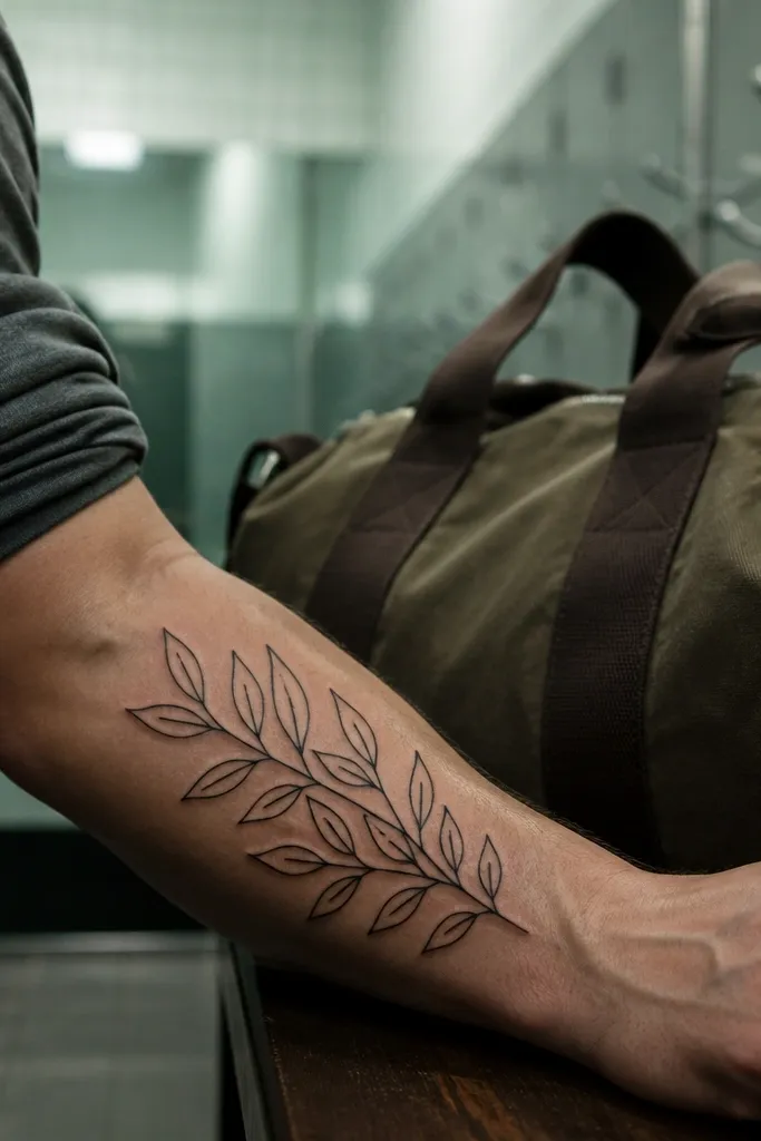
This is stylish because negative space stays clean and crisp. When the leaves are unfilled, the tattoo looks lighter and more modern, and you don’t get that heavy ink look that can feel dated. It also makes the branch read clearly even from a distance, because the outlines do the work. I like this for men who want an olive branch that looks like design — not decoration. It also hides well if you ever need to cover it, since there’s less dense ink.
Start by choosing a placement on the outer forearm where you have a flatter surface for the leaf outlines to sit smoothly. Size it around 10-14 cm and keep the leaf outlines consistent in thickness. Ask for a few vein lines inside each leaf, but keep them thin and spaced — too many lines makes it look messy. Since there’s no fill, the tattoo can look lighter during healing, then settle into a crisp outline finish. Aftercare: moisturize lightly so the skin doesn’t get overly dry and crack around the outlines.
Ask your artist to keep leaf outlines slightly thicker than you expect so they don’t fade into the skin.
Don’t request full shading with this concept — the whole point is the clean negative space.
14. Olive branch with a small heart hidden inside the leaves
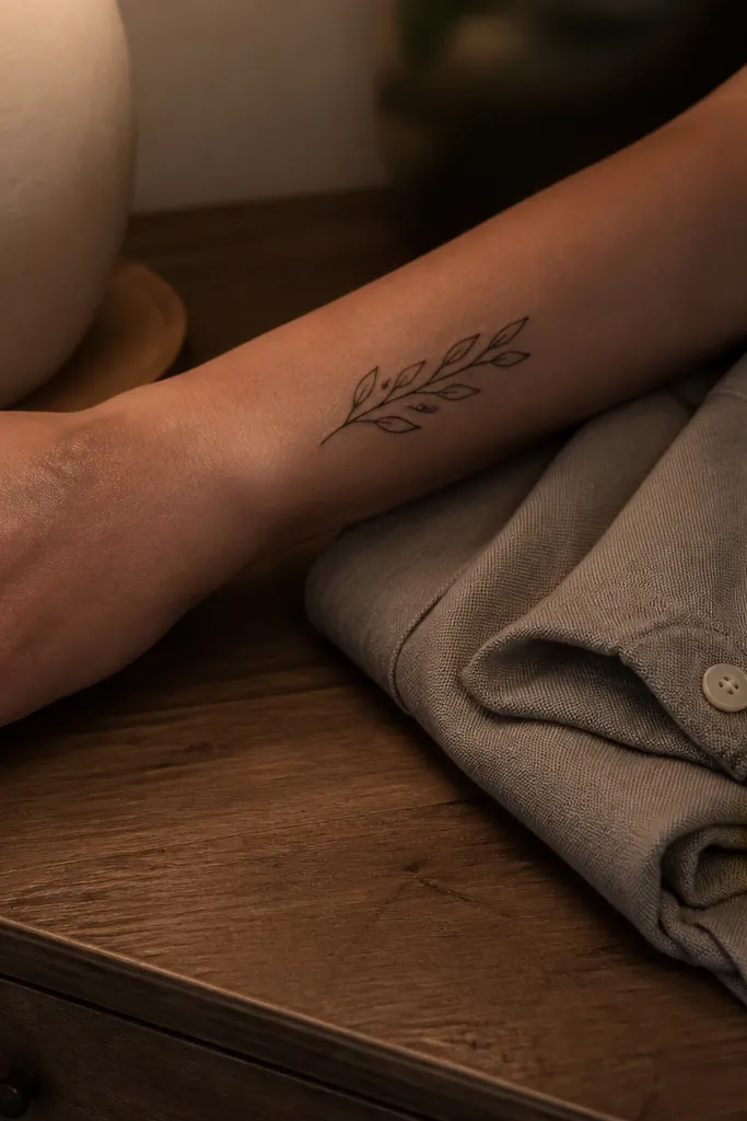
This looks stylish because it’s a secret detail. From far away, it reads as a normal olive branch, but up close you notice the heart formed by negative space and a tiny outline. That kind of hidden symbol feels personal without turning the tattoo into something cliché. The heart also gives you a reason to choose this placement — forearm tattoos get noticed when you shake hands, gesture, or roll sleeves. The soft shading around the leaves keeps the heart from looking random.
Start by planning where the “hidden heart” will sit, usually around mid-forearm where it’s easiest to see. Ask for one leaf cluster with a slightly larger center leaf so there’s room for the heart shape. Use soft black-and-grey shading on surrounding leaves, but keep the heart formed by negative space or a thin outline so it stays crisp. Size the whole piece about 12-15 cm so the hidden detail isn’t tiny. Aftercare: protect the area from friction and avoid picking; small line details heal unevenly if you disturb them.
Tell your artist to draw the heart first as a stencil, then build leaves around it.
Avoid hiding the heart too small — if it’s under 5 mm, it won’t read after healing.
15. Olive branch with two-tone shading and subtle leaf highlights
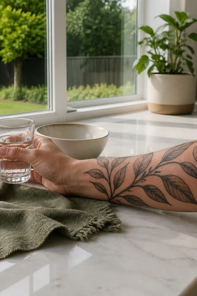
This design is stylish because it looks dimensional without going full realism. Two-tone shading gives each leaf a sense of direction, like the leaves are catching light. I recommend this when you want the tattoo to look good in both daylight and indoor lighting. The subtle highlights are what make it feel premium — they stop the leaves from looking flat. It also ages well because the structure is in the outline and shading contrast, not in a heavy color wash.
Start by sizing to 13-16 cm and placing the branch so the leaves alternate left-right along the stem. Ask for black outlines plus two gray values, and request highlights left as skin or very light gray on the top edges of leaves. Keep the shading concentrated under each leaf where the fold would be, so the tattoo doesn’t turn smoky. For aftercare, keep it moisturized but not thick, because heavy ointment can make fine shading look dull temporarily. Once fully healed, use SPF daily since contrast can drop if the tattoo gets sun-faded.
If you want extra sharpness, ask for a slightly darker outline on the topmost leaves only.
Avoid over-blending — if shading turns into one gray haze, the leaves lose their shape.