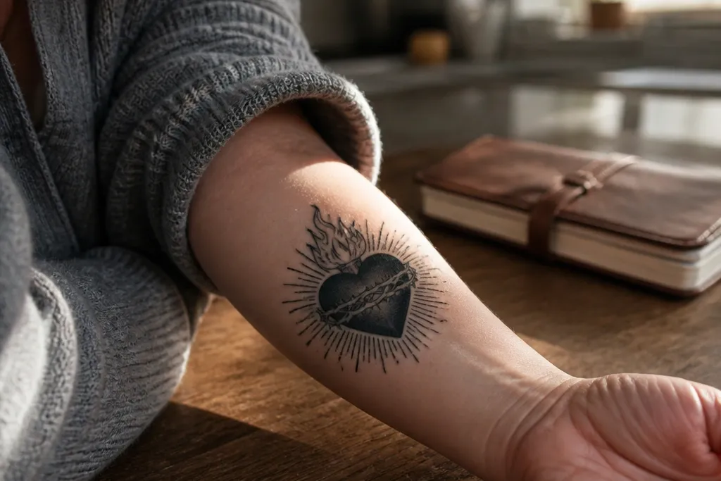

1. Inner Forearm Radiant Heart with Thin Ray Lines
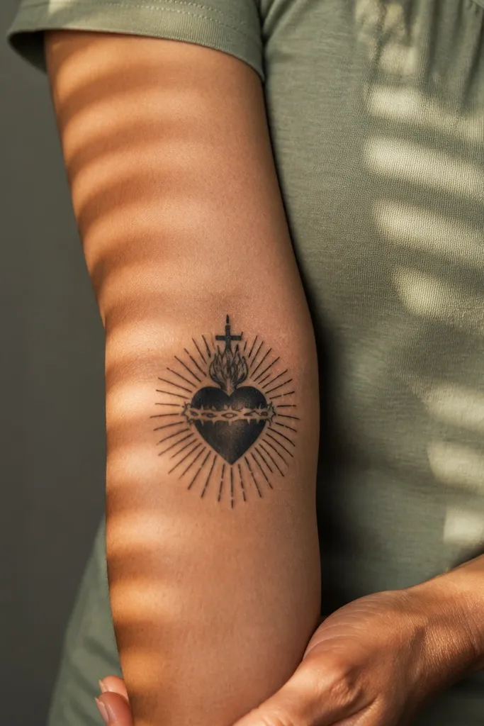
This design is the cleanest way to get that classic Sacred Heart look on a forearm. The heart sits centered and slightly elongated, while thin ray lines fan out evenly like a halo — it reads crisp in photos and stays legible as it heals. Thin linework also flatters the forearm because it follows the arm’s natural curve instead of creating a heavy block. Meaning-wise, it keeps the focus on devotion and protection without getting cluttered. It’s a great pick if you want something that looks “intentional” even when you’re wearing short sleeves.
Start by placing the heart so the point faces toward the wrist, with the rays staying symmetrical across the center. Keep the heart outline bold (slightly thicker than the rays) and use light gray shading only inside the heart to create depth. Ask for thorns to be minimal or left out entirely so the ray lines stay crisp. Finally, plan size around 9-11 cm tall, then add a small amount of negative space around the rays so the design doesn’t turn into a dark mass.
If you want maximum clarity years later, choose ray lines that are clearly separate from the heart outline.
Don’t add extra icons like crosses and crowns unless you’re also reducing ray density.
2. Sacred Heart with Crown of Thorns and Micro Dots
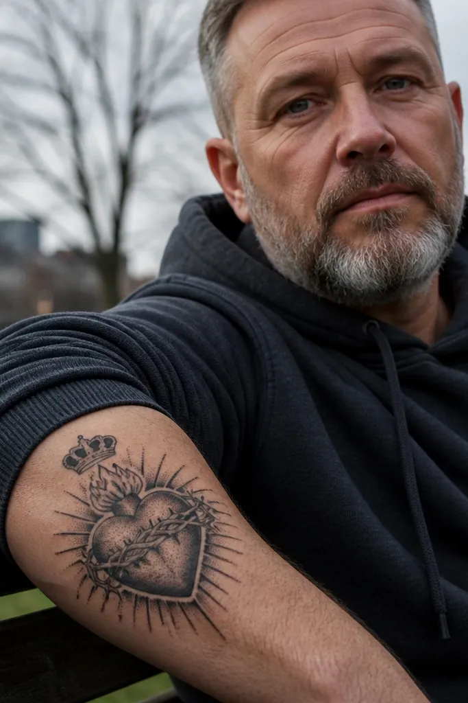
This option makes the forehead-to-wrist storytelling feel balanced: the crown sits at the top, the heart glows in the middle, and the thorns give structure. Micro dot shading (stipple) creates a sacred, old-school texture that looks detailed without needing thick gray fills. It’s visually photogenic because the dots catch light and create depth, especially under natural light. The symbolism is clear — sacrifice and suffering framed around love and devotion. Choose this if you like fine detail and want the design to feel delicate instead of heavy.
Start with a vertical layout about 10-12 cm tall, so the crown doesn’t get cramped. Then ask the artist to use stipple only for the heart interior and the thorn texture, keeping outlines solid and dark. Finally, keep thorn lines thin and separated — if thorns overlap too much, they’ll merge into a dark patch as the skin heals.
Use a stencil layout that shows thorn spacing — if the thorns feel “dense,” reduce the count before you tattoo.
Avoid tiny text in this style; dots and letters both blur if the lines are too fine.
3. Half-Sleeve Style Sacred Heart on Outer Forearm with Rays
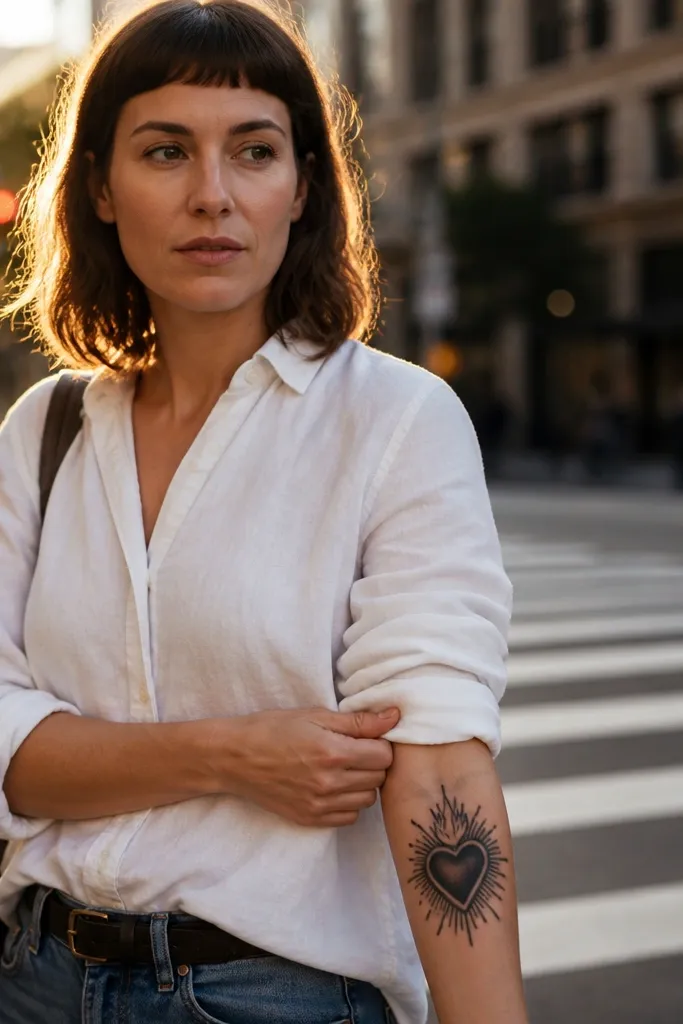
If you want the forearm to look like it belongs to a bigger piece, this is a smart move. The heart stays centered, but the rays extend farther than the heart’s width, creating a “frame” along the outer forearm. It’s striking because the rays create a graphic silhouette that reads from across a room, not just up close. Symbolically, it keeps devotion forward — like the message is meant to be seen. This works especially well if you already wear bracelets or want the heart to sit above a watch line.
Start by placing the heart slightly above the middle of the forearm, leaving space for rays to spread outward. Use strong black outlines for the heart and rays, then add restrained gray to the heart only — not the entire ray field. Ask for ray lines to taper slightly toward the edges so the outer forearm doesn’t look boxy. For longevity, keep the ray lines clean and avoid thick shading behind them.
Choose ray length based on your sleeve — if you wear short sleeves often, keep the rays visible above the cuff line.
Don’t turn the rays into a filled background; filled backgrounds on forearms fade and blur faster.
4. Sacred Heart with Banner Scroll and Roman Numerals
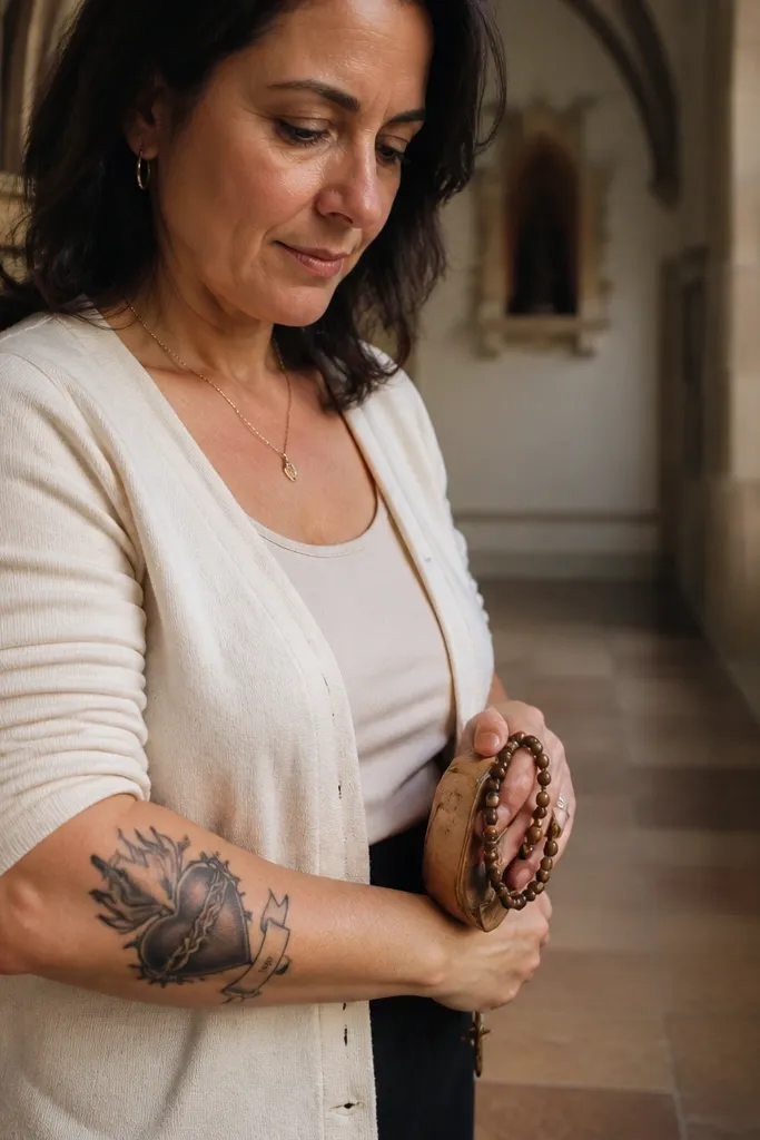
A banner makes this design feel personal without losing the Sacred Heart focus. The heart and flames stay central, while the banner scroll gives you a clean place for a date or phrase in Roman numerals — it looks classy and stays readable longer than tiny script. Roman numerals also match the old-school religious vibe without needing ornate lettering. This is a good choice if you want the meaning to be specific, not just symbolic. It also photographs well because the banner creates a strong horizontal element against the vertical heart.
Start with a vertical heart sized about 9-10 cm tall, then place the banner so it arcs across the lower half of the heart. Choose a simple serif numeral font rather than cursive — ask your artist to mock up the exact digits on your skin during placement. Use minimal shading on the banner so the letters don’t fill in. Finally, keep flame shading light and controlled; too much flame gray can swallow the banner edges over time.
Editor's notePick numerals that have enough spacing — if two characters touch in the stencil, widen them.
One warningSkip super-small lettering; forearm movement and sun exposure can turn it into a smear.
5. Sacred Heart with Cross Behind the Heart
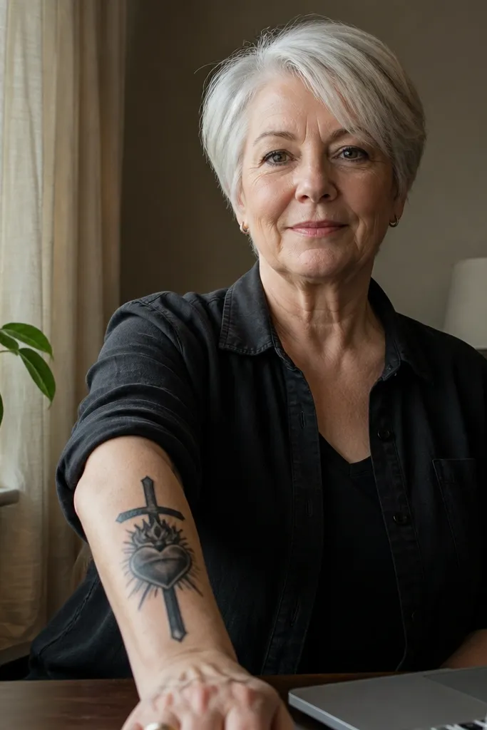
This design is pure focus: the cross sits behind the heart like a silhouette, so the heart remains the hero. The cross adds meaning without clutter, and the negative space between cross lines keeps everything looking sharp. It’s especially photogenic because the cross creates structure and symmetry, even if you keep the rest minimal. Choose this if you want the Sacred Heart to look “grown-up” and graphic, not overly ornate. It also ages well because there’s less micro detail to blur.
Start by drawing the cross as a clean, centered shape behind the heart — the top should sit just above the heart’s crown area. Use thick, consistent outlines on both the heart and cross, then limit grayscale to the heart interior. Place the design vertically on the forearm, about 8-11 cm tall, so the cross doesn’t get cut off when your arm bends. Ask the artist to keep the cross lines slightly lighter than the heart outline so the heart reads first.
Tell your artist you want the cross as linework only, not a filled cross background.
Avoid adding rays and a crown together in this layout; it becomes visually crowded fast.
6. Flames and Rays Sacred Heart with Soft Gray Glow
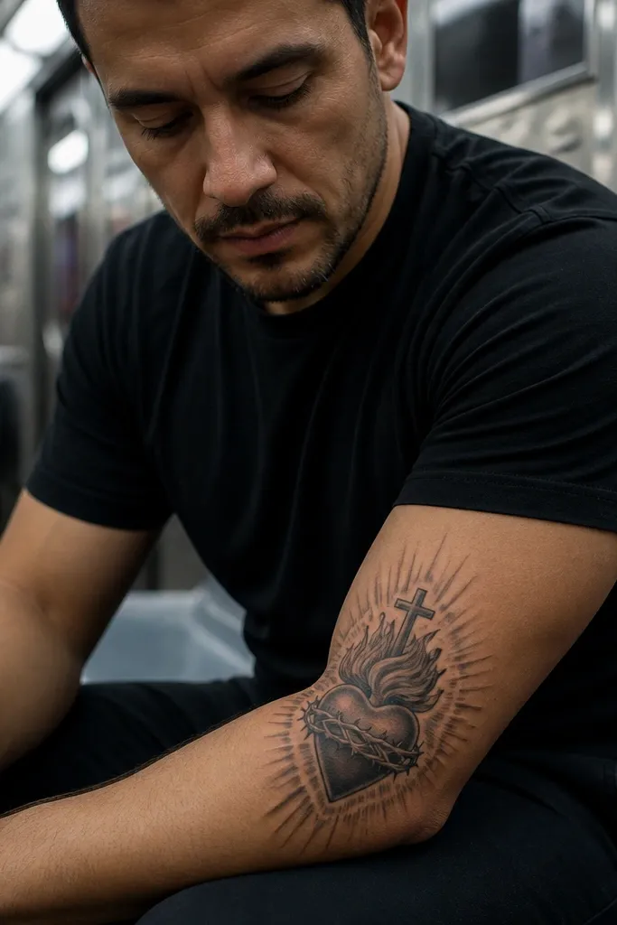
This one is for the glow lovers. The flames wrap the heart edges, and the rays rise around it, but the shading is controlled — you get a soft sacred aura instead of harsh black blocks. The glow effect looks beautiful in daylight because the gray transitions catch light without looking muddy. Meaning stays traditional: love and sacrifice, shown with warmth in the flame and radiance in the rays. It’s a strong choice if you want something that feels more “spiritual art” than strict iconography.
Start with a vertical heart and flame shape about 10-12 cm tall, then plan rays as linework, not a full shading field. Use one gray tone for mid-shadows and a lighter tone for the outer glow, keeping the brightest highlights near the heart’s center. Ask the artist to avoid overblending; forearms show overworked gradients as gray haze. Finally, place the design so flames point slightly toward the outer edge of your forearm for a natural flow when you rotate your arm.
Request a test stencil with your arm relaxed and slightly bent; glow shading can look different under flex.
Don’t go heavy with black fills behind the glow — it kills the highlight contrast.
7. Minimal Linework Sacred Heart with Tiny Halo Dots

Minimal doesn’t mean boring. This version uses clean linework for the heart and a small halo made of tiny dots, so the design looks delicate but still unmistakably Sacred Heart. The halo dots create a soft shimmer effect in photos and give the tattoo a “floating” feel. It’s ideal if you want something that stays elegant with age and doesn’t rely on heavy shading. Meaning is still front and center — devotion, protection, and love — just stripped down to the essentials.
Start with a heart outline that’s thicker than the halo dots, placed vertically on the inner forearm. Then add a compact halo of dots — keep it tight so the dots don’t spread into a gray halo. Use no solid black fill unless you’re keeping it very small inside the heart. Finally, size it around 7-9 cm tall for the best longevity and readability.
Choose dot spacing that’s clearly visible in the stencil; if you can’t count the dots, the artist will struggle later.
Avoid tiny flame details; keep flames either simplified or left out.
8. Sacred Heart with Mirrored Thorns and Symmetry Frame
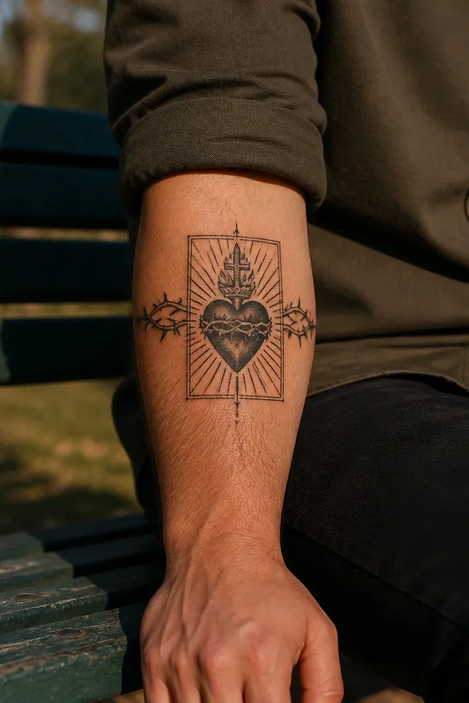
Symmetry is what makes this look sharp and “designed,” not random. The thorns mirror each other on both sides, and the heart sits in the exact center with a frame-like composition. It looks great in straight-on photos because the forearm is a long canvas and symmetry turns it into a clean graphic. Symbolically it’s about suffering held in balance, love protected by structure. This is a strong pick if you like tattoos that look intentional from far away.
Start by placing the heart in the middle of your chosen forearm section, then sketch mirrored thorn arcs on both sides. Ask for outlines to stay consistent thickness across the thorns so the frame reads evenly. Keep shading light — use a small amount inside the heart and let the rest stay linework. Finally, plan around 10 cm tall and leave breathing room above and below so the frame doesn’t feel cramped.
If you want it to look extra crisp, choose a stencil that keeps thorn tips pointing in the same direction on both sides.
Don’t add extra elements like a cross and crown; symmetry already uses the space.
9. Sacred Heart with Sacred Rays in a Triangle Composition
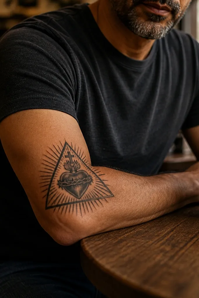
A triangle composition makes the design feel modern while keeping the Sacred Heart classic. The heart sits inside the triangle, and the rays expand along the triangle lines so the whole thing reads like a structured emblem. It’s photogenic because the triangle gives a clear silhouette, and the rays add movement. This one works well if you want a symbol tattoo that also looks like graphic design. Meaning stays devotional — the triangle can also read as faith structure holding love.
Start by drawing a triangle frame that matches the forearm’s vertical axis, with the base near the wrist. Then place the heart in the center and align rays so they follow triangle edges. Use bold outlines and keep ray lines spaced — overcrowded rays blur. Add minimal shading inside the heart only, keeping the triangle lines crisp.
Editor's noteAsk the artist to keep the triangle lines slightly lighter than the heart outline so the heart remains the focal point.
One warningAvoid thick shading on the triangle — it turns into a dark block.
10. Sacred Heart with Roses on One Side
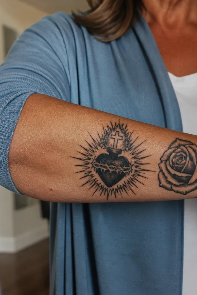
Roses make the Sacred Heart feel softer without losing meaning. This design places one rose beside the heart, usually on the outer edge of the forearm, so the composition has a clear “flow” from rose to heart. The rose petals create beautiful shading planes that photograph well and add texture that the heart alone doesn’t provide. Symbolically it shifts toward love, remembrance, and healing — still rooted in devotion. If you want something that looks pretty in a way that still reads spiritual, this is a great pick.
Start by placing the heart centered and vertical, then position the rose so it overlaps slightly but doesn’t cover the heart outline. Use grayscale shading on the rose petals with smooth gradients, but keep the heart shading more defined so it stays readable. Ask for thorns to be light or omitted — the rose already brings botanical energy. Finally, size the overall piece around 11-13 cm tall so the rose has room to bloom without compressing.
Pick rose shading that uses distinct petal edges rather than a full fill; it keeps the petals crisp as it fades.
Don’t add multiple roses and rays; you’ll lose the Sacred Heart hierarchy.
11. Sacred Heart with Roses and Thorns Wrap
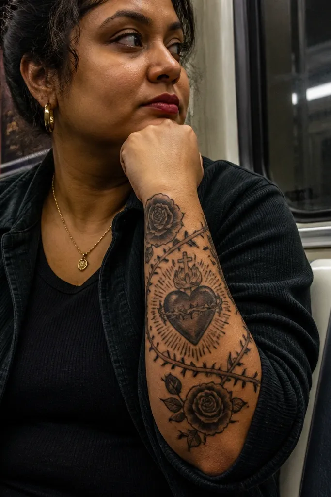
This is the wrap-around look that makes your forearm tattoo feel like it was designed for your anatomy. The thorn vines curl around the heart, and roses sit at one or two points of the curve, creating a motion effect even with black ink. It’s visually striking because the wrap creates layered depth: vines in front, heart in the center, and rays or flames tucked behind. Meaning stays layered: love held through pain, with devotion surrounded by growth. Choose it if you want a piece that looks good even when your arm is bent.
Start by choosing an inner or outer forearm placement based on where you like vines to show — inner looks intimate, outer looks bold. Then map the thorn wrap so it curves with your forearm muscles, keeping the heart centered and not twisted. Use stippling or light gray on the vines and deeper shading on the rose petals. Finally, keep the heart outline thick and clean, and limit flame detail so it doesn’t compete with the roses.
Ask for the vine thickness to match your desired visual weight — too thin and it disappears, too thick and it overpowers the heart.
Avoid heavy full-black fills in vines; they blur and look like smudges over time.
12. Sacred Heart with Crown and Halo Ring
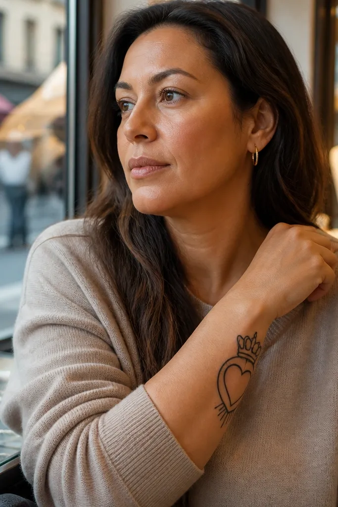
Crown plus halo gives you a “royal devotion” look that still reads clean. The crown sits above the heart like a top frame, while a halo ring wraps around the heart area and rays are kept minimal. It’s photogenic because the ring creates a bright outline effect that stands out against the forearm skin. Symbolically it adds honor and sanctity without cluttering the design. This works well for people who want a Sacred Heart tattoo that looks composed and intentional, not chaotic.
Start with a vertical heart and place the crown directly above it, keeping crown points evenly spaced. Then add a halo ring that’s slightly separated from the heart outline so it doesn’t merge as it heals. Use crisp black linework for crown and halo, with light gray shading inside the heart only. Size it around 9-12 cm tall so the crown doesn’t feel too big and the halo stays proportional.
Ask for the halo ring to be a single clean shape, not broken segments.
Avoid adding too many tiny details in the crown; keep it to clear points and simple ornament.
13. Sacred Heart with Crossed Keys Beneath

Keys beneath the heart add a strong Catholic symbol without turning the piece into a collage. The crossed keys create a visual base that balances the heart above, so the tattoo looks stable and grounded. It’s visually striking because the keys have long, straight lines that look sharp on the forearm, even when the rest is softer. Meaning-wise it suggests protection and spiritual authority tied to devotion. Choose this if you want the Sacred Heart to feel grounded and structured rather than purely ornamental.
Start with the heart centered and vertical, then place the crossed keys so the handles sit just below the heart point. Keep key teeth and grooves simplified — forearm movement blurs micro details. Use black outlines for keys and heart, then add minimal grayscale inside the heart for depth. Plan around 10-13 cm tall total so the keys don’t compress into the same space as the heart.
Editor's noteIf your artist can, request a test stencil of the key teeth count; keep it low for long-term readability.
One warningAvoid adding a banner with keys; three text-like elements will fight for clarity.
14. Sacred Heart with Angel Wings Flanking the Heart
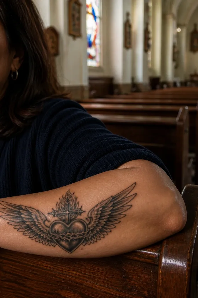
Wings give you a dramatic, symmetrical frame that still keeps the heart readable. This design places wings on both sides of the heart, usually with clean feather lines that taper outward. It photographs well because the wings create width while the heart stays the focal point. Symbolically it leans into protection and divine love. Pick this if you want a stronger “story” look without adding lots of extra objects like crowns, banners, and text.
Start by placing the heart in the center and mapping wing tips so they align near the forearm’s width — don’t let wings stretch too far. Use clear feather linework with light gray shading only at the feather bases. Keep the heart outline thicker than feather lines so it remains dominant. Finally, size it around 12-15 cm tall if you want the wings to show fully; otherwise go smaller and simplify feather count.
Ask for feather lines that curve smoothly rather than jagged scribbles; smooth lines age better on forearms.
Avoid heavy feather fills; they blur and turn into dark wings.
15. Sacred Heart with Watercolor-Style Red Glow (No Full Color Fill)
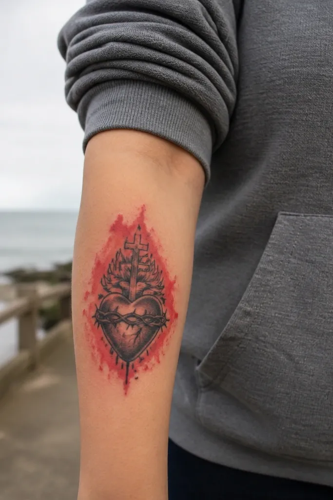
This is the Sacred Heart design that looks alive without turning into a muddy color tattoo. The heart is outlined in black, then a controlled red glow spreads outward like watercolor, staying concentrated near the heart interior. The key is restraint: you want blush-like red gradients, not full red coverage. In photos, the red catches light and makes the heart pop against skin — especially in daylight. Meaning stays love and devotion, but the color adds warmth and emotion. This works best for people who want color without losing clarity over time.
Start with a black-ink heart outline and keep the flames and rays mostly linework. Then add red glow only inside and just outside the heart, with a soft edge that fades into skin. Ask the artist to avoid saturating the entire forearm — keep the red area small and focused so it doesn’t blur into a patch. Finally, size it around 9-11 cm tall and plan for touch-ups; color glow often needs a refresh sooner than pure blackwork.
Editor's noteBring reference photos that show light red gradients, not dark maroon blobs.
One warningAvoid full-color heart fills; they age unevenly and can look bruised.
16. Sacred Heart with Blackwork Dotwork Flames
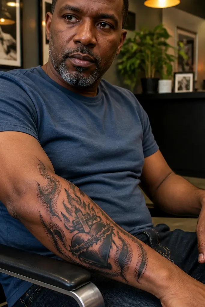
Dotwork flames make the Sacred Heart feel textured and modern while staying rooted in classic symbolism. Instead of smooth gray flames, this uses black dot gradients to create flame shape — the result is crisp in photos and doesn’t rely on heavy shading. It also ages well because the dots stay distinct as long as the artist doesn’t overpack them. Meaning is still devotion and sacrifice, shown through the fire motif. Pick this if you want something that looks like tattoo art, not like a printed icon.
Start with a vertical heart outline and minimal interior shading so the flames stand out. Then build the flames using dotwork that’s darkest at the flame base and fades toward tips. Keep dot density controlled — too dense turns into a solid black blob. Finally, place the piece on the outer forearm for visibility and size around 10-12 cm tall so the flame tips don’t get cut off when you flex.
Ask for a “dot map” where the artist shows how they’ll taper dot density from base to tip.
Avoid combining dotwork flames with tiny banner text; both need breathing room.
17. Sacred Heart with Minimal Crossed Rays and No Thorns
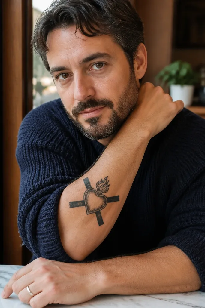
If you want maximum clarity, go for a simplified sacred emblem. Crossed rays create a strong X-like structure behind the heart, so the tattoo reads instantly even at a glance. Removing thorns keeps the design from turning into a black tangle on skin. It’s photogenic because the composition is graphic and uncluttered. Meaning stays clear: the Sacred Heart as the center of faith and love, framed by radiance. Choose this if you’re concerned about line blur and want something that looks sharp years later.
Start with a heart sized about 8-10 cm tall and place it vertically on the forearm. Then add crossed ray lines behind the heart — keep them straight and evenly spaced, not curved spaghetti. Use black outlines with a small amount of grayscale inside the heart for depth. Finally, leave negative space between rays and heart outline so healing doesn’t merge them.
Editor's noteKeep the ray lines separated by at least a couple millimeters in the stencil so they don’t fuse during swelling.
One warningAvoid heavy gray behind the rays; it kills the crisp emblem look.
18. Sacred Heart with Gothic Arch Frame on Forearm
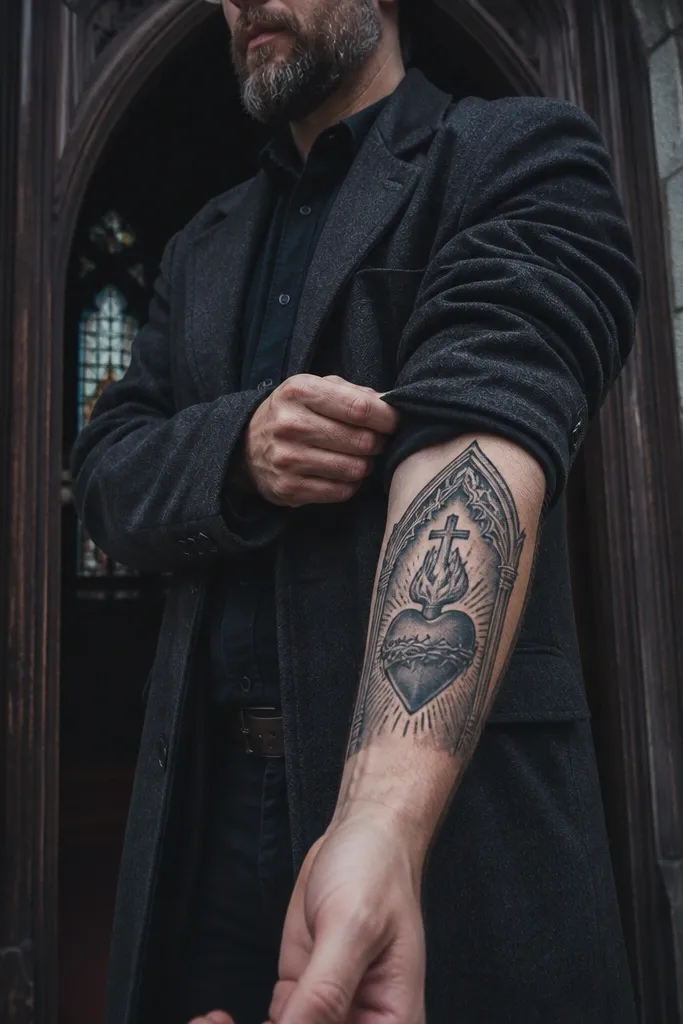
A gothic arch turns the Sacred Heart into a framed devotional icon. The arch shape is flattering on the forearm because it creates a top-down silhouette that looks elegant when your arm is straight. It also gives you a built-in composition, so the heart doesn’t need extra ornaments to look complete. Symbolically, it leans into church architecture aesthetics while keeping the meaning focused on love and devotion. This is a great choice for someone who wants a tattoo that feels older-school and visually composed.
Start by sketching a gothic arch that fits the forearm width — the arch points should not hit your wrist crease. Place the heart centered inside the arch, with the heart outline thicker than the arch lines. Use minimal shading inside the heart and keep the arch mostly linework to prevent blur. Finally, size it around 10-14 cm tall so the arch reads clearly in photos.
Editor's noteAsk for arch line thickness to stay consistent; uneven thickness makes the arch look accidental.
One warningDon’t add a banner or crown inside the arch; the frame already does the heavy lifting.
19. Sacred Heart with Geometric Halo and Dotwork Border
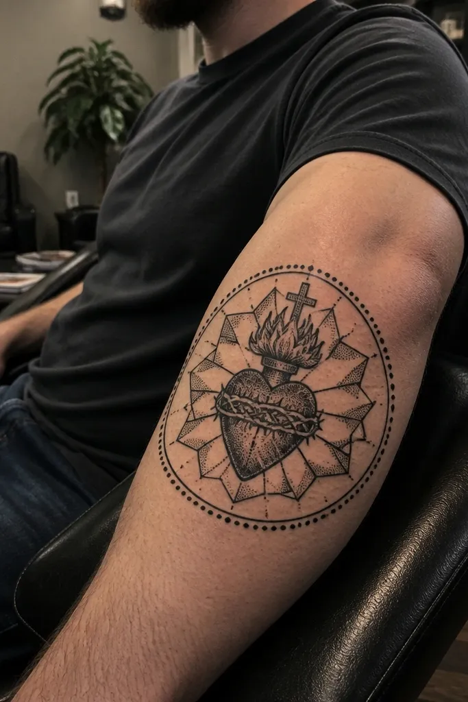
This is where Sacred Heart symbolism meets modern geometry. The heart stays classic, but the halo becomes a geometric shape — think faceted rays or a polygon ring — and the border uses dotwork to create a clean “medallion” edge. It’s photogenic because the geometric lines look sharp and intentional, while the dots add texture without overwhelming the heart. Meaning stays devotional, but the style looks contemporary and clean. Choose this if you want your forearm tattoo to look like art even when it’s small.
Start by placing the heart in the center of a vertical medallion area about 9-12 cm tall. Then add a geometric halo ring around it, keeping linework crisp and evenly spaced. Add dotwork only at the outer border so the dots don’t interfere with the heart outline. Keep shading inside the heart limited to one light-to-mid gray range for depth.
Editor's notePick geometric shapes with straight edges — curved halos can turn into a blur faster on forearms.
One warningAvoid mixing too many geometric elements; one halo shape is enough.
20. Sacred Heart with Cross and Thorns Split Layout (Left-Right)
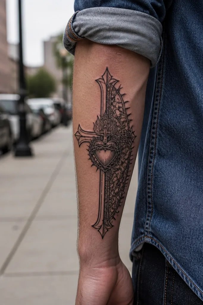
A split layout gives you a dynamic composition that still feels balanced. One side carries the cross linework, the other side carries thorn texture, and the heart sits in the center between them. It looks striking because your eye travels across the forearm — cross, thorns, then heart. Meaning is clear: devotion and suffering held together. This design suits people who want more visual energy than a single emblem, without turning into a full sleeve. It also looks good in motion when you flex your wrist.
Start by drawing the heart centered and vertical, then split the supporting elements so the cross occupies one side and thorns occupy the other. Keep the cross as linework with consistent thickness and keep thorn lines separated to avoid merging. Use a small amount of shading inside the heart only. Finally, size around 10-13 cm tall so the split elements don’t crowd the center when the arm bends.
Editor's noteAsk your artist to test placement with your arm flexed; split elements can shift visually depending on tension lines.
One warningDon’t add rays across both sides; it makes the split layout too busy.
21. Sacred Heart with Mirrored Rays and Flame Tips Down
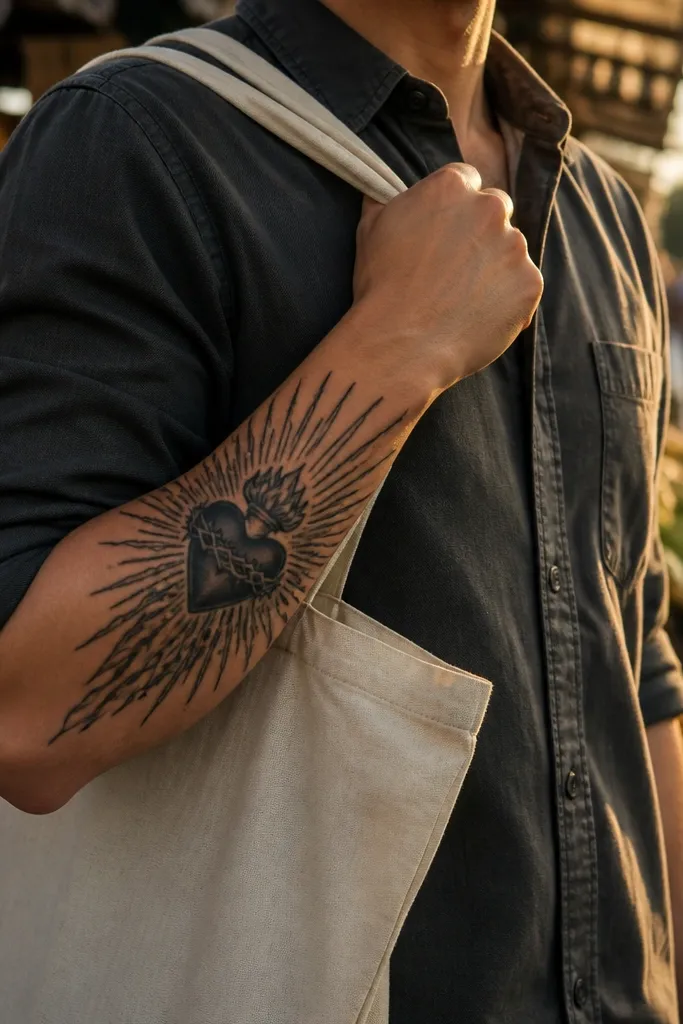
This version adds direction. The rays mirror evenly, and the flame tips angle downward, creating a controlled “pull” toward the wrist. That makes the tattoo look intentional and flattering because the forearm naturally narrows toward the wrist. It’s photogenic because the downward flame geometry frames the heart and reads well in close-ups. Meaning stays traditional — love burning through sacrifice — just with a composition that feels carefully engineered. Choose it if you want a Sacred Heart tattoo that looks good in both straight and bent-arm photos.
Start with a vertical heart and place it slightly above the mid-forearm, then build mirrored rays on both sides with clean spacing. Add flames around the heart edges with tips angled downward, not straight outward. Use black outlines and minimal grayscale inside the heart, letting flame shapes be mostly linework or dot shading. Finally, size around 9-12 cm tall so the flame tips don’t extend too far past your wrist crease.
Ask for the flame tips to have a clear taper — wide bases and thin ends look sharper as they fade.
Avoid thick flame fills; they turn into a heavy dark shape over time.
22. Sacred Heart with Ornate Halo Ring and Simple Banner
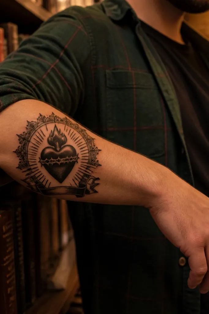
This design balances ornament with readability. An ornate halo ring frames the heart, and a simple banner sits below with one short phrase, kept clean and bold. The halo ring is what makes it aesthetic — it catches light and gives the heart a finished look without needing dozens of small symbols. Meaning stays devotion, and the banner makes it personal without turning the tattoo into micro-text soup. This one looks great on the outer forearm because the halo ring reads like jewelry.
Start with a heart outline and place it centered vertically, then add a halo ring that’s slightly separated from the heart. Use ornament only on the halo ring edges — keep it to a few repeating shapes so it doesn’t blur. Add a banner with short text and a bold serif font, placed across the lower third of the design. Finally, keep the heart shading minimal and controlled so the banner remains readable.
Editor's noteChoose a phrase length that fits in one banner line with spacing between letters in the stencil.
One warningDon’t choose ornate cursive for the banner; it fades faster and becomes unreadable.
23. Sacred Heart with Candle Flame Above the Heart
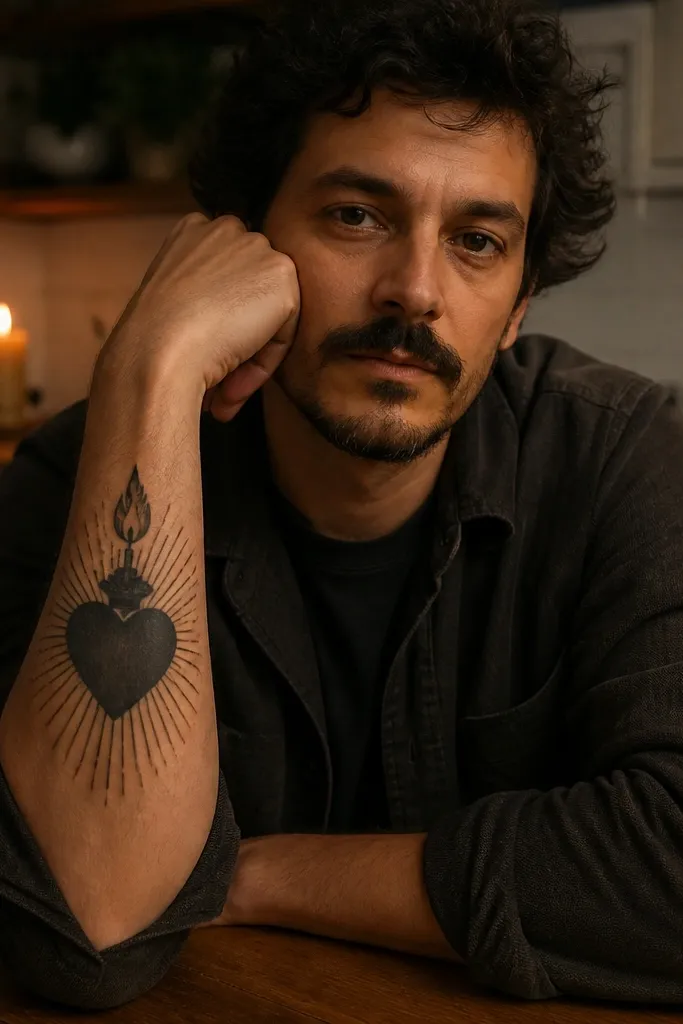
A candle flame above the heart makes the tattoo feel intimate and “kept burning,” without changing the Sacred Heart identity. The flame acts like a top focal point, and it visually connects to the heart through light shading or ray lines. It’s photogenic because flame shapes have natural curves that look good against skin and move with your arm. Meaning stays devotion and prayer, expressed as a steady light. This design suits people who want a softer, less crowded Sacred Heart piece that still has a story.
Start by placing the heart as the center of the design, then add a candle flame above it with a clean outline. Use grayscale shading inside the flame and a small highlight area to keep it from turning into a dark blob. Keep the rest of the design minimal — no heavy rays, just a faint suggestion if you want it. Size it around 9-11 cm tall so the flame stays visible without stretching the heart.
Editor's noteAsk for the flame tip to be slightly pointed; it stays sharper as the tattoo ages.
One warningAvoid adding too many small flame details; keep it readable.
24. Sacred Heart with Crown and Halo Rays Only (No Thorns)

This is a clean, regal version that keeps the Sacred Heart feeling strong but visually light. Crown on top gives you the authority vibe, and halo rays give radiance without the thorn texture that can get messy on the forearm. It’s a great option if you want a classic look that’s easy to maintain and ages well. Meaning is devotion and honor, framed with rays and crown rather than suffering details. It’s also very photo-friendly because the crown and rays create a strong silhouette.
Start with a vertical heart about 8-10 cm tall, then add a crown directly above it with clear points. Add halo rays as evenly spaced lines around the heart, keeping them separate from the heart outline. Use light grayscale inside the heart only, and keep the crown mostly linework. Finally, leave negative space around the crown so it doesn’t blend into the rays during healing.
Choose crown ornament that repeats in a few simple shapes instead of lots of tiny curls.
Don’t add thorn vines if you’re already using crown and rays — the forearm gets crowded fast.
25. Sacred Heart with Thorns Wrapped Around a Small Cross
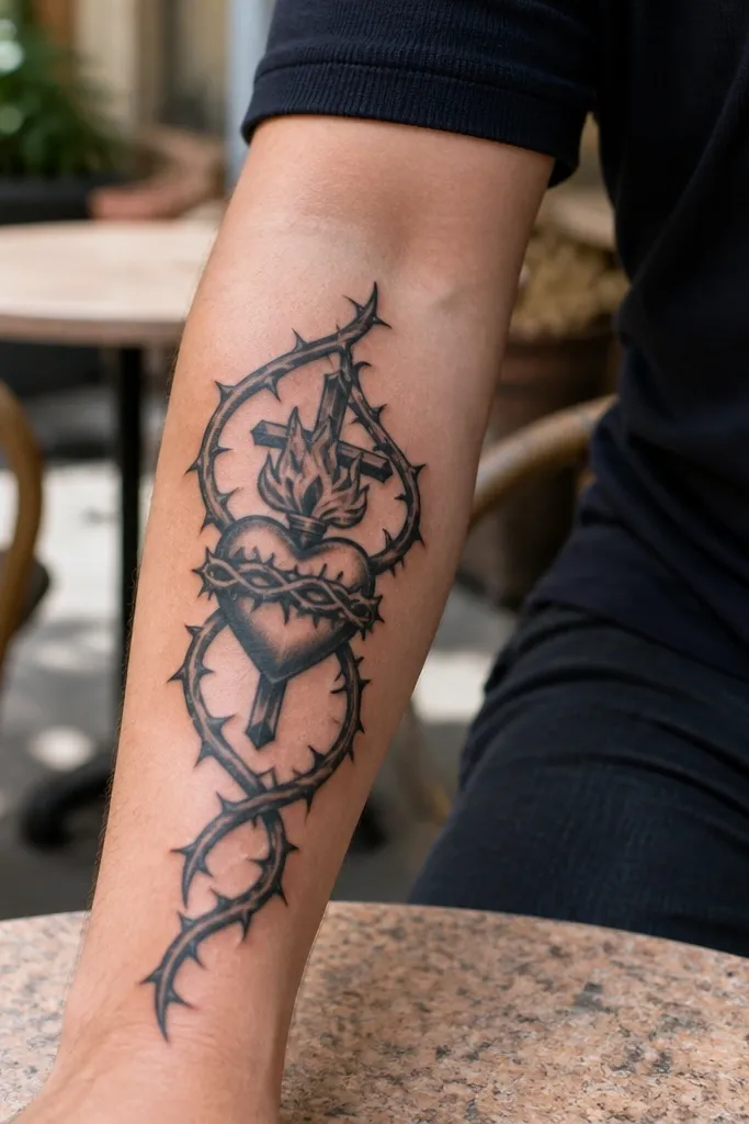
This layout gives you a tight, symbolic centerpiece. The small cross sits behind or beneath the heart, and thorns wrap around it in a controlled spiral, creating a strong visual rhythm. It looks amazing in close-ups because the thorn lines add texture, while the heart stays clear and centered. Meaning is direct: sacrifice held around love. Choose this if you want a compact piece that still feels meaningful and doesn’t need extra icons to look finished.
Start by placing a small cross behind the heart, aligned vertically. Then wrap thorns around the cross in a spiral that frames the heart, keeping thorn lines thin and separated. Use solid black outlines for the heart and cross, and use minimal grayscale in the heart interior. Finally, size it around 7-10 cm tall so the thorn spiral stays crisp and doesn’t sprawl.
Editor's noteAsk the artist to keep thorn spacing visible in the stencil; tight thorns blur first.
One warningAvoid thick black fills in the thorn area; it turns into a dark ring.