
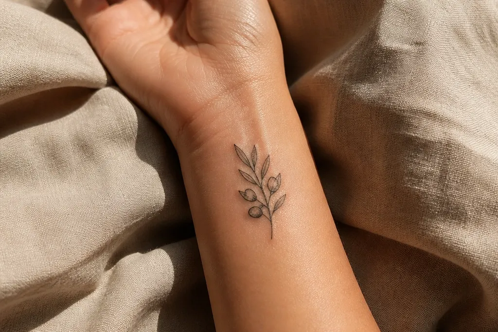
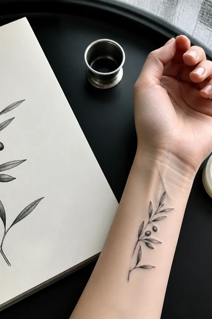
1. Single Curved Branch on Inner Wrist
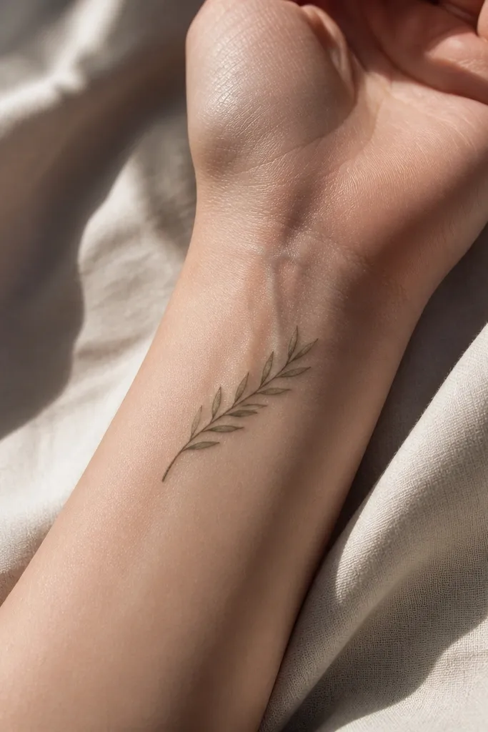
This is the “quiet chic” version. The inner wrist placement makes the branch look delicate, and the curve matches the body so it never feels stuck-on. Keeping the leaves narrow and evenly spaced makes it read as an olive branch even when the tattoo is tiny. I like this one for people who want symbolism without a lot of visual noise.
Start by placing the branch so the thickest part of the stem sits closer to the palm side and the tip points toward the thumb. Keep the overall size around 1.5 to 2.5 inches long, with leaves that don’t overlap. Use linework only or add a micro-dot at each leaf stem — no heavy shading. For aftercare, treat it like a fine-line tattoo: gentle wash, thin ointment layer, and avoid sun on it for a full month so the black stays bold.
Editor's noteAsk for a slightly thicker line on the stem than on the leaf outlines so it stays readable as it softens with time.
One warningDon’t cram more than 7 leaves into this size or the leaf tips will blur together.
2. Mini Branch with Three Leaves and One Berry
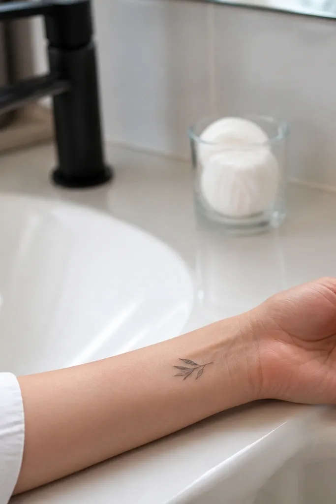
Three leaves plus one berry looks intentional because the composition has a clear focal point. The berry dot gives the symbol a “this is an olive branch” cue without turning the tattoo busy. This design is perfect when you want small, modern symbolism that still reads clearly in photos and in real life. It also hides well under a watch band or a bracelet.
Start by drawing the branch as a simple arc, with the berry dot positioned near the center of the arc. Keep each leaf about the same width, and add a single vein line that runs from stem to tip. Fill the berry fully in black, then leave the rest as linework for contrast. Choose a size around 1 to 2 inches long so the berry stays crisp instead of turning into a smudge.
Editor's noteIf you want it extra clean, request no gray shading — just solid black for the berry.
One warningAvoid outline-only berries; empty circles in tiny tattoos fade into nothing.
3. Olive Branch Wrap at the Outer Ankle
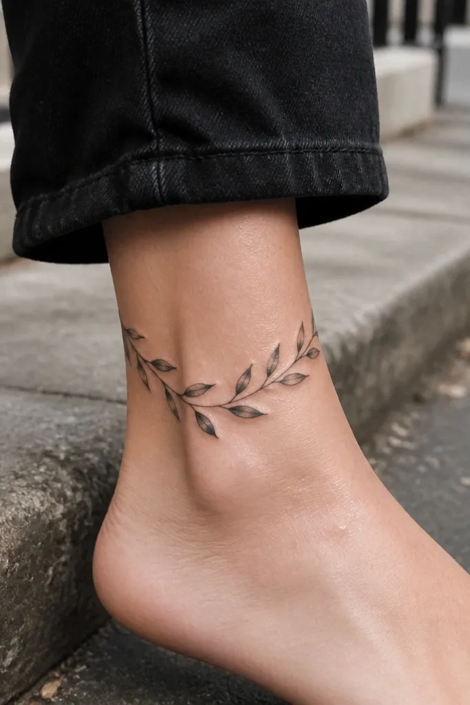
The outer ankle is one of the best places for monochrome symbolism because it moves with your foot and still looks neat. A wrap-like layout keeps the branch from looking like a straight sticker. Alternating leaf angles make the tattoo feel balanced rather than symmetrical-and-stiff. This one photographs beautifully because skin highlights move across the lines as you walk.
Start by mapping the curve along the ankle — the stem should follow the bone line, not cut across it. Keep the tattoo under 3 inches long, and space leaves so you can see the negative skin between them. Use linework with tiny stem shading if you want depth, but skip stipple that can gray out. Pain is moderate here because it’s close to bone; plan a smaller session and don’t rush the aftercare.
Editor's noteSchedule it when you can avoid sandals for a week so friction doesn’t irritate new ink.
One warningDon’t place it too high on the calf; the angle makes the leaves look tilted and less “chic.”
4. Rib Side Branch with Asymmetric Leaves
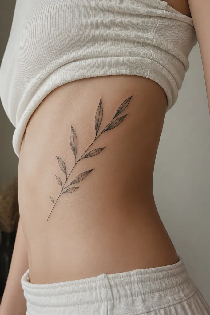
Ribs are where monochrome olive branches look most elegant because the curve follows your ribcage. Asymmetry keeps it from looking like a stamp, and the leaf length variation gives it a natural feel. I like this design when someone wants symbolism that looks classy even from the side angle. It also looks great under a low-cut neckline because it hugs the body line.
Start by placing the stem so it runs diagonally with the curve — aim for a gentle upward sweep. Keep the leaf sizes within a narrow range so it stays small; about 0.25 to 0.35 inches per leaf is a good target. Use linework with minimal shading; a thin gray wash only on the lower leaf edges can add dimension without blurring. Aftercare matters here: wear loose clothing, wash gently, and expect a longer healing time because ribs move constantly.
Editor's noteAsk your artist to stencil while you’re standing and breathing normally — ribs shift, and the stencil can look off when you’re hunched.
One warningDon’t add lots of micro-texture on ribs; it heals uneven and can look scaly.
5. Two Sprigs Crossing on Upper Forearm
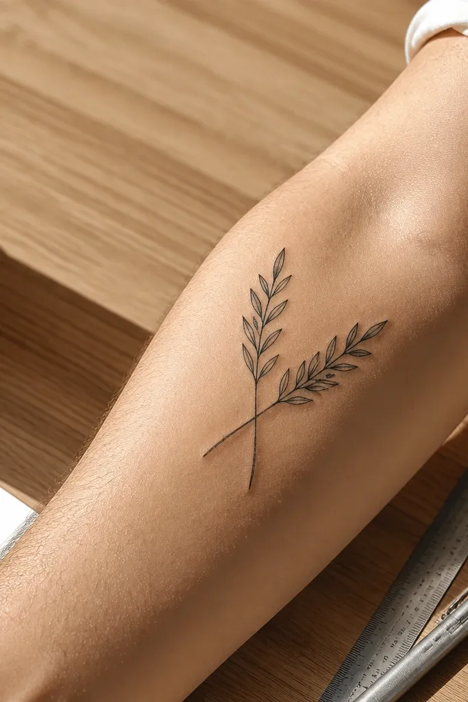
Crossing sprigs give you a clean graphic look without needing a wreath circle. The negative space at the intersection makes it feel modern, and the thin stems keep it airy. This is a great option if you want the olive branch symbolism but you also like minimalist geometry. It reads as intentional from across the room because the crossing shape is strong.
Start by choosing an X that sits near the center of the forearm — too close to the wrist makes it feel cramped. Keep each sprig about 2 inches long with 3 to 5 leaves. Use consistent line weight, and keep leaf veins as one simple line, not a dense pattern. Plan for easy touch-ups: fine linework on forearms can fade faster with sun, so wear sunscreen on it every day after it heals.
Editor's noteIf you want it extra chic, ask for a slightly thicker outline on the outer edge of each stem only.
One warningDon’t thicken the stems too much or the crossing will turn into a black knot.
6. Micro Olive Branch on Collarbone
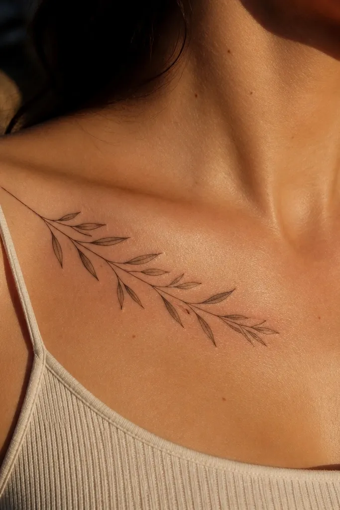
Collarbone placement is where small monochrome tattoos look expensive. The branch fanning along the bone makes it feel light and feminine without turning into a dainty doodle. The key is leaf size — tiny leaves with clean edges look sharp, while larger leaves start to look like a sticker. This one is also easy to hide with a crew-neck if you need flexibility.
Start by centering the stem so it sits on the collarbone curve, not the hollow of the neck. Keep the overall size around 1.5 to 2.25 inches, and leave clear spacing between leaves. Go linework only, then add a single thin gray line inside each leaf if you want a subtle dimension. Healing is usually quick, but the area rubs against clothes; use a thin protective layer and avoid tight collars during week one.
Wear a loose top to the appointment so the stencil sits correctly on the collarbone with your natural posture.
Avoid placing it too far toward the shoulder — the curve changes and the leaves look angled off.
7. Olive Branch with a Ribbon Knot Tip
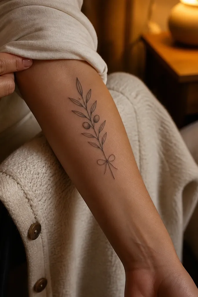
A knot tip adds a finishing touch that still feels minimal. It gives your eye a place to land, which makes a tiny branch feel more complete. I like the knot drawn in the same line weight as the stem so it doesn’t look like a separate element. This design is a good pick if you want peace symbolism but you also like a slightly stylized ending.
Start by sketching the stem so it curves gently, then reserve the last third for the knot. Keep leaf count to 4-6, with leaves that get slightly smaller toward the knot. Use linework and keep the knot loops simple — two curves and a small overlap line. Aftercare is standard, but the upper arm heals smoother than ribs; still, avoid heavy sweating for 48 hours and keep the area out of direct sun for a month.
Ask the artist to draw the knot a touch smaller than you think so it doesn’t overpower the branch.
Don’t add shading to the knot; gray on a small knot turns uneven.
8. Olive Branch Micro-Wreath on Side of Waist
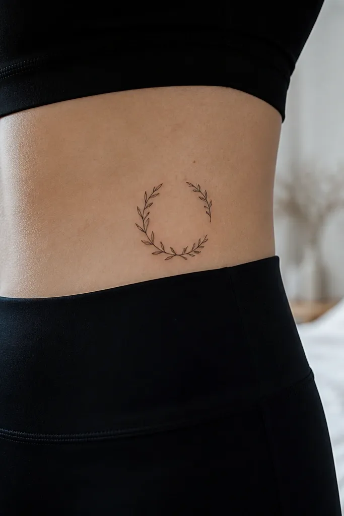
A micro-wreath gives you the “olive branch” feeling without the full circle that can look busy. The open gap keeps it chic and lets the skin breathe. On the side waist, the partial curve sits naturally on your body line and looks great with high-waisted clothing. It’s a good option if you like the symbolism but want it to feel fashion-forward.
Start by choosing a placement where you can keep the tattoo mostly on one curve — side waist works well above the hip bone. Keep the full width around 2.5 to 3.25 inches, and plan an intentional opening so the design doesn’t feel closed-off. Use linework, and if you add gray, keep it to 1 thin shadow line under the leaves. For aftercare, avoid tight waistbands right away since rubbing can blur fine lines.
Editor's noteIf you wear bikinis often, place it slightly higher so the leaf tips don’t get stretched by swimsuit seams.
One warningAvoid a full wreath circle; tiny full circles age into a gray ring.
9. Single Leaf Trail on Finger Side
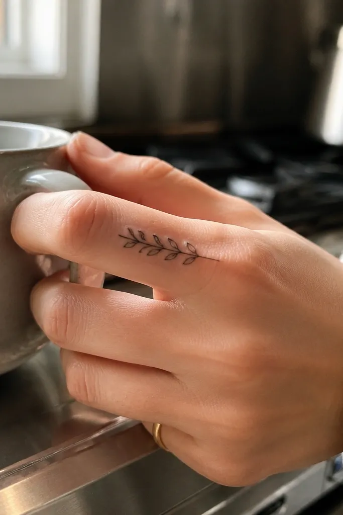
Finger tattoos are bold, and this design stays tasteful because the leaves stay tiny and spaced. The side-of-finger placement means the tattoo catches light without getting smudged by constant hand rubbing. It reads as an olive branch when you look closely, but from a distance it also looks like a clean botanical line motif. If you like minimalist symbolism you can still see up close, this is it.
Start by targeting the side of the finger between the first and second knuckle — that’s where it tends to heal more evenly. Keep the total length under 1.25 inches and use only linework with no gray. Ask for the stem to be thin and straight, then let the leaves angle slightly so they don’t look like they’re stamped. Healing on fingers is rough because skin moves; expect faster fading and plan for a touch-up after a year.
Use a very thin layer of aftercare ointment and keep it covered if your job rubs your hands constantly.
Don’t place it across the front of the finger; it takes more friction and fades faster.
10. Olive Branch with Tiny Dot Shading (No Fill)
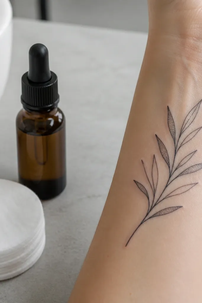
This is monochrome with a little texture, but it stays chic because the dots are controlled. Sparse dot shading makes the leaves look dimensional while keeping the overall look clean and modern. It’s also flattering on medium and light skin tones because the dots add contrast without turning into a heavy gray cloud. I like this when you want the tattoo to look slightly more detailed in photos without getting complicated.
Start by choosing a branch size around 2 to 3 inches so the dots have space to breathe. Keep the dots very light and only inside the leaf area, not along the stem. The linework should stay the darkest element, so ask the artist to avoid thick black outlines on leaf tips. Aftercare is like any fine-detail tattoo: keep it clean, don’t pick flakes, and avoid soaking it for at least two weeks.
Tell your artist you want dots that look like “salt,” not “smoke.”
Avoid dense stipple — it heals into gray smudges on small tattoos.
11. Olive Branch with Negative Space Leaf Centers
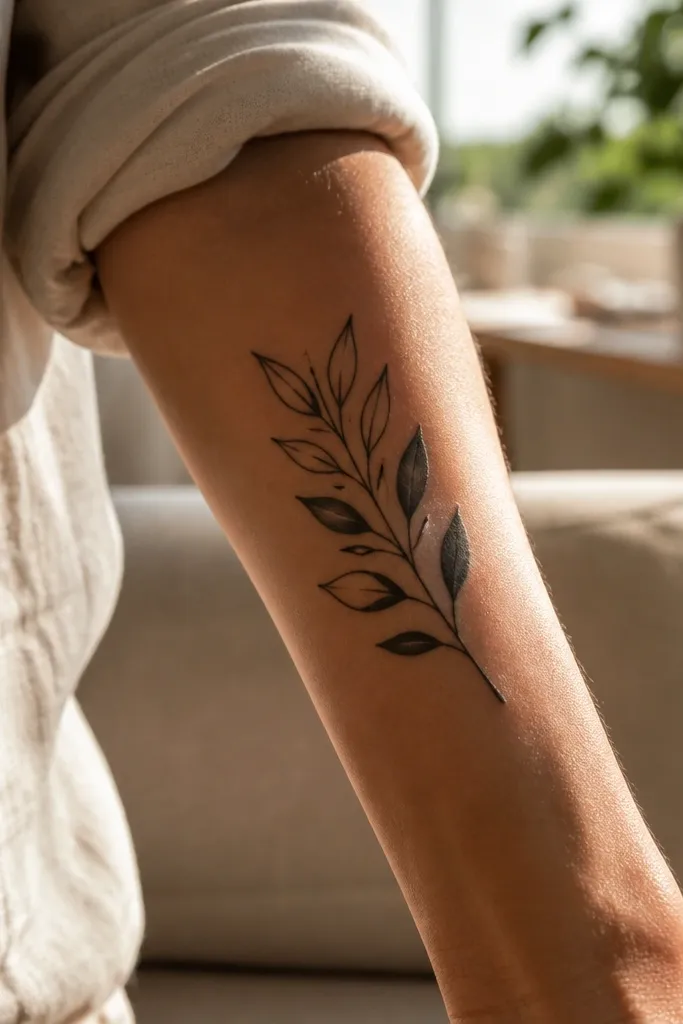
Negative space leaf centers look crisp because you’re using skin as the lighter tone. It stays monochrome but gives you a “clean print” look that doesn’t blur as quickly. This design also makes the branch feel airy, which is exactly what “simple and chic” should look like. It’s a great choice if you hate tattoos that turn dark and heavy over time.
Start by outlining each leaf with a single clean line and a simple vein line, then leave the inside completely blank. Keep leaf count around 6 to 8 depending on placement, but keep each leaf narrow. Use a slightly thicker stem outline so the branch reads as one symbol. For aging, this style holds up well because there’s no gray fill to fade unevenly; still, wear sunscreen to prevent skin tone changes around the lines.
If your skin scars easily, keep the lines slightly thinner and avoid overworking the leaf edges.
Don’t add any solid shading inside the leaves if you want the clean negative-space look.
12. Olive Branch with Minimal Veins Only
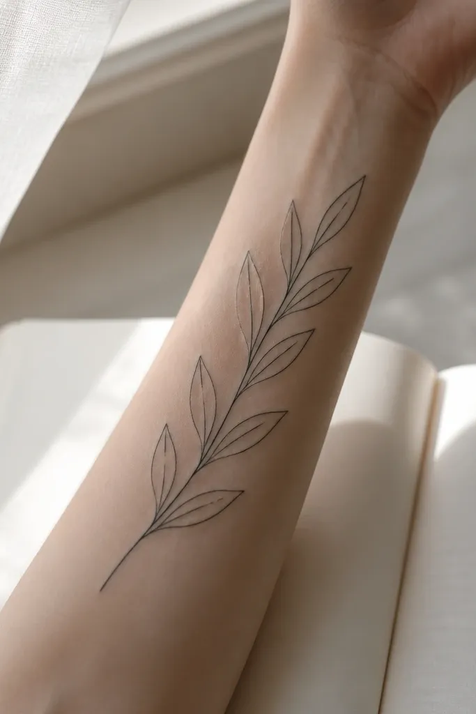
Minimal veins make the tattoo feel modern and graphic. It’s also the most forgiving option for aging because there’s less detail to blur. The branch still reads as botanical because the leaf outline and vein line do the work. I recommend this when you want a clean symbol that looks good on day one and still looks good after years of sun and friction.
Start by keeping the leaf outline consistent and using one vein line that runs from stem to tip. Keep the leaf tips slightly pointed; rounded tips can look like generic leaves instead of olives. Place it on the back shoulder or upper outer arm where movement is gentle. Aftercare is straightforward, but you should still moisturize and protect from sun since shoulders get a lot of exposure.
Editor's noteAsk for a stencil that shows the tattoo from two distances: arm length and close-up.
One warningDon’t add extra vein lines; a second vein turns tiny leaves into clutter.
13. Olive Branch with One Side Shaded Leaf
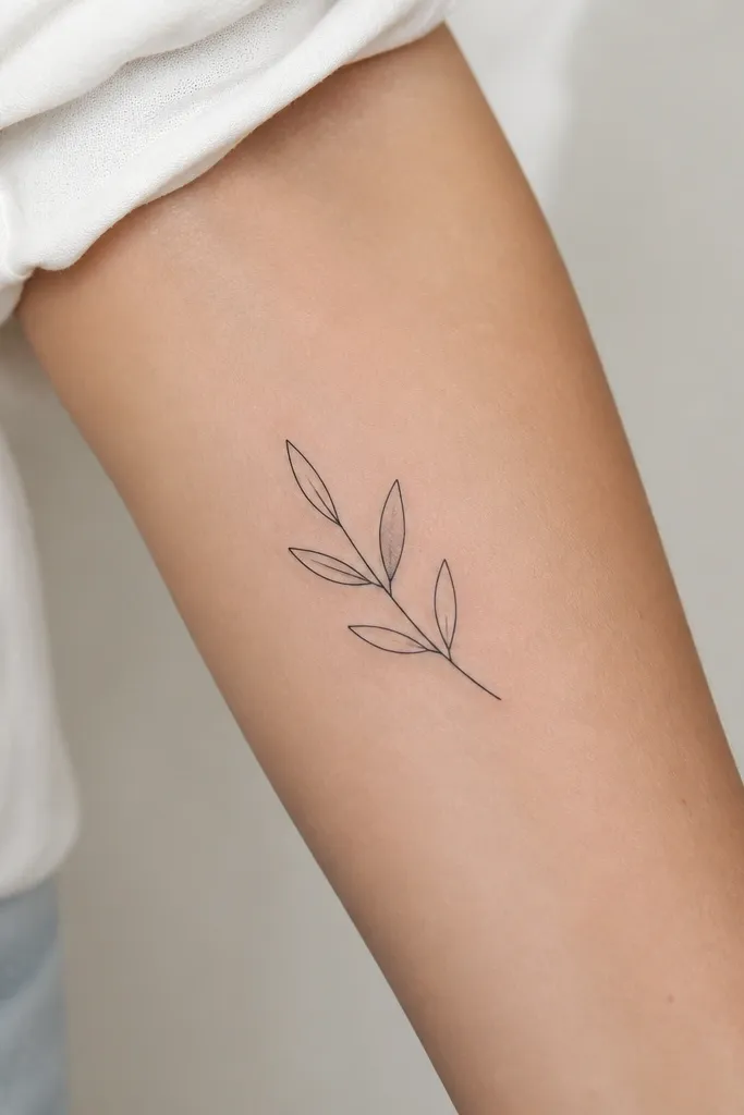
This design uses restraint. One shaded leaf gives you depth and visual interest without turning the whole tattoo gray. It looks chic because the shading is controlled and the rest stays crisp. I like it for people who are undecided about whether they want shading — it’s a “just enough” compromise.
Start by picking one leaf as the “hero leaf,” usually the middle one or the one that points outward. Keep the shading to a thin gray band along one side, like a light cast, not a full fill. The stem and other leaves stay pure black linework. Place it on the forearm or upper arm where the tattoo can be seen cleanly in natural light.
Editor's noteTell your artist you want the gray to be subtle enough that it still looks like linework when it’s fresh.
One warningAvoid shading multiple leaves; it turns into a patchy gray cluster.
14. Olive Branch Attached to a Small Heart Stem
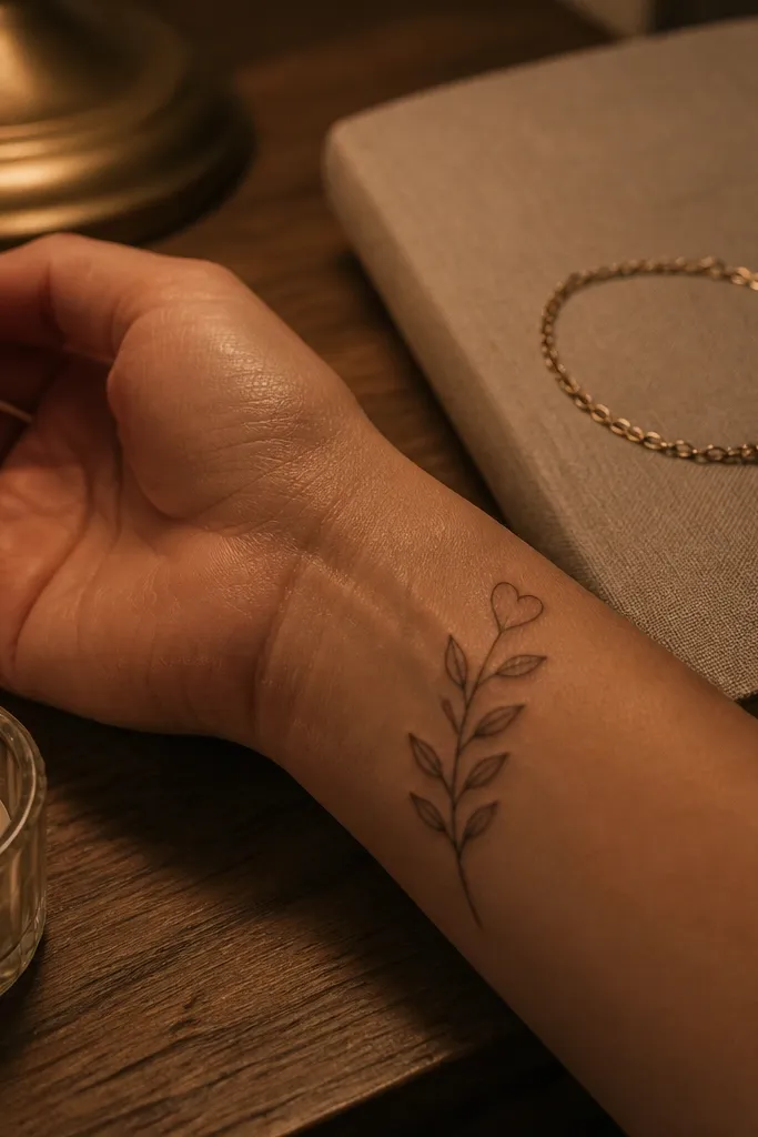
A heart-shaped top leaf makes the olive branch feel personal without adding a separate symbol. It still reads as olive branch because the rest of the leaves follow the same botanical style. The heart tip adds sweetness, and the monochrome stays clean and classy. This one is a good choice for couples symbolism or for anyone who wants peace energy with a softer touch.
Start by choosing the last leaf shape as the heart — make it slightly smaller than the others so it doesn’t look like a big heart sticker. Keep the branch curve gentle and upward. Use linework with a single central vein line on each leaf, including the heart-shaped top. Size should stay around 2 inches long so the heart doesn’t steal attention from the branch.
Ask for the heart to be drawn with the same line thickness as the other leaves so it looks like part of the plant.
Don’t add a full heart outline; the heart should read through the leaf shape.
15. Olive Branch with Tiny Buds Along the Stem
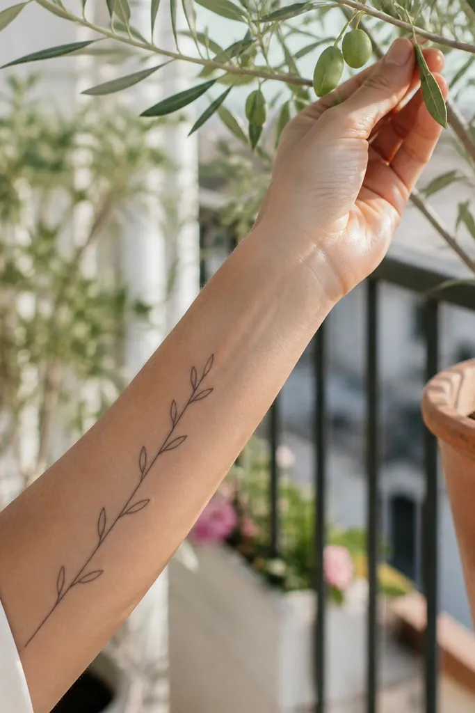
Buds along the stem make the tattoo feel alive while staying minimal. The buds also act like anchors, so the design looks balanced even when it’s small. This feels chic because the buds are drawn as simple shapes, not detailed botanicals. If you want olive branch symbolism but you like a slightly modern, almost jewelry-like tattoo, this is a great pick.
Start by drawing the stem as a gentle curve, then place 3 to 5 bud ovals along it at even intervals. Attach leaves only at a couple of points, usually the top and bottom, to keep it from turning into a dense botanical cluster. Keep everything linework except filled bud ovals in solid black. Aftercare is important for the lower ribs/hip because movement and friction are real; wear breathable clothing and avoid tight seams.
If you want extra crispness, keep bud ovals small enough that they don’t turn into dots after healing.
Don’t use tiny circles for buds — they blur more easily than short ovals.
16. Olive Branch on Back of Hand (Short Sprig)
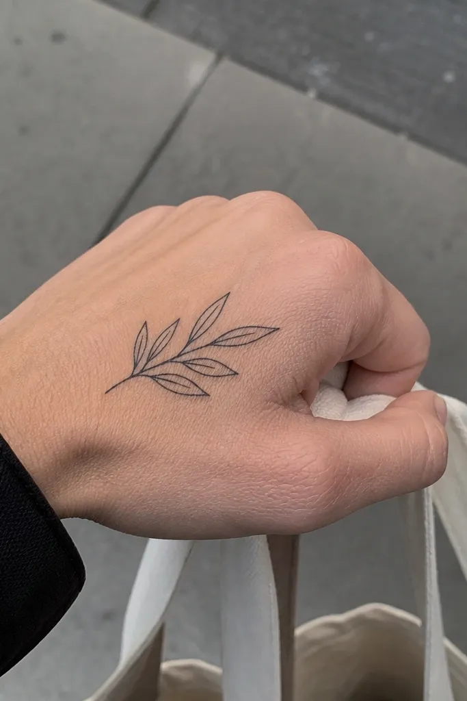
Back-of-hand placements look bold, but small sprigs keep it classy. The monochrome linework stays readable because the leaves are spaced and the stem is thin. This is a good choice if you want something that shows when you gesture, not something you need to constantly reveal. It also looks great with rings because the tattoo sits near the hand’s jewelry zone.
Start by keeping it small, around 1.25 to 2 inches long, and place it near the base of the thumb knuckle where the skin is less curved. Use linework only and avoid gray shading, since gray can fade unevenly on hands. Ask for leaf outlines that are slightly thicker than the stem so the leaves remain visible. Healing can be slower here due to friction; keep it clean, avoid washing too aggressively, and protect from sun and hand sanitizer after it heals.
Plan for a touch-up sooner than you would on an arm. Hands fade faster.
Avoid adding lots of micro-details; hands blur details faster than you expect.
17. Olive Branch with a Thin Circle Frame (Small Emblem)
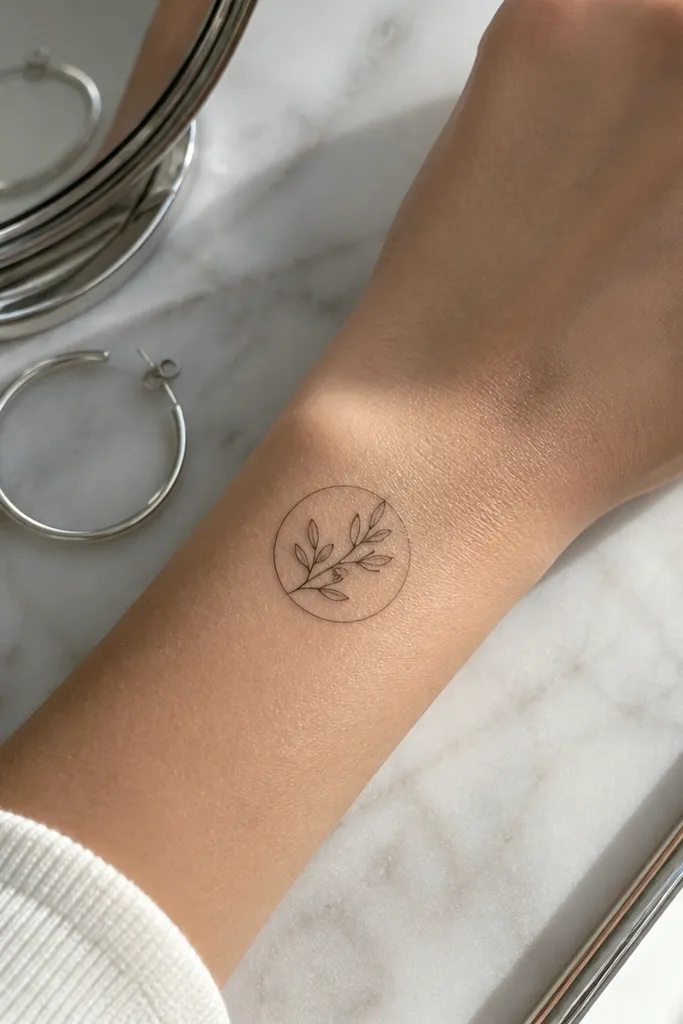
A thin circle frame makes the olive branch feel like a little emblem, still simple and chic. The key is that the circle line stays hair-thin compared to the branch stem, so it doesn’t dominate. This design reads clean in monochrome because it’s mostly linework with controlled negative space. It’s also a flattering placement because the chest line catches light as you move.
Start by sizing the circle to about the width of a quarter on skin, roughly 1.5 to 2 inches across. Place the branch so it sits slightly above center inside the circle, leaving space at the bottom. Use consistent line weight for the branch and keep the circle line lighter. Aftercare is standard, but avoid tight bras or friction around the first week so the circle line doesn’t get irritated.
Ask your artist to draw the stencil first with the circle — it’s easy to misjudge thickness on the chest.
Don’t make the circle bold or thick; it will turn into a heavy ring as it ages.
18. Olive Branch with Sparkle-Style Leaf Tips
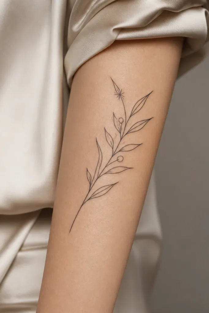
Pointed leaf tips give the branch a sharper, cleaner silhouette. It feels a little more “chic jewelry” than soft botanical, even though it’s still an olive branch. This is especially flattering on forearms because the lines look intentional against skin texture. If you want monochrome but with a slightly fashion edge, this is the one.
Start by keeping the leaf shapes consistent: each leaf should end in the same kind of point. Place the branch on the outer forearm so the curve runs with the arm’s natural line. Keep the overall size around 2.25 to 3 inches, and use linework only — no gray needed. Aftercare: moisturize lightly and avoid picking; sharp points can scab more noticeably.
Mention you want “uniform leaf points” so the artist doesn’t freestyle different tip shapes.
Avoid mixing rounded and pointed tips; it makes the branch look inconsistent.
19. Olive Branch with a Single Feathered Stem Shade
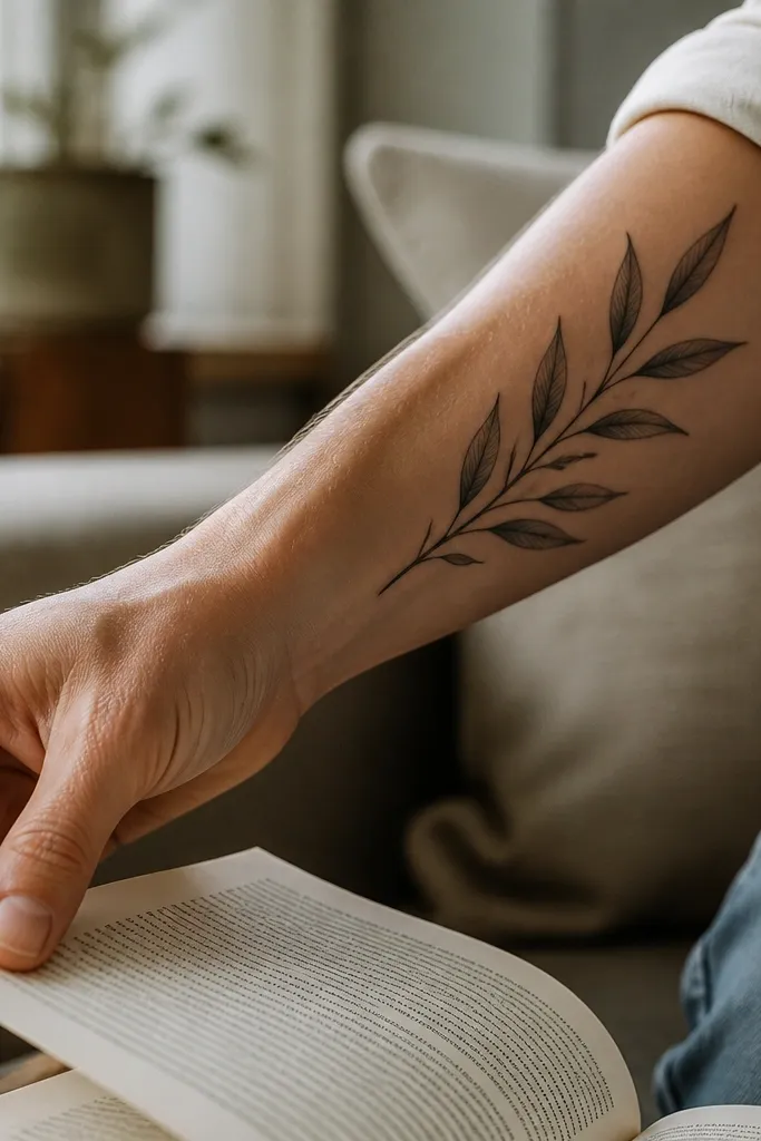
A little stem shading adds motion. When the shade is only on one side of the stem, it gives the tattoo depth without making the whole design look smoky. The leaves stay clean, so the tattoo still reads as simple. I like it for people who want monochrome with a tiny bit of artistry, not a full shaded piece.
Start by choosing one side of the stem for shading, usually the lower side so it looks like light hits from above. Keep the shading very light — think thin pencil marks, not filled gradients. Keep leaf outlines in pure black with no gray fill. Placement on upper arm or outer forearm works best because the skin is less bumpy than ribs.
Ask for the shading to be done last after the lines heal — some artists do a second pass and it keeps it cleaner.
Avoid heavy shading around the leaf edges; it thickens and blurs the leaf shapes.
20. Olive Branch Underboob Line on Side Ribcage
This placement is intimate and sleek. The side ribcage gives you a natural canvas for a curved branch that looks like it belongs to your body line. Because it’s under the breast line, it looks chic even if you wear lower necklines or off-shoulder tops. The design stays small, so it doesn’t fight the curves of the area.
Start by placing the stem so it follows the rib curve — the top end should point toward your armpit. Keep it under 3 inches long and keep leaves spaced so they don’t overlap with skin folds. Use linework only for the cleanest look; if you add gray, keep it to a single thin shadow on the underside of the top leaf. Aftercare can be tricky because clothing rubs — wear soft, breathable fabric and avoid underwire for the first week if possible.
Editor's noteDo a quick mirror check with your posture — your ribcage shape changes when you sit.
One warningAvoid placing it too close to skin folds where it stretches; the leaves can warp as you move.
21. Olive Branch with Tiny Cross-Section Vein Marks
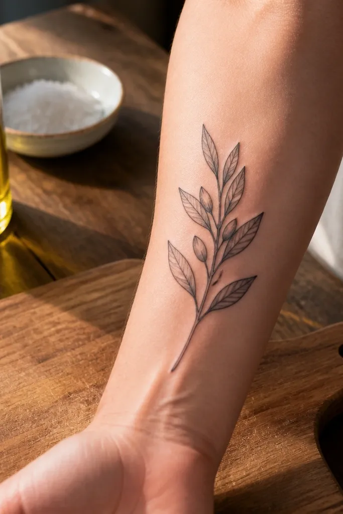
Those tiny cross marks make the leaf feel more “real” without adding clutter. It’s still monochrome and still simple, but it adds a subtle texture that looks good in close-up photos. This design is a nice middle ground if you want more detail than plain linework but you don’t want dot shading. It also looks great on thicker skin areas like inner bicep where lines heal cleanly.
Start by keeping the leaf count around 6 to 8 and drawing the central vein as a single line. Add only two small cross marks per leaf, spaced near the middle and lower part of the vein. Keep the stem thin and consistent, and place the branch so it follows the bicep curve. Aftercare: keep it moisturized, avoid tight sleeves for a few days, and don’t pick at any scabs around the cross marks.
If your artist is new, ask them to practice the cross marks on the stencil paper first.
Don’t add cross marks to every leaf if your tattoo is very small; it can turn into noise.
22. Olive Branch with One Side Leaf Ladder (Stacked Look)
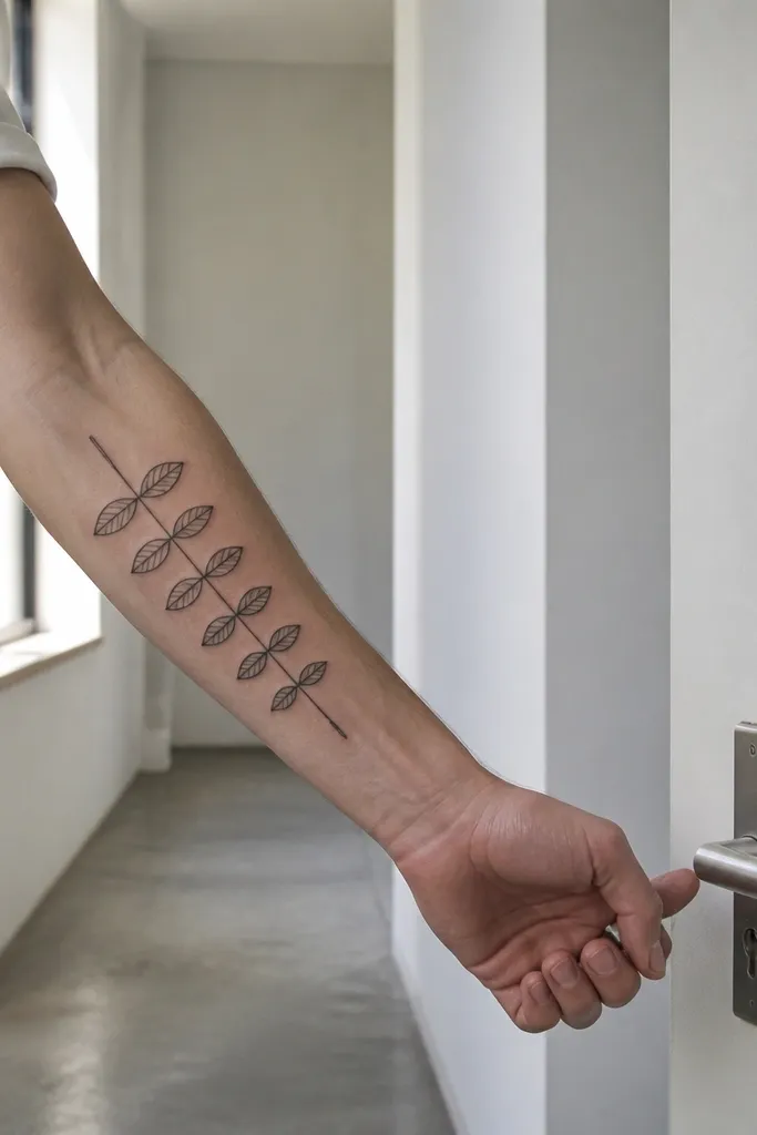
This stacked leaf approach looks graphic and clean, almost like a minimalist logo. It keeps the olive branch symbol readable while giving it a fashion layout that doesn’t look like a generic sprig. Because all leaves point the same direction, the tattoo looks sharp and tidy, which is what you want for monochrome. It’s also great if you want the branch to look “intentional” rather than naturally wild.
Start by drawing the stem diagonally and placing leaves only on one side, all at consistent angles. Keep the overall size around 2 to 2.75 inches long and keep leaves narrow. Use linework only, and add a single vein line per leaf. Placement on ankle or shin side works because the skin is relatively flat there; aftercare is important because these areas get rubbed by socks and shoes.
Wear clean, soft socks the first week after it heals — friction kills crispness.
Avoid placing this on a very bony or curved spot where the leaves will stretch out of alignment.
23. Olive Branch with a Tiny Bow at the Base

A tiny bow makes the olive branch feel like a gift symbol. It still stays simple because the bow is small and uses the same line weight as the stem. This design looks cute but not childish, especially on upper arm where it has room to breathe. If you want peace symbolism with a feminine finishing detail, this one hits the mark.
Start by placing the bow near where the tattoo begins so it anchors the stem visually. Keep the overall tattoo around 2.25 to 3 inches tall and keep leaves spaced along the stem, not layered. Use linework only, and keep the bow lines thin so it doesn’t become a thick black blob. Healing on upper arm is usually smooth; still, avoid sweat-heavy workouts for the first 48 hours.
Ask for the bow loops to be slightly rounded, not sharp, so they heal cleanly.
Avoid thickening the bow lines; it will overpower the branch.
24. Olive Branch with Two Leaves Forming an Open V
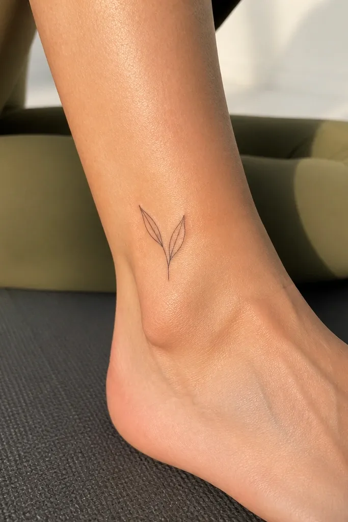
Two leaves in an open V is the smallest “olive branch” that still feels like it belongs to the symbol. The open V reads as airy and modern, and it’s ideal if you want something tiny but not meaningless. This works well when you want the tattoo to look chic even when it’s partially hidden by clothing. It’s also a good choice for a first tattoo if you’re nervous about bigger pieces.
Start by keeping the overall size around 1 to 1.75 inches tall and placing it on a flatter part of the calf. Use linework only and make the vein lines very thin and straight. Keep the stem minimal — it should just connect the two leaves, not extend into a long branch. Aftercare: protect it from sun and friction quickly, because tiny tattoos can fade faster when rubbed by fabric.
If you want it to look more like an olive branch, ask for slight leaf tapering at the tips.
Don’t make the leaves too wide; wide leaves blur into a single shape.
25. Olive Branch with Leaf Pairs Mirroring Each Other
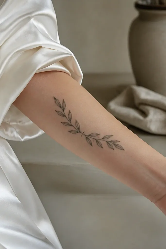
Symmetry makes this feel clean and chic. Leaf pairs give you a balanced look, and the curved stem keeps it from feeling stiff. I recommend this when you want the olive branch to look like a designed symbol, not a random sprig. It also ages well when the leaves are consistent in size and spacing.
Start by drawing a gentle curve for the stem and placing leaf pairs at equal distances. Keep the total leaf count around 8 to 10, but ensure each leaf pair has visible negative space between them. Use linework with a single vein line per leaf and no gray fill. Placement on shoulder blade works well because the skin is relatively smooth, but you still need good aftercare since that area moves a lot.
Have your artist check symmetry by taking a quick photo of the stencil on your skin before they start.
Avoid uneven spacing — asymmetry that’s accidental looks messy in monochrome.



