
1. Classic Dove With Ribbon Olive Branch
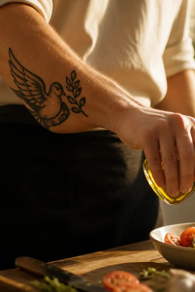
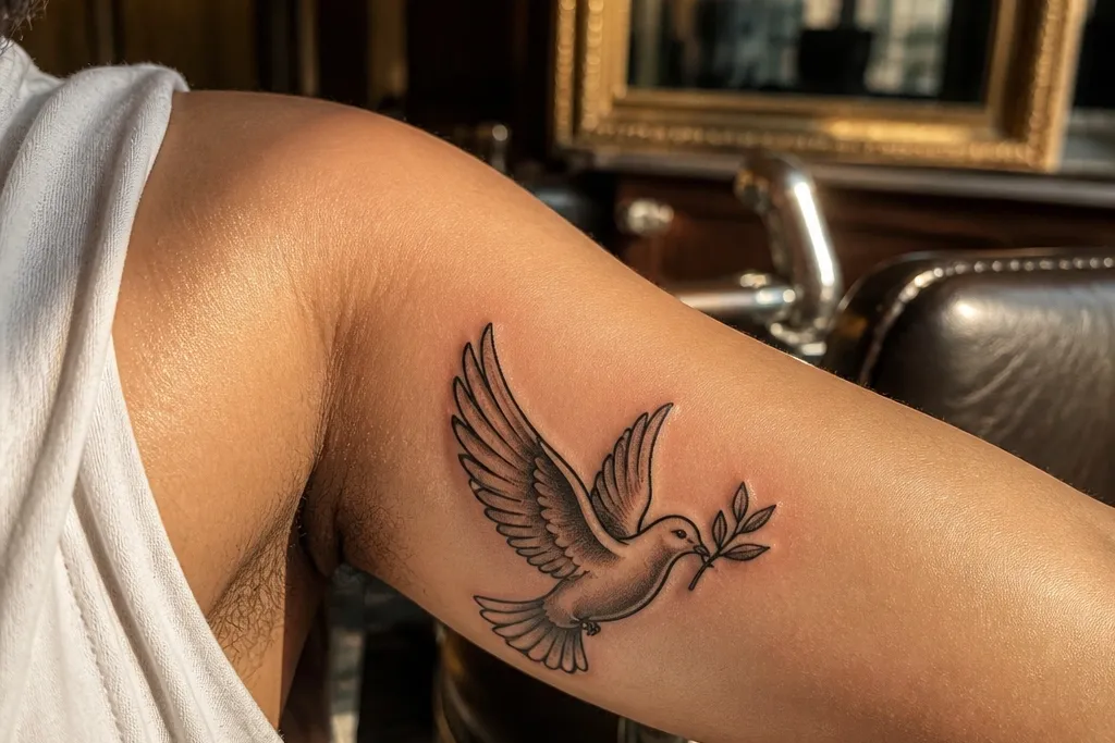
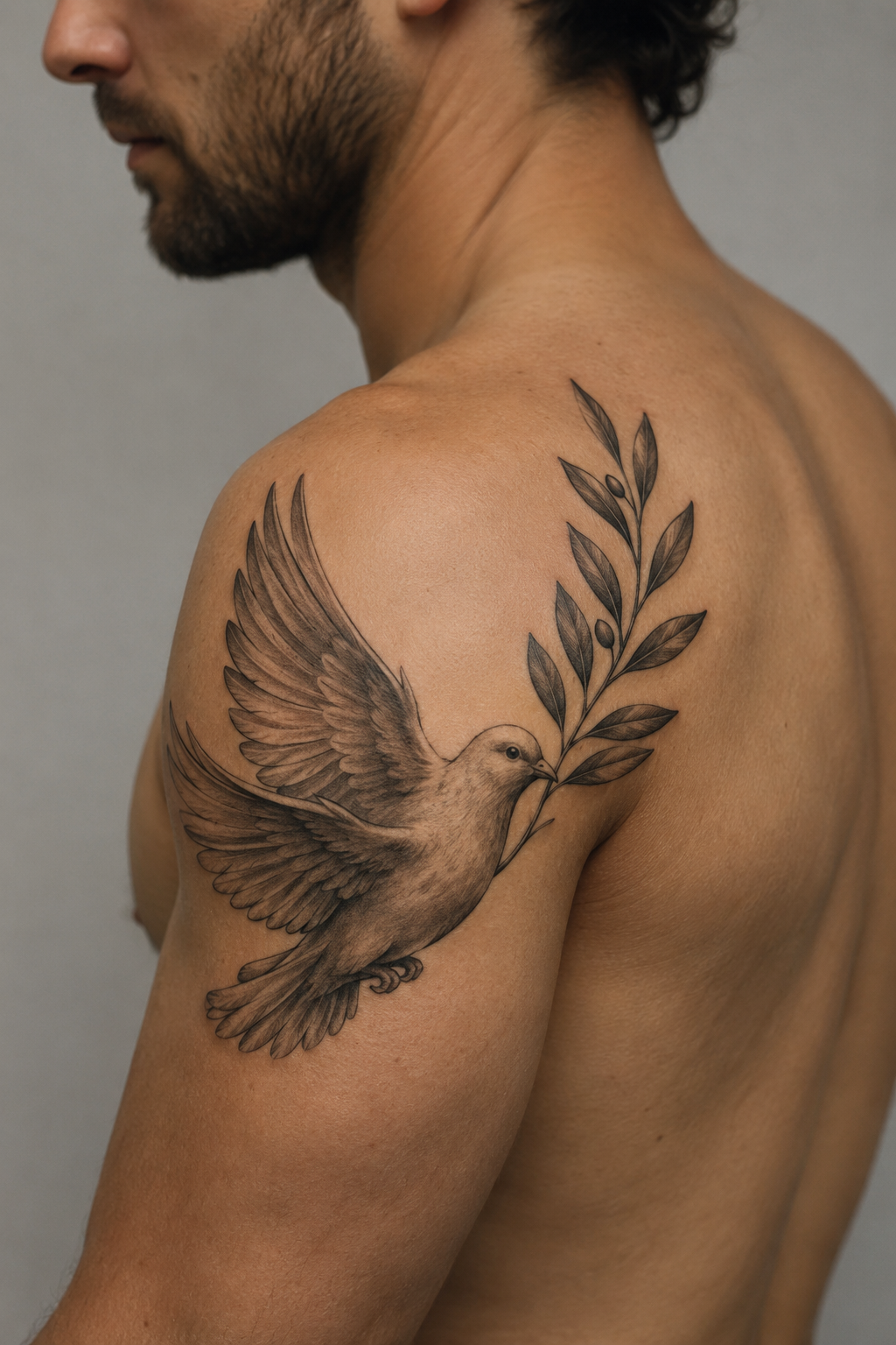
This one looks beautiful because it reads like a symbol even from a distance. The dove has a strong head-to-tail silhouette, and the olive branch is drawn with clear leaf pairs that curve the same direction as the wing sweep. The ribbon adds motion without adding clutter, so the whole piece feels balanced instead of busy. I like it on the outer forearm because your arm naturally frames the curve of the branch, and photos look clean in daylight. It suits people who want symbolic strength to feel classic and readable, not artsy-abstract.
Start by choosing a size that keeps the leaves legible: about 3.5 to 4.5 inches long on the forearm. Then ask your artist to use thicker linework for the dove outline and branch stems, with thinner lines only for a few feather grooves on the wing. Finally, keep shading light — a small amount of gray wash on the wing and neck is enough, no heavy black fill. Expect moderate soreness and normal healing scabbing; aftercare is standard, but keep the ribbon edges moisturized so they don’t look dry and dull. If you want it to age even cleaner, ask for fewer leaf dots and more leaf outlines with a visible center vein.
Bring a reference that has a blank ribbon, not a text ribbon, so the negative space stays crisp.
Don’t ask for tiny feather “hairline” texture — it blurs first.
2. Minimal One-Line Dove With Single Olive Spray
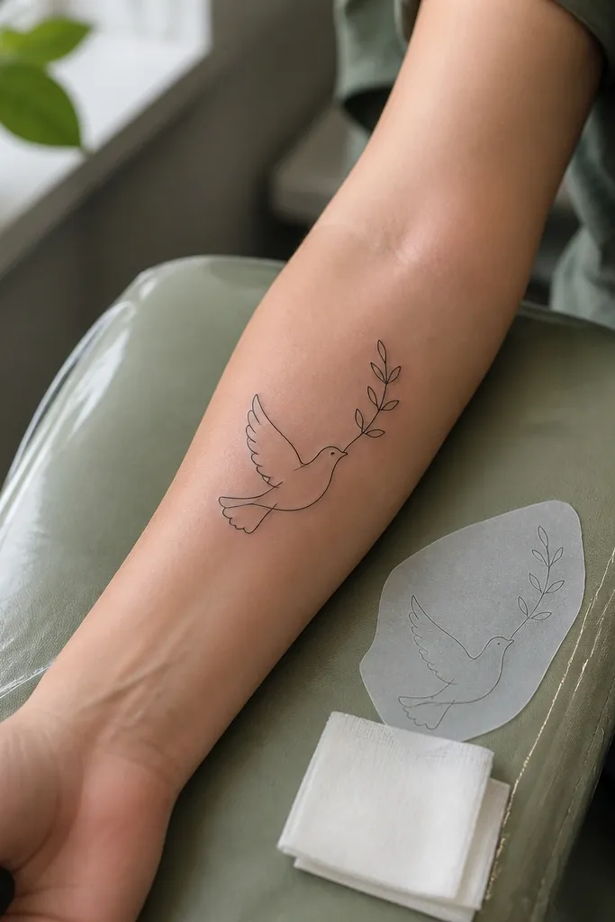
This design is gorgeous because it’s graphic and calm. The one-line approach makes the olive branch feel intentional, not decorative, and the dove’s neck curve gives the whole symbol a gentle upward lift. Because there’s no shading, the tattoo stays readable as it heals and settles, which is why it looks good in close-up photos. It suits smaller placements where you want meaning without lots of surface detail. I’ve seen this style work especially well for people who want symbolic strength to look modern and personal, not like a flash sheet copy.
Start by placing it where you get a flatter skin surface, like the inner wrist or side of the ankle, and keep it small: around 2.5 to 3 inches. Then choose a dove silhouette with only a few key curves — wing and tail should be clear without extra feather marks. Finally, ask for the olive branch to have 4 to 7 leaves maximum so each one stays distinct. Line thickness matters here: request a consistent medium line, not ultra-thin. Aftercare is simple, but don’t over-scrub in the first week, because dry linework can look chalky before it settles.
If your wrist gets irritated by watch bands, place the tattoo slightly toward the palm side so it avoids constant friction.
Skip super-thin microlines if you want longevity.
3. Fine-Line Dove Landing on Olive Branch
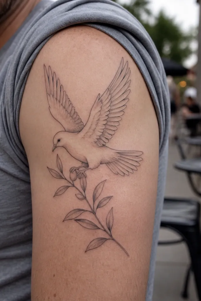
This one looks beautiful because it adds a “moment,” not just a symbol. The dove landing pose makes the olive branch feel like something the bird is choosing, which gives the design emotional weight when it catches light. Fine-line work can look delicate and meaningful, but only when the artist keeps the leaf outlines clean and doesn’t overload the dove with micro-feathers. On the ribs, the curved placement makes the branch and feet look naturally aligned, and photos show a soft, graceful arc. If you want symbolic strength that feels gentle and personal, this is the move.
Start by targeting a placement with natural curvature: upper ribs, outer shoulder, or the side of the upper arm. Then keep the overall size around 4 to 6 inches across so the leaves don’t become tiny. Ask for a few stippled shadow touches on the wing and leaf undersides, but keep most areas line-only. Finally, plan for healing that follows your movement — ribs stretch, so moisturize consistently and avoid tight clothing rubbing the first week. If you’re sensitive to detail work, ask for slightly thicker outlines on the dove’s feet and branch stems so they stay sharp.
Wear a soft, loose shirt to your appointment so your stencil placement can be checked while your torso is relaxed.
Don’t add too many leaves — the branch turns into a speckle patch.
4. Traditional Shield With Dove and Olive Branch
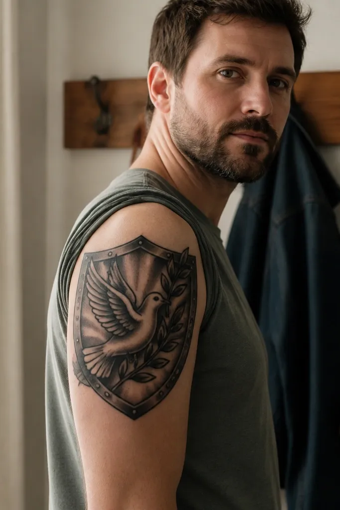
This is the strongest option when you want the symbol to feel like protection. The shield shape gives the eye a boundary, so the dove and olive branch don’t float around. Because the olive branch crosses diagonally, it adds energy, and the leaves stay readable thanks to the larger scale of the upper arm. I like this for people who want symbolic strength to feel like “standing your ground,” not just calm peace. In photos, the shield edge creates a clean contrast against skin, so the whole piece looks intentional even in casual lighting.
Start by choosing a size that lets the shield border breathe, around 5 to 7 inches tall on the upper arm. Then ask for thick outer contour lines on the shield and a dove silhouette that uses 6 to 8 clear feather lines total. Finally, keep color minimal — if you add anything, use a muted olive-green wash in the branch leaves, not bright neon. Healing is straightforward, but expect a bit more dryness because shield outlines trap lotion under scabs. If you want it to age well, avoid dense black fill inside the shield — use negative space and light shading instead.
Request a stencil with diagonals mapped first, so the branch angle matches your arm’s natural twist.
Skip tiny shield details — they disappear as the tattoo settles.
5. Realistic Dove Head With Olive Branch Halo
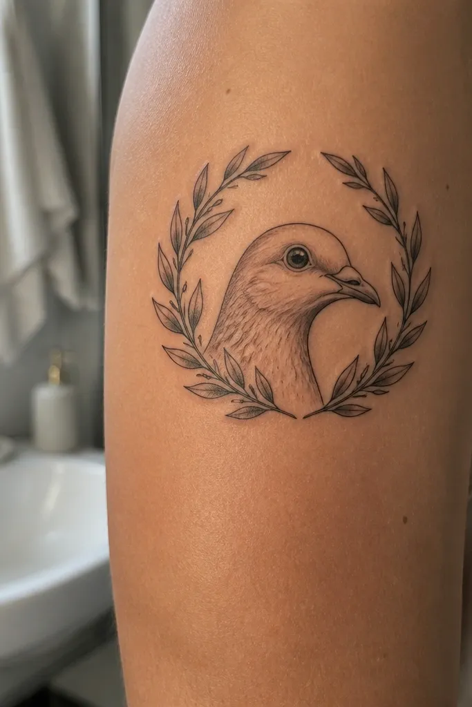
This one looks beautiful because it mixes portrait focus with symbol clarity. A dove head in profile instantly reads, and the olive branch halo creates a halo-like circle that photographs well because it frames the face of the bird. The leaf veins are subtle, so you get detail without turning the whole thing into a busy texture. It suits the upper arm and shoulder blade area where you can see it from multiple angles. If you want symbolic strength that feels spiritual and personal, this is the version that lands that vibe without going overly religious.
Start by placing it where the skin is less bony than the ribs, like the outer upper arm or shoulder. Then pick a size around 3.5 to 5 inches for the head, with the branch halo expanding another inch or so. Ask your artist for smooth gray transitions on the dove head and light, controlled shading under the leaves, keeping the outlines crisp. Finally, plan for longer session time because realistic shading takes passes; don’t rush it. Aftercare is extra important for realistic gray work, so follow your artist’s lotion schedule and protect from sun during healing. If you want it to age cleaner, keep the background unfilled and let the dove head and leaves carry the contrast.
Editor's noteAsk for a test photo of the stencil under the same lighting you’ll use for photos — side lighting changes how gray washes look.
One warningDon’t request a full black background — it turns muddy as it fades.
6. Watercolor Wash Dove With Olive Branch Edges
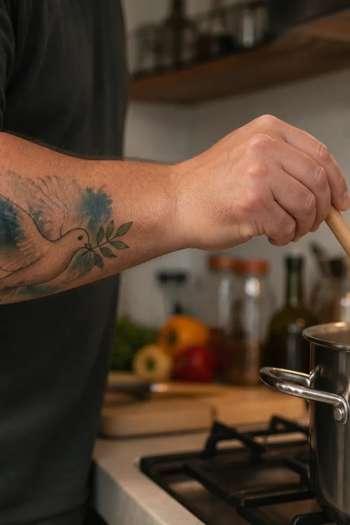
Watercolor-style tattoos look beautiful when the symbol stays readable. Here, the dove has a clean enough outline to keep the peace symbol recognizable, while the watercolor wash adds softness around the wings. The olive branch keeps stronger definition, so the meaning doesn’t get lost in the art effect. I like this on the upper chest because the colors sit close to your skin tone and look gentle in daylight. It fits people who want symbolic strength to feel tender and artistic, not heavy or traditional.
Start by choosing a placement with good healing conditions, like upper chest or shoulder, and size around 4 to 6 inches wide. Then ask for the watercolor to stay mostly around the dove outer edges, not inside the leaf clusters, so the leaves don’t blur. Finally, keep the olive green muted — a sage or olive wash looks more natural than bright green. Expect a slightly longer healing time because color fields can dry differently; use fragrance-free lotion and avoid soaking. If you’re worried about fading, ask the artist to anchor the dove with crisp black linework or a darker gray contour line.
Editor's noteRequest a color test on the stencil notes — artists can adjust sage intensity so it doesn’t look too neon on your skin.
One warningSkip heavy watercolor splatter over the leaves — that’s where it smears.
7. Blackwork Dove With Olive Branch in Negative Space
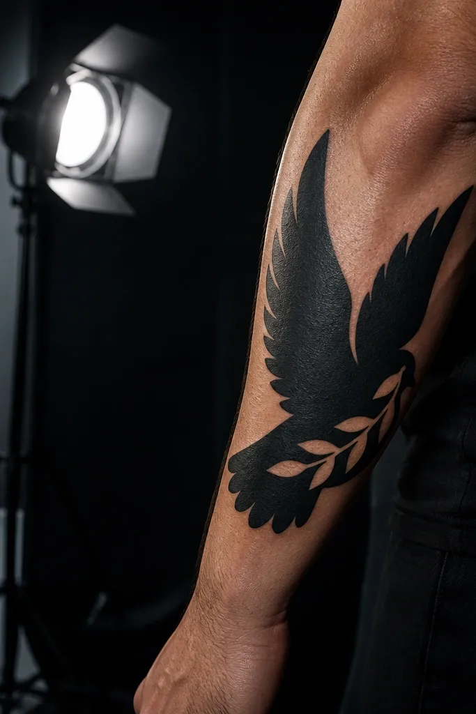
This looks beautiful because it’s graphic and high-contrast. Negative space gives the olive branch a crisp, airy feel even when the rest of the tattoo is bold blackwork. The dove is still recognizable because the silhouette of wings and tail is clear, not because of tiny feather lines. I love this for people who want symbolic strength to feel strong and modern — it reads like a design, not a delicate sketch. On the bicep, the curvature makes the blackwork move with your arm, and photos look punchy without needing color.
Start by placing it on a flatter, less wrinkly area like outer bicep or side of the calf, around 4.5 to 7 inches. Then ask for solid black shapes that define the dove body and wings, with the olive branch using negative space cutouts for leaves and stem. Finally, keep the branch leaves fewer and larger so they stay legible as the tattoo settles. Blackwork can feel sharper during healing, so keep aftercare consistent and don’t pick scabs. If you want it to age evenly, ask the artist to avoid ultra-dense black in tiny areas and spread fills more broadly.
Editor's noteBring a reference where the olive branch is “leaf-forward” — that helps the design keep meaning even if contrast softens a bit.
One warningDon’t over-detail the feathers — blackwork needs bold shapes.
8. Geometric Dove With Olive Branch Triangle Frame
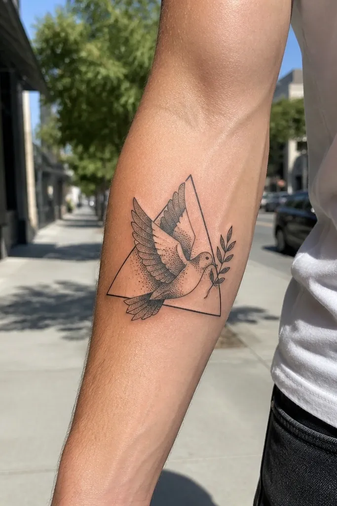
Geometric styles look gorgeous when they keep the symbol readable. The triangular frame gives the dove and olive branch structure, and the leaf alignment makes the branch feel intentional instead of decorative. Dotwork shading adds texture without stealing clarity from the outline. On the forearm, the lines catch light and look sharp in photos, especially with a slight bend in the arm. This is a great pick when you want symbolic strength to feel disciplined and grounded.
Start by choosing a size around 3.5 to 6 inches depending on how much of the triangle you want visible. Then ask for the dove outline to be clean and not too thin, with dotwork kept to the wing and triangle background rather than the leaves. Finally, place the olive branch so its stem follows the triangle’s base curve, and keep leaf pairs consistent in size. During healing, dotwork can look darker for a while, then soften — that’s normal. Protect from sun closely because dotwork fades faster than bold lines. If you want extra longevity, ask for slightly thicker outer lines on the triangle edges.
Editor's noteMake sure your stencil shows the triangle edges aligning with your arm’s direction — it looks off when the angles fight your anatomy.
One warningSkip tiny dot-heavy leaves — they merge into the frame.
9. Dove and Olive Branch With Sparkles and Stars
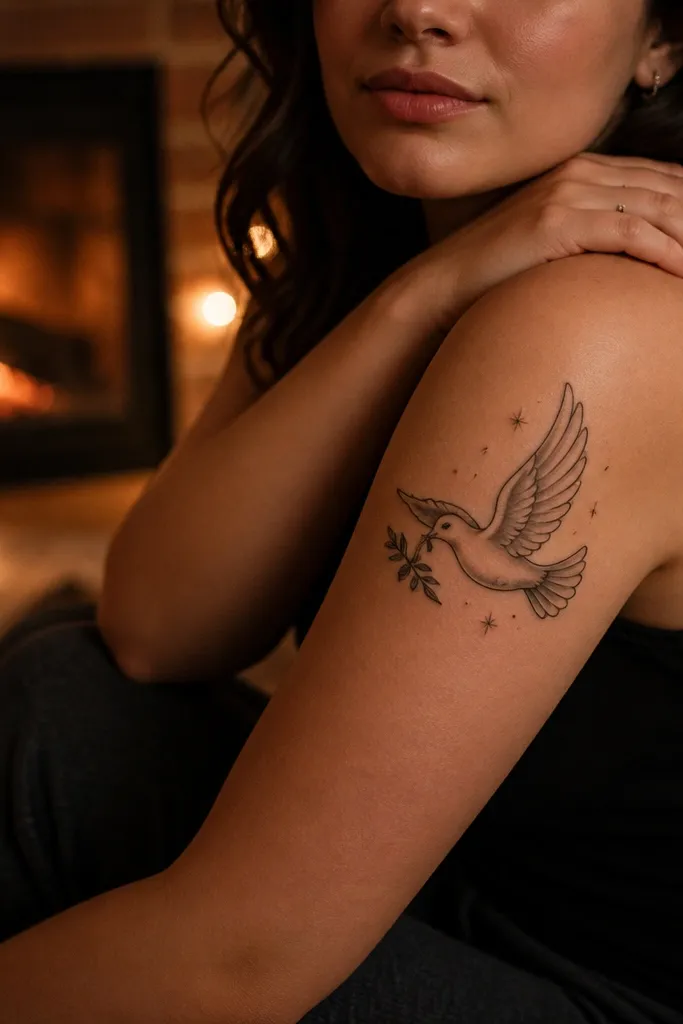
This design is beautiful because the sparkles add emotion without drowning the symbol. The dove stays the main subject, while the stars create a celebratory, hopeful feel around it. I’ve found that adding only a few stars — not a full sky — keeps symbolic strength clear and keeps the tattoo from looking random. The olive branch grounds the top flourish, so the whole thing looks balanced. It suits shoulder and upper arm placements where you can photograph it from different angles as you move.
Start by keeping the sparkle count low, around 6 to 12 stars total, and size around 4 to 6 inches. Then ask for sparkles to be placed near wing tips and above the branch ends, so they frame the dove rather than scatter across it. Finally, keep the olive leaves outlined and slightly larger than the stars, so the branch doesn’t vanish into the glow. If your artist uses color accents, keep them minimal and muted so they don’t age into muddy greens. Aftercare is standard, but be extra gentle with the small star points — they can get irritated if you rub during washing.
Editor's noteAsk for stars to be drawn with clean lines instead of filled dots; outlines hold up better.
One warningDon’t add a dense constellation pattern — it turns into a gray haze.
10. Dove Wings Spanning Olive Branch on Ribcage
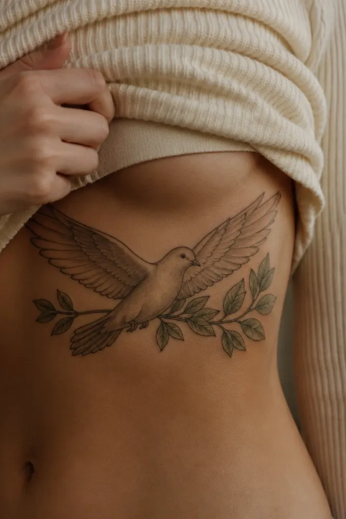
This looks beautiful because it turns the symbol into a statement. The wings spanning across the ribcage create a strong arc, and the olive branch acts like a base line that anchors the composition. The layered leaves give depth, so the branch looks dimensional in photos. I like this placement because your body movement makes the wings “move” visually, and the tattoo stays impressive without needing color. If you want symbolic strength that feels bold and personal, this is the version that delivers it.
Start by planning size carefully: on ribs, aim for about 6 to 10 inches wide so the leaves and feather lines stay readable. Then ask the artist to map the wing arc first, with the olive branch slightly lower than the center so it doesn’t look cramped. Finally, use light gray shading for the wing folds and keep feather line count moderate. Expect healing to be a bit more uncomfortable because ribs move; wear loose clothing and apply a thin layer of ointment or lotion as directed. For longevity, insist the leaves have outlines and visible spacing — layered leaves should still be separable, not stacked into a single blob.
Editor's noteDo a photo check in a mirror with your arms slightly raised; ribs change how the arc reads.
One warningSkip ultra-fine feather lines on ribs — they fade into the shading.
11. Dove With Olive Branch Through a Circular Frame
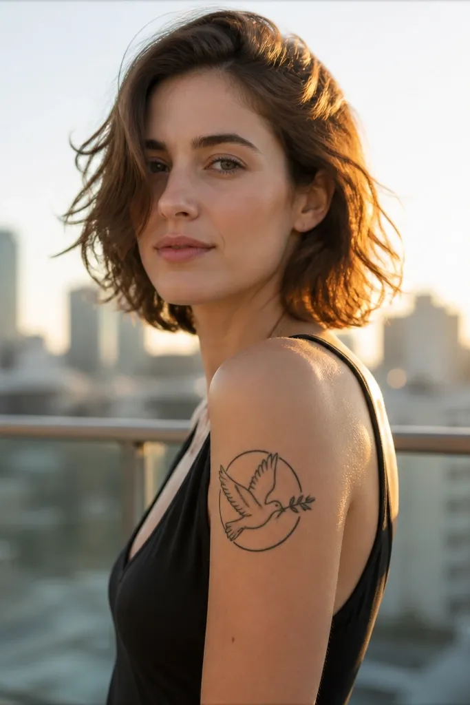
This is beautiful because the circle makes the symbol feel complete. The dove flying forward keeps the tattoo dynamic, and the olive branch passing through the circle adds depth without needing heavy color. The circular frame also helps the tattoo look intentional in photos — even partially visible, it still reads as a design. I like this for people who want symbolic strength that looks like a personal emblem. On the forearm, the circle sits well with your wrist-to-elbow line and shows well when you flex.
Start by placing it on the outer forearm and choose a size around 3.5 to 5 inches in diameter. Then ask for a consistent lineweight on the circle — this is what keeps the emblem sharp. Finally, keep the dove feathers simplified: a few strong wing curves plus a tail line, and use minimal gray only at the wing underside. Aftercare is standard, but protect the circle outline from friction since outlines can soften if rubbed early. If you want it to age cleanly, avoid tiny leaf tips and make leaf shapes about the thickness of a pencil eraser.
Editor's noteAsk for the olive branch to have one clear stem line so it doesn’t look like floating leaves.
One warningDon’t cram leaves into the circle edge — that’s where they blur.
12. Olive Branch Wrap Around Wrist With Micro Dove
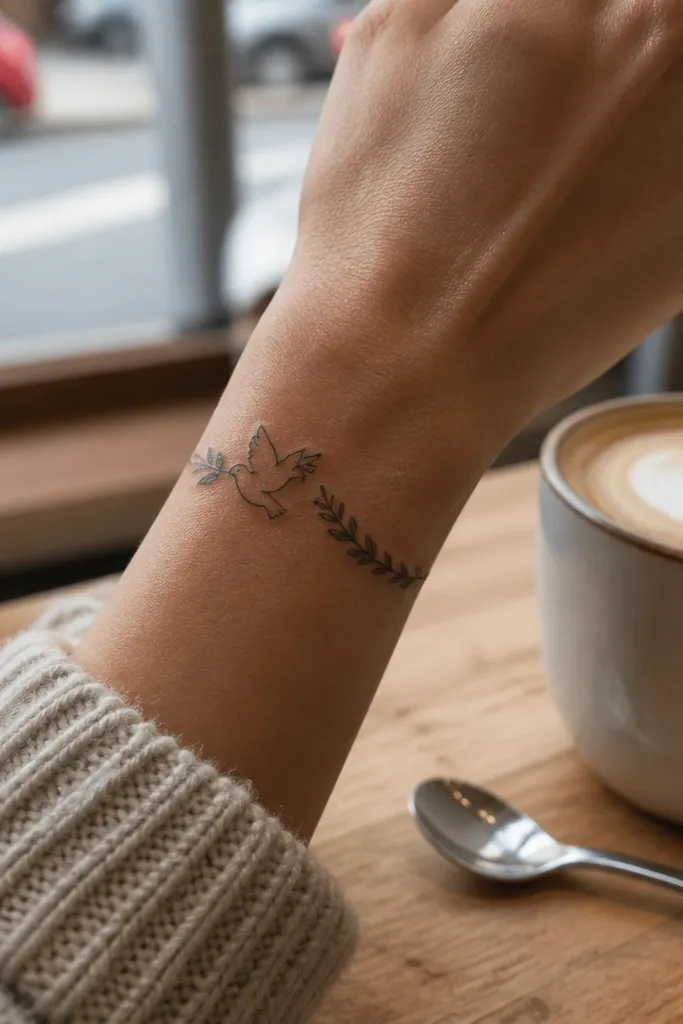
This one looks beautiful because it turns the wrist into a small emblem you can see every day. The branch wrap creates a gentle curve around your wrist bone, and the micro dove stays readable because the design is simplified. I like this style for people who want symbolic strength without a large commitment. It also photographs well because there’s always a “frame” effect from your hand and wrist positioning. The key is restraint: the dove and leaves need to stay bold enough to survive the tiny scale.
Start by choosing a placement that avoids the most bony area — slightly toward the inner wrist skin is better than directly over the bump. Then keep the size around 2.5 to 3.5 inches of wrap length, with the dove about 1 inch tall. Ask for medium linework and leaf shapes that are teardrops with a visible gap between each leaf. Finally, keep shading minimal or none; tiny shading fades faster than lines. During healing, keep it clean and moisturized, and avoid tight sleeves that rub the wrap edges. If your artist offers, ask for a slightly thicker outline on the micro dove head so it doesn’t disappear first.
Editor's noteTake a side photo of your wrist before the appointment; the artist can match the curve to your anatomy.
One warningSkip micro-realism. Small feather textures don’t hold up.
13. Dove Feather Detail With Olive Branch Stem Scroll
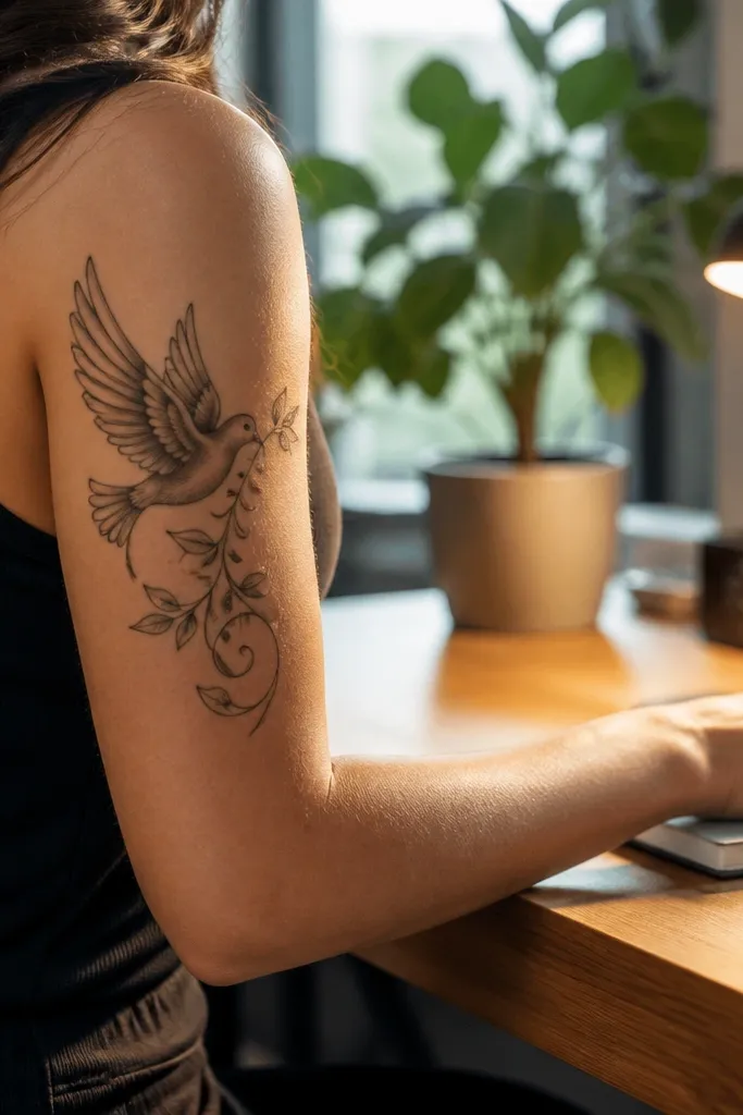
This looks beautiful because the branch stem gives it movement. Instead of a simple curve, the stem scroll creates a flowing path that leads your eye from dove to leaves. The dove profile is clean and easy to read, and the feather detail is limited to a few shaded grooves that catch the light. On the upper arm back, the scroll shape looks elegant as your arm moves, and photos capture that motion. If you want symbolic strength with a bit of old-world grace, this is a strong option.
Start by placing it on the back of the upper arm or outer shoulder where the skin can stretch without breaking the linework. Then set a size around 5 to 8 inches long so the stem scroll has room to breathe. Ask for leaf pairs that increase and decrease in size gradually, not all the same size, and keep the number of leaves around 10 to 14 total. Finally, use gray shading only on the dove’s neck and a few wing feather lines, leaving the rest line-only. Healing is normal, but keep an eye on the scroll line — long curves can get dry and crack if you neglect moisturization.
Ask for the stem thickness to match the dove outline thickness so the composition feels unified.
Don’t add too many tiny leaf tips along the scroll — it clutters fast.
14. Dove Landing on Olive Branch With Water Droplet Accents
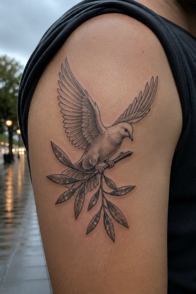
This is beautiful because the droplets add a fresh, clean feeling to the symbol. The dove landing pose already reads gentle, and the droplets make the olive branch look like it’s just been touched by rain. It keeps symbolic strength from feeling static — the eye has small highlights to follow. I like this placement on the inner forearm because droplets and branch leaves show well in motion and in close-up photos. It suits people who want peace to feel like relief, not solemnity.
Start by choosing a size around 4 to 6 inches for the main dove and branch, with droplets adding a small extra height. Then ask for 3 to 6 droplets total so they feel intentional, not like random decoration. Finally, request droplets with a clear outline and a small highlight area — your artist can leave a tiny skin-toned gap inside the droplet for shine. Aftercare matters for droplets because the small details can look uneven if you pick at scabs; let them peel naturally. If you’re prone to keloids or thick scarring, keep the droplets line-based rather than shaded heavily.
Editor's noteIf you want it to photograph well, ask for the droplets to be placed near leaf tips, not floating far away.
One warningSkip lots of droplets — too many makes it look like a themed sticker.
15. Dove and Olive Branch With Minimal Shading and Bold Outline
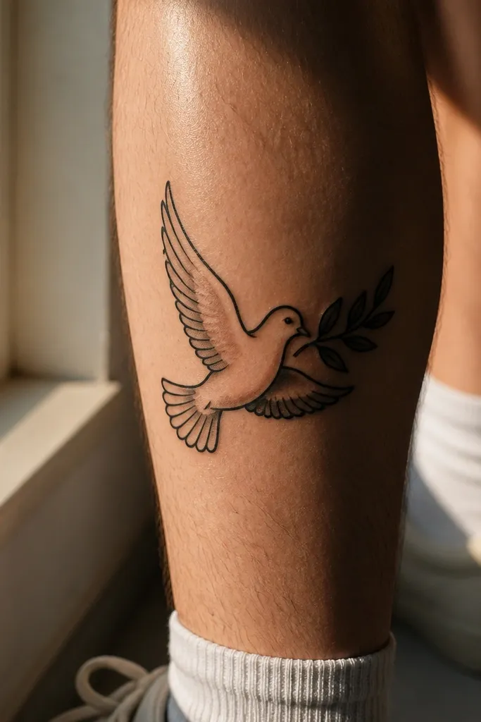
This looks beautiful because it’s built for aging. The thick outline keeps the dove and branch readable as the years pass, and the minimal shading adds depth without relying on delicate gradients. The dove holding the branch makes the composition feel intimate, like you’re seeing a quiet moment up close. On the calf, the larger canvas lets the leaves stay crisp and spaced, so the olive branch doesn’t smear. I recommend this when someone wants symbolic strength that still looks sharp years later.
Start by choosing calf placement and a size around 5 to 7 inches, so leaf shapes stay bigger than freckle-sized. Then ask for a bold outline lineweight that matches the branch stem thickness. Finally, keep shading limited to a couple of wing folds and a slight under-shadow under the olive leaves. Healing should be comfortable, but calves can rub on shoes and clothing, so protect with breathable covering if needed. If you want to make it even sturdier, ask for fewer feather lines and slightly larger leaf outlines.
Editor's noteAsk your artist to show you a healed example of a similar bold-outline dove before you commit.
One warningDon’t request heavy full-black fill under the wings — it can look flat after healing.



