
1. Classic Sacred Heart with Lifelike Flame Glow
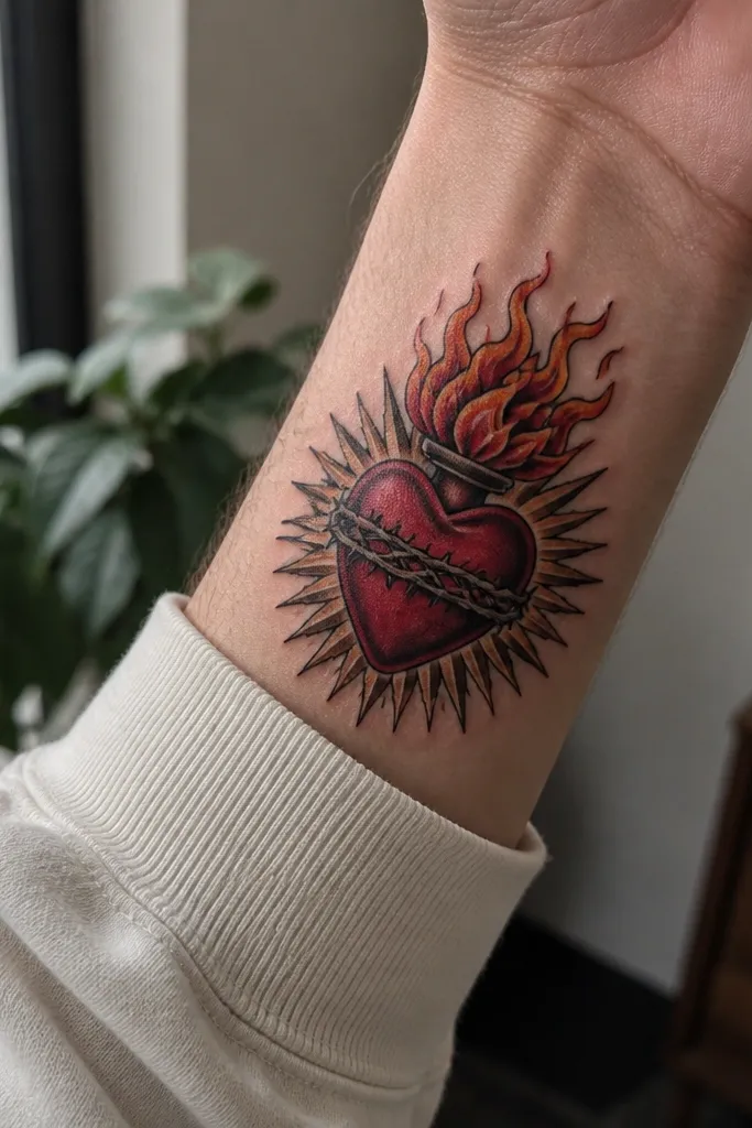
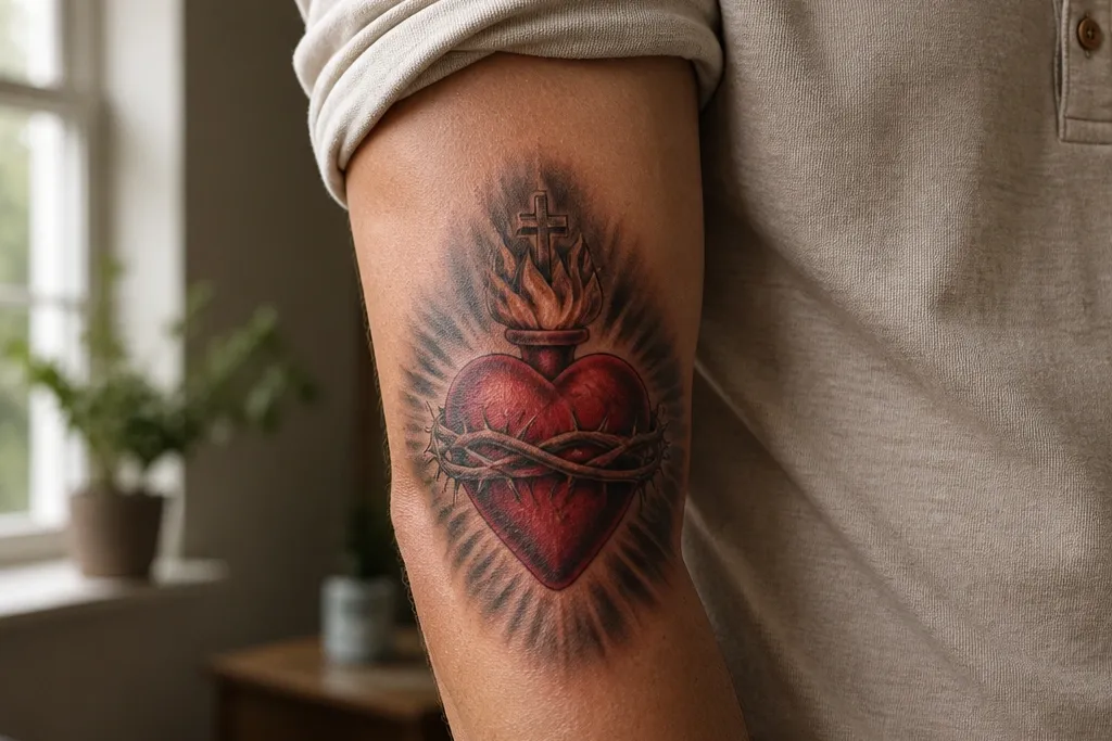
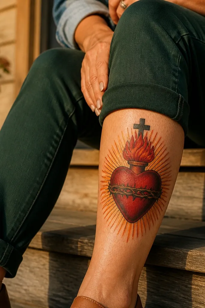
This is the “reads as real” version of the Sacred Heart. The heart has layered reds — dark cherry in the deepest curves, warmer mid red in the center, and pale highlight where the skin would catch light. The flames aren’t just outlines; they fade from bright orange to smoky ember tones so they look like heat, not decoration. The rays stay controlled, with fewer, thicker streaks so the tattoo stays legible as a whole. It suits upper arm, forearm, and chest where you can show the heart as the clear focal point.
Start by placing the heart slightly above the center of the design so the rays can fan out without swallowing the details. Then ask the artist to shade the heart with at least three red values and add a thin, bright highlight edge along the heart’s top curve. Finally, keep the ray lines medium-thick and spaced — no micro-sparkle dots — and let the glow sit behind the heart rather than inside every flame. Expect moderate pain because the heart’s shading is dense, and plan for careful aftercare to keep the reds from looking dull.
Bring one reference that shows flames with visible fade from orange to ember; it helps the artist match the heat effect.
Avoid heavy black fill around the heart — it flattens the realism and makes the reds look muddy.
2. Sacred Heart Cross Wrapped in Soft Smoke Shading
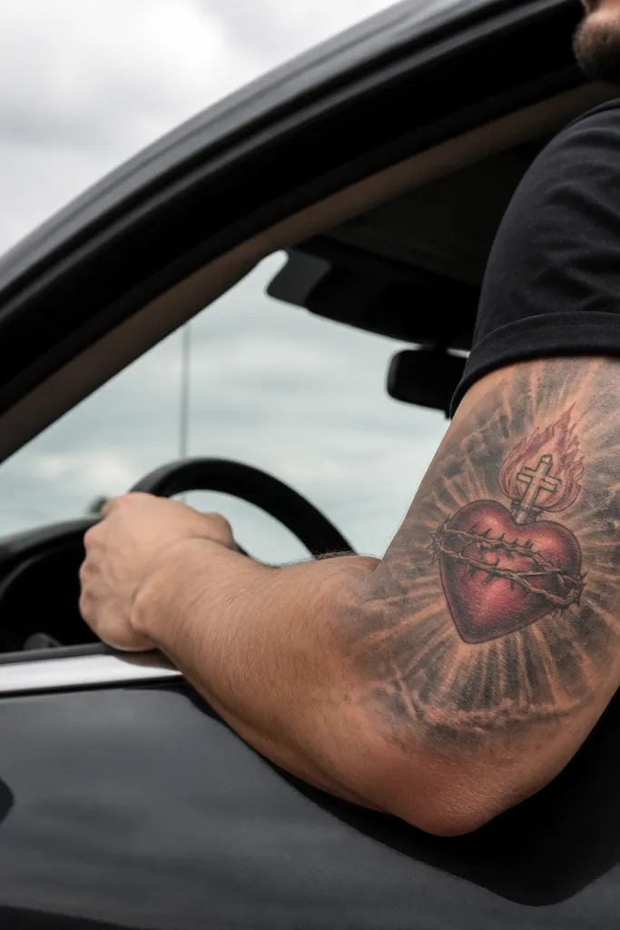
If you like realism that feels cinematic, this layout uses smoke-like gray transitions around the cross and rays. The cross looks dimensional because the artist uses darker gray under the edges and a lighter, almost warm gray highlight on the front face. The Sacred Heart sits crisp and red, while the background fades outward like breath in cool air. This makes the tattoo look deeper without adding a busy scene. It’s a strong choice for ribs, upper chest, and shoulder blades where curved fading looks natural.
Start with the cross slightly angled so the realism reads from the body’s natural curve. Then have the artist build a gradient halo behind the heart using gray wash — darker at the cross edges, lighter as it moves outward. Finally, keep the rays reduced to short, clean streaks so the smoke does the heavy lifting for depth. Plan for touch-ups on the cross edges because thin highlight lines can soften if the design is too aggressive with contrast.
Editor's noteAsk for the smoke fade to stop before it reaches the heart outline — that separation keeps the focal point sharp.
One warningSkip full black background — it turns a smoke idea into a flat dark block.
3. Watercolor Realism Sacred Heart with Controlled Bleed
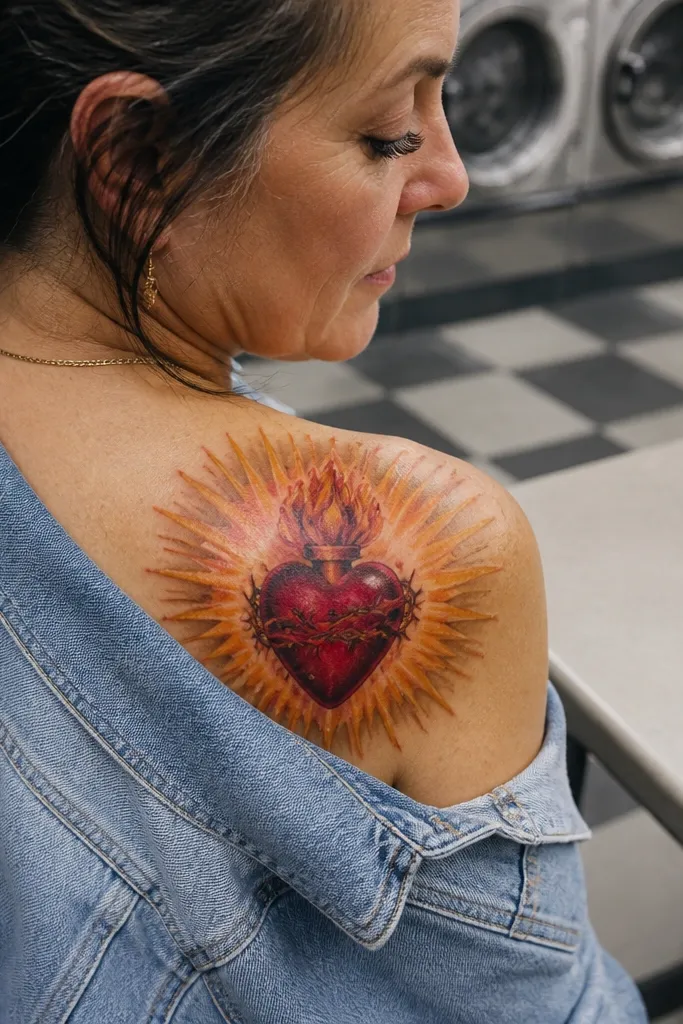
This one blends realism with painterly softness, but it stays readable because the heart itself is rendered with classic value shading. The rays look like gold watercolor wash, with edges that feather out instead of hard lines. The flames keep a realistic shape — you still see the fold-like structure inside the flame — but the surrounding glow has a gentle, pigment-spread look. It’s photogenic on forearm and upper arm because the wash creates movement while the heart holds the definition. Great if you want a Sacred Heart that looks spiritual, not stiff.
Start by deciding how far the watercolor bleed should travel — a good rule is it should end before it reaches the skin’s natural creases in the area. Then ask for the heart to be fully realistic first, with sharp highlights on the top curve and deeper shadows under folds. Finally, keep the gold wash in the background and avoid putting tiny ray points into the watercolor area. Aftercare matters even more here; don’t let the tattoo dry out too fast or the wash can look patchy.
Choose a placement where the wash has space to fade, like upper arm or outer forearm, not tight inner elbow.
Avoid overusing bright yellow in the wash — it can look chalky and kill the realism.
4. Engraved Realism Sacred Heart with Etched Cross Detail
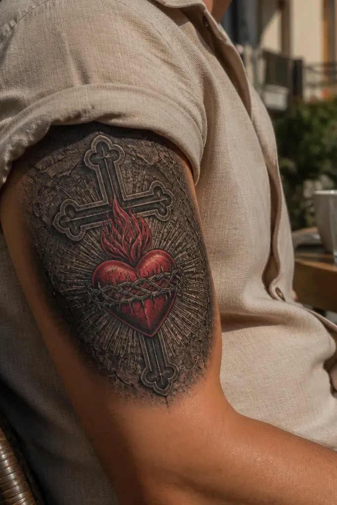
This design looks like it was carved into metal, but the heart stays lifelike. The cross has etched linework that reads as grooves, and the heart has realistic color depth so it pops off the engraved background. The realism comes from combining crisp, controlled blacks with careful red gradients — not from thick outline. It’s visually striking in photos because the engraved lines catch light differently than soft shading. It fits forearm, calf, and upper arm, especially if you like tattoos that look detailed even when they’re not huge.
Start with a stencil that gives the cross enough surface area for etched line spacing. Then ask for the engraved lines to stay consistent in thickness and direction so the cross looks like it has direction and grain. Finally, keep the heart’s highlight edge thin and bright so it doesn’t bleed into black lines. Pain is usually manageable because the linework is precise, but expect more sensitivity where the cross engraving is dense.
Editor's noteRequest a test patch of shading on the heart highlight so you can see if it stays clean at your artist’s needle depth.
One warningAvoid mixing heavy black blobs with fine engraving — it breaks the illusion of etched metal.
5. Half-Real Sacred Heart with Dramatic Side Lighting
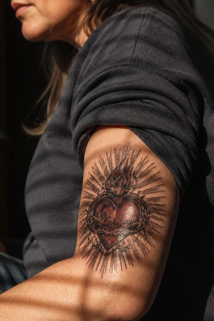
This one uses a single light source, usually from one side, and it makes the heart look almost sculpted. The shaded half goes deep — near-burgundy in the darkest parts — while the lit half has glossy highlights on the heart’s curves. The rays follow the lighting too, with brighter streaks on the lit side and muted streaks on the dark side. It’s the kind of realistic Sacred Heart Tattoo that looks expensive in photos because your brain reads it as 3D. Best for upper arm, shoulder, and chest where the tattoo can sit flat enough for the lighting effect.
Start by marking where the light source should be on your body — pick the side that gets sun most often on your life. Then ask the artist to shade the heart with a hard-to-soft transition at the edge of the light and shadow. Finally, keep the rays fewer and longer so they don’t turn into a textured blur. Aftercare is normal, but do not pick at the highlight areas as they heal — those thin bright lines are easy to scab and dull.
Bring a reference photo of side-lit skin or candlelight; it helps the artist match the contrast you want.
Skip full, even shading across the entire heart — it kills the 3D effect.
6. Sacred Heart Halo Ring with Soft Gold Realism
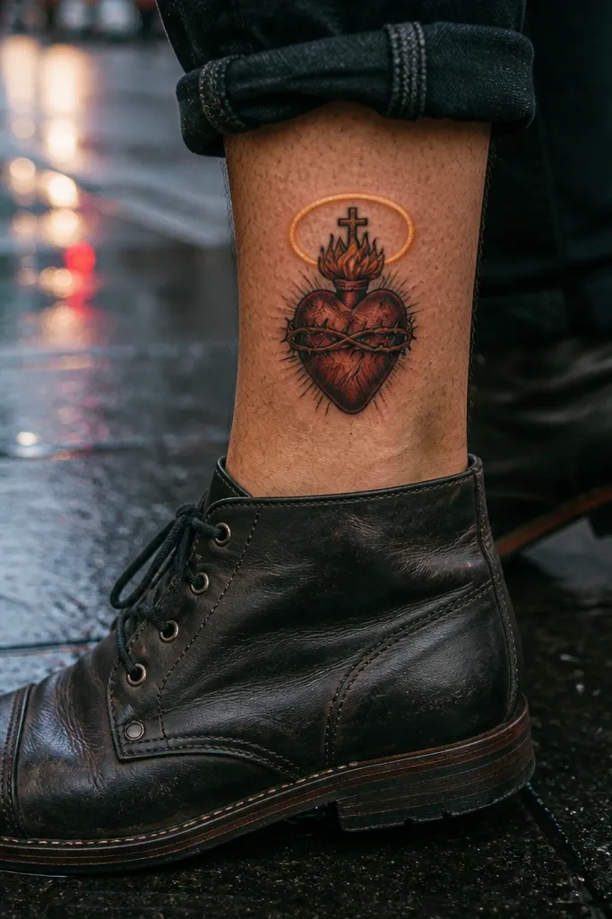
This layout focuses on the halo as the realism engine. The halo ring has a gradient gold — brighter at the top edge and darker underneath — so it looks like it’s emitting light. The heart is rendered with natural red tones and subtle gray-brown undertones so it doesn’t look like flat Valentine red. Rays are minimal, just a few short streaks that frame the halo. It looks stunning on upper chest, collarbone-adjacent placements, and back of shoulder where the ring can feel centered and symmetrical.
Start by choosing a placement with enough width for the halo ring to stay circular. Then ask for a gold gradient that turns darker at the bottom edge of the ring to simulate light direction. Finally, keep the flame detail crisp but smaller than the halo so the ring remains the main photo magnet. Plan for a follow-up touch-up if you want the halo glow to stay strong after healing, since gold tones can fade faster than reds.
Editor's noteIf you want extra glow, ask for a faint outer aura in light gray, not more yellow pigment.
One warningAvoid tiny halo sparkles all around — they age into a speckled gray haze.
7. Sacred Heart with Realistic Velvet Drapes Behind It
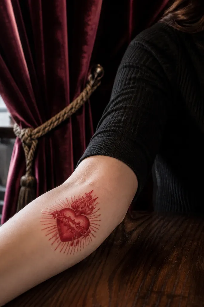
This design makes the Sacred Heart feel like it’s set on a throne of fabric. The drapes are shaded like velvet — deep maroon folds, soft transitions, and a slight sheen on the raised ridges. The heart sits in front with cleaner, brighter red highlights so it stays the focal point. The rays can be subtle, tucked behind the drapes so the overall look feels grounded instead of floating. It’s a great pick for thigh, upper arm, and upper chest where fabric folds can be stretched without distortion.
Start by sketching drape direction based on your body movement — vertical folds for straight surfaces, curved folds for ribs. Then ask for the drapes to use smooth midtone blending with darker under-shadows in fold creases. Finally, place the heart slightly forward with crisp edges and a brighter highlight line so it reads as separate from the drapes. Expect more time in the chair because fabric realism takes blending and careful transitions.
Editor's noteAsk for a limited palette: maroon, burgundy, and one warm highlight color. It keeps the drapes from looking muddy.
One warningDon’t let the drapes get too bright — if the fabric competes with the heart, the realism breaks.
8. Sacred Heart with Candle Flame Support Lighting
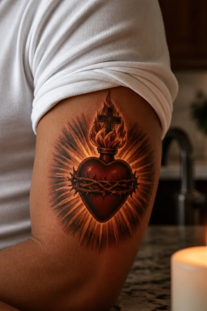
This one looks like the heart is lit from below, like candlelight reflecting on skin. The flames are shaped with realistic taper and internal gradients, and the surrounding rays have a warm amber glow rather than pure yellow. The heart’s highlight edge has a slightly orange tint, which makes the whole piece feel cohesive. It’s visually warm and reads beautifully in low light photos, which is exactly what makes it stand out online. Best for forearm, upper arm, and calf where the bottom glow can spread naturally.
Start by placing the heart so the “light” comes from the direction you want — usually the lower half of the design. Then ask the artist to tint the heart’s highlight with warm amber, not just pale white. Finally, keep rays as a controlled fan with thicker lines near the glow and thinner lines farther out. Aftercare is standard, but keep the tattoo moisturized consistently so the warm tones heal evenly.
Editor's noteRequest a small amount of gray in the flame tips so they look like smoke at the edges.
One warningAvoid using bright yellow for the glow everywhere — it looks flat and turns the realism into a color mask.
9. Sacred Heart with Tears Dropping from the Heart

Tears make the design feel emotional and give you extra realism targets: glossy highlights and natural drip shadows. The tears should look wet, meaning they have a bright highlight stripe and a darker underside where the drip hangs. The heart still has layered reds and shadows under the heart’s folds, but the tears add a lifelike effect that’s easy to photograph. Rays can be modest so they don’t compete with the glossy tears. This works well on forearm, inner bicep, and upper ribs where the tear direction can flow downward.
Start by deciding how many tears you want — two or three looks cleaner than a whole stream. Then ask for each tear to have one main highlight and one shadow edge, with a slight blur where it touches the skin to avoid harsh edges. Finally, keep the tears slightly brighter than the rays so they’re the second focal point after the heart. Expect extra sensitivity at the drip tips where the artist places fine highlights and thin gradients.
Editor's noteChoose a placement that lets the tears hang naturally; don’t force them into a tight curved area where drips kink.
One warningSkip matte tears with no shine — dry-looking tears kill the realism.
10. Sacred Heart with Crown and Micro-Highlights
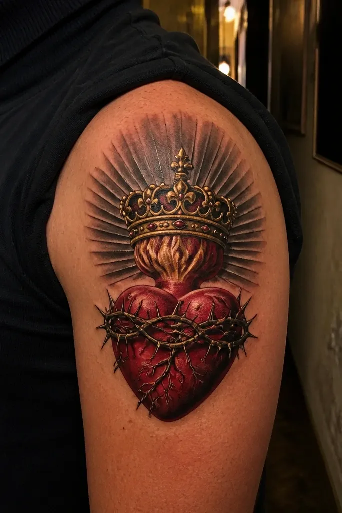
This design adds a crown above the heart, and the realism comes from micro-highlights on the crown edges. The crown should have metal-like shading — dark undercuts and warm highlights that feel like gold reflecting light. The heart stays red and dimensional so the crown doesn’t steal the show. The rays sit behind the crown and frame the heart, giving you a clean triangle composition that looks great in portrait photos. Best for upper arm and shoulder where the crown can sit high without compressing.
Start with the crown width — it should be narrower than the ray fan so the composition stays centered. Then ask the artist to limit micro-highlights to the highest points of the crown, not across the entire surface. Finally, keep the rays behind the crown and stop them before they touch the crown edges to maintain crisp separation. Plan for a touch-up if the micro-highlights fade; thin bright points are the first to soften.
If you want the crown to last, ask for slightly thicker highlight lines rather than hair-thin sparkles.
Avoid turning the crown into heavy black outlines — it makes metal look like stained glass.
11. Sacred Heart with Radiant Burst Behind the Cross
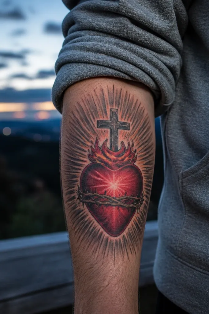
This is the boldest ray-forward option, but it stays realistic by using a burst shape with controlled line thickness. The rays start thicker near the heart and thin outward, which creates depth. The cross has shadowed edges so it doesn’t look pasted on. The heart’s reds are layered with a darker center and a brighter top highlight, so it looks like it’s glowing from within. It’s a strong choice for upper chest and shoulder where a centered burst reads clean and doesn’t distort.
Start by building a burst that fits the body curve — a slightly oval burst works better on shoulders than a perfect circle. Then ask for ray lines that vary in thickness and spacing, with a bright glow gradient behind the densest part of the burst. Finally, keep the cross and heart edges crisp and avoid adding extra ornaments around them. Pain is moderate because of the dense ray work, and aftercare is key to keep the rays from scabbing unevenly.
Editor's noteRequest fewer rays than you think you want; realism looks better with spacing than with maximum coverage.
One warningSkip ultra-thin ray points across a wide area — they blur into gray smudges.
12. Sacred Heart with Realistic Rose Thorns Frame
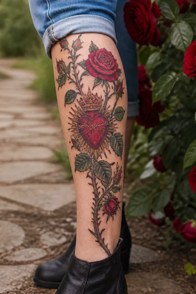
Thorns add texture and movement, and this version uses realism where it counts: the thorns cast subtle shadows and the heart stays clean. The surrounding rose stems are shaded with mid-green tones and darker undertones so the plant work doesn’t look like flat icon art. The heart is still the focal point — red values are deeper and highlights are brighter than anything in the frame. Rays can be minimal or hidden behind the plant stems, which keeps the whole tattoo feeling cohesive instead of busy. Great for forearm and calf where you can let stems wrap naturally.
Start by mapping thorn direction around the heart so the thorns point inward toward the focal area. Then ask for the green shading to use at least two green values and add darker shadow under each stem edge. Finally, keep ray work minimal so the heart remains highest contrast. Expect more time in the chair due to the plant realism, and plan for extra moisturization after healing to keep green tones from looking flat.
Editor's notePick a placement where stems can wrap without being stretched too tight over a joint.
One warningAvoid outlining every thorn with thick black — it makes the plant work look cut-out.
13. Sacred Heart with Broken Halo and Dimmer Rays
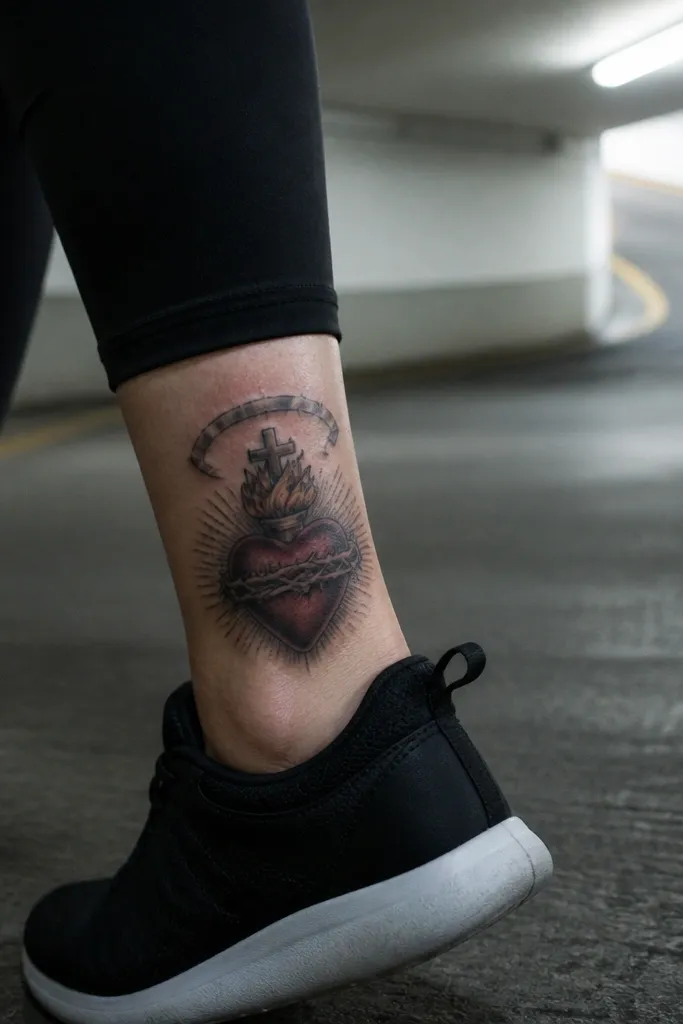
This design is more modern and a little darker, but it still reads realistic because the halo is shaded like metal light. The halo ring is broken or cracked, with shadowed gaps that show depth. Rays are dimmer and fewer, so the cracked halo becomes the second focal point after the heart. The heart uses deep reds and a controlled highlight edge so it doesn’t blend into the darker background. It looks great on outer ribs, upper arm, and back shoulder where you want something symbolic without a massive burst of brightness.
Start by sizing the halo so the breaks are clearly visible at normal viewing distance. Then ask the artist to shade the halo ring with a gradient — darker at the inner edge, brighter on the outer top edge. Finally, use fewer rays and let the halo cracks carry the drama. Aftercare is straightforward, but don’t rush healing — thin halo highlights can fade if you don’t protect the tattoo from sun.
Ask for the halo breaks to cast tiny shadows so the cracks look like depth, not just lines.
Skip a fully black background — it flattens the halo and makes the heart lose contrast.
14. Sacred Heart with Glowing Sacred Lettering Banner
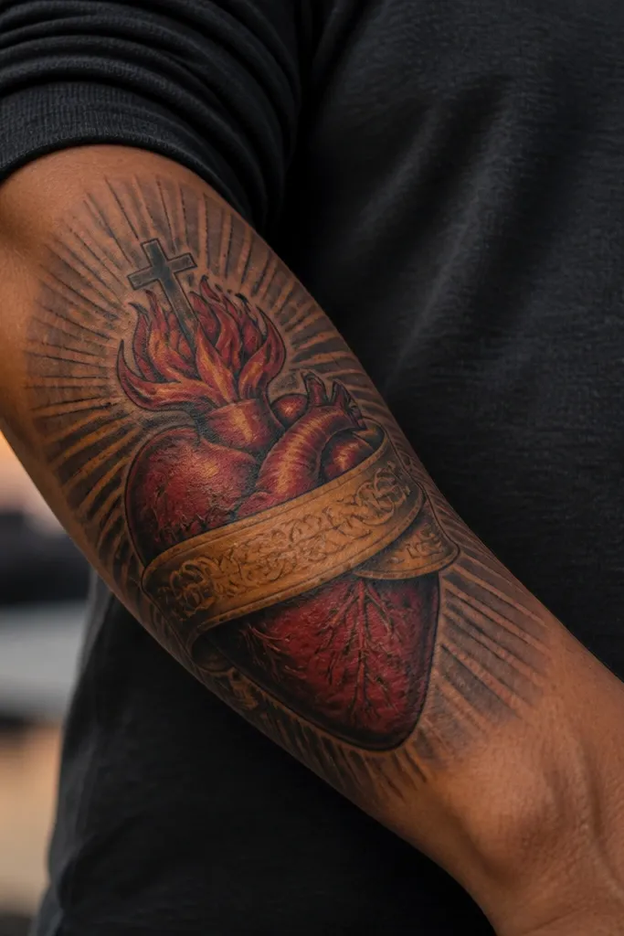
A banner gives you a clean horizontal anchor, and when it’s done with realism it looks like soft fabric illuminated by the heart’s glow. The banner should be shaded like cloth — darker folds, lighter highlights on ridges — not just a flat strip with text. The lettering can be subtle, either embossed-style or lightly glowing, so it doesn’t become the main thing that competes with the heart. This design is photogenic because it creates layers: banner in front, heart in the middle, rays behind. Best for upper arm, chest, and thigh where you have room for a horizontal element.
Start by deciding whether the banner sits slightly curved with your body or perfectly straight; curved looks more realistic on ribs and chest. Then ask the artist to shade the banner folds using two values and keep the highlight narrow so it doesn’t look like a sticker. Finally, keep the lettering crisp and limited — too much text turns into visual noise. Pain is usually moderate, and aftercare should focus on keeping the banner’s thin highlight lines from drying out.
Editor's noteRequest the banner glow to be light gray-to-warm amber, not bright yellow, for a more natural illumination.
One warningAvoid tiny, dense text — it heals into a gray smear and ruins the realism.
15. Sacred Heart with Realistic Embers Falling Down
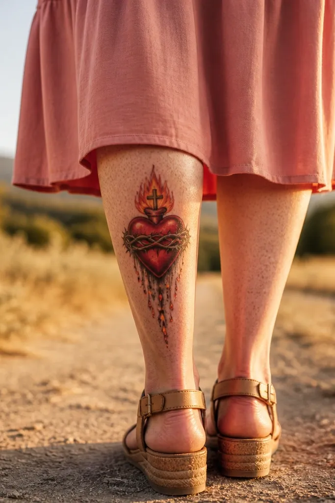
Embers add motion and a “live” look without needing a full background scene. The key is realism in the embers: bright orange cores with darker edges and a faint gray smoke trail. The heart stays sharply rendered with layered reds and a high-contrast highlight so the ember effect feels like it’s coming from the heart. This is a great design if you want something more dynamic than rays but still focused and clean. It looks best on forearm, calf, and outer thigh where you can let embers drift downward naturally.
Start by placing the heart higher in the composition so the embers have space to fall. Then ask the artist to limit ember count to what reads clearly — too many makes it look like a grainy filter. Finally, keep embers as small accents with a bright core and a soft fade outward. Aftercare is normal, but protect the tattoo from sun because the bright orange tones can fade faster than darker reds.
Editor's noteIf you want a cleaner look, ask for embers only on one side of the heart for a directional flow.
One warningAvoid using large, solid orange dots — they look like glitter and age badly.
16. Sacred Heart with Dark Rose Vines and Soft Red Highlights
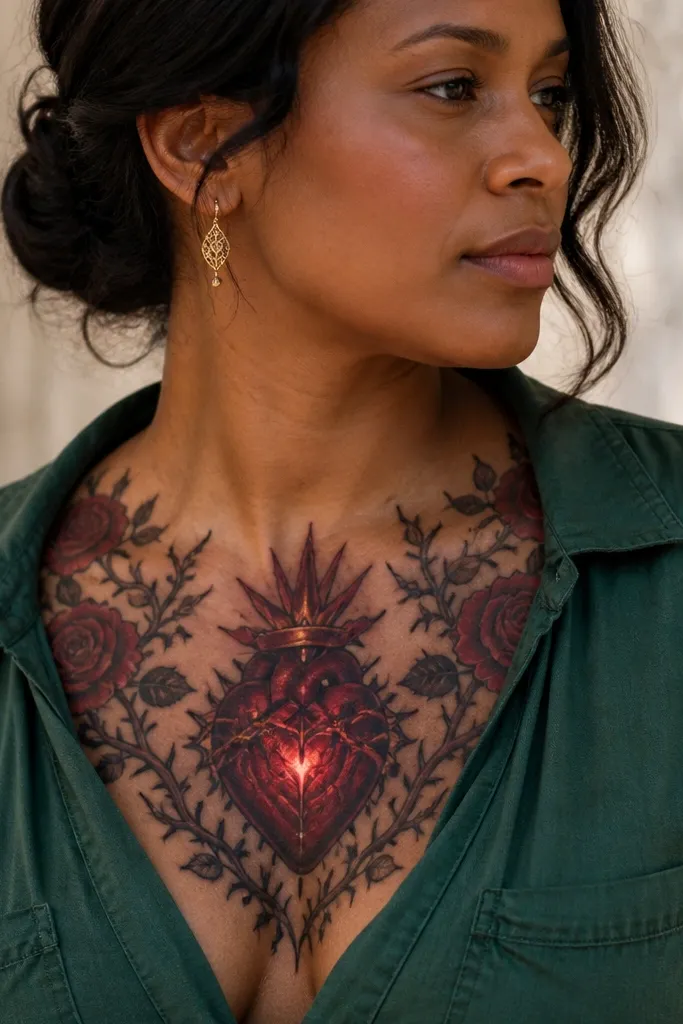
This design frames the Sacred Heart with dark rose vines instead of bright roses. The realism comes from deep maroon and near-black shadows in the vines, plus subtle red glow highlights that match the heart’s light. The heart remains the main focal point — crisp red values and a clean highlight edge — while the vines add a moody, photo-ready backdrop. Rays can be minimal or hidden behind vine leaves so the composition feels layered. It suits upper arm, shoulder, and thigh where the vines can wrap without stretching into a thin line.
Start by choosing vine thickness that matches your placement — thicker vines look better on upper arm and thigh, thinner vines on forearm. Then ask the artist to shade leaves with two green values and add red reflection highlights near the heart. Finally, keep the Sacred Heart’s outline crisp and don’t let vine shadows touch the heart edge. Expect longer healing time if the piece is dense with color, so keep aftercare consistent.
Editor's noteAsk for red reflection highlights on leaves only near the heart, not across the entire vine.
One warningAvoid bright lime greens — they clash with the Sacred Heart palette and make the realism feel off.
17. Sacred Heart with Realistic Ribbon and Soft Gold Accent
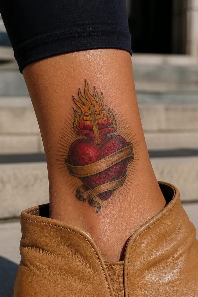
A ribbon adds motion that reads well in photos, and realism here comes from fold shading and controlled highlight placement. The ribbon should have soft gold accents that mirror the halo glow, plus darker shadow folds so it looks like fabric draped in front of the heart. The heart is shaded with deep reds and a warm highlight edge so it feels lit, not painted. Rays are kept minimal — just enough to show the Sacred Heart theme without clutter. Great for forearm and upper arm where the ribbon can arc and frame the heart.
Start by placing the ribbon so one fold crosses in front of the heart slightly, creating depth. Then ask for ribbon shading using smooth gradients in maroon or wine-red, with highlights on the top ridges only. Finally, keep gold accents sparse — a thin glow line or small points — so the tattoo stays elegant and realistic. Pain is moderate, and aftercare should include careful moisturizing around ribbon folds, since they can crack-looking if they dry.
Editor's notePick ribbon flow that matches your anatomy; a ribbon draped with your muscle line looks more real.
One warningSkip thick black outlines on the ribbon — it makes fabric look like a cartoon.
18. Sacred Heart with Realistic Porcelain Skin-Like Highlights
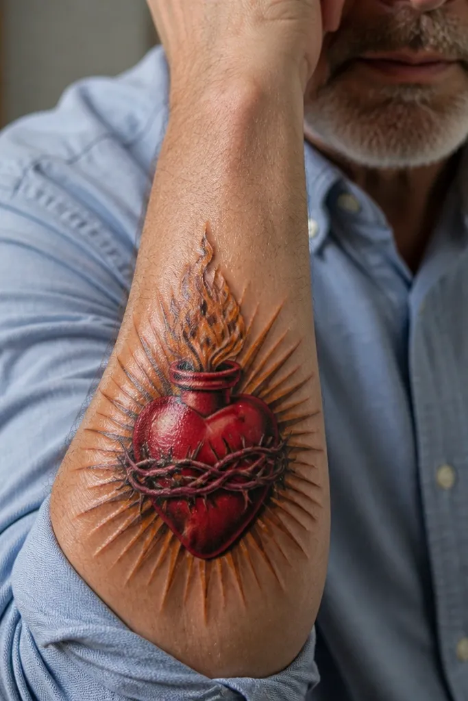
This version leans into smooth realism. Instead of harsh contrast, the heart has a porcelain-like smoothness: soft midtones, controlled gradients, and bright highlights that look like light on glossy skin or ceramic. The flames and rays are shaded to match that smooth style, so everything feels cohesive. This works best if you want a clean, high-end look that still reads as realistic from a distance. It’s especially flattering on upper ribs, upper arm, and calf where smooth blending shows well.
Start by asking for smooth gradient shading rather than scratchy stipple in the heart’s midtones. Then have the artist place highlights on the heart’s top curve and around the flame edges, keeping them thin and bright. Finally, use fewer ray streaks with softer edges so the eye stays on the heart. Expect moderate pain because smooth gradients require time and repeated passes.
Editor's noteAsk if the artist uses a limited needle approach for smooth blending; it helps the heart heal evenly.
One warningAvoid mixing super gritty stippling into smooth gradients — it creates a patchy texture difference.
19. Sacred Heart with Classic Rays and Subtle Background Star Dust
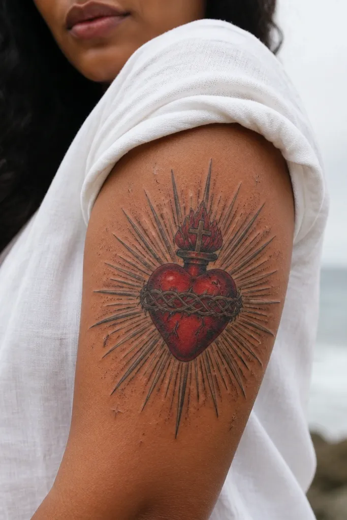
This design keeps the Sacred Heart traditional but upgrades realism with a subtle star dust background. The heart is the anchor, with red values and shadowed folds that read dimensional. The rays are classic — medium-thick streaks — but they have depth through a light-to-dark gradient, not flat line color. The star dust is faint gray and sparse, so it adds atmosphere without turning into a heavy black background. It’s photogenic because the heart and rays stay crisp while the background adds texture.
Start by mapping the rays so they radiate evenly around the heart without crowding. Then ask for a light gray star dust that fades outward and doesn’t touch the heart outline. Finally, keep the rays brighter near the center and darker at the outer edges to simulate depth. Aftercare is standard, but avoid sun exposure during healing so the faint gray dust doesn’t fade unevenly.
Editor's noteRequest star dust only in the outer third of the design to keep the focal area clean.
One warningDon’t add large black dots as “stars” — they age into heavy speckling.
20. Sacred Heart with Realistic Heart Veins and Soft Gloss
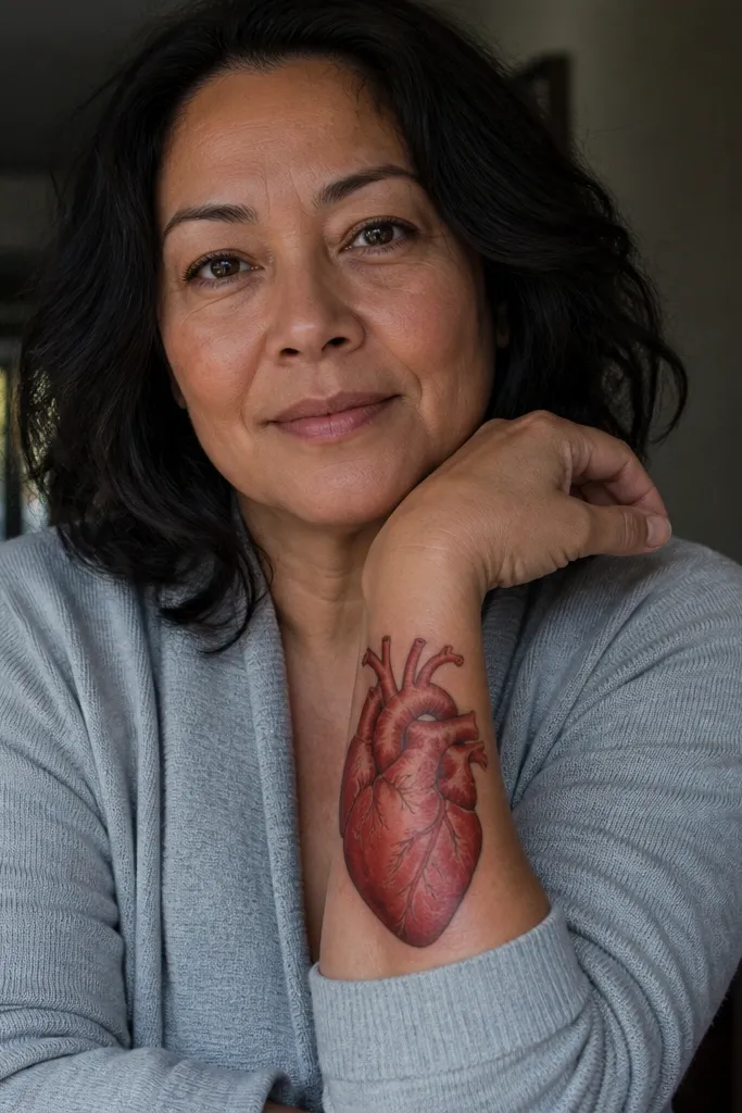
This is for people who want anatomy-level realism. The heart has subtle vein lines — not cartoon cracks — with darker red-brown shading that follows the natural curve of the heart. The gloss effect comes from a bright highlight stripe and a gentle shadow under each vein line, making it feel like the heart is wet and alive. Rays stay simple so they don’t distract from the internal realism. It looks incredible on forearm, upper arm, and chest because the heart’s internal detail is visible in close photos. If you want a Sacred Heart that doesn’t look generic, this is the one.
Start by keeping vein detail limited to the heart’s main planes; too many lines looks overworked and ages poorly. Then ask for veins to be shaded with darker red-brown, not pure black, so the realism stays organic. Finally, add a soft gloss highlight on the top third of the heart and let the rest fade naturally into midtones. Pain can be higher due to the detail, so plan for a longer session and strict aftercare.
Editor's noteBring a reference of a realistic anatomical heart drawing to show how veins taper and fade.
One warningSkip thick black vein outlines — they look like wiring and ruin the lifelike effect.
21. Sacred Heart with Realistic Marble Cross Texture
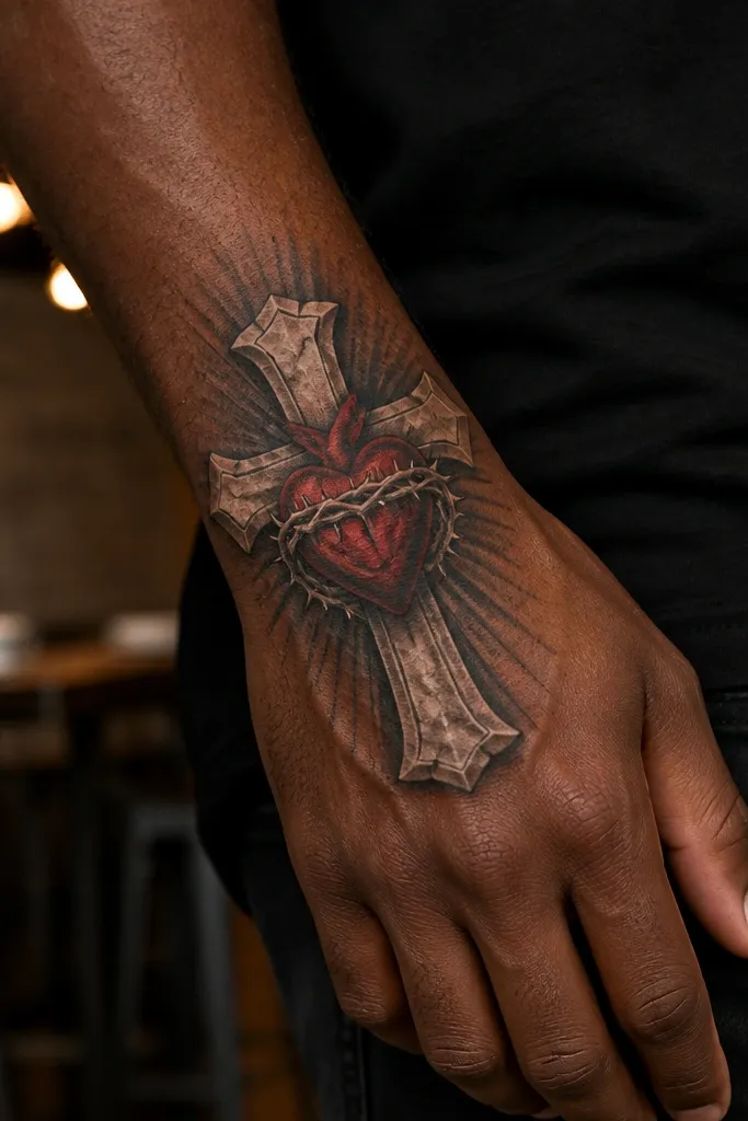
Marble texture makes the cross look expensive and dimensional, which instantly upgrades the realism. The cross has light gray and off-white veining, with darker gray undercuts to make it feel carved. The Sacred Heart stays true red with layered values so it doesn’t get washed out by the gray stone. Rays can be minimal because the marble texture already adds visual interest. This design looks sharp on upper chest, shoulder, and upper arm where the cross can be a focal slab.
Start by choosing a cross size that’s wide enough for veining to show; thin crosses don’t read marble. Then ask for marble veining to be irregular and directional, with darker shadow lines under the veining to simulate depth. Finally, keep the heart’s highlight edge bright and warm so it contrasts with the cool stone. Healing is usually fine, but marble textures need careful aftercare so the gray doesn’t fade into flat gray.
Ask the artist to keep marble veining off the heart edge so the heart remains the focal point.
Avoid uniform gray fill on the cross — it makes the stone look like plastic.
22. Sacred Heart with Realistic Rainbow Aura Glow
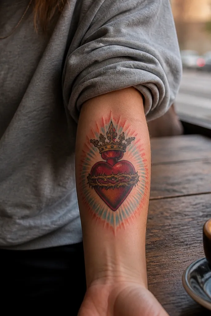
This is a stylized-realistic Sacred Heart Tattoo that still looks grounded because the heart is rendered with real red shading and realistic contrast. The aura glow behind it uses subtle, light gradients — soft pink, warm gold, and pale blue — layered like light scattering through haze. The flames can be kept classic orange-red, then the aura does the color play. It’s photogenic because the glow creates depth while the heart stays crisp. Best for chest, ribs, and upper arm where you can control how the glow spreads across skin.
Start by keeping the heart’s edges crisp and limiting the aura to a halo shape behind it. Then ask for the aura colors to fade smoothly — no sharp color bands — and keep the brightest part near the heart. Finally, keep rays minimal or absent so the aura doesn’t conflict with the Sacred Heart rays. Expect a longer healing period because multiple colors need even aftercare to prevent patchiness.
If you want it to age better, ask for the aura to use soft gradients rather than saturated neon colors.
Avoid heavy saturation around the whole design — it makes the heart lose realism fast.
23. Sacred Heart with Realistic Lace Frame and Soft Shadow Depth
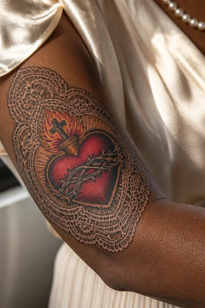
Lace frames give the Sacred Heart a delicate, high-contrast look without turning it into a dainty line drawing. The lace is shaded with tiny midtone shadows so the pattern looks dimensional, like fabric layered in front of the heart. The heart stays bold in red with realistic highlights, so the lace doesn’t overpower it. Rays can be faint or tucked behind lace to keep the composition clean. This is perfect for forearm, inner bicep, and shoulder where fine patterning can be showcased in photos.
Start by sizing the lace frame so the pattern has breathing room; cramped lace turns into noise. Then ask for lace shading that uses gray gradients behind the linework, not thick black outlines. Finally, keep the heart’s highlight edge bright and clean and make sure the lace shadow stops before it touches the heart outline. Pain is usually moderate to high because lace detail requires lots of passes.
Editor's noteAsk for lace line thickness variation — slightly thicker at the front and thinner at the back reads more realistic.
One warningAvoid uniform, single-thickness lace lines — it looks flat and loses the dimensional effect.
24. Black-and-Gray Sacred Heart in a Wet-Look Oil Painting Frame
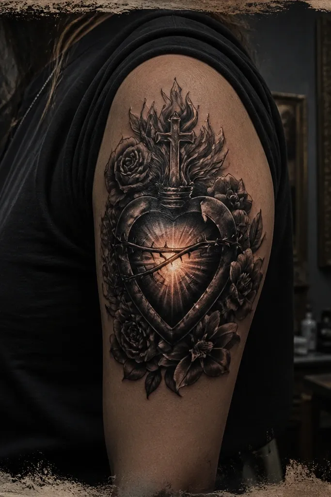
This design keeps the realistic Sacred Heart tattoo focus, but gives it a gallery-style finish. The heart is rendered in black and gray with a wet-look highlight on the petals and inner glow, so it reads dimensional even from a distance. Around it, an oil-painting style frame uses uneven brush textures and a dark vignette to make the heart pop without adding clutter. It looks stunning on people who want realism without bright color, and it works especially well for forearms, upper arms, and calves where you get room for the frame to breathe. The symbolism is still clear — devotion and protection — but the mood is more modern and moody than classic red-and-gold.
Start with placement where the frame can sit flat: forearm (inner or outer), upper arm, or calf. Size it around 4 to 6 inches for the heart, with the frame extending 1 to 2 inches beyond on each side. Ask for black-and-gray realism on the heart with layered shading on the lobes and a few controlled white highlights that look like wet varnish. For the frame, keep it mostly grayscale and let the “paint” texture come from stipple and short, directional strokes, not heavy outlines. Expect it to age well if the artist limits pure white to small highlight areas; aftercare should be strict about sun protection for the first year because contrast tattoos fade fast when they get UV. Pain is moderate since black-and-gray shading is dense — plan for extra sensitivity on the inner forearm or shin.
Editor's noteBring reference photos of wet varnish highlights (not just religious art) so the artist matches the sheen. If you want it brighter later, add a thin red wash inside the heart after the healing period, not on the first session.
One warningDon’t request a full black outline around the whole piece — it flattens the realism and makes the frame look like a sticker.
25. Sacred Heart Behind a Clear Glass Dome with Condensation Beads
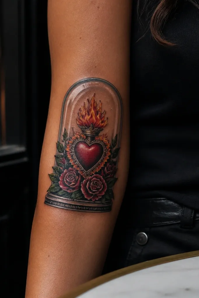
This realistic Sacred Heart tattoo design feels like the heart is protected behind a clear glass dome. The heart itself is shaded to look alive — soft gradients on the petals, a believable glow at the center, and fine detail on the flames. The “glass” effect is what makes it photogenic: smooth highlights, subtle refraction lines, and tiny condensation beads that catch the light like real moisture. It appeals to people who want realism with a modern optical twist, not a traditional border or banner. This one looks best on placements that catch light naturally, like the upper arm, shoulder cap, or outer forearm where the dome shape can curve with your body.
Choose a placement with a natural curve: upper arm (slightly toward the outer bicep) or shoulder for a dome that follows anatomy. Aim for about 5 to 7 inches tall for the dome, with the heart occupying the middle third so it doesn’t get lost under reflections. Use color sparingly for realism — keep the heart mostly deep reds and warm shadows, then use thin white-gray highlights to sell the glass surface. Ask for condensation beads to be placed asymmetrically, with a few larger droplets near the top edge and smaller ones trailing downward, so it looks natural instead of patterned. For aging, prioritize clean transitions in the glass area; heavy black in the dome will crack the illusion over time. Pain is moderate to higher because the dome needs smooth gradients — expect more sensitivity on bony areas like the outer forearm near the radius.
Editor's noteAsk the artist to leave a few “clean” highlight paths through the dome where skin tone can read — it makes the glass look clearer. If you’re worried about fading, keep the condensation highlights slightly less white than you think and let the reds carry the contrast.
One warningDon’t make the dome fully outlined — crisp borders around glass make it look like a flat sticker instead of a realistic surface.



