
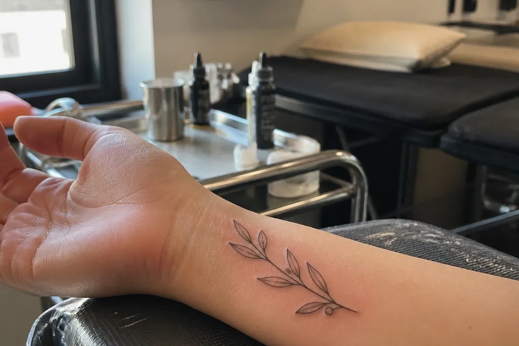
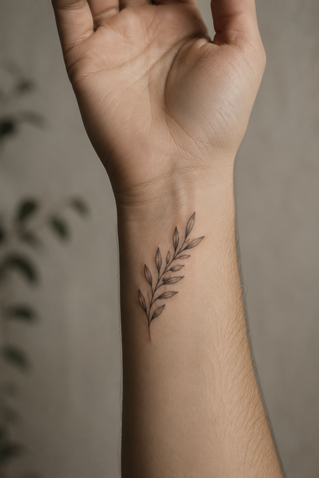
1. Single-line olive branch with three tiny leaves
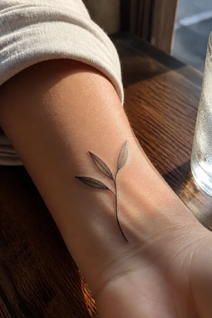
This design looks delicate because it has fewer elements. One continuous stem keeps the composition clean, and three leaves means each leaf can stay small without crowding. The negative space between leaves matters — you can see the skin through the gaps, so it photographs like lace rather than a dark symbol. I like it for people who want symbolism without a busy look, especially if you wear bracelets or watch bands that move across the area. On the wrist, it reads best when the stem follows the natural curve and the leaves sit at slight angles like they’re catching light.
Start by sketching the branch as a single arc that runs 35-45 mm from the inner wrist crease toward the thumb side. Then ask for linework at a fine, consistent thickness and leaf tips kept short so they don’t get chewed up by movement. Finally, keep shading to zero or just a tiny dot in each leaf center — no background fill. For aging, single-line tattoos hold up well because there’s less pigment to blur into the skin. Expect mild redness the first week, then a flatter look as it heals; the lines usually snap back as the surface settles.
Ask your artist to place the stencil on your wrist while you flex your hand — if the leaves stretch apart, resize before you ink.
Avoid adding extra leaves to “fill space,” because wrist motion will turn the cluster into a single dark mark.
2. Olive branch ribbon loop with micro leaves
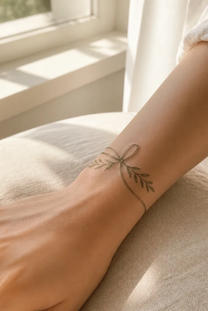
This one looks delicate because the branch is structured like a loop, so the eye follows a smooth path instead of fighting scattered details. Micro leaves keep the symbol readable without heavy fill, and the ribbon motion creates a soft, elegant silhouette that stays flattering on the wrist. I’ve seen this style work especially well for people who want something a little more decorative than a simple branch. It also hides slight wrist unevenness because the loop sits evenly across the skin. In photos, the loop catches light along the stem and leaves, which makes it look airy even when your wrist is at an angle.
Start by measuring the loop to about 30-40 mm across so it stays delicate under bracelets. Then have your artist place the stencil slightly angled so the loop sits parallel to your wrist crease, not perpendicular. Finally, keep leaf size consistent and use no thick shading — if you want depth, use one small dot or a light grey wash only inside leaf centers. Healing is straightforward, but keep the first week extra clean and dry since the loop shape can trap lotion. After healing, it ages well because the symbol has clear edges and minimal pigment mass.
Editor's noteChoose a loop size that leaves at least 10 mm of clear skin above and below so it doesn’t collide with future tattoos or jewelry.
One warningAvoid making the loop too big — larger loops need thicker lines to hold, and thick lines kill the delicate effect.
3. Olive branch with dot-shaded leaf centers (no background shading)
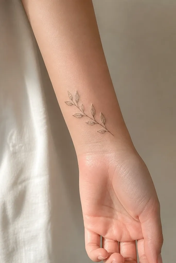
Dot-shaded leaf centers give you softness without turning the whole tattoo dark. I like this look because the outline stays fine, and the dots add texture like a whisper of shadow. That texture reads as delicate in close-up photos, but it doesn’t turn into a muddy grey patch because there’s no background shading. The symbol is still unmistakably an olive branch, and the dot work makes the leaves feel dimensional. This design suits inner or outer wrist placements if your artist can keep the dots tight and consistent.
Start with a stencil that has generous spacing between leaves so the dot clusters have room to breathe. Then ask for outlines in fine linework and dot shading limited to the leaf interior — keep it away from the leaf edges. Finally, avoid grey haze around the stem; if the artist wants to add depth, they should do it leaf-by-leaf. For aftercare, don’t over-moisturize — dot work can look darker in the first days, then fade to the right tone once the surface heals. If you’re getting it near the watch area, plan for extra friction and consider a barrier like a thin protective film during the first week.
Request a test patch on the stencil area so your artist matches dot density to your skin tone.
Avoid full leaf shading that touches the outline — it blurs when the wrist flexes.
4. Micro olive branch with one curved leaf spine detail
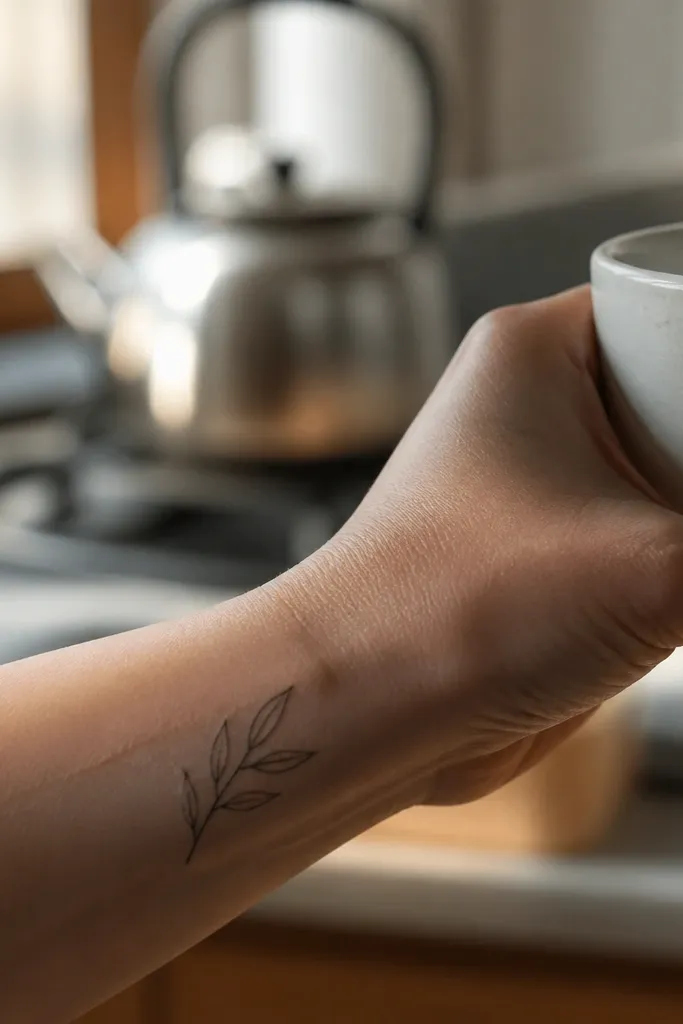
The secret to delicacy here is the leaf spine line. It adds realism without adding pigment mass, so the tattoo stays light but still looks intentional. The micro scale works because the spine lines are thin enough to hold their shape as the skin moves. I’ve found this design looks especially good on wrists where you want a “barely there” symbol that still shows up clearly in daylight. It also pairs nicely with other tiny tattoos later because each leaf has a crisp internal detail. The olive branch reads as calm and respectful, but the drawing style keeps it modern.
Start by keeping the whole branch under 40 mm and placing it so the stem curves along the wrist contour. Then have your artist draw leaf spines with the same fine line weight as the outline — no thicker spine lines. Finally, keep leaf shapes consistent and avoid adding extra veins or texture; too many interior lines make healing look scabby and uneven. During healing, watch for dryness and keep the surface from cracking, since thin interior lines can fade if the skin sheds unevenly. After a month, the spine lines usually look crisp again and the leaves look more defined.
Editor's noteIf your wrist skin gets dry easily, start moisturizing 3-4 days before your appointment so the surface heals evenly.
One warningAvoid thick spines or double-tracing outlines — that’s how micro tattoos turn bold instead of delicate.
5. Olive branch with negative-space leaf cutouts
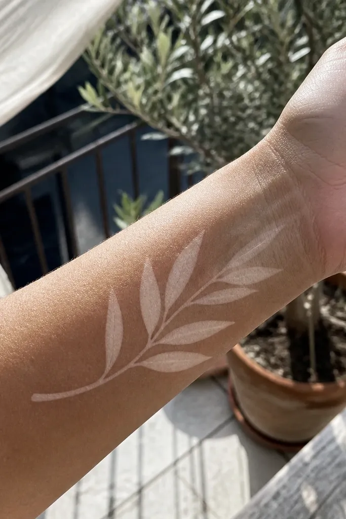
Negative-space cutouts make this tattoo look airy even when the leaf shapes are small. Instead of shading, the design uses the skin as the “color,” so the leaves stay bright and photogenic. I like this for people who want a delicate olive branch that doesn’t rely on grey gradients. It also ages well because there’s less pigment to blur; what you’re relying on is the outline and the preserved gaps. In photos, the cutouts create a light-catching effect that looks crisp against wrist skin texture. Placement on the inner wrist helps because the skin is smoother and the cutouts stay readable.
Start by choosing a design where each leaf outline is closed but has one or two clear internal cutouts. Then ask for a very fine line and keep cutouts large enough to survive healing — if they’re too tiny, they can fill in. Finally, avoid any dot shading that sits near the cutouts; keep the interior clean so the negative space stays intentional. For aftercare, keep the tattoo from peeling thick flakes, because peeling can shrink or distort the cutout edges. Once fully healed, the cutouts should look like crisp white spaces in the leaf shapes.
Bring a reference photo with similar cutout size; ask your artist to match the gap thickness to what you see there.
Avoid tiny cutouts — they disappear when the skin heals and the tattoo loses the delicate look.
6. Olive branch with a thin crescent arc base
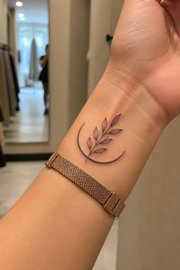
This design looks delicate because it gives the branch a base shape without filling the wrist area with extra elements. The crescent arc frames the branch and makes the whole tattoo read as one clean symbol. I like the outer wrist placement because the arc follows the curve of the forearm and looks balanced when your hand is relaxed. It also makes the tattoo feel intentional even if you wear a watch, because the arc stays visible between strap edges. For symbolism, the arc gives it a “halo” feel — calm, protective, and neat.
Start by placing the crescent arc about 10-15 mm above the wrist crease so it doesn’t get distorted by flexion. Then angle the branch so the leaves sit slightly higher on the thumb side, not straight across. Finally, keep line thickness consistent across arc and stem and skip shading completely. Healing is easier with fewer pigment areas, but still keep it protected from rubbing. After 4-6 weeks, the arc line should stay crisp if your artist used fine work.
Editor's noteIf you tan easily, ask for stencil placement to account for how the line contrast changes with sun exposure.
One warningAvoid adding shading to the arc — it turns into a thick grey curve over time.
7. Two-stem olive branch with one leaf pair
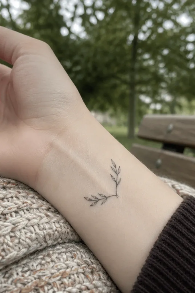
Two stems create a delicate “breath” in the design. Because there are only two leaf pairs, each leaf can stay small and crisp, and the split adds motion without adding clutter. I’ve seen this work well on wrists that already have other small symbols, because it doesn’t compete. The split-stem look also flatters different wrist shapes — it can sit neatly even if your inner wrist curve is uneven. When you move your hand, the tattoo still reads as one symbol because the stems guide the eye.
Start by keeping the overall width around 25-35 mm so the split doesn’t spread too far. Then have your artist sketch the stem split so it happens near the base, not mid-leaf, which helps the composition stay tight. Finally, keep the leaf outlines fine and use no shading. During healing, protect it from friction because the split lines can scab if the area dries out. After healing, this design looks delicate because there’s no heavy pigment to blur.
Editor's noteIf you want it even lighter, ask your artist to reduce leaf height and keep tips rounded rather than sharp.
One warningAvoid adding a third stem or extra leaves — the design stops reading as delicate and starts reading as busy.
8. Olive branch with tiny berries dots on the stem
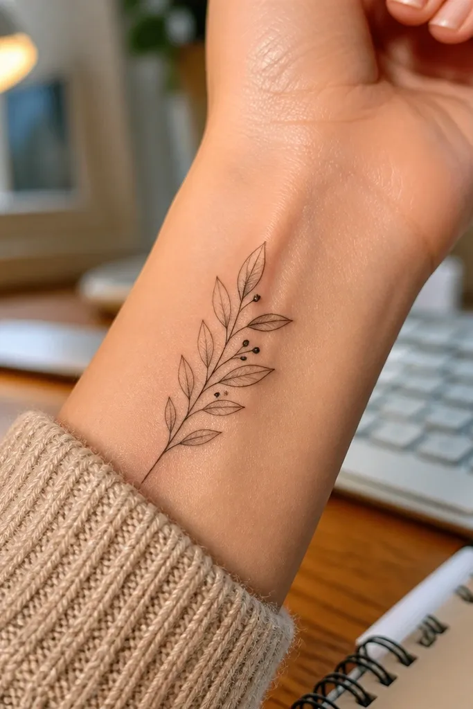
Tiny berry dots give a delicate focal point without turning the tattoo into a heavy cluster. The leaves stay light, and the berries add symbolism and texture, like a natural detail you’d only notice up close. This is one of my favorite wrist styles because it looks clean from a distance but still rewards close inspection. It also works well if you want the olive branch to feel organic rather than purely symbolic. The berries help the branch read as a living plant, which makes the tattoo look less like a generic icon.
Start by planning berry placement so there are only one or two dots — no more than that on a wrist. Then ask for filled circles that are smaller than the leaf width, and keep them aligned on the stem’s centerline. Finally, keep leaf outlines fine and skip shading so the berries don’t blend into leaf shadows. For aging, dot-filled circles hold up well if they’re not too large. During aftercare, avoid picking at any flakes near the dots; they can fade if the surface lifts.
Editor's noteIf you’re prone to keloid scars, talk to your artist about dot size — smaller dots usually heal flatter.
One warningAvoid large berry dots — thick circles on the wrist look heavy fast.
9. Olive branch with a thin laurel-style tail
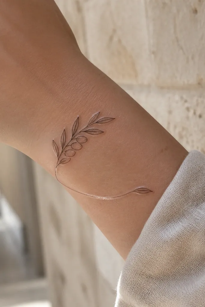
This design looks delicate because the tail line adds elegance without adding bulk. It’s like the branch is finishing gracefully, which makes it feel intentional rather than unfinished. I like it for people who want an olive branch but also want their wrist tattoo to feel “drawn,” not stamped. The tail line catches light in motion, and the small leaves give a soft rhythm. Placement on the outer wrist makes the tail read longer and more refined, especially if your hand posture shows that side.
Start by placing the base near the wrist crease and letting the tail extend 10-15 mm further than the tallest leaf. Then ask for leaves spaced so there’s at least a leaf width of skin between each one. Finally, keep the tail line the same thickness as the stem — don’t thicken it for “balance.” Healing is simple because there’s no shading to trap moisture. After it heals, the tail line usually stays crisp if you avoid rubbing and keep it moisturized.
Editor's noteWear a watch on the opposite wrist for the first two weeks so friction doesn’t dull the tail line.
One warningAvoid thickening the tail — it turns into a black line that makes the whole branch look less delicate.
10. Watercolor-tinged olive leaves with fine outlines
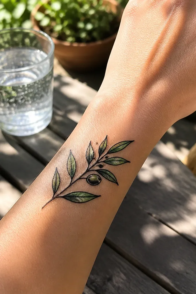
If you want delicate but with color, this is the way I’ve liked it best. The outlines stay fine and black, and the green is only a light tint inside leaf interiors. That keeps the tattoo from turning into a muddy patch as it heals and fades. In photos, the light green pops without looking loud, especially in daylight. It also makes the olive branch feel more botanical and less like a generic symbol. This works for inner wrist placements because the lighting is steadier and the color reads cleanly.
Start by choosing a very light green tint and keeping it to small leaf areas, not across the whole leaf. Then ask your artist to keep the black linework thin and crisp so the watercolor doesn’t bleed outside the edges. Finally, request no heavy grey wash under the color; watercolor should sit on top of the skin, not create a dense background. For aging, color fades faster than linework, so expect the green to soften over the first year. Aftercare is the same as black ink, but keep it extra moisturized to prevent color drop-out.
Editor's noteBring a reference for the exact green tone you like — “olive” can look yellow or grey depending on the pigment.
One warningAvoid full watercolor leaves — they look delicate at first, then blur into a stain.
11. Olive branch with micro stipple shading only at leaf tips
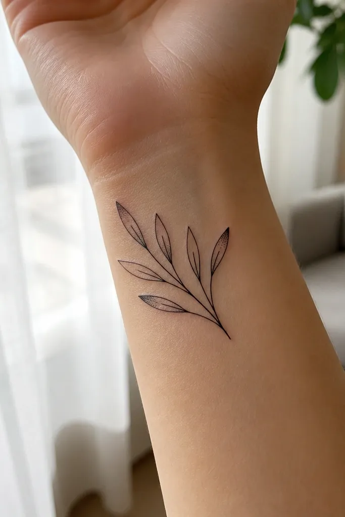
Leaf-tip stipple is delicate because it creates depth where the leaf naturally thins. It also keeps most of the leaf outline pure, so the tattoo stays crisp even after healing. I like this style because it looks like a hand-drawn botanical sketch, not a filled icon. The stipple sits in a small area, so it doesn’t spread into a grey smear. In close-ups, it looks soft and artsy; in wider shots, it still reads as an olive branch instantly. This is a great pick if you want texture but refuse heavy shading.
Start by keeping the stipple area tiny — about a third of the leaf near the tip, not the whole leaf. Then ask for stippling done with controlled density so it doesn’t create a thick dark cap. Finally, keep the stem and leaf edges fine and unshaded. Healing usually looks patchy for a few days, then smooths out as the stipple settles. If you’re sensitive to dryness, use a thin lotion layer after the initial ointment phase so the stipple doesn’t scab.
Ask for a healed photo reference from the artist that shows stipple on thin wrist skin.
Avoid stippling across leaf centers — it blurs faster on wrists.
12. Olive branch with a tiny crown of leaves at the top
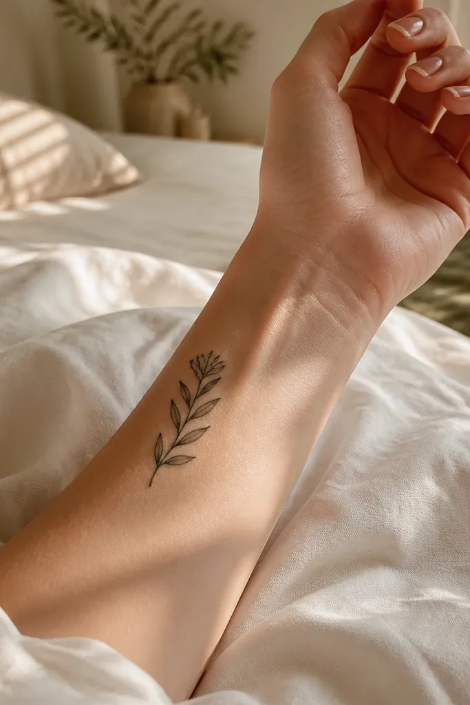
A leaf crown at the top creates a gentle focal point without filling the wrist with a big wreath. The cluster is small, so it stays delicate, and it gives the tattoo a “grace” feeling when your wrist is turned. I like the symbolism here too — it reads like peace with a little dignity, not a heavy laurel. This design photographs well because the top cluster catches light first, and the stem trails cleanly. It also works if you want a tattoo that looks good both with a watch and with bracelets since the top sits above most strap edges.
Start by placing the crown cluster about 5-10 mm above your wrist crease so it doesn’t distort with flexion. Then keep the crown to 4-6 micro leaves and taper the stem down with 1-2 leaves total. Finally, keep linework fine and avoid shading around the crown; let the leaf edges define the shape. Healing should be smooth if you avoid over-lotioning — clusters can trap moisture and cause uneven peel. After healing, the crown should stay crisp because the design has clear boundaries.
If you have a faint wrist bone ridge, angle the crown slightly so it sits flat on the skin rather than riding the ridge.
Avoid making the crown too wide — it turns into a thick band quickly.
13. Olive branch with a thin ribbon bow at the base
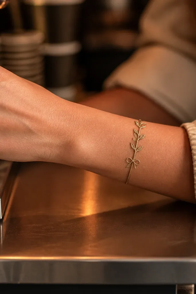
This is delicate because the bow is drawn with slim lines and open space, so it doesn’t become a black knot. The ribbon detail adds sweetness and makes the olive branch feel personal rather than generic. I’ve had this placement look especially cute on wrists with a thin watch band because the bow sits where the band edge doesn’t cover it. In photos, the bow gives you a clear focal point, and the branch above stays airy. If you love symbolism but want it to feel soft, this is a great route.
Start by designing the bow so it’s about 10-14 mm wide and the stem length stays around 35-45 mm. Then ask for the ribbon loops to be slightly open so the negative space stays visible. Finally, keep leaves small and spaced, and avoid shading under the bow. Healing is fine, but ribbon linework can get scabby if it dries out, so keep the surface moisturized after the first ointment phase. Once healed, the bow lines should stay thin and sharp.
Tell your artist whether you wear a watch — if you do, place the bow just above the watch edge so it stays visible.
Avoid thick ribbon lines — bows are the first thing to look heavy on the wrist.
14. Olive branch with feather-like leaf outlines
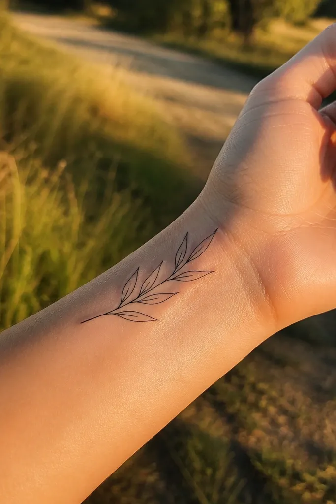
Feather-like leaf outlines make the branch feel light and airy, even though the symbol stays clear. The leaf shape is longer and slightly tapered, which visually reduces bulk. I like this for wrists because it looks refined and doesn’t fight with the wrist’s natural lines. The no-shading approach keeps it crisp and photogenic as it ages. In daylight photos, the thin leaves look almost like pencil marks, which is exactly what “delicate” should look like. This design is also easy to keep consistent if you want it aligned with future tiny tattoos.
Start by keeping leaf length small, around 6-10 mm, and spacing leaves so each one has a clean buffer of skin. Then ask your artist to draw a smooth stem line that curves gently and doesn’t kink at each leaf. Finally, keep the outline thin and consistent, and skip shading entirely. During healing, avoid picking at any dry flakes — thin leaves can fade if rough handling lifts the top layer. After a month, the outlines should still look like fine line drawing.
Editor's noteIf you want it extra delicate, ask for slightly rounded leaf tips instead of sharp points.
One warningAvoid jagged leaf edges — they look messy when the wrist flexes.
15. Olive branch with two mirrored leaf pairs (balanced symmetry)
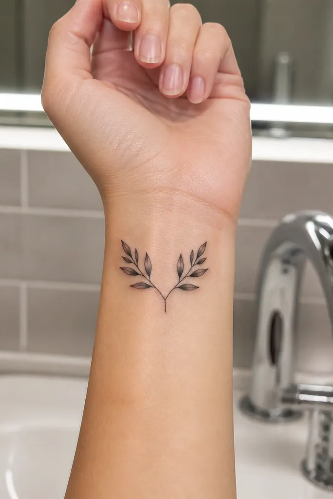
Symmetry reads delicate because your eye doesn’t have to work. The mirrored leaf pairs make the design feel calm and controlled, and the centered stem keeps it neat. I recommend this for people who want a wrist tattoo that looks good straight-on in photos, not just from the side. The symmetry also helps the tattoo age because the composition doesn’t rely on tiny, uneven details. It’s a great fit if you like minimal symbols and plan to add more tattoos later — the shape stays tidy and easy to expand around.
Start by placing the stem so it runs along the wrist’s natural vertical line, about 30-40 mm long. Then ask for two leaf pairs with equal spacing and identical leaf sizes, and keep them small enough that they don’t overlap when your wrist flexes. Finally, keep shading out and rely on crisp outlines. Healing should be even if your artist uses consistent line weight. Watch for any early irritation — thin symmetrical lines can look red longer if the skin is sensitive.
Ask for the stencil to be placed while your wrist is relaxed and while it’s slightly flexed, then compare — symmetry can shift with posture.
Avoid uneven leaf sizing — one bigger leaf makes the whole tattoo look less delicate.
16. Olive branch with thin branch forks and one leaf cluster
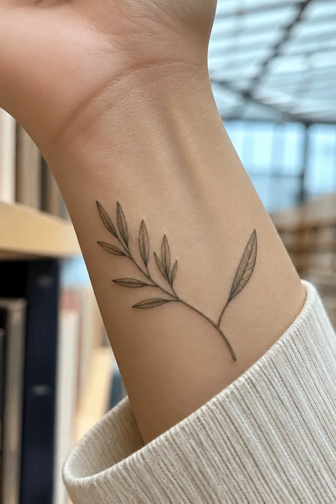
This design stays delicate because the cluster is controlled and not spread across the entire wrist. The fork gives it movement, and the single leaf on the other side keeps it balanced. I like the asymmetry here because it looks natural, like a plant branch you’d actually see, not a perfectly stamped icon. It also photographs well because your eye lands on the cluster first, then travels along the stem. If you want the olive branch to feel artistic but still minimal, this is a strong choice.
Start by mapping the fork so it happens around the midpoint, then keep the cluster to 3-4 leaves max. Then ask for the cluster leaves to be slightly different angles but the same size so it stays delicate, not messy. Finally, keep shading minimal or none, and make sure the stem line is thin enough that the fork doesn’t thicken. Healing should be fine, but clusters can dry out faster due to small surface area — keep aftercare consistent. After healing, the design should still read as a branch because the fork outlines remain crisp.
If you wear bracelets, place the cluster just above where the bracelet sits so it doesn’t get rubbed daily.
Avoid large clusters — dense leaf bunches turn into a dark patch on wrists.
17. Olive branch with tiny leaf veins (single line) and no shading
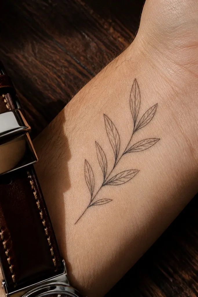
Leaf veins add realism without the bulk of shading. When the veins are done as a single thin line, the tattoo stays delicate and reads like botanical illustration. I like this because it gives you detail up close, but from a distance it still looks like a clean olive branch symbol. It also ages better than heavy shading since the veins are linework, not pigment haze. This is a great pick for people who want the design to feel “hand-drawn” and not like an icon from a flash sheet. Placement on the inner wrist helps because the lines stay crisp against smoother skin.
Start by keeping leaf size small, around 6-9 mm, so the veins don’t turn into thick marks. Then ask your artist to draw only one vein per leaf and keep it the same thickness as the outline. Finally, skip any shading so the tattoo doesn’t blur into grey as it heals. For aftercare, moisturize lightly and avoid exfoliating near the tattoo until it’s fully healed. Thin vein lines can fade if the skin peels aggressively, so keep it from drying out completely.
Editor's noteIf your artist suggests multiple veins, ask for one — more lines at this scale blur faster.
One warningAvoid double-veining each leaf; it makes the work look heavy and less delicate.
18. Olive branch with micro leaves and a thin underline stem
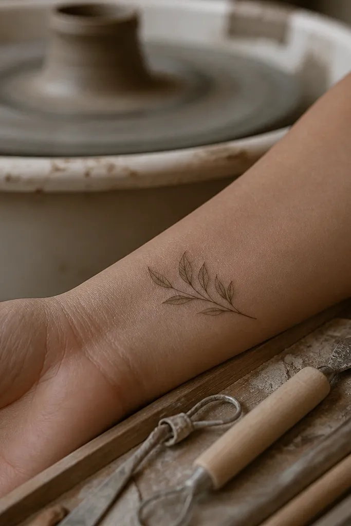
The subtle underline line gives the tattoo a soft, layered look without adding pigment darkness. It makes the branch look like it has depth, but because both lines are thin and close, the overall effect stays delicate. I like this design when you want something that feels a bit more “designed” than single-line work, but you still want it to look light. The micro leaves keep it from becoming a simple line-only tattoo. In photos, the double-line creates a gentle contrast edge that looks crisp against wrist skin.
Start by keeping the double-line spacing very small, around 1-2 mm, so it reads as one delicate structure. Then place the leaves in between the lines so they don’t overlap and thicken the center. Finally, keep everything fine and avoid shading — the depth comes from line placement, not pigment. Healing should look clean, but the double-line can scab if it dries out, so keep aftercare consistent and avoid friction. Once healed, it should look like a delicate botanical sketch with a soft dimensional feel.
Editor's noteAsk your artist to confirm the spacing on your wrist in a mirror — wrists vary and the double-line can look uneven if it’s too close to a crease.
One warningAvoid thickening either line for “readability” — thick double lines ruin the delicate effect.
19. Olive branch with tiny leaf clusters around a central stem dot
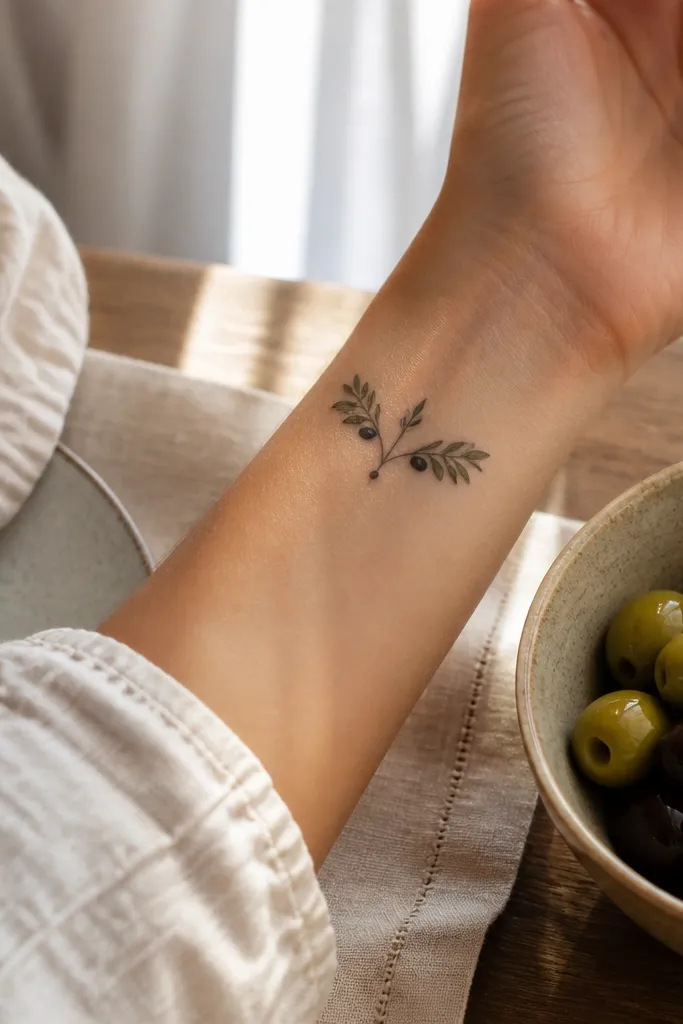
A central dot anchor makes the symbol feel composed and delicate. It gives your eye a resting point, then the leaf clusters read like soft wings. I like this when someone wants an olive branch but doesn’t want a long stem — it stays compact and wrist-friendly. The clusters are small enough to avoid heaviness, and the dot prevents the tattoo from looking like a random scattering of leaves. In photos, the dot catches light and the clusters frame it, so the tattoo looks intentional even when the wrist is at an angle.
Start by designing the whole piece around 25-35 mm so it fits the inner wrist without stretching. Then place a single small dot at the base and build leaf clusters of 2-3 leaves each, one on each side. Finally, keep outlines thin and skip shading so the dot and leaves don’t turn into a dark mass. Healing is usually smooth, but the dot area can look slightly raised for a few days — don’t pick at it. After healing, the dot should remain crisp and the leaves should look airy.
If the dot fades easily on you, ask your artist to use a slightly smaller dot size and keep the linework fine.
Avoid adding too many leaves around the dot — clusters get heavy quickly on wrist skin.
20. Olive branch with thin leaf outlines and a single grey wash leaf
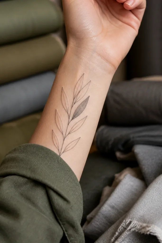
One grey wash leaf creates a focal softness without breaking the delicate look. The rest of the branch stays crisp linework, so the tattoo doesn’t turn into a fully shaded smear. I like this for people who want a hint of depth but don’t want to commit to dot shading or full watercolor. The single wash leaf also makes the design feel handcrafted and less “icon-like.” In photos, that one softened leaf catches attention and makes the entire branch look more dimensional while still staying light overall.
Start by picking one leaf spot for the grey wash — usually the center leaf in the composition. Then ask for a very light grey wash that stays inside the outline and doesn’t touch the edges. Finally, keep all other leaves unshaded with fine linework so the tattoo remains airy. Healing will make the grey wash look darker at first, then settle as it fades. Aftercare is the same as black ink, but don’t scrub the wash area — let it heal evenly to keep that delicate softness.
Editor's noteAsk your artist to show you how they do light grey wash on healed wrist examples, not fresh photos.
One warningAvoid grey wash on multiple leaves — that’s how delicate work turns into a dark patch.
21. Olive branch with micro leaf scallops and no stem thickening
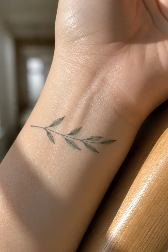
Scalloped micro leaves look delicate because they have texture without filling the skin with pigment. The stem stays thin throughout, which is the difference between “fine” and “blob.” I like this style when you want the olive branch to feel playful and hand-rendered rather than perfectly symmetrical. The scallops also create tiny light edges that show up in close photos, especially when your wrist is slightly angled. Placement on the outer wrist works well because the texture reads cleanly along the forearm curve.
Start by keeping scallop leaves small, around 5-8 mm wide, and spacing them so they don’t overlap during movement. Then instruct your artist to keep the stem line the same thickness at every leaf connection — no thick knots. Finally, skip shading and rely on clean scallop outlines. Healing is usually good, but scalloped edges can dry unevenly; keep moisturized after the initial ointment stage. If the scallops get too detailed, they can fade — keep the shapes simple enough to survive healing.
If your artist tends to “reinforce” line junctions, tell them you want thin continuity instead.
Avoid thicker line junctions where leaves meet the stem — that’s where delicate work turns heavy.
22. Olive branch with tiny leaf pairs and a thin end curl
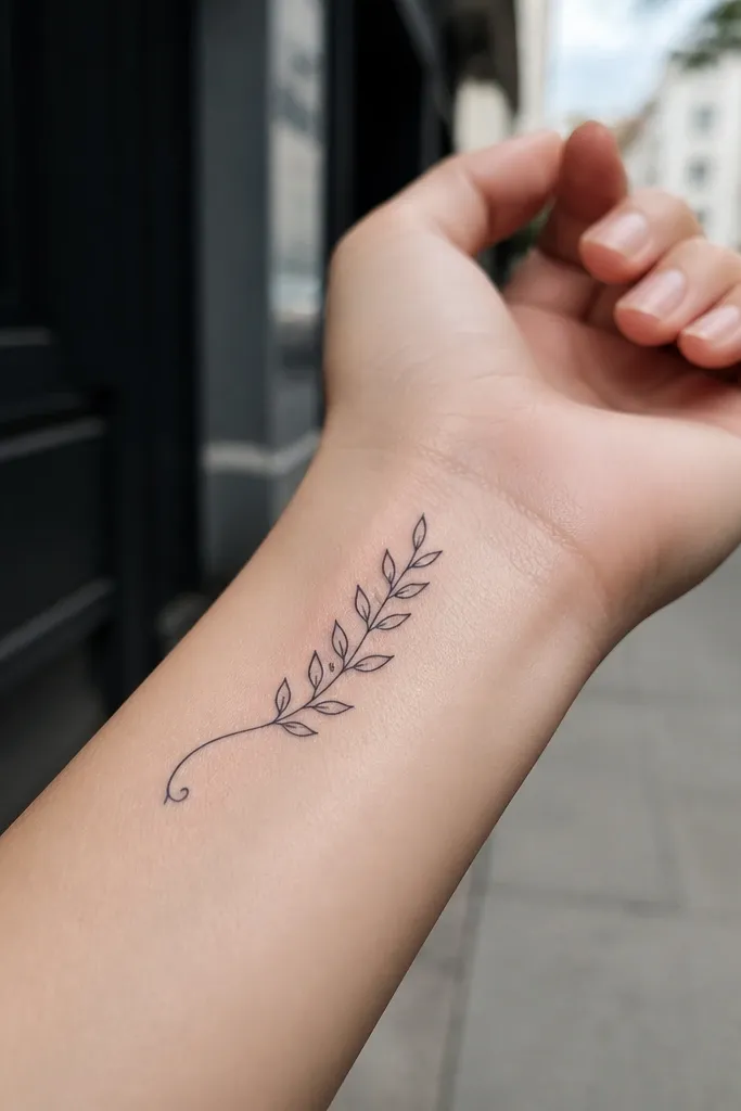
The end curl is what makes this feel delicate instead of “just a symbol.” It finishes the branch like a signature line, so it looks intentional and graceful. I like it for wrist tattoos because the curl can sit where the skin is smoother, keeping the line crisp. The tiny leaf pairs keep the branch readable without crowding, and the curl adds motion that photographs well. This design looks good even if you later add a small constellation or word tattoo nearby, because the curl gives a clean direction.
Start by drawing the stem with an upward curve and making the end curl about 6-10 mm long. Then place leaf pairs in a steady rhythm, leaving at least a leaf width of skin between pairs. Finally, keep everything linework only and avoid shading. Healing should be smooth, but the curl tip is the first spot to fade if you rub it, so protect the area from friction. After healing, the curl usually stays crisp because it’s a single thin line with no fill.
Editor's noteIf you get tattoos on both wrists, mirror the curl direction so each side looks balanced in photos.
One warningAvoid making the curl too thick or too long — thick curls look heavy and longer curls get distorted by motion.
23. Olive branch with a thin vertical stem and staggered leaf heights
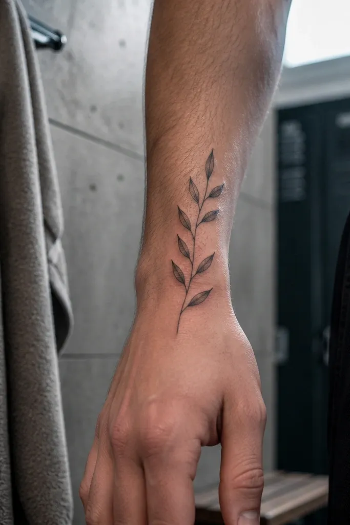
Staggered leaf heights create a natural rhythm that reads delicate instead of symmetrical and stiff. The vertical stem keeps it from spreading too wide, which is the number one problem with wrist olive branches that start to look bulky. I like this for people who want their tattoo to look good when their hand is relaxed because the vertical line aligns with wrist posture. In photos, the staggered leaves catch light at different angles, which makes the tattoo look more detailed without adding pigment. It also feels more botanical than a perfectly even row of leaves.
Start by keeping the stem length around 40-50 mm so it has enough room for stagger without crowding. Then ask your artist to place leaves at alternating heights and keep each leaf the same size so it still looks delicate. Finally, keep linework thin and skip shading to prevent leaf spacing from collapsing as it heals. During healing, avoid stretching your wrist too hard in the first week; stretching can distort how thin lines settle. After a month, the staggered leaves should look airy and crisp.
Ask for a quick test stencil and take a photo in the same lighting you’ll wear it in — staggered designs show up differently across light.
Avoid packing leaves tightly along the stem — spacing is what keeps it delicate.
24. Olive branch with ultra-thin outline and one tiny leaf behind the stem line
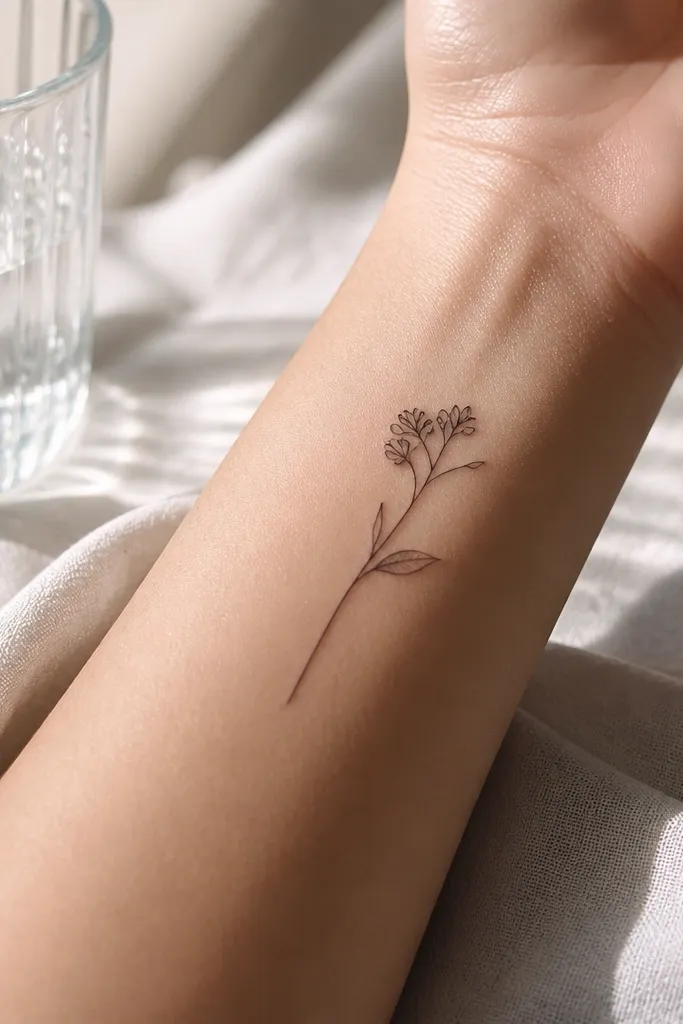
Layering one tiny leaf behind the stem adds depth while staying delicate because it’s still mostly linework. The “behind” leaf trick creates a visual pause, so your eye doesn’t treat the tattoo as one flat icon. I like this style for wrists because it looks like a sketch — subtle, thoughtful, and not loud. It also photographs nicely because the layered leaf creates a slight contrast edge. This is a good option if you want delicate but also want something that feels more personal than a straight branch.
Start by keeping the overall branch under 45 mm and using an ultra-thin line consistent with the artist’s finest healed work. Then place one tiny leaf so it overlaps visually behind the stem line, and keep its size smaller than the front leaves. Finally, keep shading out so the layering stays crisp. Healing should be clean, but thin lines need protection from sun and friction; use sunscreen once fully healed. If you’re prone to fading, this design still holds because it’s mostly outlines and not heavy pigment.
Ask for the layered leaf to be drawn with the same line weight as the stem, not thicker.
Avoid adding multiple layered leaves — too much overlap turns into a dark tangle on wrists.
25. Olive branch with a thin oval frame around the leaves
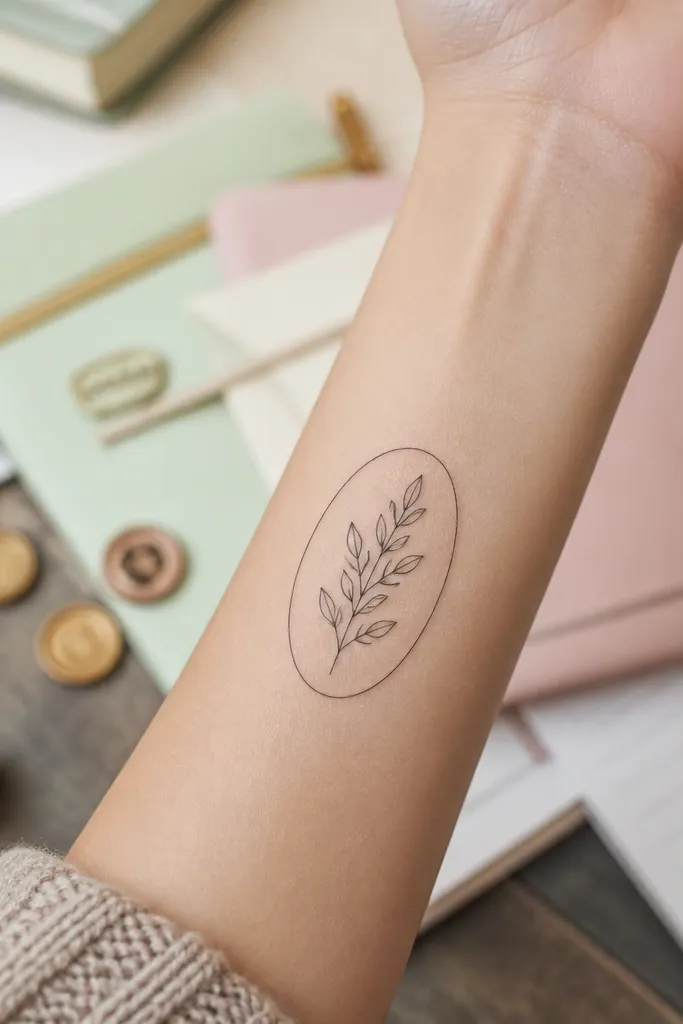
An oval frame makes the symbol look like it has a “container,” which is why it reads delicate instead of messy. The frame line is thin, and the leaves sit inside with space, so the tattoo feels light and controlled. I like it for people who want a defined composition without turning to a big wreath. It looks especially good when your wrist has a watch band gap, because the oval remains visible and clean. In photos, the frame adds structure and makes the leaves stand out as separate shapes rather than blending into each other.
Start by choosing an oval size around 25-35 mm so it fits the wrist without expanding. Then place the olive branch centered inside and keep leaf count low so the oval stays airy. Finally, keep the frame and stem line thickness consistent and avoid shading. Healing is usually even, but frames can be prone to irritation if they sit over high-friction areas; keep it protected from rubbing. After healing, the oval frame should stay crisp if the lines are fine and not reinforced.
Editor's noteIf you plan to get more tattoos later, leave a small gap around the oval so it doesn’t collide visually.
One warningAvoid thick oval frames — heavy frames make the whole design look heavy and less delicate.



