
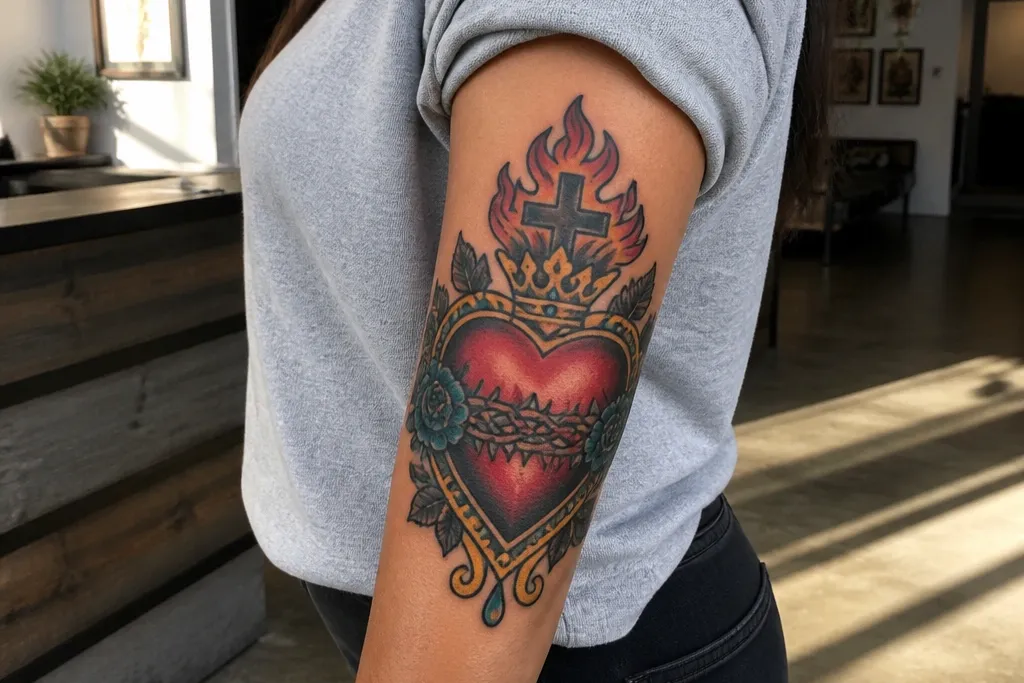
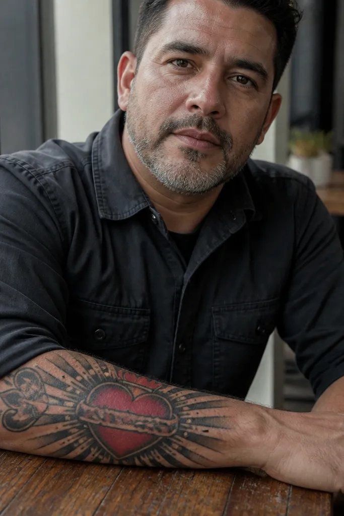
1. Flame-Edge Heart with Black Rayburst
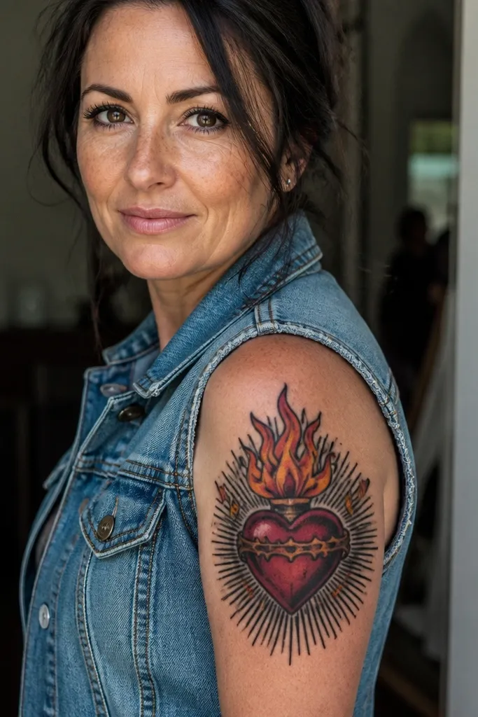
This one is built for bold readability. The heart sits centered, with flame shapes that have darker maroon bases and bright orange tips, so the flames look like they’re moving even when the design is still. Behind it, black rays radiate outward with consistent spacing, creating a graphic sunburst that makes the heart stand out instantly. It looks especially good on forearms and upper arms where straight ray lines can stretch cleanly along the limb.
Start by sketching the heart so it’s wider at the top and slightly tapered at the bottom, then ask for thick outer contour lines around the heart and flames. Next, choose two flame tones: maroon for the inner flame body and orange for the outer edge highlights, kept in separate sections. Finally, place a black rayburst behind the halo with equal gaps so the rays don’t turn into a solid black blob. For aging, keep the flame highlights limited to thin edge strokes instead of filling the whole flame with bright color.
Ask your artist to do a quick stencil test from arm’s length so the heart reads instantly in a mirror.
Avoid full-color blending across the rays and halo; it makes the center look smudged over time.
2. Halo Split-Color Sacred Heart on Dark Sunburst

This design leans into Mexican bold contrast by using a dark background field behind the symbol. The halo is split in tone — one part stays light and the other has a darker wash — so the ring looks dimensional without turning fuzzy. The heart itself uses clean red blocks with orange highlights that hit the flame and the heart’s top curves. It’s a strong pick if you want the tattoo to look dramatic in low light and still stay crisp in bright daylight.
Editor's noteIf you plan to wear short sleeves, place it on the outer upper arm where the halo sits flat in photos.
Start with a dark ray or stipple sunburst background, then keep the halo ring separated with clear breaks so it stays a halo, not a circle. Next, request the heart in solid red with selective orange on the upper flame edges and heart highlights, avoiding heavy gradients. Finally, align the rays so they radiate from the halo center, not from the heart center, which keeps the composition balanced. For aftercare, protect the initial scabbing stage from friction since the dark background can look uneven if it gets rubbed early.
One warningSkip tiny ray lines packed too tightly; they disappear first around the halo area.
3. Blackwork Sacred Heart with Red Droplet Tears
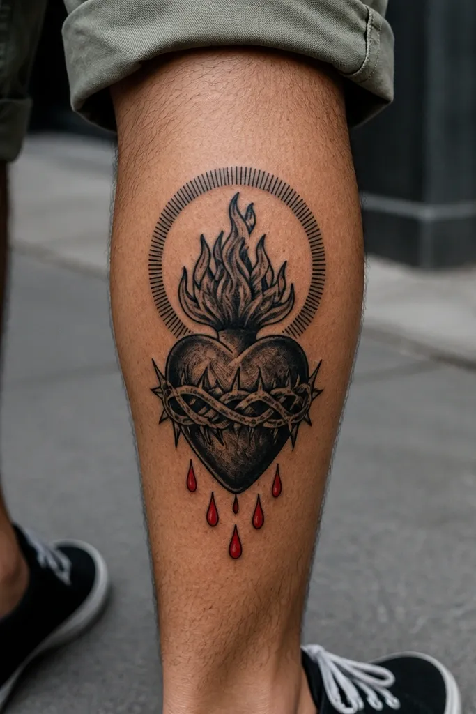
If you want bold detail without lots of color coverage, this is the move. The sacred heart is mostly blackwork with sharp line weight, while the emotional focus comes from red droplet tears that fall below the flames. That red accent pulls the eye to the center and gives the tattoo a clear focal point even when the background is simple. It’s photogenic because the contrast between blackwork and saturated red looks clean and intentional.
Start by designing the heart outline in thick blackwork lines, then add black shading only where it supports depth under the heart curves and behind the flames. Next, place two or three red droplets with crisp edges, keeping them spaced so each droplet reads as a separate shape. Finally, build a minimal rayburst or small sun halo outline rather than a full dense background. This approach ages well because the red is concentrated in shapes that stay bold instead of fading across a big area.
Ask for red droplets with a slightly darker red base and lighter highlight edge so they still pop after healing.
Don’t add lots of tiny decorative dots around the tears; it clutters the focal point.
4. Mexican Banner Sacred Heart with Bold Serif Text

This design makes the symbol feel complete by adding a banner under the heart with bold, readable lettering. The Sacred Heart stays the hero — thick outline, red heart, orange flame edges — while the banner uses clean blackwork with a limited red accent for emphasis. The rays stay medium density so the banner doesn’t get swallowed by background detail. It looks best on upper arms, shoulders, and calves where you have the surface length to keep text legible.
Start by placing the banner so it follows the curve of the body — straight text on a curved muscle looks wonky. Next, keep the lettering bold serif (thicker strokes, fewer thin lines), and request the text lines to be separated from the heart by a small gap. Finally, ask for a controlled rayburst behind the halo, not behind the banner, so the composition stays organized. For aftercare, avoid heavy sun exposure for the first months because text contrast fades faster than thick outlines.
Bring your artist a reference of the exact letter style you want, then ask them to test the word spacing on skin with a marker grid.
Skip ultra-thin script fonts; they blur and turn gray.
5. Oaxaca-Inspired Sacred Heart with Geometric Frame
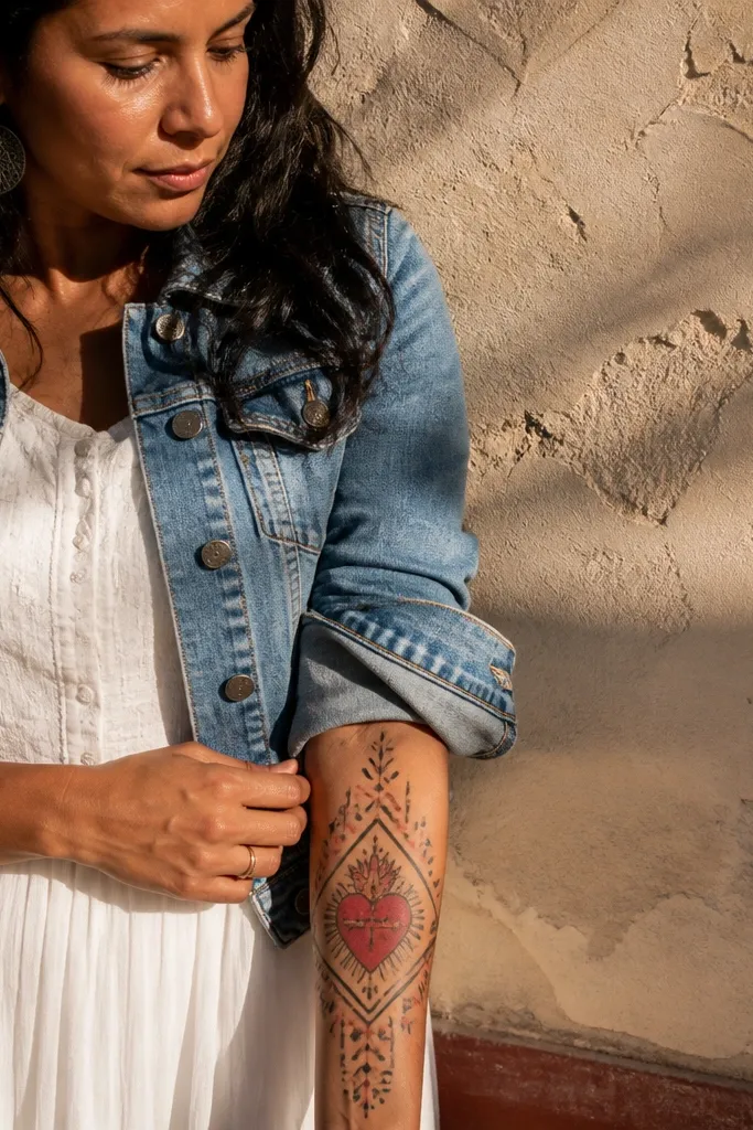
This one frames the heart like a poster. You get the Sacred Heart in bold reds and blacks, but it sits inside a geometric border made of straight lines, chevrons, and stepped shapes — the kind of structure that photographs sharply. The frame keeps the design from feeling like a floating symbol, and it gives you clean edges for placement on the thigh or upper arm. It’s also a good choice if you want Mexican bold detail without relying on tons of tiny ornaments.
Editor's noteAsk for the frame to stop before the halo edges so the halo stays visually separate.
Start by blocking the Sacred Heart in the center with thick outline and flame highlights in orange. Next, build a geometric frame around it with consistent line weight, using black for the main structure and small red accents at corners. Finally, keep the ray lines inside the frame lighter than the outer frame so the heart remains the focus. For aging, the geometric lines should be slightly thicker than you think — fine geometry softens quickly on moving skin.
One warningDon’t overload the center with extra symbols; the frame already adds visual weight.
6. Color-Blocked Sacred Heart with Orange Flame Cutouts

This design looks modern because it uses strict color blocks instead of heavy gradients. The heart is saturated red with crisp black contours, and the flame shapes have orange cutout highlights that sit like separate pieces. That separation is what keeps the tattoo looking sharp after healing and makes it look good in close-up photos without turning muddy. It’s a great pick for people who want bold detail but don’t want a full-blackwork sleeve.
Start with a stencil plan that maps each color zone — red heart, orange flame highlights, and black outline. Next, request minimal shading: a few dark maroon underlayers under the flame base and a thin black shadow under the heart curve. Finally, keep the background rays either black linework or negative space, not a fully packed fill. This style ages well because the tattoo relies on shape clarity, not delicate tonal transitions.
Choose a limited palette (red, orange, black, and optional maroon) so the piece stays high-contrast as it fades.
Avoid watercolor-style blending; it blurs into a gray-red haze.
7. Traditional Sacred Heart with Bold Double Rays
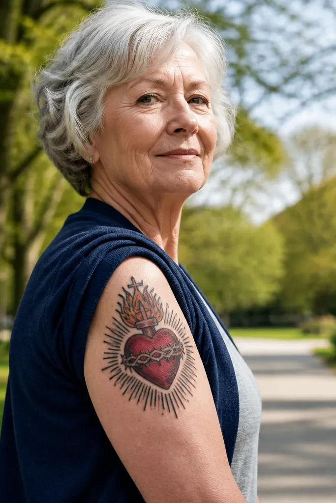
This is the traditional layout, but tuned for bold detail. Instead of one rayburst, it uses double rays: a thicker set of rays closer to the halo and a thinner set extending outward. That layering makes the whole tattoo look more dimensional and gives you a stronger silhouette in photos. The heart stays classic with red and orange flames, while the double rays add the extra punch that makes it feel “Mexican bold.”
Editor's noteAsk for the inner rays to be slightly longer than the halo ring, so the tattoo has a strong frame.
Start by placing the halo and heart so the halo sits slightly above the heart center, then outline the heart in thick blackwork. Next, draw two ray sets: inner rays with heavier line weight and outer rays with thinner lines, keeping spacing consistent. Finally, use maroon shading only under the flame base and around the heart’s lower curve. For placement, the double rays look best on forearms and calves where the silhouette holds its shape.
One warningDon’t pack every ray to the edge; crowded rays turn into a single dark halo.
8. Sacred Heart with Crown Halo and Thick Outline
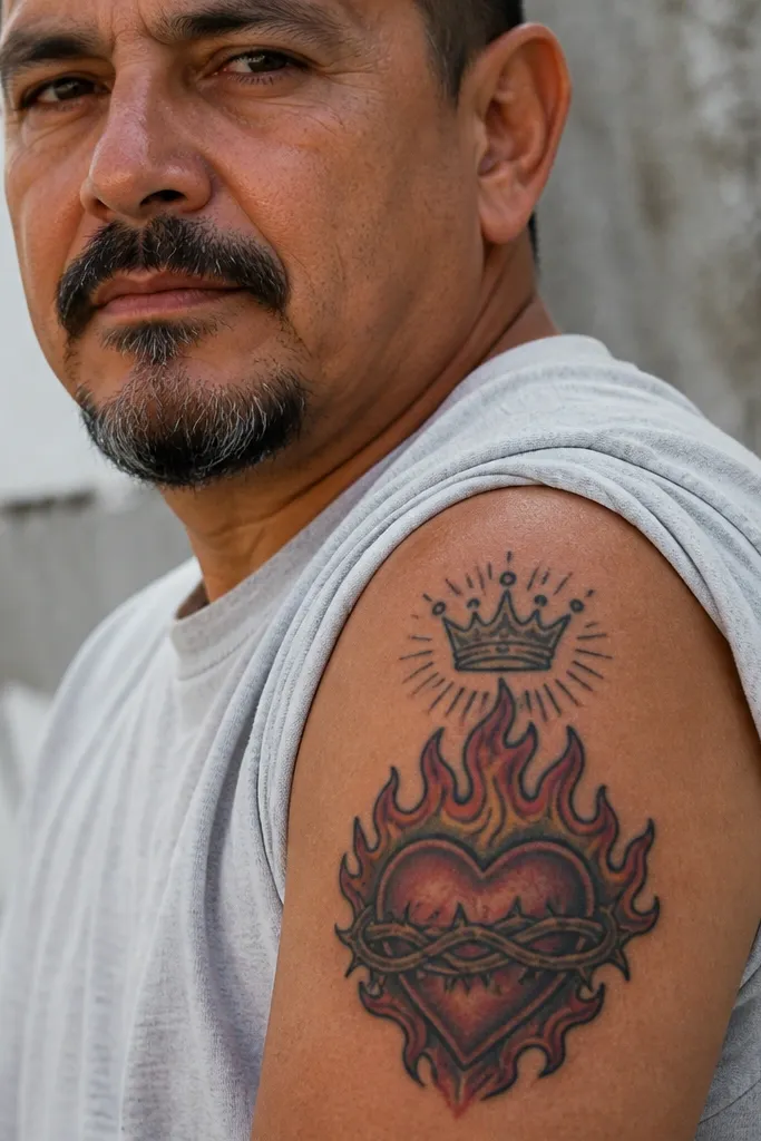
Adding a small crown halo gives the design a more regal look without changing the Sacred Heart’s core readability. The crown sits above the halo, drawn with thick black strokes and minimal interior shading so it stays crisp. The heart remains red with orange flames, and the crown adds a clean vertical element that looks great on shoulders and upper arms. If you like the idea of Mexican bold Sacred Heart Tattoo but want it to feel a little more “statement,” this is the style.
Editor's noteUse thick outline on the crown even if the heart has slightly thinner interior lines — crowns blur fast if they’re too delicate.
Start by keeping the crown simple: a few clear points, thick outline, no tiny spikes. Next, place the crown above the halo ring with a small gap and keep the halo itself separated by negative space. Finally, add medium ray lines behind the halo, not a full dense fill, so the crown stays readable. Expect a slightly longer session because crown lines need clean spacing, but it’s worth it for the silhouette.
One warningSkip detailed filigree on the crown; it breaks up during healing.
9. Blackwork Sacred Heart with Red Heart-Within-Heart
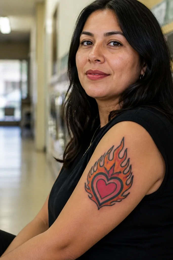
This design gives you depth by stacking hearts. You get a main Sacred Heart in bold red, then a smaller inner heart shape in a slightly different red tone, separated by thin black lines. That “heart-within-heart” trick makes the center look layered and intentional, even from a distance. It’s a strong choice for people who want a bold Sacred Heart tattoo that doesn’t rely on a full background.
Editor's noteAsk for the inner heart edges to be slightly thicker than the background lines so they don’t fade first.
Start by outlining the main heart in thick blackwork, then block the inner heart inset with a slightly different red — deeper cherry or brighter crimson. Next, keep shading minimal and use black line separation to create the layered effect. Finally, add a small rayburst or just a halo ring so the inner heart stays the focal point. For aging, inner shapes keep their contrast better when they’re not too thin.
One warningDon’t make the inner heart too small; it will turn into a dark blob.
10. Sacred Heart with Pink-Orange Flame Highlights and Black Rays

This is a color-forward take that still reads as Mexican bold. The heart stays red, but the flame highlights use orange with a thin pinkish overlay on the hottest edge. That gives the flames a glowing look without turning the whole piece into neon. Pair it with black rays, and you get a high-contrast silhouette that still feels warm and romantic in photos.
Start with a standard red heart and maroon under-shading under the flame base. Next, request orange highlights along the flame outer edges, then add a narrow pink line right at the flame tip — keep it thin. Finally, build black rays behind the halo with consistent spacing and no heavy gray wash. This palette ages best when the pink is used as a highlight line, not a big fill.
If your skin heals cool-toned, ask for the pink highlight to be more orange than magenta so it stays warm.
Avoid filling the entire flame with pink; it fades and turns flat.
11. Rosary Bead Frame Around Sacred Heart
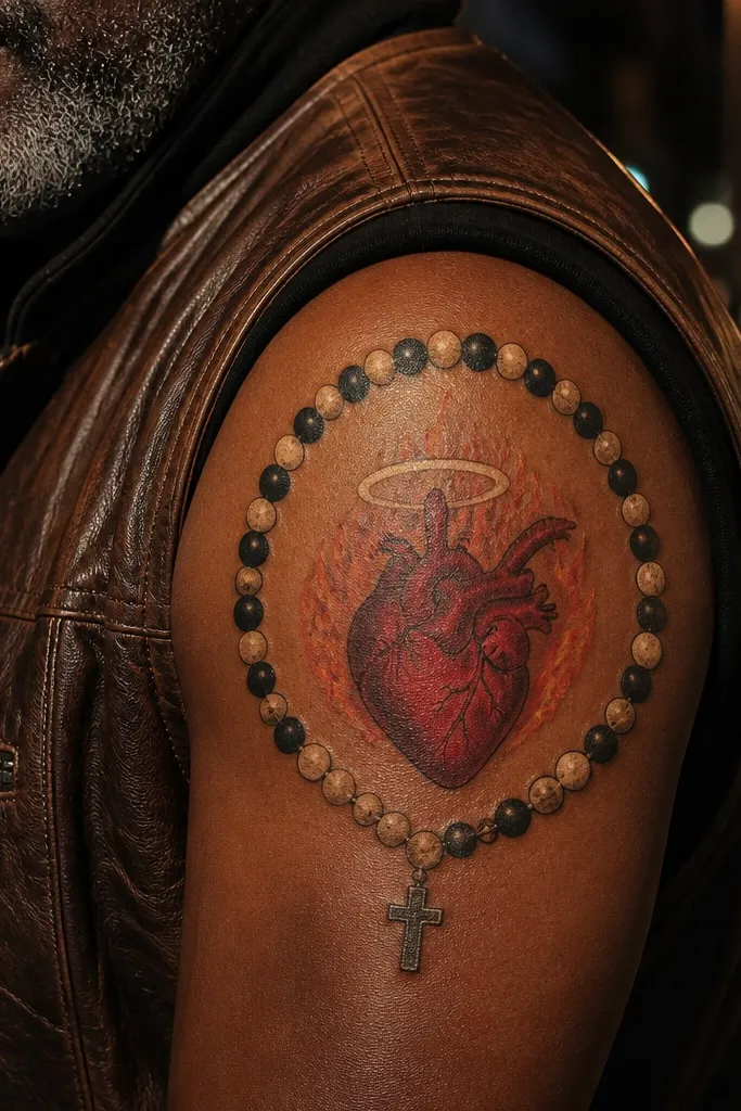
The rosary bead frame makes the tattoo feel complete and extra “Mexican sacred” without turning into clutter. The beads are drawn in alternating dark and light tones, and the arc frames the heart so the whole design looks like a devotional emblem. The Sacred Heart remains bold with red flames and a clean halo ring, while the beads add texture you can see in close photos. It also works on forearms where the arc naturally follows the arm curve.
Editor's noteAsk for bead highlights on the same side across the whole arc so the tattoo looks consistent and not random.
Start by sketching an arc of beads around the heart, leaving clear space between the beads and the halo so nothing smears together. Next, outline each bead with thick edges and shade with a simple two-tone — dark base with lighter highlight on one side. Finally, add black rays behind the halo but keep the bead frame dominant, not the rays. For healing, keep it clean and dry because bead edges can trap irritation if the aftercare is sloppy.
One warningSkip tiny bead dots; you want bead shapes, not micro specks.
12. Sacred Heart with Day of the Dead Flower Crown
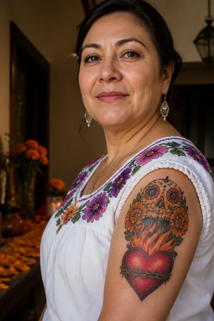
Marigold and flower crown elements make this tattoo look festive but still devotional. The Sacred Heart stays central with bold red and orange flames, and the crown sits above it like a halo made of flowers. The petals are drawn with strong linework and limited color fills so they don’t turn into a mushy watercolor mass. This one is photogenic on upper arms and shoulders because the crown naturally frames your body.
Start with the heart and halo first, then design the flower crown so it doesn’t cover the halo ring — keep a small gap. Next, use marigold orange and yellow petal blocks with black outlines, and add a few darker centers for contrast. Finally, keep rays behind the halo medium density so the flowers remain visible. For aftercare, flowers with multiple color layers need extra moisturizer once the skin is fully closed.
Choose fewer flowers with bigger petals instead of many small petals. Big shapes hold up better.
Don’t add thin vine lines around the crown; they blur faster than flower outlines.
13. Sacred Heart in a Rectangular Bold Frame
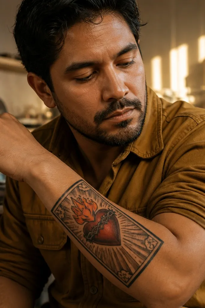
This is a graphic, tattoo-poster look. The Sacred Heart sits centered inside a rectangular frame drawn with thick black lines, while rays and small ornaments fill space behind the heart. The frame gives you clean edges and makes the design look intentional even when it’s partially covered by clothing. It’s excellent for forearms and outer biceps where you want strong geometry that looks sharp from different angles.
Editor's noteAsk your artist to leave a small margin between the halo and the rectangle so the halo stays distinct.
Start by drawing the rectangle first — thick enough to act like a border, not a thin outline. Next, place the halo and heart centered inside, then add rays that stop before they hit the frame so the composition doesn’t get noisy. Finally, use red heart fill with orange flame edge highlights and keep shading minimal under the flames. This ages well because geometric borders stay readable and help the center keep contrast.
One warningAvoid a frame that’s too thin; it fades into the skin tone and loses the poster effect.
14. Sacred Heart with Crossed Arrows and Bold Rays
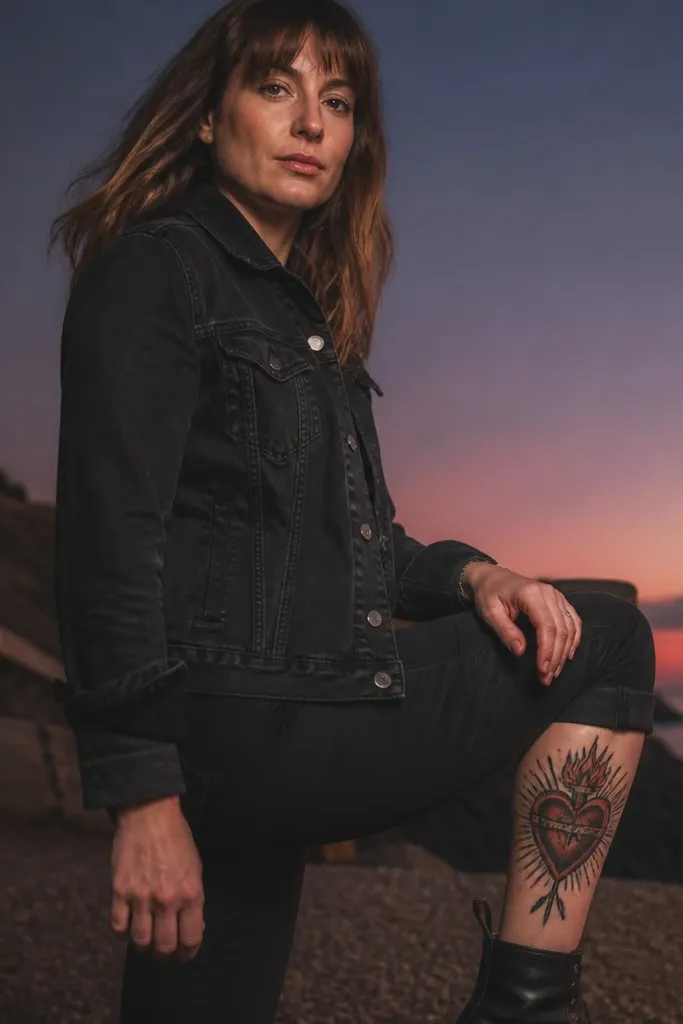
This design adds motion and symbolism by placing crossed arrows behind the Sacred Heart. The arrows are drawn in blackwork with thick lines, then the rays radiate behind everything so the heart stays the focal point. The result feels bold and protective, and the arrows give the tattoo a strong diagonal structure that photographs well. It’s a good fit for upper arms and calves where you have space for diagonals.
Start by placing the heart and halo slightly forward in the layout, then sketch two arrows crossing behind it. Next, keep arrow tips and shafts thick and simple — no micro engravings — and shade with a light black wash only where it adds depth. Finally, add black rays behind the halo but ensure rays don’t cross directly through the heart outline. For aging, thick arrow lines keep their shape even if the skin moves a lot.
Ask for arrow shafts to be aligned so the diagonal lines match your body’s natural muscle direction.
Skip tiny arrowhead details; they disappear and make the center feel busy.
15. Sacred Heart with Thick Black Ornamental Swirls
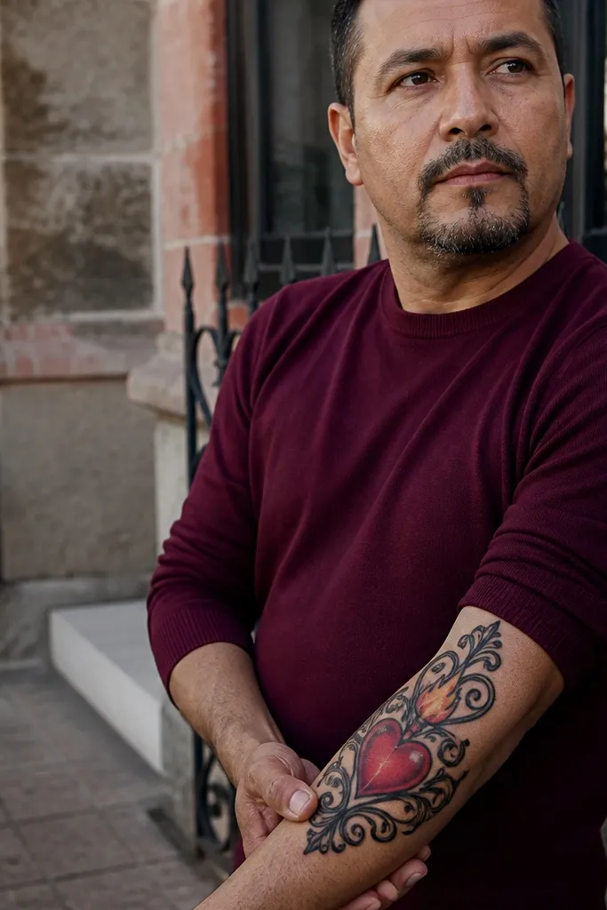
Ornamental swirls make the tattoo feel Mexican bold without needing a full background. The Sacred Heart stays crisp in the center, and thick black swirls curl outward like a frame, giving you a sense of flow. The flames remain red and orange with clean edges, while the swirls provide texture that reads even if color fades. This one looks great on upper arms and shoulders because the curls follow the curve of the body.
Start with the heart and halo first, then plan your swirl curls so they don’t touch the flame edges. Next, ask for thick black swirls with a consistent line weight and limited shading — use black fills only on the outer edge of the swirls. Finally, add a light rayburst or keep rays minimal so the swirls remain the second focal element. For healing, thick black work can look patchy if you pick at scabs, so follow aftercare strictly.
Choose swirls that are fewer and thicker. Three big curls look cleaner than eight thin ones.
Avoid thin lace-like swirls; they blur into gray lines.
16. Sacred Heart with Bold Black Shield Shape
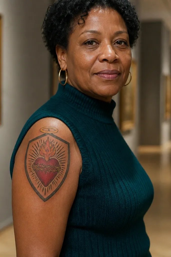
A shield shape makes the tattoo feel strong and readable. The Sacred Heart sits in the center of a black shield outline, and the halo rays fill the background inside or behind the shield. This design is great if you want bold detail that doesn’t rely on a lot of color — the shield creates contrast and structure. It also looks good on ribs and upper arms where you can let the shield follow your body’s contour.
Editor's noteAsk for a small gap between the shield edge and the halo so the halo doesn’t merge into the shield shading.
Start by outlining the shield with thick lines, then place the halo and heart inside the shield boundaries. Next, keep the rays either inside the shield or behind it with a clear separation so the outline stays crisp. Finally, use red for the heart and orange for flame edges, and add minimal maroon shading under the flame base. The shield holds the design together when the body moves, which helps it stay photogenic over time.
One warningDon’t fill the entire shield with gray; it kills the crisp silhouette.
17. Sacred Heart with Large Orange Flame Wings
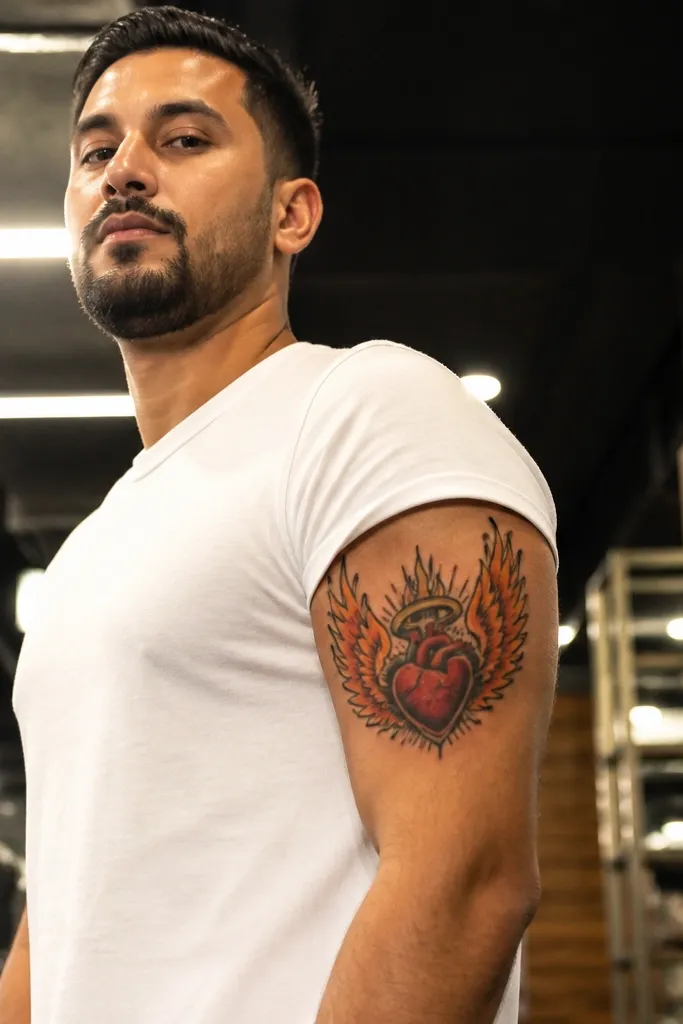
Flame wings turn the Sacred Heart into a full composition. The heart stays centered and bold, while the flames extend outward in wing-like shapes that frame the symbol. This gives you a dramatic silhouette that looks great on the outside of the upper arm and calf where the wings can spread. The key is keeping the flames as distinct shapes with thick outlines, not as a drifting gradient.
Start by drawing the heart and halo first, then plan two large flame wing shapes that stop short of the outer placement area so they don’t look cut off. Next, request orange fill for the outer flame wings and maroon underlayers near the base for depth. Finally, outline the flame wings with thick black lines and keep background rays light. This will heal cleaner because the design relies on shapes and edge contrast.
If you want maximum bold detail, go bigger on the flame wing outline thickness than you think you need.
Avoid thin flame edges; they fade and make the wings look uneven.
18. Sacred Heart with Mirrored Flame Symmetry
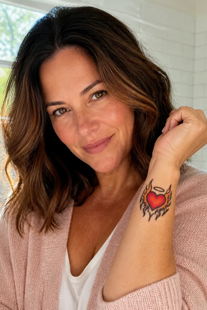
Symmetry makes this Sacred Heart look engineered and clean, which is what you want for bold detail. The flames are mirrored left and right with consistent curves so the tattoo reads balanced from every angle. The heart is red with a few orange highlight lines, and the halo ring sits perfectly centered. This works well for smaller to medium sizes because symmetry preserves clarity even when you don’t have a lot of space.
Start by insisting on a symmetrical stencil — even a slight mismatch makes flames look messy. Next, keep flame highlights to thin orange edge strokes on both sides so both flames match in intensity. Finally, add a simple black rayburst with fewer rays than a full sunburst, so the symmetry stays the focus. For aging, symmetrical designs hold their look because the viewer’s eye expects balance.
Ask your artist to align the heart and halo with the bone line where you’ll place it, so the symmetry matches your body’s geometry.
Skip heavy background clutter; symmetry needs breathing room.
19. Sacred Heart with Crossed Rosary and Thick Center Glow
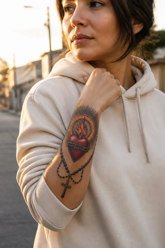
This design mixes devotional elements with a strong center glow. The halo ring has a thicker “glow” effect made from layered black lines and a small amount of warm color, while a crossed rosary frame adds structure at the bottom. The heart stays red and bold with orange flame edges, so the glow doesn’t steal attention. It’s a great option for people who want Mexican sacred symbolism but still want the tattoo to feel graphic and modern.
Editor's noteAsk for rosary beads to be larger than you think — bigger bead shapes read longer as the tattoo ages.
Start by designing the halo ring with a thick outline and a second ring line slightly offset to create the glow effect. Next, place crossed rosary strands below the heart with bead shapes that have thick edges and simple shading. Finally, keep rays behind the halo limited so they don’t collide with the rosary. For aftercare, avoid tight clothing rubbing on the rosary area since bead edges can scab unevenly.
One warningDon’t add extra small charms around the rosary; the crossed frame already fills the space.
20. Sacred Heart with Bold Black Smoke-Like Rays
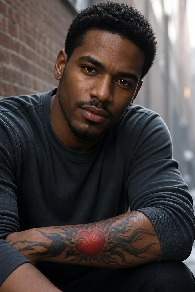
Smoke-like rays give the Sacred Heart a dramatic, almost cinematic silhouette without needing complex color. The heart is still classic — red body, orange flame highlights — but the rays are drawn as bold, sweeping black shapes that taper outward. That taper makes the tattoo look energetic in motion and adds depth in photos. It’s especially good on upper arms and shoulders where sweeping lines can follow muscle contours.
Editor's noteAsk for a few wider ray bands instead of many thin ones; wider bands stay readable longer.
Start with a clean heart outline and halo ring, then draw the rays as tapered black shapes instead of thin lines. Next, keep the ray edges crisp with thick linework so they don’t look like accidental ink spread. Finally, use minimal maroon shading under the flames so the red stays bright against the black ray shapes. This ages well when the rays are solid and edge-defined rather than filled with gray haze.
One warningAvoid gray watercolor shading in the rays; it blurs and turns muddy.
21. Sacred Heart with Marigold and Black Lace Background
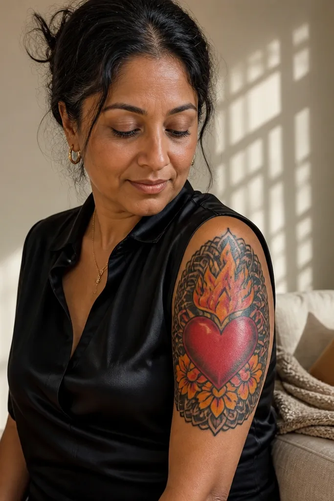
This is where Mexican bold detail meets texture. The heart is red with orange flames, and marigold petals sit around the lower part like a crown made of flowers. Behind it, a black lace-like fill adds structure and contrast, making the colors pop. The lace pattern is drawn with bold negative space — not tiny dots — so it stays crisp instead of turning into a gray carpet.
Editor's noteIf you want maximum crispness, ask your artist to keep the lace lines thicker near the heart and thinner at the outer edges.
Start by placing the Sacred Heart and halo as the center anchor, then add marigold petals around the bottom half only. Next, request a black lace background that uses thicker line segments and clear gaps, leaving the heart region clean. Finally, add small orange highlights on the flame edges and a few on the marigold petals for cohesion. For aftercare, keep the tattoo moisturized because lace-like fills can feel tight during healing.
One warningSkip dense dot backgrounds; they blur and flatten the whole piece.
22. Sacred Heart with Bold Black Cross and Red Heart Glow
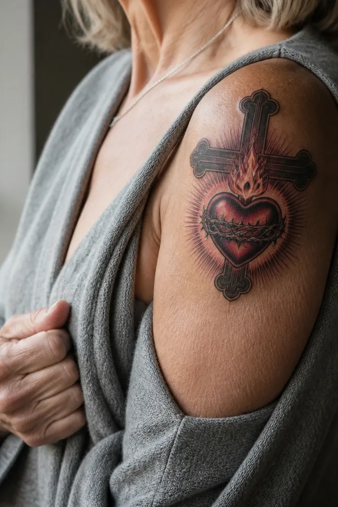
A thick cross behind the Sacred Heart gives you instant structure and a strong vertical composition. The cross is drawn in bold blackwork, and the halo sits in front of it so the Sacred Heart stays the hero. The heart has a “glow” effect using a controlled maroon-to-red edge blend — limited to the heart and flame area only. It reads clean from far away and still shows detail up close because the contrast is concentrated in the center.
Editor's noteAsk for the cross line weight to match the heart outline thickness so the composition feels balanced.
Start by drawing the cross with thick, even line weight and keep its edges crisp. Next, place the halo and heart in front of the cross using a small separation gap so they don’t merge. Finally, add a red glow effect by slightly deepening maroon at the heart’s lower curve and using brighter red at the center highlight. For placement, ribs and outer upper arm work well since the vertical cross aligns with the body line.
One warningDon’t add tiny cross ornaments; thick cross lines already carry the design.
23. Mexican Bold Sacred Heart with Ornate Red Banner Ribbon
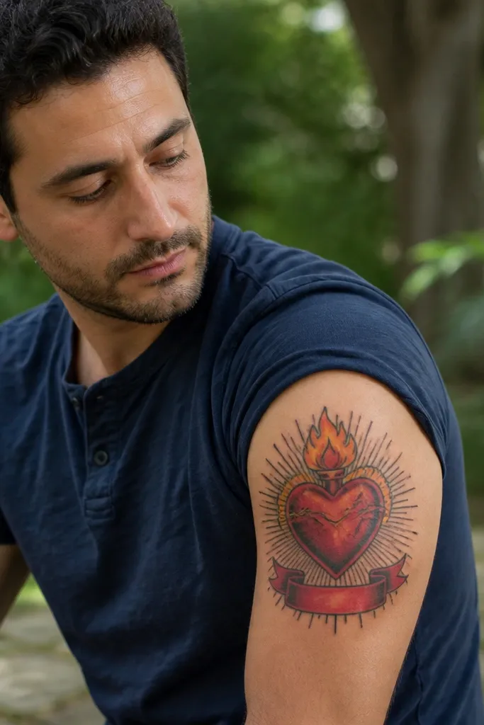
This tattoo uses a ribbon banner for movement. The Sacred Heart stays centered with bold red and orange flames, while the banner ribbon under it is drawn in red with black outline and a few highlight folds. The rays behind the halo are black and medium density, so the banner stays readable. It’s a strong pick for upper arms, calves, and thighs where you can let the ribbon drape naturally.
Editor's noteChoose a ribbon shape with 2-3 main folds instead of many tiny crease lines.
Start by sketching the banner ribbon drape — ask your artist to follow the body curve so the ribbon looks like cloth, not a flat strip. Next, keep the ribbon mostly solid red with black outline and add only a few highlight folds in a lighter red or orange tint. Finally, place the halo ring above the heart and keep rays behind it only, not behind the banner. For aging, ribbon folds should be drawn with thick line edges so they don’t fade into the red fill.
One warningAvoid thin ribbon tails; they blur and look like accidental ink.
24. Sacred Heart with Bold Black Crosshatch Shading and Clean Rays
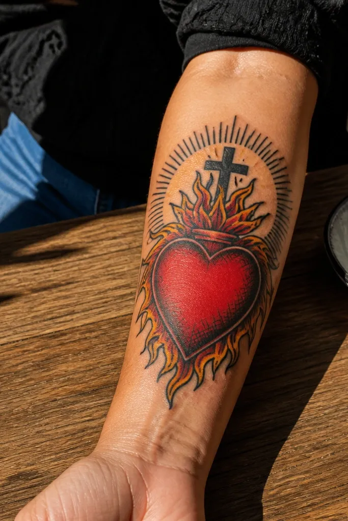
Crosshatch shading makes the tattoo look detailed without relying on delicate gradients. The Sacred Heart has red fill with orange flame edges, but the depth comes from black crosshatching around the heart curves and under the flame base. Clean rays behind the halo keep the Mexican bold silhouette crisp. This design is great for people who want “bold detail” that still looks sharp years later because crosshatch lines stay defined when they’re thick enough.
Editor's noteAsk for crosshatch that fades out toward the heart center so the red stays dominant.
Start with thick outlines for the heart and flames, then plan crosshatch zones — keep them mostly on the lower heart and around the flame base for depth. Next, request crosshatch lines that are consistent in spacing and not too fine; thick crosshatch holds up better. Finally, keep the rayburst clean with fewer rays and clear gaps so your eye stays on the heart. For aftercare, don’t let scabs dry out — crosshatch areas can scab more tightly.
One warningSkip extremely fine crosshatch; it turns to gray dust over time.
25. Sacred Heart with Bright Red Heart and Minimal Background
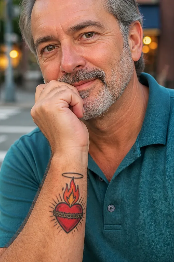
This is the clean, bold option when you want the Sacred Heart to be the whole point. The heart is bright red with orange flame tips, and the background is minimal — just a halo ring and a few short rays. That negative space keeps the tattoo looking sharp and modern, not crowded. It’s also a great choice for placement on the inner bicep, outer forearm, and upper ribs where you don’t want a huge background field.
Editor's noteIf your artist wants to add more rays, ask them to keep rays thicker and fewer, not thin and numerous.
Start by outlining the heart and flames with strong line weight, then fill the heart in bright red with only light maroon underlayer near the flame base. Next, add orange flame edge highlights in narrow strokes so they stay crisp after healing. Finally, use a simple halo ring and a small set of rays — enough to frame the heart but not enough to create a dark halo blob. This style ages well because it depends on shape and contrast rather than background texture.
One warningDon’t remove the halo gaps; a solid ring can flatten and lose definition.



