

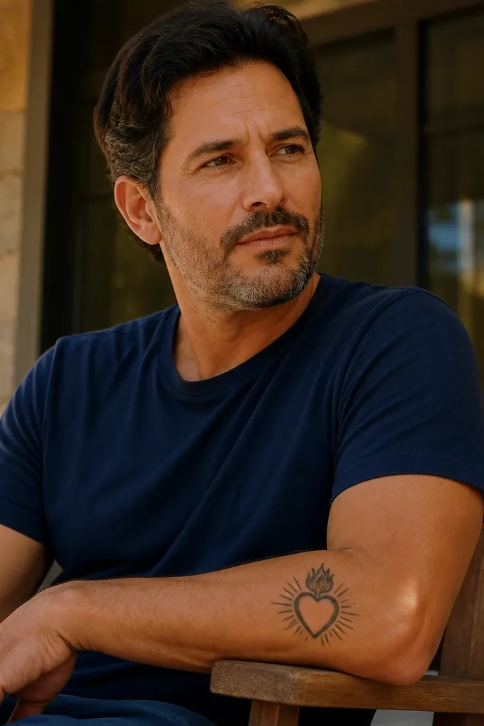
1. Center-Heart with Three Clean Rays
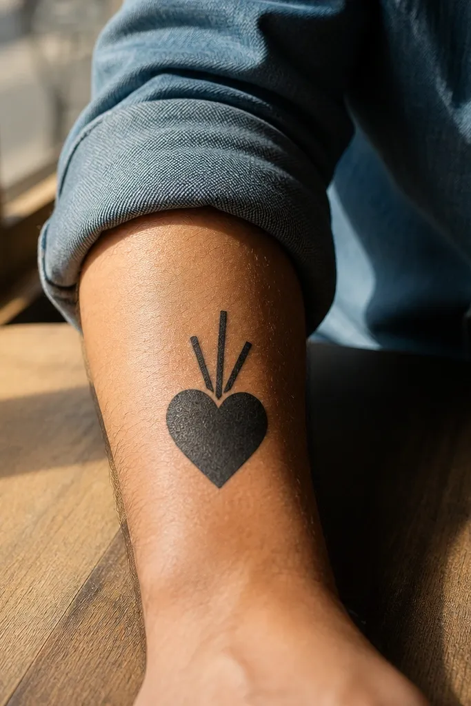
This is the “I want it to look good immediately” version. The heart sits as the only heavy shape, with three straight rays rising from behind it. Those rays are the whole aesthetic — simple, graphic, and easy to read even when the lines soften during healing. It feels devotional without turning into a crowded illustration. Placement on the inner forearm makes the rays look like they’re lifting toward your wrist, which flatters the natural line of the arm.
Start by marking a vertical center line on your forearm and choosing a height around 10-12 cm. Ask the artist for a single consistent outline thickness on the heart, then make the rays thinner and evenly spaced. Keep the flames and crown out entirely for this version, since the rays are doing the work. If you want a little depth, add stipple only inside the heart’s lower half, not across the whole design. Aftercare matters here: moisturize lightly and avoid heavy sun exposure early so the rays stay crisp.
If you’re worried about readability, remove the small details first, not the rays.
Don’t add too many rays or tiny hatch marks — the forearm will blur them fast.
2. Sacred Heart Dotwork Halo
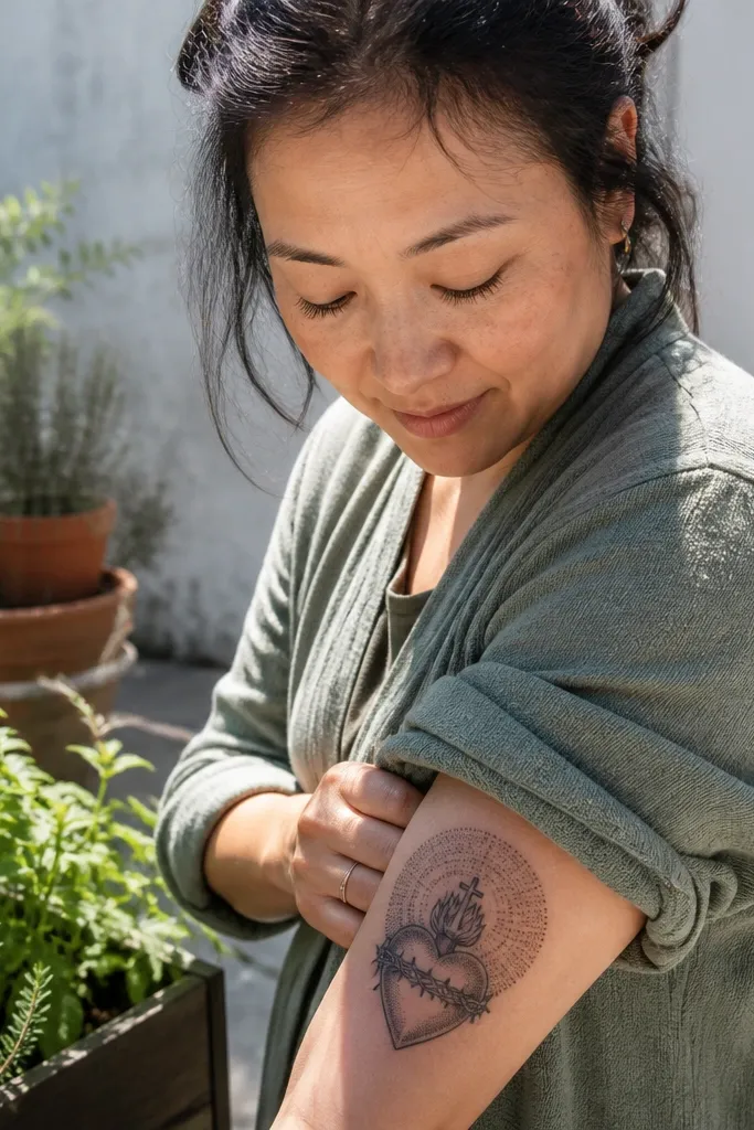
Dotwork is the minimalist Sacred Heart Tattoo cheat code. The heart stays clean with linework, and the halo of dots creates a soft glow that looks intentional rather than “unfinished.” This design is photogenic because the dots catch light from different angles, especially under daylight. It also ages better than heavy grey shading since the fade turns into softer texture instead of turning muddy. It suits people who want a gentle, spiritual look without flames crowding the forearm.
Choose a centered heart about 9-13 cm tall, leaving space above for the halo. Ask for a crisp outline on the heart, then build the halo with stipple dots that gradually thin out at the edges. Skip any dense black fill; use dot density changes instead. For the Sacred Heart center, keep the cross out or make it a single thin vertical line if you want it. Healing tip: avoid scrubbing the dots during wash; let the scabs shed naturally to keep the dot pattern intact.
Use dotwork around the heart, not inside it, for a cleaner silhouette as it heals.
Avoid full grey shading behind the heart — it turns into a dark patch on forearm skin.
3. Heart + Tiny Cross on a Single Vertical Line
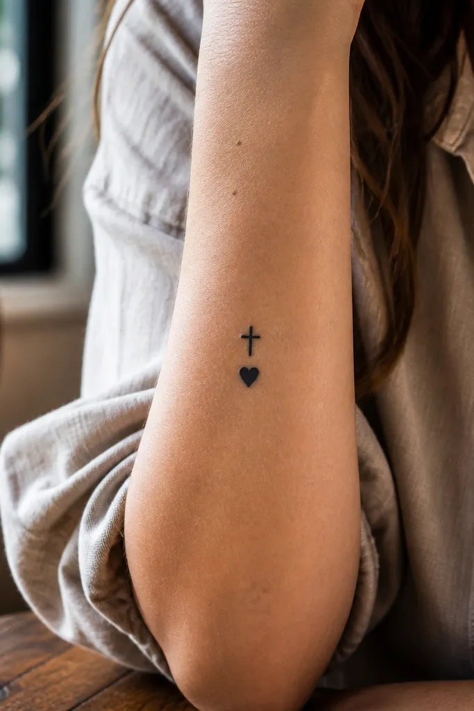
This one reads like a minimalist icon. The cross is a tiny, clean shape placed above the heart, and both align to a single vertical axis. That alignment makes it look designed, not random. It’s also great if you don’t want flames or crown details — the cross gives the religious signal while the heart keeps the symbolism. Outer forearm placement works well because the vertical line looks strong against the arm’s curve.
Editor's noteIf you want extra meaning, add a single ray line behind the heart instead of extra details.
Start with a simple layout: center the heart and place the cross directly above it with a small gap. Request linework that’s consistent for both elements, with no thick-to-thin transitions. Keep the heart outline slightly bolder than the cross so the heart remains the main read. Size target: 8-11 cm tall for a forearm minimalist Sacred Heart Tattoo that stays sharp. Aftercare: use sunscreen once fully healed, because the cross line is thin and will show sun-fade first.
One warningDon’t make the cross as wide as the heart — it will overpower the composition.
4. Flame Tips Only, No Full Flames
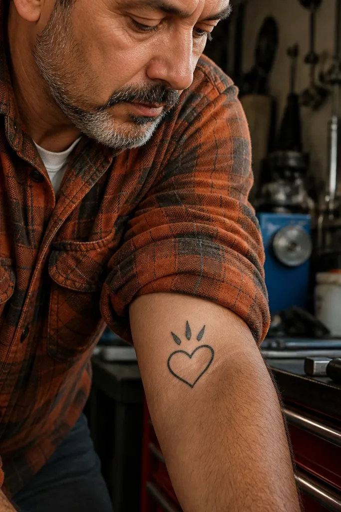
This version keeps the Sacred Heart vibe using flame tips instead of full flame curls. It’s minimalist, but it still looks like Sacred Heart when you clock it. The flame tips sit above the heart like punctuation, giving motion without clutter. It works for people who want a forearm piece that stays clean in close-ups and still reads from a distance. Inner forearm is best because the flame tips look like they’re rising naturally with your arm.
Choose a heart shape that’s slightly taller than wide, around 10-13 cm tall. Ask for the flame tips as just three short, pointed shapes — no heavy flame shading. Keep rays minimal or skip rays entirely; let the flame tips do the “energy” look. If you add a small halo, keep it as a thin ring line, not a dense dot field. For healing, avoid tanning right away and keep the area moisturized to prevent over-dry cracking that can make thin flame tips fade unevenly.
Add one tiny notch detail at the flame tip to make it look intentional, not like random sparks.
Don’t include flame smoke curls — they turn into a grey blur.
5. Outline Heart with One Sided Ray Burst
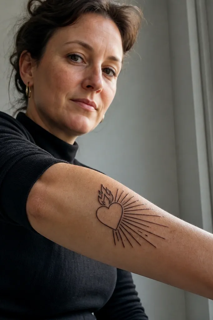
Asymmetry looks modern and keeps the forearm from feeling like a logo. This design draws rays on only one side of the heart, creating a directional burst. The heart stays centered, but the rays pull the eye — so it looks styled, not symmetrical-by-default. It’s especially flattering on the outer forearm where the arm’s curve can emphasize the directional lighting effect. If you like minimalist tattoos but want one “editor’s pick” twist, this is it.
Start by drawing the heart outline and decide which direction the rays will lean — toward the elbow or toward the wrist. Keep the ray count low, like 5-7 lines, and make them evenly spaced. Ask the artist to keep the rays thinner than the heart outline so they don’t thicken as they heal. Size should be about 9-12 cm tall so the imbalance still reads clean. Aftercare: sunscreen is non-negotiable on the forearm; thin rays fade faster than the heart outline.
If the burst feels too bold, shrink the ray length by 20% instead of adding more rays.
Don’t add shading behind the rays — it will fill in and remove the clean minimalist contrast.
6. Sacred Heart with Crown as a Single Line

A crown can go wrong fast. This version avoids the busy spikes and keeps it as a simple crown line — just enough to signal “Sacred Heart” without turning into a medieval mess. The look is sharp, graphic, and very forearm-friendly because it uses straight geometry. It pairs well with a clean heart outline and a tiny glow line. If you want a minimalist piece that still feels like a real symbol and not just a heart with rays, this is a strong pick.
Place the crown directly above the heart, with a small gap so it doesn’t fuse into the heart shape. Keep the crown outline thin and consistent, and use three to five small points total. Add rays only if you can keep them minimal — two or three lines behind the heart is plenty. Size: 10-14 cm tall so the crown doesn’t look cramped. Healing: avoid picking at any scabbing on the crown points; thin points are the first thing to blur if you disturb the skin.
Ask for crown points that are slightly rounded at the tips; they hold shape better as skin heals.
Skip detailed jewel shading on the crown — it becomes a dark smear.
7. Heart with Two Rays and a Micro Halo Ring
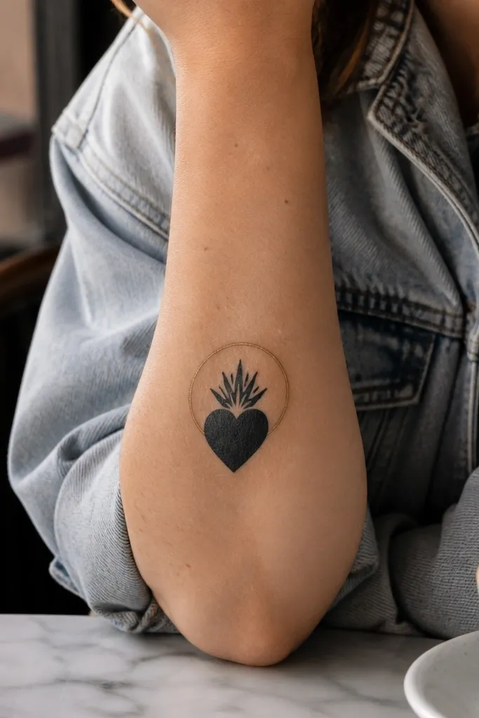
This is a “quiet but intentional” Sacred Heart Tattoo. Two rays are enough to communicate the glow, and a micro halo ring adds a subtle aura without any heavy shading. The design looks crisp in photos because the ring creates a clean border around the main symbol. It also stays elegant as it fades — the ring and outline soften but don’t disappear. This is a good choice if you want minimalism that still feels complete.
Editor's noteIf you want more contrast, make the halo ring slightly thicker than the rays, not thicker than the heart outline.
Start with a heart outline about 8-11 cm tall. Place two rays behind the top half of the heart, evenly spaced, and keep them short. Add a micro halo ring as a thin oval or circle behind the heart, with a small gap at the bottom so it doesn’t look like a badge. Keep the linework consistent and avoid thick black fills. Aftercare: moisturize and protect from sun so the ring line doesn’t fade into the background.
One warningAvoid a full halo of dots — it can look textured and less minimalist on the forearm.
8. Sacred Heart with Minimal Cross in the Flame
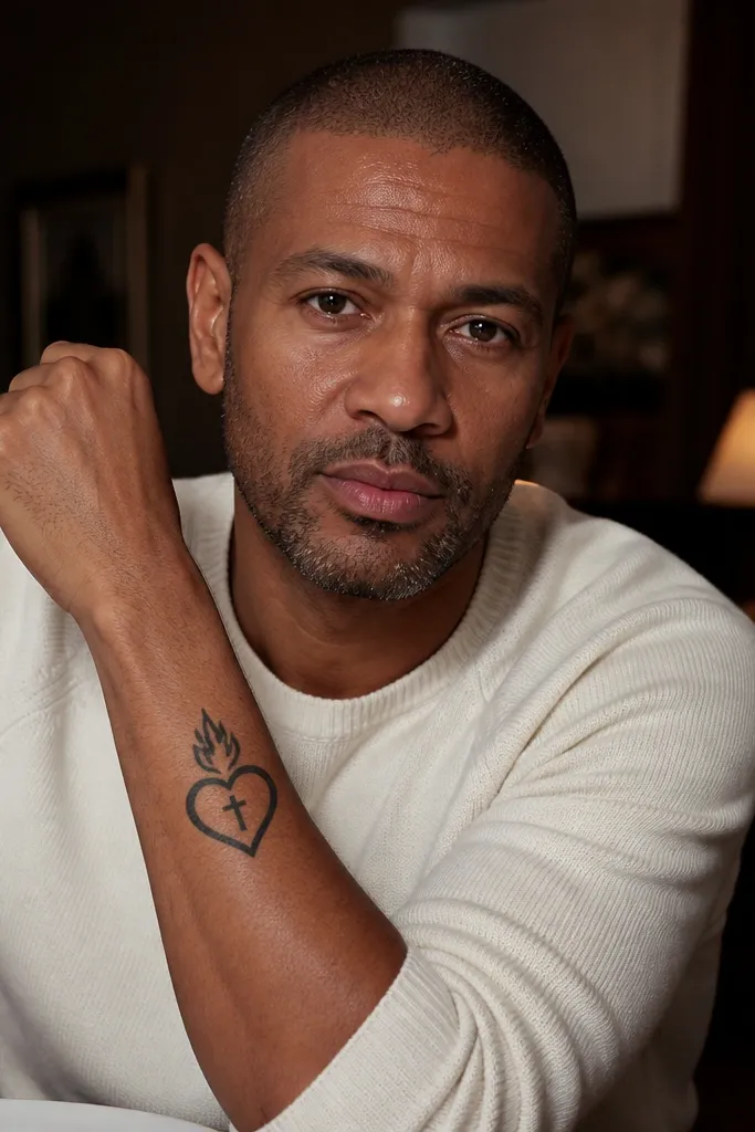
This is for people who want symbolism without turning the forearm into a full illustration. The flame is simplified into one clean shape, and the cross sits inside it as a tiny vertical mark. The result is a compact, graphic tattoo that still reads as Sacred Heart when seen quickly. The flame gives movement, and the cross gives meaning. It looks best slightly above mid-forearm so the flame can “point” upward toward the elbow.
Pick a placement around the upper third of the forearm, about 12-14 cm from the wrist. Draw the heart centered with a single simplified flame above it. Put the cross inside the flame as a thin outline or just two straight lines. Keep all lines the same thickness except the heart outline, which should be a touch bolder. For aftercare, keep the tattoo clean and avoid tight sleeves rubbing early — the flame and cross are thin, and friction makes them blur.
Choose straight, angular flame edges instead of rounded curls for a sharper look.
Don’t add extra flame layers or a crown — this design needs breathing room.
9. Outline Heart with Negative Space Rays
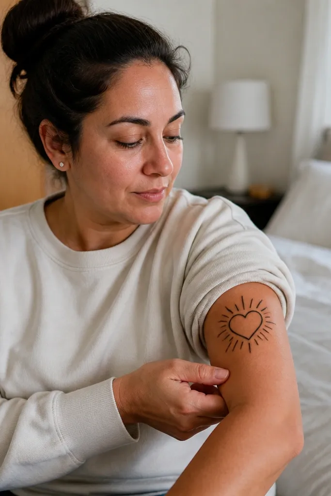
This is the cleanest minimalist trick: rays created by negative space instead of extra lines. The heart outline is solid, and the rays are implied by gaps that make light-looking streaks. It looks modern and crisp because there’s less ink to blur. This style also ages well because negative space stays negative space even when lines soften. If you want the Sacred Heart to look airy instead of heavy, this is the one.
Editor's noteIf you’re worried about visibility, increase the spacing between the negative rays instead of adding more ink.
Start with a heart outline and decide how many negative rays you want, like 4-6. Ask the artist to keep the rays as un-inked gaps behind the heart, not as thin lines. Make sure the heart outline is consistent and doesn’t over-thicken around the ray area. Size should be about 9-12 cm tall so the negative gaps remain visible. Aftercare is simple: treat it like an outline tattoo — gentle wash, light moisturizer, and no sun until healed.
One warningDon’t fill the rays with stipple — it removes the airy effect.
10. Heart on a Small Banner Without Letters

Text is where minimalist Sacred Heart tattoos often fail, so this one keeps the banner but skips the letters. The heart sits on a small ribbon shape, giving you that classic icon look without micro-lettering. The tattoo still reads as “Sacred Heart” because the heart is doing the job. The blank banner looks clean and graphic, and it ages without the fading-letters problem. Place it on the inner forearm so the ribbon drapes naturally with your arm.
Editor's noteIf you want the words later, add them as a separate session when the outline is fully healed.
Choose a vertical layout: heart centered, ribbon banner just below it. Keep the ribbon as a simple curved shape with two folds and no text. Ask for a slightly thicker outline on the heart and a thinner outline on the ribbon folds. Size target: 10-14 cm tall so the ribbon doesn’t look like a random strip. Aftercare: keep it moisturized and avoid stretching the skin with tight cuffs during the first week.
One warningDon’t cram tiny letters into a ribbon on the forearm — they blur first.
11. Two Hearts Stacked with One Ray
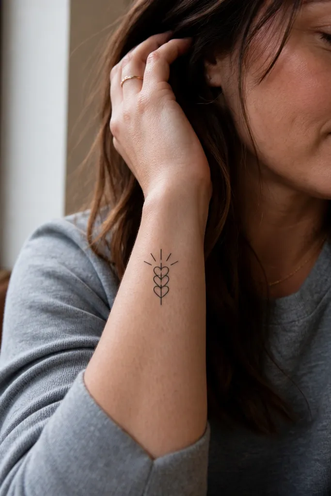
Stacking gives you a clean forearm composition and keeps it minimalist. Two small hearts share the same center axis, and only one ray line rises behind them for a subtle glow. It looks thoughtful and unusual without getting busy. This design is great if you like the idea of symbolism but want the tattoo to stay minimal and symmetrical. Outer forearm suits it because the stacked hearts look like a vertical emblem against the arm.
Start by deciding on a clear vertical stack — top heart smaller or equal size, but keep spacing between them so they don’t fuse. Ask for one single ray line behind the top heart, with consistent line thickness. Keep the outlines crisp and avoid shading between the hearts. Size: about 11-13 cm tall total so both hearts remain readable. Healing: outline tattoos can scab hard; don’t pick, and keep the area clean to prevent patchy ink loss.
Add a tiny notch detail at the top of the lower heart to make it feel intentional in close-ups.
Don’t add flames or crown with stacked hearts — it becomes crowded fast.
12. Heart with a Thin Ray Fan (5 Lines)
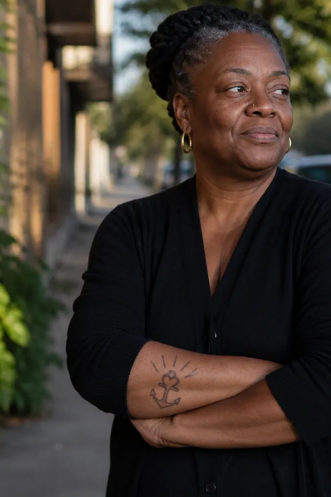
A ray fan looks aesthetic because it creates a smooth gradient of attention: the heart is the anchor, and the rays spread out like light. This version uses exactly five thin lines, which keeps it minimalist while still giving that “glow” feel. It photographs well because the rays catch side light and create depth even without shading. It’s a strong pick if you want a classic Sacred Heart look but with modern spacing. Place it mid-forearm for a balanced view.
Editor's noteIf the fan looks too delicate on paper, increase line thickness slightly but keep rays count at five.
Draw the heart first, then add a fan of five rays that spread evenly from behind the top half of the heart. Keep the rays thin and straight, not curved, so the design stays graphic. Ask the artist to keep the fan width narrow enough that the rays don’t extend too close to the arm’s edges. Size: 10-12 cm tall, with rays extending only a few cm beyond the heart width. Aftercare: protect from friction since rays are thin; consider a loose sleeve while it heals.
One warningAvoid curved ray waves — they make the tattoo look decorative instead of devotional.
13. Sacred Heart with Small Flame and No Rays
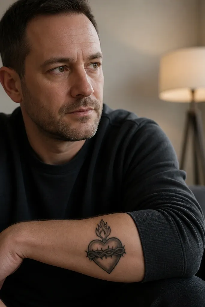
Some people think rays are required. They aren’t. A small flame above the heart gives the Sacred Heart energy, and leaving rays out makes the tattoo calmer. This approach is more minimalist and often heals cleaner because there are fewer thin lines to fade. It still reads as Sacred Heart because the flame shape is recognizable. It suits people who want a single focal symbol that looks good even when it’s partially covered by sleeves.
Pick a heart outline about 9-12 cm tall and place a single simplified flame above it. Keep the flame as one shape with a clean point at the top and one curve at the base. Skip rays entirely so the composition stays tidy. If you want extra symbolism, add a tiny cross inside the heart using two straight lines. Aftercare: the flame point will be the most delicate area — protect it from rubbing and sun.
Make the flame slightly taller than you think; small flames look accidental when they’re too short.
Don’t add dots behind the flame — it makes the symbol look like a random aura.
14. Heart Inside a Slim Oval Frame

A slim oval frame makes the tattoo look intentional and “finished” even when you keep the symbol minimal. The frame gives structure and helps the heart stay the focus. This design looks clean on photos because the oval line creates a border that reads well against skin texture. It also keeps the Sacred Heart from drifting visually as it ages. Place it on the inner forearm or just off-center on the outer forearm where the oval can follow the arm’s natural curve.
Start with a heart outline sized to about two-thirds of the oval’s height. Ask for a thin oval frame line that’s even all the way around, with small spacing from the heart outline. Keep rays minimal or completely out so the frame does the structuring. Size: total height 10-14 cm, with the oval slightly longer than the heart. Healing: frame lines can thicken if overworked, so keep the line weight consistent and don’t let the artist double-pass the oval.
If you want more glow, add a single dotted line behind the heart, not a full dot field.
Avoid thick black frames — they turn into a heavy badge on the forearm.
15. Minimal Sacred Heart with Two Flame Points
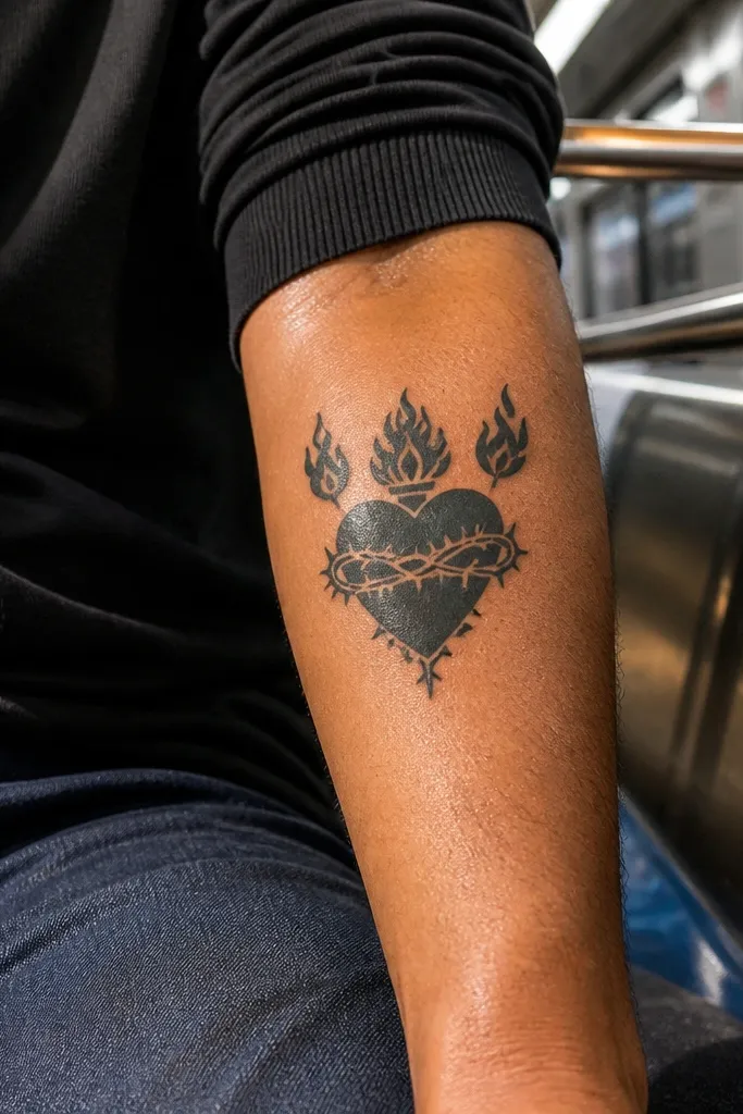
This version uses two flame points instead of a full flame stack. The heart is centered, and the flame points sit like brackets around the top — clean, graphic, and very forearm-friendly. It’s a good choice if you want symmetry but don’t want the classic flame curl that can look busy. It also gives a “lightning” feel when the arm moves, which looks great in motion photos. Place it slightly above center forearm for the best visual lift.
Editor's noteAsk for the flame point tips to be rounded — they hold shape better than sharp tips.
Choose a heart outline about 9-12 cm tall. Ask for two flame points placed symmetrically on either side of the heart’s top edge, with no extra flame curls. Keep linework consistent and avoid adding rays. If you want a cross, add it as one thin vertical line inside the heart. Aftercare: keep the tattoo moisturized and avoid heavy stretching during the first week so the thin flame points heal evenly.
One warningDon’t add crown details — the top area is already doing the work.
16. Sacred Heart with Thin Rays and One Spark
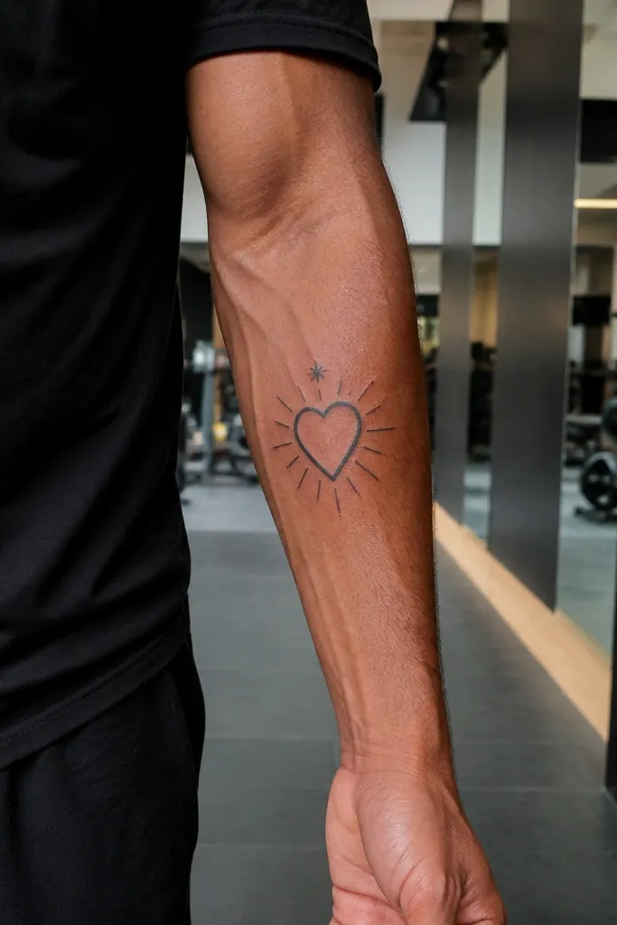
This is minimalist with a wink. You get thin rays for glow, but only one “spark” detail above the heart. That tiny extra mark makes the tattoo look styled and slightly playful without losing the devotional symbol. It photographs well because the spark catches light like a highlight. If you’re tired of every Sacred Heart looking identical, this one gives you a distinctive focal detail while staying clean and simple.
Start with a heart outline about 10-12 cm tall. Add 4-6 thin rays behind the top half of the heart, evenly spaced. Place one small spark as a short star-like shape or a single dot with tiny lines above the rays. Keep the spark line weight the same as the rays so it doesn’t look like a separate tattoo. Healing: thin rays need protection from sun; use sunscreen once fully healed and avoid heavy friction during healing.
Keep the spark small enough to read as a highlight, not a separate symbol.
Avoid multiple sparkles — it stops being minimalist and starts being decorative.
17. Heart with a Micro Crown and Thin Rays

If you want the full Sacred Heart vibe but still minimalist, do it with micro details. The crown is tiny, the rays are thin, and the heart outline stays the main focus. This design feels classic because the crown is present, but it avoids the heavy crown work that can look cluttered. It also looks good on a forearm because the crown sits near the upper part of the symbol, balancing the heart. Outer forearm placement works well since the crown and rays read clean along the arm’s length.
Editor's noteIf your artist tends to thicken lines, ask for a test stencil placement first to confirm the crown won’t disappear.
Set your size first: target 10-14 cm tall so the crown has room to breathe. Ask for a micro crown with 3-5 points, drawn thin. Add thin rays behind the top half of the heart, keeping them straight and short. Skip any heavy shading and keep the heart outline consistent. Aftercare: crown points are delicate; don’t scrub hard in the shower and keep the area protected from friction.
One warningDon’t add jewels or crown shading — minimalist needs clean edges.
18. Minimal Sacred Heart with Two Ray Lines Only
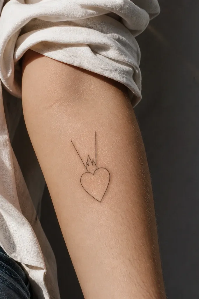
This is the simplest version that still looks like Sacred Heart. Two rays create symmetry and glow, but the tattoo stays quiet and clean. It’s great for people who want a forearm piece that looks good in casual outfits and doesn’t scream for attention. The heart outline does the religious work, and the rays give just enough light effect. This design also ages predictably because there are fewer thin details to fade unevenly.
Editor's notePlace it closer to the inner forearm so the symmetry reads clean against skin folds.
Choose a heart outline around 8-10 cm tall. Add exactly two rays behind the heart’s top, spaced evenly and drawn thinner than the heart. Keep all other elements out — no flames, no crown, no banner. If you want one extra detail, add a tiny cross inside the heart as a single vertical line. Aftercare: outline-only tattoos can look slightly faded during healing, but they settle — don’t chase it with extra ink too soon.
One warningAvoid adding extra rays “because it looks empty” — it will lose the minimalist look.
19. Heart with a Slim Ribbon Curve (No Banner Fold)

Instead of a full banner, this uses a slim ribbon curve under the heart. It gives the Sacred Heart icon shape without the extra folds that can clutter a minimalist tattoo. The curve creates a gentle underline that looks elegant in photos and complements the forearm’s shape. This design is also easier to keep crisp because the ribbon is one clean stroke. It suits people who want a subtle devotional piece that still looks “styled” rather than plain.
Size the heart first at about 9-12 cm tall. Then add a thin ribbon curve beneath it — one smooth line that dips slightly in the middle. Keep the ribbon outline thin and consistent with the rays (or skip rays entirely). If you include a cross, keep it minimal inside the heart. Healing: ribbon lines can be sensitive to motion, so avoid heavy lifting with tight sleeves during the first week so the skin doesn’t rub.
Use a single smooth curve instead of two sharp bends; smooth curves heal cleaner.
Don’t add text to the ribbon — thin lettering fades quickly on the forearm.
20. Sacred Heart with Rays as Short Ticks
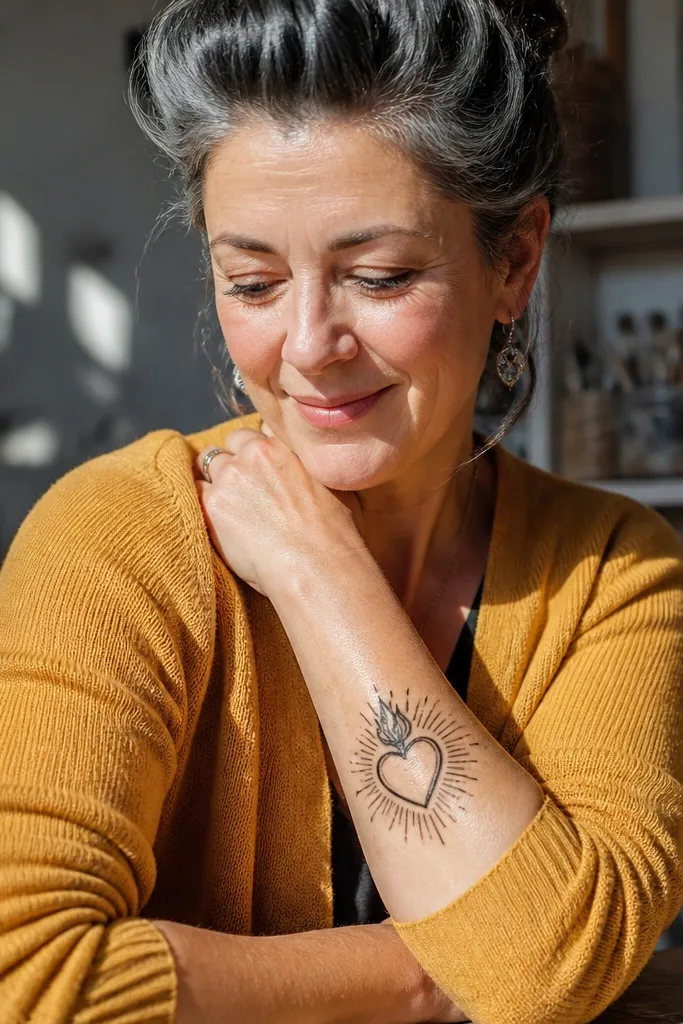
Tick-mark rays are minimalist in a way that looks graphic and modern. Instead of long lines, you get short, evenly spaced marks that suggest light without adding too much ink. The heart stays clean, and the ticks create a textured glow that looks good under different lighting. This version is also a good compromise if you want more visual energy than two rays, but you don’t want the tattoo to become busy. It reads well on the forearm because the ticks align with the arm’s vertical orientation.
Editor's noteIf you want it to look extra crisp, ask for ticks with squared ends instead of rounded ends.
Start with a heart outline about 10-13 cm tall. Place 6-10 short tick rays behind the top half of the heart, all the same length and spacing. Ask the artist to keep tick rays thinner than the heart outline. Skip shading; the ticks do the visual interest. Aftercare: keep the tattoo protected from sun early because tick lines are short and can fade unevenly if exposed.
One warningAvoid thick dot clusters for rays — ticks keep the minimalist look.



