

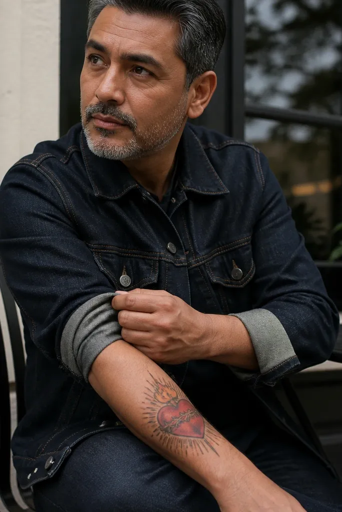
1. Classic Sacred Heart with Radiant Rays and Small Cross
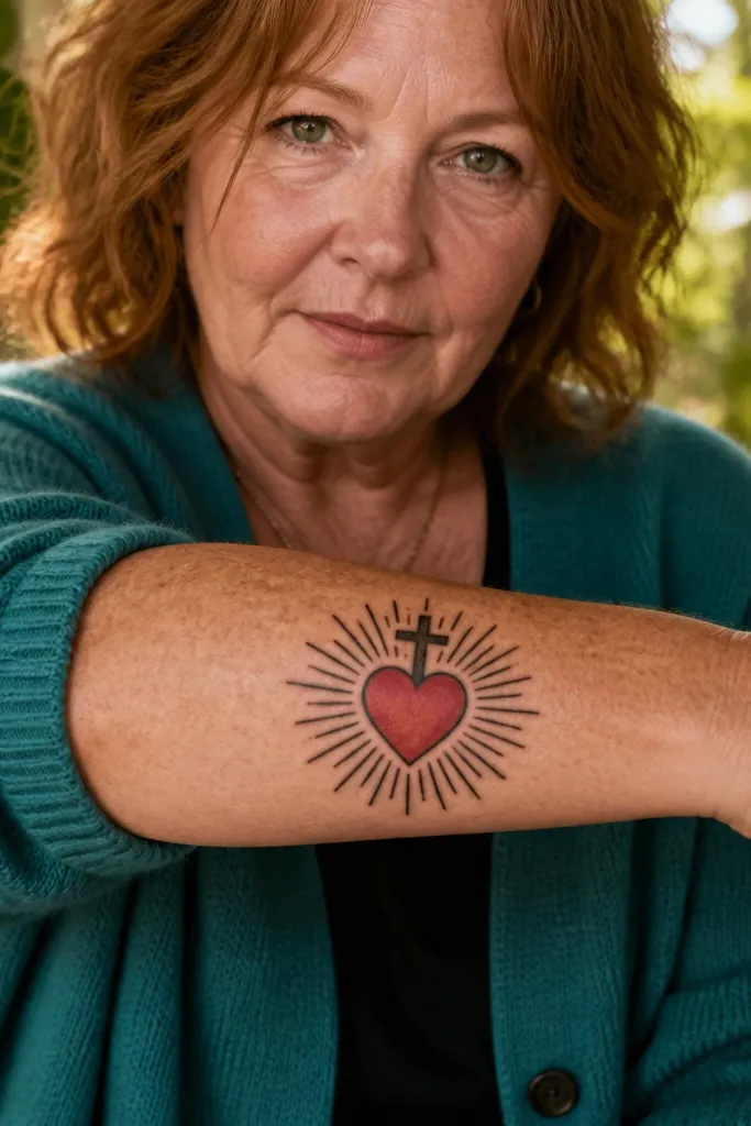
This is the cleanest “Sacred Heart of Jesus Tattoo Meaning” look because the composition is simple and instantly readable. The heart sits dead center, with a small cross perched above so your eye lands on the devotion first. Straight rays radiate outward like a halo, which makes the tattoo feel bright even if you keep the palette mostly black and gray. If you want a design that looks good in both close-up and from across the room, this layout wins. It fits people who like traditional symbolism but don’t want a cluttered background.
Start by placing the heart so it has breathing room — aim for at least one finger-width of space around the rays. Keep the cross smaller than the heart so it doesn’t steal the spotlight, and use dark outlines to lock the silhouette. For shading, use black-and-gray gradients on the heart and a restrained red wash only on the wound area or inner glow. Then choose ray style: use evenly spaced straight lines for crisp clarity. Aftercare is standard, but if you go heavy on red, expect a slightly muted tone as it heals and plan a touch-up for the brightest glow.
Editor's noteAsk your artist to stencil the ray spacing before ink — even spacing is what makes this look “designed,” not improvised.
One warningDon’t add extra icons like roses or rosary beads around the rays unless you’re going large enough to keep the heart readable.
2. Sacred Heart with Crown of Thorns Band
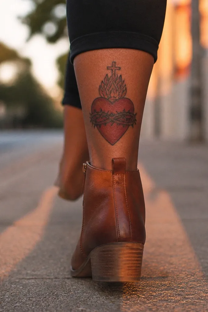
This design leans into sacrifice and endurance while still looking polished. The thorny band wraps around the heart in a continuous curve, creating a strong visual frame that makes the heart feel protected and wounded at the same time. Keep the thorns sharp and evenly angled so the band reads as intentional linework instead of scratchy texture. The cross above stays minimal, letting the thorn band do the storytelling. It’s a great pick if you want symbolism that feels emotional without adding a busy background.
Start with a medium-size heart and plan the thorn band as a single wrap so it doesn’t look like random spikes. Use linework-first thorns — thin, consistent thorn strokes with black-and-gray shading in the band’s inner curve. Add small highlight dots or light gray shading on a few thorns only, because too many highlights make it look metallic and messy. Then place the design where the wrap can follow anatomy: upper arm or ribs. Healing-wise, thorn linework can look slightly softer after a few weeks — a touch-up helps if your artist uses very fine lines.
Keep the thorn band thickness consistent from top to bottom so the tattoo stays clean as it heals.
Avoid mixing thick black thorns with tiny thin thorns in the same band — it creates a patchy look over time.
3. Sacred Heart with Rosary Beads and One Hanging Crucifix

A rosary pairing makes the meaning feel prayer-focused and personal. The beads create an elegant rhythm, and the single hanging crucifix adds a clear devotional cue without turning the piece into a crowded collage. Visually, beads also give the tattoo a “flow” — the eye travels from the heart down through the beads. If you like symbolism that feels active and repeated, this is the layout. It looks especially good when the beads are drawn with spacing you can count, not melted into a gray blob.
Start by drawing the Sacred Heart slightly above center, so the rosary has space to hang naturally. Use bead circles of consistent size with tiny gaps between them, and shade only the bead undersides for depth. Add a small crucifix at the end, keeping it narrower than the heart so it doesn’t overpower the focal point. Place it on a forearm or side of the upper arm where the drape direction matches movement. Aftercare: keep it moisturized and don’t scrub the bead lines — fine detail fades faster if you over-clean in the first week.
Ask for bead spacing that matches the diameter of the heart — the proportions make it look intentional.
Skip adding multiple crucifixes or extra wording if you’re going under 6 inches — it gets crowded fast.
4. Sacred Heart with Banner Ribbon Reading INRI
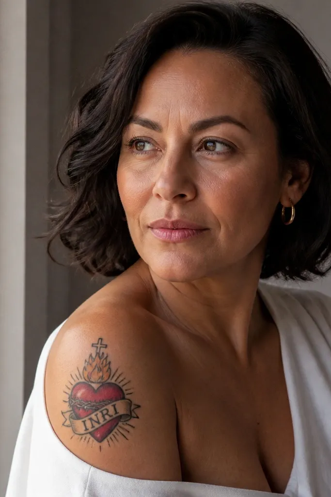
Text can look beautiful on a Sacred Heart when the ribbon is designed like fabric, not like a sticker. The banner ribbon gives motion — it breaks the symmetry so the tattoo feels alive while still centered around the heart. “INRI” is short, high-contrast, and readable, which makes it a strong choice for legibility. This design works if you want the tattoo to feel devotional and slightly dramatic, without needing a full scene. The key aesthetic is crisp ribbon edges and clean letter spacing.
Start with the heart centered and let the ribbon wrap around it in a gentle S curve. Use a simple serif or block-letter style — keep the letters bold enough to survive healing. Shade under the ribbon folds with soft gray so the fabric looks dimensional but not smoky. Place it on the upper arm, shoulder, or sternum for the best banner curvature. Aftercare: lettering needs patience — avoid stretching the area for the first few days and plan a touch-up if the letters soften.
Bring a reference for the exact letter style you like, because INRI readability depends on font thickness.
Don’t use thin, hairline lettering — it blurs within a year.
5. Sacred Heart with Burning Flames and Warm Glow
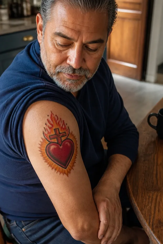
Flames add heat and emotion, turning the Sacred Heart into something visually dramatic. The secret to making it look beautiful is limiting the flame palette and placing it so it frames the heart, not swamps it. A warm glow around the heart looks like light radiating from within, which makes the whole piece feel alive. This layout suits people who want the meaning of sacrifice and love to feel intense, not delicate. It’s also very photogenic because the flames create natural highlights.
Start by outlining the heart and cross with clean black lines, then keep flame shapes larger near the heart and thinner at the tips. Use a limited color plan: red for the base, orange-yellow for a narrow highlight zone, and black-and-gray for smoke edges. Blend the flame transitions softly so the glow feels continuous, not banded. Place it on the upper arm or calf where vertical flame movement looks natural. Healing-wise, color gradients can fade — ask your artist to keep the darkest reds concentrated so the tattoo still reads after months.
Ask for a “hot core” — darkest red should touch the heart wound area, not stop short of it.
Avoid adding green or overly saturated blue shadows — it makes flames look like fantasy fire instead of devotional glow.
6. Sacred Heart with Angel Wings in Black-and-Gray
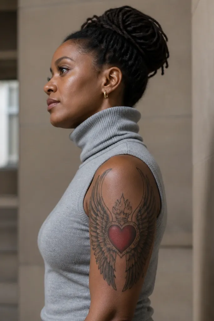
Angel wings make the Sacred Heart feel protected and reverent without needing extra text. The best versions use black-and-gray wings with a smooth feather gradient that frames the heart like a spotlight. Keep the wings symmetrical and slightly angled so they don’t look like a static stencil. This is a strong option if you want a larger piece that still looks clean and grown-up. It also photographs well because wings create depth and contrast.
Start with the heart as the anchor, then sketch wing contours that mirror each other across the centerline. Use soft feather shading — darker at the outer edges, lighter toward the heart — so the wings look dimensional. Keep feather lines thin and spaced so the wing doesn’t turn into a gray blur. Place it on the upper back, shoulder blade, or chest where the wings can spread naturally. Aftercare: larger black-and-gray areas take longer to settle; keep sun off it until fully healed to prevent patchiness.
Ask for the wings to fade slightly before they reach the skin edges so it looks like a gradual frame.
Don’t add halos, rays, and flames together on this one — wings already give the framing.
7. Sacred Heart with Crossed Swords Behind the Heart
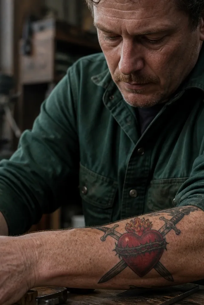
Crossed swords behind the heart give a strong “faith under pressure” vibe. The heart stays centered and holy, while the swords add intensity and discipline. This design looks best when the swords are drawn with realistic structure — flat blades, clear edge highlights, and consistent perspective. It’s not for subtle people. It’s for someone who wants their Sacred Heart to look powerful, not gentle.
Start by drawing the heart and cross first, then place swords behind it so the heart clearly overlaps the blades. Use black-and-gray shading on the swords with a bright highlight line along one edge for readability. Keep sword hilts close to the heart so the composition stays compact. Place it on the forearm, upper arm, or thigh where the crossed angle reads cleanly. Aftercare: blade lines can look sharp for months, then soften — a conservative line weight helps the tattoo age well.
Editor's noteHave your artist pick one blade finish — matte black shading or polished highlight — and stick to it.
One warningAvoid adding extra weapons or skulls — it turns devotional symbolism into generic dark tattooing.
8. Sacred Heart with Crown and Rays Split into Two Tiers
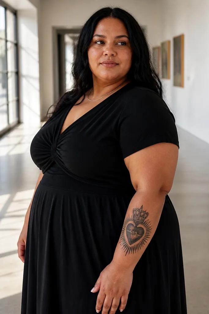
Two-tier rays make this look designed and layered, not flat. The crown adds authority and devotion, while the rays create a halo-like structure that gives the whole tattoo depth. The aesthetic is clean and “graphic,” especially if you keep the rays crisp and the crown detailed but not overly busy. This is a great choice for a forearm or upper arm where you want a strong, symmetrical look that still has dimension. It also reads well in photos because the crown gives a top focal point.
Start by placing the crown directly above the heart, with the crown points aligned to the heart’s width. Draw the rays in two layers: an inner set of shorter rays and an outer set of longer rays with consistent spacing. Use black-and-gray shading under the crown and red wash inside the heart for contrast. Keep the rays' line weight consistent so they don’t look like two different artists. Placement: upper arm for symmetry or outer forearm for a clean vertical read. Aftercare: crown fine points can catch scabs — keep the area clean and moisturized, and don’t pick.
Use a stencil grid for ray spacing — two-tier symmetry looks best when it’s mathematically even.
Avoid thickening the outer rays more than the inner ones — it makes the halo look lopsided after healing.
9. Sacred Heart with Watercolor-Style Halo Smoke
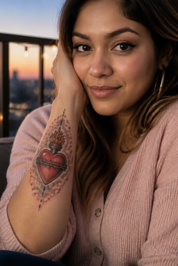
If you want a Sacred Heart Tattoo that looks airy and modern, halo smoke does the job. The heart stays crisp, but the background fades into pale gray or light pink wash around it, like incense and prayer in visual form. This approach is pretty without being childish, because the heart still has strong structure. It suits people who want a softer aesthetic but still want the symbolism to feel devotional. The best versions keep the watercolor controlled, with clean edges around the heart.
Start with the Sacred Heart in solid linework and black-and-gray shading so the focal point stays readable. Then add the halo smoke as a low-contrast watercolor wash around the rays area, keeping it lighter than the heart. Use very few colors — gray with a hint of pink or warm tone — and avoid heavy saturation. Place it on the upper chest, shoulder, or upper arm where the background haze can spread without clutter. Healing: watercolor fades faster than solid black; ask for slightly bolder initial contrast so it still looks soft after months.
Ask your artist to keep the watercolor behind the rays linework, not on top of it, for cleaner readability.
Avoid fully watercoloring the heart itself — it usually blurs the wound detail.
10. Sacred Heart with Grapevine Leaves and Cluster

Grapevine leaves connect to the idea of communion and spiritual fruitfulness, and they look gorgeous when drawn like real botany. The leaves frame the heart naturally, creating a balanced composition without needing rays everywhere. This design feels organic instead of purely graphic. It’s also a great way to add symbolism without text. The aesthetic is dark green-black tones with subtle gray highlights, which photograph well against skin.
Start with the heart centered and then build a vine that wraps diagonally across the piece. Use leaf shapes that taper at the tip and vary slightly in size so it doesn’t look like a repeating pattern. Shade the vine with black-and-gray and add a thin highlight line on leaf edges for a crisp look. Place it on the forearm, calf, or upper arm where the vine can curve with muscle lines. Aftercare: leaf detail is fine-line work, so protect it from friction during healing.
Keep the vine thickness consistent — thin vines with thick leaves look off in healed photos.
Avoid adding too many grape clusters — one small cluster is enough to read.
11. Sacred Heart in an Ornate Oval Frame with Rays
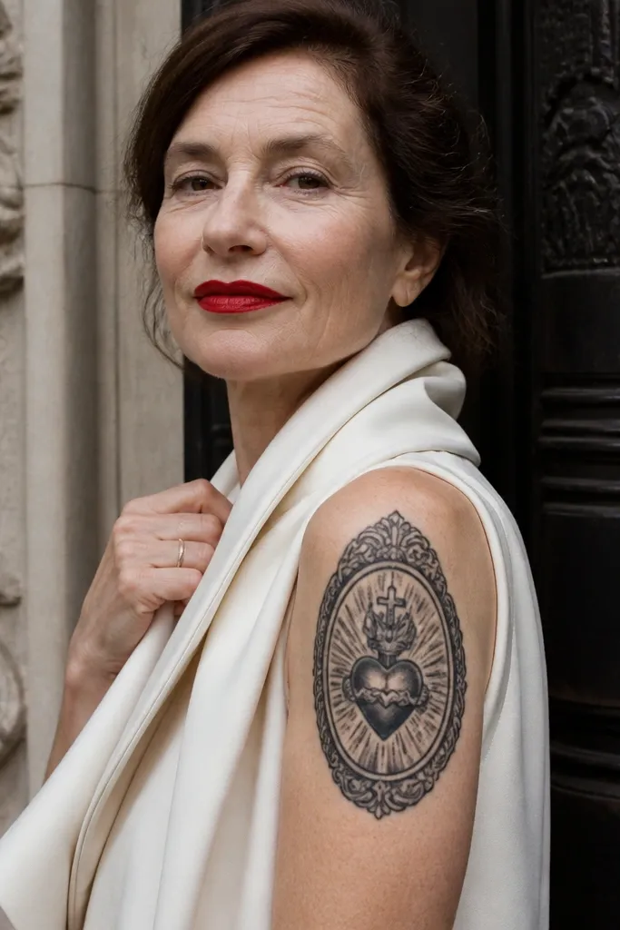
An oval frame makes the Sacred Heart feel like a devotional emblem. The ornate border gives you that antique medal look, while rays behind the heart keep it unmistakably Sacred Heart. This design is ideal if you want a tattoo that looks intentional and “finished” even from the side. It’s also a smart choice for cover-ups because the border can hide uneven skin texture. The best versions keep the frame crisp and not too busy.
Start by sizing the oval so it contains the heart plus breathing space for rays. Use a double-line border or a patterned border with consistent spacing so it stays readable. Shade inside the oval with light gray to separate it from the skin, then keep the heart’s wound area darker for contrast. Place it on the upper arm, shoulder, or chest where the oval sits flat. Aftercare: ornate borders can blur if the line weights are too thin; ask for medium line weight on the frame.
Choose one ornament style — scrollwork or dots — and don’t mix three ornament types.
Avoid heavy background filling behind the oval — it competes with the rays and frame.
12. Sacred Heart with Small Cross and Two Doves

Doves add peace and the Holy Spirit symbolism without making the piece feel fluffy. With the heart centered, the doves sit like a gentle balance on both sides, creating a calm, symmetrical composition. It’s visually soft but still devotional because the heart remains the core. This tattoo works well for people who want their Sacred Heart to look spiritual and graceful, not aggressive. It’s also very photogenic because doves create clear negative space.
Start with the heart and cross, then place two doves at mid-height on either side so they don’t crowd the top rays or crown area. Use black-and-gray shading lightly on the wings, and keep feather lines minimal for longevity. A crisp silhouette with a few highlight lines looks better than detailed feathers that fade. Place it on upper chest, shoulder, or upper arm where the symmetry can show. Aftercare: negative-space doves heal cleanly, but keep the heart area protected because it has the most contrast.
Editor's noteAsk for doves to face inward toward the heart — that small choice makes the symbolism feel directed.
One warningDon’t add extra birds or clouds; two doves are enough to keep the composition clean.
13. Sacred Heart with Lilies on One Side and Thorns on the Other
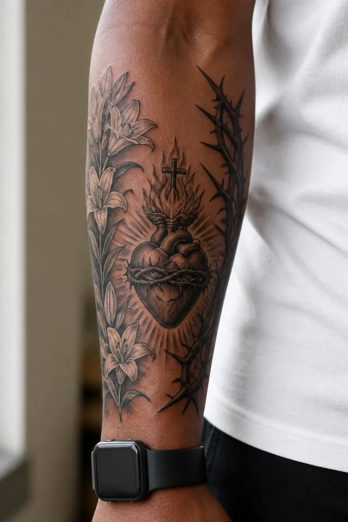
This is a contrast design — purity on one side, sacrifice on the other. Lilies give a clean, floral structure, while thorns add texture and meaning. The heart stays centered, and the two sides create a visual argument that reads instantly. It looks great when the lilies are drawn as tall, tapering stems with a few defined blossoms, not a full bouquet. This one suits people who want the tattoo to feel balanced emotionally, not one-note.
Start by sketching a centerline and deciding where the lilies sit — usually left or right — so the composition doesn’t feel random. Draw lilies with simple petals and consistent stem thickness, then add thorns as a vine with sharp points that wrap toward the heart. Shade the lily petals with light gray gradients and keep thorns darker for contrast. Place it on the forearm, calf, or ribs where the stems can run vertically. Aftercare: floral linework can fade; keep line weight medium and avoid over-thin outlines.
Keep lily leaves minimal. Fewer leaves look cleaner once healed.
Avoid filling the background between lilies and thorns — the negative space is what makes the contrast work.
14. Sacred Heart with Crossed Keys Below the Heart
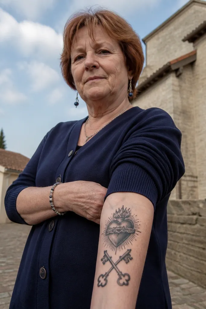
Keys are a powerful pairing when you want the symbolism to feel about authority, guidance, and responsibility. The heart stays the emotional center, while the keys add a structured, almost heraldic feel. Visually, crossed keys create an X shape that balances the vertical heart and cross. This design looks best when the keys are drawn with clear teeth and a consistent perspective. It’s a strong option for someone who likes Sacred Heart meaning but wants a more graphic, symbolic tattoo.
Start by putting the heart and cross at the top half of your canvas, leaving space beneath for the keys. Draw the keys crossing at a clear point, with teeth defined enough to read as keys after healing. Shade the keys in black-and-gray with a thin highlight on one edge. Keep the keys slightly smaller than the heart so the heart remains the focus. Placement: upper arm, thigh, or forearm where the X shape can sit flat. Aftercare: metallic-looking keys depend on contrast — keep the contrast high and don’t let the artist over-blend the highlights.
Editor's noteAsk for teeth to be drawn as small, repeated shapes — they read better than one solid jagged block.
One warningAvoid adding a full shield outline unless you’re doing a larger size; it can overwhelm the heart.
15. Sacred Heart with Crown and Rays Forming a Sunburst Frame

A sunburst ray frame makes the Sacred Heart look like a devotional emblem you can wear like jewelry. The crown adds a top anchor, while the round ray pattern creates instant symmetry. This layout photographs well because the sunburst gives a clear silhouette that stands out even when the tattoo is partially covered by clothing. It’s also a good choice if you want the tattoo to look strong on both skin and clothing photos. Keep it mostly monochrome with warm heart color so the rays don’t become a rainbow mess.
Start by sketching a circle guide for the ray frame so spacing stays even. Place the crown directly above the heart, with the crown width matching the heart’s width. Use medium-length rays for the first ring and shorter rays inside to create depth. Shade the heart with black-and-gray and add warm red to the wound and inner glow. Place it on the upper arm, shoulder, or upper chest where the round frame can sit centered. Aftercare: sunburst rays are linework — avoid heavy friction and keep it moisturized so the lines heal dark.
Use fewer ray lengths than you think — 1-2 rings usually look cleaner than 3 rings.
Avoid tiny rays packed too tightly; they blur into a halo after a year.
16. Sacred Heart with Handwritten-Style Script Under the Heart
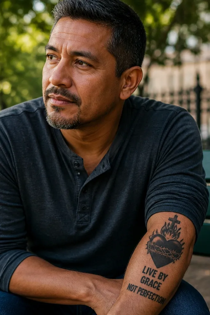
If you want meaning you can read, script under the heart can look gorgeous when it’s placed like a signature. The key is keeping the script short — one phrase — and letting the heart stay the main visual. Handwritten-style lettering adds warmth and personality, but it only works when the ink is bold enough to survive healing. This design is for people who like a more intimate, personal Sacred Heart tattoo rather than a purely emblematic one. It’s also a great way to reduce clutter while still adding symbolism.
Start with a heart sized so the script has room underneath without squeezing. Use a bold script style with consistent stroke thickness; avoid super thin cursive. Place the baseline of the script slightly arched so it matches the heart’s shape. Shade the heart with black-and-gray and keep the cross small and crisp. Placement: upper arm or forearm where you can control how the script curves with movement. Aftercare: script needs extra protection from stretching; keep the area from being tight or stretched for the first week.
Editor's notePick one phrase and keep it short. Long lines make script blur.
One warningDon’t add multiple lines of text under the heart — it turns into a smudge.
17. Sacred Heart with Mirrored Rays and Geometric Background
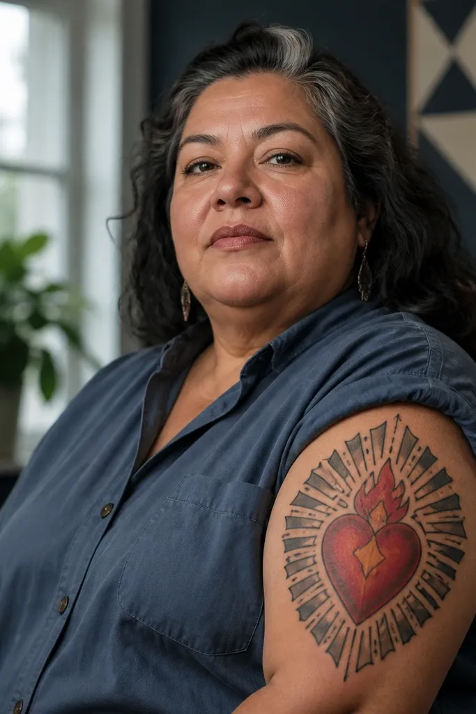
Geometric backgrounds make Sacred Heart tattoos look modern without losing devotion. The heart stays organic and emotional, while triangles or symmetrical lines create structure around it. This contrast makes the tattoo look sharp and “designed,” especially if the geometric lines are clean and evenly spaced. It’s a smart choice if you want the Sacred Heart meaning but you also like clean, graphic tattoos. The symbolism reads through the heart, and the geometry adds a sense of order.
Start by drawing the Sacred Heart with solid outlines and clear shading — don’t let the geometry dictate the heart style. Then add a geometric background using one or two shapes like triangles or a hexagon frame, keeping line thickness consistent. Use negative space so the geometric lines don’t cover the rays; rays should still be visible. Place it on the upper arm or shoulder blade where the geometry can sit flat. Aftercare: geometric linework heals well, but keep the background from being too dense — density increases blur.
Ask your artist to keep the geometry behind the rays, not on top of them, so the heart stays readable.
Avoid filling the entire background with dots — it kills contrast and makes the heart harder to read.
18. Sacred Heart with Blue-Gray Watercolor Cross and Soft Cloud Base
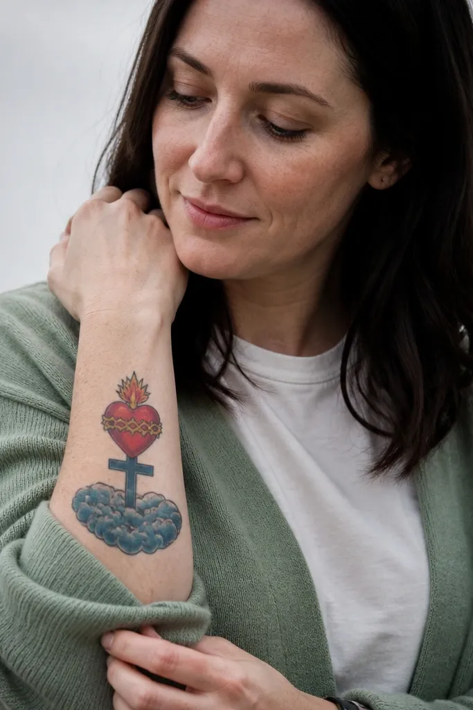
This version shifts the mood from fiery to calm. A blue-gray cross and cloud base make the Sacred Heart feel like it’s floating in prayer, while the heart stays the warm emotional anchor. The symbolism still reads clearly, but the atmosphere is gentle. It’s a great option if you want something that looks pretty in daylight and doesn’t feel too heavy for the chest or upper arm. The aesthetic is soft contrast — you need it to look airy, not washed out.
Start with the heart in black-and-gray with restrained warm red highlights. Add the cross in blue-gray tones with a soft gradient, then place a cloud base below using light gray shading that fades outward. Keep the cloud edges clean around the heart so the design doesn’t look like accidental smudging. Place it on the upper chest, collarbone area, or upper arm where the “floating” look flatters your body lines. Aftercare: watercolor-like soft shading fades sooner; ask for slightly stronger contrast around the heart outline so it stays crisp.
Use fewer blue-gray tones — two shades plus one highlight looks cleaner than a rainbow wash.
Avoid going fully watercolor on the heart outline; keep the heart outline solid.
19. Sacred Heart with Thick Black Outline and Minimal Rays
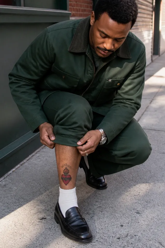
Bold outlines make Sacred Heart tattoos look modern and graphic. Minimal rays keep the symbolism clear without turning into a full halo explosion. This design is ideal if you want something that ages well because thick linework holds its shape better than super fine detail. The heart’s shading can stay simple — black-and-gray with a few red accents — so the tattoo stays readable even years later. It’s also easier to place on smaller areas without clutter.
Start by committing to thick linework on the heart and cross — ask for medium-to-bold outlines with consistent thickness. Keep rays to a small set of straight strokes behind the heart rather than dozens of lines. Use black-and-gray shading with minimal gradients so the heart doesn’t turn into a gray blob. Add red only on the wound and inner glow so the tattoo has one focal color. Placement: forearm, bicep, or upper arm where bold lines look clean. Aftercare: thick lines trap a bit more pigment; keep moisturizing consistent and avoid picking scabs to preserve edges.
If you want this style, size it so the heart is at least 3.5 inches tall — tiny hearts with thick outlines look squashed.
Avoid adding tons of extra symbols. Minimalism only works if the design stays spacious.
20. Sacred Heart with Scapular-Style Border and Central Heart
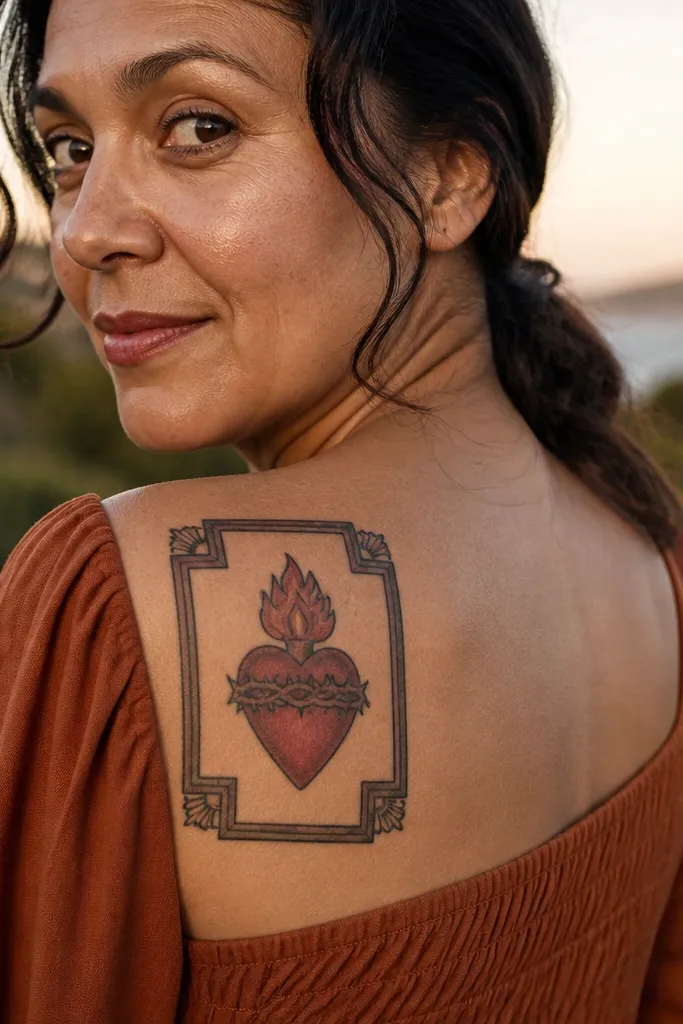
A scapular-style border gives you that devotional patch look, like a badge you’d want to wear. The central heart stays clean and readable, and the border adds texture without stealing the spotlight. This design is great for people who love symbolism but don’t want text everywhere. It looks especially good in black-and-gray with a single red heart glow. The border also gives the tattoo a clear edge, which helps it look finished on the body.
Start by choosing a border pattern: a simple repeating cross motif or a dotted border with a few corner ornaments. Keep the border thickness even and frame the heart with a consistent margin. Use black-and-gray for the border and keep the heart more contrasty. Place it on the upper arm, shoulder, or outer thigh where the shape can sit like a panel. Aftercare: borders can blur if too detailed; keep line spacing clear and avoid tiny micro-patterns. Plan a touch-up if your artist uses very thin dotted lines.
Ask for the border to be drawn as a single frame, not separate pieces — one continuous outline heals cleaner.
Avoid adding background shading behind the border panel. Let the skin negative space do the work.



