
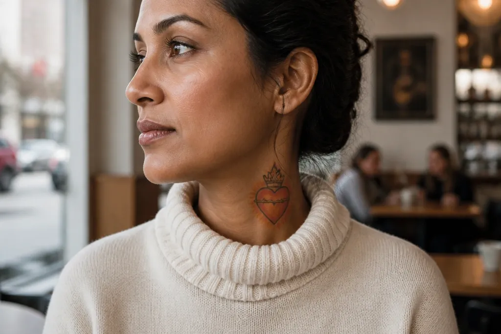
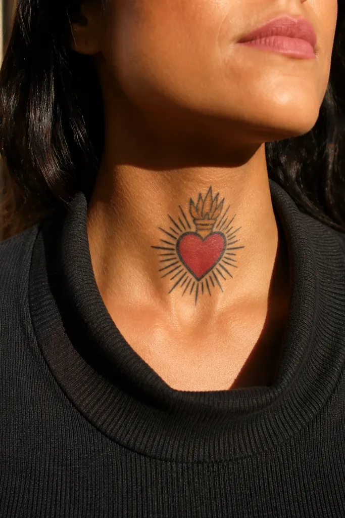
1. Classic Centered Heart with Halo Ring
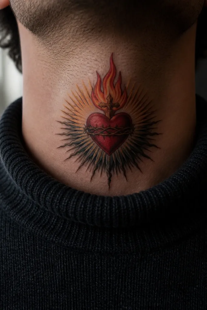
This is the Sacred Heart Neck Tattoo layout that stays readable even when your skin stretches. The heart sits dead-center on the front neck, so the glow and flame point upward without getting distorted. A simple halo ring gives you a clean, photo-friendly frame, and the dark rays below add contrast against your skin. If you want bold, this one is about silhouette first, shading second.
Start by sketching the heart so it’s tall rather than wide — aim for about 3 inches tall for a first pass. Then ask your artist to use medium-to-thick black linework for the heart outline and keep the halo as one continuous ring with no tiny gaps. For the glow, request a tight red-to-orange gradient that stays inside the heart edges, not bleeding outward. Finally, keep the rays to a small set of longer strokes so they age into readable shapes instead of speckling.
Ask for the flame to be slightly tapered and pointed, so it looks sharp in motion.
Avoid a halo made of lots of tiny dots; they fade into gray on the neck.
2. Blackwork Sacred Heart with Red Ember Highlight
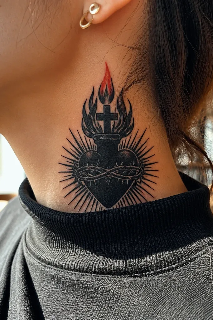
Start placement on the front-side junction so the heart can sit slightly angled toward your collarbone. Then choose a thick outline and ask for solid black fill in the heart, with gray only where you need depth under the flame. Next, request the red ember as a small, controlled patch — think a coin-sized glow area at most, not a full wash. Finally, keep the rays minimal: a few bold lines or none at all, so the black structure stays dominant.
This design leans hard on contrast: almost all blackwork, with a single red ember highlight at the flame. The result is bold and graphic, and it keeps its punch because the red is limited to one focal point. It looks especially good on the side of the neck where the tattoo catches light as you turn. If you like the idea of color but hate maintenance, this gives you color without the “everything fades” problem.
One warningSkip heavy red gradients across the whole heart; they soften faster on the neck.
Editor's noteUse a matte red ink tone (not hot neon) so it blends into warm skin undertones.
3. Fine-Line Sacred Heart with Micro-Rays
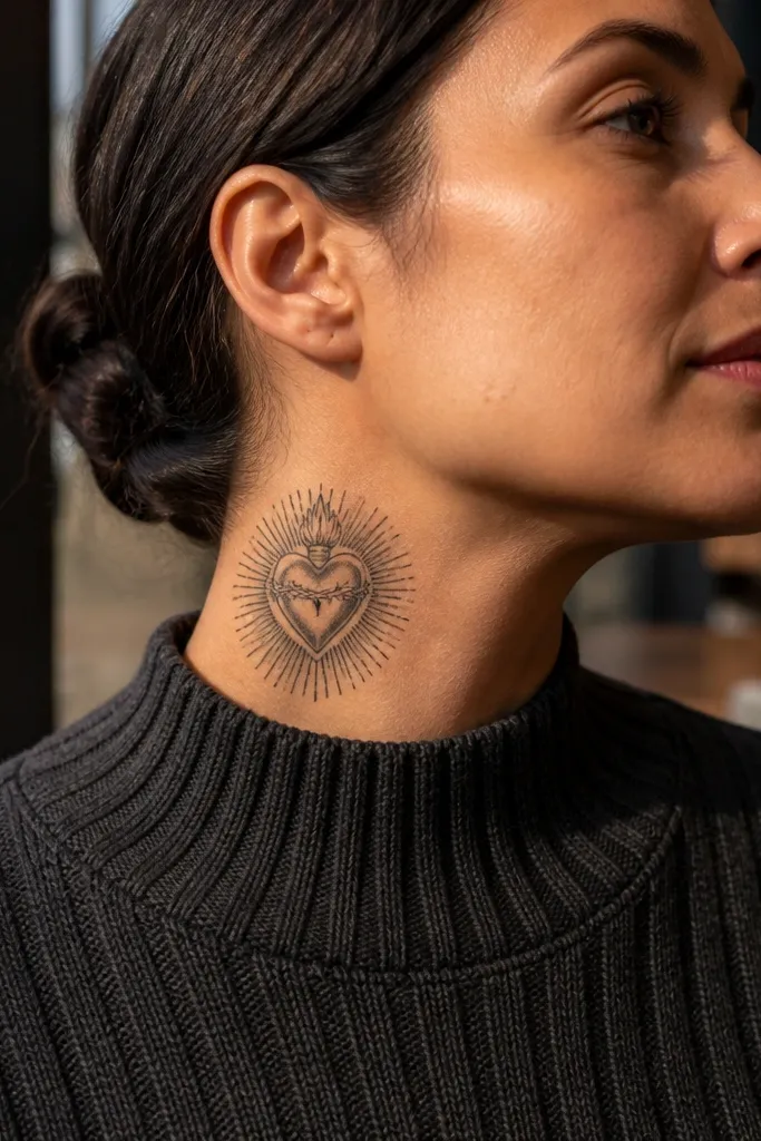
A fine-line Sacred Heart can look stunning on the neck when it’s disciplined. The key is that the rays are micro, but not messy — they should radiate evenly and stop at a clear boundary so the design doesn’t turn into a blur. This option suits people who want something elegant in close-up but still readable in photos. It’s also a good choice if you plan to add text later, because the linework gives you clean space.
Start with a size around 2.5 to 3.5 inches tall so thin lines aren’t forced too large or too tiny. Then ask for a consistent line weight — no “sketchy” variation — and shading that uses small, controlled gray patches rather than dense dotwork. Next, keep the halo either absent or as a simple thin arc, since complex halo work can blur. Finally, position it on the side of the neck where the skin moves less dramatically than the very center front.
Request a stencil that keeps the rays evenly spaced; uneven spacing makes fine-line look chaotic later.
Avoid tiny flame details like multiple flicks; they disappear into gray.
4. Sacred Heart with Crown and Thick Rays
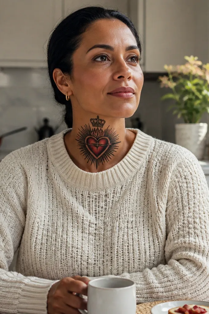
Add a crown and the design instantly reads as ceremonial, not just devotional. Thick rays around the heart create a bold burst that looks great in portraits, especially with hair pulled back. The crown gives you vertical structure, which helps the heart stay proportioned on the neck’s curve. This is a strong pick if you want the tattoo to feel “finished” even without text.
Start by placing the crown slightly above the heart’s top so the whole piece forms a vertical stack. Then ask for thick-to-medium black linework for the crown points and the heart outline, with shading kept to a few crisp gray areas. Next, request rays as solid strokes with consistent thickness — fewer rays, longer lengths — so they age into clear wedges. Finally, keep the glow minimal: one controlled red/orange highlight under the flame to keep contrast without turning into a smear.
If you wear collars, keep the bottom rays above where collars sit so they don’t get rubbed.
Don’t pack the rays too tightly; cramped rays blur into a dark halo.
5. Halo Arc with Split Heart Glow
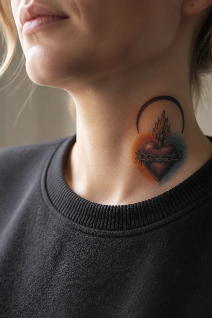
Start by sketching the halo arc to match the curvature — it should sit like a bracket above the heart. Then ask for the heart outline to be crisp and the glow to split into a left warm red and right orange highlight so it looks dimensional. Next, keep shading gradients small and close to the outline; the neck skin needs boundaries. Finally, add only a couple of rays or none at all — the halo arc and split glow are your main contrast.
This one looks modern because the halo is an arc, not a full ring, and the glow is split into two tones. The heart still reads as Sacred Heart, but the design feels more graphic and less “classic clipart.” It’s also photogenic under side lighting because the arc catches attention while the split glow creates depth. Place it on the side so the arc follows the neck line.
One warningAvoid heavy background shading around the heart; it makes neck tattoos look dirty over time.
Editor's noteAsk for the split glow to be separated by a clean edge, not blended into a foggy middle.
6. Sacred Heart with Banner Ribbon Tail
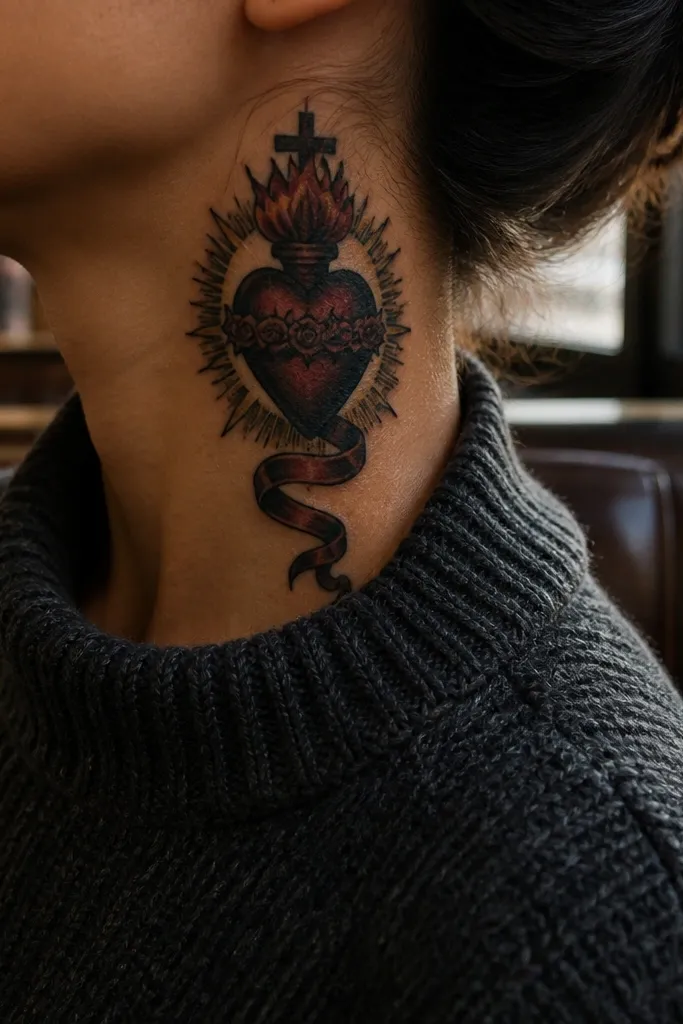
Start with a heart size that leaves room for a ribbon tail, roughly 3 inches tall for the heart plus 1 to 1.5 inches for the ribbon. Then ask for a ribbon outline that has one clear fold line, not multiple complicated curls. Next, request solid black fill on the heart outline and light gray shading only on the ribbon fold for depth. Finally, if you add text later, plan for it inside the ribbon area where lines won’t distort.
A banner ribbon tail gives you movement, and movement reads well on neck tattoos when you turn your head. The Sacred Heart stays centered, while the ribbon pulls the eye downward into a clean ending point. This design is ideal if you want the tattoo to look complete even if you don’t add lettering right away. It also gives your artist space to add shading that doesn’t mess with the heart’s legibility.
One warningAvoid tiny banner lettering in the first tattoo; fine text on the neck fades fast.
Editor's noteChoose a ribbon tail that ends before the collarbone; it keeps the tattoo from getting stretched by clothing.
7. Traditional Sacred Heart with Bold Dotwork Shading
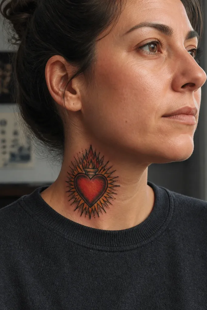
Start with a design that keeps the dots inside a defined zone, like a halo of texture just inside the heart outline. Then ask for traditional line weights: thicker outline, medium inner lines, and limited gray. Next, request dotwork density to be higher near the glow edge and lighter toward the heart center so it looks layered. Finally, place it on the front neck where symmetry helps the dots stay uniform.
Dotwork shading can look bold and textured when it’s done with intention. Here, the dots sit inside the heart and around the glow boundary, giving a gritty, traditional vibe without smearing. The neck benefits from texture because it gives the tattoo something to catch light even as it heals. This is a strong option if you want the Sacred Heart to feel “inked” and not overly smooth.
One warningSkip full-face dot shading across the whole neck; it turns into a gray patch.
Editor's noteTell your artist you want dots to be evenly spaced, not clustered — spacing is what keeps it clean.
8. Sacred Heart with Flames in Negative Space
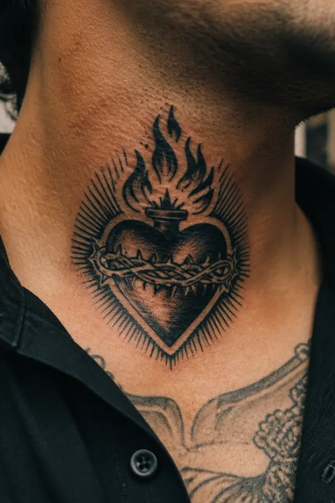
Negative space flames look sharp because the skin becomes the brightest part of the piece. This design uses dark outline and black fill for the heart, then cuts flame shapes so the flame reads as crisp openings rather than soft color. The look is bold without relying on heavy color packing, which helps the tattoo stay crisp as it ages. It’s especially good on the side neck where contrast pops under angled light.
Start by asking for the heart outline and fill to be solid black with minimal gray. Then request flame shapes cut cleanly into the glow area, with no extra micro detail inside the flame. Next, keep the halo simple — a thin arc or partial ring — so the negative space flames remain the focal point. Finally, choose a placement where the flame points upward and doesn’t get stretched across the most wrinkled skin area.
Ask for flame edges to be slightly rounded, not razor-thin, so they heal cleanly.
Avoid thin negative-space cuts that are narrower than a pencil eraser; they can heal unevenly.
9. Geometric Sacred Heart with Halo Hexagon
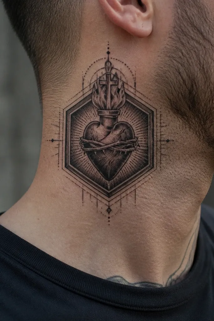
Geometry makes the Sacred Heart look modern and structured. A hexagon halo frames the heart and creates a crisp border that holds up well in photos. This design works because the heart’s curves contrast with straight edges, so the tattoo reads as intentional even from a distance. It’s a great pick if you like clean, architectural ink and want something that doesn’t look like a classic flash copy.
Start by keeping the hexagon halo slightly larger than the heart’s widest point, centered on the front neck. Then ask for crisp straight lines in black and use a limited gray fill inside the heart to avoid muddy blending. Next, request the glow effect to be a tight red/orange gradient only where the flame meets the heart. Finally, keep rays out of the design; the hexagon already provides the visual burst.
Ask the artist to draw the hexagon first, then place the heart inside it so proportions stay perfect.
Avoid mixing too many styles at once; geometric halos plus heavy baroque shading get messy on the neck.
10. Sacred Heart with Rays Fade to Skin Tone
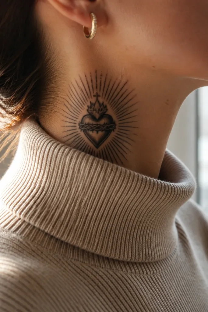
This design uses rays that start bold and gradually fade, so the tattoo looks like it’s glowing without needing lots of color. The fade effect makes the piece feel airy, but it stays readable because the heart outline is solid. It’s photogenic when you shift light across your neck — the rays catch and then disappear into skin. For people who want a bold finish without heavy color packing, this is a smart look.
Start with a clear heart outline in thick black, then ask for rays as separated lines that reduce thickness as they extend outward. Next, request shading that fades toward the outer rays, not a dark background wash. Keep the halo either absent or as a thin arc to avoid competing with the ray fade. Finally, place it on the side neck where the ray direction follows the natural curve of the collarbone line.
Tell your artist you want the fade to be done with controlled gray, not scattered dots.
Avoid full black ray bars; they look heavy and can blur into a dark smudge.
11. Sacred Heart with Rose Accent at the Bottom
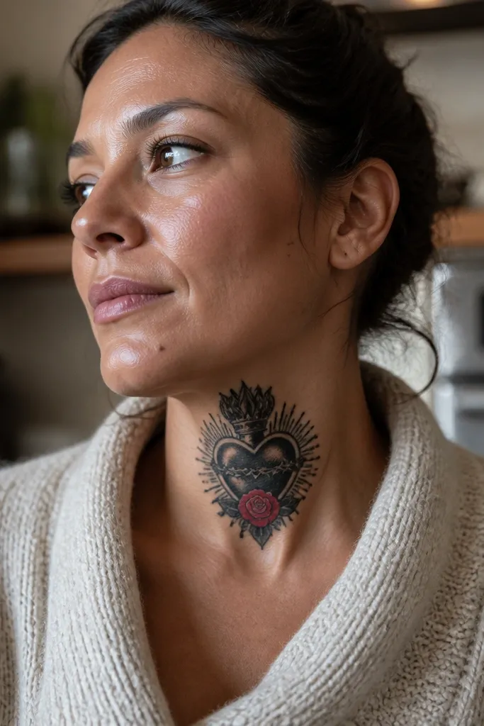
Start by placing the heart centerline and leave room below it for a rose that’s about half the heart height. Then ask for the rose petals to be outlined cleanly with medium black, with gray shading only along petal folds. Next, keep the heart glow controlled: one red/orange highlight near the flame and minimal extra color. Finally, decide whether you want rays — if you do, keep them small so the rose still shows.
A small rose accent makes the Sacred Heart feel romantic without turning it into a generic floral tattoo. The heart stays the star, but the rose adds a secondary focal point that looks great in close-up. This layout works especially well on the front neck because the rose can sit under the heart and anchor the composition. It also gives your artist an easy way to add shading contrast using petal edges.
One warningAvoid a full bouquet style; multiple flowers crowd the neck and blur.
Editor's noteChoose a rose with fewer petals if you want it to stay crisp over time.
12. Sacred Heart with Cross Key Overlay
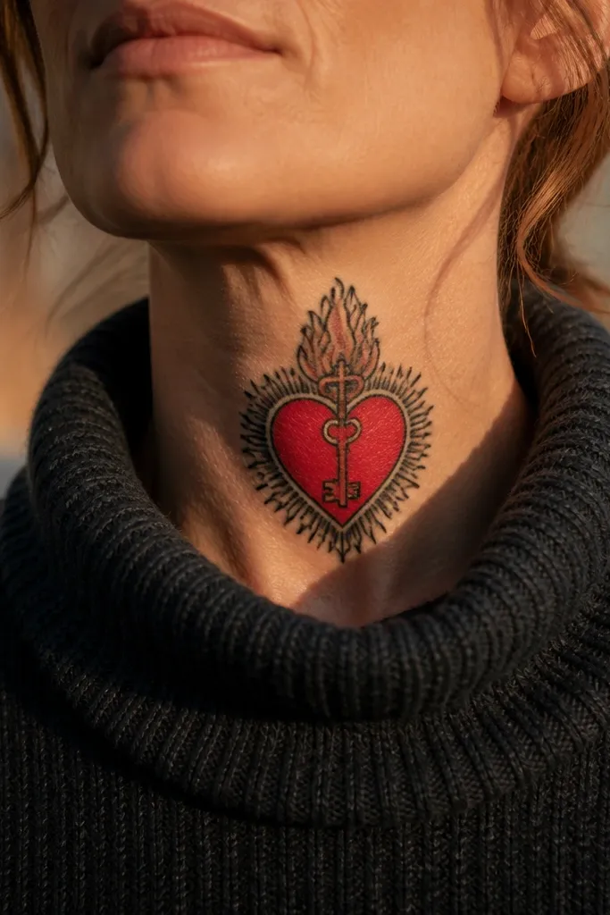
This option adds symbolism without adding clutter. The heart stays centered, and a small cross key overlay gives it a layered, graphic look that reads well on the neck. The key shape breaks up the heart silhouette and creates a strong vertical rhythm. If you want your Sacred Heart Neck Tattoo to feel bold and intentional, this is one of the cleaner ways to add extra iconography.
Start with the heart outline as your base, then place the cross key so it sits across the lower half of the heart or just below it. Then ask for the key to be outlined in the same line weight as the heart, so it looks like it belongs. Next, keep the glow limited to the heart flame area so the key doesn’t compete for attention. Finally, request light gray shading on the key only at one side edge for depth.
Ask for the key teeth to be simplified; fewer teeth age better.
Avoid tiny key details like micro engraving; they turn into a blur.
13. Sacred Heart with Stained-Glass Color Blocks
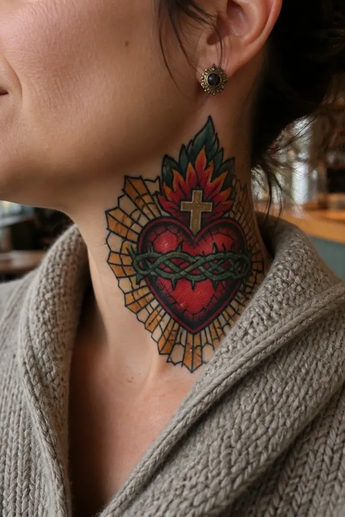
Start by choosing a limited palette: deep red, warm orange, and one accent like deep green or dark blue. Then ask the artist to separate color blocks with black lead lines that are thick enough to survive healing — not hairline. Next, keep the glow effect as one color block rather than a spray of gradients. Finally, place it on the front neck for maximum symmetry and best photo readability.
Stained-glass style looks bold because it uses strong outlines and color separation. The black “lead” lines keep each color area crisp, which is exactly what you want on a neck. You’ll get that jewel-like look in photos, especially with warm reds and deep greens around the heart. This design is best for people who want color that still holds shape as the years go on.
One warningAvoid watercolor-style bleeding between colors; it goes soft on the neck.
Editor's noteRequest color blocks to follow the heart’s contours so the tattoo stays dimensional.
14. Sacred Heart with Crown of Thorns Frame
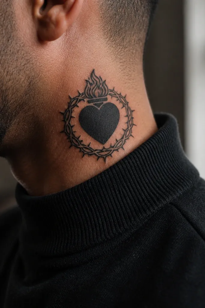
Start by sketching the thorns as a consistent crown arc above the heart, not random spikes. Then ask for medium-thick black linework and minimal gray shading — thorns look best when they stay crisp. Next, request the heart glow to be a tight red/orange highlight near the flame, with the rest of the heart in solid black or near-black. Finally, keep the heart size modest so the thorn frame doesn’t sprawl across the neck.
A crown of thorns frame makes the Sacred Heart feel intense and dramatic without needing extra objects. The thorns create a natural border around the heart, and the negative space between spikes keeps it from becoming a dark blob. Place it on the side neck so the spikes angle down toward your collarbone and look dynamic. This is a great pick for bold finish lovers who want the design to feel more “ink” than decorative.
One warningSkip heavy background shading behind the thorns; it makes the whole piece look smudged.
Editor's noteAsk for thorn tips to be slightly rounded; sharp tips can heal unevenly.
15. Sacred Heart with Ornate Baroque Rays
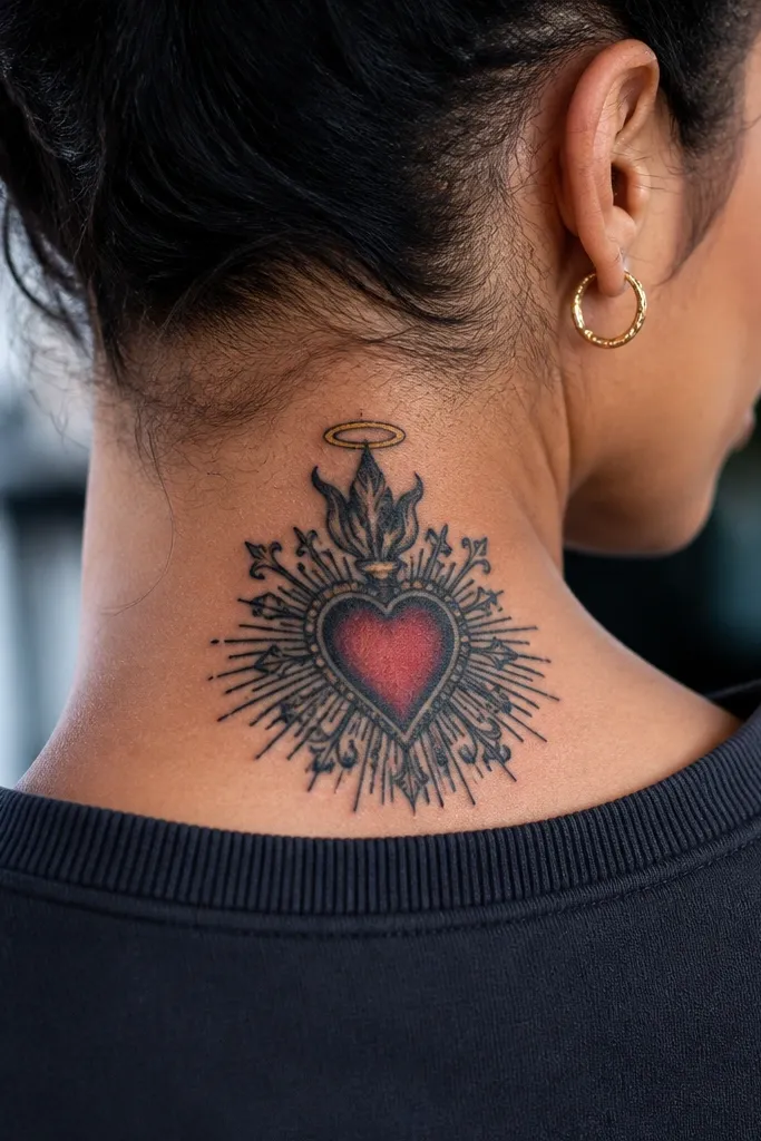
Baroque rays give you that old-world drama, and the neck’s small canvas makes the ornament look intentional instead of busy. Curled rays and small curls around the halo add movement that reads well in photos. The key to keeping it bold is controlling the line density — curls should be spaced so they don’t turn into a dark lace. This is ideal for people who want a classic Sacred Heart feel with a sharper, more decorative finish.
Start with a front neck placement so the baroque rays can fan out symmetrically. Then ask for thick black outlines on the main ray curls and limited gray shading only on the inner curves. Next, request the halo as a simple ring or arc, so the ornament doesn’t disappear into complexity. Finally, keep the color minimal: one warm glow inside the heart and no extra color in the rays.
Tell your artist to test the ray spacing by drawing it over the stencil — if it touches, reduce curls.
Avoid micro curls and tiny flourishes; neck skin doesn’t hold them well.
16. Sacred Heart with Blackwork Flame Burst
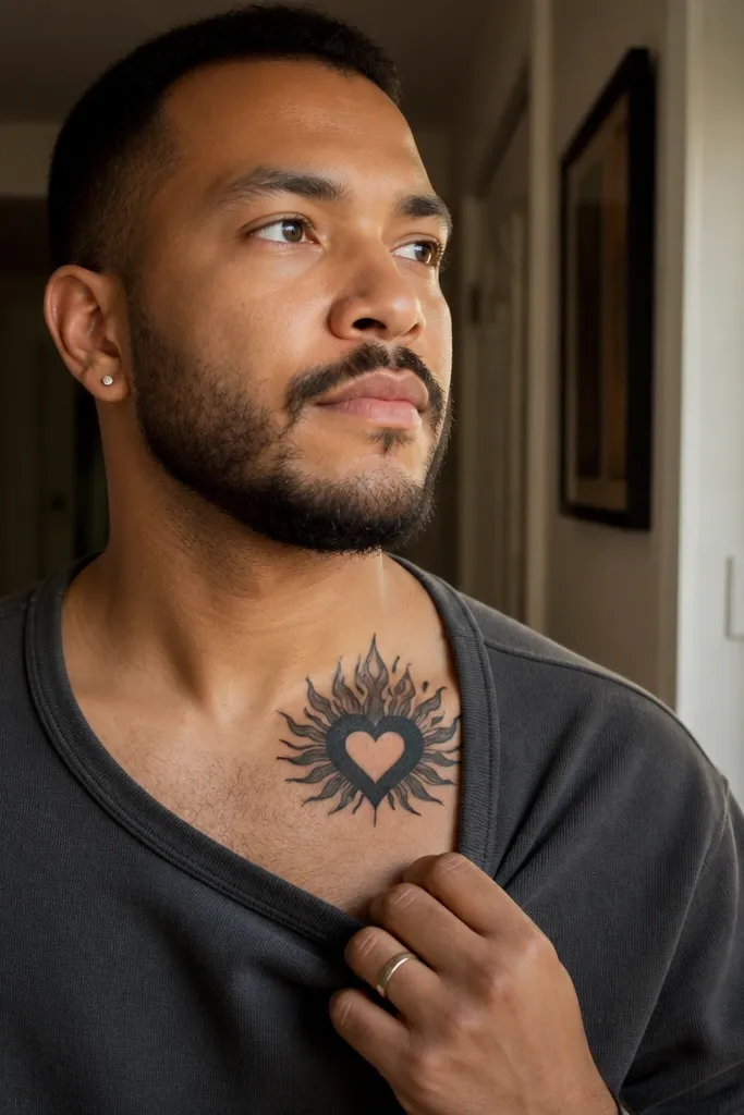
Start by placing the heart so it sits slightly lower on the side neck, giving room for the flame burst to extend upward. Then ask for the flame burst to be made of solid black shapes with clean edges, not thin line flicks. Next, include a small red/orange glow only at the base of the burst so it looks lit, not colored everywhere. Finally, keep any halo minimal — a tiny arc or no halo — so the flame silhouette stays the focus.
This design makes the flame the star. Instead of a small flame inside the heart, the flame bursts outward with bold blackwork shapes that look like a dramatic flare. It’s a strong choice for a bold finish because the flame silhouette stays graphic and readable. The heart remains the center anchor, but the burst adds energy and makes the tattoo pop when you move.
One warningAvoid layered flame outlines; they thicken into a dark mass as they settle.
Editor's noteAsk for the flame edges to be consistent thickness for a cleaner healed look.
17. Sacred Heart with Minimal Halo and Heavy Heart Fill
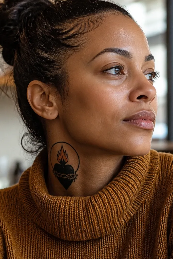
Heavy fill is the easiest way to get a bold Sacred Heart that stays crisp. This design uses a minimal halo — just a thin line or small arc — so the heart’s black mass does the work. The flame glow is kept tight and bright, making it feel intentional rather than decorative. If you’re worried about neck tattoos fading, this is a practical choice that still looks clean in photos.
Start with a front neck placement and center the heart so the heavy fill doesn’t look lopsided. Then ask for a thick outline and solid fill with minimal gray. Next, request a small red/orange glow around the flame base, limited to a narrow band so it doesn’t bleed. Finally, keep the halo simple and single-line so there’s nothing delicate to fade.
Choose a slightly smaller halo than you think; big halos look fuzzy after healing.
Avoid adding lots of rays — heavy rays plus heavy fill can turn into a single dark block.
18. Sacred Heart with Gothic Cross Above
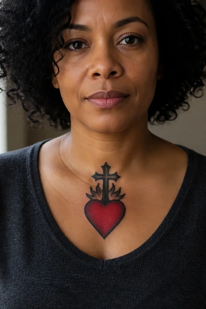
A gothic cross above the heart gives the piece a vertical, architectural feel. The Sacred Heart stays readable, and the cross adds height without crowding the heart itself. This layout is especially photogenic because the cross points upward and frames the heart in a clean stack. It’s bold without needing elaborate rays, which makes it a good option for neck skin that shifts a lot.
Start by placing the cross so it’s above the heart and separated by a small gap, about the width of a thumbnail. Then ask for gothic cross linework with thick bars and minimal cutouts so it heals as a solid shape. Next, request the heart fill to be solid black with a tight glow around the flame. Finally, decide whether you want rays — if you do, keep them to a few short lines under the heart to avoid competing with the cross.
Ask for the cross top to be slightly rounded rather than razor-thin so it doesn’t heal fragile.
Avoid thin, decorative cross filigree; it blurs into gray quickly.
19. Sacred Heart Neck Tattoo with Crowned Halo and Rays Cutouts
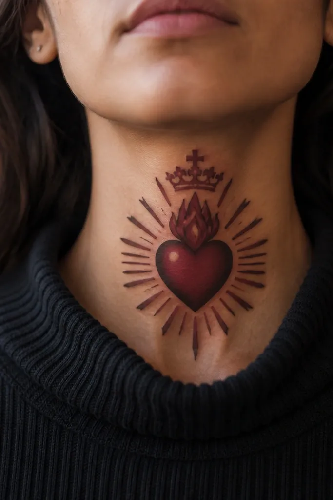
This design looks bold because it mixes thick structure with clean cutout rays. The crowned halo sits above the heart and gives you a strong top anchor, while the rays are drawn as separated strokes that look like they’re carved out. That spacing keeps the tattoo from becoming a dark halo blob. It’s a great option if you want the Sacred Heart to feel ceremonial but still sharp in close-up.
Start by placing it on the front neck with the crown centered above the heart outline. Then ask for the halo to be a thick arc with a small crown detail on top, keeping the crown simple. Next, request the rays as spaced cutout lines — not dots, not filled-in bars — so they stay crisp. Finally, keep the heart glow tight and bright, using only one warm red/orange highlight zone inside the flame area.
Tell your artist you want negative space gaps between rays to be consistent thickness.
Skip dense ray patterns; neck tattoos need air between lines to stay readable.
20. Sacred Heart Neck Tattoo with Chain-Link Halo and Tear Drop
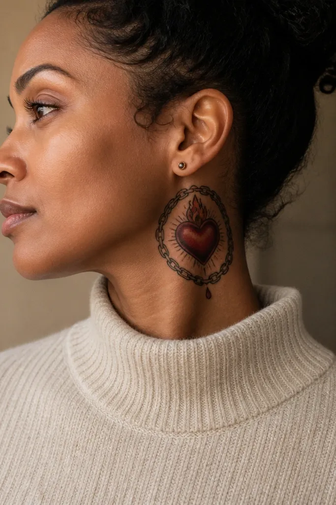
This Sacred Heart Neck Tattoo uses a chain-link halo to make the symbol feel grounded, like devotion with weight. The heart sits crisp and central, then the chain halo frames it with sharp, repeating links that read bold in photos. A single teardrop under the heart adds emotion without turning the design into a cluttered scene. It looks especially striking on the side of the neck because the chain links catch light and create a clean visual “ring” effect as your head moves. Choose this when you want a sacred theme that still feels modern and graphic, not soft or overly romantic.
Place it slightly off-center toward the side of the neck, with the heart spanning about 2.5 to 3.5 inches wide. Keep the heart and tear drop in solid black or near-black with a smooth red fill that doesn’t bleed past the outline. The chain-link halo should be line-only or thin black with minimal shading so it stays readable as the skin texture changes. For aging, ask for clean, tight linework on the links and a controlled red pigment that fades gracefully instead of turning muddy. Expect moderate discomfort at the side of the neck where the skin is thinner; plan for swelling for 1-3 days and keep it clean, dry, and out of direct sun for at least 3-4 weeks. Adapt it by scaling the tear drop smaller if your neck has less space, or by thickening the halo links if you want a stronger contrast against your skin tone.
Ask the artist to draw the chain links on paper first and confirm the spacing — even link size matters more than perfect symmetry. If you want extra boldness, add a thin black outline around the heart and tear drop so the design stays legible when it heals.
Don’t pick a heavily shaded halo — it turns into a gray blur on the neck faster than you want.



