
1. Classic Sacred Heart with Thick Rays and Banner
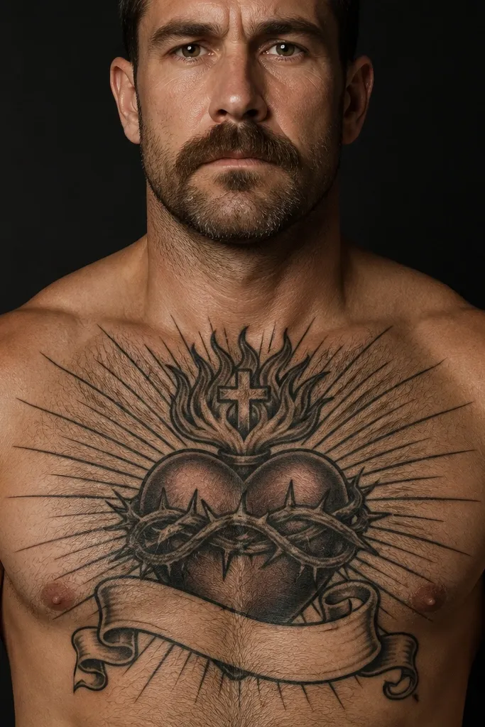
Start with placement: put the heart centered on the sternum, with the top of the heart about 2-3 fingers below the collarbone line. Choose thick linework (think bold black outlines) for the rays and cross, then keep the reds fairly solid so they don’t turn patchy over time. Then add a short banner under the heart — keep the letters large enough to stay readable after healing. Finally, ask for a stencil that matches your chest shape when you stand relaxed, not when you’re hunched.
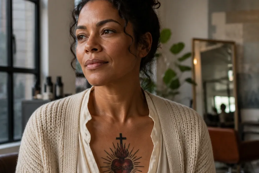
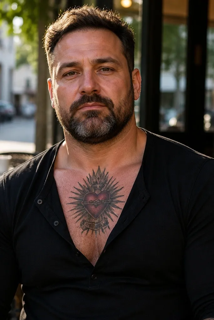
This is the “walk in and people notice” version. The heart sits centered on the sternum, with a deep red fill and a simple cross above it, then thick black rays fan outward. The banner curves underneath the heart so it frames your chest instead of sprawling down your torso. The look is powerful because it’s high-contrast and symmetrical, and it reads well even from a few steps away. It suits people who want classic Catholic symbolism but with clean, modern sizing.
One warningDon’t let the banner letters get tiny; small script will blur on chest skin.
Editor's noteUse a short line of text on the banner (or skip text) so the banner stays crisp.
2. Blackwork Sacred Heart with Negative-Space Rays
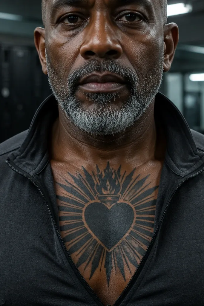
Start by mapping the rays as a fan with even spacing around the heart so the design looks symmetrical. Choose either solid black heart fill or minimal shading — either way, keep the cross bold and simple. Then leave the rays mostly empty so skin becomes the “color” of the design. Finally, request a stencil in two positions: one while standing straight and one with your shoulders slightly relaxed, because chest skin movement changes how negative space reads.
If you want “powerful” without heavy color, this blackwork style nails it. Instead of filling the rays, the artist uses negative space to carve out the burst pattern, making the rays look graphic and sharp. The heart can be fully black or partially shaded, but the key is the clean geometry of the rays. This style looks especially good on chests with some natural hair or texture because the contrast stays crisp. It suits people who want a sleek, modern Sacred Heart Chest Tattoo that still feels traditional in symbolism.
One warningAvoid overly detailed micro-shading in the rays; it turns gray and muddy as it heals.
Editor's noteAsk for slightly thicker black borders around the heart silhouette to anchor the design.
3. Red Heart with Realistic Drip and Soft Smoke
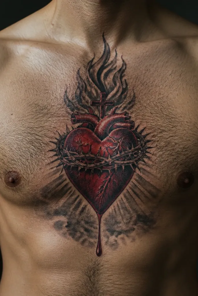
Start with sizing: keep the heart as the focal point and limit the drip so it doesn’t extend past the banner area. Use a clean cross above the heart, then replace hard rays with smoke shading that fades outward. Then add only a few drip lines — too many makes it look like random splatter. Finally, pick a darker red for the drip and keep it separate from the surrounding smoke so the layers stay readable.
This style keeps the Sacred Heart iconic but adds a dramatic, emotional edge. The heart is red with darker red or brown-red drip accents, then the rays are reduced into softer bursts or replaced by pale smoke-like shading. That contrast between bold red and smoky gray makes the tattoo feel alive, not flat. It’s a good pick if you like a powerful look that isn’t all black-and-white. Placement on the upper sternum makes the smoke feel like it’s floating around the heart.
One warningDon’t go full realism with tiny highlights inside the smoke; it fades fast.
Editor's noteChoose a drip that falls straight down in 2-3 lines for a cleaner, more powerful silhouette.
4. Dotwork Sacred Heart with Glowing Halo Rays
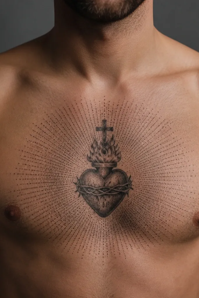
Dotwork turns the Sacred Heart Chest Tattoo into something that looks lit from within. The heart is built with dense dots for a textured glow, while the rays form a halo around it with varying dot density. The result looks softer than traditional linework but still powerful because the halo creates a clear focal ring. This style photographs beautifully because the dots catch light and show depth. It’s a great option if you want a more delicate aesthetic without losing symbolism.
Start with the heart outline as a clean boundary, then build the fill with dotwork so it looks like light. Choose dot density that’s heavier near the center of the heart and lighter toward the edges. For the halo rays, keep them evenly spaced and avoid making them too long — on a chest, long rays can warp with movement. Finally, ask your artist to test dot spacing on a stencil — too tight can blur; too wide can look sparse.
Request a slightly darker center so the heart still reads when the skin fades a bit.
Avoid thin dot-only outlines without any solid boundary; they can disappear during healing.
5. Sacred Heart in a Shield Frame with Cross Top
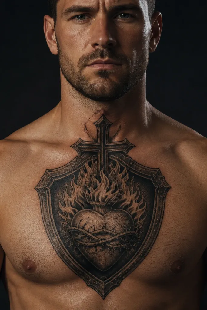
A shield frame makes the tattoo feel like protection, not just an image. The Sacred Heart sits centered inside a shield shape, with the cross perched above or integrated into the shield’s top point. This framing gives you a strong, structured look that stays readable as it ages. It also flatters the chest because the shield naturally follows the sternum’s lines. If you want your Sacred Heart Chest Tattoo to look like armor-style symbolism, this is the cleanest way to get it.
Start by choosing a shield shape that fits your torso — a slightly rounded top looks best on most chests. Put the heart dead center inside the shield, and keep the shield outline bold so it holds the design together. Then add rays lightly behind the heart, or skip them and rely on the shield lines. Finally, size it so the shield doesn’t go past mid-chest; a tight frame looks more powerful than a stretched one.
Keep the shield outline thicker than the inner details so it stays crisp after healing.
Avoid a shield that’s too tall; it turns into a vertical blob on the chest.
6. Minimal Outline Sacred Heart with Tiny Rays

Start with a smaller scale than you think — about 3-4 inches tall for the heart and cross area on the upper sternum. Keep the ray count low, with equal spacing so it still reads as a burst. Choose either pure outline or minimal dot shading inside the heart, but don’t add dense gradients. Finally, confirm the stencil sits centered and doesn’t tilt when you move your shoulders.
This is a Sacred Heart Chest Tattoo for people who hate clutter. The heart is outlined with thin-to-medium black lines, the cross is small, and the rays are short and controlled, like a subtle burst. No heavy shading. The power comes from restraint: clean lines, clear symmetry, and lots of skin breathing space. It looks especially good on people with athletic chests because it sits flat and doesn’t sprawl. It’s also a smart choice if you want to add other tattoos later without overcrowding.
One warningDon’t add tiny text to a minimal design; it will blur and ruin the clean look.
Editor's noteAsk for slightly thicker lines than you’d expect; thin lines can heal patchy on chest skin.
7. Sacred Heart with Barbed Wire Rays
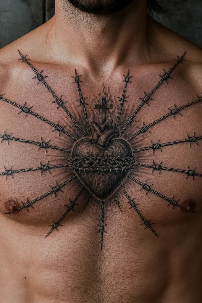
This one is for the edgy, modern chest. Instead of straight rays, you get barbed-wire spirals or wire-like strokes radiating outward, framing the Sacred Heart like it’s protected by something sharp. The heart can stay red, or be black-and-gray with a few red accents. The symbolism shifts — it still keeps the Sacred Heart, but the look reads as resilience and boundary-setting. It’s photogenic because the wire lines create texture and movement across the chest.
Start by placing the heart center on the sternum, then build the wire rays in a controlled oval or burst shape so it doesn’t sprawl. Choose line weight that’s consistent — wire art works best when the stroke width is uniform. Keep the heart simple so the wire doesn’t steal focus; one or two red accents are enough. Finally, ask for clean spacing between wire lines so they don’t merge during healing.
Use fewer wire strands than you think; 6-8 strong strands look better than 20 thin ones.
Avoid mixing barbed wire with ultra-fine lace shading; the chest will blur it.
8. Sacred Heart with Stained Glass Color Blocks
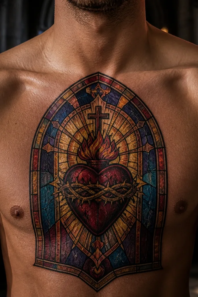
Start with a limited palette so the tattoo stays readable: 4-5 colors max inside the heart panel. Use black lead lines to separate each block cleanly, then keep the cross solid and dark so it anchors the design. For rays, use geometric shapes like triangles or short panels instead of long thin lines. Finally, choose colors that don’t rely on very pale yellow; pale tones fade faster on the chest.
Stained glass makes the Sacred Heart look like it belongs in a window — and it’s gorgeous on skin when the colors are handled in clean blocks. The heart uses multiple jewel tones like deep red, ruby, amber, and muted teal, separated by black “lead” lines. Rays can be simplified into geometric panels. This style is powerful because the color separation creates structure, not mush. It suits people who want color that still looks crisp and intentional rather than like watercolor splatter.
One warningAvoid too many tiny color shards; they turn into gray speckling over time.
Editor's noteAsk your artist to map each color block with a stencil grid so edges heal sharp.
9. Sacred Heart with Watercolor Wash Rays
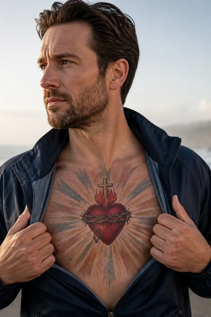
Start by keeping the heart outline crisp so the symbol doesn’t blur. Then ask for watercolor-style rays that fade outward, staying mostly behind the heart and not wrapping around your ribs too much. Use a small number of wash colors so it doesn’t look muddy; one main wash plus a subtle second tone is enough. Finally, plan aftercare carefully because watercolor-heavy tattoos can look patchy in the first week — avoid picking and keep the area clean and moisturized.
Watercolor rays soften the Sacred Heart into something emotional and atmospheric. The heart stays more defined — red with controlled shading — while the rays fade outward in blue-gray, dusty pink, or muted gold. This creates a gentle glow effect that still reads as a Sacred Heart because the heart and cross remain crisp. It’s a strong pick if you want a powerful style that doesn’t feel heavy or traditional. Upper chest placement helps the wash flow without wrapping too far onto your sides.
One warningDon’t add harsh black linework around watercolor rays; it makes the wash look dirty.
Editor's noteChoose cooler wash tones (gray-blue) if you want the red heart to pop harder.
10. Black and Grey Sacred Heart with Realistic Roses
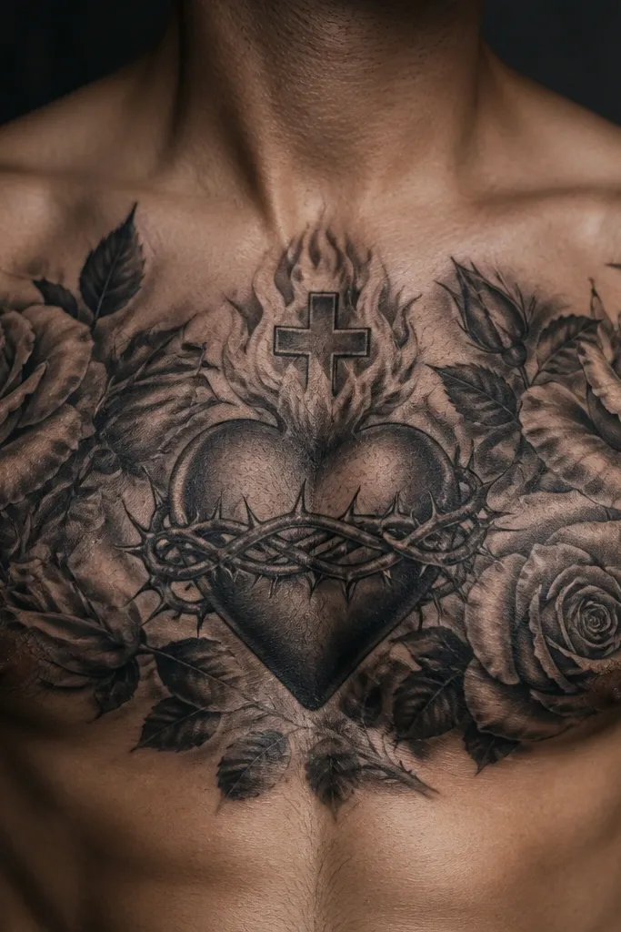
Start by deciding how many roses you want: 1-2 main blooms look cleaner than a full bouquet on the chest. Keep the heart’s cross and flame details sharper than the roses so the Sacred Heart reads first. Then use smooth black-and-gray gradients for petals and thorns, but avoid tiny highlight specks — they fade. Finally, size the overall piece so the roses don’t reach too far into the armpit area where skin stretches and blurs.
Roses turn the Sacred Heart into a fuller story without changing the core symbol. Black and grey realism around the heart — like a few roses and thorns — adds depth and makes the chest tattoo feel cinematic. Keep the heart as the clean focal point, then let the roses frame it diagonally so it follows your sternum and shoulder line. This style works well for people who want a powerful, serious look that still has softness in the flowers. It’s also great for covering or balancing other tattoos later.
One warningAvoid placing roses too low; they can drag the Sacred Heart down visually.
Editor's noteAsk for slightly thicker dark shadows under the roses; it improves longevity and contrast.
11. Sacred Heart with Ornate Baroque Filigree Frame
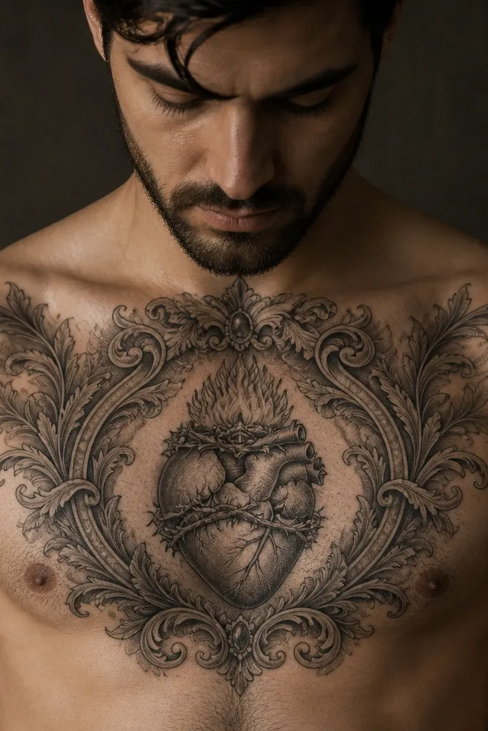
Start with a medium line weight for filigree so it stays readable after healing. Place the Sacred Heart in the center, then build the filigree frame around it with clear negative space between curls. Keep rays minimal or omit them so you don’t overcrowd the upper chest. Finally, ask your artist to do a stencil test from two angles — front view and slight side view — because filigree can distort when it wraps.
Baroque filigree makes the chest tattoo feel formal and dramatic. The Sacred Heart stays centered, but the background has curls, scrollwork, and small flourishes that add movement without turning into clutter. Rays can be thin and controlled so the filigree does the heavy lifting. This style looks best when the filigree lines are medium weight and spaced so they don’t merge. It suits people who want a powerful style that still feels feminine and decorative.
One warningAvoid ultra-fine filigree; it turns into gray lace that blends into skin.
Editor's noteUse a single accent color like red for the heart and keep everything else black/gray for clarity.
12. Sacred Heart with Crown and Split Cross
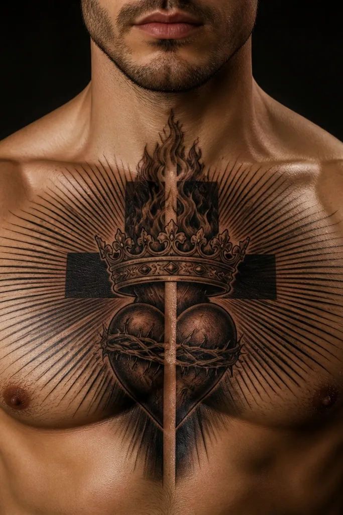
A crown changes the vibe from devotion to authority. The heart remains the center, but the cross is split or stylized, and a crown sits above it for a regal look. This style feels powerful because it adds vertical structure and a strong top element that balances rays or shading. The crown also gives you a place to add small details like gems, but keep them minimal. It suits people who want Sacred Heart symbolism with a “protector” or “leader” energy.
Start by placing the heart slightly higher than center so the crown doesn’t crowd the collarbone. Keep the crown lines bold and symmetrical, then connect it to the cross with clean negative space. Use either a solid red heart or red with soft shading; don’t mix too many colors in the crown. Finally, choose a ray style that supports the crown — short rays or a gentle halo read best on a chest.
Ask for gem accents as simple shapes, not detailed stones; they heal cleaner.
Avoid crown details that are too small; micro-gems fade first.
13. Sacred Heart Chest Tattoo with Crowned Halo Circle
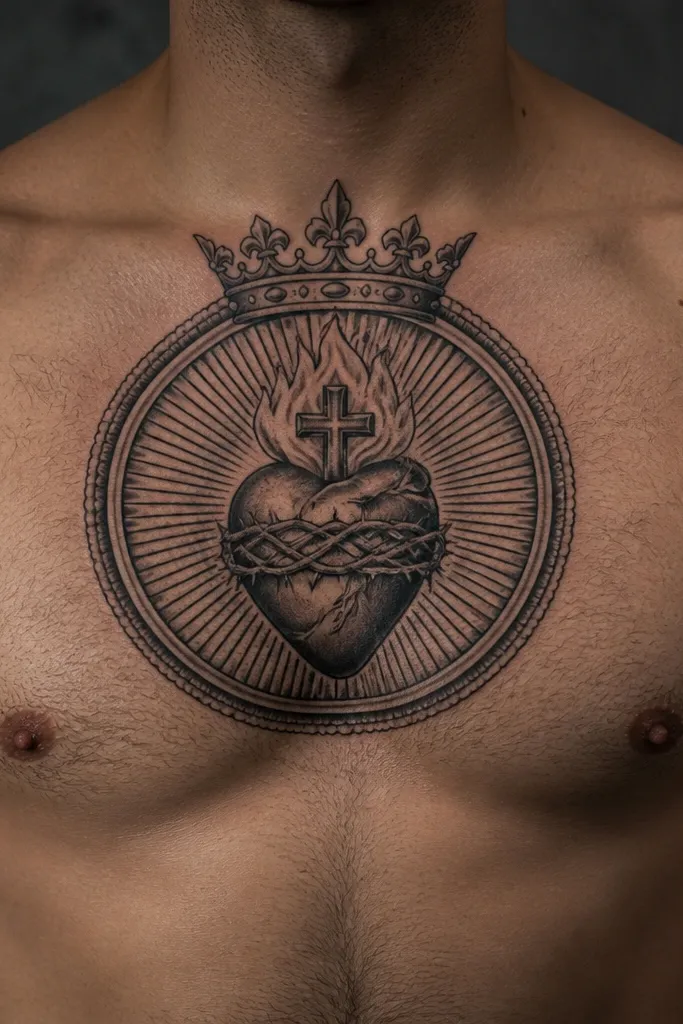
A halo circle makes the Sacred Heart feel framed and complete. Instead of rays, you get a thin circular halo that sits behind the heart, with the cross centered and a small crown or crown-like notch at the top. This style is aesthetic because the circle creates symmetry and clean geometry on the sternum. It also ages well because the halo is a simple shape that stays readable. If you want a powerful Sacred Heart Chest Tattoo that looks modern and minimal, this is the move.
Start by drawing the halo circle first in your stencil — the circle should sit behind the heart without touching the edges of your chest. Keep the halo line thin-to-medium and consistent. Then place the heart centered inside, with the cross above the heart aligned to the circle’s vertical axis. Finally, decide on color: either a red heart with black cross or all-black with a red accent line for contrast.
Keep the halo line slightly thicker than the heart outline so it doesn’t disappear.
Avoid thick shading around the halo; it can make the circle look like a dark blob.
14. Sacred Heart with Sword Through the Heart
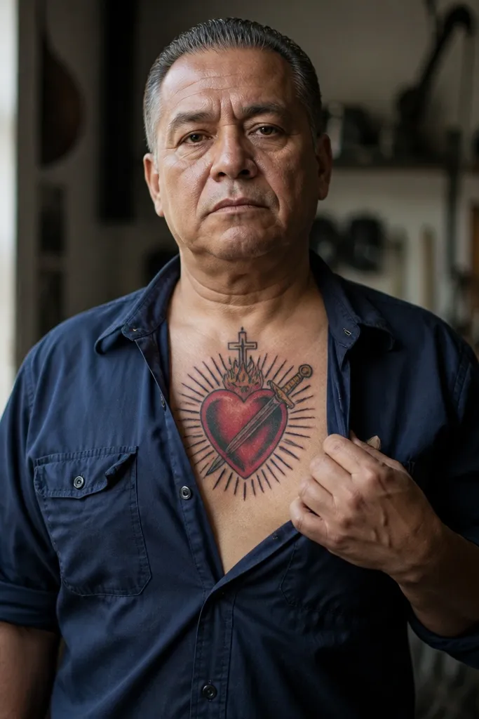
A sword through the heart makes the symbolism feel intense and protective. The heart stays centered and red, while the sword slices diagonally or straight through it, with the cross above still visible. Rays can be straight and sharp to emphasize power, or simplified into a burst behind the heart. This style looks strong on the chest because the sword line gives you a clear directional element. It suits people who want the Sacred Heart but don’t want it to look soft.
Start with composition: decide whether the sword is vertical (most readable) or diagonal (more dynamic). Keep the sword blade linework clean and thick enough to hold after healing. Then place the heart so the blade passes through the center of the heart, not the top — that keeps it from looking accidental. Finally, add rays behind the heart in a fan pattern and keep them dark and limited in length.
Choose a sword handle that stays above the heart’s bottom edge so it doesn’t clutter the lower sternum.
Avoid super thin sword etching; it fades and leaves the heart floating.
15. Sacred Heart with Blue-Black Flames
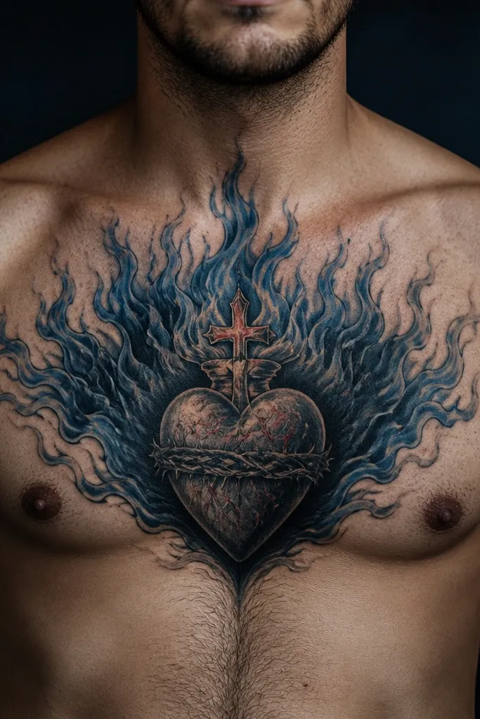
Start by placing the heart center on the sternum with enough space around it for flame shapes. Use controlled flame outlines — 6-8 flame tongues is usually plenty. Then shade the flames in blue-black with a few darker edges and keep the middle areas lighter for contrast. Finally, ask your artist to keep the flames from wrapping too far toward your ribs; side wrapping makes flames blur.
Flames around the heart add motion and heat without turning into chaos. The flames can be blue-black with gradients, which makes the heart’s red look even brighter. The cross stays crisp at the top, and the rays can be reduced so the flames become the main texture. This style is photogenic because the flame shapes create negative space between them, so the design doesn’t look flat. It suits people who want a Sacred Heart Chest Tattoo that looks intense and modern.
One warningAvoid mixing too many flame colors; blue + purple + green usually ends up muddy.
Editor's noteUse cool blue tones sparingly so the piece doesn’t turn gray in a year.
16. Sacred Heart with Photo-Style Dot Shading and Minimal Color
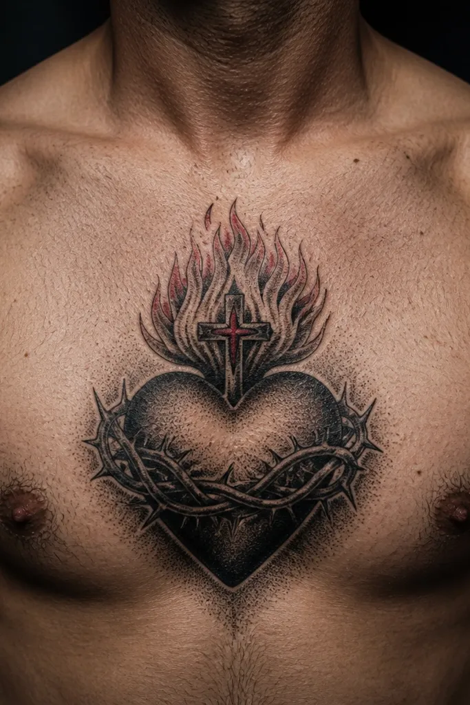
Start with a stencil where the heart’s edges are crisp and the cross is solid black. Then build dot shading mainly inside the heart and around the flames, keeping the rays simple or absent. Choose minimal red accents and keep them limited to one area so the tattoo doesn’t look patchy later. Finally, plan aftercare to protect the shaded areas — avoid aggressive scrubbing and keep lotion consistent through the healing window.
This style looks like it’s been lightly airbrushed, but it’s built to stay readable. The heart is mostly black and gray with dot shading that gives smooth transitions, and only a small red accent — often the heart’s center or a few flame lines. The result is powerful because the tattoo looks dimensional without relying on lots of red that can fade. It also pairs well with other chest tattoos because the palette stays controlled. If you want Sacred Heart symbolism that looks modern and clean, this is a strong pick.
One warningAvoid full red fill paired with heavy dot shading; it can heal uneven and look blotchy.
Editor's noteAsk for the red accent to be slightly darker than you think; it fades faster than black.
17. Sacred Heart with Sunburst Halo and Thin Line Cross
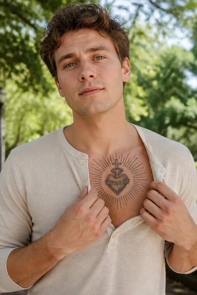
Start by keeping the rays short-to-medium in length so they frame the heart instead of stretching across the chest. Use thin linework for the cross and ray boundaries, but keep the heart outline slightly thicker for readability. Then add a red heart fill with minimal internal shading so it doesn’t turn gray. Finally, test the stencil while you’re wearing a fitted shirt — it helps you see how the sunburst sits on moving skin.
Sunburst rays make this Sacred Heart Chest Tattoo feel bright and forward. The rays are thin and evenly spaced, like a clock face or sun halo, and they wrap around the heart without cluttering it. The cross is thin-line and centered so it stays delicate but still readable. This style is a good compromise between traditional and modern — it keeps the sacred icon look, but the execution is light and graphic. It suits people who want a powerful look that isn’t heavy black.
One warningAvoid super-long rays; they break symmetry when your posture changes.
Editor's noteAdd a tiny dark shadow under the heart so the rays don’t flatten the design.
18. Sacred Heart with Script Banner and Bold Lettering
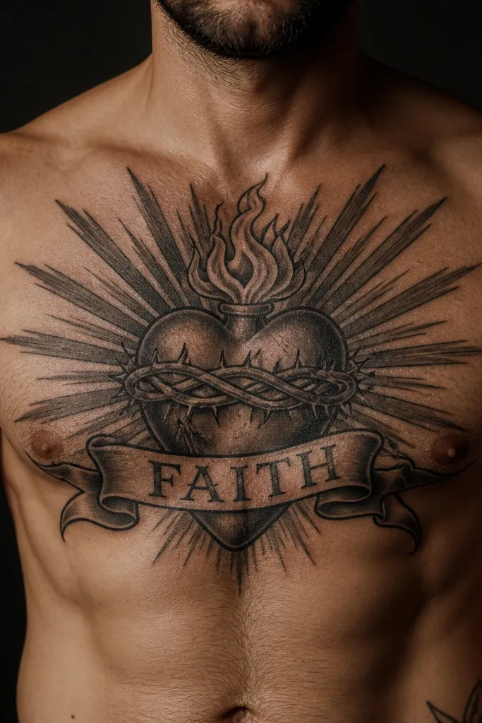
Start by picking a short phrase that fits the banner curve — 2-4 words is the sweet spot for chest readability. Then ask your artist to draw the banner first and align the heart to it, not the other way around. Use a font that has thick strokes and clear shapes; avoid hairline serifs. Finally, keep the banner ends inside the overall design frame so the text doesn’t drift outward during healing.
Text can either make the Sacred Heart Chest Tattoo look intentional or make it look like a random sticker. This style fixes that by using bold, legible banner lettering with controlled spacing. The heart and cross stay clean and centered, then the banner curves under it with thick enough letterforms to survive healing and future fading. It’s powerful because it adds meaning without sacrificing readability. Choose a short phrase so the banner looks crisp, not cramped.
One warningDon’t choose tiny cursive that disappears into the background.
Editor's noteUse uppercase letters for maximum clarity if you want a long-lasting look.
19. Sacred Heart with Mirrored Side Wings on the Sternum
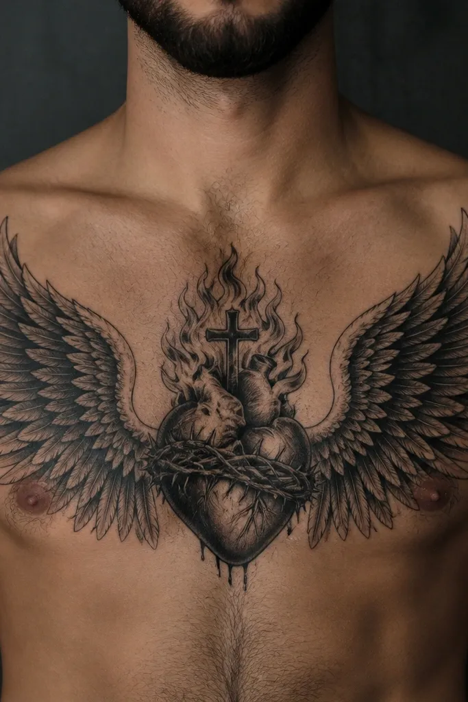
Start by placing the heart center first, then build the wings so their inner edges start close to the heart and their outer edges stop before your ribs. Choose mirror symmetry — ask your artist to measure the wing angle so both sides match. Keep feather detail medium scale; too much tiny feather work will blur. Finally, decide on color: a red heart with black wings reads strong; black heart with gray wings reads more modern.
Wings make the Sacred Heart Chest Tattoo feel protective and dramatic without needing a huge ray burst. The heart sits in the middle, and mirrored wing shapes extend left and right, following the sternum and collarbone angles. You can keep wings as blackwork feathers or as soft shading with a clean outline. The symmetry gives a powerful, balanced look, and the wings create a larger visual frame that looks good even when the heart itself is medium-sized. It suits people who want Sacred Heart symbolism but with a more fashion-forward silhouette.
One warningAvoid wing tips that reach too far down; they can turn into a stretched wing blob.
Editor's noteKeep the wings slightly higher than you think so they don’t sag visually when you stand relaxed.
20. Sacred Heart with Fiery Rays and Orange-Gold Accents
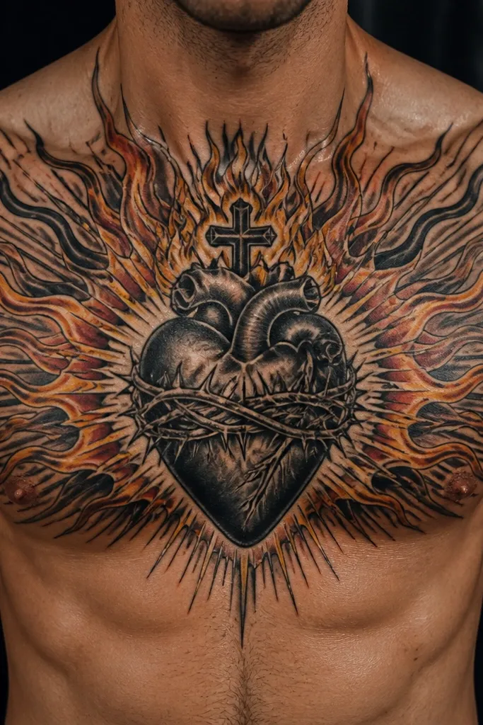
This style makes the Sacred Heart feel hot, not just symbolic. The heart stays red, and the rays are layered with black outlines plus orange-gold accents so the tattoo looks like it’s glowing. The key is controlled color — orange/gold should sit on top of the rays, not flood the whole chest. It photographs like a centerpiece because the warm tones catch light and create depth. This is a great pick if you want a powerful Sacred Heart Chest Tattoo that still looks clean and intentional.
Start with a traditional heart silhouette and cross, with thick black outlines to anchor the design. Then build the rays as a fan and add orange-gold shading only in the outer half of the rays for a glow effect. Keep the inner rays darker so the heart reads first. Finally, pick a size where the rays don’t wrap past the center of your chest — about 5-7 inches across looks balanced for most people.
Ask your artist to use warm orange highlights, not pale yellow — pale tones fade fast.
Avoid full color gradients everywhere; it turns into a dull smudge as it heals.



