
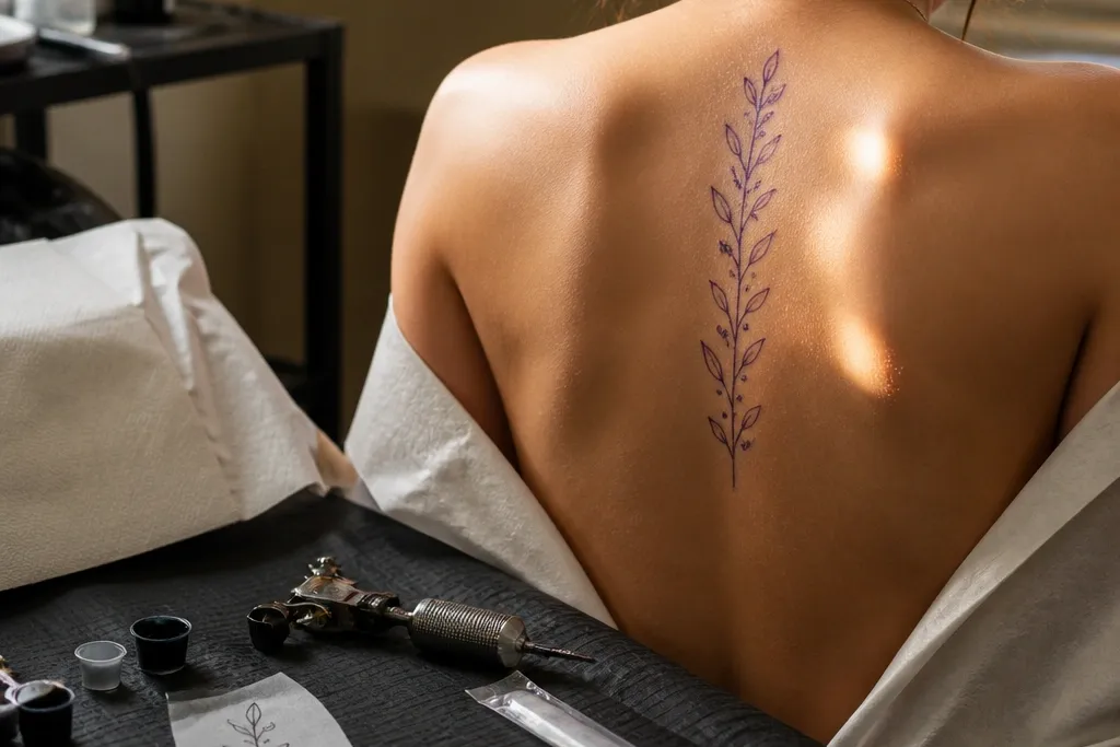

1. C7-to-T3 Small Olive Branch With Three Leaf Pairs
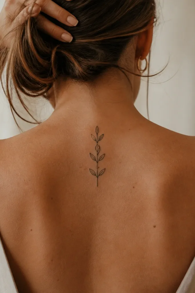
This one looks clean because it limits leaf count and keeps spacing consistent. The upper spine placement makes the branch feel like it’s “growing” from your posture, not sitting on top of it. I like the three leaf pairs because they read clearly in photos even when the lighting is harsh. The thin stem gives movement and the leaf shading is light enough that it won’t blur into a dark patch later.
Start by marking the spine from C7 down to where you want the branch to end, usually about 6-8 cm total. Ask for linework with a slightly stronger outline on the leaves than the stem, so the leaves stay defined after healing. Then request light stipple or micro-shadow inside the leaf shapes, not heavy fill. Finally, plan aftercare like any fresh black work — wash gently, pat dry, and keep it out of direct sun for at least a month so the contrast stays sharp.
Bring a reference photo with similar leaf count so your artist doesn’t “add more” during the stencil.
Avoid adding a fourth leaf pair — it makes the branch feel crowded on the upper spine.
2. Micro Olive Branch With One Seeded Olive Berry Top Accent
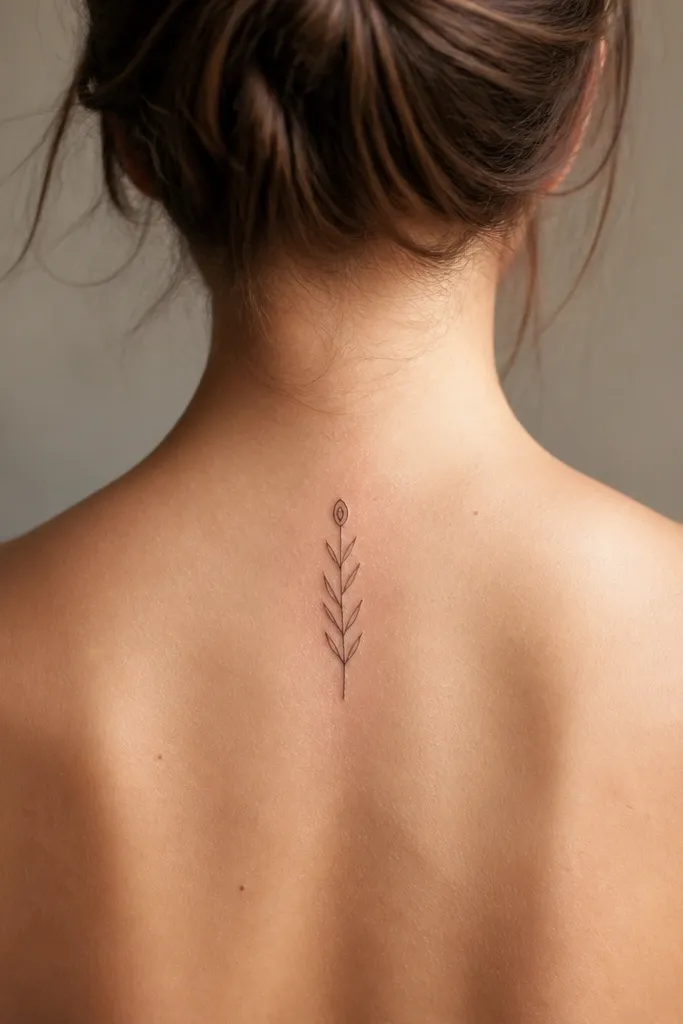
This design is beginner-friendly because it uses a clear focal point: one berry. That tiny berry catches the eye in a way a leaf-only branch can’t, so even if the rest is delicate, the tattoo still feels complete. The contrast between the berry’s solid black and the lighter leaf shading makes it photogenic from straight-on and from the side. It also ages well because the berry shape stays readable even if the leaf veins soften.
Start by choosing a size that lets the berry sit near the mid-upper spine, around T2 to T4, without drifting into the shoulder blades. Ask for the berry to be solid black with a small reserved highlight to prevent it from looking like a random dot. Then keep leaf shading to a thin grey wash or stipple — you want texture, not a filled-in leaf. After that, plan your stencil so the stem line is perfectly vertical; crooked stems look messy quickly on the spine.
If you want it to look extra crisp in photos, ask for slightly thicker berry outline than the leaf outlines.
Skip overly realistic berry texture — it turns into muddy grey as it heals.
3. Thin-Line Olive Branch With Negative-Space Leaf Veins
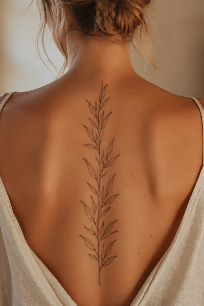
Negative-space veins look sharp because they rely on the skin showing through, not on heavy shading. When the leaves are small, this is the cleanest way to keep the “olive” identity without turning it into a grey blob. The thin-line style is also airy, which flatters the spine’s natural length. I’ve found that this design looks best under soft light — it gives that subtle, detailed look without needing high contrast.
Start with a stencil that places the branch between the midline of your spine and your natural spine crease, usually centered. Then ask for the artist to use negative-space vein lines that are thinner than the leaf outline, so they don’t thicken during healing. Keep the stem light but continuous, and request no extra dotwork in the background. For aftercare, treat it like fine-line work — keep it moisturized with a fragrance-free ointment and avoid picking any dry flakes that form along the vein gaps.
If you bruise easily, tell your artist before the session — it helps them avoid overworking the skin.
Don’t add grey shading behind negative-space veins — it kills the crisp leaf readability.
4. Olive Branch Spine With Micro Dotwork Leaf Texture
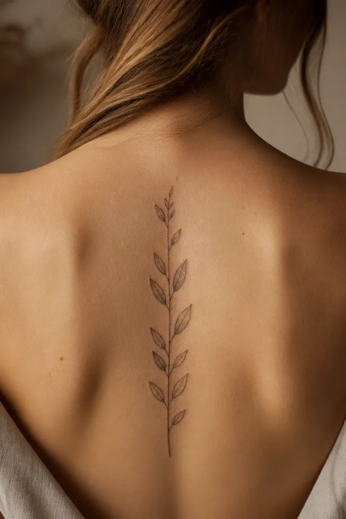
Dotwork gives a “real leaf” feel even when the tattoo is small. The texture sits inside the leaf outlines instead of spreading across the whole design, so it stays readable. This one looks gorgeous in close-up photos because the dots catch light like tiny highlights. I also like it for beginners who want detail but don’t want full grey realism — dotwork is controlled and it ages more gracefully than heavy gradients.
Start by deciding how many leaves you want — I’d keep it to 4 to 6 leaf pairs for a spine tattoo under 10 cm. Ask for dotwork concentrated on the leaf edges and along the center, leaving the base of the leaf slightly calmer. Then keep the stem line consistent in thickness so the dots don’t make the whole tattoo look uneven. Aftercare is the same as other black work, but be extra careful with hydration; dry skin can make dotwork look patchy for the first 2-3 weeks.
Editor's noteRequest that the artist show you a quick test pen sketch on paper so you can see dot density before they tattoo.
One warningAvoid full-leaf dot fills — tiny designs need negative space to stay crisp.
5. Olive Branch With Tiny Thorns and a Peace Ribbon Loop
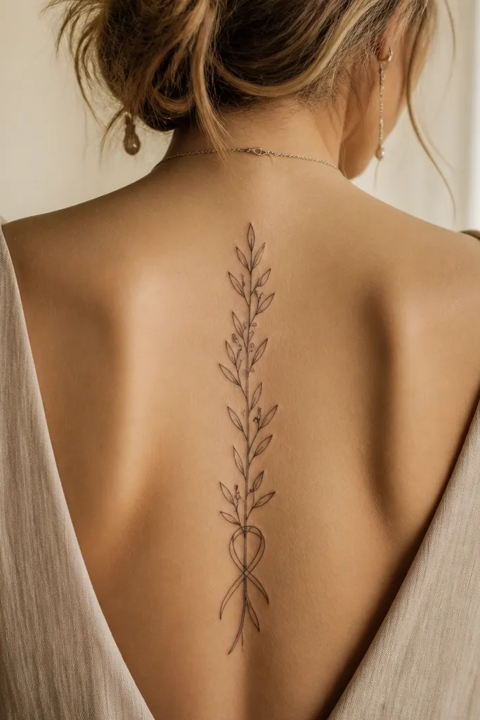
This design feels symbolic without getting busy. The thorn marks add realism and tension, while the ribbon loop gives you a gentle peace vibe that still reads clearly at a small size. On the spine, the loop looks like a small calligraphic flourish rather than a separate element, so it doesn’t break the composition. It’s photogenic because the loop creates a curve that catches light even when the rest is delicate.
Start by placing the ribbon loop at the upper third of your spine, around T1 to T3, so it doesn’t collide with your shoulder blades. Ask for only 2 to 4 thorn marks total — tiny and spaced — so they don’t turn into a scratchy line. Then keep leaf shading minimal, mostly outline with a light grey hint. Finally, discuss pain tolerance — this style can feel sharper because of the tiny line endpoints, so plan a short session or take breaks if you need them.
Editor's noteIf you want it to look calmer, ask for thorn marks to be shorter than the leaf width.
One warningSkip a big ribbon banner — wide text-like shapes are harder to read on a spine.
6. Olive Branch Side-Facing Leaves Along Mid-Spine
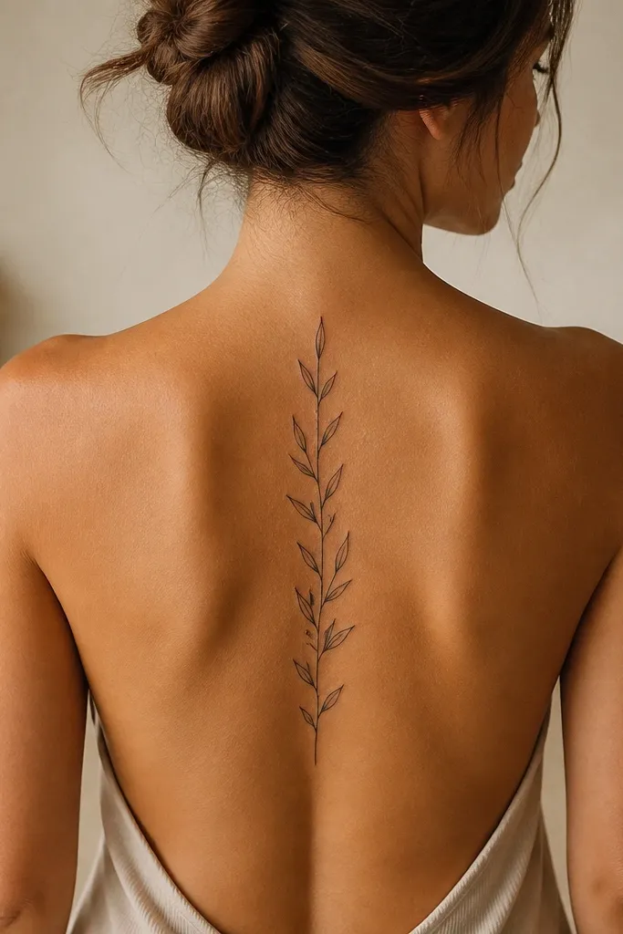
Side-facing leaves make the branch look alive. Instead of a flat, stamp-like design, you get a little “movement” impression even though the tattoo is straight. This is one of those pieces that looks better in motion — when you turn your body, the leaves catch light at different angles. It also flatters the spine because the leaf angles mirror the way your body naturally curves.
Start with a vertical stem placement centered on your spine crease. Then ask your artist to draw leaf pairs with alternating angles — left leaf slightly outward, right leaf slightly inward — while keeping size consistent. Keep shading light and on the underside of each leaf only, not across the whole leaf. For aftercare, avoid tight clothing rubbing during the first week; side-facing leaves have more edges that can scab and then dry out.
Editor's noteAsk for a reference of your own spine photo in the same posture the artist will use for placement.
One warningDon’t mirror the leaves perfectly — perfect symmetry makes it look like a sticker.
7. Olive Branch With a Single Curved Stem S-Shape
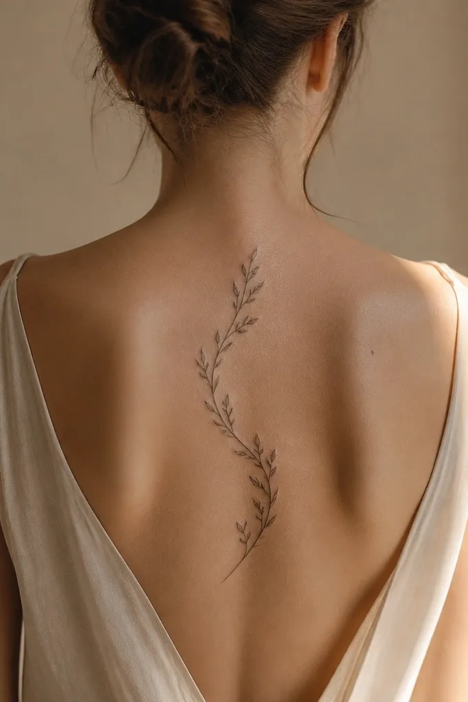
An S-shaped stem gives you elegance without adding extra elements. On a spine, a gentle curve looks intentional because it follows the natural line of your body rather than forcing a straight line that can look awkward on real anatomy. The leaves stay readable because they’re still anchored to a continuous stem. I’ve seen straight stems look too rigid on some people, and this curve fixes that immediately.
Start by choosing a mid-upper placement, around C7 to T6, where there’s enough length for the subtle curve. Ask for the S-curve to be small — think millimeters, not dramatic arcs. Then request leaves placed evenly along the curve, with outline thickness consistent from top to bottom. Aftercare is straightforward, but I recommend extra sunscreen once healed; curved linework shows sun-fade faster than straight lines because light hits it differently.
If you want it to look extra crisp, request slightly stronger outline on the outer edge of the stem.
Avoid big swoops — they blur when the skin stretches.
8. Realistic Olive Leaf Pairs With Tiny Vein Lines
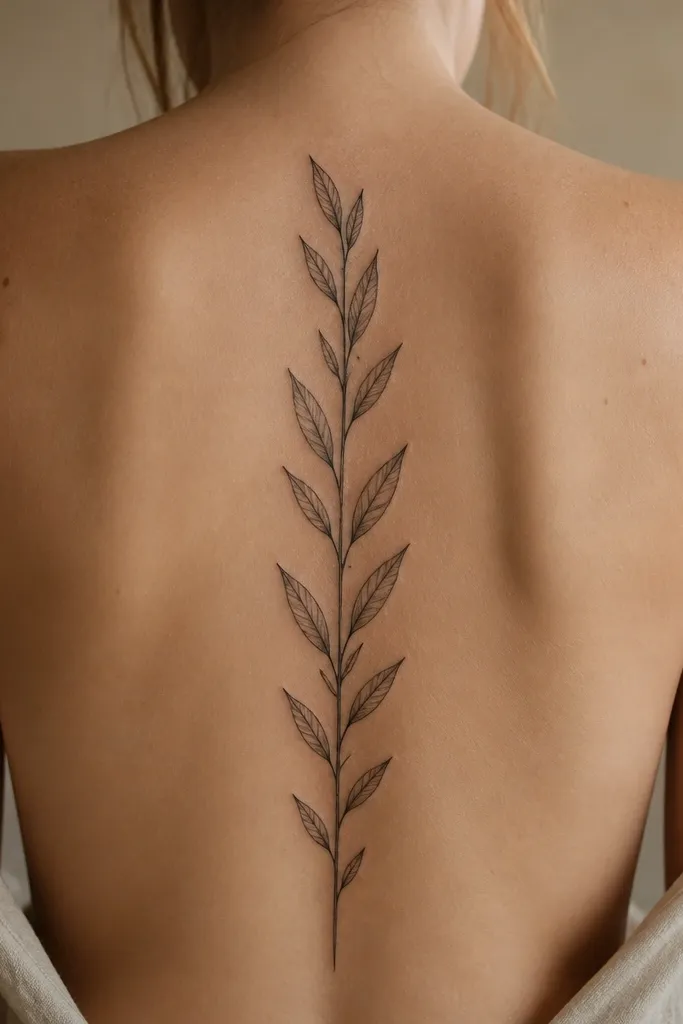
This is the “stunning detail” version, and it works because the veins are tiny and controlled. Realistic olive leaves look gorgeous in side-angle photos because the vein lines create depth without needing heavy grey gradients. The key is keeping shading subtle so the veins stay crisp. If you’re a beginner, this style can still be manageable, but you want an artist who is comfortable with fine line texture.
Start by keeping the total height around 8-9 cm so the veins don’t shrink into invisibility during healing. Ask for a dark stem outline and then thin vein lines inside each leaf, with the side veins shorter than the center vein. Request only a small amount of shading at the base of each leaf to suggest depth. Aftercare should include strict moisturization and no picking; fine vein lines can look raised or flaky before they settle.
Editor's noteBring a photo reference where the leaves have visible veins at small size — that’s the standard to aim for.
One warningAvoid full realism with heavy grey — it turns into a smoky mass on a small spine tattoo.
9. Olive Branch With Minimal Outline and One Grey Wash Leaf
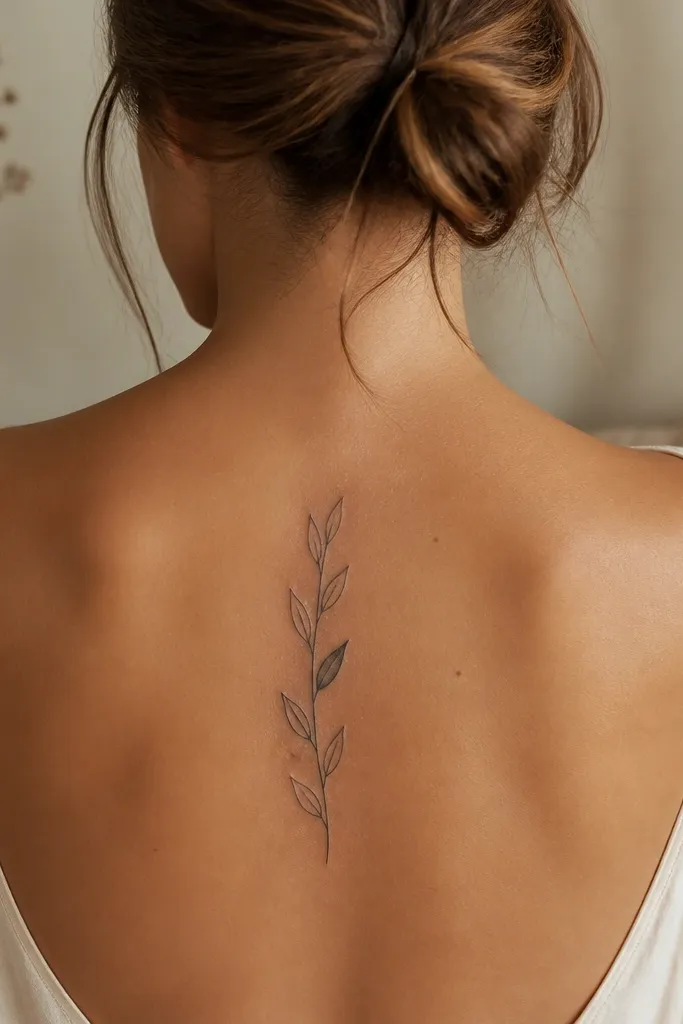
This one is a trick: you get detail by contrast, not by filling everything in. The mostly-outline leaves keep the tattoo airy, and the single grey wash leaf adds depth so the design looks intentional. In photos, that grey leaf becomes the focal point, so your tattoo reads as “designed” even from far away. It’s also easier on healing because you’re not putting a ton of ink into every tiny leaf.
Start by placing the tattoo centered on your mid-spine, around T6 to T9, where you can keep it straight and visible. Ask for 4 leaf pairs with black outline only, then choose one leaf to receive a light grey wash on the inner curve. Request the grey wash be thin and layered, not a single heavy pass. For aftercare, keep the washed leaf moisturized a bit more; grey areas can dry out and look dull if you don’t hydrate them during healing.
Editor's noteIf you like this look but want more detail, choose two grey wash leaves instead of five.
One warningSkip grey wash on every leaf — it defeats the purpose and muddies the branch.
10. Olive Branch With Two Small Olives and a Clean Stem
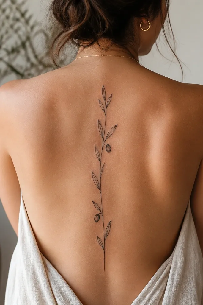
Two olives give you a clear story without clutter. The leaves stay simple, which keeps the tattoo readable as a whole, while the berries act like punctuation marks. This is the design I recommend when someone wants “olive branch symbolism” but doesn’t want the fine-line stress of realistic veins. It also looks great on thicker skin because the berries hold contrast even if details soften.
Start by setting the height at about 7-9 cm, with the berries spaced around the middle third of the design. Ask for teardrop leaves with a consistent outline thickness and no heavy shading. Then request the berries be solid black with a tiny highlight reserved at the top edge. Finally, confirm your stencil orientation so the stem is perfectly vertical; a slight slant makes the berries look like they’re sliding.
Editor's noteAsk for the berries to be the same width as the leaf bases so the proportions look balanced.
One warningAvoid tiny, hollow berries — they heal uneven and look like ink stains.
11. Olive Branch With a Small Laurel-Style Crown Top
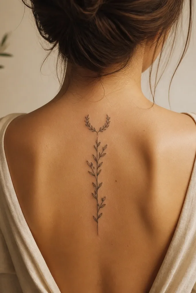
A mini laurel crown at the top makes the branch feel ceremonial. It’s still a single olive branch piece, but the crown shape gives you that “statement” feeling even when the tattoo is small. The crown reads well in photos because it creates a natural silhouette against your back. I like the gradual leaf size down the stem — it looks proportional and prevents the ends from looking cut off.
Start by placing the crown near T2 to T4, where the shoulder blades won’t distort it when you relax. Ask for a slight curve on the top leaves and then reduce leaf size by about 10-20% as you move downward. Keep the stem clean and not too thick, so the crown doesn’t look like a lump. For aftercare, protect it from friction; crown areas rub the most when you wear high collars or bras with tight straps.
Editor's noteIf you want it extra delicate, keep the crown leaves outline-only and add shading only to the bottom two leaves.
One warningAvoid thick outlines on the crown — it can turn into a blob on small placements.
12. Olive Branch Spine With Chevron Shading Under Leaves
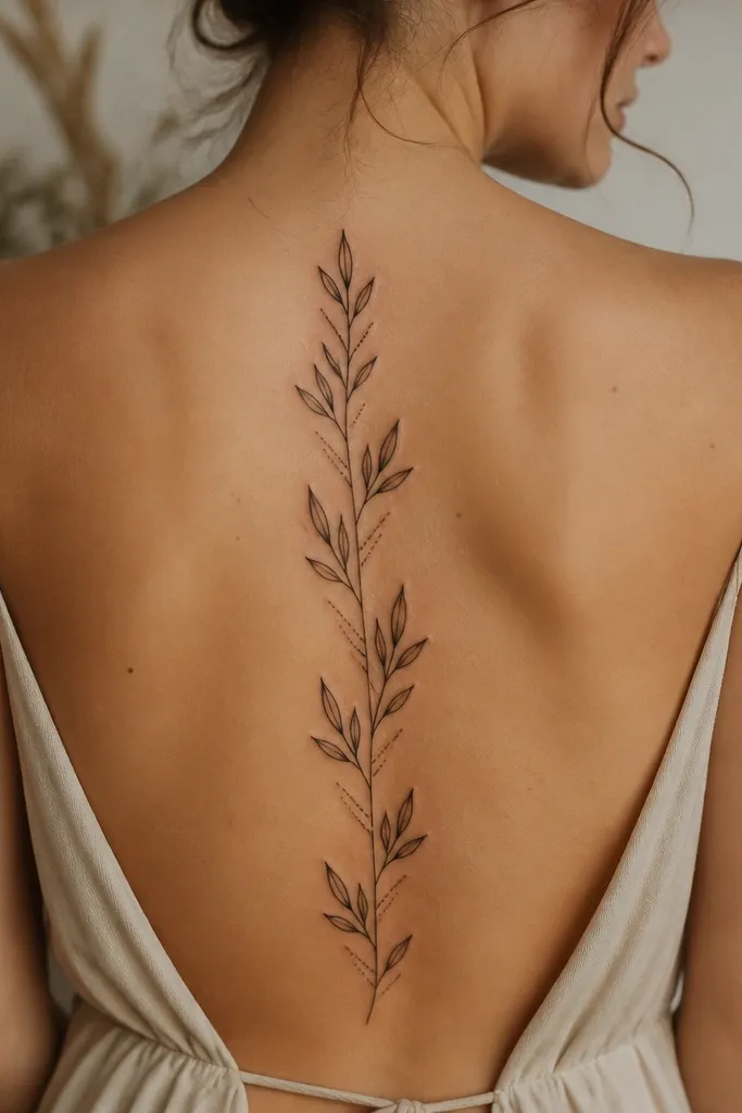
Chevron shading is one of the fastest ways to make small leaves look dimensional. Because the shading is under the leaf, it creates a highlight-shadow effect that reads clearly in photos. The repeated chevrons also give rhythm, so the tattoo doesn’t look like separate stickers — it looks like one flowing branch. This style appeals to beginners who want detail without full realism.
Start by keeping leaf outlines crisp and thin enough to stay elegant. Ask for chevron shading that is only 2-3 short strokes per leaf, placed on the underside curve. Then keep shading consistent across the design so it doesn’t look random. Aftercare is normal, but be patient with the first healing phase; grey shading can look darker right after the tattoo, then settles into a soft tone after a few weeks.
Request that the artist test the chevron size on one leaf first, then match the rest.
Skip heavy grey blocks — chevrons should be small strokes, not filled shapes.
13. Olive Branch With a Tiny Cross Stitch Style Stem
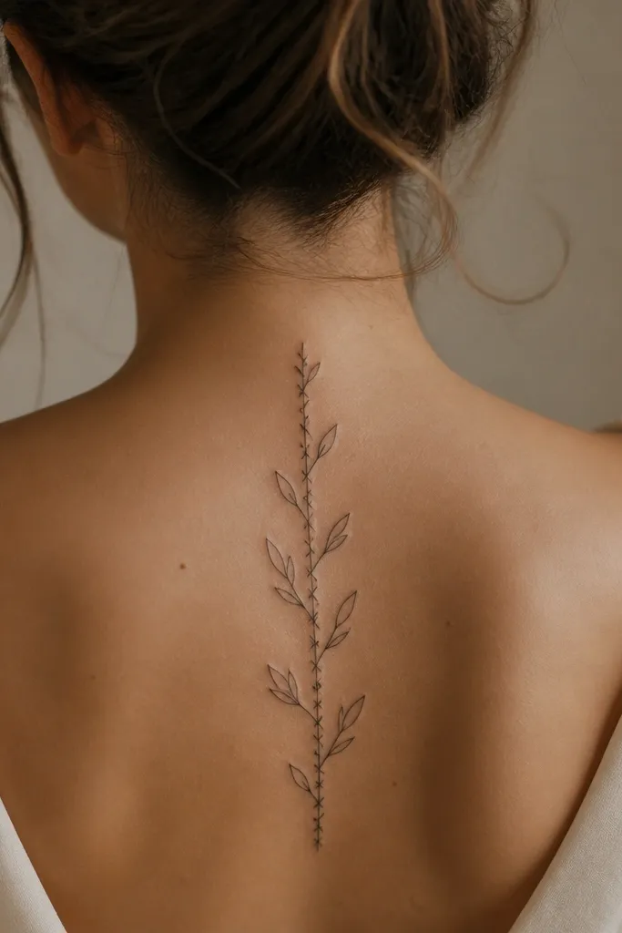
This is the olive branch for people who like graphic tattoos. The cross-stitch stem adds texture without needing a lot of leaf detail, so the tattoo stays readable at small size. It also photographs well because the texture catches light differently than smooth linework. The symbolism still reads as “olive” because the leaves are classic olive shapes, not abstract filler.
Start by placing it on the mid-spine where you can keep the stem straight, usually around T6 to T8. Ask for the cross-stitch only on the stem, not across the leaves, so the leaves stay crisp. Then request 2-3 cross lines per segment of stem, evenly spaced. For aftercare, keep the area moisturized and avoid tight friction; textured stems can scab a bit more than smooth lines.
If you want a softer look, ask for cross-stitch lines that are slightly thinner than the leaf outlines.
Don’t cross-stitch the entire leaf — it turns into visual noise quickly.
14. Small Olive Branch With a Single Ribbon Tail at the Bottom
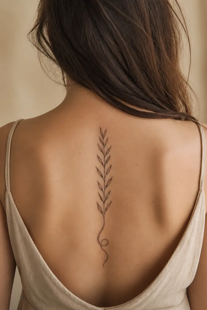
The bottom ribbon tail makes the tattoo feel finished. Without it, small olive branches can look like they stop mid-grow, but the curl gives closure. It also adds a gentle curve that looks good when you wear fitted tops because the tail peeks out and catches light. The leaf pairs stay simple, so you still get that beginner-friendly clean look.
Start by placing it around T7 to T10 so the tail has room to curl without hitting the curve of the ribs too early. Ask for a stem that transitions into a ribbon tail by thinning slightly and curling at the last 1-1.5 cm. Keep leaf pairs 3-5 total so the ribbon tail remains the focal point at the bottom. Aftercare is standard, but be mindful of the tail area when your skin folds; protect it from rubbing and keep it clean during healing.
Bring a reference where the ribbon is tiny — oversized tails look like a separate doodle on the spine.
Avoid thick ribbon tails — they blur and turn into a dark comma.
15. Olive Branch With Watercolor-Style Green Stipple at Leaf Tips
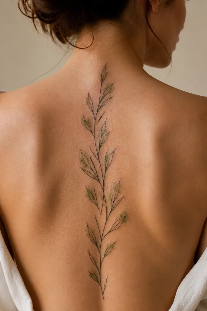
Color only at the tips gives you the “alive” look without overwhelming a small tattoo. The green stipple adds a flash of color in photos, especially under window light, while the black outline keeps the design readable when color fades. I like this for beginners because you still get strong structure — the leaves are defined even if the green softens over time. It also looks great on warm skin tones and under sheer clothing.
Start by choosing a muted olive green rather than bright neon; ask for a pigment mix that stays close to natural leaf color. Request green stipple only at the outer third of each leaf tip, with feathered edges into grey. Keep the stem and vein lines black so the tattoo doesn’t rely on color for readability. Aftercare: avoid sun hard for the first month, and use sunscreen later because color fades faster than black work.
Ask your artist to show you a healed example of green stipple on skin, not on a fresh stencil photo.
Skip full-color fill on every leaf — it swells visually and heals uneven.
16. Olive Branch and Feather Combo on the Spine
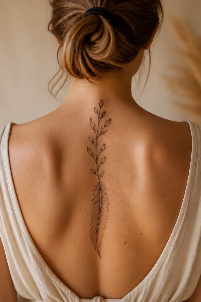
This combination feels personal because it reads like “growth and freedom” without turning into a cliché. The feather adds delicate detail that makes the whole tattoo look intentional, while the olive branch keeps the symbolism grounded. On the spine, the feather sits naturally with your body’s vertical line, so it doesn’t fight the anatomy. In photos, the feather’s fine barbs create that crisp micro-detail people love.
Start by placing the feather at the top third of the spine, around C7 to T3, with the olive branch continuing down. Ask for feather barbs to be thin and evenly spaced, and keep the olive leaves slightly larger than the barbs so both elements read. Then request minimal shading on the olive leaves — outline plus a small grey base — so the design stays balanced. Aftercare is careful with the feather lines; fine barbs can look fragile, so moisturize and don’t pick flakes.
If you want this to stay subtle, shrink the feather by about 20% and keep the barbs fewer.
Avoid thick black fill on the feather — it crushes the barbs and loses the feather effect.
17. Olive Branch With Tiny Star Sparkles Between Leaves
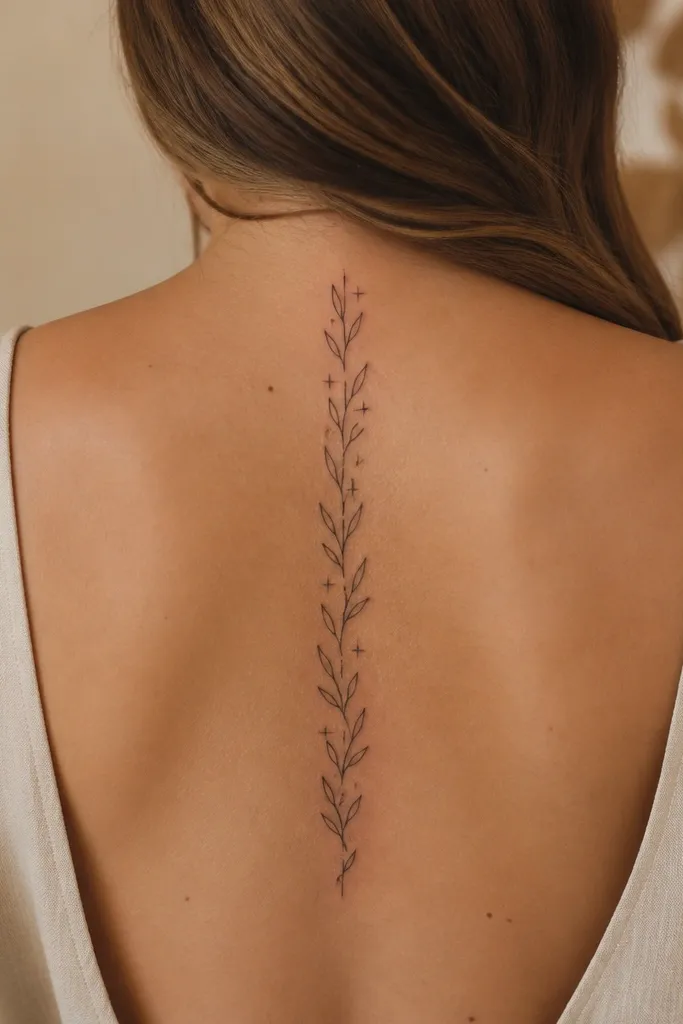
Stars between leaves make the tattoo feel magical, but they stay small enough to keep the olive branch the main character. The negative-space stars also help the design look airy, so it doesn’t feel heavy on the spine. This is a great option if you want something beginner-friendly that still looks special in photos. The stars catch light as points, which makes the tattoo pop even when the rest is delicate.
Start by choosing a placement around T6 to T9 so the stars sit where you can see them when you move. Ask for exactly 2 stars, placed in the negative space between leaf pairs, not on top of the leaves. Request that the star lines are thin and consistent, and keep leaf shading light so the stars don’t look accidental. Aftercare is normal, but be extra gentle cleaning around the stars because those tiny points can scab and feel rough.
Editor's noteIf you want a calmer look, make the stars outline-only with no fill.
One warningAvoid more than two stars — extra points crowd the spine spacing.
18. Olive Branch With a Thin Underline Ghost Stem
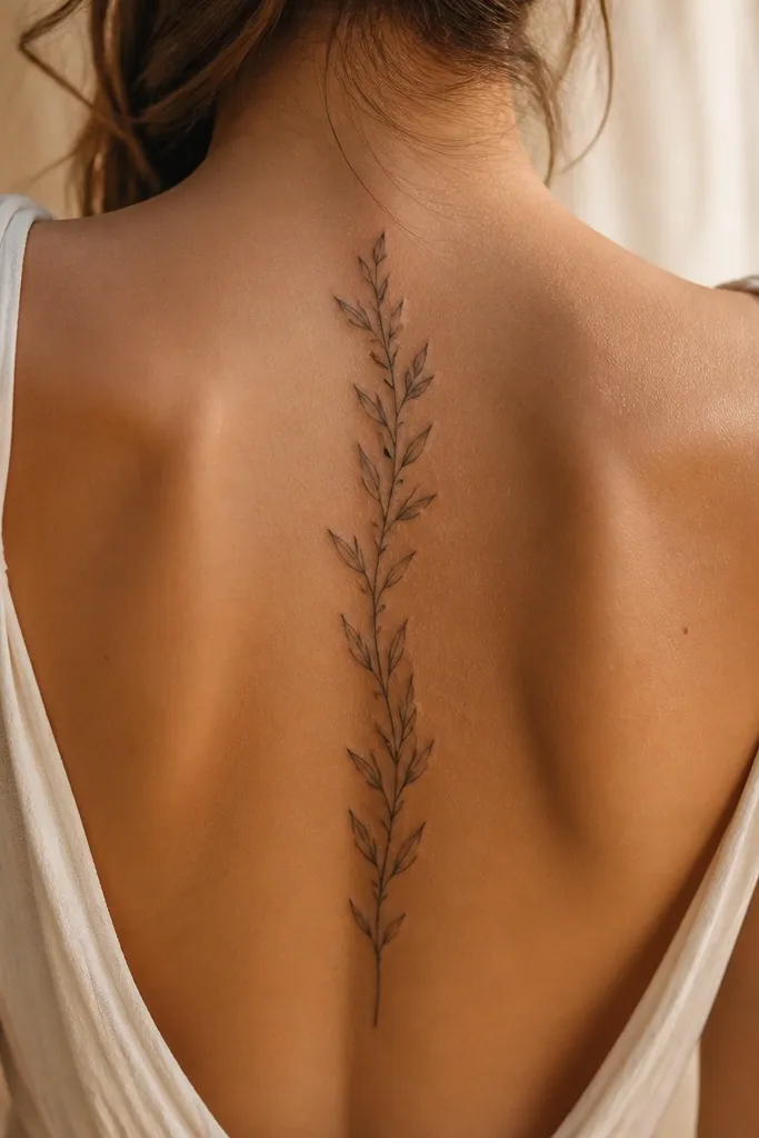
The ghost stem effect makes the tattoo look layered without adding extra symbols. It creates a subtle depth trick that shows up in photos — the leaves look like they’re sitting above the linework. This style appeals to people who want something a little different but still clean. The grey ghost line also fades gracefully compared to heavy black, so it doesn’t turn into a harsh outline later.
Start by placing the design on the mid-spine where there’s enough flat space for two lines to read clearly, usually T6 to T8. Ask for the main stem in black with crisp outline, then request the ghost stem in light grey only under the bottom half. Keep leaf pairs anchored to the main stem so the grey line doesn’t confuse the composition. Aftercare: keep it moisturized, and watch the ghost line area closely during healing since lighter ink can look patchy if the skin dries out.
Ask for the ghost line to be 30-40% lighter than the stem so it stays subtle.
Skip a full-length ghost stem — it can look like a double line mistake.
19. Olive Branch With a Small Infinity Loop at the Middle
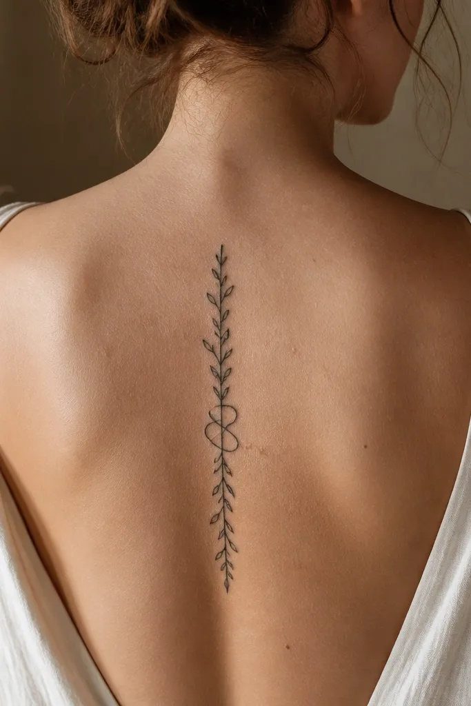
An infinity loop in the middle gives you meaning without adding a separate tattoo. It still reads as an olive branch because the leaves and stem are continuous; the loop just changes direction briefly. This design is super photogenic because the loop creates a clear shape that’s easy to spot in a mirror. It also works well for beginners because the loop acts like a focal anchor, so the rest can stay minimal.
Start by placing the infinity loop around T7 or T8, centered on your spine. Ask for the loop size to be small, about the width of two leaf pairs, so it doesn’t dominate. Then request the stem lines to flow into the loop smoothly with no breaks, and keep leaf pairs evenly spaced above and below. Aftercare is like other fine-line work; avoid tight clothing over the loop area because constant rubbing can blur small curves.
If you want it softer, ask for the loop to be grey-lined instead of fully black.
Avoid covering the loop with leaves — it makes it hard to read.
20. Mini Olive Branch on Lower Cervical With Clean Leaf Silhouettes
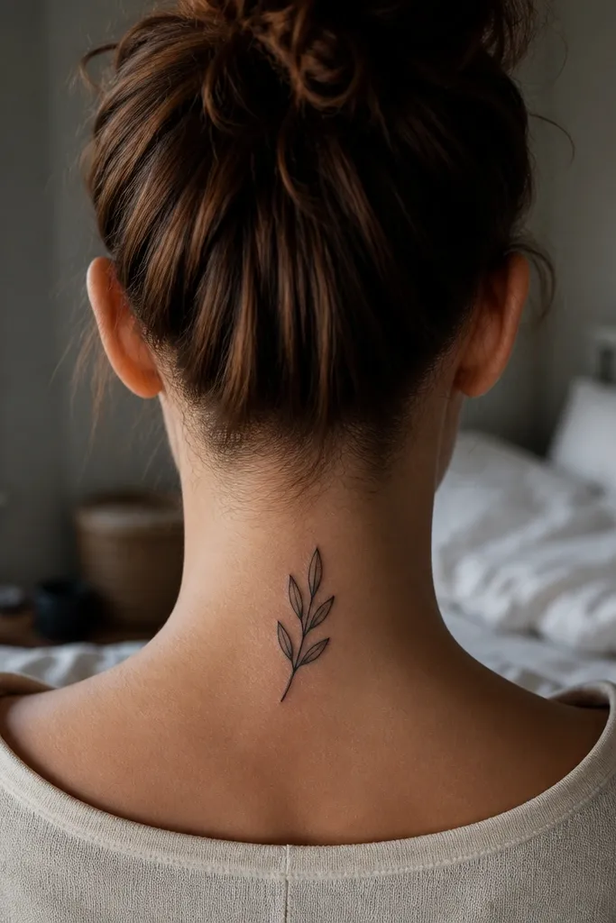
Lower cervical placement is a sweet spot for beginners because the design is visible when you look down and it looks delicate when you wear your hair up. Clean leaf silhouettes look sharp because the tattoo relies on outline and shape, not lots of tiny internal details. This is one of the most reliable “small olive branch” looks for aging well, since bold outlines usually hold up. In photos, the silhouette style reads instantly as an olive branch even at a quick glance.
Start by measuring placement from the base of your neck down about 5-7 cm. Ask for leaf silhouettes with consistent outline thickness and no more than a tiny grey accent near the base of each leaf. Then keep the stem thin but continuous so it looks like a real branch. Aftercare: protect from sun and friction, especially if you wear high collars; the lower cervical area gets rubbed more than people expect.
Editor's noteIf you want a softer look, ask for slightly rounded leaf tips rather than sharp points.
One warningAvoid tiny internal vein lines in this placement — they can disappear as the skin heals.



