
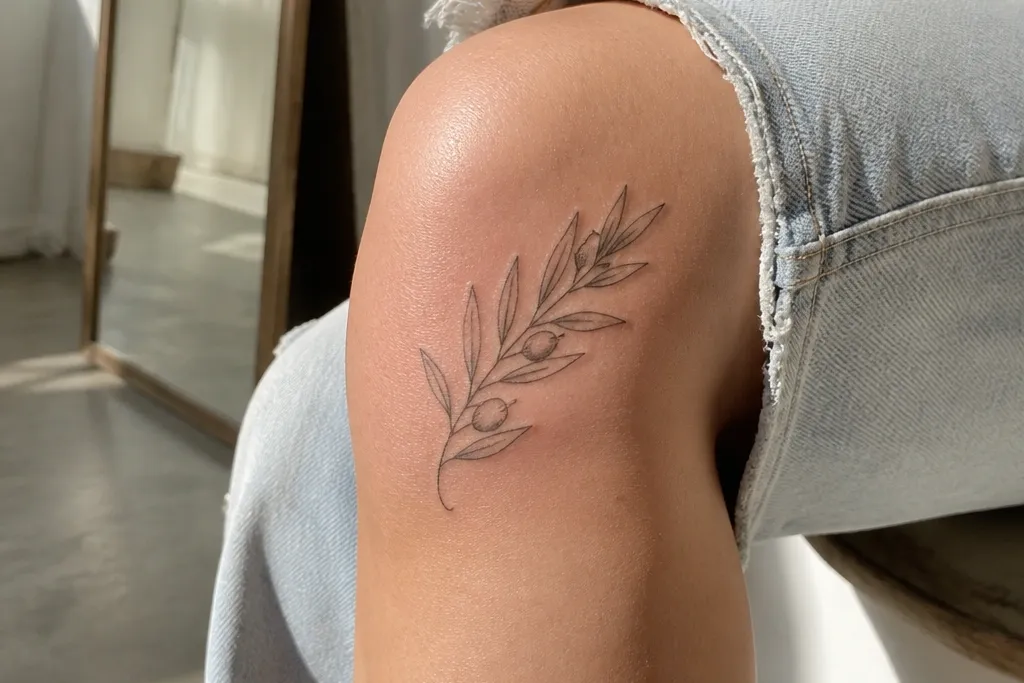
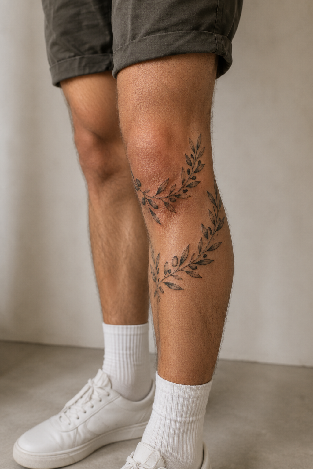
1. Outer Kneecap Olive Branch with Gold-Leaf Style Highlights
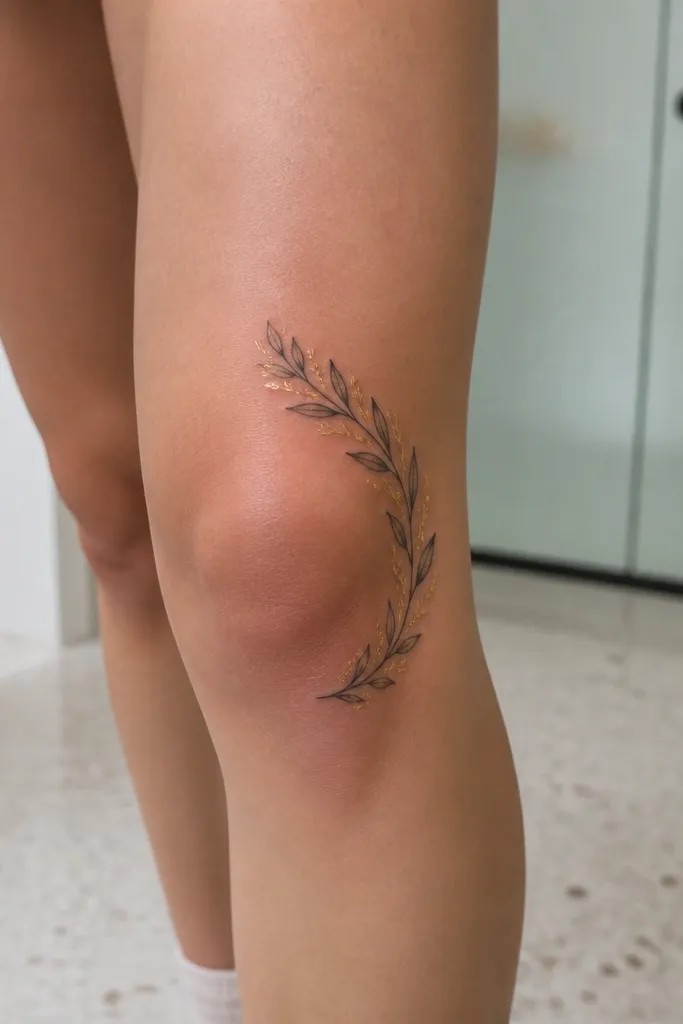
This layout looks expensive because the branch sits on the outer knee contour where the light hits it cleanly. The upward arc makes the leaves read as a focused cluster instead of a scattered bunch, which is the difference between “cute” and “gallery photo.” I like the gold-leaf effect because it’s not actual gold — it’s light gray stippling and tiny highlight lines that mimic reflective leaf edges. It flatters people with a defined outer knee line, and it also hides early fading better since the highlights live near the top of each leaf. Symbol-wise, a single branch reads as peace and closure, and the clean negative space around it keeps the message crisp.
Step one — ask your artist to place the stencil on the outer knee while you stand and then while you bend the knee 30 degrees, so the arc stays aligned. Step two — request line weight slightly heavier than forearm fine line, plus stipple shading that stays under the leaf edges rather than filling the whole leaf. Keep the smallest leaf at least the size of a dime in final work, even if the design looks “small” on paper. For aftercare, plan extra protection from rubbing — friction is what blurs the highlight lines first. Expect a touch-up if the knee flex area softens after 6-12 months.
Bring a reference photo that shows reflective leaf edges in bright light, then ask for “highlight stipple” instead of full black shading.
Don’t use ultra-fine micro leaves packed tightly — knees eat that detail fast.
2. Inner Knee Olive Branch Frame with Thin Crown Leaves
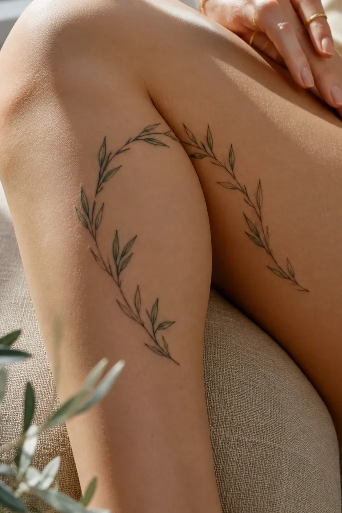
Inner knee tattoos can look pricey when they use the skin as part of the design. This frame layout uses the center negative space like a mat, so the branch reads as intentional and architectural. The thin crown leaves give a “jewelry” feel, and the two-stem structure keeps the symbol from looking like it’s drifting. It suits people who want subtle symbolism without a huge coverage area, because the frame makes your knee look more shaped. The peace meaning stays readable even from a distance because the leaves form a clear silhouette. On photos, the negative window makes the ink pop under flash.
Editor's noteIf you want it to look more expensive, ask for a tiny dot constellation above the top meeting point — just 3-5 dots, not a full scatter.
Step one — mark the stencil with your knee slightly bent, then check that the frame doesn’t pinch when your skin folds. Step two — ask for a clean stem line with consistent thickness and leaves that have visible vein lines, but keep the veins slightly lighter gray than the leaf outline. Size the frame so it spans from mid-inner kneecap to the top of the inner shin, roughly palm-length. For aging, this design looks best with minimal heavy black; keep shading light to avoid a muddy center. Aftercare means keeping the area dry and protected from friction, especially when wearing leggings.
One warningAvoid placing the frame too low into the inner shin crease where fabric rubs daily.
3. Kneecap Split Branch with Motion-Friendly Leaf Sizes
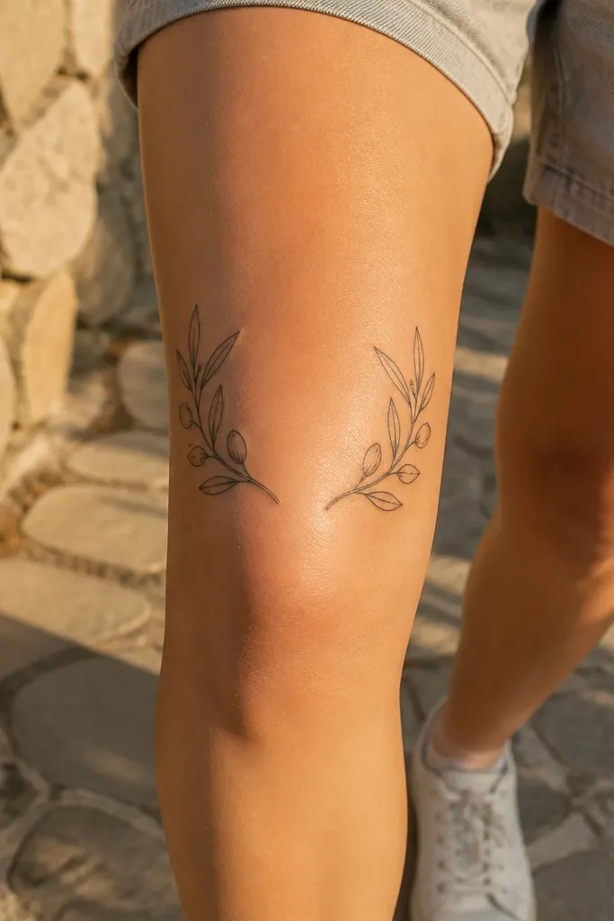
This is the placement I reach for when someone wants “more design” but still wants clean healing. The split branch respects how the knee moves — each side cluster holds its own shape, so the center doesn’t rely on tiny details staying perfect. It looks expensive because the symmetry is controlled, and the leaf size changes create depth without needing heavy black. The central dot-knot catches light in photos, making the piece look intentional rather than flat. It’s great for people who have a rounder kneecap and want the tattoo to follow that curve instead of fighting it. Symbolically, the two branches read as reconciliation or coming together.
Editor's noteAsk your artist to draw a temporary line across your kneecap so the stems never drift off the joint when you flex.
Step one — choose a size that fits across the kneecap without crossing too far onto the thigh or shin; aim for a width about the size of your palm. Step two — ask for three leaf sizes: large at the ends, medium on the curve, small only near the center knot. Use stipple shading under the leaf edges and keep outlines consistent across both halves. For pain, plan for more sensitivity at the center meeting point, then protect it with a thin barrier during the first week. Touch-ups are common on the center, so schedule your artist for a check-in 8-12 weeks after full healing.
One warningDon’t mirror two identical micro-leaf branches — the center will smear first.
4. Olive Branch Around the Knee Cap Like a Bracelet
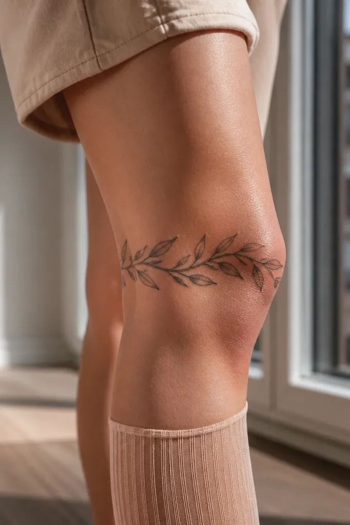
A bracelet wrap looks expensive because it reads as wearable jewelry, not a random symbol placed on skin. The circumference placement also hides early fading better, since the leaves face different angles as you move. I like alternating leaf direction because it creates motion in photos, especially in side shots. It suits people who want a bold statement but don’t want a full leg sleeve. The meaning stays strong because the branch is continuous, like a single line of peace passing around you. It photographs best when there’s a little negative space between leaf clusters so your skin tone remains part of the design.
Editor's noteChoose a leaf count that makes one full sweep around the knee; if it feels too sparse, it will look unfinished in photos.
Step one — ask your artist to place the stencil at the upper knee crease and confirm with you standing, then with you sitting down, so the bracelet doesn’t twist. Step two — request a consistent stem thickness and leaf spacing that leaves at least a finger-width gap between dense clusters. Use light stipple shading on every other leaf to avoid a heavy black band. For aftercare, treat it like a friction piece — keep it protected under clothing and avoid long hot baths early on. Plan for one touch-up because the curve can fade in the most rubbed area.
One warningAvoid placing the densest cluster exactly over the kneecap bump — it heals unevenly.
5. Olive Branch with Fine Chain Links Under the Leaves
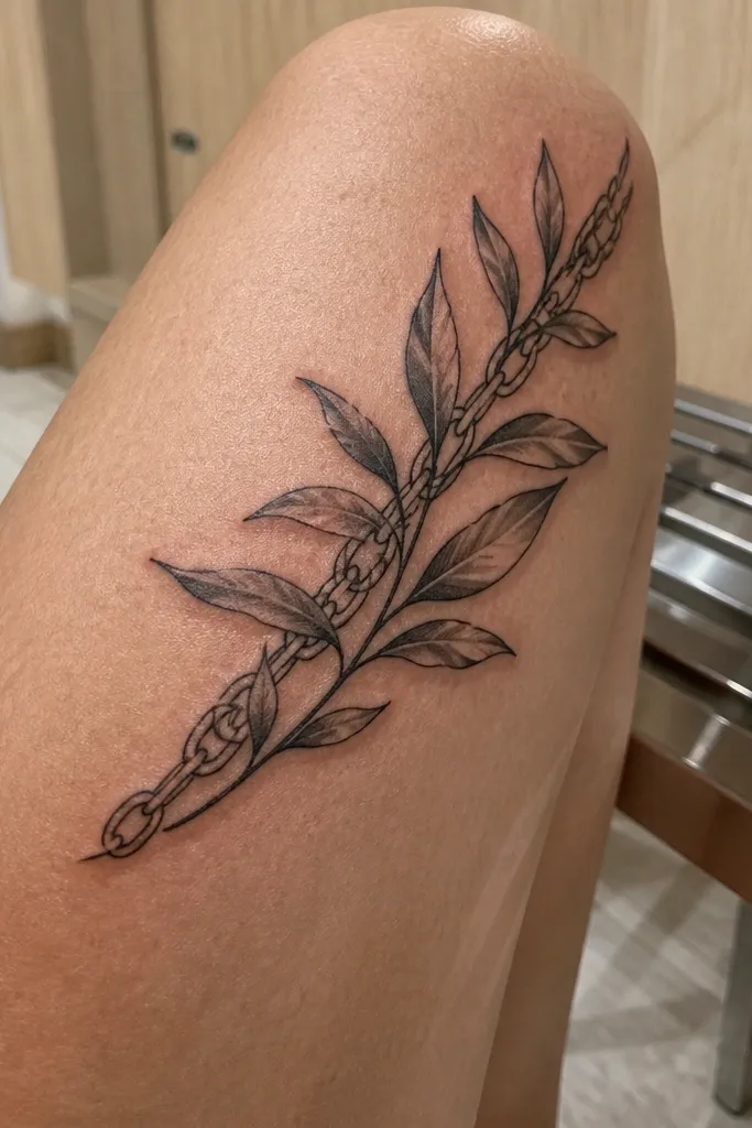
This design has that “expensive jewelry” feel because it adds a second texture line without making the tattoo look busy. The thin chain links beneath the leaves create a sense of depth and craftsmanship, and the diagonal placement keeps it from looking flat. I’ve found that chain details look best on knees when they’re slightly thicker than you’d expect, then faded with light gray so they don’t turn into a black scribble. It suits people who like symbolism that feels romantic and personal rather than literal. The olive branch still reads clearly, and the chain gives it a “kept close” vibe in photos. It’s also great if you want something that looks good in both shorts and dresses.
Editor's noteIf you want it to look more premium, ask for one or two leaves to have a faint vein highlight that matches the chain line angle.
Step one — place the stencil diagonally from the outer kneecap toward the inner upper shin, so the chain line follows the natural tendon direction. Step two — ask for crisp outlines on the leaves, then a lighter gray wash on the chain so it doesn’t overpower the branch. Keep the chain links larger than you’d do on a finger tattoo; knee skin needs legible scale. Aftercare should include extra moisturization once the top layer heals, since chain lines can feel dry and look dull during recovery. Expect the chain to fade slightly faster than the leaf outlines — that’s normal and part of the layered look when healed.
One warningDon’t stack the chain too close to the leaf outlines — it can merge when the knee flexes.
6. Minimal Olive Branch on the Shin-Side of the Kneecap
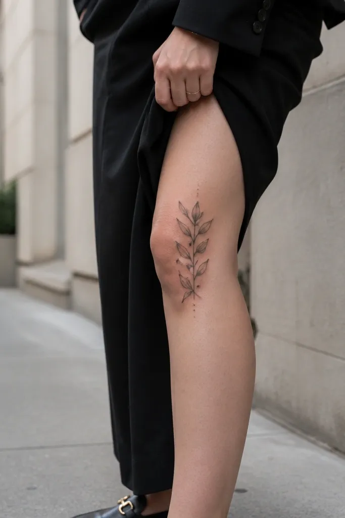
Minimal designs can look expensive when they have restraint and perfect spacing, not when they’re tiny and fragile. This placement on the shin-side of the kneecap avoids the harshest bending zone while still reading as a knee piece. The even leaf spacing makes the branch look intentional and calm, and the dot accents add a “fine print” detail that shows up on close-up photos. I like this for people who want the olive branch aesthetic without committing to a big cover. It also ages better than dense black work because there’s less pigment to blur. The symbolism stays clear: one branch, one message, no clutter.
Editor's noteAsk for a slightly rounded leaf shape instead of long narrow leaves; rounded leaves hold better in healing.
Step one — position the stencil so the lowest leaf sits just above the top of the shin bone crease, not on the most rubbed area. Step two — request light gray stipple shading, not full black fill, and keep the outline slightly thicker than a typical minimalist forearm tattoo. Your artist should space the leaves so each one has a clean silhouette when you bend your knee. For aftercare, keep the area protected from sweat and friction — minimal work shows irritation quickly. Plan a touch-up if the outline softens after a few summers of sun.
One warningAvoid placing the tattoo directly over the kneecap center when you want minimal detail.
7. Olive Branch with Micro Dotwork Halo Around Leaves
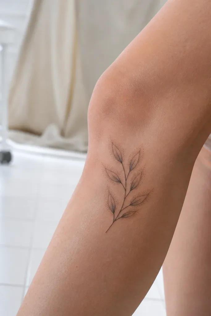
Dotwork halos create an “expensive” look because they add texture without heavy black blocks. On the knee, this is especially flattering because the dot fade reads like light catching on the surface. The halo also helps the leaves look fuller even if you keep the pigment light, which reduces blur risk. I’ve seen this style look stunning in flash photos because the dots pop and then soften as the light changes. It suits anyone who wants the olive branch aesthetic with a more artistic, modern finish. Symbol-wise, the halo makes the peace symbol feel like it’s framed by calm energy rather than just drawn lines.
Step one — ask your artist to keep the halos tight to each leaf edge, with dots thinning out within 1-2 millimeters of the outline. Step two — request stipple shading on the leaf underside and use the halo to separate leaves from the skin background. Keep the smallest leaves large enough to hold a halo; tiny leaves turn into gray fuzz. Aftercare matters more here: avoid picking, because dotwork can look patchy if healing scabs lift early. Touch-ups are worth it at 3-6 months if any leaf halo fades unevenly.
If you want a more premium look, ask for 2-3 leaves to have stronger halo density and keep the rest lighter for contrast.
Don’t do a full background dot field — it makes knee motion blur worse.
8. Olive Branch with Ribbon Knot at the Bottom of the Kneecap
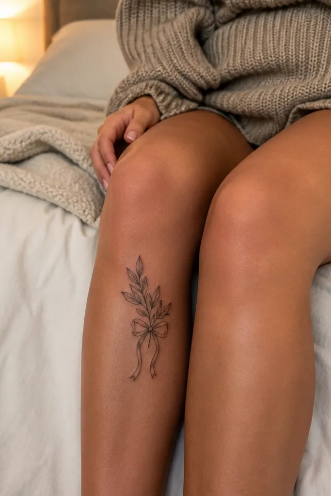
A ribbon knot makes the olive branch feel finished, like a gift tag or award seal. The bottom-of-kneecap placement is smart because it anchors the design where skin movement is less chaotic than the exact kneecap center. The ribbon folds add a little realism, and the small gray shadows keep it from looking flat. This is the style I recommend when someone wants the tattoo to look “expensive” even if they wear shorts — it reads clearly fast. It also photographs well because the ribbon knot sits like a focal point. The symbolism is peace tied to closure, celebration, or a personal promise.
Step one — center the ribbon knot just below the kneecap bump, then angle the branches slightly upward so they don’t stretch when you bend. Step two — request thin ribbon outlines with light gray shading under folds, and keep leaf outlines slightly thicker than the ribbon lines. Size the ribbon knot to about the width of a quarter so it stays legible as you move. During healing, friction will hit the ribbon area first, so use a breathable protective layer and keep it clean. Plan one touch-up if the ribbon folds flatten after full recovery.
Ask for the ribbon to have a soft shadow line on only one side to keep it crisp instead of muddy.
Avoid heavy black fill on the ribbon — it turns into a dark patch on knees.
9. Half-Sleeve Style Olive Branch on the Upper Outer Shin
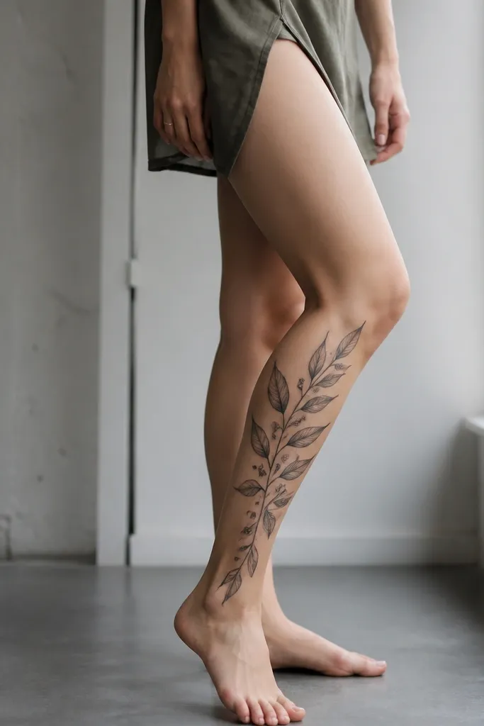
This feels expensive because it looks like part of a planned collection, even when it’s just one tattoo. The upper shin placement gives you a longer canvas than the kneecap, so the leaves can be bigger and clearer. The overlap between leaves creates depth without needing dark color, and the offshoot vine detail makes it feel designed rather than copied. I like this for people who want an olive branch tattoo that reads strong in motion — the vertical flow stays steady when you walk. Symbol-wise, the branch becomes a “path,” not just a single icon. It’s also a good choice if you’re worried about knee joint healing — the outer shin takes ink more predictably.
Editor's noteAsk your artist to draw the vine offshoots with consistent spacing so it looks intentional, not random sprigs.
Step one — place the top of the branch 1-2 centimeters below the outer knee crease and let it descend toward the upper shin without crossing the most rubbed pant seam. Step two — request a thicker stem base and overlapping leaves with light gray under-shading. Keep the leaf edges clean and avoid dense black; knee skin needs breathable pigment. Aftercare should focus on preventing scabs from sticking to clothing because scab pull can distort leaf edges. Touch-ups are common on overlapping zones, so book a follow-up if your artist offers one.
One warningDon’t keep everything the same size — flat leaves look cheap on a shin-to-knee flow.
10. Olive Branch with Watercolor-Like Sage Green Wash in Leaves
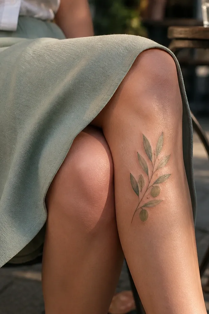
Color changes the whole vibe, and this one reads expensive when you keep the palette restrained. The sage green wash stays close to the olive branch symbolism and looks soft instead of loud, which matters on knee skin that shows texture changes as it heals. I’ve done this with clients who wanted something feminine but not “cartoon.” The black outline keeps the design crisp, while the green wash gives depth and makes the leaves look dimensional. Placement on the front outer knee catches light nicely in photos. It also ages better than full-color fills when the wash is controlled and not too saturated.
Step one — choose a limited color plan: outline in black, then apply sage green as a fade inside each leaf, leaving skin tone at the edges. Step two — request that the green stays in the leaf shape only, with no spill into the stem area, so healing doesn’t blur it into a smudge. Keep leaf size large enough for color boundaries to stay clean. For aftercare, avoid heavy sun on the colored leaves for at least 6-8 weeks, because fading happens faster in color ink. Expect a touch-up if the green lightens unevenly; it’s common and still looks good when corrected.
Bring two shades of green swatch photos and ask for the lighter sage, not a deep olive — it heals brighter.
Avoid full solid green fill on knees — it turns flat and can look patchy.
11. Olive Branch with Ornate Filigree Border on One Side of the Knee
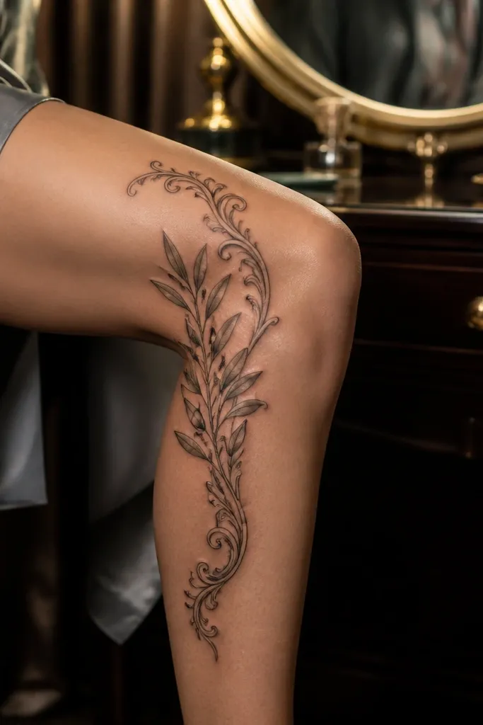
Filigree can look cheap when it’s too dense, but this version looks expensive because it uses a single ornate border and keeps the branch itself clean. The border frames the branch like a vintage piece of jewelry, and the one-sided placement makes it look intentional rather than symmetrical-for-symmetry’s-sake. It’s also a smart way to hide the knee’s texture differences — filigree lines soften into the skin as you move. This suits people who want a more decorative olive branch without covering the whole knee. Symbol-wise, the filigree adds a “ceremony” feel while the branch keeps the peace meaning readable.
Editor's noteAsk for filigree curls to start and stop at defined points so they don’t smear into the branch when the knee bends.
Step one — position the branch on the side of the knee where the skin is smoother, then place the filigree border along the outer edge only to avoid the most creased area. Step two — request consistent line weight: filigree lines should be slightly thinner than the olive outline, but not hairline-thin. Use gray shading under the olive leaves for depth, and keep the filigree mostly linework with minimal shading. Aftercare should include strict friction control because fine filigree lines pick up irritation fast. Plan a touch-up if any filigree curls soften after healing.
One warningDon’t fill the filigree with black — it turns into a lace-like blob.
12. Olive Branch with Realistic Leaf Veins and Soft Grey Shadow
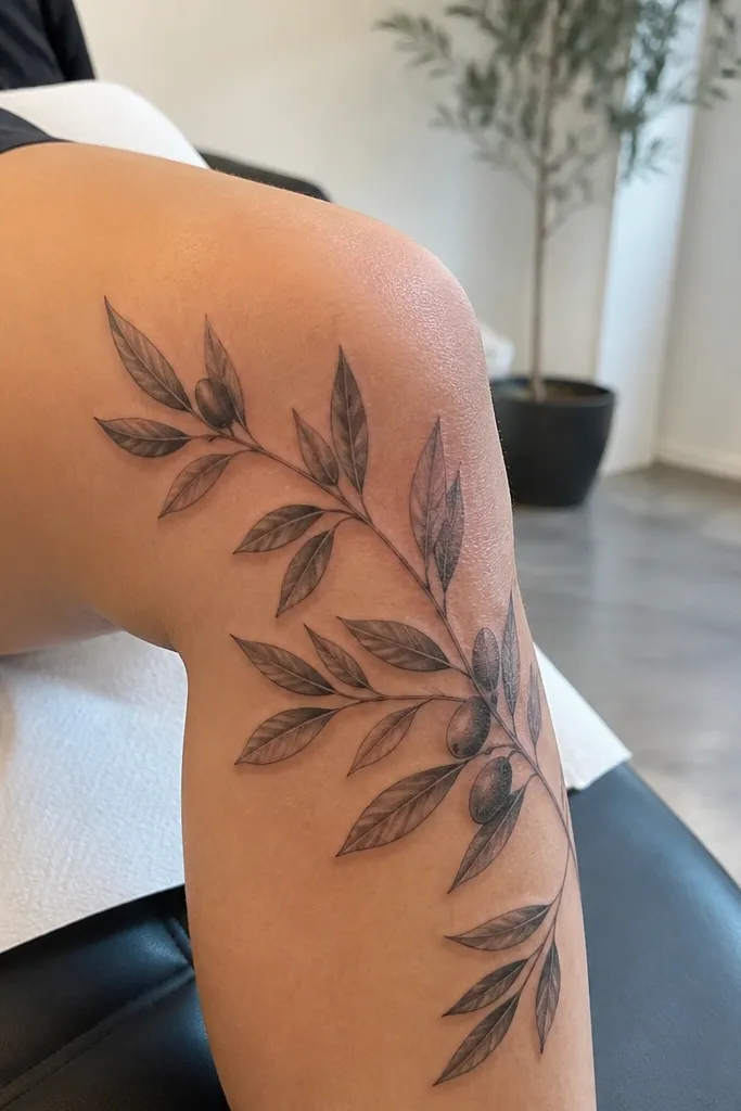
Realistic veins make this one look expensive because they add structure, not just decoration. On knees, a realistic approach only works if the veins are visible as the tattoo heals, so you need a balance of line weight and light shadow. This design keeps the background clear, which helps the leaf texture read even at a distance. It’s perfect if you like botanical tattoos but want the olive branch symbol to stay recognizable. Placement on the lower outer knee gives you a stable surface that still frames the kneecap. The symbolism reads like “growth through calm,” and photos look crisp because the veins catch light.
Editor's noteIf you want extra realism, ask your artist to vary vein thickness slightly — thicker at the base, thinner toward the tip.
Step one — ask for vein lines in light gray rather than pure black, and keep them spaced so they don’t merge when the skin flexes. Step two — request soft gray shadow under each leaf using a gentle gradient, not dense stipple. Size the leaves so the largest leaf is about the width of a nickel and the smaller ones are still clearly distinct. For aftercare, keep it moisturized after the first peeling phase so the veins don’t look dull while healing. Touch-ups help if any veins fade first; it’s common on knee areas.
One warningAvoid single-weight black veins — they heal too harsh and look like scratches.
13. Olive Branch with Curved Arrow Stem Ending at the Inner Knee

This one looks expensive because the stem direction is doing work. The arrow-like curve makes the tattoo feel dynamic, and it also makes the design read as purposeful from one angle. The ending arrow leaf gives you a focal point near the inner knee, which can look elegant because it sits where the leg naturally tapers. It suits people who want the peace symbol but also want movement and structure. The olive branch aesthetic feels modern rather than “classic stencil,” especially with the leaf scale change. In photos, the curve looks clean in both standing and sitting positions.
Editor's noteAsk the artist to make the arrow end slightly thicker than the stem so it stays legible as the knee flexes.
Step one — stencil the curve while you sit down, because knee tattoos distort when you’re seated and that’s when people see them in real life. Step two — request a smooth stem line with consistent thickness and a tapered leaf sequence toward the arrow end. Keep shading minimal and focused on leaf undersides so the arrow tip stays crisp. Pain is moderate but the inner knee leaf tip can be tender, so plan for numbing and take breaks if needed. Aftercare should emphasize friction control because the inner knee gets rubbed by clothing seams.
One warningAvoid placing the arrow tip directly on a crease line where your skin folds hard.
14. Olive Branch with Negative-Space Ribbon Banner Across the Knee
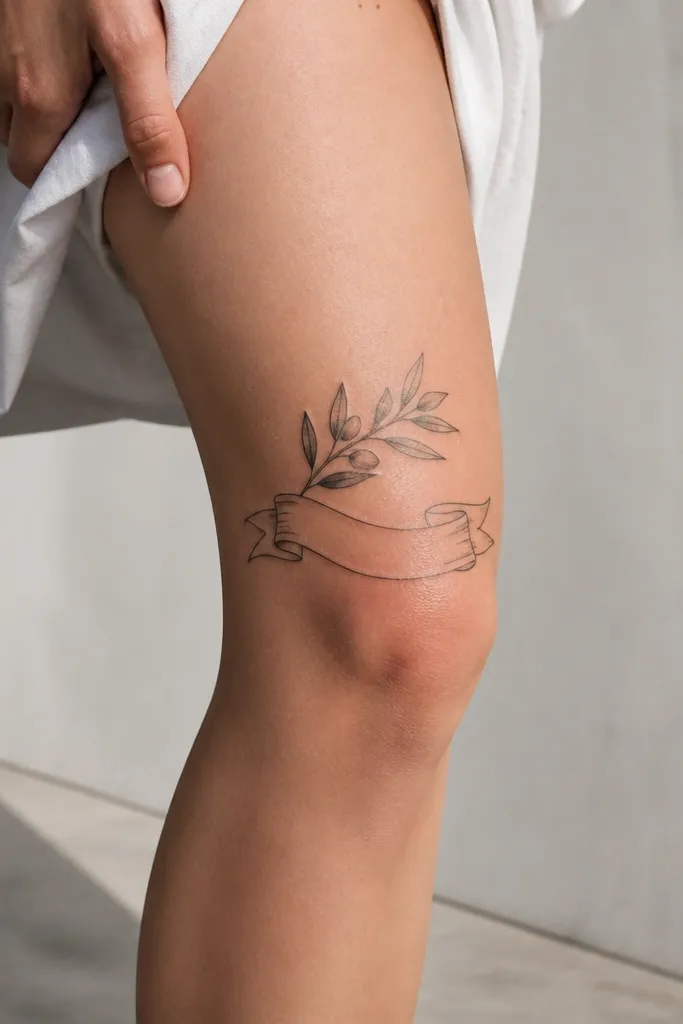
Negative-space ribbon banners look expensive because they rely on design geometry, not heavy shading. This layout makes the knee area feel cleaner and more high-end, since the ribbon is “air” bordered in ink. The olive branch above it stays readable and doesn’t get swallowed by black fill. I like it for people who want symbolism that feels like an award or a personal vow. It also photographs well because the banner gives a strong horizontal line and the leaves add texture above. The peace meaning reads clearly even when the tattoo is partially obscured by clothing.
Editor's noteIf you want extra “luxury,” ask for the ribbon ends to curl slightly, matching the leaf curve so everything looks designed as one unit.
Step one — design the ribbon height so it sits across the front knee without crossing too far onto the thigh; a width around 10-12 centimeters looks right on most legs. Step two — ask for a thin border outline and only light gray shadow under the ribbon line, keeping the center open. Leaves should overlap the ribbon edge lightly, not float far above it, so the composition feels anchored. For aftercare, protect the negative-space border because fine lines can look dry during healing. Plan a touch-up if the border line softens after 2-3 months.
One warningAvoid thick black ribbon borders — they remove the negative-space effect and look heavy.
15. Olive Branch with Blackwork Dot Shading Only on the Leaf Edges
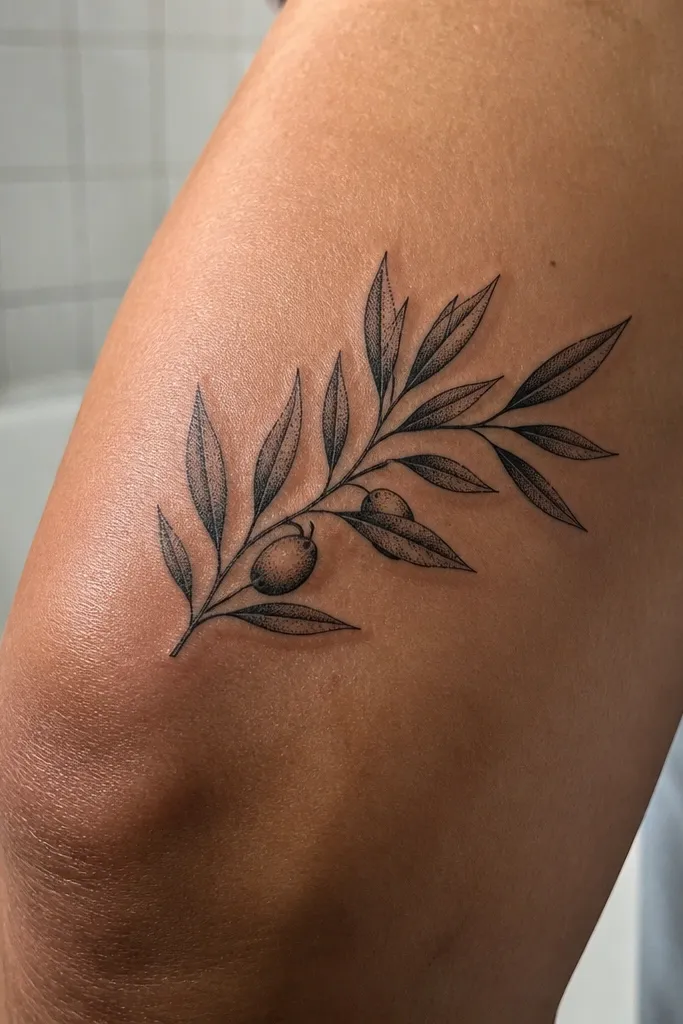
This is a “high-end blackwork” look that reads expensive because the shading is controlled and stays crisp. Dot shading only along the edges gives a crisp silhouette and avoids the knee blur that happens when you fill entire leaf surfaces. The outer knee placement gives you a smoother healing surface than the inner crease, so the edges stay sharp longer. This is a great choice if you hate the idea of color fading but still want depth. Symbol-wise, it stays true to the olive branch shape and reads clearly even in low light. In photos, the edge-dot texture catches flash without turning the whole tattoo gray.
Step one — ask your artist to outline each leaf in solid black and then add dots only within a narrow band along the leaf perimeter. Step two — keep the stem line slightly thicker than the leaf outline so the branch reads as one continuous symbol. Don’t add full leaf fill; let the skin show through where possible. For aftercare, blackwork needs consistent moisturizing after the first peeling phase, or it can look flat and chalky. Touch-ups are still normal on knees, but this style holds up well because the edge dots remain visible.
Ask for fewer leaves with bigger shapes — blackwork looks more expensive when it breathes.
Avoid heavy black fill inside leaves — it heals into a flat gray-black patch.
16. Olive Branch with Subtle Grey Realism and Micro Spark Dots
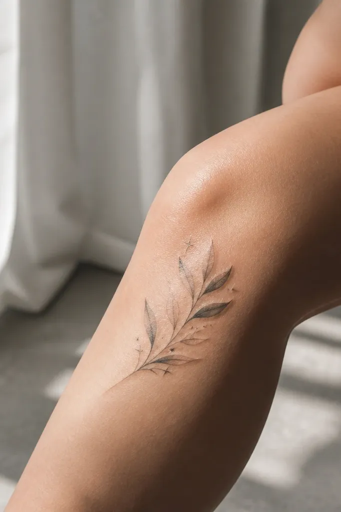
This design feels expensive because it uses realism cues without overloading the knee. The subtle gray shading gives the leaves a dimensional edge, and the micro spark dots add a celebratory detail that reads like jewelry, not glitter. Placement on the front inner knee makes the tattoo look delicate but still visible in motion. I like it for people who want peace symbolism that feels personal and slightly magical. The spark dots also help photos, because flash catches them even if the rest of the tattoo is soft gray. It ages fairly gracefully when the outline stays strong and the shading is light.
Step one — keep the leaf shading light: a thin gray gradient under the leaf edges and minimal fill inside. Step two — place spark dots only at the top cluster so they don’t create background noise across the knee. Size the leaves so vein lines stay legible — if the veins are too tiny, they disappear after healing. Aftercare includes strict cleanliness and avoiding friction; soft gray shading can look uneven if you rub scabs. Plan for a touch-up at the top cluster if any spark dots fade first.
Ask for star points to be tiny and sparse — 2-4 clusters max — so it stays classy.
Avoid scattering spark dots across the whole branch — it looks like a cheap sticker.
17. Olive Branch with Geometric Triangle Frame on the Knee
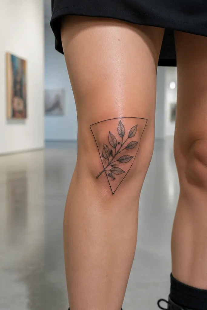
Geometric framing makes the olive branch aesthetic expensive because it adds structure and makes the symbol feel designed, not random. The triangle border gives a premium “logo” look, and the branch inside keeps it from feeling too strict. Placement on the knee works best when the triangle is slightly tilted so it follows the natural angle of your kneecap. I’ve found this tattoo is a winner for people who want clean lines that still feel botanical. Symbol-wise, the branch inside a geometric frame reads as intention and peace with discipline. In photos, the triangle outline gives a strong silhouette even if the leaves soften over time.
Editor's noteAsk your artist to use a crisp line taper on the triangle corners so it doesn’t look blunt after healing.
Step one — stencil the triangle while the knee is slightly bent, then adjust until the corners don’t warp when you flex. Step two — request leaf outlines with light gray shading, but keep the triangle lines slightly thinner than the leaf outline so the branch remains the hero. Size the triangle so it spans about 12-14 centimeters on the leg for a typical knee area. Aftercare is important for the geometric lines because fine corners can irritate; keep the area protected and avoid tight fabric. Touch-up is common at the triangle corners if they take the most friction.
One warningAvoid thick triangle borders — they make the whole piece look heavy and mask leaf detail.
18. Double Olive Branch with Bow Tie Center on the Front Knee
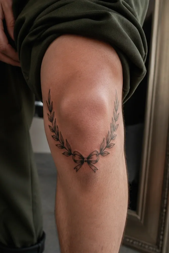
Symmetry can look cheap on knees, but this one looks expensive because the center bow tie is proportioned and the branch linework stays consistent. The bow tie gives a clear focal point that reads instantly in photos, and it also makes the design feel “finished.” I like the double-branch setup because it balances the knee curve and makes the tattoo look like a coordinated set rather than a single spray. It suits people who want a playful peace symbol without losing elegance. The bow tie also adds a soft, gift-like meaning — peace you choose, not peace you stumble into. When done with medium leaf sizes and clean negative space, it stays readable as the tattoo ages.
Editor's noteAsk for one leaf on each side to overlap the bow tie border — it ties the composition together visually.
Step one — place the bow tie at the front center of the knee, then flex-test the stencil so the bow loops don’t stretch apart. Step two — ask for medium leaf sizes with light gray shading under leaf edges, and keep the smallest leaves no smaller than a dime. Request a slightly thicker outline on the bow tie than the leaf outlines so it stays crisp. For aftercare, the center knot area takes the most attention — keep it clean and moisturized after the initial healing phase. Expect one touch-up if the bow tie shadows flatten.
One warningAvoid ultra-thin bow tie lines — they blur under knee bending.
19. Olive Branch with Crescent Moon and Leaf Tips on Outer Knee
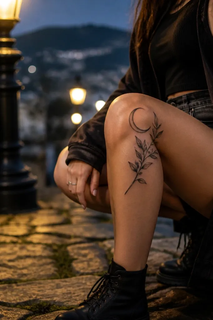
This looks expensive because it combines a classic symbol with a second focal shape that stays clear even when the knee moves. The crescent moon above adds a celestial frame, and the leaf tips reaching toward it create a natural path for the eye. Placement on the outer knee keeps it from getting swallowed by inner crease shadows, and the negative space between moon and leaves keeps it photogenic. I’ve seen this combo read as “peace under protection,” which people love because it feels personal. The olive branch still stays the hero, not the moon. In flash photos, the moon outline gives a crisp highlight that makes the whole piece look intentional.
Editor's noteAsk for the moon outline to be slightly thicker than the leaf outlines so it stays crisp longer.
Step one — stencil the moon slightly above the kneecap bump and then place the branch so the top leaf tips nearly touch the moon curve without overlapping thickly. Step two — request light gray shading for the moon interior and stipple shading under leaf edges only. Keep the smallest leaf tips thick enough to hold their outline — knee skin blurs tiny sharp points first. Aftercare should prioritize protecting the moon outline from friction since it sits near the most rubbed outer area. Plan touch-up at 6-12 months if moon shading fades into the skin.
One warningAvoid filling the moon with dense black — it turns into a dark patch on knees.
20. Olive Branch with Vertical Stem and Three Large Leaves at the Kneecap
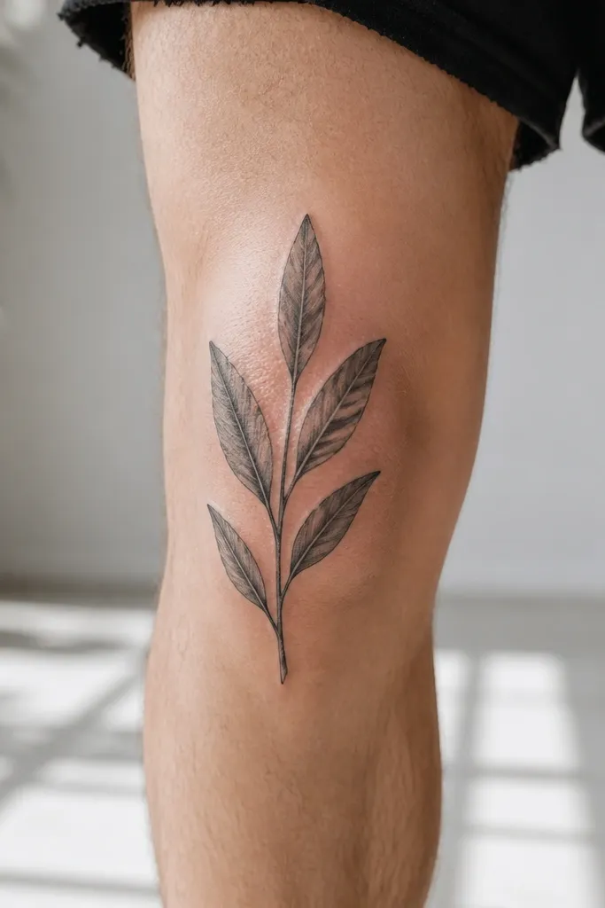
This is the “expensive” version of a classic olive branch because it uses scale and spacing instead of lots of tiny details. Three large leaves read instantly, and the vertical stem makes the tattoo look taller and more intentional on the knee curve. The soft gray shading gives depth, while the empty background keeps it clean and high-end. I recommend this if you want the symbol to look strong even after a year of sun and friction. It also flatters almost every leg shape because the vertical line lengthens the area around the knee. Symbol-wise, it reads as steady peace — not a scatter of sprigs. On photos, the three-leaf stack looks like a designed emblem.
Step one — place the top of the stem near the upper kneecap edge and keep the bottom leaf above the most rubbed shin seam. Step two — request a medium-thickness stem and leaf outlines that are strong enough to survive movement, with soft gray shading under the leaf edges. Size the three leaves so each one is clearly distinct when you bend your knee; if they merge, the design looks messy. For aftercare, treat it like a focal piece — avoid friction and keep it moisturized once peeling starts. Touch-ups are common for the top leaf since it gets the most flex.
Ask for subtle shadow on only one side of each leaf so it stays dimensional without turning muddy.
Avoid tiny leaves stacked too closely — they blur into one mass after healing.



