
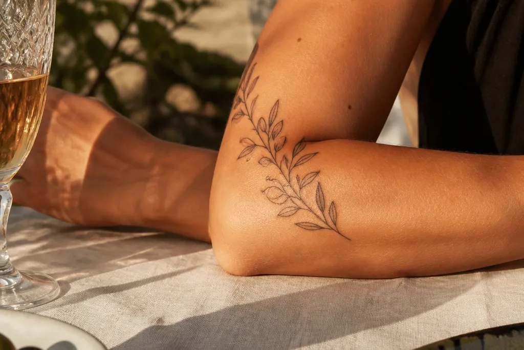
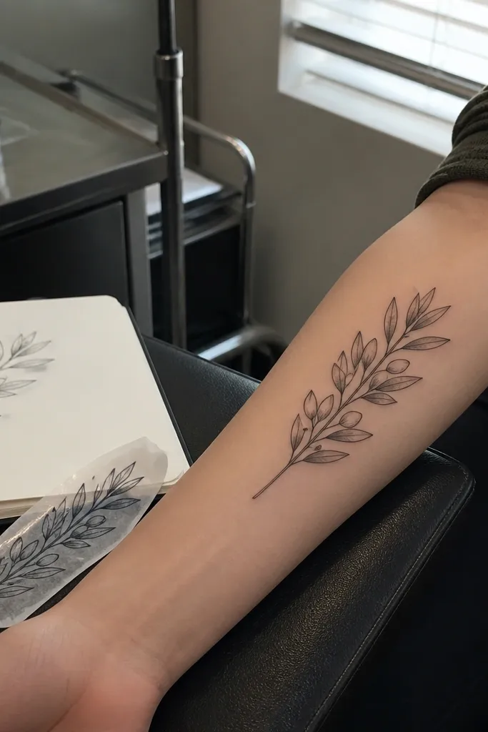
1. Outer Forearm Diagonal Olive Ribbon
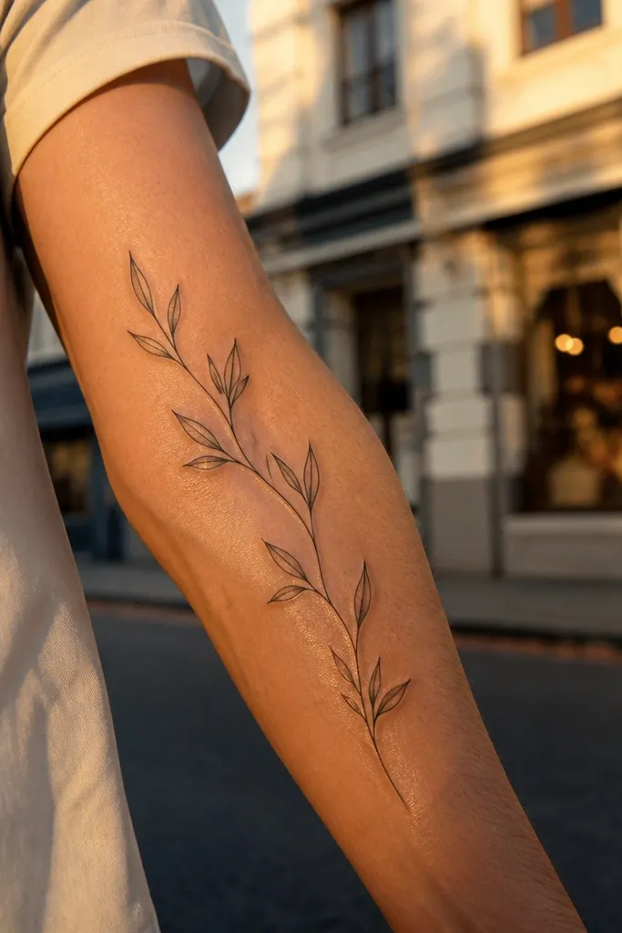
This layout is the one I recommend when you want “bold flow” without turning the whole piece into a thick-black tattoo. The diagonal spine makes your arm look longer in photos, and the leaves catch light because they’re spaced with breathing room. The slightly heavier main line gives the tattoo a clear silhouette even after healing softens the skin. It flatters the outer forearm best because the curve naturally supports that ribbon angle.
Start by marking a diagonal line from about 5 cm below the elbow crease down toward the outer forearm halfway between wrist and elbow. Then place the first leaf cluster at the top anchor point and keep each next cluster smaller by about 10-15% as you move toward the wrist. Finally, ask for fine line veins with micro dots only on selected leaves, not every leaf, so the texture stays crisp. Expect light tenderness for 2-3 days, and use unscented moisturizer with a thin layer for the dry phase.
Bring a photo of your forearm flexed and relaxed so the artist can match the diagonal to your movement.
Don’t pack leaves all the way to both edges of the wrap — the design turns into a shaded band.
2. Inner Arm Single Stem Wrap With Fewer Leaves
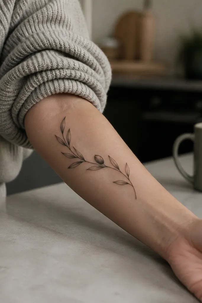
Start with the placement: center the stem along the inner forearm where the skin is flatter and less wrinkly when you flex. Then decide on leaf count before you sketch — nine leaves gives a balanced wrap without crowding. Finally, keep the olive oval outlined in crisp black and add only a tiny highlight dot inside it. Aftercare is the same as any fine line — avoid soaking for 48 hours, then moisturize lightly until the skin stops flaking.
If your goal is clean, readable fine line that still looks strong, fewer elements win. The inner arm has less visual clutter around it, so a single stem reads elegant and intentional. The olive oval near mid-forearm acts like a focal bead for your eye, so even with fewer leaves, the tattoo feels complete. This design also ages well because there’s less line density to blur.
One warningSkip heavy dot shading across the whole stem — it turns gray fast on inner forearm skin.
Editor's noteAsk for the stem line to be slightly thicker than the leaf outline so it stays visible in harsh lighting.
3. Bicep to Forearm Olive Branch Cascade
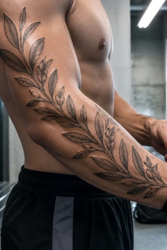
Start by placing the top of the stem on the outer bicep, about 3-4 cm below the armpit line so it doesn’t get distorted by shoulder motion. Then work downward with a leaf size gradient — big at the top, medium mid, small near the forearm. Finally, add olive ovals only on every other leaf pair to keep the focal rhythm. Expect the bicep area to be a bit more sensitive; plan a loose long-sleeve for the first night so you don’t rub it.
This one reads as bold flow because it has height. The cascade gives you a sense of movement from bicep to forearm, and the largest leaves anchor the composition so it doesn’t look like a small ankle tattoo stretched upward. I’ve had this design photographed in both daylight and indoor light, and the olive ovals keep the piece from going too delicate. It’s also great if you want the tattoo to show even when your sleeves are down.
One warningDon’t extend the wrap all the way to the wrist — it can distort when the wrist bends.
Editor's noteIf you lift weights, tell your artist — the bicep flex changes the spacing, so they should test the sketch on your arm position.
4. Olive Branch With Micro-Wreath Ends
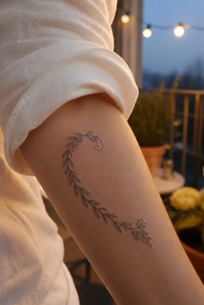
Start by choosing a wrap length that ends around the mid-forearm, not right above the wrist. Then sketch the stem with a soft curve and plan two end curls that mirror each other, so the tattoo doesn’t look lopsided after it heals. Finally, keep wreath leaves small and spaced, using fine line outlines with minimal dot veins. During aftercare, wash gently, pat dry, and keep the area protected from friction because the curled ends get tugged by fabric.
This design gives you that “finished” feeling like a frame, not a random branch. The curled ends create a visual closure, so the tattoo looks intentional even if it’s partially covered by sleeves. The micro-wreath clusters add texture without turning into a busy sleeve. It’s perfect for people who want fine line but still want the tattoo to read bold in close-up photos.
One warningAvoid thickening the ends too much — it makes the rest look thinner by comparison.
Editor's noteAsk for symmetrical end curls — even a 5 mm difference shows in healed photos.
5. Olive Leaves Alternating Chevron Flow
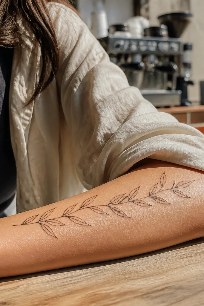
This is the “bold flow” version because the leaf rhythm creates a moving pattern. Even though the lines are fine, the repeated chevron silhouette makes it look graphic and strong. It also photographs well because your eye follows the zig-zag path across the arm. I like it for people who want the tattoo to look like design, not just symbolism.
Start by mapping a diagonal stem line and then decide the step size — about 1.2-1.5 cm between leaf pairs on a standard forearm. Then alternate leaves left-right so the tips line up in a chevron wave. Finally, add vein lines that stop short of the leaf edges, leaving a clean outline so it stays sharp after healing. For care, keep it out of direct sun for at least 6 weeks; fine line tends to fade faster in bright sun.
Bring your favorite bracelet or watch placement photo — it helps decide where the mid-olive oval should sit.
Don’t make every leaf identical size — the repeating pattern blurs into a band.
6. Two-Branch Olive Wrap With Central Olive
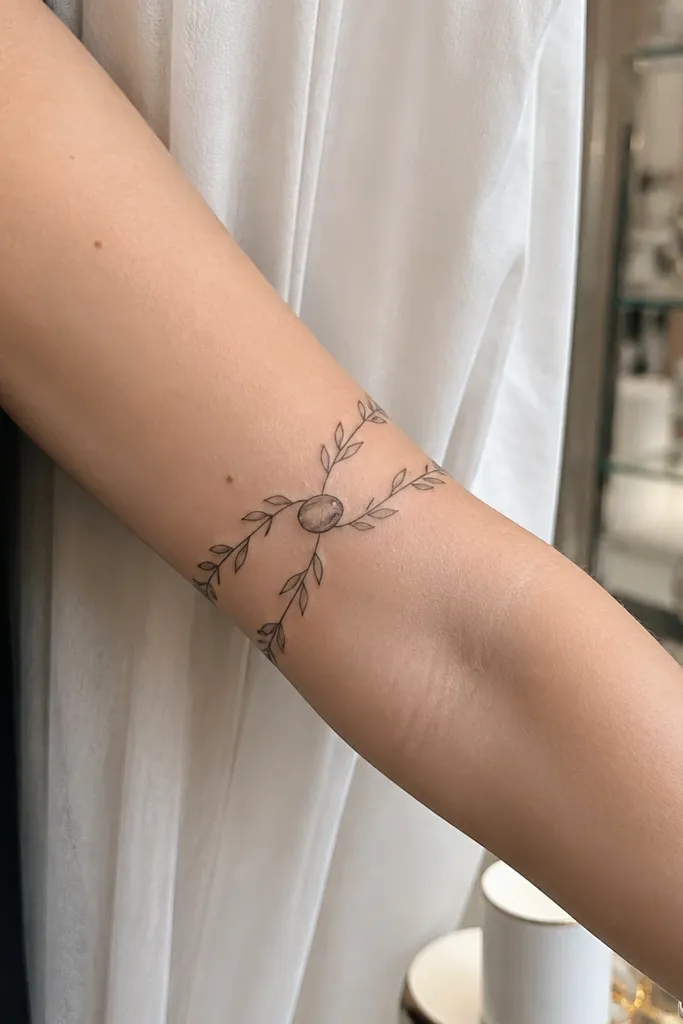
Two branches make the piece look thicker in a good way, without using heavy black. The central olive oval acts like a focal knot, and the parallel stems create a balanced frame across your arm. This layout is a strong choice if you want the tattoo to look “intentional” even when you’re not fully showing it. It also reads clean because the negative space stays open between the two stems.
Start by placing the central olive oval where you want attention — usually mid-forearm or slightly above. Then draw one branch on either side with the same curvature so they mirror as they wrap. Finally, keep the densest leaves around the central cluster and thin out toward the ends by reducing leaf count, not just spacing. Expect the densest area to be more tender — plan your session length accordingly.
If you want it to feel more masculine or bolder, ask for the central olive outline slightly thicker than the rest.
Avoid adding a leaf on every node along both stems — it turns into a gray mesh.
7. Olive Branch Fine Line With Sage-Green Highlights
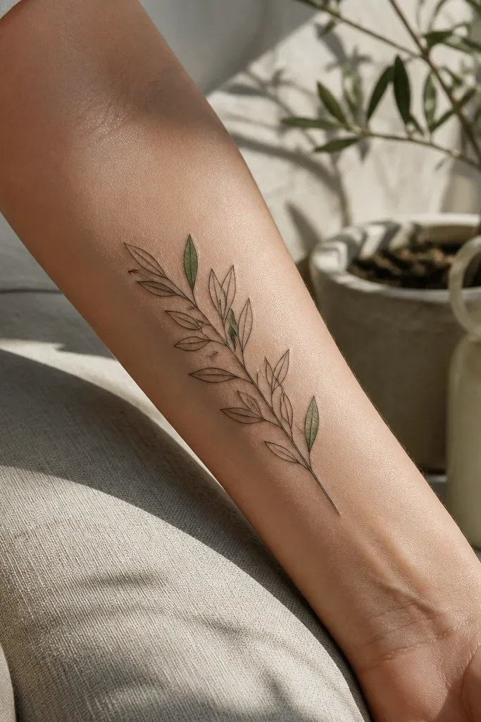
Color can make fine line look bolder, but only when it’s used like seasoning. The sage-green highlights give the leaves a softer depth that reads well in daylight, and it keeps the tattoo from feeling purely monochrome. I’ve seen this exact approach age better than full-color fills because the black outline does the heavy lifting. It’s best if you like subtle color and want your tattoo to still look sharp years later.
Start by choosing a limited palette: black outline plus a light sage wash only inside 30-40% of leaves. Then decide where to tint — I like the upper half of each leaf so the design catches light as the arm moves. Finally, keep olive ovals unfilled or lightly shaded with a single dot so they don’t turn muddy. Aftercare matters more with color — use fragrance-free moisturizer and avoid sun exposure early so the green stays pale and clean.
Ask for a test spot on a small leaf during the stencil session so you can judge the green intensity before they commit.
Don’t tint the entire leaf — it will blur into a darker smear as it heals.
8. Olive Branch With Tiny Olive Bead Chain
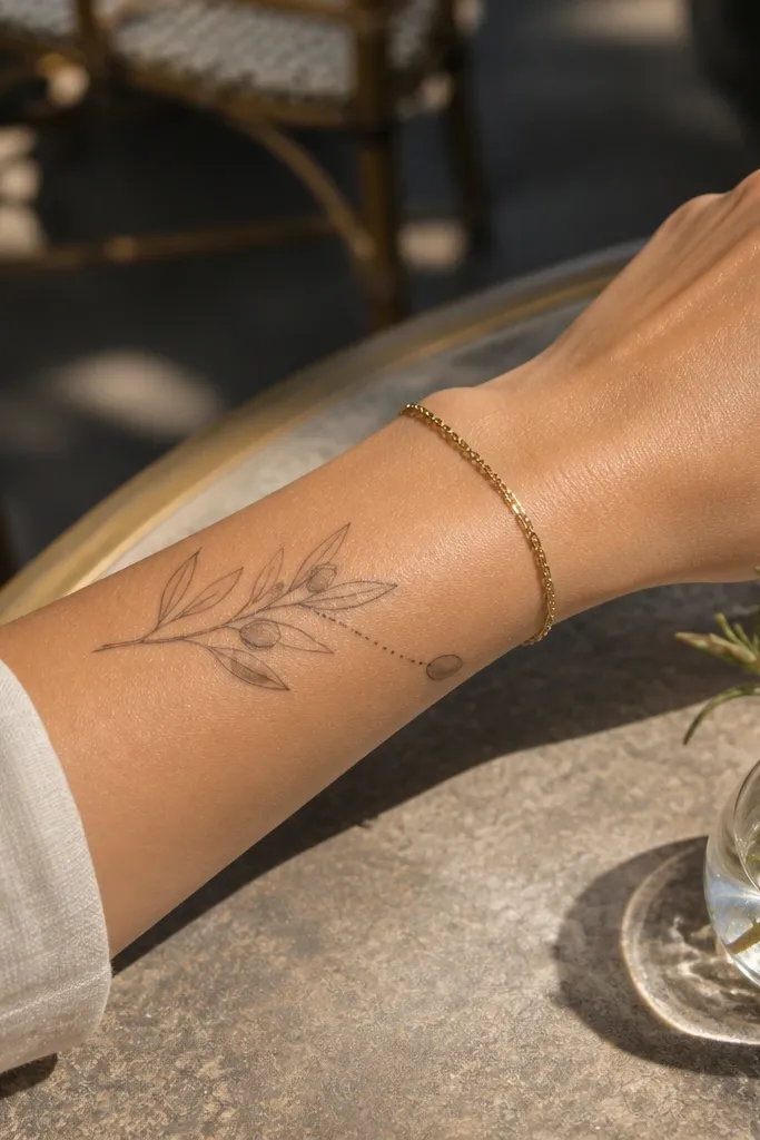
Start by drawing the stem first, then place olive ovals at even intervals — about 1.0-1.3 cm apart depending on your arm width. Then add leaves only between olives, keeping leaf size consistent so the chain stays the star. Finally, outline each olive oval and add a single tiny dot inside to suggest the seed without heavy shading. During healing, keep the area from rubbing your sleeves; the small ovals can scab slightly and look uneven if they get friction.
This one looks bold because the bead chain creates a strong visual rhythm. The olive ovals act like punctuation marks, so the tattoo reads instantly even if it’s partially covered. It also makes the design feel wearable with jewelry because it sits like a delicate bracelet pattern. If you want a fine line olive branch that doesn’t disappear, this layout gives your eye a repeating landmark.
One warningAvoid uneven spacing — uneven bead intervals make the whole wrap look messy after it heals.
Editor's noteIf you sweat a lot, use a very light moisturizer layer and change into clean dry clothing fast after day one.
9. Olive Leaves in Negative-Space Frames
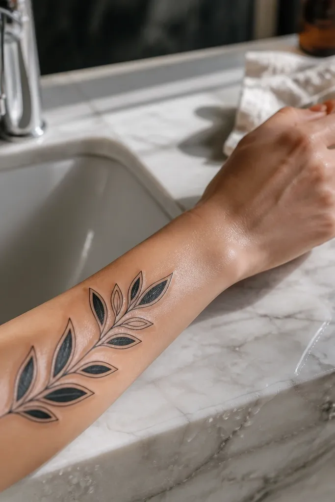
Start by choosing a band width — keep it around 3-4 cm so the frames don’t feel too wide. Then sketch leaf clusters in sets of two, each set inside a light curved frame line that follows the forearm curve. Finally, keep the frames thinner than the branch spine so the tattoo keeps depth. Aftercare is straightforward, but be patient with frames — they can take longer to settle because the linework is continuous around the leaves.
Negative-space framing makes fine line look intentional and bold because it creates shapes your brain reads quickly. Instead of relying on dense leaf detail, this design uses clean borders around leaf clusters. It photographs well because the arm’s skin tone becomes part of the design, not empty space. This is a great option if you want the olive symbol but you also love graphic tattoos.
One warningSkip thick frames — heavy borders make fine line look like it’s been overworked.
Editor's noteAsk for the frame lines to stop a few millimeters before the leaf tips so the silhouette doesn’t look crowded.
10. Olive Branch Wrap With Minimal Olive Ovals
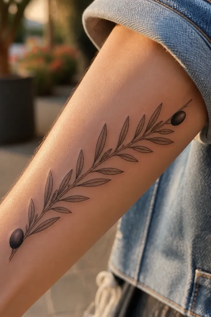
Start by planning the leaf density first — aim for a steady rhythm across the wrap, not clusters. Then place the first olive oval about 5-6 cm below the elbow and the second around 5-6 cm above the wrist. Finally, keep vein lines simple: one central vein with a short side line, no heavy dot shading. For aftercare, avoid picking at any tiny scabs on leaf tips since those are thin lines.
This design is all about contrast. Lots of leaves create texture, while the two olive ovals act like bookends. It looks bold because your eye travels from oval to oval across the wrap, and the path is easy to read in a photo. It also ages well since the focal ovals keep definition even if some leaf veins soften.
One warningDon’t add olives between every cluster — it ruins the spacing contrast.
Editor's noteTell your artist you want “two focal olives,” not a full olive scatter, so the composition stays clean.
11. Olive Branch With Feathered Leaf Tips
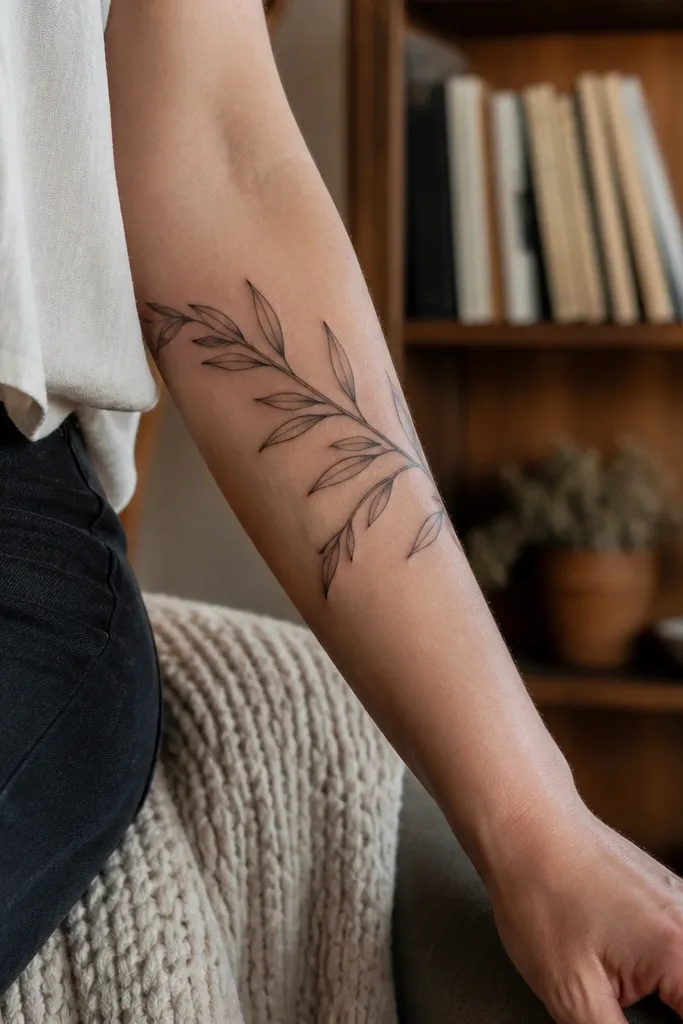
Feathered leaf tips give movement without adding extra elements. It makes the olive leaves look like they’re swaying, which is the exact kind of flow you want from an arm wrap. Because the design uses thinner side veins, it reads as fine line but still has a clear spine. I’ve found this style looks especially good on arms with visible tendons because the tattoo mirrors that organic motion.
Start by choosing the outer forearm where leaf tips have space to taper without hitting bone creases. Then ask for vein lines that fade in thickness as they reach the leaf edge — that’s what creates the feathered look. Finally, keep the leaf count moderate so the tapering tips don’t overlap when your arm flexes. Healing is normal for fine line, but moisturize consistently so the delicate leaf edges don’t look dull.
If you prefer a cleaner look, keep feathering only on every other leaf to avoid a busy texture.
Skip heavy shading on leaf edges — feathering should come from line variation, not gray fills.
12. Olive Branch Arm Wrap With Micro Dots Under Leaves
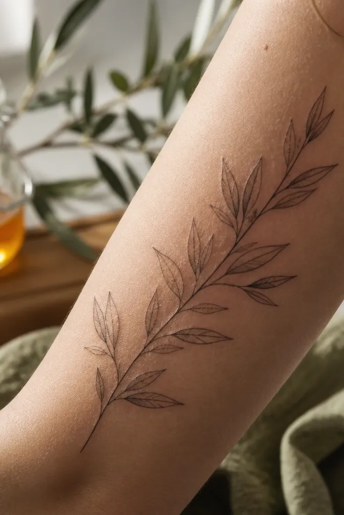
Start by asking the artist to choose dot placement rules: one dot cluster per leaf group, not per leaf. Then keep dot density low enough that you still see the leaf outline clearly — think a small scatter, not a filled shape. Finally, put dots mostly on the “lower” side of leaves so the tattoo reads like it’s catching light. Aftercare should be careful with dots because they can look raised during healing; don’t scrub them.
Micro dots under leaves add depth while staying fine line. They give the illusion of a light source, so the tattoo looks dimensional in close-up photos. The key is restraint — only a few leaf clusters get dots, which keeps the tattoo from turning into a stipple blur. If you want bold flow but still want that airy fine line look, this hits the sweet spot.
One warningDon’t blanket stipple across the whole wrap — it heals into gray fog.
Editor's noteBring a screenshot of your favorite olive leaf photo lighting — the direction helps decide dot placement.
13. Olive Branch With Thin Ribbon Banner Across the Wrap
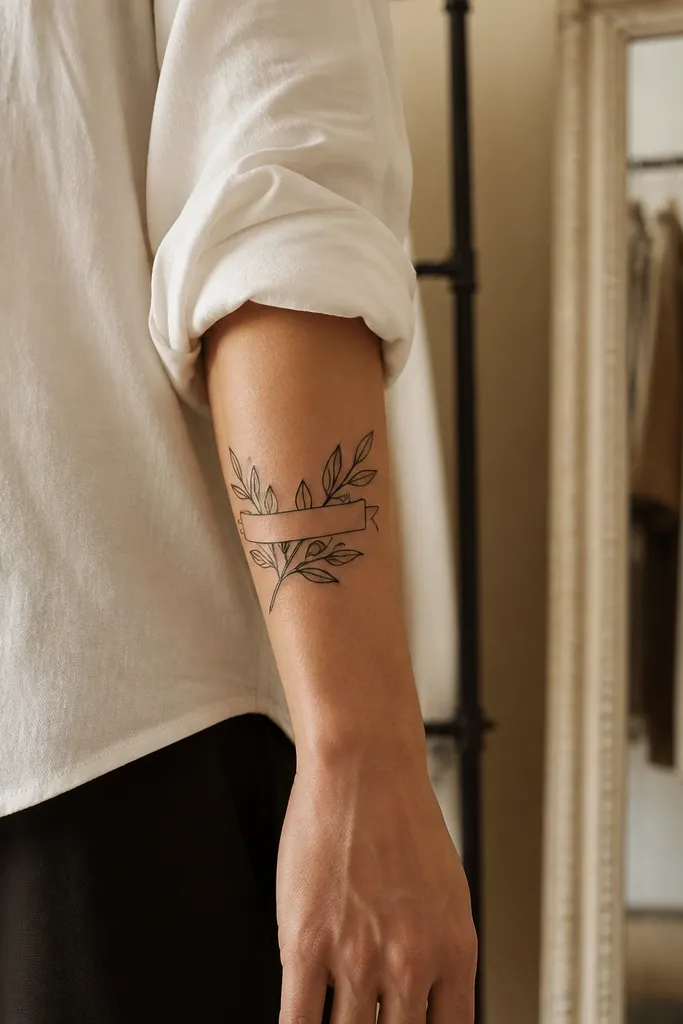
Start by placing the banner crossing around mid-forearm, about where a watch sits naturally. Then design the olive branch so leaf clusters grow slightly around the banner and thin out below it. Finally, keep the banner line thinner than the stem and avoid adding extra shading on the banner. Healing is the same, but be extra careful about friction on that crossing point since it sits where sleeves move.
A ribbon banner gives you graphic structure. Even without text, the band crossing creates a strong focal moment and helps the tattoo look bold in photos where your skin tone changes across the arm. I like this for people who want the olive symbol but don’t want to commit to lettering. It also helps “control” the wrap so the leaves don’t look random.
One warningAvoid putting the banner too close to the wrist — it warps with hand movement.
Editor's noteIf you wear watches, align the banner with the watch face edge so it looks coordinated.
14. Olive Branch Wrap With Curved Stem Breath Lines
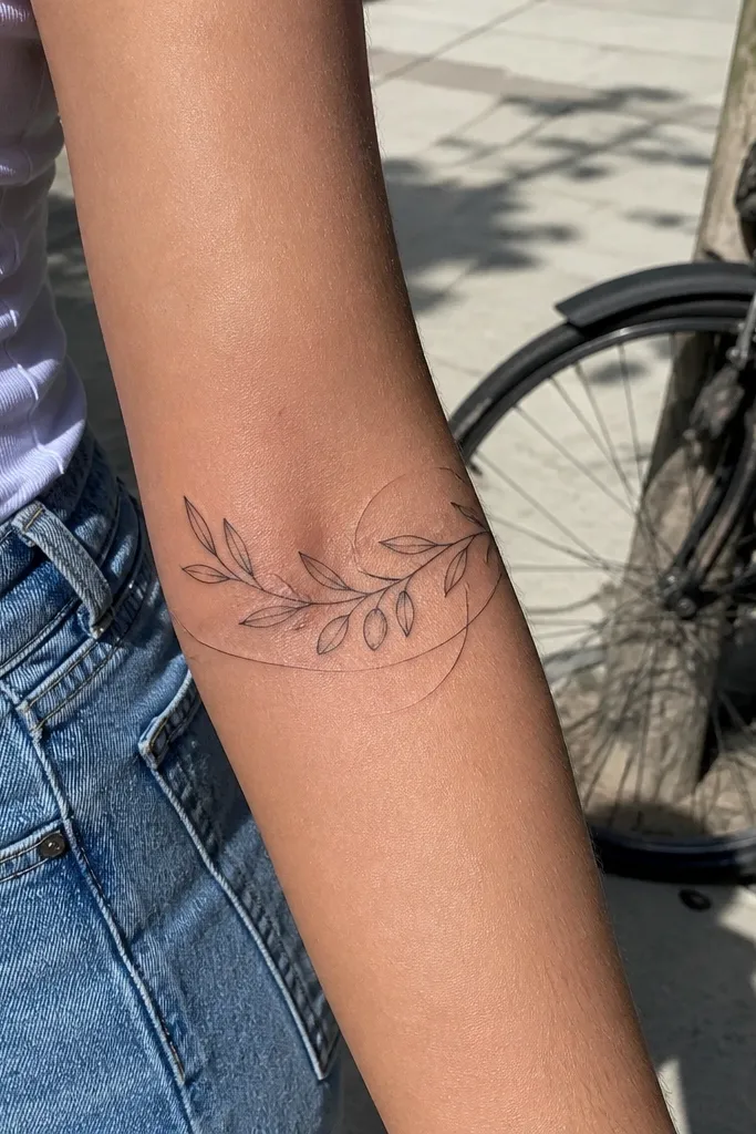
The breath lines make the whole piece feel alive. Instead of relying on thicker line weight, the design uses motion cues that read as bold flow. It works best on arms where you like clean graphic detail — it won’t look like a busy sleeve, because the breath lines are sparse. Photos show it well because the thin lines create a layered effect against your skin.
Start by planning only 2-3 breath lines total, each one parallel to the stem but separated by a few millimeters. Then place leaves so they don’t cover the breath lines — keep a gap of at least one leaf width. Finally, use crisp black for the stem and lighter black for breath lines so the stem stays the main anchor. Aftercare: keep it moisturized and avoid tight fabric for a week so those thin motion lines don’t scab unevenly.
Ask for breath lines to end before the leaf clusters so they don’t look like accidental extra marks.
Skip adding breath lines on every section — too many makes it look like scribble.
15. Olive Branch Wrap With Single Olive Cluster at the Elbow
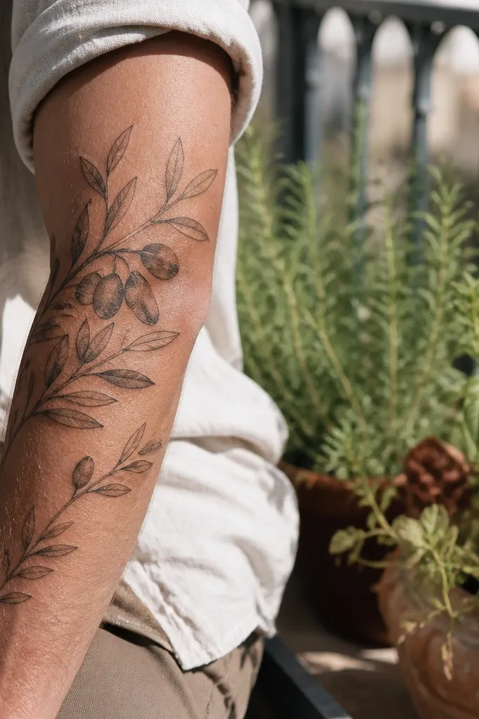
Start by choosing elbow-side placement that sits just off the inner crease so it doesn’t fold into itself. Then build a top cluster: three olive ovals with 5-7 leaves around them, and then reduce leaf count down the stem by about half. Finally, keep the stem line consistent and avoid adding extra dots — let the composition gradient do the work. Aftercare can be a little more intense at the elbow because it moves — use a thin moisturizer layer and keep it clean to prevent irritation.
This is the “statement at the top” option. By putting the densest cluster near the elbow, you get a bold focal area that shows when you wear short sleeves. The taper toward the wrist keeps the fine line look airy, so it doesn’t turn into a heavy band. I’ve also found this design is forgiving — if your skin changes slightly with weight or muscle, the top anchor still reads clearly.
One warningDon’t place the densest cluster too close to the crease line — it distorts as you bend.
Editor's noteAsk for the top cluster size to match your elbow width so it doesn’t look too small when flexed.
16. Olive Branch Wrap With Double Leaf Outline Variation
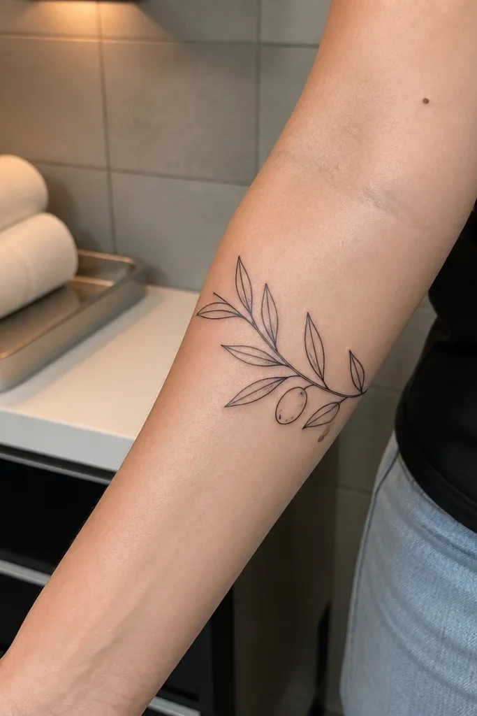
Double outlining creates a bold look without thick ink coverage. The inner contour line adds a graphic highlight that stays readable even when the skin softens fine line over time. It also gives the leaves a crisp, almost engraved feel in photos. This is a great option if you want a tattoo that looks “designed” rather than purely delicate.
Start by limiting double-outline leaves to about 40-50% of the leaf set so it doesn’t become visually heavy. Then ask for the inner contour to be slightly offset toward the center vein, not centered exactly, so it looks dimensional. Finally, keep olive ovals simple to avoid overcrowding — outline plus one dot inside is enough. Healing is normal, but protect the double lines from friction because they can look dry if you over-wash.
If your skin runs dry, moisturize more consistently starting day two so the inner contour stays crisp.
Avoid double outlining every leaf — it turns into a gray double stroke after healing.
17. Olive Branch With Tiny Stem Twists Like a Rope
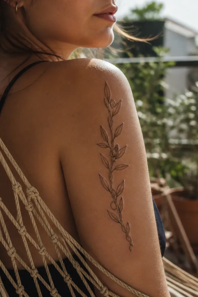
Start by choosing the outer forearm and marking the stem path with a gentle S-curve. Then add twist marks: tiny alternating line segments around the stem at intervals of about 8-12 mm. Finally, place leaves slightly off the twist peaks so they don’t hide the texture. Aftercare: keep the tattoo from drying out; rope-like linework can look dull if it flakes heavily.
Twist marks make the stem look dimensional and bold. You still get fine line delicacy in the leaves, but the rope-like stem carries the “flow” through the whole wrap. This layout looks great on the outer forearm where the twisting texture catches light. It also gives the tattoo a bit of personality — it doesn’t feel like a standard olive branch stencil.
One warningDon’t make twist marks too thick — it defeats the fine line style.
Editor's noteAsk your artist to show you a zoom-in sketch of the stem twists so you can approve the tightness before they tattoo.
18. Olive Branch Arm Wrap With Minimal Shaded Leaf Underbellies
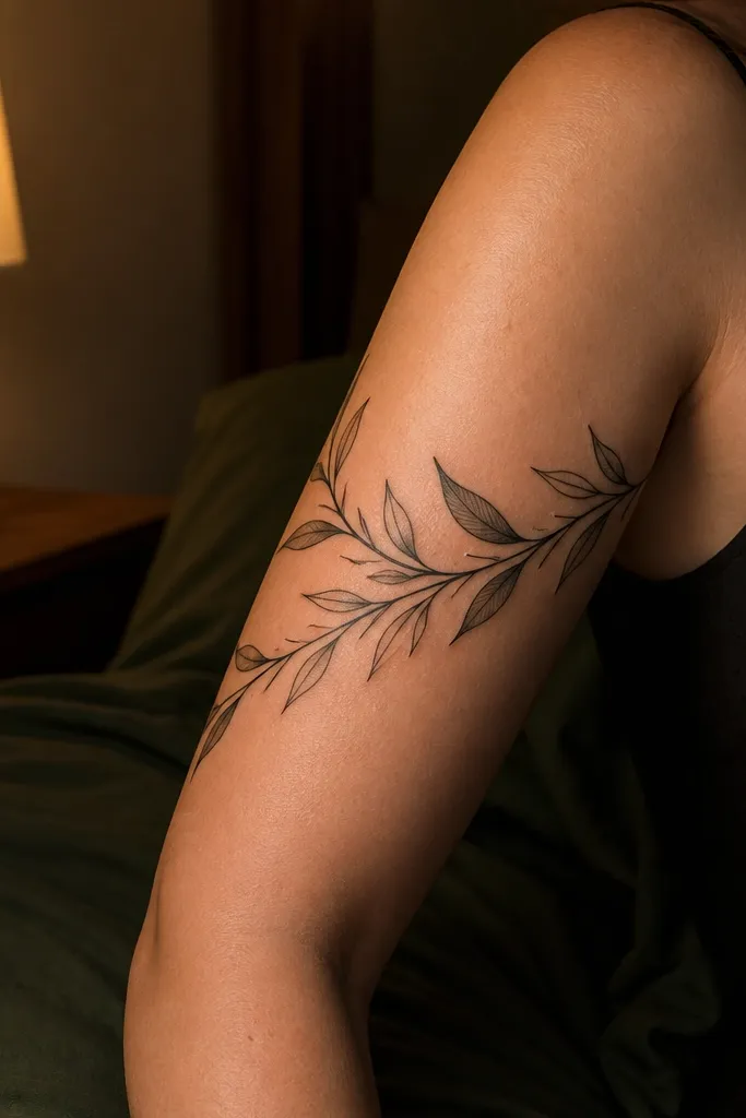
Light gray underbellies add depth without turning into a full-color tattoo. The shading makes leaves look layered, which is what you want for bold flow — the arm wrap looks like it has dimension. I use this when someone wants a fine line piece that still holds up in low-light photos. It also flatters arms with strong muscle lines because the shading sits under the leaf forms like a shadow.
Start by keeping shading limited to the underside of each leaf — about 1/4 of the leaf area max. Then ask for a soft edge, not a hard filled patch, so the fine line outline stays the main structure. Finally, keep the shading tone light enough that it won’t look gray-black after healing; your artist can test with a tiny spot on the stencil area. Aftercare is important: avoid heavy ointments that over-soften the scabs, since shading can blur if it gets too wet.
If you’re unsure about gray, start with dot shading only under 2-3 leaves so you can see how it heals on your skin.
Skip large shaded leaf fills — they settle into dark patches over time.
19. Olive Branch Wrap With Leaf Pairs Mirroring a Compass Shape
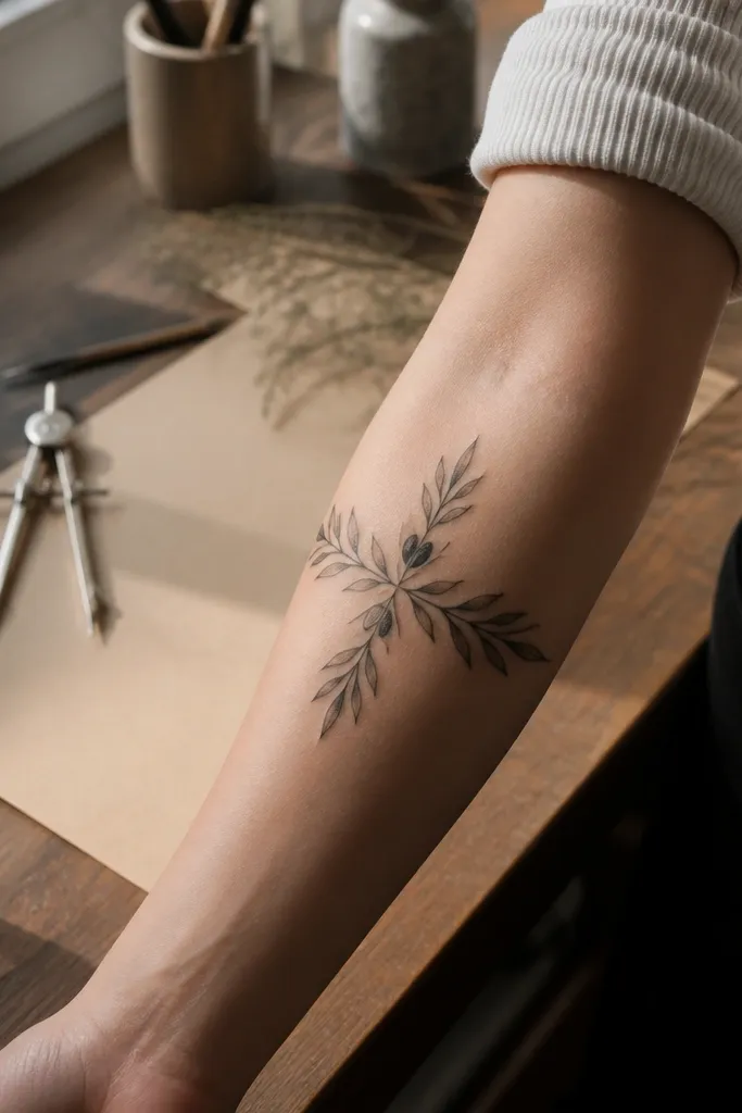
Start by placing the design on the upper forearm where symmetry is easiest — closer to the bicep side usually works best. Then plan two olive ovals opposite each other on the wrap, with leaf pairs pointing toward the center line. Finally, keep leaves with consistent spacing so the compass effect stays clear. Aftercare: avoid stretching the area too hard in the first week; symmetry tattoos can look uneven if you irritate one side.
Compass-like symmetry makes the tattoo feel strong and intentional. The mirroring leaf pairs create a graphic balance that reads well even if your arm is at a different angle in photos. The two olive ovals opposite each other act like a visual anchor line. This is a good pick if you want peace symbolism but you also like structure and clean geometry in fine line work.
One warningDon’t use random leaf angles — the compass effect dies when leaves don’t mirror.
Editor's noteAsk for a stencil preview in the exact arm angle you’ll use for photos — symmetry shifts fast when the arm rotates.
20. Olive Branch Wrap With Hidden Olive Ovals in the Leaves
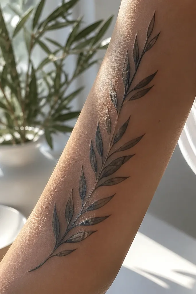
Start by planning leaf overlap intentionally — leave small negative-space gaps where hidden olives can sit. Then place olive ovals inside those gaps so they don’t extend beyond leaf outlines. Finally, keep the hidden olives outlined only, with a tiny dot seed so they look like olives and not abstract shapes. Aftercare: be careful with the overlap zones, since they can scab thicker and need gentle washing.
This design is playful and still bold. The hidden olive ovals make people look twice, but the overall wrap still reads clean because the branch spine is clear. In photos, the tucked olives show when the light hits the overlap areas, which makes the tattoo feel alive. It’s a great choice if you want the olive symbol but also want a little secret detail.
One warningAvoid hiding olives too deep — if they’re fully covered, they heal into smudges.
Editor's noteAsk for the hidden olives to be visible from both straight-on and a slight angle photo — that’s how they’ll look in real life.



