


1. Micro heart with 3 rays and no flames

This is the cleanest way to keep a Sacred Heart tattoo looking sharp when it’s tiny. The heart is the main shape, with three short rays rising above it — no flame curls, no banner, no crowded border. The symbolism still reads as Sacred Heart because the rays point up and the heart stays centered. It’s perfect for placement where you want it to look like a deliberate mark, not a detailed scene.
Start by keeping the heart outline medium-thin and leaving the interior mostly negative space. Then add exactly three rays — straight lines or slightly angled bars — spaced evenly so they don’t overlap the heart edge. Finally, skip shading or do one light gray wash only in the lower half of the heart so it doesn’t turn muddy. Size target is about 1 to 1.5 inches tall for best clarity.
Editor's noteAsk your artist to draw a quick cardboard stencil the same size first so the rays don’t crowd the heart.
One warningAvoid tiny text or flame curls — at this size they blur fast.
2. Tiny Sacred Heart with a simple cross on the heart
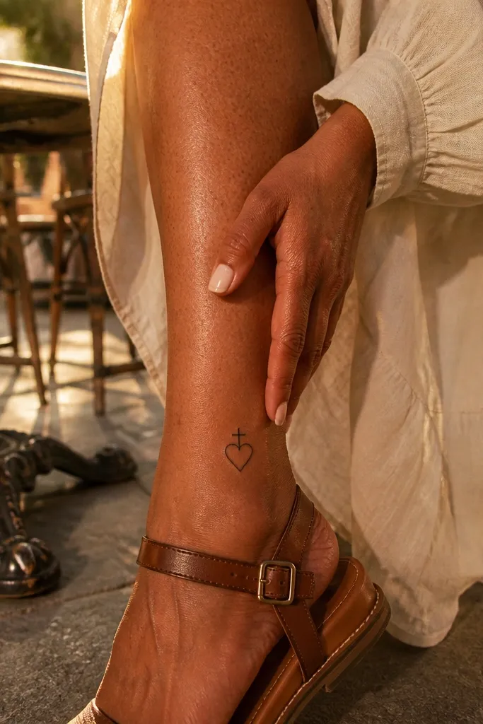
This design keeps the Sacred Heart recognizable by showing the cross without turning the tattoo into a full religious panel. The cross is drawn as two clean lines with rounded ends, sitting directly above the heart, aligned to its center. The heart outline stays crisp and the rays are minimal or omitted entirely. It’s a great pick if you want a tattoo that looks good from day one and doesn’t demand heavy detail to communicate meaning.
Start by outlining the heart with slightly thicker outer lines than the interior. Then place the cross so its width matches the heart width, not wider, so it stays balanced at small scale. Finally, add 4 short rays only if you have room; if space is tight, leave the background bare. Use light shading on the heart only — a thin gray gradient toward the bottom — and keep it to one consistent tone.
Editor's noteChoose placement near muscle lines where the skin stays flatter, like upper outer arm or upper chest.
One warningDon’t make the cross too tall; it breaks the silhouette when the tattoo shrinks.
3. Small Sacred Heart with flame tips and 6 rays

This one looks “classic” without getting busy. The flames are drawn as short, rounded tips rather than long curls, so the tattoo stays readable. Six rays radiate from behind or above the heart, giving that glow effect while still keeping the linework controlled. It’s photogenic because the rays create contrast and the flame tips give the Sacred Heart its signature energy.
Start by sketching the heart and then decide the flame style: short teardrop tips or small scallops, not swirling flames. Next, add six rays evenly spaced so each ray has a clear gap from the next. Finally, shade only the heart interior with a soft gray — keep the rays unshaded so they don’t darken together. For longevity, keep the total design width under about 1.75 inches.
Editor's noteIf your skin is prone to thick scarring, stick to outlines and minimal gray — no heavy fill.
One warningAvoid both dense flames and dense rays. Pick one main effect and keep the other lightweight.
4. Single-line Sacred Heart icon
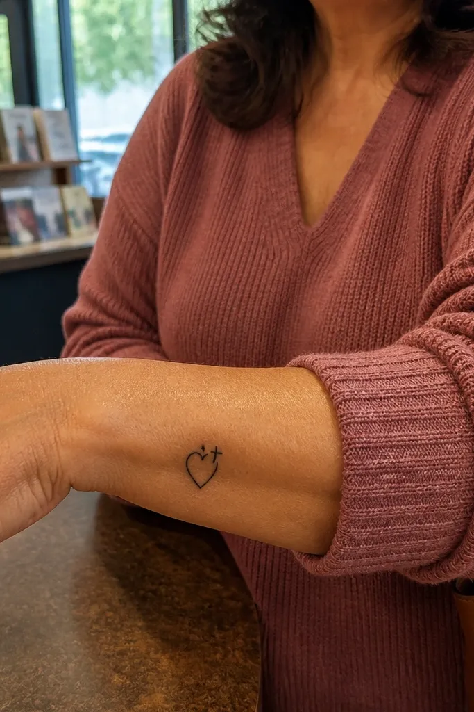
This is the “tattoo that looks clean forever” option. A single-line Sacred Heart turns the symbol into a sleek icon, and that simplicity is what keeps it looking good as it ages. The cross can be a tiny break in the line, or a small attached cross formed by the same line weight. It’s especially flattering on wrists or ankles if you keep it small and crisp.
Start with a continuous outline that defines the heart and the top flame/ray area without any interior micro-details. Then add the cross with one or two line segments that match the same stroke thickness. Finally, keep the rays as short marks — think 3 to 5 dashes — so they don’t create a gray blur. Use black ink only, no shading, for the cleanest aging.
Editor's noteTell your artist you want a consistent line weight, not tapering — tapering can vanish at small sizes.
One warningDon’t add stipple shading in a single-line design; it fights the whole look.
5. Sacred Heart with dotted halo rays

Dotted rays give you a glow effect without the bulk of solid shading. The heart stays the star, while a dotted halo ring behind it creates a soft halo look that photographs well. This style also hides small imperfections because dots are more forgiving than solid gray blocks. If you want something minimal but still “pretty,” this is a strong choice.
Start by outlining the heart with clean lines and leaving the center mostly open. Then place a dotted circle behind the heart, keeping the dots evenly spaced and not too close together. Finally, add a tiny cross above the heart point and keep the rays as dots only — avoid extra flame details. Ask for black and gray dots only, with no heavy fill.
Editor's noteFor the best healing, keep the dot density moderate so the ink can settle without turning into one dark speckle mass.
One warningAvoid thick stippling that covers the entire heart interior.
6. Small Sacred Heart with red-tinted flame tips
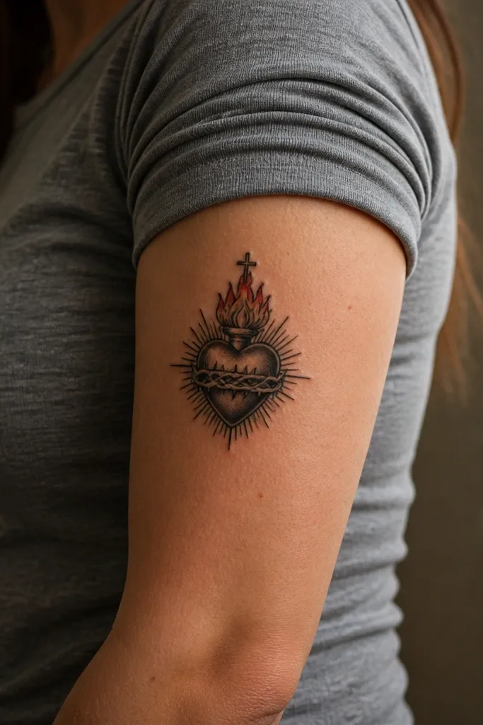
A small splash of red makes the Sacred Heart instantly recognizable and adds warmth to the design. The trick is to keep the red only in the flame tips or a tiny accent on the heart interior, not as a full-color fill. Black linework does the heavy lifting for clarity; red gives you that “lit from within” look without destroying readability. This is especially photogenic on forearms and upper arms under daylight.
Start with crisp black outlines for the heart, cross, and rays. Then add red only at the flame tips — small teardrops or scallops — so the red sits inside clear boundaries. Finally, keep the heart interior mostly black and gray with minimal shading. Tell your artist to use a thin, controlled amount of red so it stays bright and doesn’t spread over time.
Ask for red to be applied in small areas with clean borders, not blended across linework.
Don’t color the whole heart if you want a small simple look that stays sharp.
7. Tiny Sacred Heart with a ribbon banner outline

If you like the classic Sacred Heart vibe but hate legibility issues, go for a ribbon banner without text. The ribbon outline adds motion and framing, so the tattoo looks complete even at small size. Keep the ribbon lines clean and slightly arched under the heart. This style photographs nicely because the ribbon gives a second focal point without adding tiny letters that blur.
Start by drawing the heart as the center and add a simple cross above it. Then sketch a ribbon beneath with two ends curling slightly outward, keeping the lines thick enough to survive healing. Finally, add rays behind the heart only if the ribbon isn’t too wide. Avoid actual words; if you want words, keep them extremely large, which defeats the “small simple” goal.
Editor's noteUse a ribbon shape that’s wider than the heart by about 10-20% for a balanced look.
One warningDon’t include micro text. It will turn into a gray smear.
8. Sacred Heart with thin rays in a semicircle
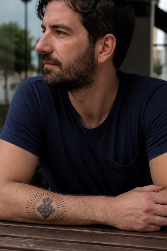
Semicircle rays look modern and tidy. Instead of many rays radiating in all directions, you get a controlled fan behind the heart that keeps the tattoo compact. The heart remains the center, and the semicircle provides a glow effect that’s easy to read in photos. This design also ages well because the lines are spaced and not packed into a solid mass.
Start with a heart outline that’s slightly thicker at the top curve. Then draw rays as thin lines confined to a semicircle arc behind the heart, leaving clear gaps between each ray. Finally, add a small cross at the top of the heart and keep shading limited to a light gray underlayer. Aim for a height of about 1.25 to 1.6 inches so the rays don’t become too cramped.
Have your artist mark the semicircle arc first so the rays stay symmetrical.
Avoid full 360-degree ray fields at small size; they blur together.
9. Small Sacred Heart with minimal flame border
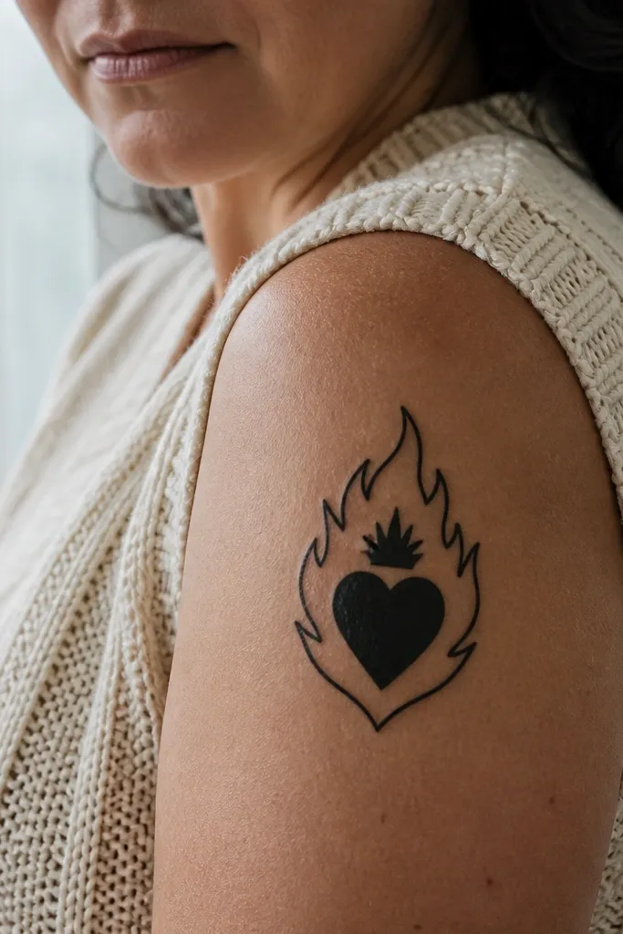
This makes the Sacred Heart look like a badge. A minimal flame border frames the heart without adding a lot of internal detail, so it stays simple and graphic. The border also helps the tattoo read as a complete unit, even when it’s small. It looks great on the outer upper arm, where you can catch light and see the clean outline.
Start by outlining the heart with medium-thin lines and add a small cross above. Then build a flame border around the heart using short, evenly sized flame shapes — like tiny scallops with pointed tops. Finally, add a couple of rays only if there’s space; otherwise keep it border-only. Shade just the heart interior lightly, and keep the border linework consistent thickness.
Ask for the flame border to be uniform size all around; mismatched flames look messy fast.
Don’t add extra flames inside the border. One frame is enough.
10. Tiny Sacred Heart with soft gray heart glow

This is a “simple, but not flat” option. The heart outline stays black and crisp, while soft gray shading creates a gentle glow effect inside the heart. You still get the Sacred Heart look without heavy cross hatching or dense stippling. It’s flattering on skin with more texture because the glow smooths out the look in photos.
Start with a clean heart outline and a simple cross above it. Then add a soft gray wash that fades from the bottom of the heart upward, keeping the top edge mostly crisp. Finally, keep rays to a minimum — 3 to 4 short lines, or skip rays entirely. Make sure the shading is light enough that it doesn’t merge with the outline as it heals.
Tell your artist you want a fade, not a fill — the gray should look like a gradient.
Avoid heavy solid gray inside the heart at small sizes.
11. Sacred Heart framed by two thin vertical rays
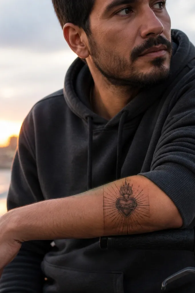
This design is calm and architectural. Two vertical rays behind the heart create a symmetrical, minimalist glow that looks intentional rather than decorative. The cross sits cleanly at the top, and the heart stays compact. If you want something you can place almost anywhere without it getting busy, this works.
Start by sketching the heart and cross first, centered to where you want the tattoo to sit. Then add two thin vertical rays that extend slightly above the cross but stay narrow and evenly spaced. Finally, keep everything black only, and skip additional flames or rays. Keep the total width tight so the two rays don’t overpower the heart.
Editor's noteIf you’re placing it on a curved area, ask for slight angle compensation so the rays look straight when you stand upright.
One warningAvoid adding lots of extra rays; two is the point.
12. Small Sacred Heart with micro halo ring
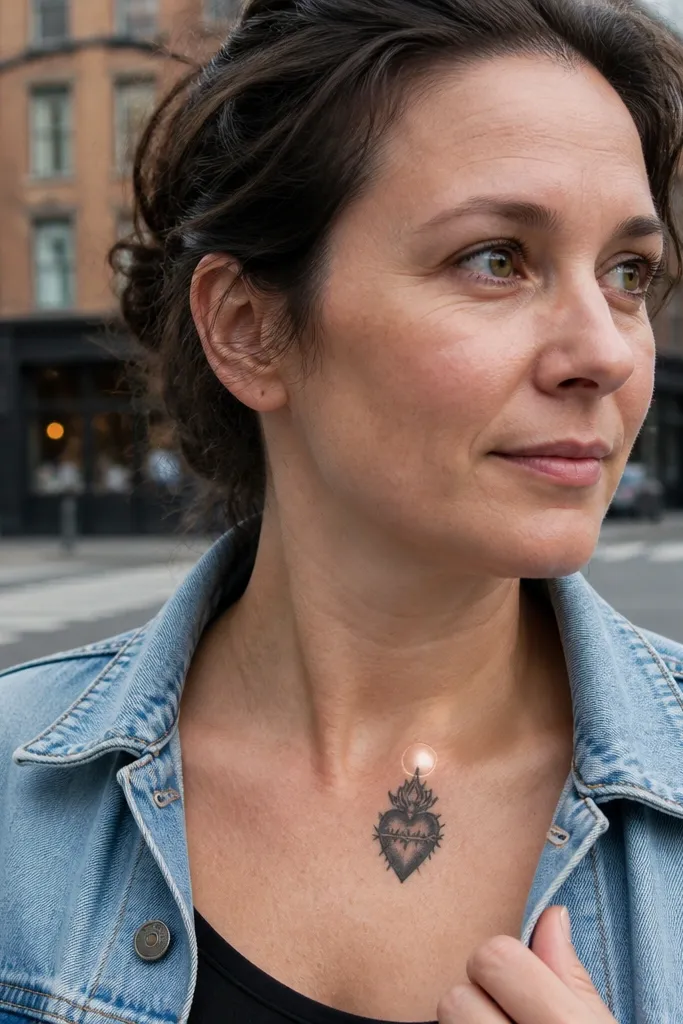
A micro halo ring gives you the religious vibe without clutter. The ring sits behind or just above the heart outline and reads as a gentle glow. Because the halo is a simple shape, it stays crisp at small sizes. It’s a strong option for upper inner arm or collarbone-adjacent placements where you want a symbol that looks delicate but clear.
Start by drawing the heart and cross with clean, medium-thin lines. Then add a small circular halo ring behind the heart, keeping the ring diameter only slightly larger than the heart width. Finally, add 0 to 3 short rays only if you have space; keep the rest negative space. Use black ink only for the simplest, most readable aging.
Editor's noteAsk your artist to keep the halo ring slightly offset so it doesn’t touch the heart outline — tiny gaps look cleaner.
One warningAvoid a full spoked halo with many lines; it turns into a gray halo.
13. Tiny Sacred Heart with thin border rectangle
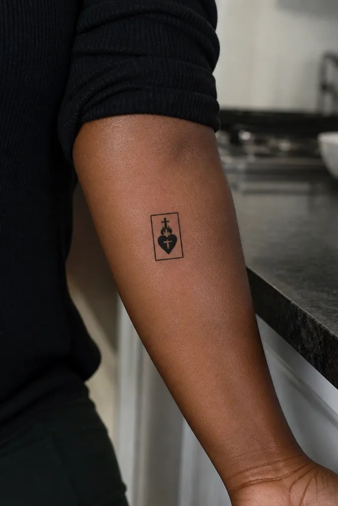
This one looks like a stamp. A thin rectangular border frames the Sacred Heart and makes it look graphic and intentional, even when it’s small. The heart and cross sit centered inside, and the border gives you a crisp edge that holds up in photos. It’s also a good choice if you want your tattoo to feel “designed” rather than purely illustrated.
Start with the heart and cross centered inside the space. Then draw a thin rectangle border around it with rounded corners so it doesn’t look harsh or boxy. Finally, keep rays minimal — either none or a couple of tiny lines behind the heart. Use black linework with little or no shading so the border stays clean as the tattoo ages.
Keep the rectangle height slightly taller than the heart so it doesn’t look squished over time.
Avoid thick borders. Thick lines can overrun the heart at small sizes.
14. Small Sacred Heart with split flame crown

Split flames give a symmetrical crown effect that reads clearly even at 1 inch. Instead of a full flame mass, you get two flame shapes that flank the cross area, so the top of the tattoo looks structured. This style is a nice middle ground between ultra-minimal and traditional flame-heavy designs. It’s photogenic because the crown shape makes the heart look centered and powerful.
Start by outlining the heart and placing the cross at the top center. Then draw two matching flame shapes on either side of the cross, keeping each flame tip short and rounded. Finally, add 4 short rays behind the heart or skip rays if the crown already fills the space. Keep shading light — just a soft gray under the heart center — and avoid dense interior texture.
Editor's noteMake sure the flame shapes are mirror-matched; asymmetry stands out more in small tattoos.
One warningAvoid swirling flame curls. They blur into blobs at small scale.
15. Tiny Sacred Heart with single ray flare and dot accents

This design uses restraint like it’s a design rule. One longer ray flare creates a focal “spark,” while a few dot accents add charm without turning into a busy pattern. The heart and cross stay crisp, and the rest is negative space. It’s a good pick if you want something small simple Sacred Heart Tattoo but still a little playful.
Start with the heart outline and cross as your base. Then add one long ray that rises from behind the heart, keeping it straight and centered. Finally, place 3 to 5 small dots around the ray and heart edges for balance, not for coverage. Use black ink only and keep any shading to a tiny gray hint at the heart bottom, if you want it.
Editor's noteHave your artist test the dot spacing with a stencil so the dots don’t look like random specks.
One warningAvoid dot clusters around the entire heart — it turns into a gray haze.



