
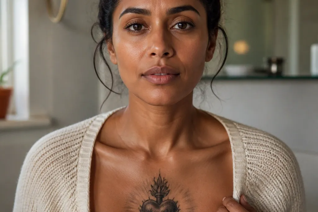

1. Midline Sacred Heart with Cream Halo Rays
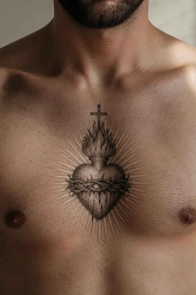
This design is the cleanest way to get “dreamy” on the sternum: a dark Sacred Heart centered on your midline with cream-toned halo rays that fade outward. The contrast is what makes it photogenic — the heart reads instantly, then your eyes catch the light glow that looks like soft morning fog. It flatters most body types because the rays can be kept narrow and vertical, which visually lengthens the chest. It also works well if you want minimal symbolism but still want the sacred theme front and center.
Start by asking for the heart to be centered on the sternum midline, with the bottom point landing around 2-3 finger widths above the bra strap line. Then request a crisp outline and dark interior shading for the heart, followed by a controlled cream wash for the halo rays that fades before it hits the skin edges. Keep ray spacing even and avoid tiny micro-details in the rays so they don’t blur. Aftercare is standard but be strict about friction: wear a soft, breathable top for the first week and avoid heavy rubbing at collar and strap points. If you’re prone to fading, ask the artist to go slightly deeper on the heart outline because that’s the part that must stay readable.
Editor's noteBring a reference photo that shows “cream glow” rather than heavy white highlights; it helps the tattooer match the dreamy level.
One warningAvoid full-color watercolor splatter across the entire halo — it spreads and kills the clean silhouette.
2. Soft Watercolor Sacred Heart with Blush Sunburst
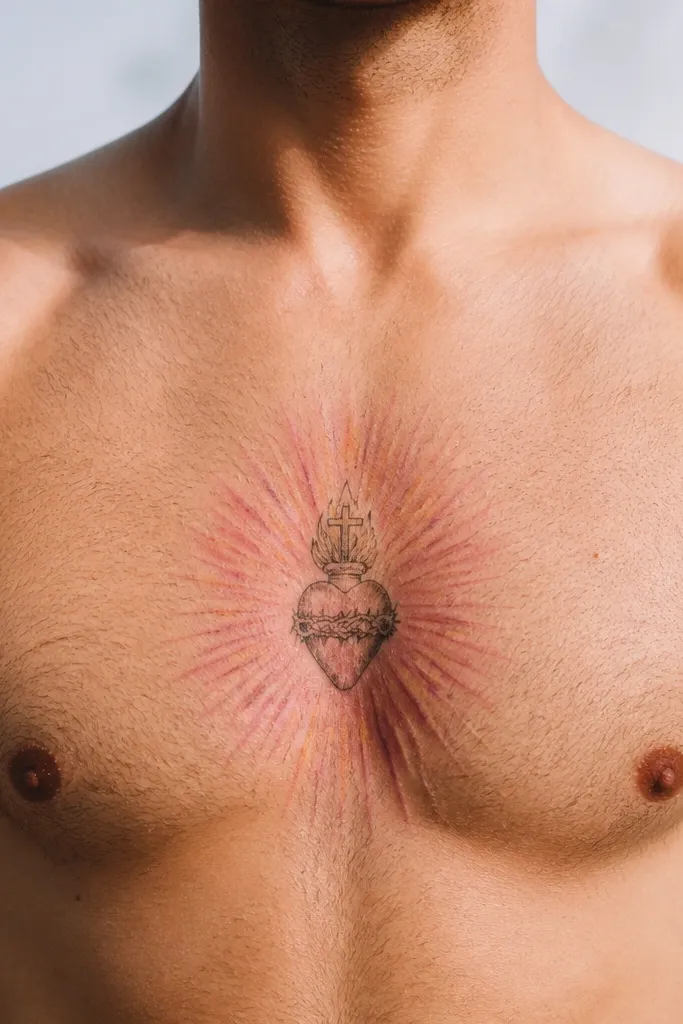
If you want the sternum to look like it’s glowing from within, this watercolor-forward option nails it. The heart stays darker for readability, while the sunburst is done in blush and pale pink that bleeds outward gently like light through sheer fabric. The dreamy effect comes from letting the color fade before it reaches the outer edges, so it looks airy instead of muddy. This is especially flattering on people who want a feminine vibe without adding a lot of extra icons. It also photographs beautifully because the blush tones catch light differently than straight black.
Start by choosing a watercolor palette: blush pink, very light peach, and a touch of warm tan for warmth. Then ask for the heart outline to be crisp and the watercolor to be concentrated around the rays, with the edges feathered and not overworked. Keep the heart size moderate (wide enough to read, not so big it stretches with breathing) and place it dead center on your sternum. For healing, keep it clean, avoid soaking, and skip scrubbing — watercolor areas scab a bit more and need gentle handling. Expect the blush to soften as it heals; ask the artist whether they’re comfortable using slightly stronger pink so it still shows in 6-12 months.
Editor's noteAsk for a test patch of ink tone under the lights at the studio if they can; blush can look different under warm bulbs.
One warningAvoid adding too many extra symbols in the same watercolor zone; packed elements blur together.
3. Fine-Line Sacred Heart with Tiny Starry Rays
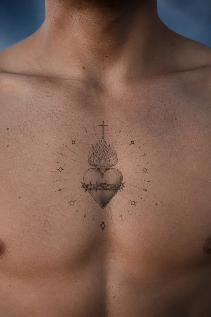
This one is dreamy because it’s delicate, not because it’s messy. A fine-line Sacred Heart sits centered, and the halo is made of thin rays dotted with tiny stars that feel like a soft night sky. The effect is romantic and modern, and it suits sternums because fine lines keep the tattoo from overpowering your frame. It’s also great if you hate heavy shading — the heart stays mostly linework with light texture so it looks airy under clothing. In photos, the stars make it feel dimensional even when the tattoo is small.
Start by requesting a fine-line heart outline with minimal heavy black fill, then add a halo of thin rays that are evenly spaced. Add tiny dot stars at the ray tips rather than filling the whole halo with stars, so it stays clean and doesn’t turn into a speckle blur. Keep the piece narrower than you think — sternum skin movement makes tiny details smear if they’re too dense. For aftercare, protect it from friction and keep lotion light and consistent so the skin doesn’t over-moisturize and lift pigment unevenly. Plan to touch up if you’re very fair-skinned or if you tend to fade quickly.
Ask for star placement to follow the curve of the sternum, not a flat circle — it looks more natural once you’re standing.
Avoid micro-text or dense lettering near the stars; it will be unreadable as it ages.
4. Sacred Heart with Nebula Halo Fade
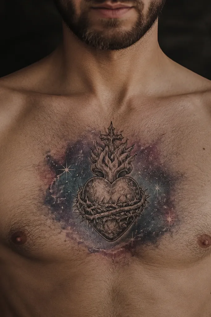
This design makes the sternum look like it’s holding a tiny universe. The Sacred Heart is anchored in dark ink, while the halo fades into a nebula gradient — think muted purple-blue with soft edges. The “dreamy” look comes from the color transition, not from heavy outlines, so you get that ethereal glow without making the heart unreadable. It’s a strong choice for anyone who wants sacred symbolism but still wants a modern, artsy aesthetic. The purple tones also photograph with a gentle glow under indirect light.
Start by choosing a limited gradient palette: one purple, one blue, and one desaturated gray to blend. Then ask the artist to keep the heart outline crisp and restrict the nebula to the halo area, fading out before it reaches the outer skin edges. Placement should stay midline, with the halo spreading mostly upward so the chest doesn’t crop the lower section in photos. Healing is where you protect the gradient: avoid picking at any scabs, and keep the tattoo out of direct sun for at least 3-4 weeks. If you’re worried about color fading, ask for slightly deeper saturation in the inner halo so it survives time.
Use your clothing photos as a guide: this looks best when you can show the upper sternum, like a scoop neckline.
Avoid going full rainbow; too many hues make the halo look dirty after healing.
5. Black-Heart Sacred Heart with Soft White Glow
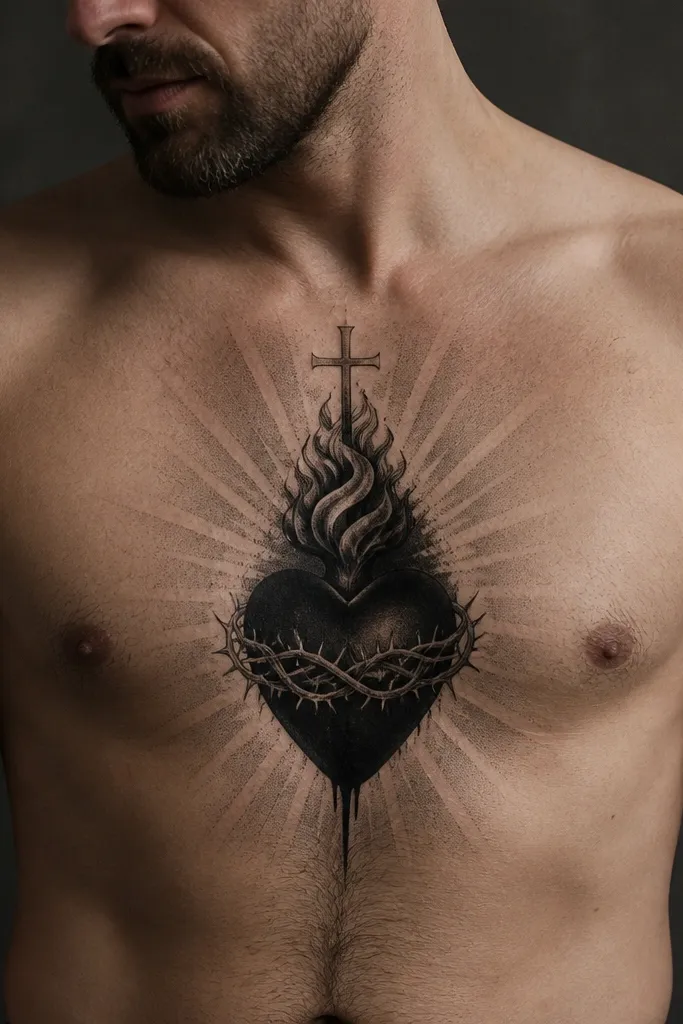
This is the “dreamy but serious” version. The heart is done in deep black with minimal interior clutter, then the glow is suggested with soft white highlights that fade like light on skin. It’s not a harsh high-contrast look; it’s more like a gentle backlight around the sacred shape. This style flatters sternums because the contrast stays controlled and the piece doesn’t get visually heavy. It’s also one of the most age-friendly options because the heart stays bold and the glow is just accent work.
Start by asking for a strong black outline and solid black fill in the heart so it stays readable over years. Then request white highlight work around the top curve and along the inner halo — keep it thin and layered, not a thick blob. Place it midline and size it so the glow doesn’t extend too far sideways; you want the tattoo to remain a focal point, not a spread. Aftercare: keep it moisturized lightly and avoid sun exposure during healing so the white doesn’t dull too fast. If you’re fair and bruise easily, ask for numbing and plan a shorter session if needed.
Editor's noteAsk the artist to show you how they place white — the best glow looks like a whisper, not a sticker.
One warningAvoid making the entire halo white; it can look cloudy and can fade unevenly.
6. Sacred Heart with Delicate Ribbon Banner
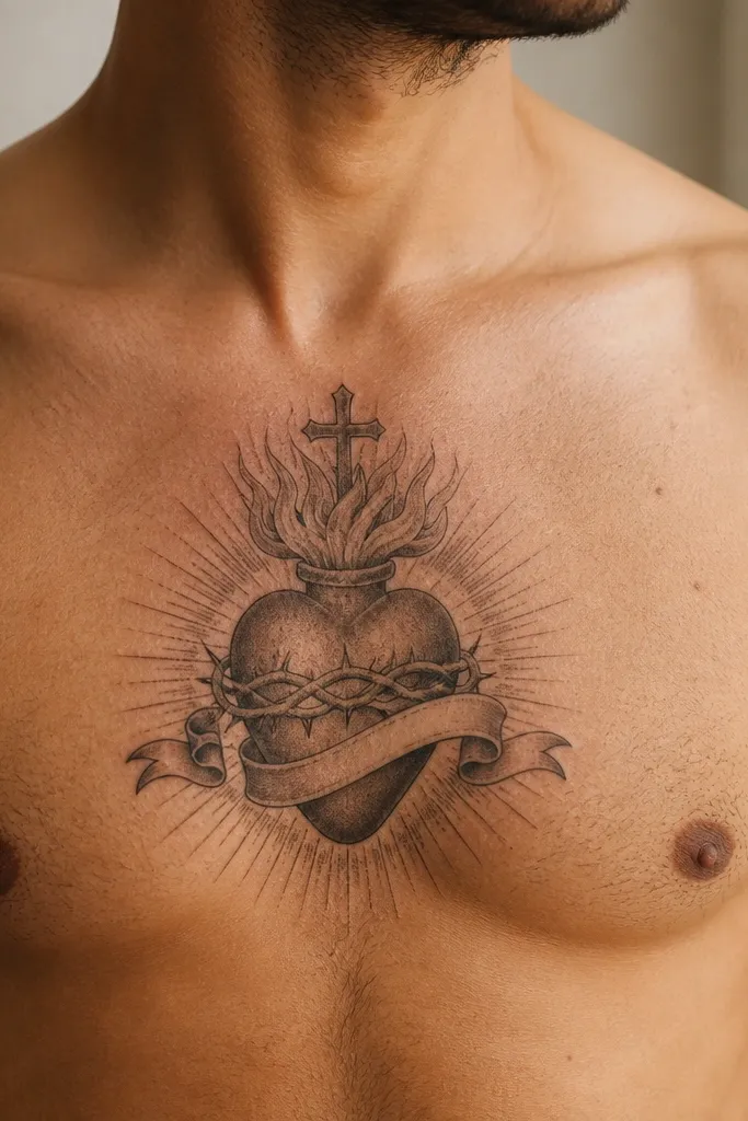
A ribbon banner adds romance without clutter when it’s drawn thin and kept short. In this dreamy sternum version, the Sacred Heart sits centered, and a delicate ribbon drapes beneath it with soft shading that makes the folds look like satin. The halo can be minimal — a few faint rays or a light aura — because the ribbon gives you the aesthetic payoff. This design is great if you want the symbolism to feel personal but still look clean in photos. It’s also a smart choice for people who dislike lots of tiny stars or heavy watercolor spreading.
Start by keeping the banner text minimal or skipping text entirely, using a ribbon shape and small ornamental ends. Then ask for the heart to be dark with light shading in the center, and add a soft aura around the heart that fades outward. Place the heart midline and let the ribbon hang slightly downward toward the upper sternum without going too low. For aftercare, keep the ribbon area protected from friction because thin lines can catch on fabric. Plan for a touch-up if you want the ribbon to stay razor-crisp after healing.
Editor's noteIf you want text, pick a short phrase and use a font style that matches the artist’s letter spacing — sternum text needs bigger spacing than you think.
One warningAvoid long Latin phrases; small letters on the sternum fade fast and turn into a gray blur.
7. Sacred Heart with Rose-Gold Warm Highlights
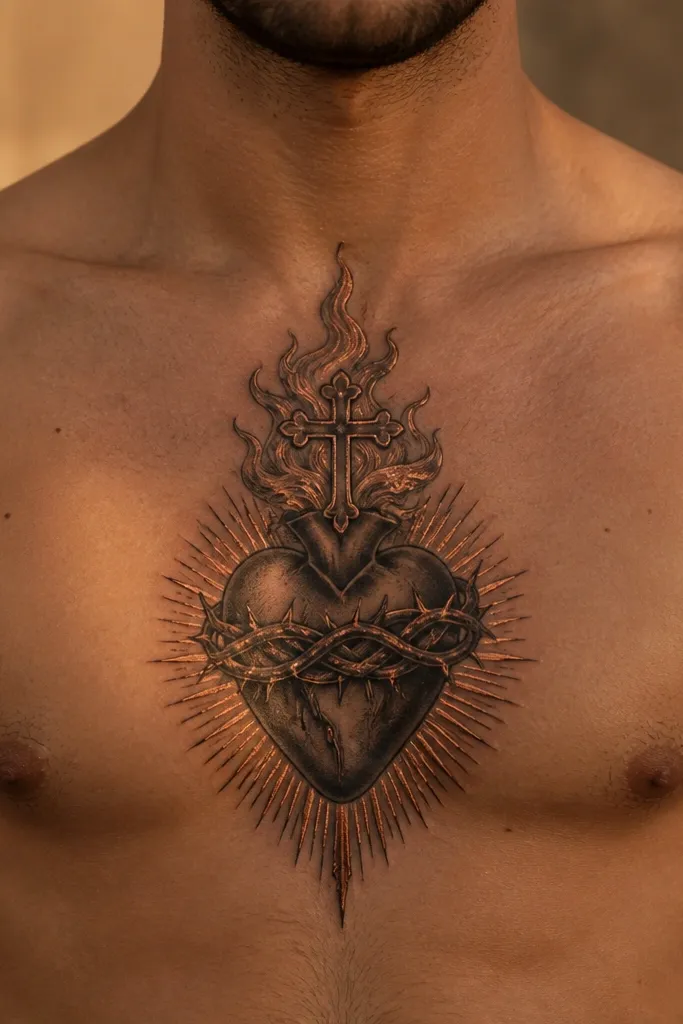
This is how you get dreamy without turning the piece pastel and washed out. The heart is dark and readable, then warm rose-gold highlights are placed along the inner flame and halo edge, like candlelight reflecting off metal. The effect is romantic and flattering because warm highlights pull attention toward the centerline. It also gives the tattoo a “glow” that looks good even under indoor lighting. If you love jewelry tones, this one looks right at home with gold necklaces and layered chains.
Start by asking for a dark Sacred Heart with clean linework and controlled shading so the base stays strong. Then add warm highlights in small sections — around the inner curve and along a thin halo ring — using a warm light tone rather than harsh white. Keep the halo narrow and concentrated so the rose-gold doesn’t spread outward like watercolor. Placement is midline, with the halo ring slightly above the heart’s top curve. Aftercare is the same as any black-and-gray-plus-color piece, but be extra careful with sun once it’s healed because warm tones can fade faster than black.
Editor's noteWear a simple chain during photos; the warm highlights look best when they reflect light off something gold-toned.
One warningAvoid using actual yellow ink for large areas; it can turn muddy and look uneven.
8. Sacred Heart with Halo of Tiny Dots
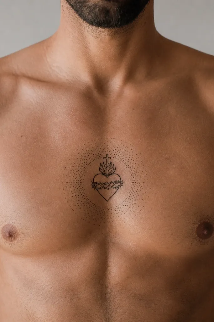
Dot halos are quietly dreamy. The Sacred Heart stays crisp and dark, and the halo is built from tiny, evenly spaced dots that fade into a soft edge. It looks like starlight dust, and because the halo is made of points, it holds shape better than sprawling watercolor. This design is great for sternum placements because it stays delicate without shrinking the heart’s readability. In photos, the dot halo catches light and makes the tattoo look dimensional.
Start by asking for the heart outline and inner shading to be solid enough that it reads from a few feet away. Then request a dot halo around the top and sides of the heart, with dot density highest nearest the heart and thinning out as it expands. Place it midline, slightly higher than you’d place a larger tattoo, so the halo sits in the area people notice first. For healing, avoid over-lotioning; dot work can look shiny during healing and should settle naturally. If you’re prone to raised healing or keloids, tell the artist beforehand and consider smaller dot density.
Editor's noteChoose a dot halo radius that fits your upper sternum; if it spreads too wide, it will blur from friction.
One warningAvoid thick black rings; they kill the dreamy, airy effect.
9. Sacred Heart with Dreamy Cloud Aura
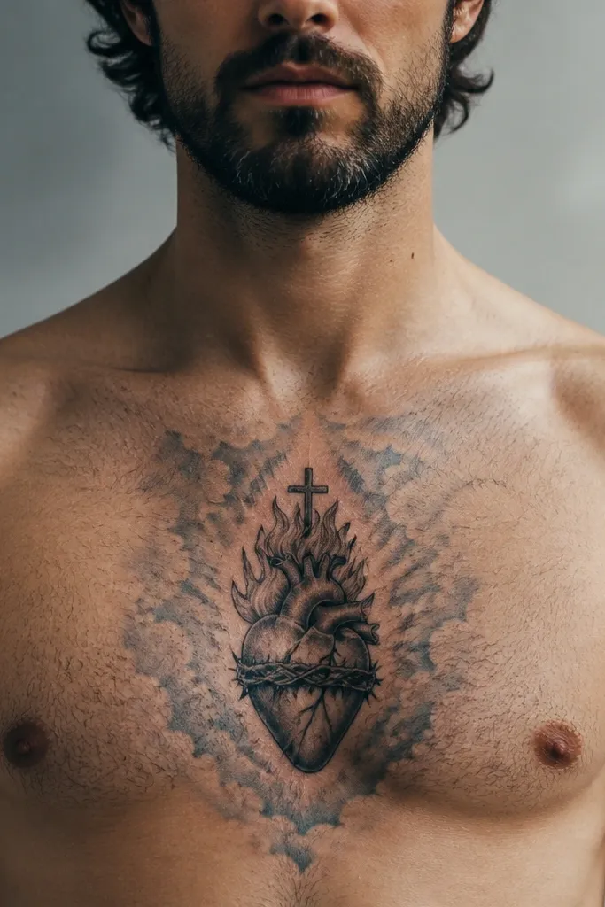
Cloud aura shading turns the sternum into a soft focal point. The Sacred Heart sits centered in dark ink, while the halo becomes cloud-like gray shading that puffs outward in gentle layers. This is dreamy because it looks like mist rather than a hard sunburst. It also works with almost any skin tone because the aura is built from subtle grays and light transitions. If you want something romantic but not colorful, this is the move. It also ages well because the mist effect is spread evenly rather than concentrated in tiny details.
Start by requesting a crisp heart silhouette and a smooth inner shading so the heart stays the anchor. Then ask for cloud aura shading around it in 2-3 layers: darker mist closest to the heart, lighter mist at the edges, with no harsh boundary line. Keep the aura mostly upward and slightly outward so it doesn’t extend into areas that rub against clothing. Aftercare: protect from direct sun and keep the mist area moisturized lightly so it doesn’t dry too fast and look patchy. If you want extra glow, ask for a small highlight near the top curve of the heart.
Editor's noteAsk for the aura to be drawn with smooth transitions, not stipple-heavy gradients, so it stays “cloudy” instead of grainy.
One warningAvoid mixing heavy stippling with cloud shading; it can look speckled rather than misty.
10. Sacred Heart with Soft Rainbow Arc Behind
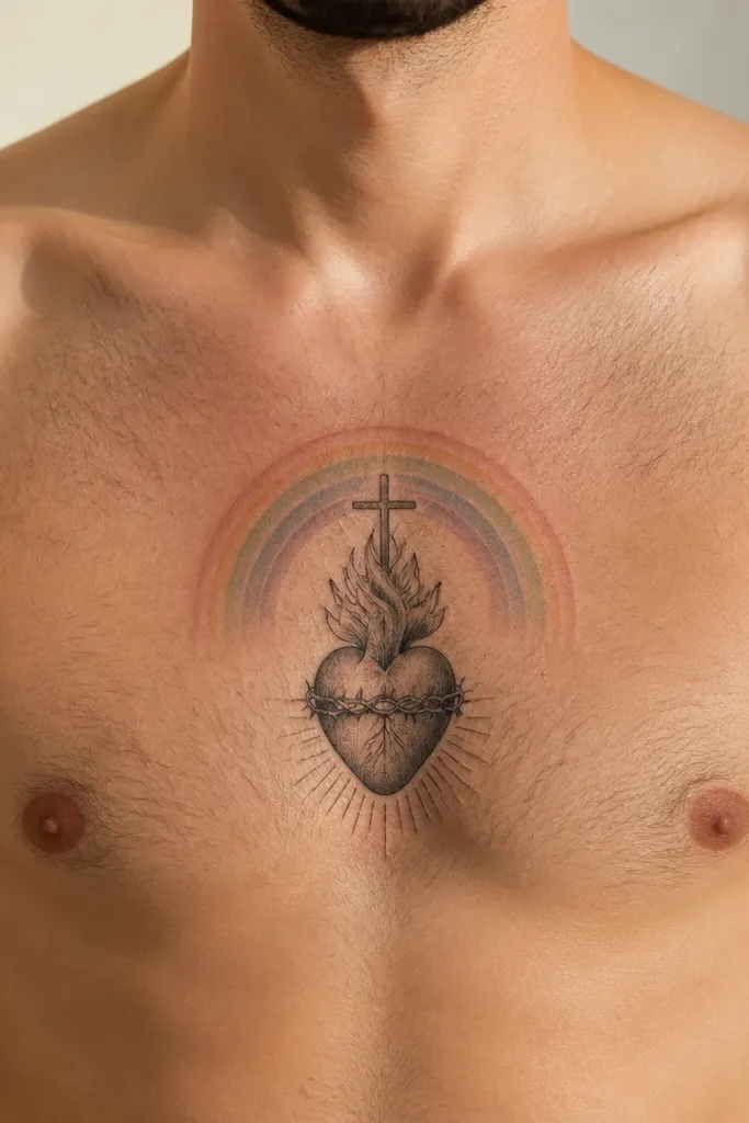
This one is dreamy because the rainbow is muted, not loud. The Sacred Heart stays dark and centered, while a soft rainbow arc sits behind it like a gentle prism glow. The colors should be desaturated — think pale peach, muted pink, dusty blue, and soft lilac — so it reads as a mood, not a theme park. It photographs beautifully because the arc frames the heart and creates a clean shape. This is a good option if you want color but you don’t want to commit to full watercolor spreading.
Start by choosing a tight arc shape that sits behind the heart and extends only slightly beyond the heart width. Then request desaturated color packing with a smooth fade, keeping edges soft and avoiding harsh outlines around each color band. Place the tattoo midline and slightly higher so the arc stays visible under most neckline styles. For aftercare, protect from sun hard once healed, since pastel rainbow tones fade faster than black. Expect the colors to settle and mute further — the goal is that it still looks like a soft arc after a few months.
Editor's noteAsk for the rainbow arc to be thicker at the center and thinner at the ends — it keeps the glow flattering on sternum curves.
One warningAvoid bright neon colors; they look flat and can turn dull gray-green as they heal.
11. Sacred Heart with Moonlit Rays and Minimal Fill
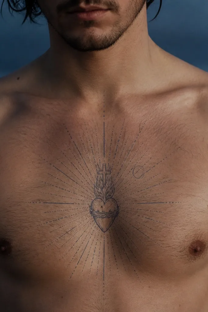
Moonlit rays give you that dreamy night-sky feeling without adding color. The Sacred Heart is mostly clean with light shading, and the halo is made from thin, slightly uneven rays that look like they’re glowing under moonlight. Because the rays are minimal and spaced, the sternum tattoo stays elegant and doesn’t turn into a big dark blob. This design suits people who want sacred symbolism but hate busy tattoos. It’s also a strong choice if you plan to wear necklines that show the upper chest — it will look intentional, not random.
Start by asking for minimal interior fill — enough to shape the heart, not so much that it becomes a solid heavy block. Then request thin rays that radiate upward and outward, with slightly varied length so it feels natural. Place the heart centered and keep the widest part of the rays within your bra strap line. Aftercare: keep the tattoo out of sun and avoid heavy exfoliation during healing so the gray rays don’t fade patchy. If your skin runs warm or you sweat a lot, tell the artist so you can plan breathable clothing for the first week.
Choose slightly longer rays if you want a taller look; sternum tattoos read more flattering when the rays guide the eye upward.
Avoid dense crosshatching inside the heart; it can muddy the dreamy look.
12. Sacred Heart with Tiny Butterfly Halo
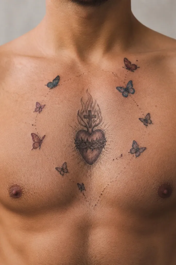
This is sacred symbolism with a soft, airy twist. Instead of standard rays, the halo uses tiny butterfly shapes around the heart, drawn in thin lines with minimal shading. The Sacred Heart stays the focus, while the butterflies add a dreamy movement feel without making the design chaotic. It looks especially good on the sternum because butterflies naturally frame the centerline and mimic the curvature of the chest. If you want something romantic and slightly whimsical but still clearly “Sacred Heart,” this nails the balance.
Start with a centered Sacred Heart in dark ink and keep the wings small so the halo stays delicate. Then ask for butterfly outlines to be evenly distributed around the heart, with a few placed higher than the rest to create an upward glow effect. Keep shading minimal — a light gradient near the wing bodies is enough. Place the tattoo midline and scale so the halo fits within the upper sternum area you want to show. Aftercare needs extra attention around the tiny lines: avoid friction and don’t stretch the skin with tight clothing while it heals.
If you want extra dreaminess, ask for a faint dot halo behind the butterflies, not full watercolor behind them.
Avoid adding large butterflies or thick black wings; it turns the sacred heart into a background element.
13. Sacred Heart with Water Mist Shading Edges
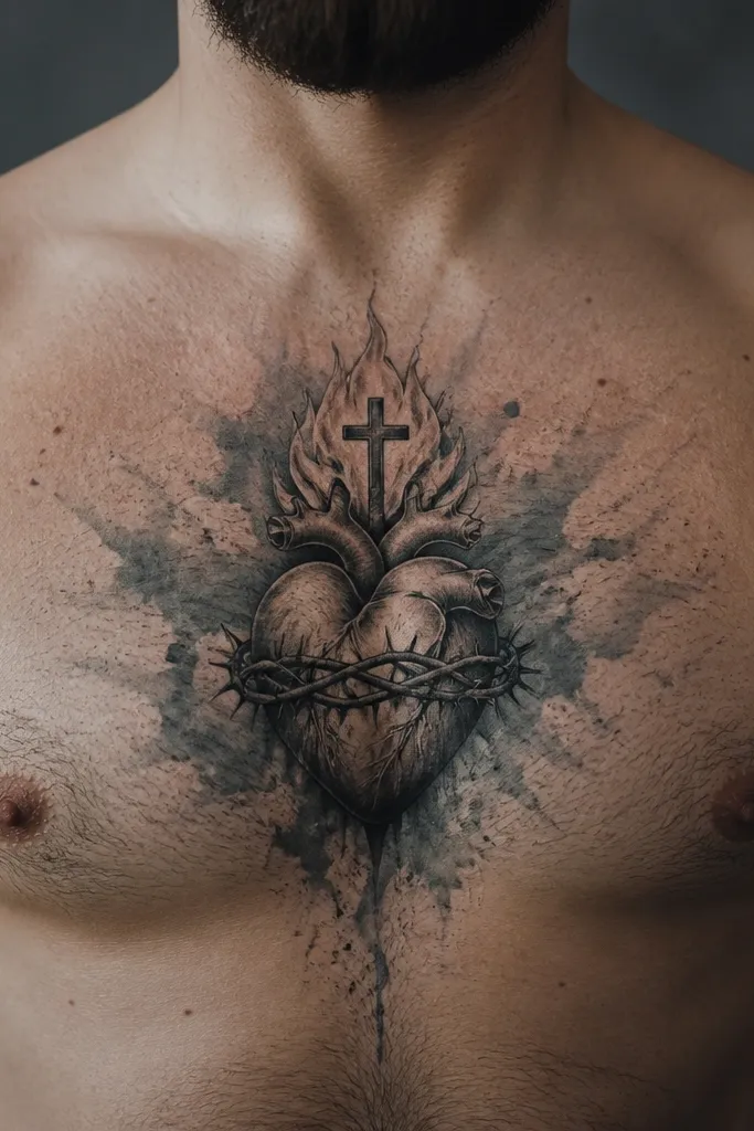
This design looks like the heart is surrounded by water vapor. The Sacred Heart is drawn crisp and dark, then the halo edges are shaded with a watery, mist-like gradient that fades out quickly. It’s dreamy because it’s controlled — you see the heart sharply, and the halo behaves like soft fog. This is a great option if you want the tattoo to feel airy and light, not heavy or religious-traditional. It also photographs beautifully because the mist shading catches highlights and looks smooth under flash.
Start by asking for a strong heart outline and a smooth inner shading so the base stays readable. Then request mist shading only at the outer edges of the halo, using 2-3 levels of gray that fade quickly. Keep the mist concentrated near the top and sides rather than spreading to the bottom of the heart, so the tattoo doesn’t look like it’s dripping. Placement is midline with the heart sized to avoid crossing too far into the sides of your chest. Aftercare: keep it moisturized but not greasy; mist shading can look uneven if the tattoo dries out and then rehydrates too much.
Bring an example of “mist” shading you like; the difference between mist and smoky shading is how quickly it fades.
Avoid heavy smoke shading that spreads wide; it flattens the dreamy effect and ages into gray haze.
14. Sacred Heart with Soft Glow Flame and Minimal Rays
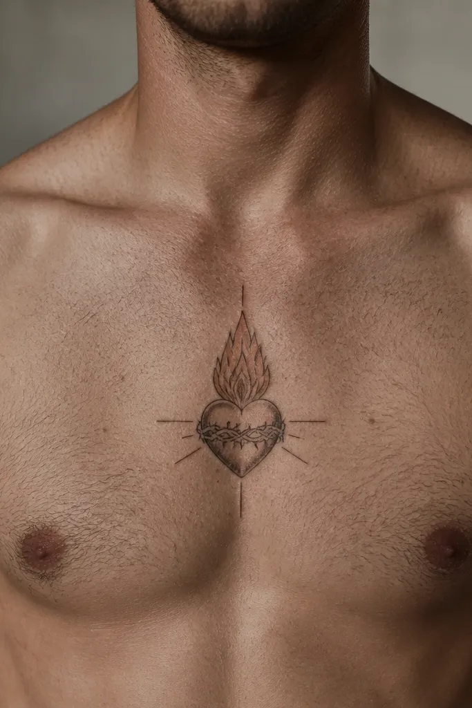
This is the sternum version of a candle flame. The Sacred Heart sits centered with a small flame element above or inside the top curve, shaded with warm, soft glow highlights. Rays are kept minimal — just a few faint lines or a thin aura — so the flame becomes the dreamy focal point. It’s romantic, readable, and looks great when you wear a neckline that shows the upper sternum. The symbolism still reads clearly because the heart shape is the anchor, and the flame adds the sacred fire feeling without turning into a full traditional flame scene.
Start by deciding where the flame goes: above the heart or tucked into the top curve, then keep it small. Ask for the heart to be crisp with dark shading, then add flame glow highlights in warm tones like pale amber or peach instead of bright yellow. Request only a few faint rays or a thin halo line so the composition stays clean. Place it midline and keep the overall width narrow enough that the flame stays visible even when you’re seated. Aftercare is normal, but protect the flame glow area from over-sun exposure because warm highlights fade first.
If you want maximum dreamy effect, make the glow brightest at the flame base and fade upward — it looks natural and flattering.
Avoid thick traditional flame outlines; they look harsh and kill the soft halo vibe.
15. Sacred Heart with Pearly Halo Ring and Dot Sparkles
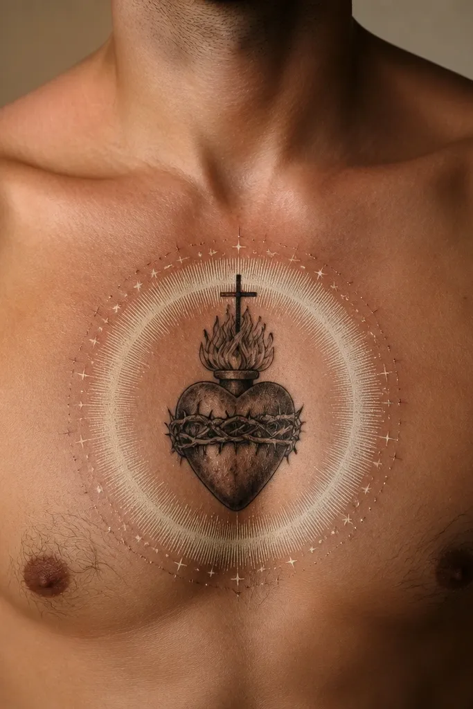
This design is all about a controlled highlight. The Sacred Heart is centered and dark, and the halo is a thin, pearly ring that looks like a soft bubble of light. Around it, tiny dot sparkles are placed sparingly so the glow feels magical rather than busy. It’s dreamy because the pearly ring gives you that “light catching on skin” effect without needing heavy color. This tattoo looks especially good in photos where the sternum catches light, like under a scoop neckline. It also ages well because the most important elements are bold (heart outline) plus simple (ring and dots).
Start by asking for a strong heart outline and clean inner shading. Then request a thin pearly halo ring drawn with soft white or very light gray that stays narrow and doesn’t expand into a thick cloud. Add dot sparkles only at select points — top and sides — and keep them small so they don’t merge. Placement should be midline and slightly higher than center if you want the ring to stay visible with most clothing. Aftercare: keep the tattoo out of direct sun while healing, and avoid scratching at any raised scabs around the ring.
Ask for the ring to be slightly thicker at the top; it flatters the sternum curve and looks “lit” in photos.
Avoid spreading the ring into a wide glow; it turns into a gray band.



