
1. Crown-Top Sacred Heart with Micro-Rays
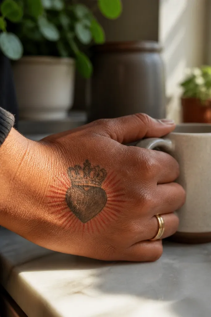
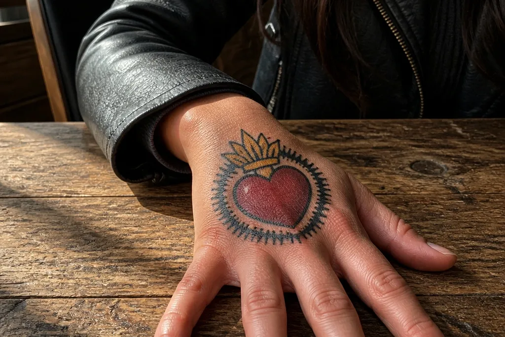
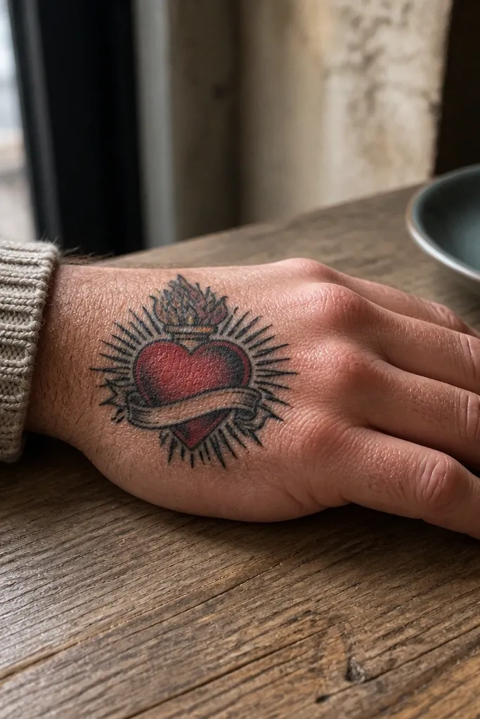
This one looks like a ring you can’t take off. The heart sits centered, crowned with a clean, symmetrical top, and surrounded by micro-rays that stop before they get crowded. Those tiny rays are the creative detail that makes the Sacred Heart feel lit from within instead of flat. It’s best on the top of the hand where the rays can follow the curve without wrapping too far over moving skin. The crown adds structure, so even if the red softens, the silhouette stays elegant.
Start by mapping the heart so it sits about 1 inch below where your fingers meet the hand, not on the knuckle line. Then ask for bold outline work around the heart and crown, with red used only for the heart interior and small highlights. Finally, request shading that stays close to the lines — think controlled gradients, not a wide gray wash. Aftercare matters: keep it clean, dry, and out of direct sun until fully healed, because the rays are where fading shows first.
Use this placement if you want “pretty from across the room” without sacrificing detail up close.
Don’t let the rays run into your finger joints — they’ll blur when you flex.
2. Sacred Heart with Blackwork Rose Frame
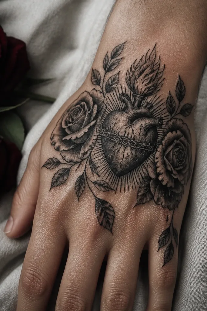
A rose frame makes the Sacred Heart feel romantic and graphic at the same time. The heart sits in the center, while a blackwork rose wraps around it like a border — petals create natural negative space that keeps the design from turning into a dark square. This style is especially photogenic because blackwork catches light differently than flat color; it looks crisp in both daylight and indoor lighting. Place it on the outer side of the hand for the smoothest flow of petals. It suits people who want religious symbolism, but with a fashion-forward look.
Start by choosing a rose that has clear petal separations; single-line petals hold up better than filled, heavy blocks. Then outline the heart slightly larger than you think, because the rose frame visually shrinks as it heals. Finally, keep the heart mostly black and use red only as a small accent in the flame area or inner shine. For aftercare, treat it like a blackwork piece: moisturize lightly and avoid picking any scabs that form along the petal tips.
Editor's noteAsk for the rose leaves to angle toward the thumb side — it makes the whole tattoo look intentional, not pasted on.
One warningSkip full-color rose shading; it makes the piece age faster on hands.
3. Rosary Loop Sacred Heart on the Thumb Side
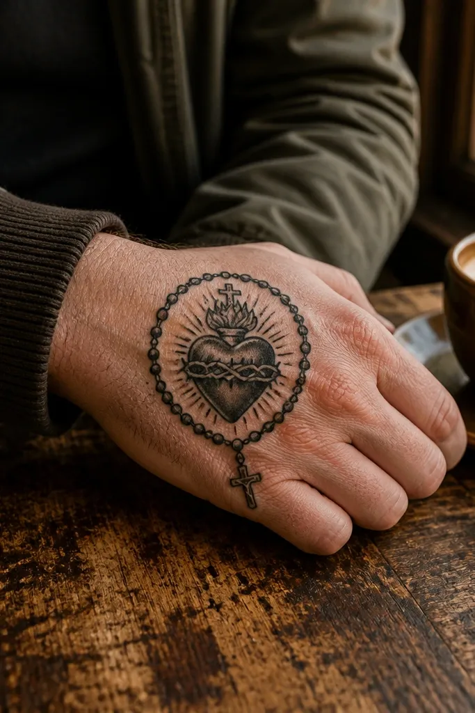
This design reads instantly because the rosary loop gives you a clear, recognizable shape. The Sacred Heart sits at the center, while the rosary arcs around it with bead-like dots that create a rhythmic pattern. It’s creative detail without clutter: your eye follows the loop, then lands on the heart. The thumb side of the hand is ideal because the curve matches the rosary arc and hides minor fading better than straight-on knuckles. It looks especially good with short nails and rings because the tattoo overlaps that “ornament” vibe.
Start by placing the heart slightly closer to the thumb crease so the rosary loop doesn’t cross too many moving joints. Then have the artist keep bead marks consistent in size — uneven beads make the loop look messy over time. Finally, decide on color: either keep the heart black with a small red inner glow, or use red only in the heart flame accents. During healing, avoid tight gloves and friction so the rosary bead dots don’t scab thickly.
Editor's noteIf you want maximum sharpness, request dotwork beads instead of tiny filled circles.
One warningDon’t wrap the rosary across the finger bases — it stretches and blurs.
4. Flame-Edge Sacred Heart with Black Smoke Shading
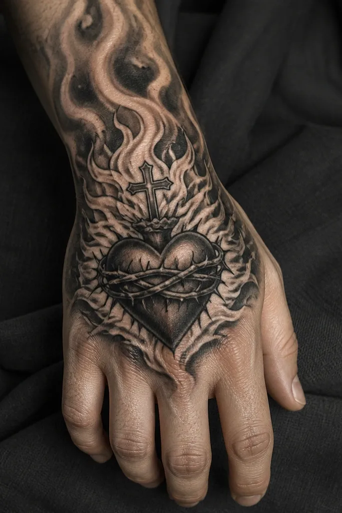
Flames add motion to the Sacred Heart, and smoke shading gives it depth without needing lots of color. The heart stays crisp at the center, while the flame tips stretch downward like a controlled brushstroke. Below, black smoke shading fades outward in a gradient so the design looks like it’s glowing and floating. This is one of the most photogenic options because the contrast makes the heart pop in close-up photos. Put it along the back of the hand near the center, where the smoke can spread without hitting the wrist too early.
Start by drawing a heart shape with a strong outline and a defined bottom point so the flame placement looks natural. Then ask for flames with clear linework at the edges and minimal red — red should be a highlight, not a fill. Finally, request smoke shading that transitions gradually into the skin with soft stipple, not a big solid gray blob. Aftercare should include strict sun protection once healed; smoke shading is where UV fading shows first.
Editor's noteKeep the smoke on one side of the heart, not both, to avoid symmetry that can look stiff.
One warningDon’t overfill the flames with solid color — it spreads and turns into a muddy patch.
5. Sacred Heart with Halo Ring and Tiny Star Scatter
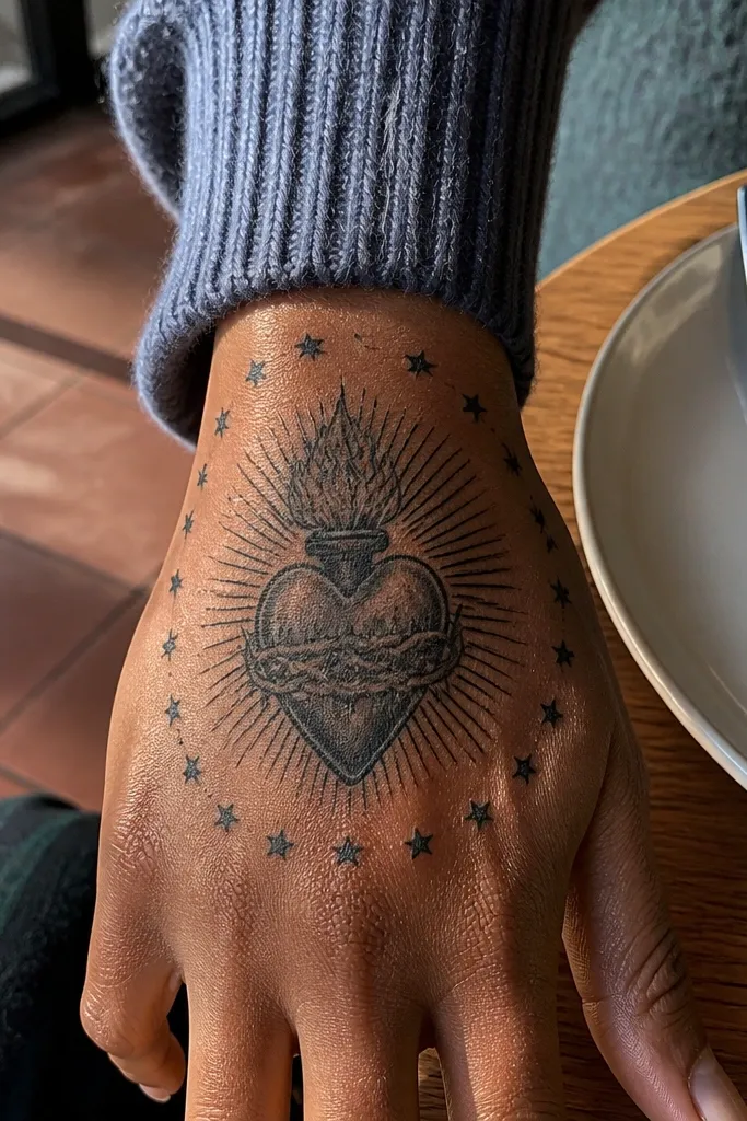
This design is clean, bright, and very “hand jewelry” looking. The halo ring frames the heart like a crown without adding heavy details, and tiny star scatter keeps it playful without taking over. The creative detail is the star placement: it follows the halo curve so the tattoo looks balanced. It’s best on the top of the hand or upper side where the halo can arc naturally. When it heals, the star dots help the tattoo look intentional even if the red fades slightly.
Start by sizing the halo ring to your hand width — the ring should almost align with the space between finger bases. Then keep the star dots small and evenly spaced; add a few slightly larger stars for variation. Finally, use a two-tone approach: black for outlines and the halo, red for the heart interior highlight only. In healing, protect from heavy rubbing; star dots are tiny and can fall out if the tattoo gets scraped.
Editor's noteAsk for stars to be slightly off-axis, not in perfect rows, for a more organic look.
One warningDon’t pack stars all the way to the wrist; the negative space is what makes the halo read.
6. Sacred Heart with Ribbon Banner and Micro Script
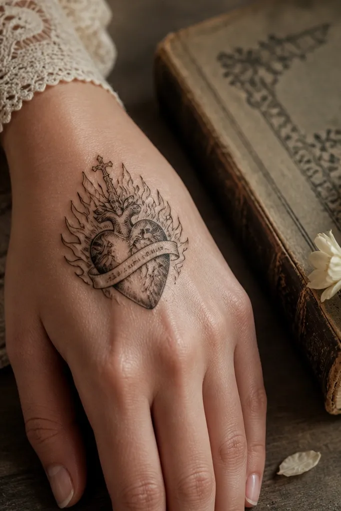
A ribbon banner makes the Sacred Heart feel like a real emblem. The heart sits above, then a ribbon drapes below with sharp folds that look great in photos because the light catches the edges. Micro script on the ribbon adds meaning without forcing you to translate anything into full legible text. This is a good pick if you want the tattoo to look “designed” rather than “symbol only.” Put it on the back of the hand so the ribbon folds have room to curve.
Start by deciding on ribbon width — it should be narrow enough to keep folds crisp, not wide enough to cover half your hand. Then have the artist outline the ribbon folds with clean, dark lines and keep the script thin so it doesn’t thicken during healing. Finally, choose red for the heart only and keep the ribbon mostly black and gray. Aftercare is straightforward: keep it moisturized and don’t stretch the ribbon area by over-flexing right after it starts healing.
Editor's noteIf you care about readability, choose very short script or skip words and use symbols like a small cross at the ribbon ends.
One warningDon’t use long phrases — micro script on hands blurs fast.
7. Sacred Heart with Heartbeat Line Underlay
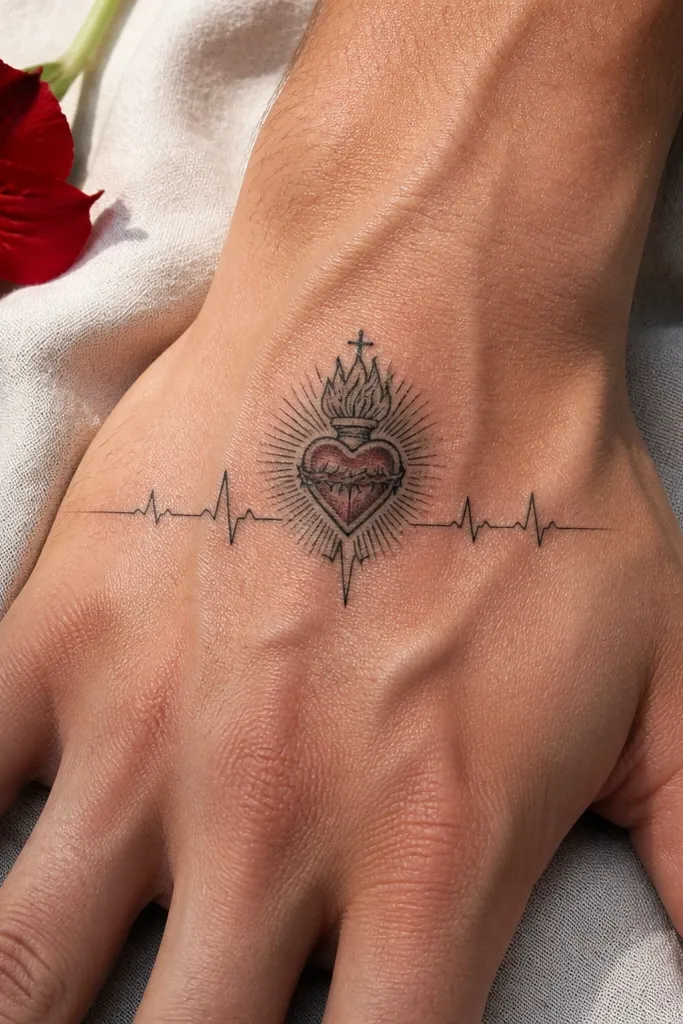
This is a modern Sacred Heart that still reads clearly. The heart sits centered, but a heartbeat line snakes underneath, creating a sense of life and motion. The creative detail is how the heartbeat line interacts with the heart — it crosses near the bottom point and then curls away, so the composition looks engineered, not random. It’s ideal for the side of the hand where a thin line can flow with your anatomy. This one looks great in black and gray with a small red highlight in the heart for contrast.
Start by placing the heart so the bottom point lines up with the heartbeat peak, then plan where the line exits toward the wrist. Then ask for the heartbeat line to be smooth and consistent in thickness — no wobble, no tiny gaps. Finally, add a single red accent in the heart interior so the rest stays monochrome. During aftercare, avoid soaking and keep the tattoo from rubbing against sleeves; thin lines can get irritated easily.
Editor's noteUse black and gray shading instead of heavy color to keep the heartbeat line sharp.
One warningSkip very thin outlines — the heartbeat line will disappear first.
8. Sacred Heart with Cross-Embroidered Look (Stitch Shading)
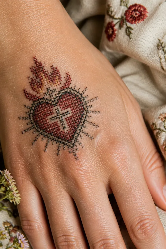
This design looks like the Sacred Heart was stitched onto your skin. The heart is outlined normally, then the shading inside uses crosshatch or stitch-like marks so it has texture instead of smooth gray. That texture is what makes it photogenic — it catches light and looks dimensional even in flat lighting. Place it on the top of the hand where you can keep the heart compact and let the stitch shading stay controlled. The result looks artsy and intentional while staying clearly recognizable as a Sacred Heart.
Start by choosing a compact heart size, because stitch shading needs space to stay crisp. Then ask the artist to use consistent crosshatch spacing — messy stitch patterns blur together on hands. Finally, keep color minimal: black stitch shading with a small red inner highlight at the center. Aftercare is important for texture work; avoid picking and keep the area moisturized so the stitch lines heal cleanly.
Editor's noteRequest a stencil with a few “breathing gaps” inside the heart so the crosshatch doesn’t fill in during healing.
One warningDon’t go for full solid color fills with this style — it kills the stitched look.
9. Sacred Heart with Broken Chain Halo
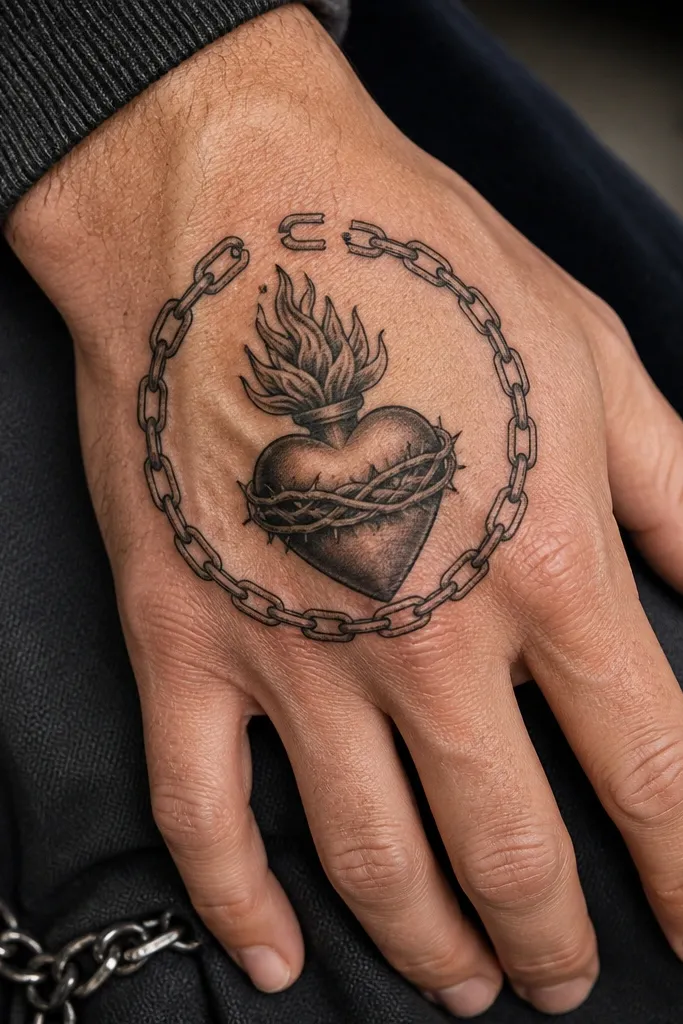
Broken chain elements make the Sacred Heart feel like a message, not just a symbol. The heart sits in the center, while a chain halo arcs around it — but with breaks or gaps so it looks like something is freed. The creative detail is the contrast between the smooth heart and the mechanical chain links, plus tiny highlight lines that make the metal-like look pop. This tattoo is strong on the back of the hand because the arc reads clearly against skin movement. It looks especially good when you keep the heart mostly black with controlled red for the glow.
Start by mapping the chain halo so the arc doesn’t cross your finger joints; keep it on the back of the hand. Then have the artist draw chain links with consistent thickness and clear separations so links don’t merge into a dark ring. Finally, request a small red highlight only in the heart interior and maybe one flame tip. Aftercare: keep the tattoo protected from friction and sun; chain lines are where fading is most obvious.
Ask for two or three chain gaps — too many gaps make it look accidental.
Don’t make the chain too thick; chunky links lose definition as they heal.
10. Sacred Heart Finger Medallion (Index or Ring)
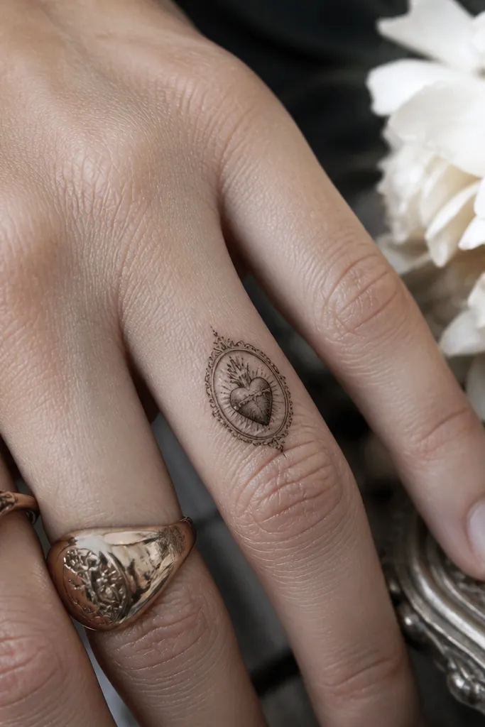
Finger placement is tricky, so this idea is intentionally compact. The Sacred Heart sits as a small medallion on the side of the index or ring finger where the skin moves less than the front pad. A tiny halo or micro rays sit above it, and the heart is done with bold outline and minimal color so it stays readable. This is the most “aesthetic jewelry” look because the tattoo feels like a charm attached to your finger. It works best when you keep the design small enough to avoid turning into a smear.
Start by choosing the side of the finger instead of the front center; the side holds ink better with daily flex. Then ask for thicker line weight than you’d expect — hands fade thin lines first. Finally, keep red to a small inner highlight or skip red and go black and gray only. Healing time is about two weeks for surface closure; avoid rings that rub the area during that period.
Editor's noteIf you get rings often, place the tattoo just above where the ring sits, not underneath it.
One warningDon’t add long ribbon tails on fingers — they won’t hold.
11. Sacred Heart with Watercolor Wash Halo (Controlled Red)
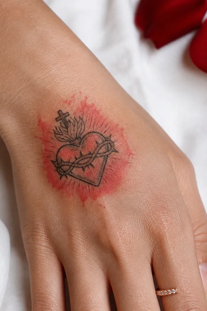
If you want a softer, artsy look, use controlled watercolor-style wash — but keep it disciplined. The Sacred Heart has crisp outlines, then the halo around it is a gentle red wash that fades outward. The creative detail is the fade gradient: it gives the heart a glow without turning into a full red blob. This tattoo is photogenic because the wash looks different depending on lighting, especially in natural daylight. Place it on the back of the hand where the halo can expand slightly without colliding with finger joints.
Start by asking the artist to keep the heart lines bold and separate from the wash, so the wash never bleeds into the outline. Then choose a limited wash palette: red and maybe a hint of warm pink, with no heavy blue-gray. Finally, keep the wash area small — watercolor on hands spreads and ages quickly. Aftercare should be extra careful with the wash edges; avoid over-moisturizing and protect from sun so the gradient doesn’t flatten.
Choose this if you like a “glow” effect more than sharp blackwork.
Don’t go big with the wash — the edges will blur and the halo will lose its shape.
12. Sacred Heart with Engraving Lines and Dot Highlights
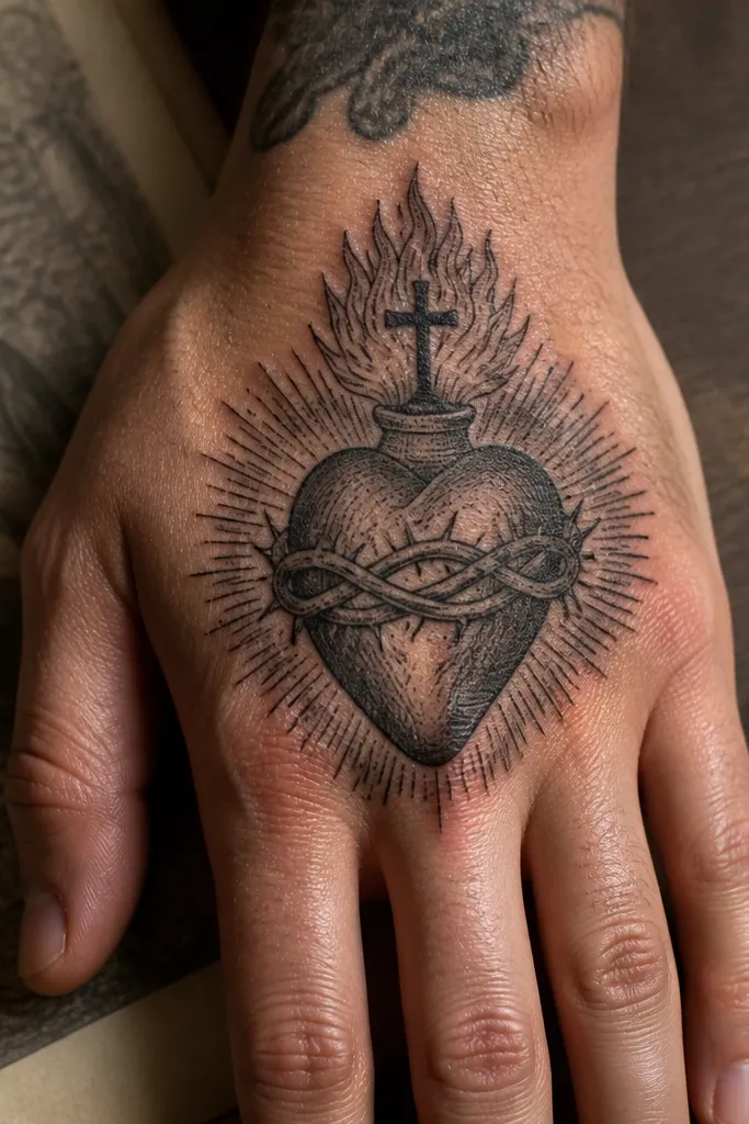
Engraving linework makes the Sacred Heart look like it was carved into metal. The heart is drawn with fine etched lines that create shading through spacing, not through heavy gray. Small dot highlights act like reflections, which is why this design looks so good in photos — it has sparkle without literal glitter. Put it on the outer hand where the light hits the etched lines cleanly. This is a strong option if you want a more tattoo-shop art look rather than a religious icon look.
Start by keeping the heart compact so the engraving lines stay crisp as the hand moves. Then ask for a mix of line spacing and dot highlights — the dots should mark the shine area, not fill the whole heart. Finally, keep color minimal: black ink with a single red highlight line is enough to read as Sacred Heart. Aftercare: avoid friction and keep the tattoo moisturized; etched lines need smooth healing to look sharp.
Ask for the engraving direction to follow the heart curve — it looks more natural once healed.
Skip over-thick outlines; engraving styles need delicate spacing to stay pretty.
13. Sacred Heart with Lace Pattern Veil
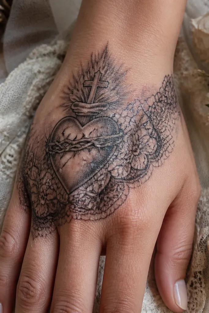
This is the most “soft and pretty” Sacred Heart option. The heart sits behind a lace veil — a pattern of small loops and gaps that creates a delicate frame. The creative detail is that the lace pattern is not random; it’s aligned to the heart’s edges so it looks like the heart is protected by something beautiful. The effect is feminine and photogenic, especially when you pair it with short sleeves or a watch. Place it on the back of the hand where the lace can spread slightly without wrapping over too many joints.
Start by outlining the heart first, then design the lace veil around it with clear negative spaces so the pattern stays readable. Then keep the lace line weight slightly lighter than the heart outline to avoid a heavy blob. Finally, use red only on the heart interior highlight so the lace stays airy. Aftercare is simple but strict: keep it clean, moisturize gently, and don’t pick any lace edges that form scabs.
Editor's noteChoose a lace pattern with fewer, larger loops. Tiny loops blur faster on hands.
One warningDon’t add extra symbols on top of the lace; the pattern already carries the detail.
14. Sacred Heart with Stained Glass Panels (Black Lead Lines)
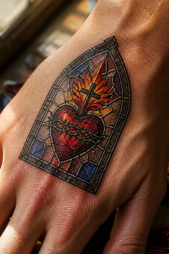
Stained glass turns the Sacred Heart into an actual design piece. The heart is divided into panels with black “lead” lines, then filled with restrained color blocks — think red, deep burgundy, and warm amber highlights. The creative detail is the panel geometry: clean edges and consistent spacing make it look like glass, not like watercolor. This tattoo is gorgeous in photos because reflections and color separation show up even when the tattoo is slightly faded. Place it on the back of the hand for the best flat look and legibility.
Start by keeping the panel grid simple — too many tiny panels won’t hold on hands. Then ask for black lead lines that are bold and consistent, with color used in controlled patches. Finally, add a small white highlight line on one panel so it reads like light hitting glass. Aftercare: protect from sun and avoid soaking until healed; color blocks can soften if you irritate the area early.
Editor's noteIf you want this to stay crisp, choose darker reds over bright cherry red.
One warningSkip thin, hairline panel dividers — they disappear first.
15. Sacred Heart with Minimal Outline and Large Negative Space

This is the Sacred Heart idea for people who want it to stay clean for years. Instead of filling the heart heavily, the design uses a bold outline and generous negative space, with tiny red accents used sparingly. The creative detail is the restraint: the heart shape is crisp, the negative space keeps it from turning into a dark mass, and the small accents add meaning without crowding. It looks sleek on the side of the hand where skin texture and light make the outline pop. It’s also the easiest to touch up later because the shape is simple.
Start by choosing a larger outline than you think, because negative space can shrink visually as it heals. Then ask for one or two red accent spots — like a flame tip or inner glow — so the color doesn’t spread. Finally, keep the halo or rays minimal: either a tiny halo ring or none at all. Aftercare: moisturize lightly and avoid direct sun so the outline stays sharp.
Editor's noteThis is the smart move if you’re working with a smaller hand or a placement near high-friction areas.
One warningDon’t add extra symbols around it — minimal designs need breathing room to look intentional.



