
1. Single Branch Arc With Soft Gray Veins
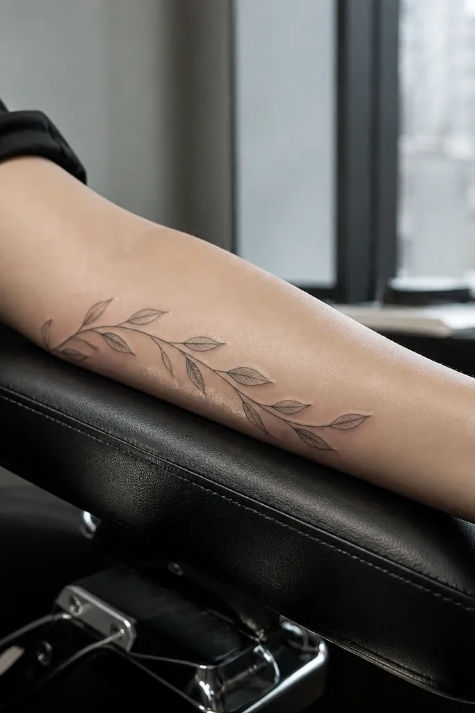
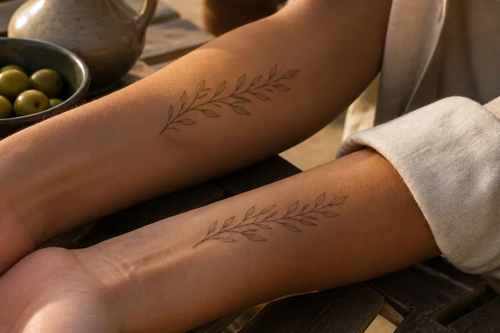
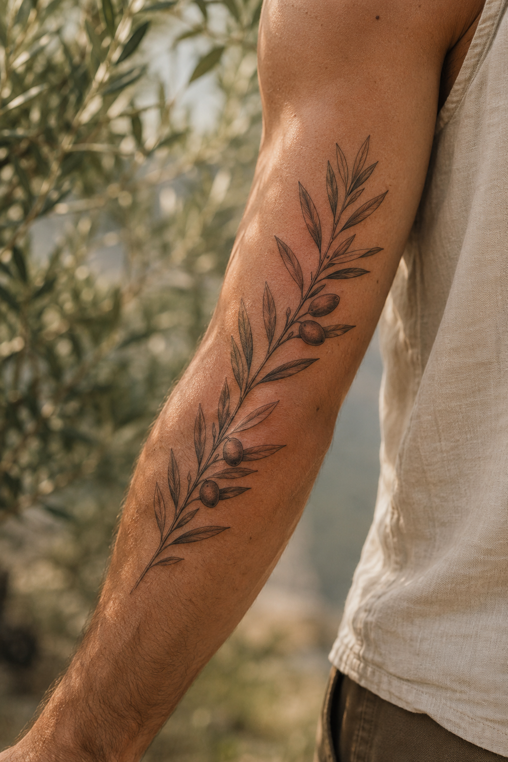
This design is the easiest way to get that airy, natural vibe without turning into a heavy outline. The arc shape follows the forearm curve, so the leaves look like they’re drifting along your skin instead of sitting flat. I like soft gray veins because they read like texture, not like harsh line art. It’s especially pretty for best friend matching because you can keep the same arc direction while changing how many leaves sit on each side. It also photographs well in daylight because the shading catches light without looking dark and muddy.
Start by placing the center of the branch about 2 to 3 inches above the wrist crease on the outer forearm. Then ask your artist to keep the stem line weight thin and tapered, and shade the leaves with a light gray wash so the vein lines stay subtle. Finally, decide leaf count range (like 10 to 14 leaves) and let the layout vary between you and your best friend while keeping the same arc curvature. For aftercare, plan on keeping it out of direct sun for at least 6 weeks, since gray shading fades faster with heavy sun exposure. Expect mild tenderness for 2 to 3 days and keep the moisturized layer thin — thick lotion can blur the fine veins as it heals.
Editor's noteBring a reference photo in daylight and ask for “veins in gray, not black” during the stencil approval.
One warningAvoid thick outlines on the leaves — they age into solid spots and kill the dreamy look.
2. Olive Leaf Cluster at the Collarbone With Air Gaps
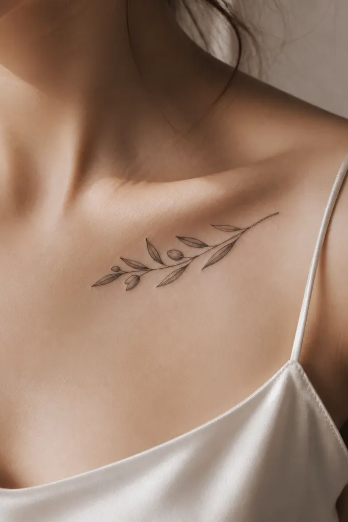
Collarbone placements make olive branches feel delicate, like jewelry that grew on you. The key is air gaps — leaves should not touch each other, or the cluster will look like a single dark mass. I love this version because the stem curve is short and controlled, so it stays crisp even after healing. For best friend matching, you can keep the same leaf style (slightly pointed ovals) while placing the cluster a little more toward the center on one person and closer to the shoulder on the other. It’s a great choice if you want something noticeable in photos but still easy to hide with a higher neckline.
Start by marking where your collarbone dips — place the cluster so the lowest leaf sits just above the top of your bra strap line. Then keep the overall size modest, about 2.5 to 3.5 inches long, and ask for a thin stem with light shading only on the leaf undersides. Finally, vary the leaf count by 1 to 3 leaves between you and your best friend while matching the general direction of the curve. Collarbone skin is sensitive, so expect higher sting than forearm — plan a shorter session if you’re doing multiple tattoos. Aftercare is straightforward: keep it clean, moisturize lightly, and avoid sleeping face-down so the healing skin doesn’t get rubbed.
Ask for one leaf to be slightly rotated compared to the others so it looks organic, not stamped.
Skip a dense leaf fill — packed leaves don’t breathe and they heal darker than the mockup.
3. Olive Branch + Tiny Olive Fruit on One End
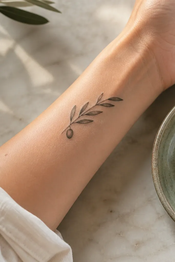
Adding one tiny olive fruit makes the tattoo read instantly as an olive branch, even from a distance in photos. The trick is scale: one fruit, small, with a little highlight or a soft gray shadow — not a dark circle. This works beautifully for best friend matching because you can share the same fruit style while changing whether the fruit sits on the inner or outer side of the branch. It feels symbolic without needing extra text. In real life, the fruit draws the eye first, then your gaze follows the stem and leaf tips like a soft frame.
Start by choosing a placement that gives the branch a clear “start” and “finish,” like the outer upper arm or side of the forearm. Then design the fruit as the focal point: size it about the width of a pencil eraser on the skin, and keep it with minimal shading so it stays crisp. Finally, keep leaf count consistent in range but rotate 2 to 4 leaves differently between you and your best friend. This design ages well because the fruit is small and the leaf veins stay fine if outlines stay thin. Aftercare: treat it the same as other fine-line tattoos, but be extra gentle around the fruit — rubbing is what turns small details into smudges.
Editor's noteIf you want extra realism, ask for a tiny notch line on the fruit where the stem meets the olive.
One warningAvoid multiple fruits — more than one makes the branch look busy and less dreamy.
4. Half-Wreath Olive Branch Around the Wrist
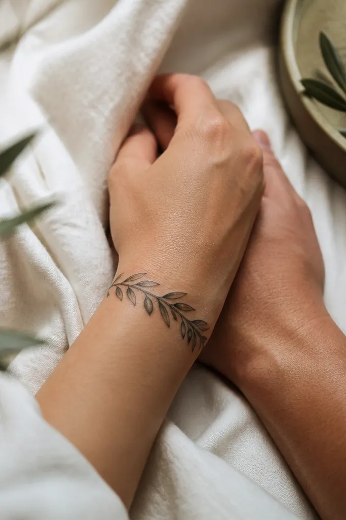
Wrist wreaths look “dreamy” because the tattoo hugs a natural curve and reads like a delicate accessory. This is not a full circle wreath — it’s half, which keeps it airy and prevents it from looking like a sticker. I like this for best friends because you can match the general bracelet shape while letting each person’s leaf tips point slightly differently. In photos, the leaves catch light when you move your wrist, so it looks alive. It’s also a good option if you want something you can show off with bracelets sometimes and hide when you want to keep it private.
Start by placing the ends of the branch about 1 inch above and below the wrist bone so the design stays centered when your hand flexes. Then keep the overall length around 3 to 4 inches and ask for thin outlines with light gray shading under each leaf. Finally, agree on the wreath direction between you and your best friend, but swap which side has the most leaves. Wrist tattoos heal fast but can fade faster because the area gets sun and friction. Aftercare: wear loose sleeves, keep friction low, and moisturize lightly — thick ointment can blur the leaf edges.
Editor's noteChoose a fine-line artist and ask for a stencil mockup on your actual wrist, not just a hand sketch.
One warningSkip heavy black fill — it turns the wreath into a dark ring after a year.
5. Olive Branch Frame for Two Names Hidden in Negative Space
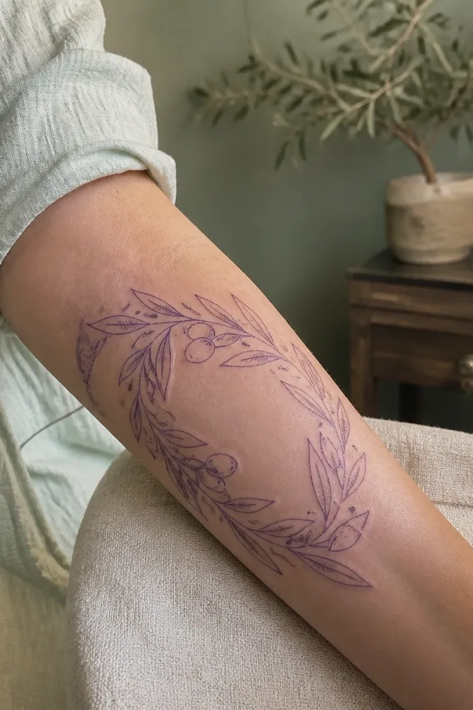
If you want matching that feels personal without adding a big banner, negative space is your friend. This design uses the gaps between leaves to form tiny initials or a date — but it stays airy because the “text” is just skin, not ink. I’ve seen full-color text inside an olive branch look crowded; negative space keeps it dreamy and readable in photos. For best friend matching, you can both keep the same branch frame and each person uses their own initials. It looks symbolic, but it doesn’t scream for attention.
Start by keeping the branch size medium, about 4 to 5 inches, and leave enough open leaf gaps for your initials to sit cleanly. Then ask your artist to plan the stencil so the initials align with leaf spacing, and keep any extra shading very light so the negative space stays crisp. Finally, match the overall branch curve direction between you and your best friend, but change the initials placement slightly so it feels like each tattoo belongs to its wearer. This is a fine-line-friendly option, but it needs a steady hand because negative space can shrink if lines are too thick. Aftercare: treat it like a fine-line tattoo, avoid over-moisturizing, and keep it out of sun since negative space relies on crisp healing.
Use initials with simple shapes (no tiny serifs) so they stay legible as the skin heals.
Avoid tiny script inside the leaf gaps — it disappears into the shading.
6. Double Branch Crossing on the Outer Bicep
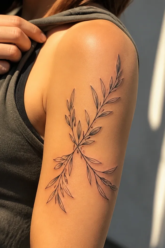
Crossing branches give you movement, and movement reads dreamy in photos. I like this one on the outer bicep because the skin curve lets the branches look layered without needing heavy black shading. The crossing point becomes the focal “meeting” spot for best friend matching — you two can keep the same crossing placement, but each of you can have different leaf density on each branch. That gives you real matching energy without copying each other leaf by leaf. It also looks great with short sleeves because the branches peek out as you move.
Start by mapping the crossing point where your bicep looks fullest, usually around the middle-upper arm. Then keep each branch around 3 to 4 inches long and use thin linework that tapers toward the ends. Finally, decide leaf distribution: ask for one branch to have slightly more leaves on you and the other branch to have slightly more leaves on your best friend, while keeping leaf size consistent. This design holds up well if the crossing point is done with clean line breaks instead of thick ink layering. Aftercare: avoid intense arm workouts for a few days, since stretching can irritate fresh fine lines.
Editor's noteRequest a “clean crossing” where the stems don’t blend into a single thick knot.
One warningAvoid packing leaves at the crossing point — it turns into a dark clump.
7. Olive Branch With Watercolor Leaf Highlights
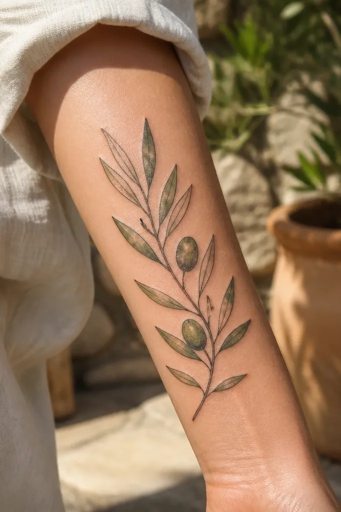
This is the one I recommend when you want “dreamy” to mean soft color, not just gray. The outlines stay fine and crisp, while watercolor highlights in sage green and muted olive add that sun-kissed feel. The reason it looks natural is the color is concentrated on the leaf top edges, like light catching waxy surfaces. For best friend matching, you can keep the same branch layout style while using slightly different green tones — one person leans more sage, the other more olive — and it still reads as a set. Photos look extra pretty in golden hour because the color wash glows.
Start by choosing a placement with enough room for color to breathe, like outer upper arm or side calf. Then ask your artist to keep the color wash light and controlled, with no full-color fill — you want highlights, not solid pigment. Finally, agree on a shared leaf shape and vein style, and let the green tone vary between you two by about one shade family. Expect slightly more irritation than pure black/gray because color layers can be denser, and touch-ups sometimes happen faster on watercolor edges. Aftercare: avoid soaking, use gentle fragrance-free moisturizer, and keep it out of sun hard for 6 to 8 weeks so the wash doesn’t dull.
Bring a color reference that looks like sage green paint, not neon green.
Avoid full-color leaf fills — they heal flat and look less natural than light washes.
8. Olive Branch + Tiny Sparkle Dots Like Sun on Leaves
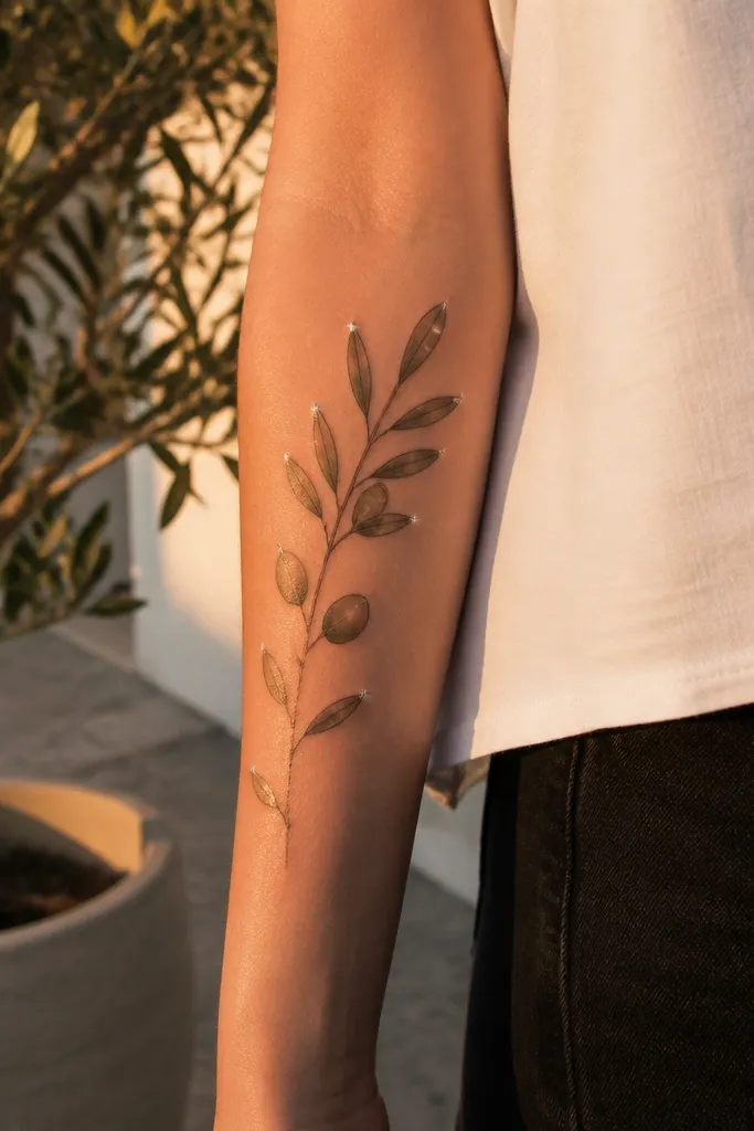
Sparkle dots turn the olive branch into something that looks almost glossy in photos. I’ve done this for friends who wanted symbolism but didn’t want extra icons. The dots should be sparse and placed on leaf tops, not sprinkled everywhere, or it looks like glitter pen. This design still reads natural because the dots mimic light catching waxy leaf surfaces. For best friend matching, you can share the same dot count range and leaf placement style, then vary which leaves get the sparkles between you two.
Start by keeping the main tattoo in fine-line black or soft gray, then add only a few dot highlights per leaf top. Then place the tattoo on the outer forearm or upper arm where movement makes the dots catch light in photos. Finally, decide on a dot pattern rule: for example, every third leaf gets one or two dots. Ask your artist to use a very light touch for the dots so they don’t turn into permanent dark specks. Aftercare: treat like a fine-line tattoo, but be extra careful with picking — dots can lift if the scab is disturbed.
Ask for dot placement guidance based on your most photographed angles (front of forearm, not back).
Avoid too many dots — it shifts from dreamy to childish fast.
9. Olive Branch Down the Side of the Ribs
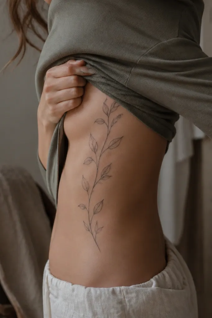
Ribs are where olive branches look the most “grown.” The skin curves and moves with you, so the branch feels like it’s shifting through the air. I like this placement for best friends who want matching that’s visible when you wear fitted tops, but still private. The leaves look natural because the artist can angle each leaf to follow the rib curve. In photos, it looks like a delicate vine without the heavy darkness of full botanical sleeves. It also gives you room to keep the tattoo narrow and elegant.
Start by placing the top of the branch near the side of the upper rib, around where your bra band sits, then let it taper downward about 4 to 6 inches. Then keep the lines thin and the shading light, and ask for vein lines that stop short of the leaf edges so they don’t get too harsh. Finally, match the overall direction between you and your best friend, but vary leaf spacing so it doesn’t look stamped. Pain is real on ribs, so expect stronger stinging and plan a shorter session or breaks. Aftercare: wear breathable clothing, avoid tight waistbands, and keep showers gentle because friction is the enemy for fine lines.
Editor's noteIf you’re nervous about pain, choose a slightly smaller size and skip extra fruit details.
One warningAvoid heavy black shading on ribs — it heals darker and can blur as the skin stretches.
10. Olive Branch With Micro-Dot Background Glow
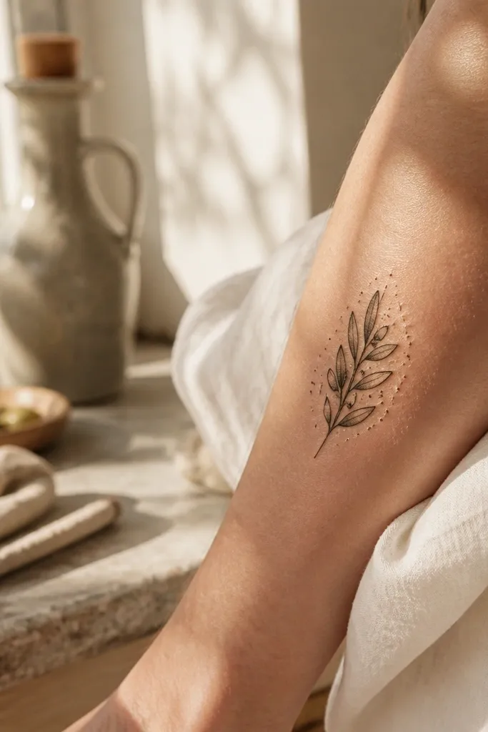
Micro-dot backgrounds create a soft halo effect without turning into a full background blob. It makes the leaves look like they’re lit from within, which is exactly the dreamy look people want for matching tattoos. I recommend this when you want the tattoo to pop in photos even on days you’re not wearing bright outfits. For best friends, you can both do the same dot density and leaf style, then tweak the branch length by about half an inch. That keeps it cohesive while still reading personal in close-ups.
Start by choosing a size that stays delicate, around 3.5 to 5 inches long on the upper arm or outer shoulder. Then ask your artist to add micro dots only behind the branch area, not as a full scatter — keep it concentrated around the leaves. Finally, agree on dot density between you two, but let leaf placement vary so the tattoo doesn’t look identical. Aftercare matters because dot fields can dry out — moisturize lightly and don’t over-wash. Expect a slightly longer healing time than simple fine-line because dot work can feel more “surface” on the skin.
Ask for the dots to be gray, not black, so the background stays soft after it heals.
Avoid full stipple fills — they look muddy once the skin texture changes.
11. Olive Branch Wrapped Like a Ribbon on the Forearm
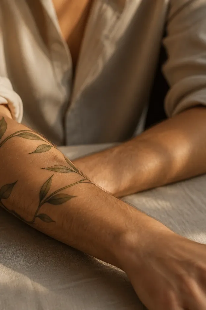
This one looks dreamy because it uses the arm’s three-dimensional shape. The branch wraps, so leaves appear at different angles, and the tattoo looks more dynamic than a flat line drawing. I like it for best friend matching when you both want the design to feel like an “agreement” across two bodies — the same branch style, but different leaf placement. It’s also flattering because the ribbon effect follows your arm muscles, which makes it look good even when you’re not posing perfectly. In photos, it reads clean and intentional from multiple angles.
Start by placing the tattoo so it wraps around the outer forearm at about mid-forearm height, roughly between the tendon line and the inner arm side. Then ask the artist to draw the stem as a single continuous taper and alternate leaf direction left/right so it feels like a twist. Finally, match the wrap height between you and your best friend, but change leaf positions by a few leaves along the length. This design needs a careful stencil to avoid stretching — keep outlines thin. Aftercare: avoid heavy gripping and friction for the first week because the wrapped lines can scuff more easily on the forearm.
Request a wrap test in the mirror before you commit to the stencil placement.
Avoid straight, non-wrapping layouts — they look like a sticker when the arm turns.
12. Olive Branch With Leaf Tips Tucked Under a Thin Line
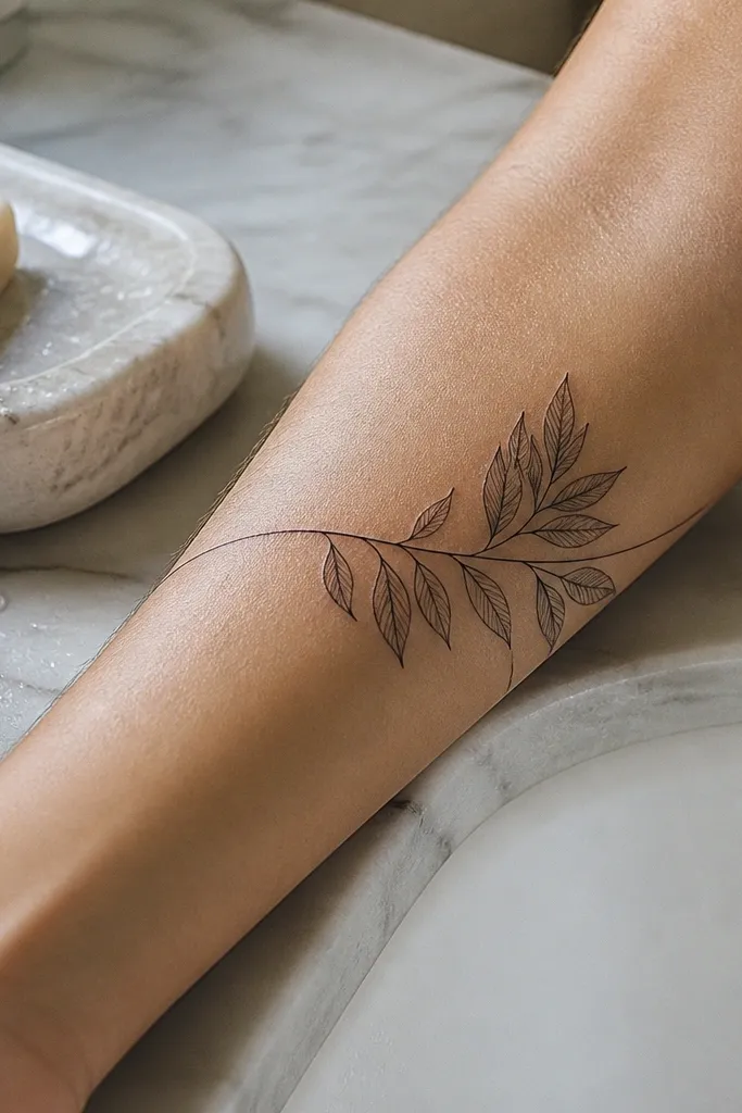
This design gives a dreamy “managed chaos” look. The thin curved line acts like a soft boundary, and the leaves tuck under it so they feel layered without heavy overlap. It’s photogenic because the line catches light and makes the leaves look like they’re peeking out. For best friend matching, you can both keep the same boundary arc while changing which leaf tips tuck under the line. That keeps the set cohesive while still feeling custom. It also looks great on upper arm because the boundary line can follow the muscle curve.
Start by choosing a placement with a smooth curve, like upper arm outer side, and size it around 3.5 to 5 inches. Then ask for a thin boundary line drawn first, and place leaf stems so leaf tips cross underneath it by a small amount. Finally, keep shading light and focus on vein lines in soft gray so the boundary line stays crisp. This ages well because the boundary line is simple and the leaf details are not over-packed. Aftercare: keep sunscreen off until healed, and moisturize lightly — thick lotion can blur the thin boundary line edges.
Editor's noteIf you want it extra dreamy, ask for the boundary line to be slightly offset, not perfectly centered.
One warningAvoid thick boundary lines — they make the tattoo look like a frame sticker.
13. Olive Branch With Minimal Shading and Crisp Fine Veins
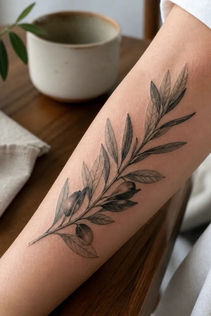
This is the “clean and dreamy” option for people who hate heavy shading. Minimal shading keeps the leaves airy, and crisp fine veins make the tattoo look botanical even without lots of color. I like it for best friend matching because it’s consistent — both tattoos can share the same vein style and leaf shape while varying leaf placement. In photos, the linework stays readable even when the lighting is harsh. It also feels timeless because it doesn’t rely on color that might fade faster.
Start by keeping the tattoo smaller, around 3 to 4 inches, so the fine veins don’t collapse over time. Then ask your artist to use a soft black or gray for veins and keep shading to a light under-tone only. Finally, match the stem taper and leaf outline style between you two, but let one person have slightly more leaves near the center and the other near the end. Expect a quick healing cycle since there’s less pigment mass. Aftercare: don’t pick at any micro scabs on the veins and keep the tattoo clean and lightly moisturized.
Ask for a stencil with vein placement marked — it’s the difference between “pretty” and “actually botanical.”
Avoid mixing thick outlines with minimal shading — it creates contrast that looks harsh after healing.
14. Olive Branch + Soft Leaf Shadowing Like Pencil Sketch
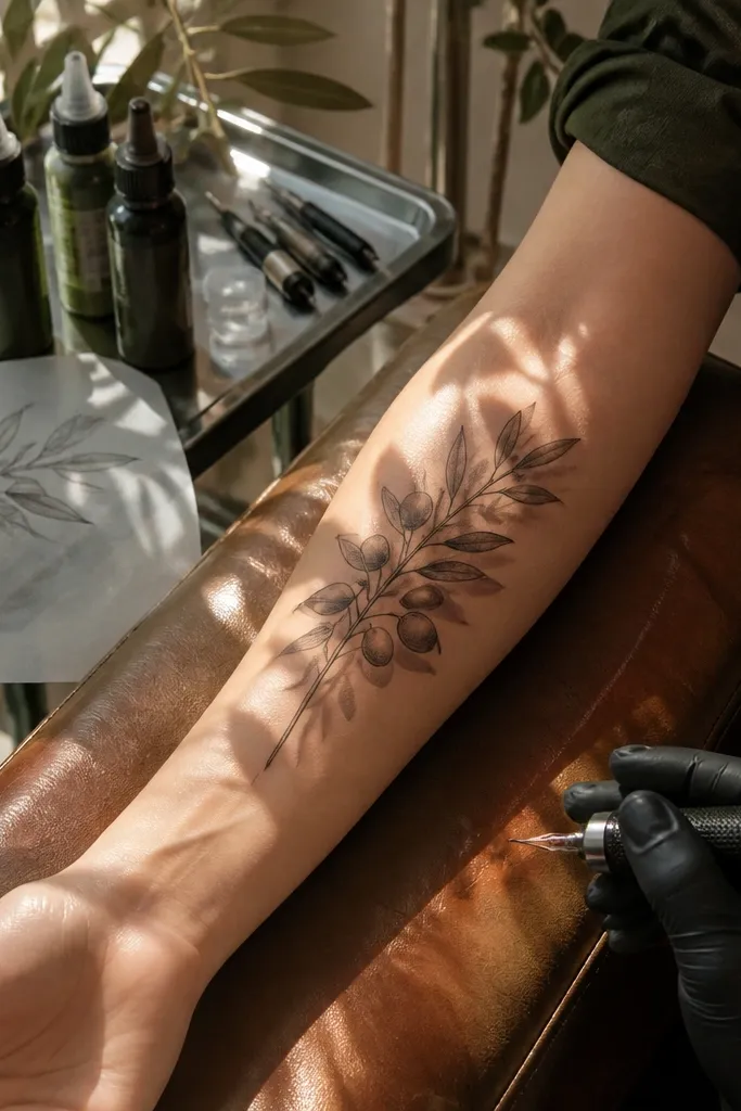
This style gives you that handmade, dreamy feel. Instead of smooth uniform shading, the leaves have soft, pencil-like shadowing that looks textured and natural. I love it because it doesn’t look like a digital vector — it looks like someone drew the branch on your skin. For best friend matching, it’s forgiving: you can keep the same leaf outline and shadow direction while letting the artist freestyle the exact shadow pockets. That makes each tattoo feel like it belongs to the person wearing it. Photos look best when you take them in indirect light so the soft shadows show up.
Start by choosing placement where you can see texture, like the outer forearm or upper arm. Then ask for shading that follows leaf curvature with uneven density — light at the outer edge, slightly heavier under the center vein. Finally, match your stem direction and leaf size range between you and your best friend, but let the shadow pockets vary. This style ages well if the outline stays thin and the shading doesn’t turn into a gray blob. Aftercare: keep it moisturized but not greasy, and avoid scrubbing — pencil-like shading can look patchy if you over-clean during healing.
Schedule your appointment so you can photograph it in 1 week and 6 weeks — you’ll see how the pencil shadows settle.
Avoid super-smooth gradient shading — it can heal too uniform and lose the sketchy dreaminess.
15. Olive Branch Under a Small Crown of Leaves
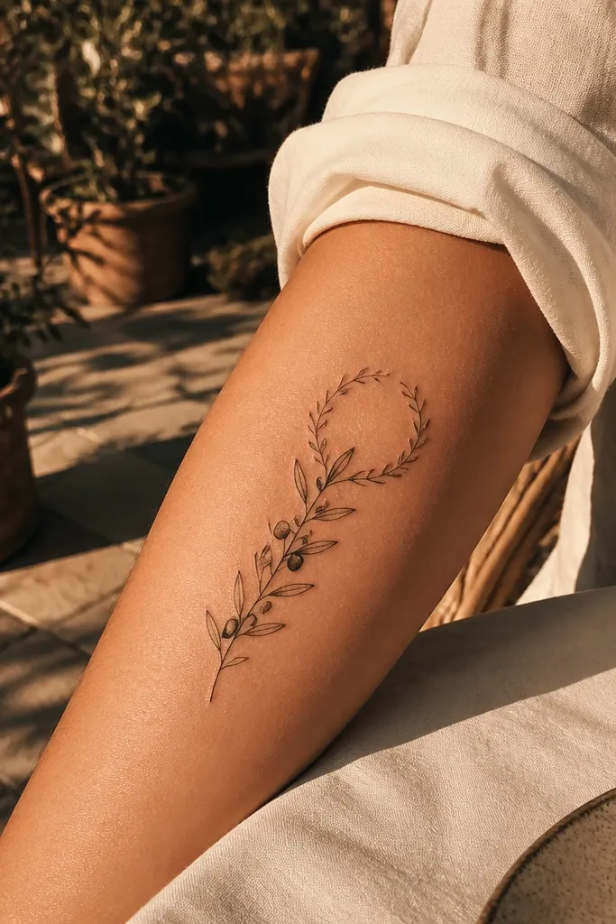
A tiny leaf crown adds a “friendship as protection” vibe without turning into a generic symbol. The crown sits at the top like a delicate arc, and the branch below keeps it flowing. This looks dreamy because the composition has two levels: a light top curve and a longer taper downward. For matching best friend tattoos, you can keep the same crown shape and branch length range, then vary the leaf count in the crown by one or two leaves. In photos, it frames the collarbone or upper chest nicely and looks intentional even when it’s partially covered by clothing.
Start by placing the crown where your collarbone is most defined, then let the branch drop about 3 to 5 inches below it. Then keep both the crown leaves and the branch leaves in the same style: thin outlines and light gray shading under the center vein. Finally, match the crown arc between you two, but vary crown leaf spacing so it doesn’t look duplicated. Pain can be moderate on upper chest depending on exact placement, so plan a comfortable session length. Aftercare: avoid tight bras or high-friction collars for a few days so the fine lines don’t get irritated.
Editor's noteAsk for crown leaves to overlap slightly, but not touch — overlap reads layered, touching reads crowded.
One warningAvoid adding a full crown ring — it becomes too heavy and loses the airy olive look.



