
1. Broken Chain Olive Branch Over the Heart
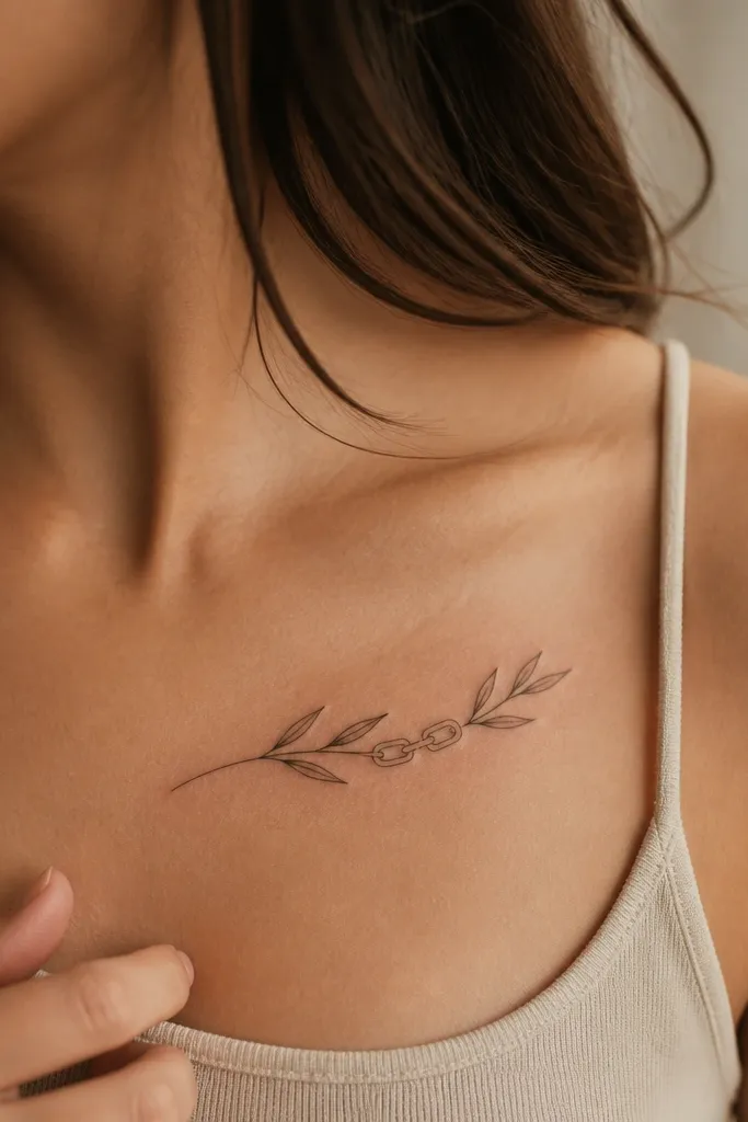
This one hits peace with proof. The broken chain behind the branch tells people you’re not just hoping for calm — you’re out of something. I’ve seen this placement look powerful because the branch naturally points toward the center of the body, where the eye lands first. The leaves stay readable when the chain is drawn with thicker link shapes and fewer gaps, so it doesn’t dissolve into gray. It suits people who want the tattoo to feel personal and grounded, not decorative.
Editor's noteIf you want it to age well, get the chain drawn slightly thicker than you think you need — it holds the contrast longer.
Start by placing the branch so its highest leaf cluster sits about two to three finger widths above the sternum line. Then draw the chain with chunky links in the background — keep the link spacing wide enough to let the olive branch stand out. Finally, use bold outlines on the leaves and add only light olive shading on the leaf backs, leaving the front edges mostly black for contrast. Pain-wise, expect more sensitivity over the chest and near the collarbone; ask your artist to pace the session and take short breaks. For aftercare, keep it out of direct sun for at least a month because the muted green tones fade faster than the black linework.
One warningAvoid thin chain links and tiny leaf veins; both turn into gray smudges as skin texture changes.
2. Single Olive Fruit Peace Drop Banner
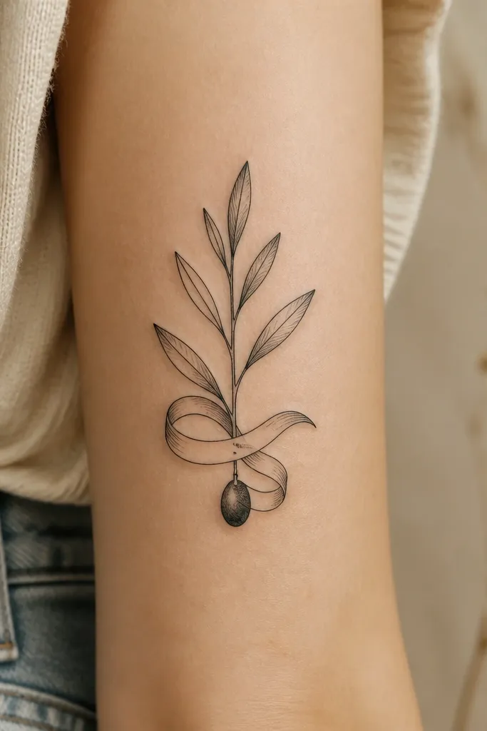
This is peace told in one clear moment. One fruit reads like a “result” instead of a “symbol,” and the downward drop makes the tattoo feel emotional and specific. I like it for people who want a statement without a ton of extra objects — the branch does the work. The banner tail anchors the composition so it doesn’t look like a floating plant. On camera, the fruit catches light because the shading stays close to the black outline.
Start by picking a vertical or slightly diagonal placement on the outer forearm, sizing the branch so it spans roughly two-thirds of your forearm length. Then keep the leaf count low — think 5 to 7 leaf shapes total — and make each leaf larger than you’d expect for a “bold” look. Finally, add one olive fruit with a dark seed detail and a small highlight spot, then place the banner under the fruit so your eye reads stem to fruit to anchor. Expect moderate pain on the forearm since it’s not bony, but the outer edge can sting; keep the session moving. Aftercare is standard, but keep the tattoo moisturized with a thin layer so the banner area doesn’t dry out and crack.
Ask your artist to design the banner with thick edges so it stays crisp when you flex your wrist.
Skip multiple fruits and tiny banner text; too much detail makes it look busy and dull over time.
3. Wreath Olive Branch With Laurel Crown Symmetry
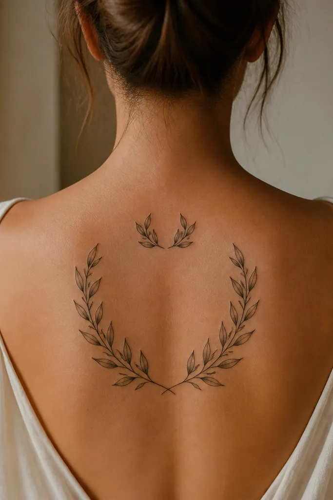
This design looks like a seal. Symmetry makes it feel ceremonial, and bold linework gives you that “statement” presence even when it’s not huge. The laurel-crown curve adds respect and achievement energy, so the peace message feels earned instead of soft. I like it for people who want their tattoo to look like it belongs on a poster — clean, graphic, and readable. It also photographs well because the wreath frames the center and keeps a strong shape from every angle.
Editor's noteUse a thicker outline on the wreath outer edge so the silhouette stays crisp against clothing friction.
Start by choosing an upper arm or shoulder placement where you can keep the wreath centered — aim for the widest part of your deltoid for best proportions. Then map the wreath with a pencil sketch grid or measurements: half the leaves on one side, mirrored on the other. Finally, keep shading minimal: muted olive on leaf backs, black outlines everywhere else, and no heavy gradients. Pain is moderate on the outer shoulder and can spike near the armpit edge, so plan the session for a time you can handle longer sessions. For aging, avoid over-coloring; dense green saturates and blurs faster than linework.
One warningDon’t add lots of extra filler flowers; they fight the symmetry and weaken the wreath’s read.
4. Olive Branch and Dove Negative Space
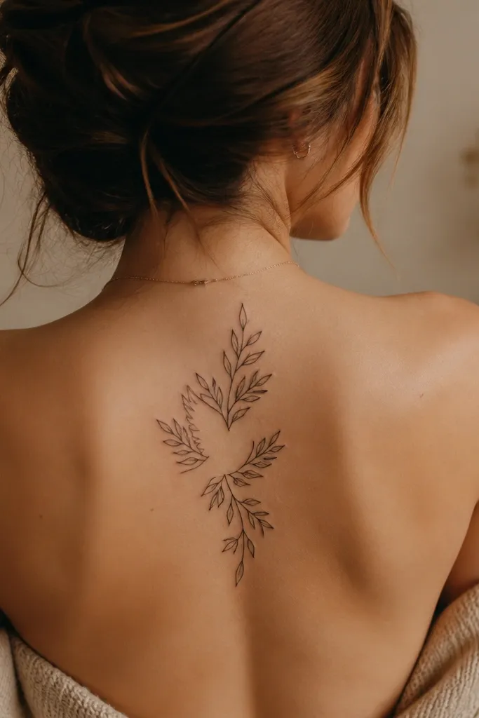
This one reads instantly because the dove isn’t buried in details. Negative space keeps the bird clean and graphic, which makes it feel modern instead of old-school. The olive branch gives the peace message, and the dove gives the “yes, I mean peace” clarity. I’ve found this design works great for people who want a tattoo that still looks good when it’s slightly faded, because the dove silhouette is the core. It also looks great on skin that has natural texture — the unshaded areas stay crisp.
Start by placing it on the upper arm, bicep, or outer forearm where the diagonal stem can hold motion. Then design the dove first and let the leaves wrap around it like a frame, leaving intentional empty spaces inside the wings. Finally, keep leaf veins minimal — bold outlines only — and add light olive shading on every other leaf so the pattern feels rhythmic. Expect moderate pain depending on placement; bicep is usually more tolerable than inner arm. Aftercare matters for negative-space tattoos because scabbing can fill in thin lines — follow your artist’s instructions closely and don’t pick.
Ask for a test stencil on the spot you want; negative space needs accurate placement to stay readable.
Avoid over-shading the dove area; if you fill it with green, the negative-space effect disappears.
5. Olive Branch With Broken Spear Cross

This design feels like a ceasefire you can see. The broken spear brings the “end of conflict” message, while the olive branch turns it into peace. I like the cross-over layout because it gives you a strong center mass, which makes the tattoo feel like a statement even at medium size. The jagged break lines add drama without crowding the composition. For photos, the spear/branch overlap creates depth, especially when the leaves have clean outlines and light shading.
Start with a centered placement on the forearm, upper arm, or calf where the cross shape can sit square to your body line. Then draw the spear first with thicker shaft lines and a clear break point, so the viewer knows what’s broken. Finally, let the branch arc across the spear and place fruits near the outer leaf clusters, keeping leaf count under control for readability. Pain is moderate on outer forearm and higher on calf; plan a session length you can manage. Aftercare: protect from friction, especially if it rubs against jeans or belts, because bold linework can still get scuffed.
Keep the spear break lines sharp and black — gray breaks fade faster than you think.
Don’t add a bunch of battlefield icons; the spear already carries the conflict story.
6. Olive Branch Handshake Centerpiece
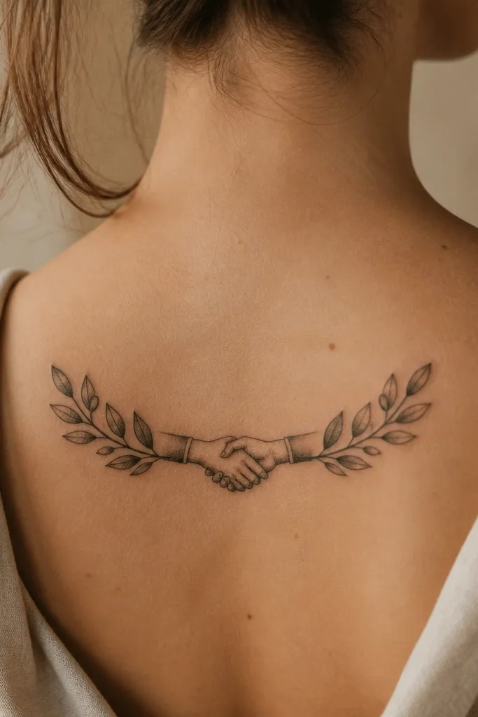
This is peace with agreements attached. A handshake makes the message specific — it’s not just “peace,” it’s “we made terms.” The olive branch wraps the hands so the symbol feels protective and official. I’ve done versions of this for people who want a clean, meaningful tattoo for work milestones, family reconciliation, or moving forward after a hard year. It also stays photogenic because the central handshake gives the eye a clear anchor point.
Editor's noteIf you want it to look bold, ask for thicker outlines on the handshake edges, not just the leaves.
Start by placing it on the upper arm where you can keep the handshake centered and not squeezed by the elbow curve. Then simplify the handshake: fewer finger segments, strong outlines, and a clear thumb shape. Finally, wrap the branch around the handshake with alternating leaf pairs and keep fruits small — two to three fruits max. Pain is usually moderate on upper arm; expect more sensitivity near the bicep tendon area. Aftercare is straightforward, but keep the handshake area moisturized because it gets more movement than a flat patch of skin.
One warningAvoid highly detailed finger shading; it disappears first and leaves the handshake looking hollow.
7. Olive Branch and Crown of Thorns Contrast
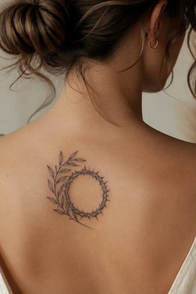
This one is for people who want peace that comes after pain. The crown of thorns adds the history of suffering, and the olive branch brings healing and forgiveness. The contrast between sharp thorn silhouettes and soft leaf shapes makes the tattoo look dramatic and statement-level. I like the side-growth layout because it gives motion — the branch feels like it’s pushing forward. It photographs well because the thorns create a spiky outline that frames the calmer leaves.
Start by placing it on the upper arm, outer thigh, or calf where you can fit the crown arc without compressing it. Then draw the thorns with bold black lines and limited shading, because fine thorn details blur with time. Finally, add olive leaves with thick outlines and muted green shading only on leaf backs, plus one or two olive fruits to keep the focal point. Pain is higher on outer thigh and calf due to muscle movement; plan a shorter session if you’re sensitive. Aftercare: be strict about washing and drying — thorn-heavy areas can trap moisture if you don’t keep them clean.
Ask for fewer thorn points than you think — a clean spiky crown reads better than a cluttered one.
Skip full green shading on thorns; it kills contrast and makes everything look the same age.
8. Olive Branch With Eye of Peace Symbol
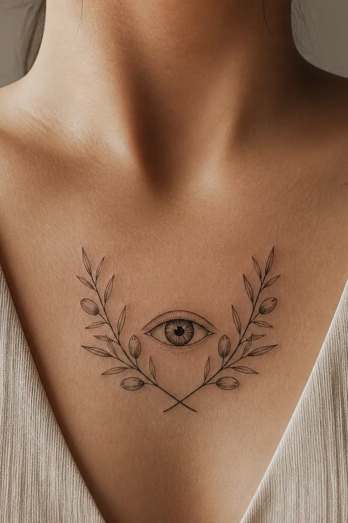
This is peace plus awareness. The eye symbol tells people you’re watching, learning, and choosing calm with intention. Olive leaves around the eye make it feel protective rather than creepy, especially when the eye is stylized and symmetrical. I like this design for people who want their tattoo to feel like a personal rule or vow — not a random aesthetic. It looks bold because the eye is naturally high-contrast, and the branch gives it a frame.
Editor's noteRequest a stencil that matches your forearm angle so the eye doesn’t end up tilted when your arm bends.
Start by placing it on the forearm where the eye can sit at a comfortable viewing angle when your arm rests at your side. Then design the eye first, with thick black outlines and a small highlight dot so it stays readable. Finally, wrap the olive branch around the eye with 6 to 8 leaves total and keep shading restrained to muted green on leaf backs. Pain is usually moderate on forearm; near the wrist it spikes because skin is thinner. Aftercare: keep the tattoo protected from heavy sun and friction; the eye outline is the first thing people notice if it fades.
One warningAvoid tiny pupils or overly detailed iris patterns; they turn into a gray haze.
9. Olive Branch With Feathered Ink-Style Motion
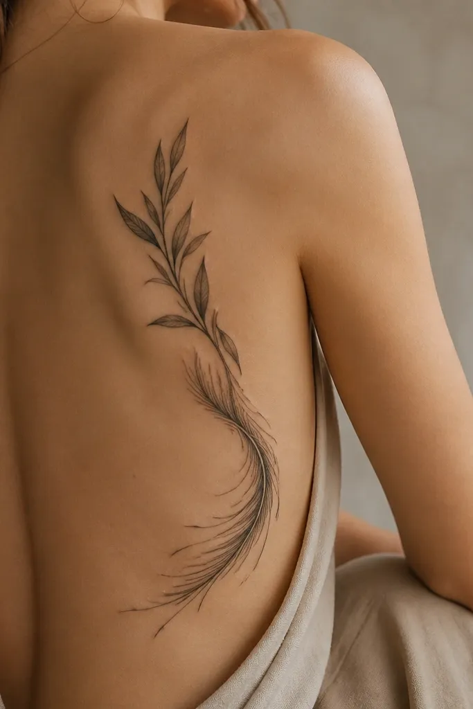
This design feels like peace moving through you. The feather-like motion lines keep the tattoo from looking static, and they make the branch look alive. I’ve done this style for people who want something less literal but still unmistakably an olive branch. The meaning reads through the symbolism — olive for peace, motion for progress — and it looks good even when it’s slightly faded because the black outline still carries the form. It’s also very photogenic because the edges catch light differently than flat solid fills.
Start by placing it on a place that moves a lot, like forearm or upper arm, where the motion lines look natural. Then keep the olive leaf shapes bold and identifiable, but taper the outer edges with feather-like ink strokes. Finally, use only light muted olive washes behind select leaves, and rely on black outlines for readability. Pain is moderate; the feather-like areas can feel more like repeated passes. Aftercare: keep the surface moisturized and avoid soaking; washed-color areas can dry tighter and feel itchy longer.
Ask your artist to limit wash to 20-30% of the leaf area so it ages like linework, not like watercolor only.
Don’t go heavy on gradients; smooth blends blur quickly on skin texture.
10. Olive Branch and Candle Flame Peace
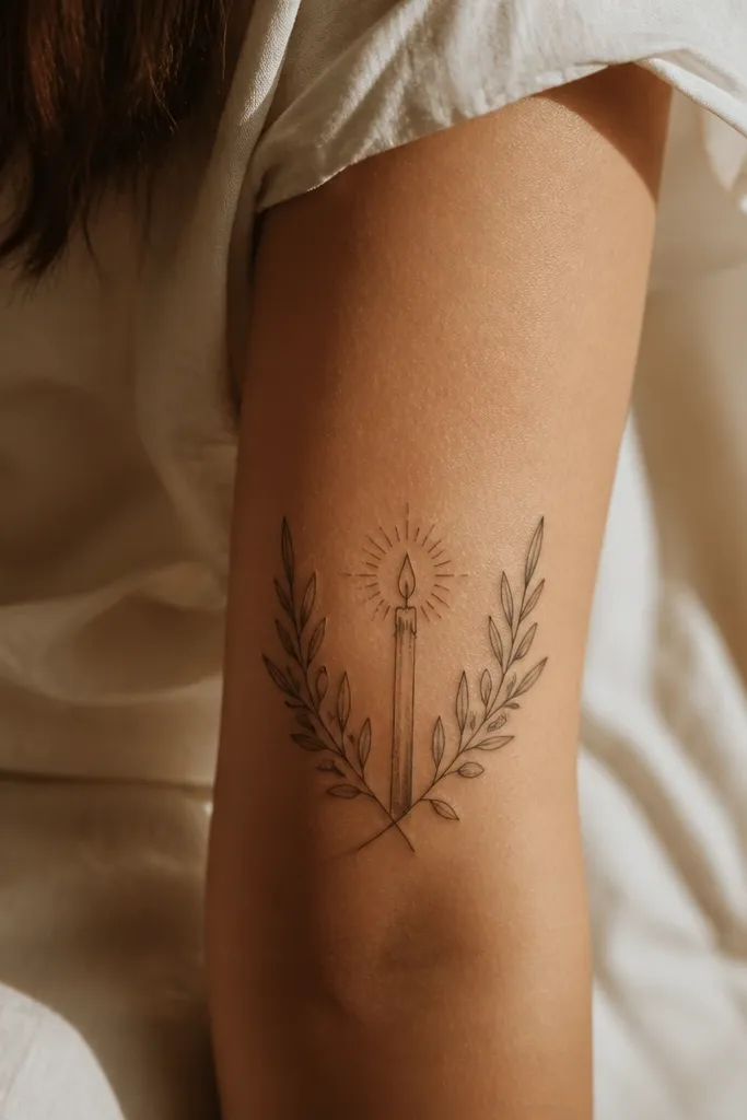
This is peace that stays lit. A candle flame gives you calm with resilience — it’s not just an idea, it’s a practice you keep returning to. The olive branch wraps the candle so the peace message feels like protection. I like it for people who want something more “home” and grounded than a dove or ribbon. It also photographs well because the flame silhouette sits higher and creates a vertical focal point.
Start by placing it on the upper arm, calf, or side of the ribcage where you can keep the candle vertical. Then draw the candle with thick lines and minimal shading so it stays readable under different lighting. Finally, wrap the branch around the candle with alternating leaves and place one fruit near the flame level. Pain is moderate to higher on ribs; wear loose clothing after. Aftercare: protect the colored flame area from sun, since color fades faster than black.
Keep the flame outline thick; thin flame lines disappear and the whole candle looks unfinished.
Avoid tiny candle wicks and micro-shading — they don’t survive time well.
11. Olive Branch With Compass Peace Direction
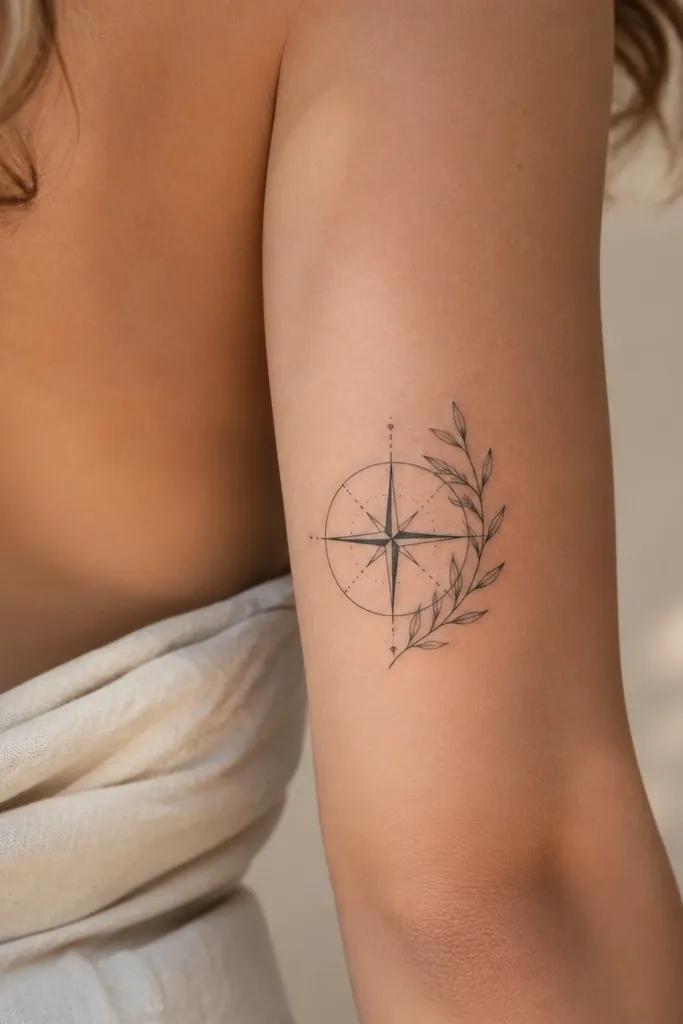
This tattoo says you choose peace with direction. A compass adds “where I go matters,” and the olive branch tells people you’re traveling toward calm and clarity. I like the circle composition because it reads like a badge, and badges always look strong on skin. It’s a good option if you’ve been through a messy chapter and want your tattoo to feel like a map, not just a symbol. The olive leaves around the compass also make the design look fuller without adding clutter.
Start by placing it on the upper arm, shoulder, or thigh where the circle can sit flat without stretching too much. Then draw the compass first and keep it bold — thick outer ring and simple needle shapes. Finally, wrap the olive branch around the compass rim with 10 to 12 leaves total, alternating left and right so it doesn’t look like a repeating border pattern. Pain is usually moderate on shoulder and thigh. Aftercare: keep it moisturized and avoid tight straps or waistbands that rub the circle edges.
Ask for the compass ring thickness to match the leaf outline thickness so the whole tattoo feels one weight.
Skip tiny compass markings; they blur and make the center look dirty.
12. Olive Branch and Hands Cradling a Heart
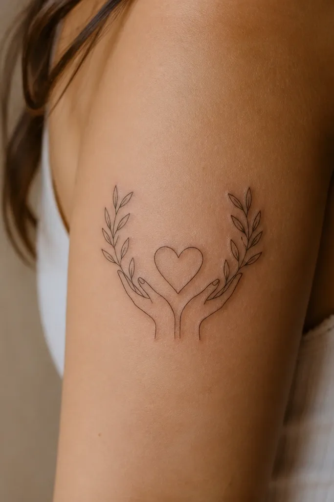
This is peace you protect. The hands make it feel human and caring, and the olive branch adds the calm, forgiving message. I’ve seen this design work when someone wants to honor a relationship, family bond, or self-respect after a tough stretch. The heart stays small but high-contrast, so it reads even when the hands and leaves are detailed. It looks especially good on upper arm because the hands can be shaped to follow your arm curve.
Start by placing it on upper arm or outer shoulder so the hands can open naturally without fighting the elbow bend. Then keep the heart compact and outlined thick, so it remains the focal point. Finally, arc the olive branch behind the heart with fewer leaves than you’d think — 6 to 9 leaves — and shade only the leaf backs with muted olive. Pain is moderate on outer shoulder and higher near the armpit line; plan your session accordingly. Aftercare: avoid heavy sweating for a few days since hand areas can stay damp and irritate.
Choose a heart outline that matches your lineweight — if the heart is thinner, it looks like a sticker on top.
Avoid realistic hand shading; it fades faster than the bold outlines you want.
13. Olive Branch With Minimalist Date Stamp
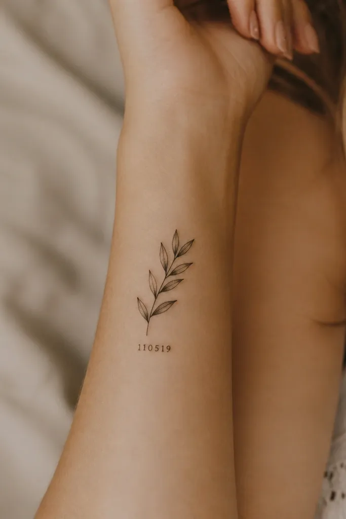
This one turns peace into a personal marker. The date stamp makes the message specific without needing a long quote, and the olive branch tells people it’s peace you chose or peace you survived. I like it for forearms because the rectangular stamp gives a steady shape that stays readable as your arm moves. The olive leaves add softness around the hard edges, which makes the tattoo look balanced. It also photographs well because the stamp is high contrast and easy to read.
Editor's noteAsk for the date to be slightly arched to match your forearm line so it doesn’t look crooked over time.
Start by placing it on the inner or outer forearm where the rectangle can sit straight when your wrist is relaxed. Then design the stamp with thick borders — don’t go thin — and keep the numerals bold and clean. Finally, wrap the olive branch around it with a tapered stem and leaf clusters that don’t cover the stamp corners. Pain is moderate; inner forearm can sting more. Aftercare: keep the tattoo clean and moisturized, and avoid rubbing from bracelets or watch straps during healing.
One warningAvoid micro-text or script fonts; if the numbers aren’t thick, they blur into a gray block.
14. Olive Branch and Serpent Forgiveness Loop
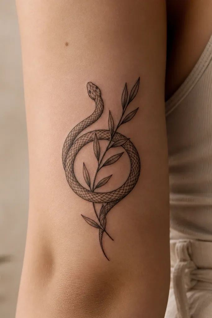
This tattoo reads like forgiveness with boundaries. The serpent can mean transformation or healing after betrayal, and the olive branch brings the peace outcome. I like this design because it’s not the usual dove or ribbon — it feels thoughtful and strong. The loop shape creates a “statement badge” look, so it works even at a medium size. When it’s done with thick outlines and simple scale shapes, it stays readable and doesn’t turn into a generic snake blob.
Start by placing it on the upper arm, forearm, or calf where a loop can fit without stretching too tight. Then draw the serpent as bold ribbon-like bands with simple scale bumps, not detailed scales. Finally, place the olive branch across the loop with thick leaf outlines and muted olive shading on leaf backs, keeping the leaves fewer than the serpent bands. Pain is moderate to higher on calf due to muscle movement. Aftercare: keep it moisturized and avoid tight clothing rubbing the serpent outline edges.
Request a clean negative-space center for the symbol so the design stays legible when it ages.
Avoid heavy green on the serpent; color there makes the whole piece look muddy.
15. Olive Branch and Ribbon With One Word Only
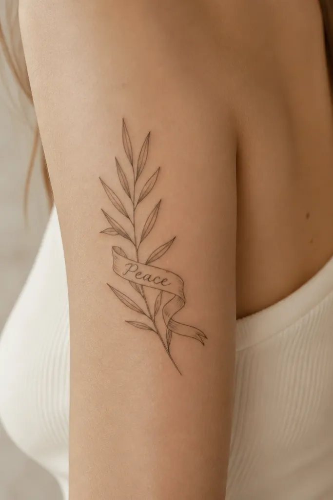
This is the cleanest way to make the tattoo feel like a statement without cramming it full. One word keeps it readable, and the olive branch gives it emotional context. I’ve done this for clients who wanted a vow like “PEACE” or “STAY” and didn’t want the extra clutter of long sentences. The ribbon shape adds movement and makes the branch look like it’s growing from something solid. For photos, bold uppercase letters on a thick ribbon edge stay crisp longer than script.
Editor's noteIf you want maximum impact, make the ribbon border the same thickness as the branch outline.
Start by choosing a forearm or upper arm placement where you can keep the ribbon straight — the wrist flex can warp thin banner text. Then pick one word in bold uppercase and design the letterforms thick enough to survive healing. Finally, build the branch with alternating leaf pairs and a strong stem line, and keep shading limited to muted olive on leaf backs only. Pain is moderate on forearm and can be higher near the wrist bone. Aftercare: protect the ribbon letters from sun and friction; lettering fades first.
One warningAvoid long phrases; they shrink visually and turn into a blur.



