
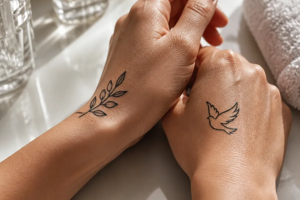
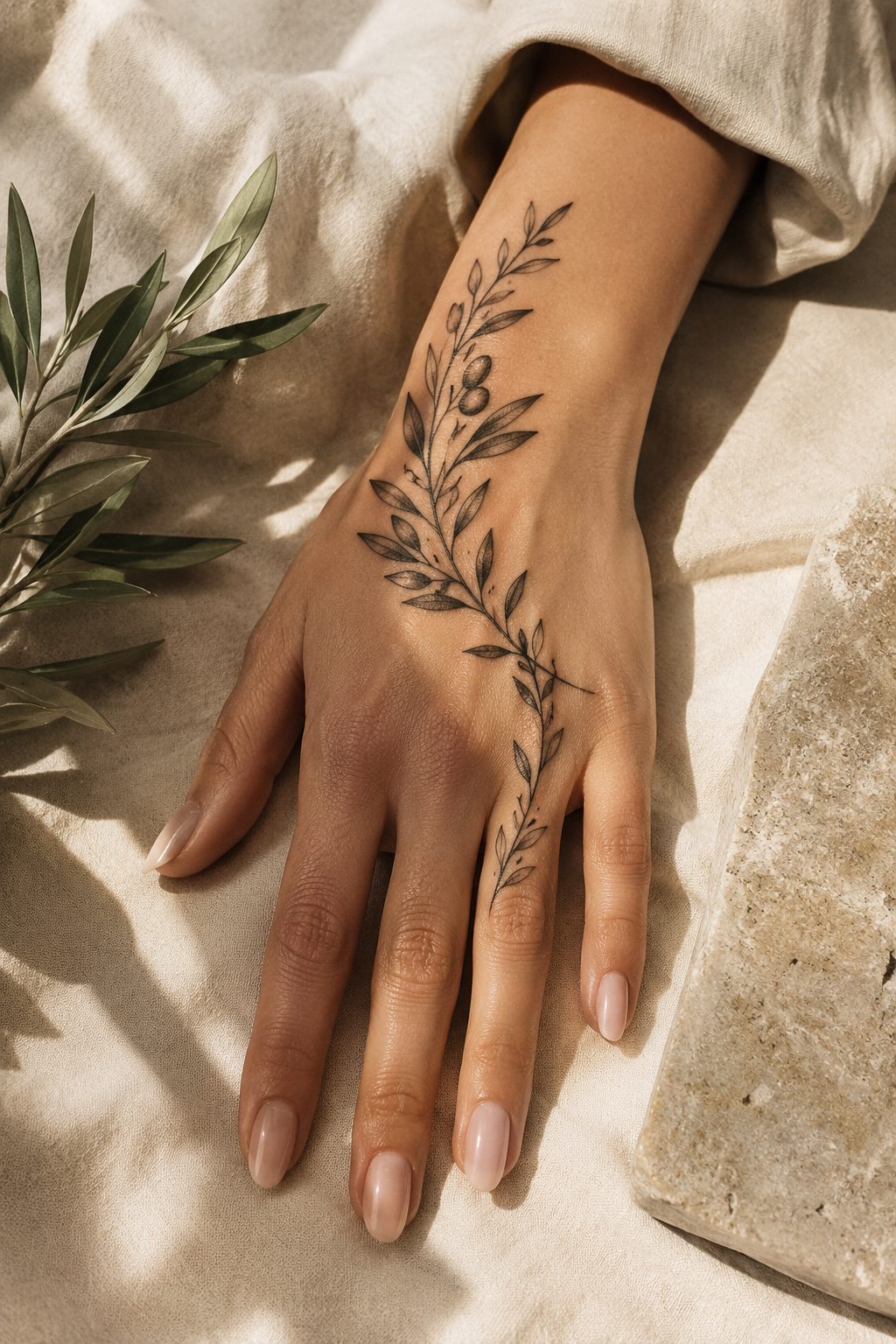
1. Side-of-Hand Olive Branch With Thin Stem Sweep
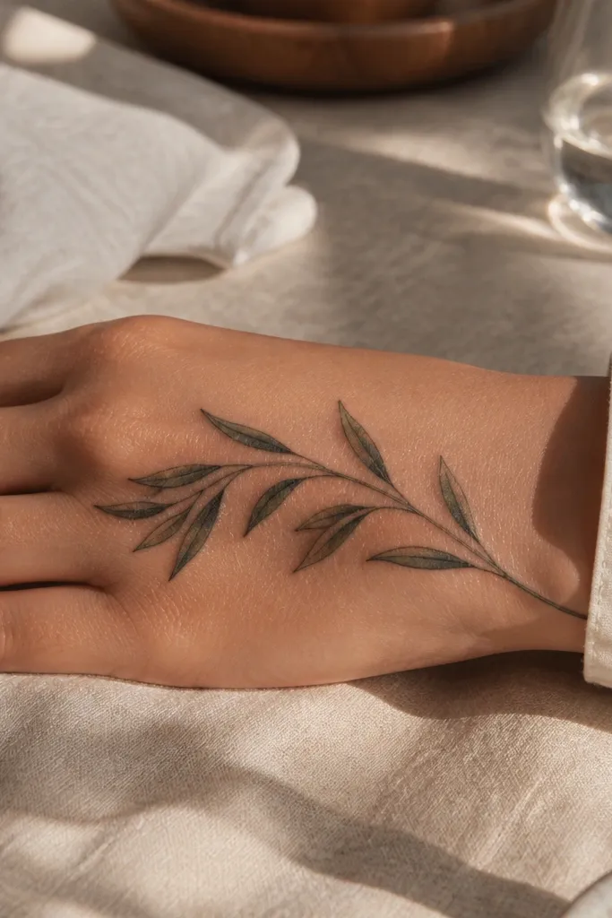
This design is what I recommend when someone wants an olive branch that reads instantly in photos. The thin stem sweep creates a single graceful motion, and the leaf spacing keeps the tattoo from looking like a dark sticker. I like how it frames the hand without covering the whole surface, so it still looks neat when your fingers spread. The black linework stays crisp against skin because the leaves are separated enough to catch light and reduce blur. It suits people who want “symbolic but stylish” rather than a busy scene.
Start by placing the stem on the outer edge of the hand, roughly halfway between the pinky knuckle and the wrist crease. Keep the overall size around 2.5 to 3.5 inches long so the leaves don’t get crushed by hand flex. Then ask the artist for fine outlines only, with light gray wash just at the base of a few leaves — not every leaf — so the texture doesn’t turn into a gray haze later. Finally, plan for a slightly longer healing time because the side of the hand rubs on sleeves; moisturize with a thin layer and avoid wristbands that press into it.
Editor's noteAsk for “leaf spacing first” on the stencil — you want visible skin between leaves.
One warningAvoid thick shading on every leaf; it turns into a dark band as the hand moves.
2. Olive Branch Thumb Web Mini Laurel
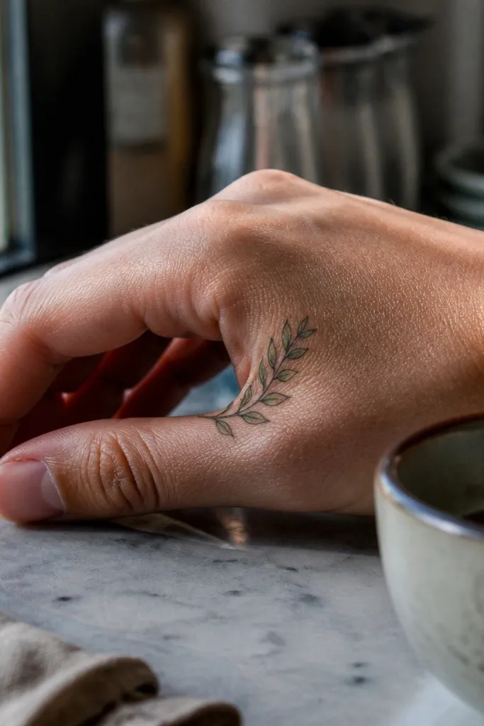
This placement is sneaky-good because the thumb webbing shows off the tattoo even in everyday photos. A mini laurel-style olive branch looks intentional, not random, because it fits the natural shape of that skin pocket. I’ve seen this design look especially clean after healing since it doesn’t get as much constant friction as the top of the fingers. The leaves also read like jewelry, which is why it looks stylish with rings and nail polish. If you like the idea of “Olive Branch Tattoo vs dove” but want something less face-like and more ornamental, this is a strong pick.
Start by keeping the design tiny: about 1.25 to 2 inches across at most. Then map it so the stem sits between the thumb and index finger crease, with the leaves pointing toward the thumb side for a flattering angle. Choose fine linework with one or two micro dots in the leaf centers if you want extra texture without heavy gray. Finally, expect moderate tenderness during healing since that area moves a lot; moisturize consistently and avoid stretching the thumb wide for the first week.
Editor's noteBring a reference photo of your thumb angle — the stencil should match how your hand naturally opens.
One warningDon’t place it too close to the thumb base where the skin folds — it blurs faster there.
3. Top-of-Hand Olive Branch Above the Knuckle Line
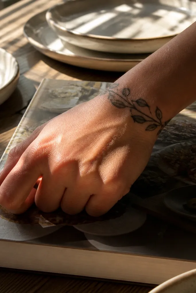
This is the olive branch look that makes people stop and stare because it looks like a bracelet stretched over your knuckles. The top-of-hand placement shows movement in a pretty way, especially when you gesture while talking. I like the alternating leaves because it creates a balanced pattern that still reads when your hand is partially closed. It’s symbolic without turning into a full sleeve, and it works well with minimalist style jewelry. If you’ve seen dove tattoos on hands that look crowded, this gives you the same “peace” vibe with cleaner structure.
Start by placing it across the top of the hand, just above the knuckle line, not directly over the biggest joint bumps. Keep it roughly 3 to 4 inches wide depending on your hand size. Then use thin outlines and add dotwork only along one side of each leaf to create depth without smudging. Finally, protect it during healing from friction — wear a loose glove or keep it covered when you’re doing dishes or cleaning.
Editor's noteAsk for one consistent leaf size and let the stems do the variation — it ages more evenly.
One warningAvoid putting it directly on top of the knuckle where the skin creases hard.
4. Blackwork Olive Branch Cuff With Negative Space Leaves
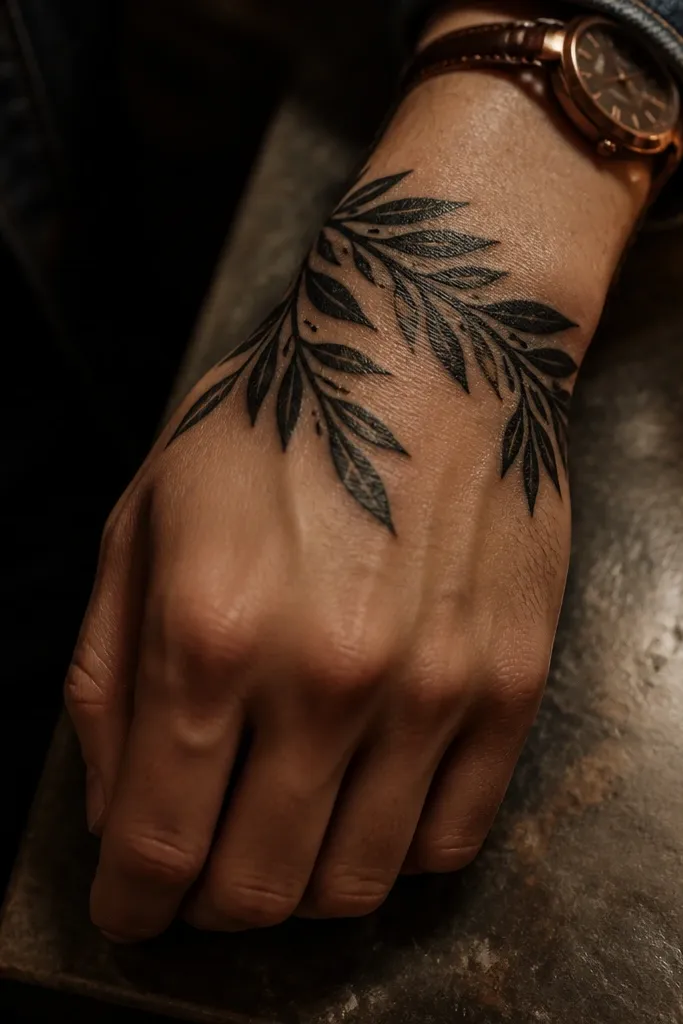
A cuff version is where the olive branch starts to look like fashion rather than a single motif. The negative space leaves keep it from turning into a heavy black mass, and that makes it photo-ready even in low light. I’ve had this style look sharp on clients who wear watches because it sits in the same visual zone as accessories. It also hides small aging changes better because cuff tattoos have more surface area and consistent shape. If you’re comparing Olive Branch Tattoo vs dove, this cuff gives you the symbolic peace feeling without needing a detailed face or wings.
Start by sketching the cuff so it wraps about 1.5 to 2 inches around the wrist, with a small branch extension onto the hand. Then use bold black stem segments but keep leaf fill minimal — outline plus a few internal dots is enough. Finally, add light gray on the underside of two or three leaves only, so the tattoo has dimension without turning gray everywhere. During aftercare, keep the cuff moisturized and avoid tight watch straps pressing into the healing skin.
Editor's noteRequest crisp leaf outlines — clean edges are what keep blackwork from looking like a patch.
One warningAvoid filling every leaf solid black; it fades into one dark blur.
5. Fine Dotwork Olive Branch With Micro Highlights
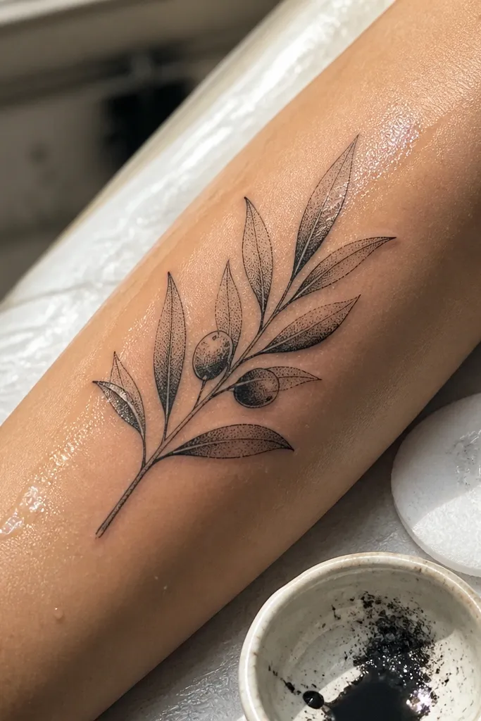
Dotwork makes olive branches look airy and expensive. When your leaves are built from dots, you get a soft gradient that still stays readable as the skin texture changes. I like this design for people who want something feminine but not overly ornate. It also photographs well because the dot pattern catches light differently than solid ink. This is the olive branch option I reach for when someone wants “stylish detail” without adding a dove’s tiny facial features.
Start with a diagonal placement across the back of the hand, from near the base of the index finger toward the outer wrist. Keep it around 2.5 to 3 inches so the dotwork doesn’t get swallowed by hand movement. Then ask for dot sizes to vary slightly — smaller dots on leaf tips, slightly larger dots closer to the stem — and keep the stem line fine. Finally, plan for a longer healing cycle because dotwork can feel dry; use a fragrance-free moisturizer and don’t scrub the scabs.
Tell your artist you want “dots, not smudges” — that means crisp dot separation on the stencil.
Avoid heavy gray wash under the dots; it can merge into a single gray patch.
6. Olive Branch and Line-Drawn Seed Pods on the Side of the Hand
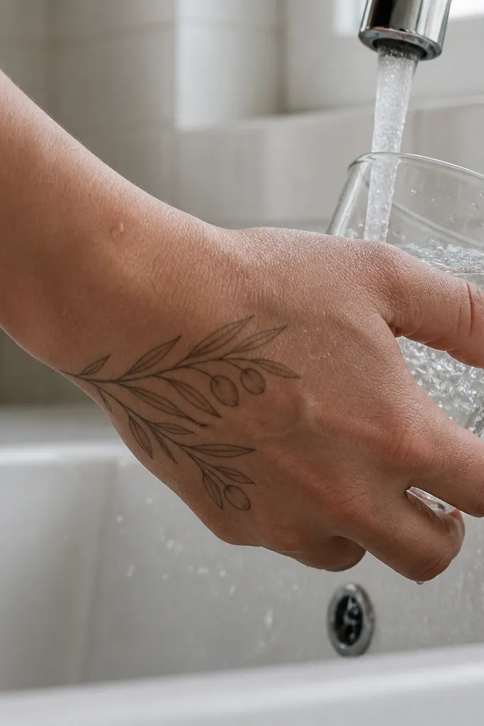
Seed pods add visual storytelling to an olive branch without making it look like a botanical illustration. The line-drawn pods give you extra interest in the negative space, so it doesn’t feel like “just leaves.” I’ve found this style works for people who want a symbol that feels grown-up, not cutesy. The gray pod shading makes the whole piece look dimensional while still staying light enough for hand skin. It’s also a good alternative to dove designs that can look too literal if you don’t want a full bird.
Start by placing the main stem on the outer side of the hand, then hang one or two pods beneath the leaf line like little punctuation marks. Keep the design 2.5 to 3.5 inches, with pods about half the height of the leaves. Then use thin outlines for the pods and only a small gray wedge on one side for depth. Finally, during aftercare, avoid soaking your hand — short showers are fine, but don’t leave it wet while you wash dishes.
Editor's noteMake the pods asymmetrical by one leaf length; symmetry can make it look flat.
One warningAvoid tiny pod details at the very edge of the design; they blur fastest.
7. Olive Branch With a Tiny Crosshatch Stem
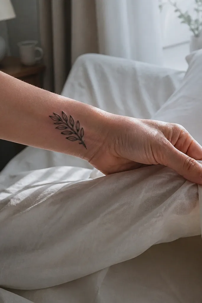
Crosshatching on the stem gives texture without cluttering the leaves. I like this because it looks clean from a distance, but you notice the extra detail when you’re close. It’s a great “Olive Branch Tattoo vs dove” switch for people who want peace symbolism but don’t want a bird silhouette. The inner wrist placement also helps the tattoo stay crisp since it’s less exposed to direct friction than the top of the hand. This is the kind of design that looks like a signature.
Start by placing it on the inner wrist or lower palm edge, about 1.5 to 2.5 inches long. Then keep the leaves mostly outline with light gray on only two leaves for dimension. For the stem, ask for micro crosshatch — a few tight lines running along the stem length — not a full shaded block. Finally, protect it from sun because fine line tattoos darken and fade differently under UV.
Use a sunscreen habit — SPF 30+ on the wrist keeps the line contrast longer.
Avoid crosshatch that’s too dense; it turns into a thick gray rope.
8. Olive Branch With Tiny Olive Fruits on the Outer Hand
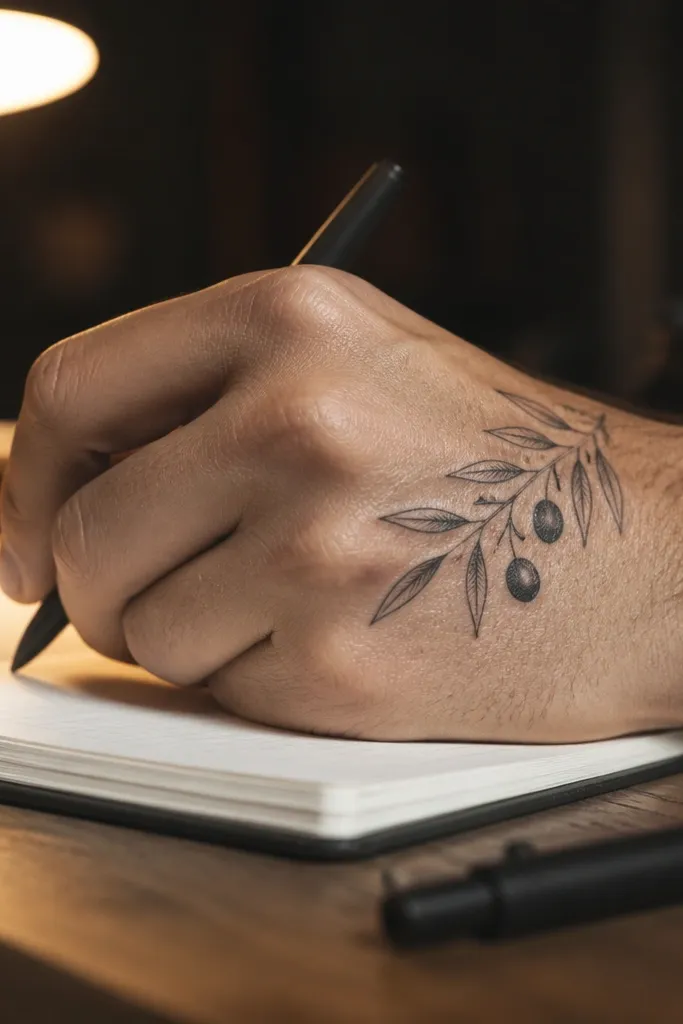
Adding olives changes the whole vibe from “decorative branch” to “symbol with texture.” Those tiny fruit circles give you focal points that read clearly even as the hand moves. I’ve seen this style look surprisingly “clean” because the fruits act like anchors for the eye. The little highlight dot makes the fruit look glossy, which is a detail that pops in photos. If you want something that feels more complete than a dove wing or feather cluster, this is a satisfying pick.
Start by placing the branch on the outer hand near the base of the thumb and let it angle down toward the wrist. Keep it around 2.5 inches long so the fruits don’t crowd. Then draw each fruit as a small circle with a tiny dot highlight and very light gray under the leaf line. Finally, during aftercare, keep it moisturized but not greasy — too much ointment can blur fine lines as they heal.
Ask for fruit sizes to be consistent — one or two bigger fruits look better than random sizes.
Avoid too many fruits; three to five total looks stylish, more turns into clutter.
9. Olive Branch and Feather-Like Leaf Tips (Peaceful Rhythm)
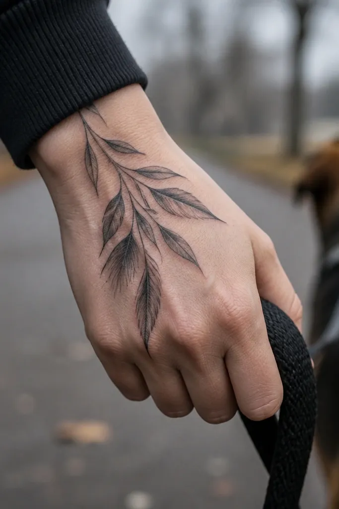
This design borrows the flow people love in dove feathers but stays in olive branch territory. The leaf tips are elongated so the tattoo looks like motion, especially across the back of the hand where movement is visible. I like the one-edge shading because it creates a “light direction” effect, so the tattoo looks intentional in daylight. It’s also a smart compromise if you’re stuck between Olive Branch Tattoo vs dove and you want the peace theme without a full bird. The result reads stylish, not literal.
Start by placing it across the back of the hand, between the thumb web and the ring finger side, with the stem running diagonally. Keep the total length around 3 inches. Then ask for elongated leaf shapes with shading only along the inner edge so you avoid a muddy fill. Finally, during healing, avoid tight sleeves that rub the back of your hand; friction can flatten the contrast of fine shading.
Bring a reference for the leaf tip shape you like — the silhouette matters more than the symbol.
Avoid full leaf fill; it kills the feather-like look and speeds up blur.
10. Olive Branch Finger Wrap Ending at the Middle Knuckle
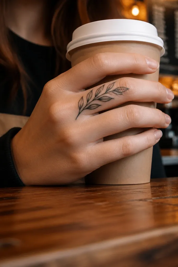
A finger wrap gives you that “small but personal” feel, and it looks extra stylish when the wrap stops at one knuckle instead of running the whole finger. The olive branch works well here because leaves can be angled to follow the finger curve, so it still looks neat when your hand bends. I’ve watched this design heal nicely when the artist keeps the linework thin and avoids packing too many leaves into the wrap. It’s also a good choice if you want peace symbolism but don’t want a dove’s wings that can look busy on fingers. This reads clean and intentional.
Start by choosing the index or middle finger side, not the fingertip pad. Keep the wrap length to about 1 to 1.5 inches, ending at the middle knuckle so it has a natural stopping point. Then use thin outlines and limit shading to one side of the leaves, with the stem staying mostly unshaded. Finally, plan for extra aftercare because finger tattoos dry out fast; moisturize lightly and keep it clean and dry.
Editor's noteAsk your artist to stencil while you bend your finger — the placement should match your natural curve.
One warningAvoid heavy shading on finger wraps; it breaks up and fades faster on moving skin.
11. Olive Branch With Tiny Ribbon Banner Under the Leaves
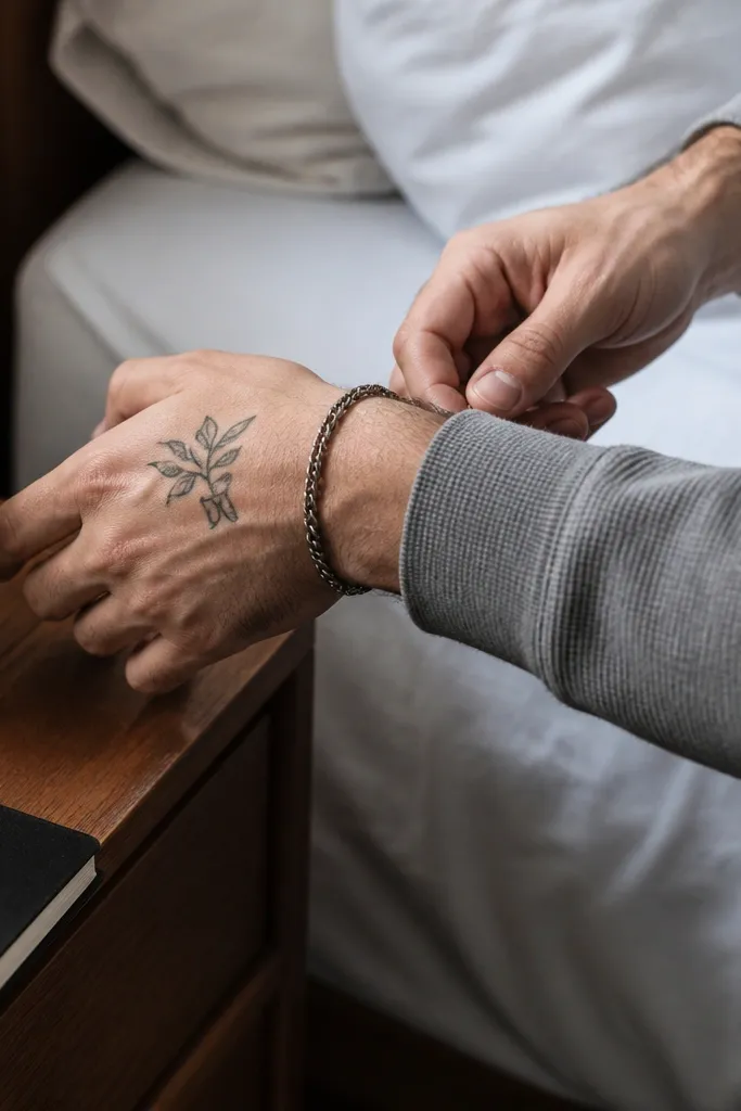
The ribbon banner adds a fashion detail without needing words. I’m picky about this: if you want something that looks stylish from across the room, the banner should be a clean shape, not tiny readable lettering. The olive leaves sit above like a crown, and the ribbon anchors the composition so the whole piece looks balanced. This is also a smart way to avoid the “dove vs olive branch” dilemma if you like the sentiment but don’t want a bird silhouette. It’s peace symbolism with design restraint.
Start by placing the olive branch and banner on the back of the hand near the center of the metacarpals, roughly between the index and ring finger lines. Keep it about 2.5 to 3 inches tall. Then ask for a thin stem and leaf outlines, with a single gray accent on two leaves and a simple ribbon fold line. Finally, keep the banner area protected during healing since it sits where hands rub against clothes.
If you want a banner, leave it text-free or use only large, bold letters — small script won’t stay sharp.
Avoid micro lettering; it turns into a gray blur on the hand.
12. Olive Branch and Spark Dot Accent (Minimal Peace Energy)
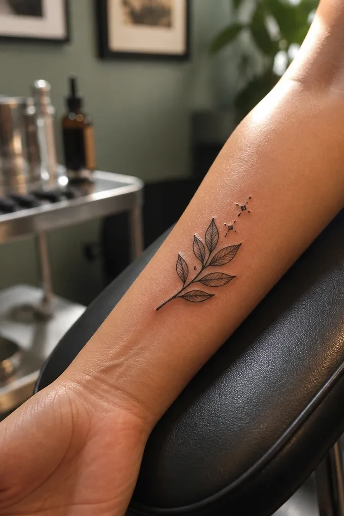
These tiny spark accents make the olive branch feel modern. I like it because it adds “stylish detail” without turning into a themed scene, and it stays readable because the spark dots are large enough to survive aging. If you’re choosing between Olive Branch Tattoo vs dove and you want something softer than a bird silhouette, the sparks mimic the same light-and-peace vibe. The outer wrist placement also keeps it comfortable and less rubbed than the back of the hand. It’s a clean look that still feels special.
Start by placing it on the outer wrist, just below the wrist bone, about 2 inches long. Then design three main leaves on a short stem and add three to five spark dots above the top leaf like small punctuation. Use fine linework for leaves and keep dot accents slightly thicker than typical dotwork so they don’t disappear. Finally, aftercare is simple but strict: moisturize twice daily and avoid sleeping on it with tight sleeves for the first week.
Editor's noteAsk for spark dots to be placed in a gentle arc — it makes the tattoo look intentional when your wrist bends.
One warningAvoid tiny five-point stars; stick to dots and short spark lines.
13. Olive Branch Mandala Frame on the Outer Hand
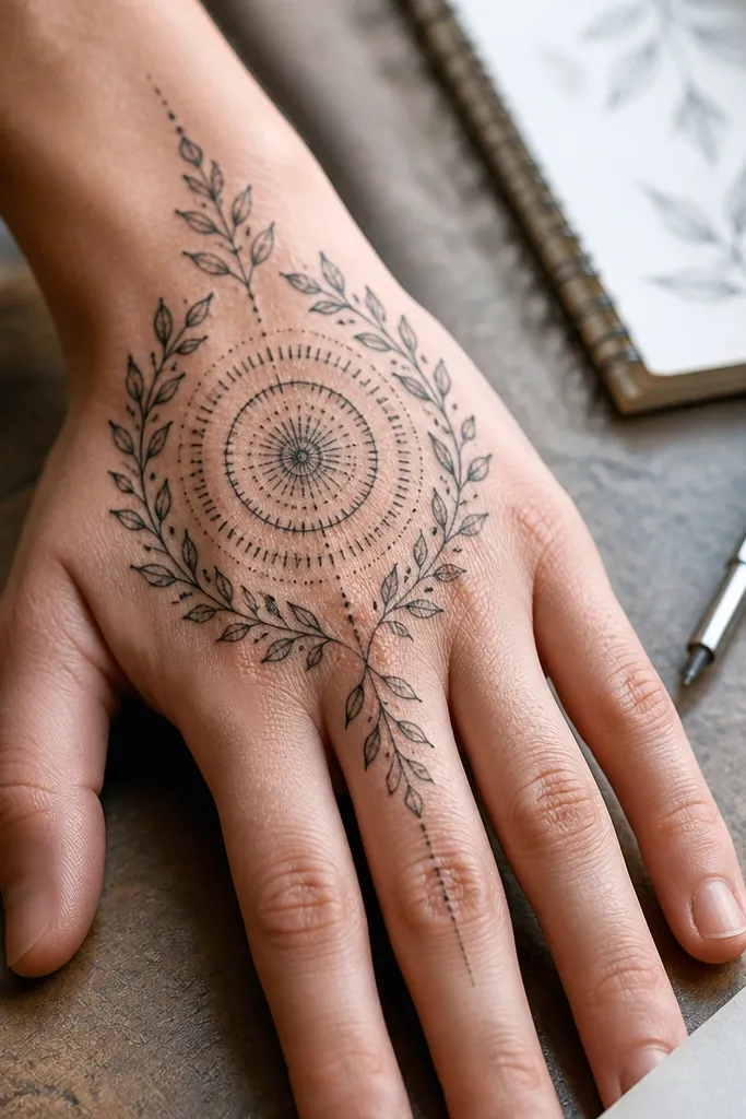
This is where olive branch detail turns into a full composition without needing a dove. The mandala frame gives you symmetry and a focal center, and the olive branch acts like the natural border. I like the way the leaves sit against the dot rings — it looks like jewelry with meaning. It’s also a great option if you want the peace theme but you enjoy ornamental tattoos more than minimalist ones. On photos, the mandala catches light and makes the whole tattoo look “finished.”
Start by placing the circle on the outer back of the hand, near the base of the thumb or between thumb web and index knuckle. Keep the mandala diameter around 1.5 to 2 inches so it doesn’t sprawl across moving skin. Then outline the olive branch leaves thin and connect them with a light stem curve that frames the bottom of the circle. Finally, keep shading minimal — dot rings are enough; heavy gray fill will smear as the hand flexes.
Editor's noteAsk for dot ring spacing to be consistent — tight rings blur together over time.
One warningAvoid covering the entire circle with solid black; it kills the delicate mandala effect.
14. Olive Branch With Watercolor Wash Leaves on the Back of the Hand
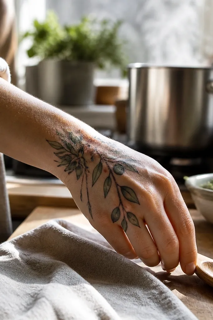
Color changes everything, and watercolor leaves make the olive branch feel fresh rather than old-school. I like this version because the wash is selective — a few leaves get pale olive-green, while others stay black outline for contrast. That keeps it from looking like a colored sticker, which is the risk with hand color. In daylight, the wash adds a soft glow that makes the tattoo look expensive. If you’re stuck on Olive Branch Tattoo vs dove and you want something that looks styled in real life, this color restraint is the move.
Start by choosing pale olive-green wash, not bright neon — the hand will dull it as it fades, and you want it to stay pretty. Place the design on the back of the hand where light hits it, around 2.5 to 3.5 inches long. Then ask the artist to keep the linework black and crisp, with wash only on 30-40% of the leaves so the design keeps structure as color fades. Finally, aftercare matters more with color: follow your artist’s instructions closely and use sunscreen after it fully heals to slow down fading.
Bring a color reference swatch you like — pale sage tones photograph better on skin than saturated greens.
Avoid full-color fill on every leaf; it fades fast and turns patchy on hands.
15. Olive Branch and Small Knot Detail at the Stem Base
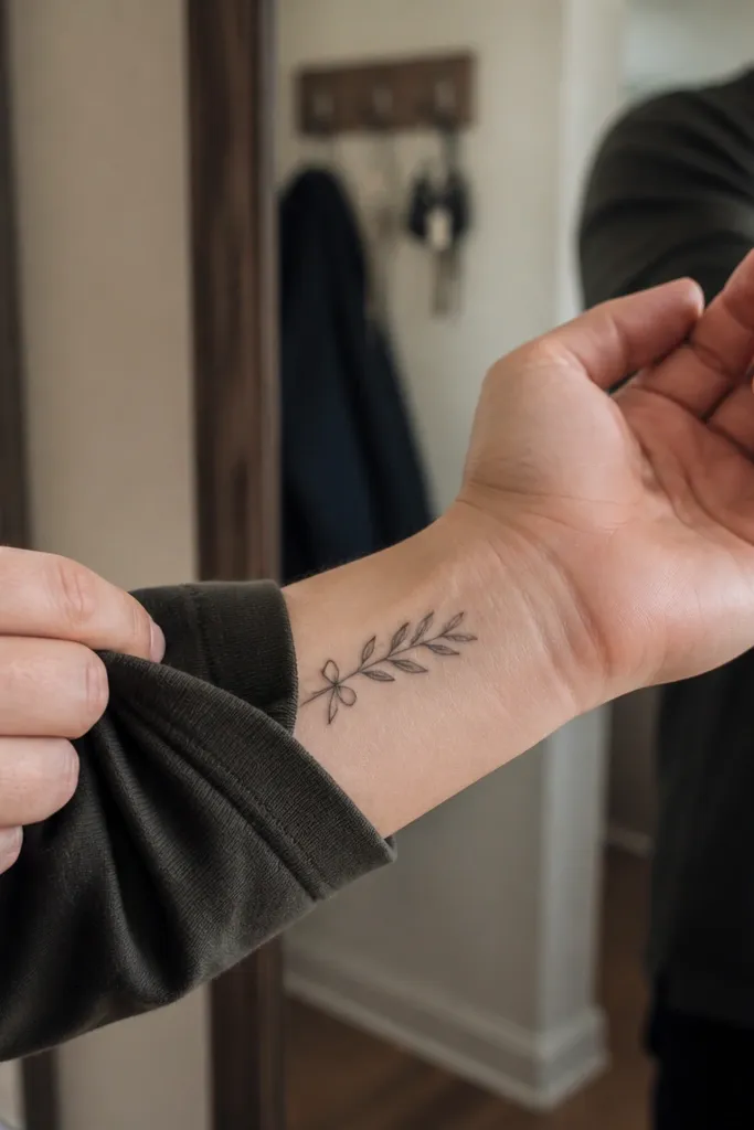
The tiny knot detail makes the design feel finished, like the branch is tied into place. I love this because it adds personality without adding clutter, and it gives you a strong anchor point that looks good even when the tattoo is partially covered by sleeves. Inner wrist placement also keeps the design comfortable and less exposed to friction. If you want peace symbolism but you hate the look of a dove’s head or eye detail, the knot-and-branch combo gives you a clean symbol with stylish structure. It’s a subtle tattoo that still reads clearly.
Start by placing it on the inner wrist, about 1.75 to 2.75 inches long, with the knot sitting closest to the wrist crease. Then keep leaf count to four or five leaves so the composition stays crisp. Ask for thin stem lines and a simple knot drawn with crisp negative space, not thick black fill. Finally, during aftercare, moisturize and avoid tight bracelets; pressure can blur the knot lines early on.
Ask for knot lines to be drawn thinner than the leaf outlines — it keeps the focus on the branch.
Avoid a big knot that dominates the piece; it can make the olive branch look secondary.



