
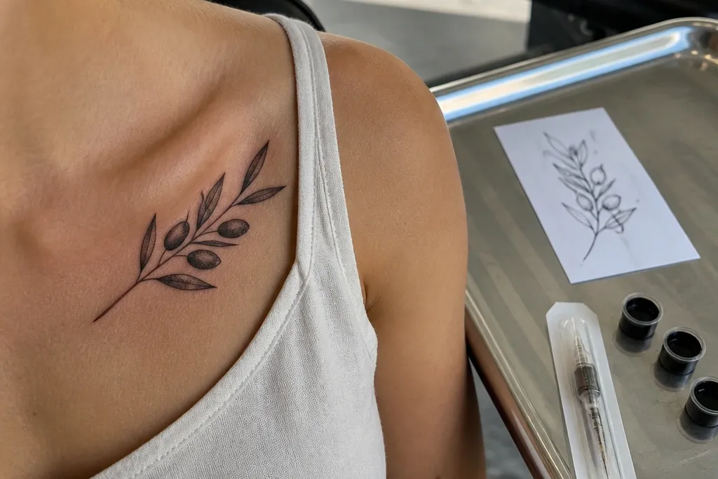
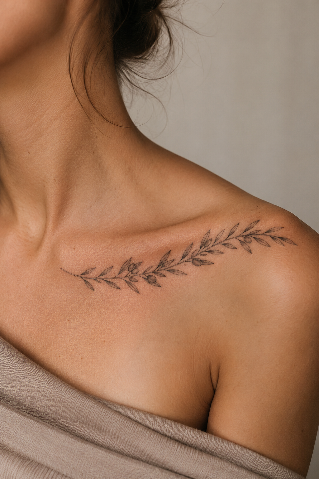
1. Single Branch Arc with Three Leaves
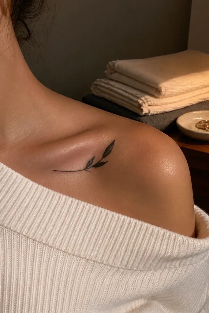
Start by marking the center of your collar bone and have the artist place the branch so the inner end sits about one finger-width from your sternum. Then keep each leaf about the same size, with the tips pointing outward toward your shoulder. Finally, request clean line weight and no tiny vein engraving; if you want texture, ask for a couple of light stipple dots at the leaf base. Expect moderate soreness because the collar bone is bony; follow aftercare closely and don’t stretch the area with tight straps for a few days.
This design is the one I recommend when someone says “budget” and still wants it to look sharp in photos. The arc hugs your collar bone curve, so it reads instantly even when you’re wearing a neckline that shows part of your shoulder. Three leaves is enough symbolism without turning into a leaf collage that needs micro-detail. I like it in solid black because the healed result keeps crisp edges and doesn’t rely on heavy shading.
One warningAvoid cramming five to seven leaves into the same space — the ends blur and the arc stops looking intentional.
Editor's noteBring a photo of your preferred neckline (like a V-neck bra line) so the artist can plan how much of the arc will show.
2. Olive Branch Crown Corner (Asymmetrical)
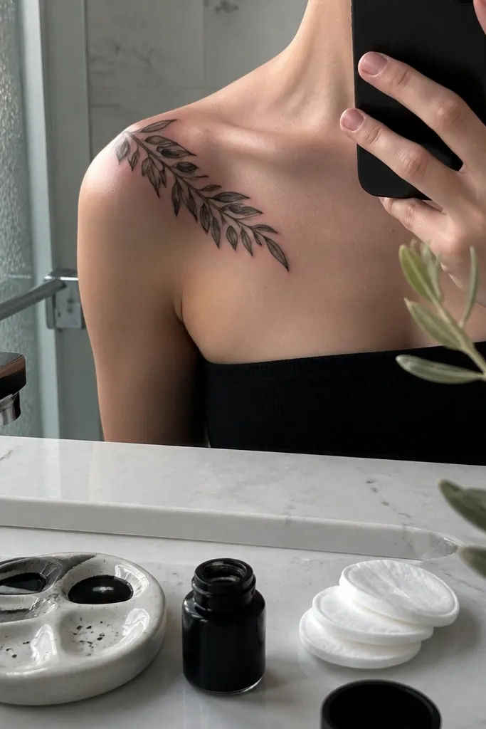
Start by choosing one side of the collar bone and decide the direction of the crown corner — toward your neck or toward your shoulder. Then ask the artist to place the highest leaf near the outer third of the collar bone, so it doesn’t run into your shoulder joint. Finally, keep the stem thin and let the leaves do the visual work; add light gray under-leaf shading only on two or three leaves. Healing can look patchy if you overdo shading, so keep it minimal and plan gentle washing and light moisturizer.
If you want something that looks “styled” without covering a big area, this corner-crown placement is perfect. The asymmetry makes it feel modern and less like a generic branch. It also photographs well because the leaves overlap the collar bone curve in a way that catches light. I like pairing this with black ink and a couple of soft gray leaf shadows so it has depth without relying on color.
One warningSkip bold, wide linework all over — it can make the crown corner look heavy and blocky on a bony area.
Editor's noteAsk for the stem to be thinner than the leaf outlines; it makes the whole tattoo feel airy.
3. Feather-Soft Branch with Negative Space Leaves
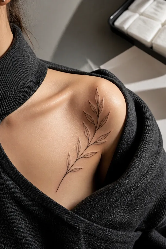
Start by asking for leaf outlines with minimal interior fill so the design stays crisp. Then position the branch so it runs along the collar bone’s curve, with the widest leaf shape near the middle. Finally, request light gray shading only at the leaf base or along one side of the stem, not across the whole leaf. Pain is usually manageable, but thin-line tattoos can sting more — keep the area clean, moisturize lightly, and avoid picking flakes.
Negative space is your best friend on a budget because it reduces fill work while still looking delicate. This version uses thin outlines and lots of open skin inside the leaves, so it stays readable as your skin heals and settles. The feather-soft stem creates movement, which looks great when you turn your head or raise your shoulder. It’s also a good choice if you hate thick tattoos and want something that doesn’t feel heavy.
One warningDon’t go ultra-thin everywhere; a tattoo that’s too faint heals into a ghost outline.
Editor's noteIf your skin tends to blur fine lines, ask for slightly thicker outlines than you think you need.
4. Micro Olive Branch with Tiny Buds
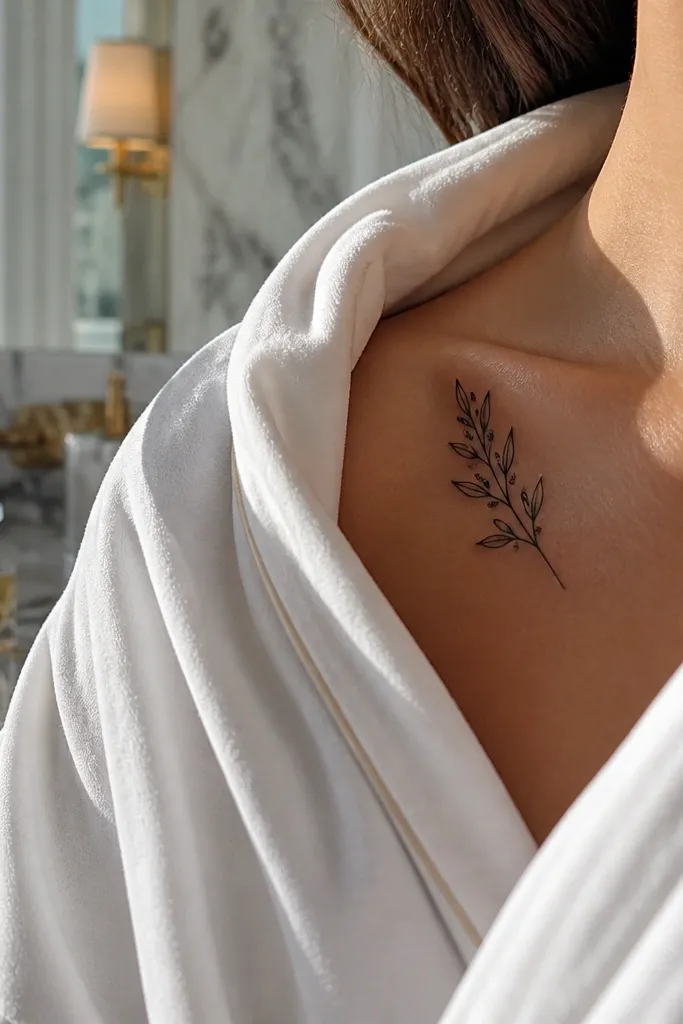
Start by keeping it small — aim for a total tattoo width around 1.5 to 2.5 inches so it doesn’t stretch as your skin moves. Then place it slightly higher than you think, because collar bone tattoos can drift visually downward once healed. Finally, request crisp dots or micro bud circles rather than filled-in tiny shapes; filled micro areas can heal unevenly. Aftercare is the same, but treat it like a delicate drawing — no tight clothing friction for the first week.
Micro designs can look gorgeous on the collar bone because they read like jewelry when your neckline shows them. This one uses tiny buds and simplified leaves so it doesn’t require a lot of shading or color. The symbol still feels clear because buds give that “growing” look associated with olive branches. In photos, this design pops because it’s close to the bone and has clean, minimal shapes.
One warningAvoid tiny leaf veins or super tiny text — micro detail is where budget tattoos fall apart.
Editor's noteBring a reference photo next to your collar bone mirror angle so the artist sizes it correctly.
5. Olive Branch + Small Heart at the Inner End
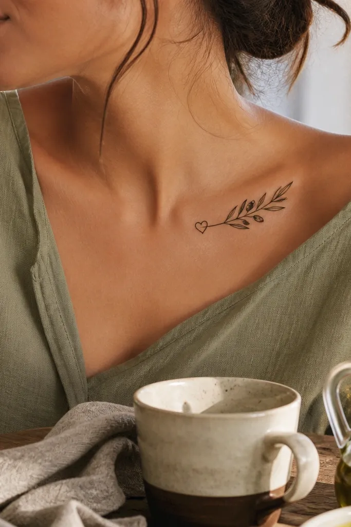
Start by placing the heart about one finger-width from the sternum, then have the branch arc outward from that point. Keep the leaves to two or three so the heart remains the star. Finally, request a thin outline heart and keep leaf outlines slightly thicker so nothing disappears during healing. Aftercare matters here because the inner collar bone gets rubbed by fabric — choose loose clothing for a few days and apply a thin moisturizer layer to stop cracking.
This is the “symbol with a personal twist” design that still stays budget-friendly. The heart adds meaning without adding a ton of complexity, and it gives you a focal point near the inner collar bone. I like the way the heart balances the branch’s outward taper, so the tattoo looks intentional instead of like a random vine. It’s also easy to photograph because the heart sits where your camera naturally focuses when you take a close shot.
One warningSkip a large heart plus lots of leaves — you’ll pay for the fill and it will blur into a shape.
Editor's noteAsk for the heart to be slightly smaller than the largest leaf so it doesn’t overpower the branch.
6. Olive Branch with One Red-Orange Leaf Accent
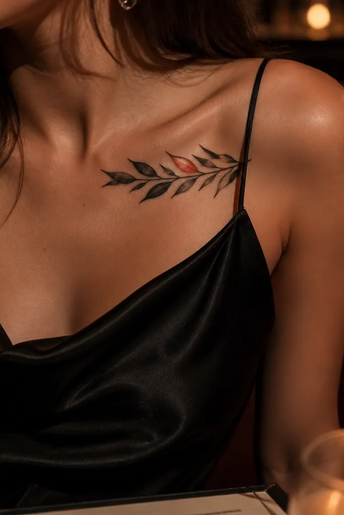
Start by choosing the leaf that will be the accent and keep it near the middle of the branch for maximum visibility. Then ask for black outlines around that leaf and a limited color fill inside, like a soft wash or light stipple, not heavy solid color. Finally, keep the other leaves black with a few gray shadows so the tattoo stays balanced. Healing tip: colored ink can scab differently, so avoid picking and keep the aftercare gentle and consistent.
If you want color but don’t want to spend like it’s a full sleeve, do one accent leaf. That single red-orange pop makes the tattoo feel alive in photos, especially against darker clothing. I’ve had this heal in a way that still looks clean because the artist only has to pack color into one small area, not across every leaf. The rest stays monochrome, so the design still reads even if the accent fades a bit.
One warningDon’t add multiple colored leaves on a budget — you’ll pay for extra packing and it will heal patchy.
Editor's noteBring a color reference like a dried-rust leaf photo so the artist matches the tone to your skin.
7. Olive Branch with Tiny Rings (Symbolic Rings)
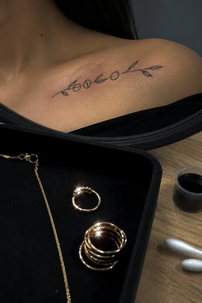
Start by keeping the olive branch size consistent with the collar bone curve, then place the rings evenly along the stem. Then ask for ring linework to be the same thickness as the branch outline, so nothing looks mismatched. Finally, request no shading inside the rings; leave them as clean circles for crisp healing. Expect the collar bone to feel extra sensitive because you’re tattooing near bony edges — take breaks if you need them and follow aftercare strictly to avoid scabbing cracks.
Rings along the stem make the tattoo feel intentional and wearable, like stacked jewelry without the bulk. The olive branch stays the main symbol, while the rings add a subtle “promise” vibe that still looks clean. This design is photogenic because the rings create bright highlights in flash and move with your posture. I like it for people who want more than a basic branch but don’t want a full scene tattoo.
One warningSkip thick ring fills — filled circles can heal cloudy and lose their sharp edges.
Editor's noteIf you wear necklaces, get the tattoo placed so the rings sit above your necklace line by about half an inch.
8. Branch Split into Two Vines (Balanced Symmetry)
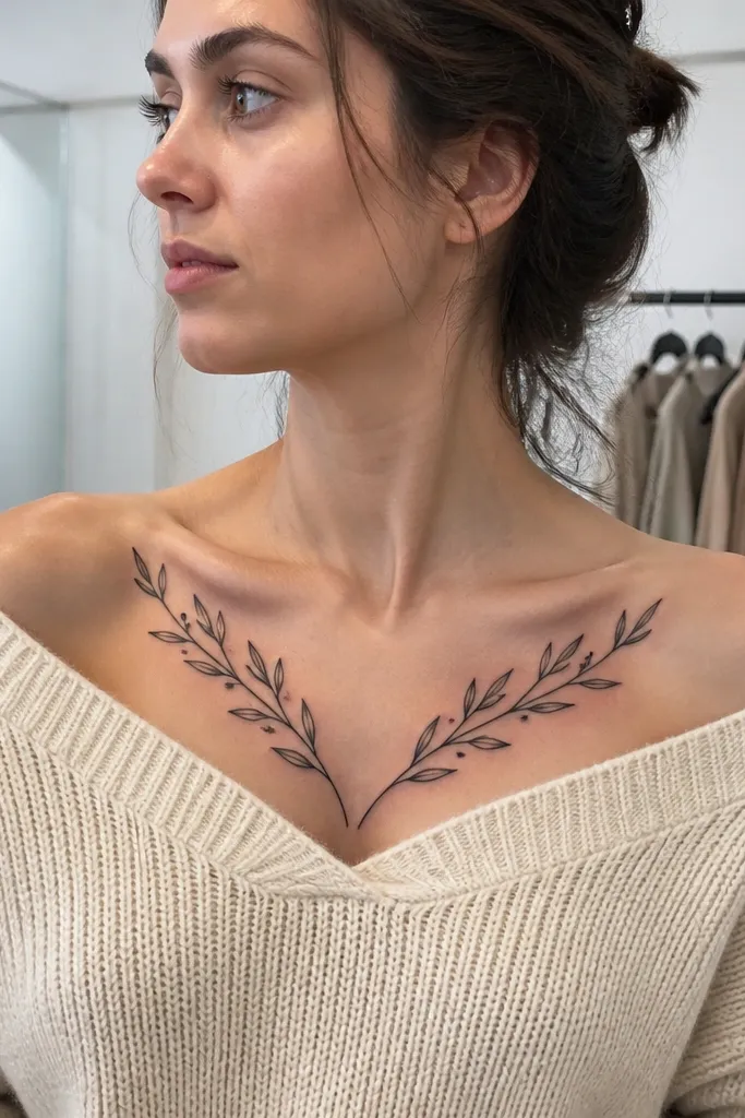
Start by placing the split point slightly above the middle of your collar bone so the V shape opens nicely toward your shoulders. Then keep leaf count modest — two or three on each side is enough. Finally, request thin stems and medium leaf outlines, with light gray shading only under a couple of leaves. Aftercare: because there’s more linework, your skin may feel tighter as it heals — keep moisturizer thin and avoid heavy ointment that smothers scabs.
This split-vines layout looks balanced without being boring. It frames your collar bone like a soft V, which is flattering because it pulls the eye toward your center. Leaves are simple, so it stays budget-friendly and ages better than super detailed work. The symmetry also makes it easier to match with your outfit — it looks good with scoop necks, square necks, and off-shoulder tops.
One warningAvoid making the split too low; if it starts near the chest crease, the V can look messy in motion.
Editor's noteAsk the artist to mock up the V shape on your skin with a marker before tattooing.
9. Olive Branch with Minimal Shaded Leaf Bases
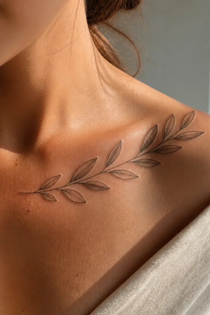
Start by choosing a design with a repeating leaf pattern so the shading can stay consistent across the branch. Then ask the artist to shade only at the lower third of each leaf, using a light gray wash or stipple rather than heavy black blending. Finally, keep the stem linework slightly thinner than the leaf outlines. Pain is usually moderate, and your aftercare should focus on keeping the shaded areas from cracking — moisturize lightly and don’t over-wash.
This is the “cheap but not flat” version I keep coming back to. The gray half-moon shading gives depth, but it’s limited enough that it doesn’t turn into a smudgy mess after healing. Each leaf reads clearly because the outline stays crisp and the shading is tucked under the leaf where it won’t blur into the stem. It also looks great in close-ups because the contrast changes with angle.
One warningSkip full-leaf gray gradients on a budget — they often heal uneven and look like dirt marks.
Editor's noteTell your artist you want “shade only under the leaf” so they don’t darken the whole surface.
10. Olive Branch Wrap Along the Collar Bone Edge
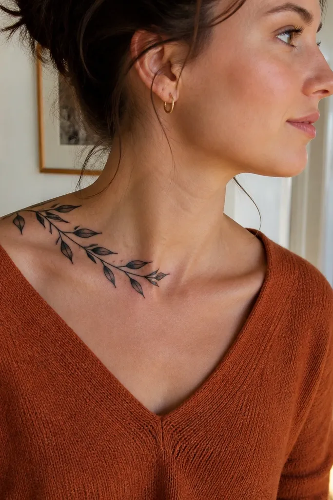
When people say “collar bone tattoo,” they picture something straight-on. This design uses the angle of the bone so it looks like it wraps around you, which makes it extra photogenic when you turn. The leaves are angled outward, so they catch light and look dimensional even without heavy shading. I’d choose this if you want the tattoo to still look good from the side, not just in the mirror.
Start by standing sideways in front of a mirror and mark where your collar bone ridge actually sits. Then have the artist place the branch so it follows that ridge, not the flat center of your chest. Finally, angle the leaves so their tips point outward toward your shoulder; keep the stem thin to avoid bulk. Aftercare: side placement rubs more from fabric — wear soft, breathable materials and keep the area dry for the first day after your session.
Ask for a stencil check from two angles — front and side — before any ink goes in.
Avoid straight, front-facing placement if your collar bone curves strongly — it can look crooked once you move.
11. Olive Branch with a Small Feather Detail on the Stem
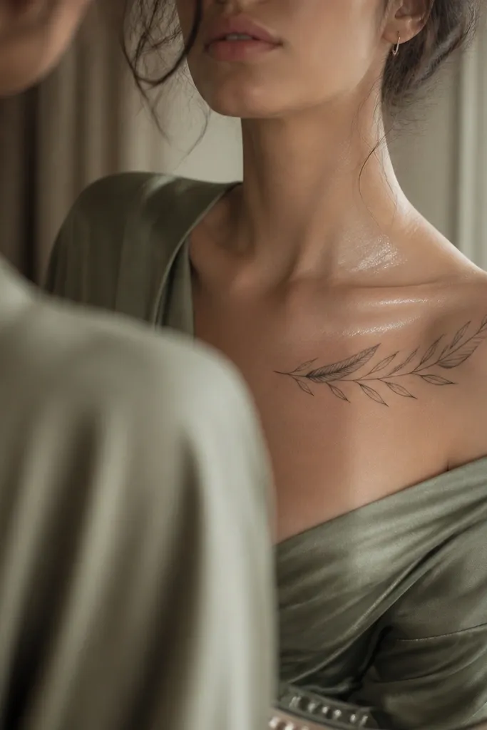
Start by placing the feather detail at the center of the branch where your eyes naturally land. Then keep the feather small, with a few barb lines only, so it doesn’t require micro shading. Finally, use the same line weight across the feather and the branch outline, and add light gray under one leaf only if you want depth. Collar bone pain is real here because the feather lines are close together, so expect sharper stinging — keep breaks short and follow aftercare.
Adding a tiny feather detail gives the tattoo personality without turning it into a busy design. The feather shape reads cleanly at small scale and it pairs well with the olive branch symbol because both are associated with calm, renewal, and gentle strength. In photos, the feather linework adds a little sparkle-like contrast when the light hits. If you’re trying to keep cost down, this is a smart “one extra detail” choice.
One warningSkip lots of feather barbs — too many tiny lines blur into one dark patch.
Editor's noteAsk the artist to stencil the feather detail with two sizes so you can pick what stays readable after healing.
12. Two-Leaf Olive Branch with a Tiny Bow Knot
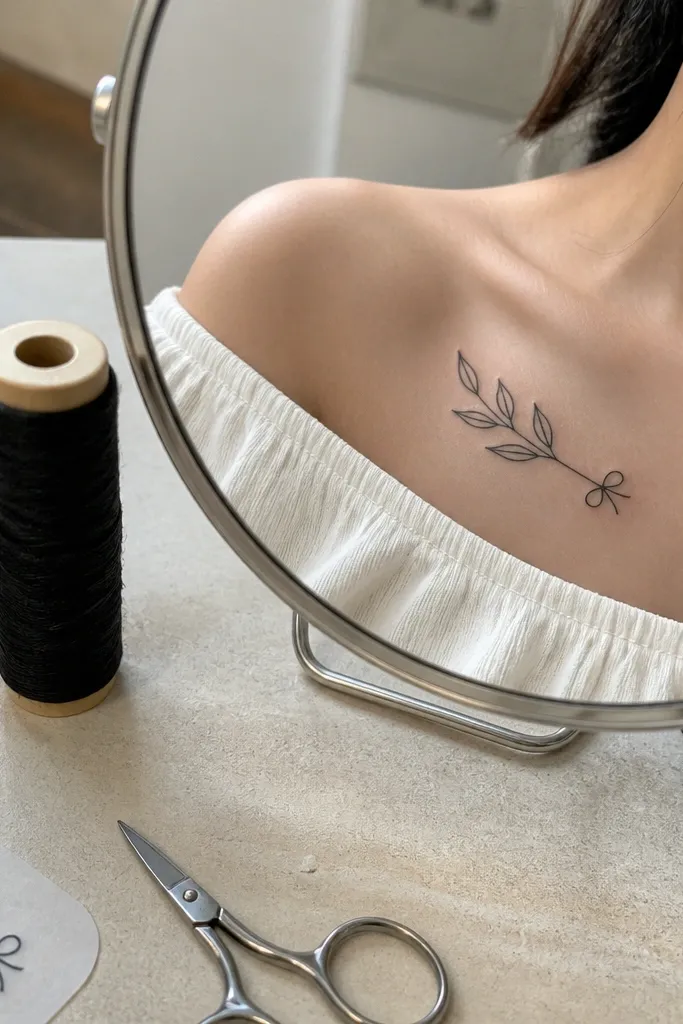
Start by placing the bow knot where your collar bone meets the center — slightly above the sternum line so it doesn’t get lost. Then attach two leaves on either side, with the leaf tips angled outward. Finally, request sharp linework on the bow and minimal shading on the leaves, just a faint gray under one leaf if you want dimension. Aftercare: because the bow has small tight lines, don’t scrub hard during washing — let warm water loosen residue.
This is the “cute and clean” collar bone tattoo that still reads as an olive branch. Two leaves keeps the design simple and keeps your budget where it belongs. The tiny bow knot adds a focal point and gives the branch a finished, decorative feel. I like it for people who want the symbol but don’t want the tattoo to feel too serious or too dainty.
One warningAvoid thick, cartoon-style bow lines — they heal chunky on the collar bone.
Editor's noteIf you want it to look more grown-up, ask for the bow outline to be thinner than the leaf outlines.
13. Olive Branch with a Single Dotwork Leaf Cluster
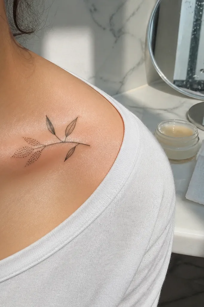
Dotwork is a budget-friendly way to add texture because it spreads healing evenly when it’s kept small. This design uses dotwork only on one leaf cluster, so you get that interesting “ink texture” look without paying for full shading across the whole branch. The contrast between line-only leaves and one dotted cluster gives the tattoo depth that still looks clean in close-ups. It’s also a great option if you want something more interesting than flat black but still simple enough to age well.
Start by choosing one side of the branch for the dotwork cluster, usually the outer third near your shoulder. Then ask for dot density that builds from light gray dots at the edge to slightly darker dots near the center of that leaf. Finally, keep the other leaves outline-only with no interior fill so the design stays legible. Aftercare: dotwork can look darker while it heals, then lighten — don’t panic and don’t over-moisturize to “fix” it.
Request stipple or dotwork that stays within the leaf outline — no dots creeping into the stem.
Skip heavy black dot packing that turns into a solid blob after healing.
14. Minimal Olive Branch with One Small Crossbar Leaf
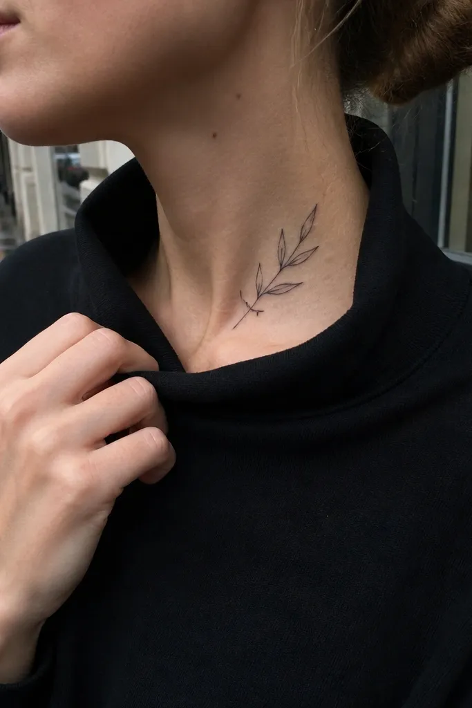
Start with a simple branch skeleton: one stem and three to five small leaves, all same style. Then add the crossbar leaf at the middle, angled slightly toward your shoulder so it doesn’t look like a mistake. Finally, keep everything in black ink with no heavy shading; if you want depth, add one tiny gray dot at the base of the crossbar leaf. Pain should be moderate; keep aftercare gentle because the accent leaf has a short line that can peel if scrubbed.
This one looks custom because of the crossbar leaf accent. It keeps the branch minimal, but the odd little leaf shape makes people ask what it is. The symbol is still clear because the rest of the leaves follow the olive branch pattern. I like it for budget tattoos because it adds personality without adding lots of extra elements. In photos, the crossbar leaf creates a small angle that catches light and makes the tattoo feel more dimensional.
One warningAvoid random leaf shapes all over — one intentional twist looks designed; many look messy.
Editor's noteAsk your artist to check the crossbar leaf angle with a marker on your skin before tattooing.
15. Olive Branch with Thin Chain Links Beneath
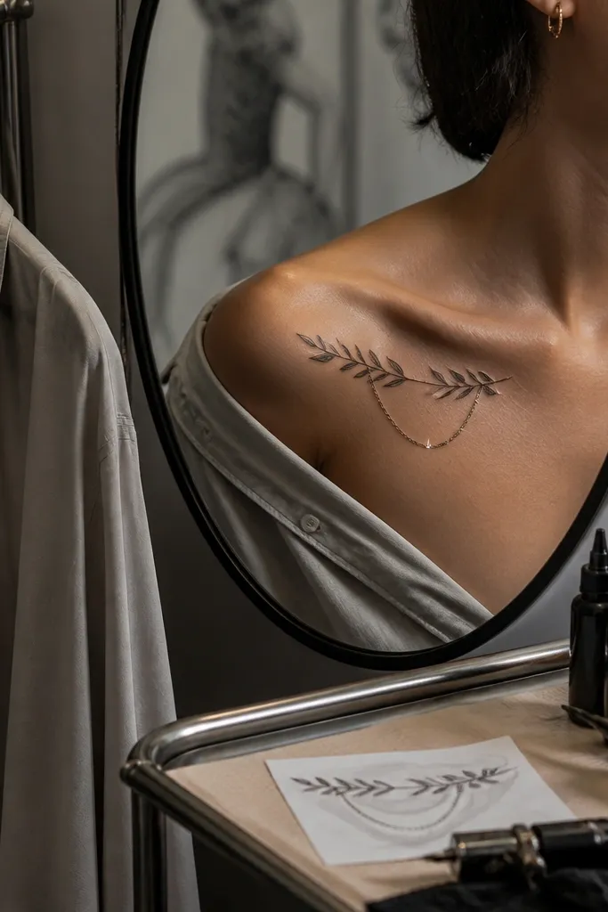
Start by placing the olive branch along the collar bone curve, then leave a small gap underneath for the chain links. Then ask for 4 to 7 simple chain links, each with consistent oval shapes and thin line weight. Finally, keep the chain links in the same ink as the branch so the tattoo looks cohesive; no extra shading is needed. Aftercare: the links can trap fabric friction, so wear soft tops and avoid tight collars for a week.
Putting thin chain links under the branch makes it look like a pendant, and that’s why it photographs so well. The olive branch stays the theme, but the links add movement and a jewelry vibe, which makes the tattoo feel more “worth it” even when you keep it small. I’ve seen this combination age nicely because the links are simple outlines, not tiny micro details. It also works for people who want something more decorative than plain linework.
One warningDon’t add too many links — five to seven looks intentional; a crowded chain can blur into a dark bar.
Editor's noteIf you wear a real chain necklace, ask the artist to position the tattoo so the ink sits about half an inch above your necklace clasp line.



