
1. Single Branch Greek Key Border Frame
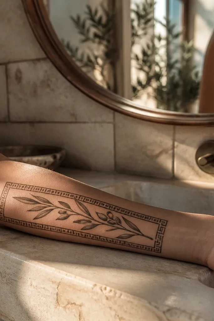
Start by measuring the tattoo space and choosing a size that lets the border breathe — I aim for about 5-7 cm long on the forearm. Then ask your artist for a slightly thicker outer contour on the border and the thinnest possible leaf vein lines, with shading only along the leaf tips and under the main stem curve. Finally, confirm the highlight plan: the artist should place light gray strokes on the upper-left edge of each leaf so the whole branch looks lit from the same direction. Expect moderate sting on the inner forearm and plan aftercare with fragrance-free soap and a thin layer of ointment for the first few days, then switch to lotion.
This one reads instantly as Greek because the Greek key border gives you a clean heritage frame without turning the tattoo into a busy pattern. The branch stays elegant because it’s a single sweep, not a tangled cluster. I like it for luxury high end because the negative space makes the linework look intentional, like jewelry rather than a filled illustration. The symbolism stays clear too — one branch still means peace, and the border adds cultural context. It suits inner forearm, upper arm, or the side of the thigh where the frame can sit flat and symmetrical.
One warningDon’t ask for a full black border; it ages into a heavy frame that kills the delicate leaf work.
Editor's noteBring a reference photo where the Greek key is narrow and tight — wide key bands make the branch look swallowed.
2. Fine Line Branch With Micro Olive Fruits

Start by keeping the branch length around 6-9 cm so the leaf spacing stays readable. Then request micro fruit placement — one fruit near the top curl, one in the middle, and one near the lower bend — so the eye travels smoothly. Finally, ask for near-zero background shading; let the skin tone do the warmth and keep the whole piece crisp as it heals. Pain is light to moderate on the collarbone, but swelling can happen, so don’t schedule a big event the next day. Aftercare is simple: keep it clean, avoid friction from bras or straps, and moisturize gently once it starts to dry.
This style is the definition of luxury high end when you want it to look expensive up close and still clean from across the room. The micro fruits matter because they add realism without heavy shading. The branch curve sits nicely along the collarbone’s natural line, so it looks tailored to your body instead of pasted on. Symbolism stays timeless since you still get the full olive branch silhouette and the fruits read as “olive harvest” peace imagery. I recommend this for people who hate thick tattoos and want something that looks like fine line jewelry.
One warningSkip thick outlines; they make micro fruits and vein lines blur together over time.
Editor's noteAsk for a mock placement on your collarbone photo so the branch doesn’t drift toward the shoulder crease.
3. Blackwork Olive Branch With Soft Gray Vein Highlights
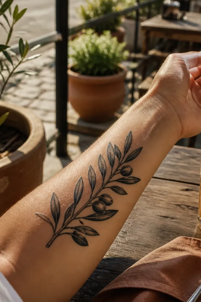
Start by choosing a placement with enough length for a vertical branch — aim for 10-16 cm. Then ask for blackwork contours at a consistent line weight and gray highlights only along the vein center and one leaf edge, not full leaf shading. Finally, confirm the stem shading is light and follows the curve — if the artist darkens the entire underside, it will look heavy when healed. Plan for a stronger sting than fine line because blackwork sits deeper visually; keep lotion light during healing and avoid heavy gym sessions that rub the area.
If you want a luxe look that still has bold presence, this is the one. The blackwork contour gives definition, and the soft gray vein highlights keep the leaves from looking like paper cutouts. I love how photogenic it is in sunlight because the gray lines create a subtle glow effect rather than a flat gray wash. Symbolically, the branch reads clear and traditional, but the vein treatment makes it feel refined instead of “folk art.” This fits best on outer forearm, upper arm, or calf where vertical flow looks natural.
One warningDon’t request full black fill in every leaf; it turns the design into a dark mass.
Editor's noteAsk your artist to show you healed photos of blackwork with gray accents, not just fresh ink.
4. Olive Branch Crown Over Small Greek Key Ribbon
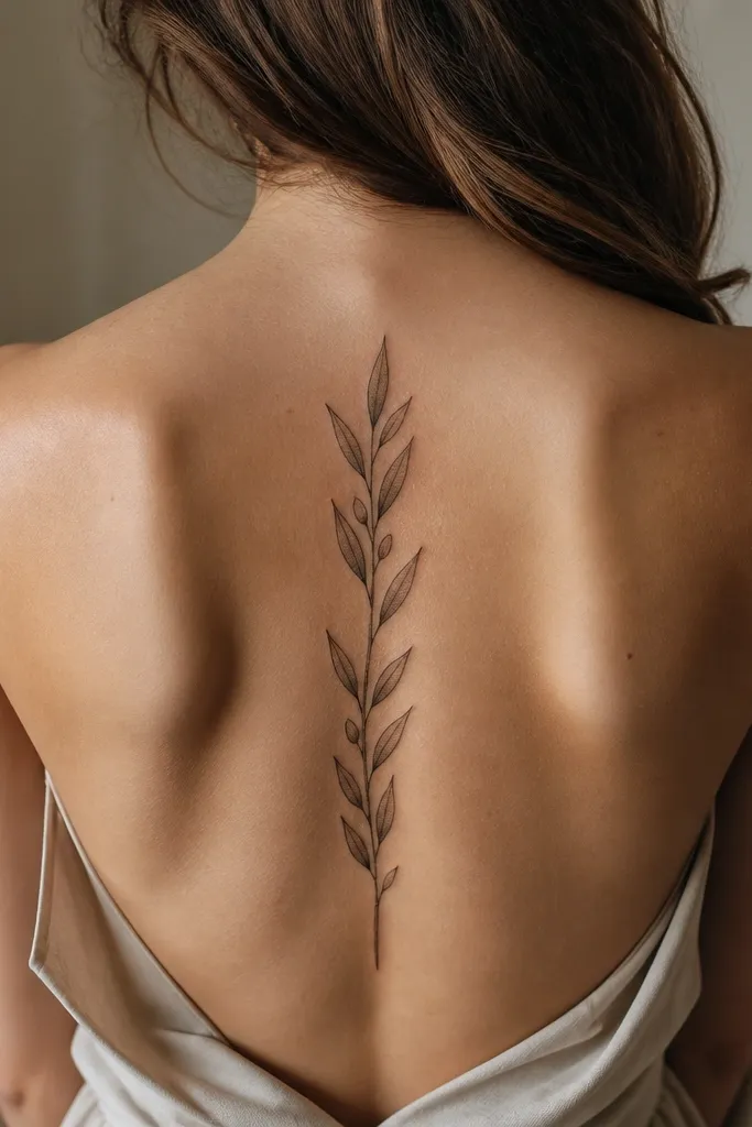
A crown layout makes the peace symbol feel ceremonial, like a seal rather than a casual doodle. The Greek key ribbon keeps it Greek without crowding the whole tattoo with patterns. This design is luxury high end because the overlap creates depth while still staying clean — you can see each leaf layer. It also photographs well on the upper chest and collarbone area because it sits where light hits naturally. If you want the symbolism to look intentional and slightly regal, this is a strong pick.
Start by sizing the crown to your chest — I recommend 9-13 cm wide so the overlap doesn’t get cramped. Then choose the ribbon size: about 2-3 cm across with a thin Greek key band that doesn’t turn into a solid stripe. Finally, ask for shading only at the overlap points so the leaves look stacked, not colored in. Healing is moderate since the chest moves with breathing; avoid tight bras or rough fabric and keep the tattoo moisturized during the dry phase.
If you’re wearing low-cut tops, place it slightly higher so the crown sits centered in photos.
Skip large text if you want a timeless look; words age faster than simple symbols.
5. Olive Branch With Engraving-Style Crosshatch Shadows
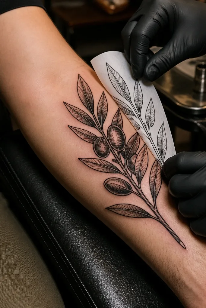
Engraving-style shading is how you get that “luxury print” feel on skin. The crosshatch under the leaves creates dimension without turning the tattoo gray and muddy, and the leaf edges stay sharp. It’s timeless symbolism because it still reads as a real olive branch, not a graphic poster. I’ve seen this style age beautifully when the artist keeps hatch lines tight and consistent. Placement along the inner bicep or outer thigh works because the branch can follow a long curve and the shading stays visible in motion.
Start by choosing a longer canvas — 12-20 cm — because crosshatch needs room to breathe. Then ask for crosshatch only in the shadow areas beneath leaves and along the underside of the stem twist, with clean negative space around each leaf edge. Finally, set a light direction with your artist so the hatch density matches the same “light” across the whole branch. Pain is moderate due to dense linework; keep aftercare strict, avoid sun, and moisturize consistently to prevent scabbing that can blur hatch detail.
Ask for a test stencil on your skin to confirm the branch twist matches your arm’s curve.
Don’t let the artist overfill shadows; heavy crosshatch can look like bruising once healed.
6. Watercolor-Edge Olive Branch in Soft Olive Green
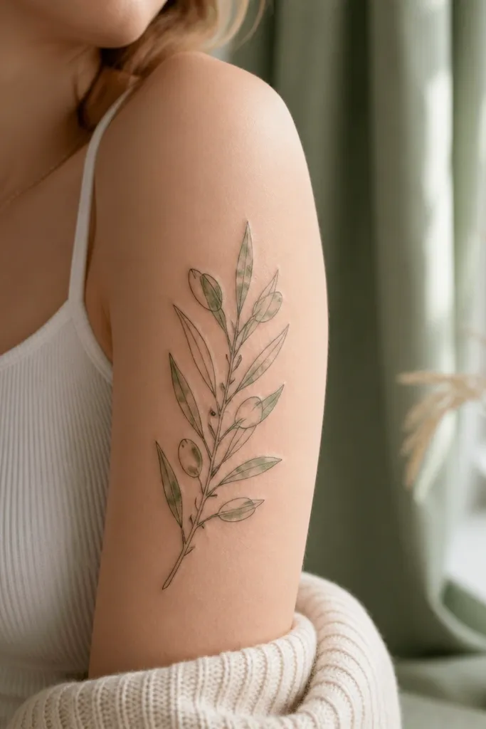
Start by choosing a placement that gets good light and avoids constant friction — outer wrist or forearm looks best. Then request black linework first, followed by tiny olive-green edge washes that stop short of the leaf center so the shape stays crisp. Finally, ask the artist to use light, diluted pigment and to avoid pooling — any puddling will age into uneven patches. Healing can be a little more sensitive with color; follow aftercare closely and keep it out of direct sun for months to protect the green tone.
If you want luxury high end with a modern twist, watercolor-edge coloring can look expensive when it stays restrained. The green sits at the leaf edges like pigment caught in fabric, not like a full color fill. This keeps the peace symbol readable while adding warmth that looks great in natural light. I like this for wrists and lower forearms because the small color accents make the tattoo feel personal and fresh. Symbolically, the olives still read clearly, just with a soft Mediterranean color mood.
One warningSkip full watercolor fills; they spread as they heal and kill the leaf definition.
Editor's noteBring a photo of olive green that you like from clothing — the tattoo green should match that undertone, not a random chart green.
7. Olive Branch With Greek Key Side Accent on Rib
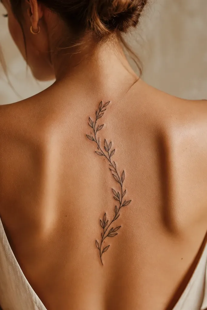
Start by placing the branch so the top curl sits under your armpit line and the lower end tapers toward your waist. Then ask for a Greek key band that’s narrow and only on one side — about 0.3-0.5 cm wide on skin for this style. Finally, request leaf overlap shading under each leaf edge, with light gray gradients that follow the ribs' curve rather than a flat wash. Pain is higher on ribs; plan sessions with breaks and keep aftercare extra careful because movement can irritate fresh ink.
Ribs give you a natural curve, and this design uses that shape instead of fighting it. The Greek key accent on one side keeps the Greek theme present without turning the whole piece into a border tattoo. It looks luxurious because the branch has layered depth and the key band is thin enough to stay sharp as it heals. Symbolically, it’s still a classic olive branch — the key detail just adds cultural framing. This is a great pick if you want the tattoo to peek out when you wear fitted tops.
One warningDon’t place it too low on the ribs where your waist compresses the tattoo and blurs fine leaves.
Editor's noteAsk for the stencil to match your breathing posture — draw it when you’re standing relaxed, not hunched.
8. Olive Branch and Dove Silhouette Minimal Peace Emblem
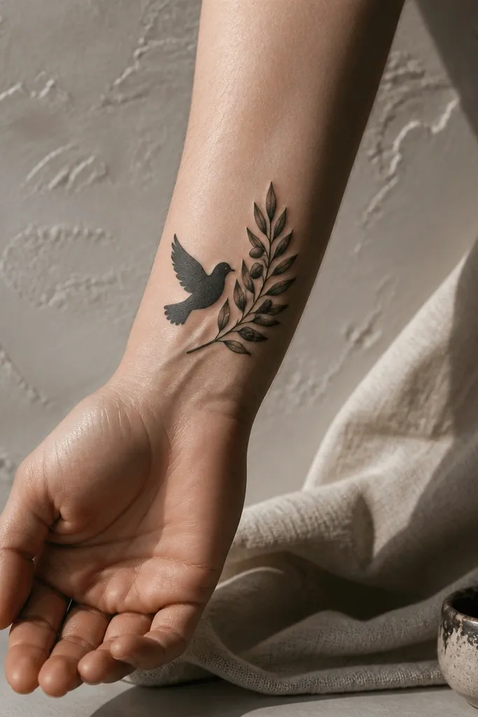
A dove is the peace symbol that most people recognize instantly, but luxury high end comes from restraint. This design keeps the dove as a clean silhouette, while the branch stays detailed with leaf edges and subtle highlights. The balance reads thoughtful, not cartoonish, because the dove is simple and the branch does the visual work. If you want timeless symbolism, this is the peace combo without needing extra text. Placement on upper arm, bicep, or shoulder looks great because the emblem shape stays centered and photo-friendly.
Start by sizing it as an emblem — 6-10 cm wide — so the dove doesn’t overpower the branch. Then ask for dove wings in solid black but keep the olive leaves as fine contours with small gray edge shading. Finally, confirm the emblem has breathing room: no extra stars or scrolls, just the dove plus branch. Pain is moderate on upper arm; aftercare is straightforward, but keep it clean and avoid tight sleeves that rub during healing.
If you want it more Greek, add a tiny Greek key micro-border around the emblem edge, not across it.
Skip heavy full-black leaves; you need leaf definition to keep the luxury look.
9. Olive Branch With Marble-Like Vein Texture Shading
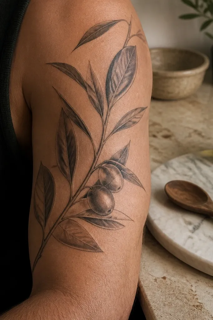
Start by asking for a crisp outline first — the marble effect goes inside, not over messy lines. Then request soft gray-white “vein streaks” in the leaves, with fewer streaks on smaller leaves and more on the larger central leaves. Finally, set the highlight direction so the brightest streaks sit on the same side of each leaf. Healing can look unusual for a few weeks because textured shading settles; keep aftercare consistent and avoid picking when the skin tightens. Pain is moderate since the shading adds density.
Marble-like texture makes an olive branch look gallery-grade because it feels like material, not ink. The leaf shading follows natural curves, so it catches light and looks smooth in photos without turning into a flat gray block. This style still holds the peace symbolism clearly because the branch shape and leaf silhouette are traditional. I like it for people who want something more artistic than plain linework but still timeless. Best placements are forearm, upper arm, or calf where the shading texture can read clearly.
One warningDon’t ask for too many streaks in every tiny leaf; it turns into visual noise.
Editor's noteUse a placement photo in daylight and ask the artist how it will look under warm indoor light too — marble shading can shift.
10. Minimal Olive Branch With Gold-Like Dotwork Highlights
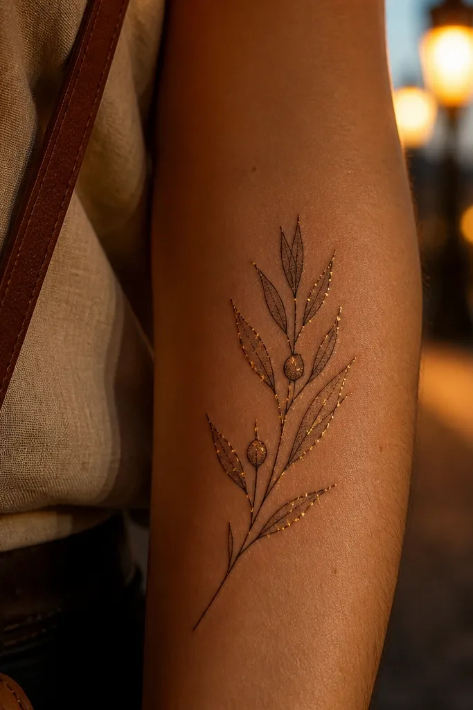
This is luxury high end because it uses dotwork like jewelry sparkle. The dot clusters sit along the leaf edges where light would naturally catch, so the branch looks dimensional even with minimal shading. I’ve seen this style photograph beautifully in phone camera flash because the dots create a subtle shimmer effect. Symbolically, it stays clean: it’s still an olive branch with olives, no extra clutter. It suits inner wrist, ankle, and side of the hand where a small amount of sparkle reads as intentional detail.
Start by keeping the branch size small — 4-8 cm — and choose a placement that stays visible but not constantly rubbed. Then ask for dotwork only at leaf edges and the top bend, not across the whole leaf surface. Finally, request the dots to be consistent in size and spacing so they heal evenly; uneven dotwork looks patchy. Pain is light to moderate for wrist/hand areas, but you may get more sensitivity than you expect. Aftercare matters: keep it clean, avoid soaking, and moisturize gently to prevent dotwork from scabbing over.
Ask for a stencil that follows your wrist’s curve — dotwork looks best when the branch arc matches your bone line.
Avoid giant dot clusters; they can heal into raised texture and blur the leaf outline.
11. Olive Branch and Greek Key Half-Circle Mandala
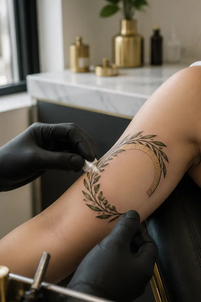
Start by choosing a placement with room for an arc — upper outer arm or shoulder — and size it to about 10-18 cm across. Then ask for a Greek key outer arc that’s even in thickness, with the branch inside kept slightly lighter in density so the key doesn’t dominate. Finally, request shading under leaf overlaps only, using soft gray gradients rather than heavy black fill. Pain is moderate to high depending on placement; the shoulder can be extra sensitive. Aftercare is normal, but keep the tattoo protected from sun because the key pattern shows every bit of fading.
This design feels luxury high end because it has a clear composition — arc frame, then branch inside — and the Greek key pattern is controlled enough to stay elegant. The half-circle is flattering on upper arm because it follows the body’s natural curve and looks balanced in photos. The olive branch stays the star, with overlap shading that gives depth without crowding. Symbolism is traditional peace with an added Greek heritage frame. If you want something that looks like a finished piece of art rather than a small symbol, this is it.
One warningDon’t let the branch overlap the Greek key too much; overlapping can blur the key lines during healing.
Editor's noteTell your artist you want the key pattern “clean and tight,” not wide and decorative.
12. Realistic Olive Branch With Tiny Olive Fruit Cluster
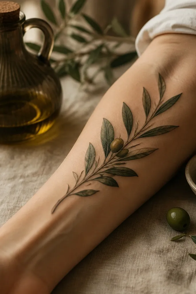
Start by picking a calf or outer thigh placement and sizing around 12-22 cm so the fruit cluster isn’t cramped. Then ask for the olives to be grouped in a tight cluster of 4-7 fruits, with highlights on the upper side of each oval. Finally, request subtle gray shading under leaf edges only — too much shading makes it look like a dark botanical illustration. Pain is moderate on calf; aftercare includes keeping it moisturized and avoiding tight socks that rub. If your calf gets frequent sun, plan for extra sun protection.
Realistic olive fruit detail is what makes this feel high end instead of generic. The leaves look like they belong on an actual branch because the veins and edges are consistent and the fruit placement feels natural. Symbolism stays clear: you get the olive branch gesture plus the olives themselves, which makes the peace imagery feel grounded. I like calf placement because the skin is smoother and gives the realistic shading room to read. In photos, the olives catch light and pull focus fast.
One warningSkip “all-over realism” shading; it makes the tattoo look like a photo printed on skin.
Editor's noteAsk for a stencil with leaf angles that match how leaves grow on olive branches — slight outward tilt looks more real.
13. Olive Branch With Negative Space Greek Key Ladder
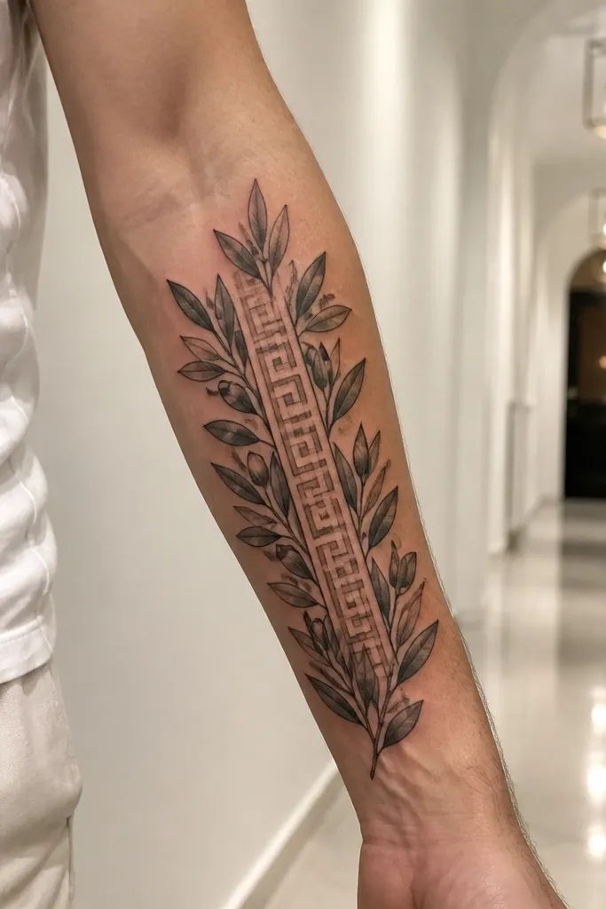
Negative space Greek key work looks expensive because it avoids the “pattern blob” problem. Instead of filling a key band with ink, the design uses skin tone as the pattern, so it stays sharp and clean. The olive branch still has depth through line weight and tiny gray touches, but it never becomes heavy. This is luxury high end because the tattoo feels airy while still having structure. It’s perfect for forearm where you can see the spacing clearly and the tattoo looks good even when you wear short sleeves.
Start by choosing a size that supports negative space — 10-14 cm is a sweet spot for forearm. Then ask the artist to map the Greek key as gaps between leaf clusters, keeping the key “ladder” consistent in width. Finally, request only light gray shading under leaf overlaps, and keep background totally clean. Healing is usually easier because there’s less dense ink, but linework still needs careful aftercare. Avoid friction from watches or bracelets until fully healed.
Make sure the artist draws a test stencil that shows the negative-space key clearly; if the stencil looks confusing, the healed tattoo will too.
Don’t ask for thick outlines around the negative-space key; it removes the crisp pattern effect.
14. Olive Branch With Ornate Greek Key Vines on Both Ends
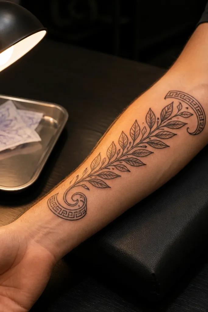
This design gives you the luxury high end effect of “finished borders” without covering the whole piece in pattern. The central olive branch stays elegant, and the Greek key vines at both ends act like anchors that frame the flow. It photographs beautifully because the symmetry reads instantly, and the ends catch light when you turn your shoulder. Symbolically, it’s still a peace branch, but the Greek key vines bring in heritage in a way that feels deliberate. It’s a great pick for back shoulder, upper back, or upper arm where you can show it in motion.
Start by placing it where the skin stays relatively steady — upper shoulder blade or back shoulder — and size it around 14-20 cm wide. Then ask for the central branch to be thinner and more negative-space driven, with the Greek key vines slightly denser only at the ends. Finally, request shading that follows leaf overlap edges, keeping the key vines mostly linework with minimal gray. Pain is moderate; shoulder areas can be stingy depending on bone proximity. Aftercare includes extra moisturizing because shoulder tattoos dry out faster.
If you want it to feel more feminine, ask for slightly more tapered leaves and a gentler stem twist.
Don’t add extra symbols in the center; the frame ends already do the heavy lifting.
15. Olive Branch With Sculpted 3D Leaf Edge Shadows
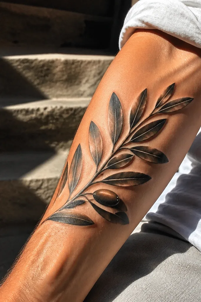
Start by choosing a placement with enough space for bold contrast — 10-18 cm. Then ask for a controlled gradient on one leaf edge only, with a clear highlight gap on the opposite edge so the leaves look rounded. Finally, keep the olives shaded but small, and avoid filling the entire leaf — the highlight gap is what keeps it elegant. Pain is higher because gradients and contrast require more time and density. Aftercare should include careful cleaning and consistent moisturizing; avoid sun and tight clothing rubbing the outer arm.
Sculpted 3D edge shadows are how you get that “high end sculpture” look. The leaf edges feel raised, not flat, because the artist uses a tight gradient and a clean highlight gap. This is luxury high end because it looks expensive in direct light and still holds shape in softer lighting. Symbolism stays timeless since the olive branch silhouette is classic; the 3D effect just makes it feel premium. Placement on outer bicep or upper arm works well because you get natural light movement when you flex.
One warningSkip full leaf gradients; they can turn into a flat dark color block.
Editor's noteTell your artist you want one consistent light direction so the 3D effect doesn’t look random.



