
1. Classic Sacred Heart with straight rays
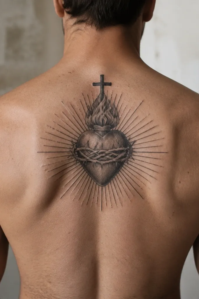
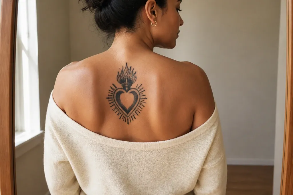
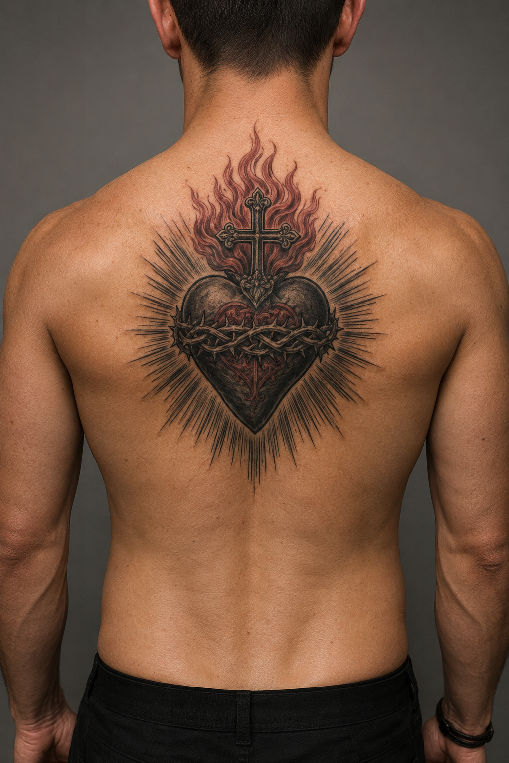
Start by placing the heart slightly above mid-back, centered between the shoulder blades. Keep the heart roughly palm-sized on most adults (about 5-7 inches tall), then let the rays extend 1-3 inches beyond the shoulder blade edges. Ask the artist for consistent line weight on the heart outline and controlled grey under the rays (not a foggy wash). For aging, prioritize crisp edges and avoid tiny highlights inside the heart. Expect moderate pain because the upper back has thinner fat than the lower back, and plan for a careful aftercare routine with tight sun protection once healed.
This is the “reads instantly” version. The heart stays the hero, and the rays pull the eye upward toward the shoulders. Straight rays keep the design graphic and symmetrical, which is why it fits the back so well — you can mirror the left and right sides without fighting the natural curve of your spine. If you want something devotional that still looks clean at a distance, this style wins. It also gives you room to add a rose later without rebuilding the whole tattoo.
One warningDon’t stretch the rays too wide across the entire back — it makes the heart look small and the symmetry harder to keep.
Editor's noteIf you want this to stay sharp, avoid super-thin outlines. A slightly thicker line makes the rays look intentional instead of fragile.
2. Sacred Heart with rose cluster and thorny stem
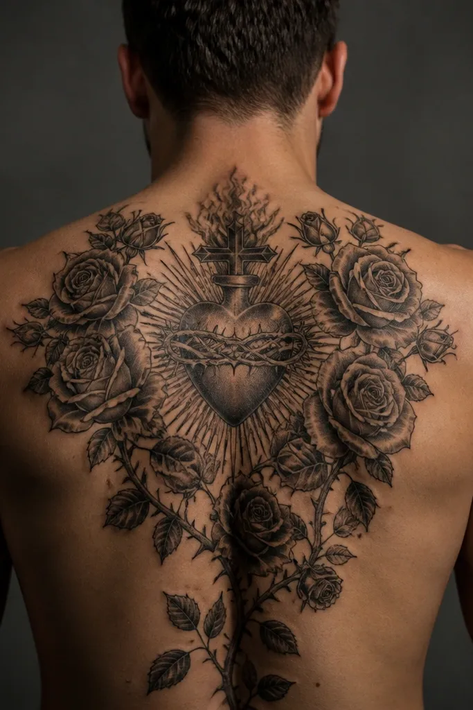
Place the heart at the center, then run the main thorn stem diagonally toward one side of the shoulder blade before it dips toward the upper-mid back. Keep rose petals bigger than you think you need — fine petal lines blur faster than bold shapes. Choose either line-and-shade roses (small grey gradients) or mostly blackwork roses (solid petals with negative space). Ask for thorns to use thinner linework than the heart outline so the heart stays readable. Plan a size around 8-12 inches tall, depending on how far you want the roses to wrap, and protect the reds if you add color.
Roses give the Sacred Heart a softer, more emotional read. A cluster of roses also adds texture without needing lots of tiny symbols, which helps with long-term clarity. The thorns matter — they create motion and pull the eye along the spine line, so the tattoo looks like it belongs to your body instead of floating flat. This style is great if you want devotion plus romance or want to balance the heart’s shape with organic curves. It also photographs well because the thorn lines create depth even when the tattoo is healed and matte.
One warningSkip micro-text inside the petals — it ages poorly and makes the roses look dirty after a year.
Editor's noteIf you want red roses, use limited red in the petals and keep shadows in grey or black so the design doesn’t turn flat as color fades.
3. Sacred Heart in a gothic arch frame
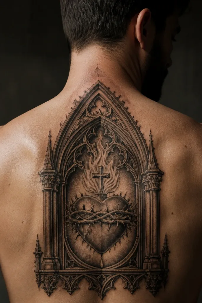
Center the arch so its widest point lands near your shoulder blade edges. The heart should sit slightly above the arch’s midline, with rays either tucked behind the arch or kept simple. Choose thick outline work for the arch and either solid black fill or soft grey for the heart; keep the heart outline at least as thick as the arch line weight. Ask for pointed arch details (small inner bevel lines) only if the artist has healed examples — tiny bevels can blur. Size it around 10-14 inches tall for a clean back read, and expect moderate-to-high session time because the arch needs symmetry.
A gothic arch makes the tattoo feel structured and intentional. It gives the heart a built-in border, so the composition stays crisp even when the back shifts with posture. This style is strong if you want the Sacred Heart to look like an emblem, not just a floating icon. The arch also gives the artist an easy way to use negative space — dark fills in the arch with lighter heart shading creates contrast that holds up over time. If you like blackwork-heavy tattoos, this one gives you the “frame” without needing a full back piece.
One warningDon’t make the arch too short. A stumpy arch fights the back’s vertical lines and makes the heart look compressed.
Editor's noteUse negative space in the arch rather than overfilling. It keeps the design airy and prevents a heavy black blob as it settles.
4. Fine-line Sacred Heart with lace shading
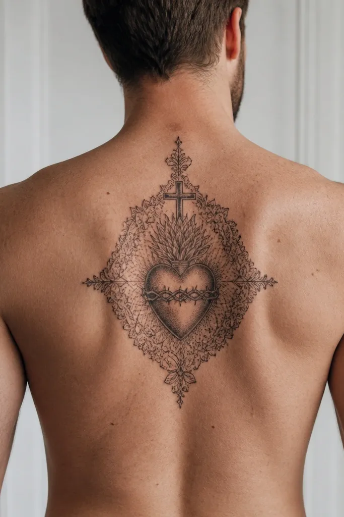
Place the heart slightly above mid-back and keep the rays narrow so the lines don’t spread into the shoulder movement zone. Aim for a heart height of about 4.5-6 inches with rays that add 2-4 inches total. Ask for single-needle or fine-line consistency and avoid thickening the outline after the fact — the outline should be planned, not improvised. Use minimal grey inside the heart and focus shading around the edges to preserve crisp borders. Expect longer healing time for fine work if your aftercare is inconsistent, and plan for sun protection because faded grey can make the tattoo look flat.
Fine-line Sacred Heart tattoos look tender and devotional without being heavy. Lace-like shading (thin grey gradients around the heart and rays) gives dimension while keeping the overall piece light on the skin. This style suits people who want something more intimate — you can see detail up close, and it still reads as a heart from across the room because the silhouette is clean. It’s also a good choice if you plan to add smaller tattoos around it later, since the design stays visually “open.” The trade-off is aging: fine linework needs a steady line weight and smart placement to avoid blur.
One warningDon’t add lots of tiny highlights and dots in the rays. That kind of micro-detail turns into noise.
Editor's notePick an artist who can show healed fine-line devotional work. Ask for healed photos of a similar line weight, not fresh ink.
5. Blackwork Sacred Heart with bold fill and negative-space rays
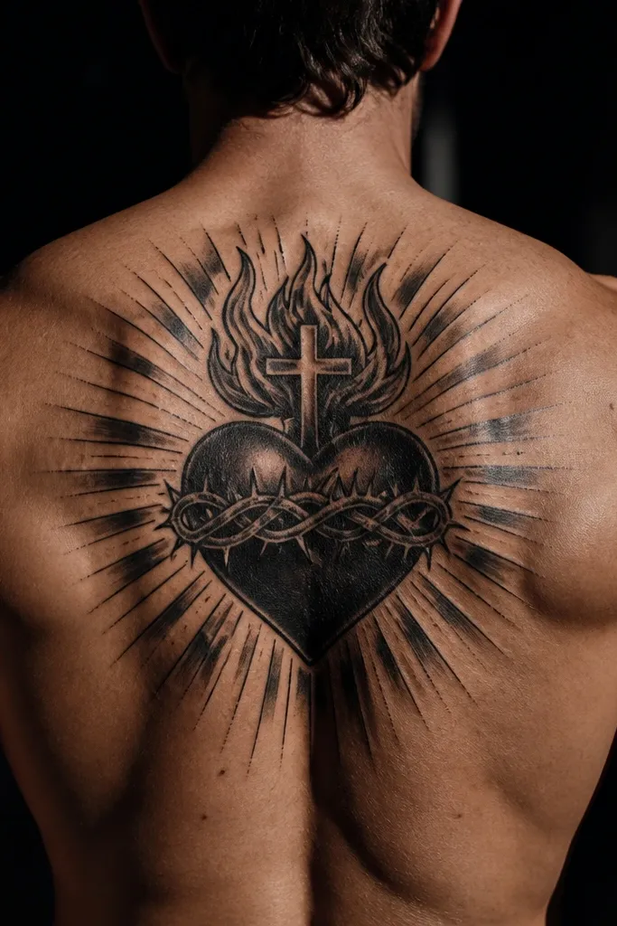
If you want the Sacred Heart to stay readable for years, blackwork is the safe bet. Solid fills in the heart and thick outlines create a strong silhouette that doesn’t depend on color. Negative-space rays look graphic and intentional — they stay crisp because the design is mostly about the shape of the light areas. This style is also forgiving if your skin texture changes over time. It suits people who like high-contrast tattoos and anyone who spends time in the sun and wants fewer worries about fading.
Center the heart between shoulder blades and let the rays extend toward both shoulder edges without crossing too far into the armpit area. Use a heart size around 5-8 inches tall, then make the rays either straight or lightly curved for flow. Ask for thick outer outline and solid fill decisions early, because a half-filled heart often looks patchy after healing. Keep grey accents minimal; blackwork should rely on shapes, not lots of soft gradients. Pain is usually moderate because of the dense fill, and aftercare needs extra attention to avoid over-drying — dense work can look darker before it settles.
If you want rays to feel “lit,” use negative space instead of thin grey streaks. Negative space holds contrast longer.
Don’t add too many tiny dot highlights. They disappear first and make blackwork look muddy.
6. Sacred Heart with crown and banner across the upper back
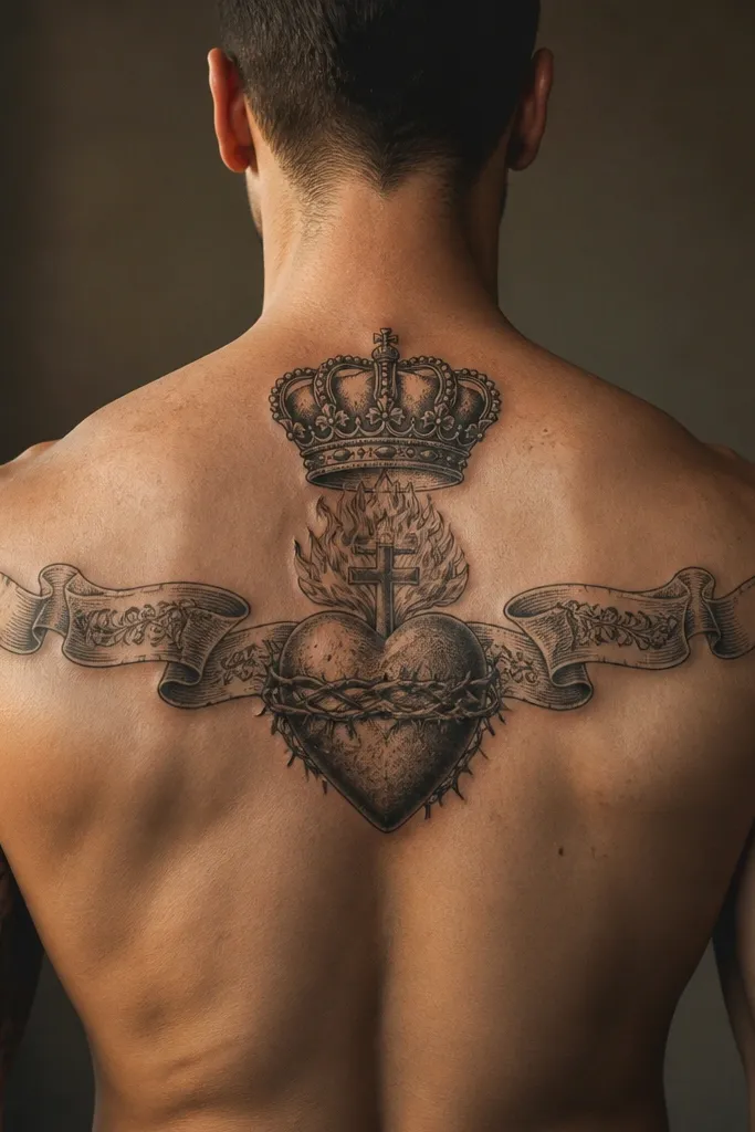
A crown and banner make the tattoo feel traditional and statement-like. The crown gives the top weight, while the banner creates a visual line you can tailor to your shoulder shape. If you want text, this is the best Sacred Heart back layout because the banner can sit along the natural horizontal line of the upper back. It also helps the heart stay centered — the banner frames it, so the whole piece looks balanced even if your shoulders aren’t perfectly symmetrical. The downside is that text needs legibility discipline.
Place the crown just above the heart, then let the banner curve slightly so it follows your shoulder blade contour. For size, think 9-13 inches wide across the upper back and about 10-14 inches tall total, including the rays. Use lettering that matches the tattoo’s line style: if your heart is fine-line, use fine text; if your heart is bold, match with bold lettering. Ask the artist for letter spacing that avoids crowding; compressed letters blur as they heal. For aging, keep the banner text minimal and clean — fewer words with better spacing stay readable longer.
Choose one short phrase instead of long script. A short banner keeps the lines thick enough to survive time.
Don’t pick ultra-thin cursive for a banner. It looks crisp on day one and turns into a smudge later.
7. Sacred Heart with broken chain and iron nails
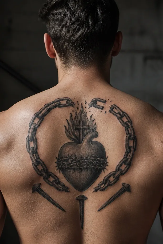
Place the heart centered between shoulder blades and let the broken chain hang from the lower part of the heart, curving slightly to one side. Keep the nails below the chain so the composition reads top-to-bottom. Size the heart around 5-7 inches tall, then allocate space for the chain and nails to reach another 3-6 inches downward. Ask for chain links with consistent thickness and clear edges; avoid overly thin links. For aftercare, expect more dryness in the chain area because it often has more linework; keep lotion light and follow your artist’s instructions.
This style leans into the suffering and redemption symbolism without needing extra saints or complex scenes. Broken chains add strong geometry — sharp link edges create contrast against the heart’s curves. Nails bring a gothic weight that makes the heart feel anchored, not floating. It’s a good choice if you want something darker and heavier than a classic devotional icon. This tattoo also looks strong even in black and grey, because the iron elements create texture through shape rather than color.
One warningSkip tiny chain links. They heal too softly and merge into a dark smear.
Editor's noteIf you want it in color, put red only in the heart and keep the chain iron grey-black to avoid a “candy” look.
8. Dotwork rays Sacred Heart with stippled glow
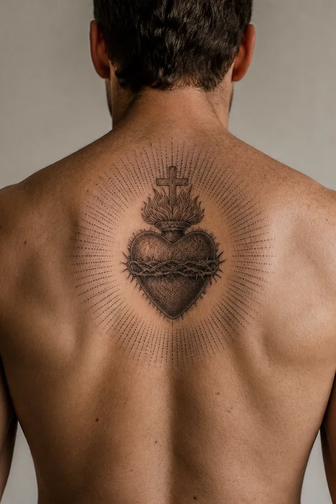
Center the heart between shoulder blades and keep the dot density consistent across the rays. Plan a heart size around 5-7 inches tall and rays that stretch 2-5 inches beyond the heart edges. Ask for stippling that starts light near the heart and increases outward only if the artist can keep the fade smooth. If the artist uses grey dotwork, make sure it is not too close to the outline — a too-tight dot border makes lines disappear. Expect moderate pain and longer healing if your skin is sensitive; keep the dotwork moisturized but not over-lotioned.
Dotwork rays create a “glow” effect without using heavy gradients. The Sacred Heart stays readable because the outline and heart shape are clear, while the dots build atmosphere around it. This style is for people who like texture and depth but want less solid black than full blackwork. It also works well on a back because you get enough skin area for dots to disperse evenly. The key is execution: dotwork needs spacing discipline, or it turns into a flat peppered patch.
One warningDon’t combine dotwork rays with tons of tiny stars or micro symbols. The back already has movement; clutter makes it unreadable.
Editor's noteRequest a clear outline around the heart. Dotwork alone without a clean border can blur into background texture.
9. Sacred Heart with half-sleeve style shoulder wings
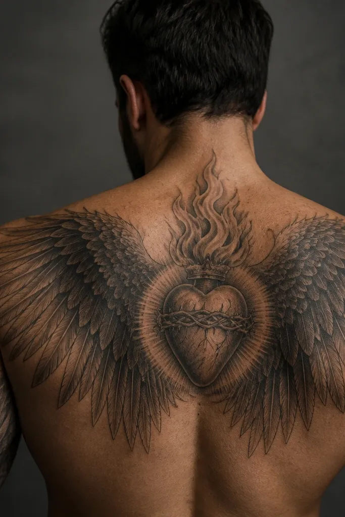
Place the heart centered and slightly higher, then design the wing rays so they hit the top of each shoulder blade. Keep the heart around 5-8 inches tall and let the wings extend outward toward the outer shoulder line. Ask for thicker ray lines at the top near the shoulder blades and thinner lines closer to the heart so the design feels aerodynamic. For shading, keep it simple: either line-only rays or light grey behind the wings. Pain can be higher at the shoulder blade edges, so schedule the appointment with enough recovery time.
This is the “back-to-shoulder” Sacred Heart that looks bigger than it is. Instead of rays spreading evenly, you give the heart wing-shaped rays that flare toward the upper traps. It frames your face when you’re standing and makes the tattoo look like it belongs to a larger body suit. The wings also help with symmetry — even if one shoulder is slightly higher, the wing shape hides minor imbalance. If you want a bold look without covering the entire back, this style is a smart use of the shoulder blades.
One warningDon’t extend the wings too far down the sides of the back. The curvature there distorts the ray shapes.
Editor's noteIf you want a more feminine look, use curved wing lines instead of sharp spikes. The curvature reads softer without losing clarity.
10. Sacred Heart with flame rays and smoky grey base
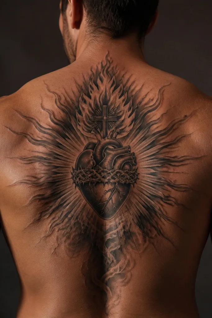
Center the heart between shoulder blades and design flame rays that rise upward and outward, not straight out. Keep flame tips clear — ask for rounded flame ends rather than tiny spikes that vanish as they age. Add smoky grey shading behind the heart and lower ray area, but keep it away from the outline so the heart border stays sharp. Size around 9-14 inches tall depending on how high the flames go. Expect moderate pain and keep aftercare strict; smoky shading can scab more and needs careful washing and light moisturization.
Flame rays turn the devotion icon into something more intense. The Sacred Heart stays the center, but the flames create a sense of motion and heat. A smoky grey base under the heart adds depth and helps the tattoo look “grounded” instead of pasted onto skin. This style suits people who like gothic or dark religious art without going full blackwork. It also looks good in black and grey because the smoke gives contrast even when you skip color.
One warningDon’t over-blend the smoke into the heart outline. Once the border softens, the whole tattoo loses its icon shape.
Editor's noteIf you want flames to feel bright, keep the smoke darker and the flame edges cleaner. Clean edges make the flame look intentional.
11. Sacred Heart with sunburst halo behind the rays
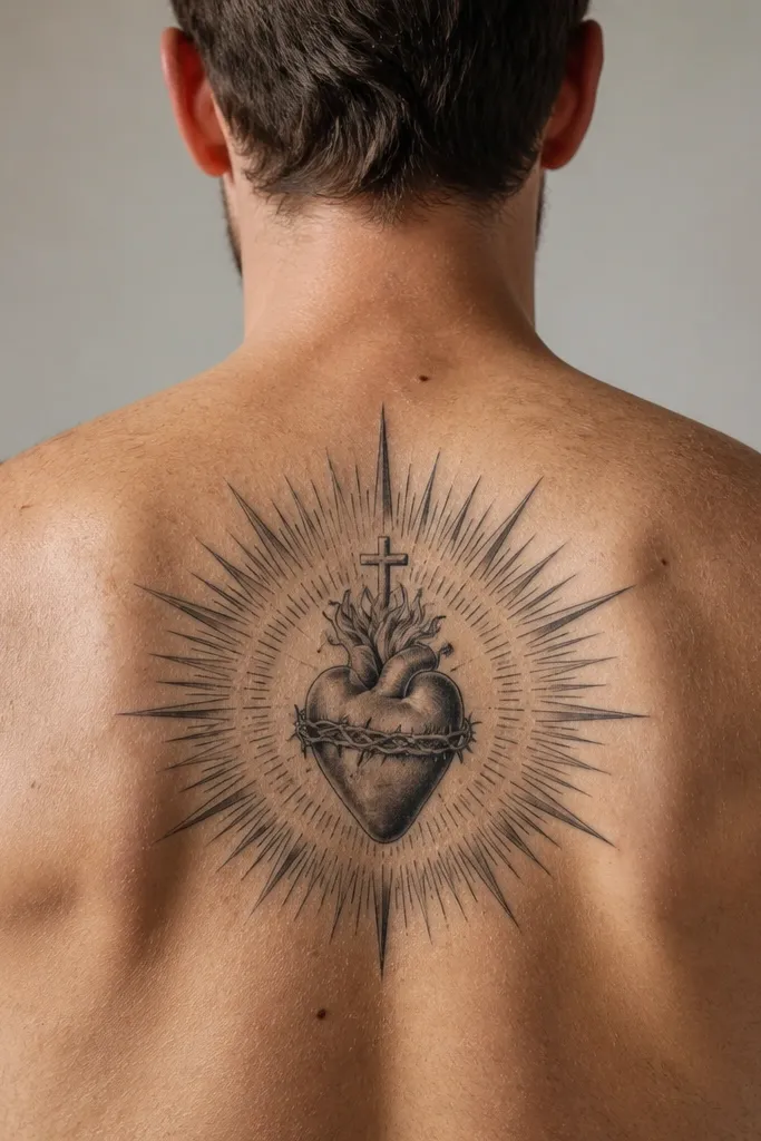
A sunburst halo makes the Sacred Heart feel illuminated. It’s different from straight rays because the halo adds a layered background that makes the heart stand out. This style is flattering on a back because the halo can extend wider than the heart while still staying symmetrical. It also gives you options: you can keep the halo simple and blackwork, or add fine-line ray detailing for a more delicate look. If you want something devotional but with an art-print vibe, this is a strong pick.
Place the heart centered and then build the sunburst behind it so the halo’s widest part sits near the shoulder blade edges. Keep the heart outline crisp and let the sunburst rays be slightly thicker than the inner ray lines for clear hierarchy. Choose either full black sunburst rays or a dotted/grey sunburst; mixed styles need careful planning so the tattoo doesn’t look busy. Size the piece around 10-15 inches tall and 6-12 inches wide depending on how far the rays extend. Pain is moderate because of the larger coverage, and aftercare matters because the rays can get irritated if you over-lotion during the first week.
For clarity, ask for a clear separation between the heart rays and the halo rays. Overlapping rays can blur into one texture.
Skip too many ray lengths. A few consistent ray sizes look cleaner than a random mix.
12. Sacred Heart with script banner and minimal roses
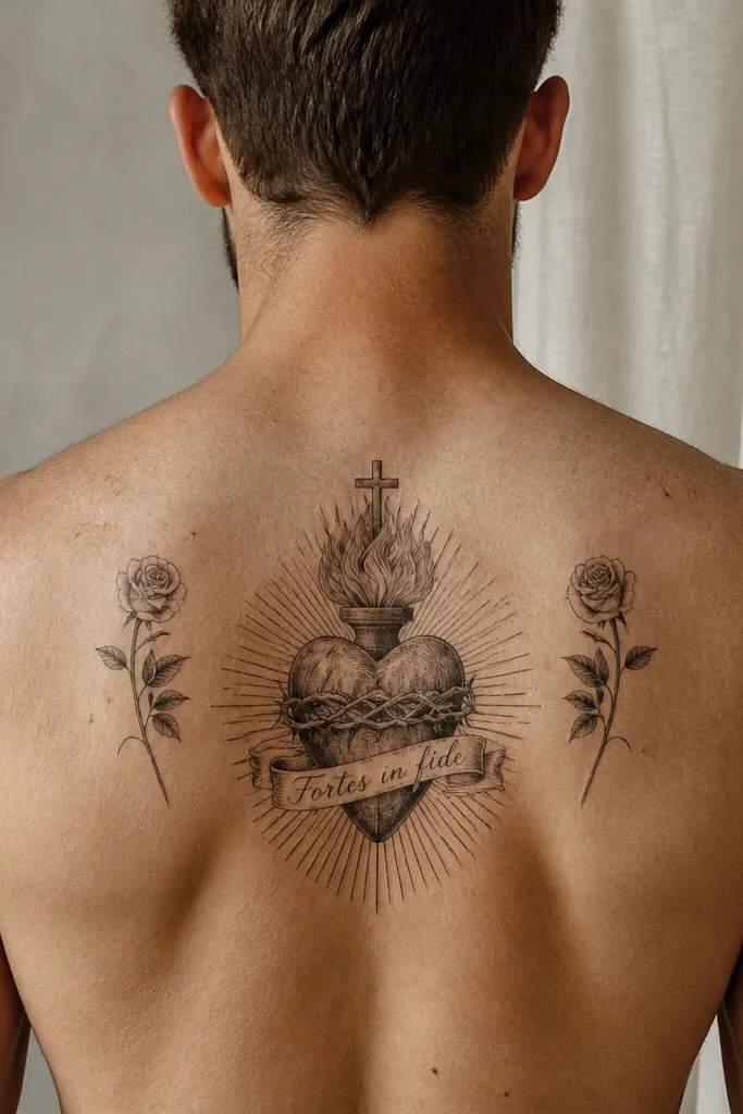
Place the heart centered and the banner across the upper back, keeping the banner letters spaced with steady line weight. Keep rose accents small (about 1.5-3 inches each) and positioned near the banner ends so they frame the text. Ask for the roses to use bold petal shapes rather than micro petals. Size around 8-12 inches wide across the upper back and 10-13 inches tall total. If you add color, keep it limited to the heart and maybe one rose highlight so fading doesn’t flatten the composition.
This is for people who want text and romance without turning the back into a full scene. Minimal roses add just enough organic texture to keep the design from feeling purely graphic. The banner gives a strong horizontal anchor on the upper back, and the small rose accents prevent the center from looking too flat. This style is also easier to keep readable because you’re not stuffing tiny details everywhere. It works well in black and grey with a single red heart if you want that classic pop.
One warningDon’t add extra symbols like crosses or stars around the banner. Two focal elements are enough for readability.
Editor's noteUse blocky serif lettering if you want maximum longevity; thin script is pretty but less stable.
13. Sacred Heart with ornamental filigree border
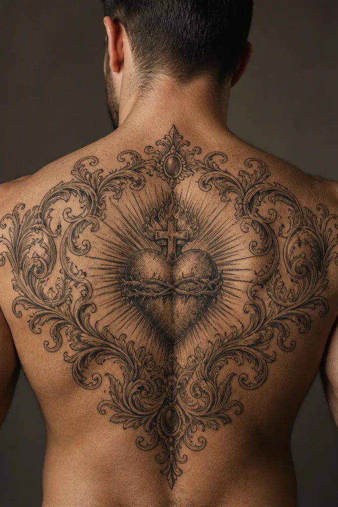
Center the heart and then build a filigree border that follows the back’s shape — wider at the shoulder blade edges, narrower near the spine line. Keep the filigree line thickness close to the heart outline so it doesn’t look like two unrelated tattoos. Decide early whether you want solid black border sections (blackwork filigree) or line-only filigree with negative space. For aging, keep the filigree gaps clear; overcrowded lace turns into a grey mesh. Size around 10-16 inches tall depending on border height, and plan for moderate pain if the filigree includes solid black sections.
Filigree makes the Sacred Heart feel like a framed devotional piece. The border creates a visual boundary that protects the heart from looking lost on a large back area. This style suits people who like ornamental tattooing but want it focused, not scattered across the whole torso. It also pairs well with blackwork or fine-line hearts because the border can carry the detail while the heart stays clean. The key is line discipline: filigree should look like deliberate lace, not random scribbles.
One warningDon’t use extremely fine filigree lines under 1 mm — they blur faster than the heart will.
Editor's noteIf you love filigree but worry about aging, choose line-only filigree with a clean heart outline and no micro dots.
14. Sacred Heart with watercolor wash rays (controlled color)
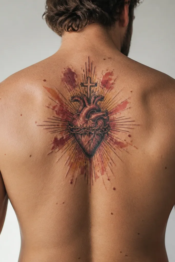
Place the heart centered between shoulder blades and keep the outline darker than the wash. Ask for limited color zones: red heart with gold rays, or red rays with a muted grey base. Keep wash edges soft but not bleeding into the heart outline; you want a clean separation line. Size around 9-13 inches tall, with rays that spread wider than the heart but stop before the lower back curves. Aftercare is the same, but sun protection is non-negotiable because watercolor tones can dull over time. Expect moderate pain and plan for a careful lotion routine to avoid patchy healing.
Watercolor-style rays can look like devotion in motion, especially with red and warm gold tones around the heart. The heart outline should stay crisp; the wash goes behind it so the icon remains readable. This style fits people who want color without a full-color illustration scene. It can also be more forgiving than super-fine line art because the wash creates a soft background texture. The trade-off is that watercolor effects fade faster, so you need an artist who can control edges and keep the heart border from melting into the wash.
One warningDon’t choose full watercolor hearts with no solid outline. The heart shape is what keeps the tattoo readable.
Editor's noteRequest a darker underlayer for the rays so the color has something to sit on and doesn’t look washed out early.



