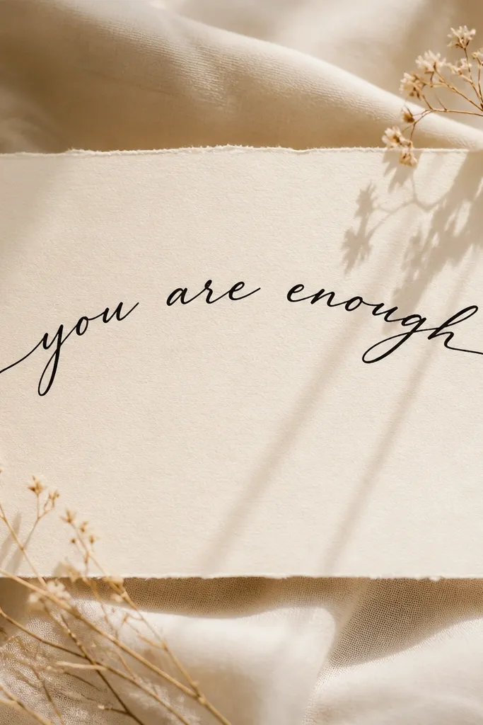
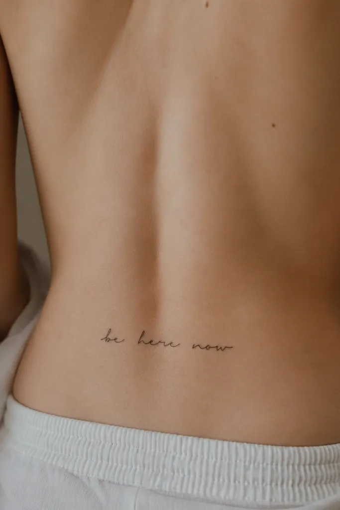
1. Micro Script Centered on the Spine
This look works because micro script reads delicate but stays controlled when it's centered and kept short. The ink sits in a narrow band, so the letters don't fight the hip curve. I like it with a true black needle pack (no gray haze) so the text stays crisp as the skin moves. The result looks like personal jewelry, not a statement block.
Ask for a phrase length that fits within roughly 5 to 7 cm (about 2 to 2.75 inches) along the spine. Keep the letters narrow, and avoid connecting every letter - too much flow turns into a blob when the lower back stretches. Placement should start just above the top of the butt crease and end before you hit the widest part of the hips.
Pro tipWear a fitted bra or low-back underwear when you get the stencil - it changes how your back relaxes and helps the artist size it right.
AvoidAvoid ultra-thin script with tiny spacing, because it fades into gray fuzz faster on this area.
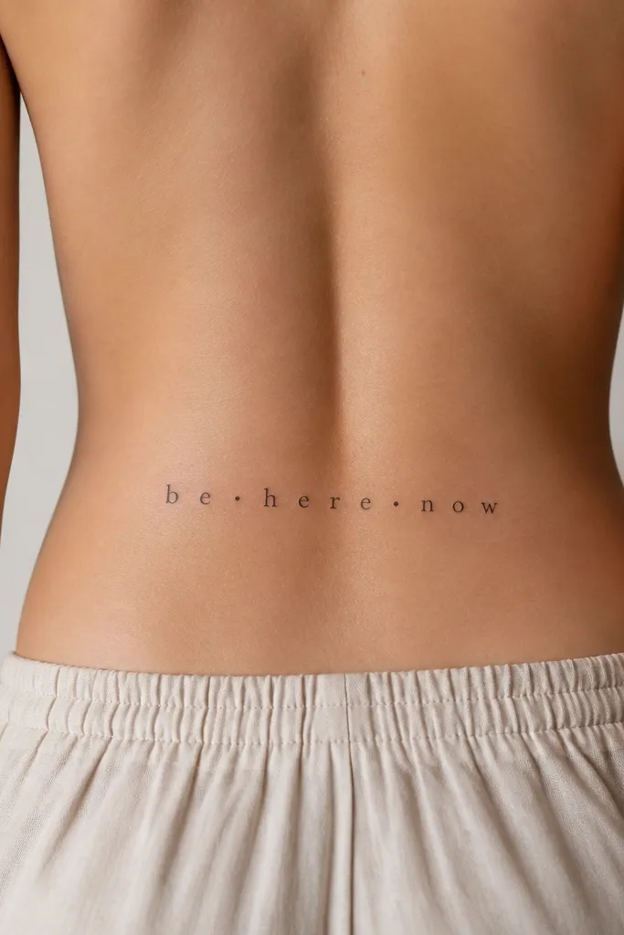
2. Straight All-Caps with Wide Letter Spacing
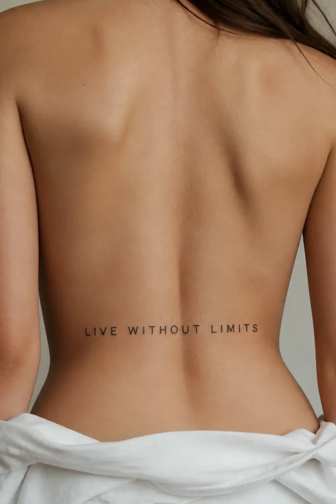
Wide letter spacing makes the phrase look intentional and airy, especially on a flat line layout. All-caps also stays readable even when the skin shifts from sitting to standing. I've found that bold sans-serif or simple serif reads best here because it doesn't rely on delicate curves. It gives "cool and clean" without needing shading.
Choose a font where the downstrokes are thick enough that they don't disappear - think medium bold, not light. Keep the text length around 6 to 9 cm (2.25 to 3.5 inches) and keep it straight, not arched. Place it centered, starting slightly lower than you think, because the skin pulls when you sit.
Pro tipAsk the artist to do a quick stencil photo from the side view - straight text can look angled in photos if it's not level on your body.
AvoidAvoid condensed fonts; they pack too tightly and turn into a dark strip over time.
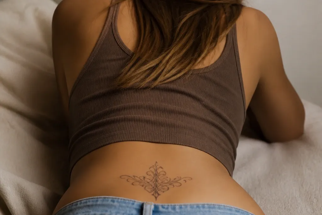
3. Soft Arched Script Like a Locket
An arched layout mirrors how your lower back curves. When it's done right, the phrase frames your shape like a locket chain - it looks flattering in jeans and low backs. I like script here when the artist keeps the stroke weight a little heavier at the end of each letter. The arch also helps the text stay readable even when your back flexes.
Pick a phrase length that fits within about 7 to 10 cm across the widest part of the arch. The center of the arch should sit around the middle of the spine, with ends tapering toward the hip line. Keep the ink purely black or black with slight gray only if you want depth.
Pro tipIf you want it to look extra clean, ask for "no heavy swirls" - small loops are fine, big curls get messy on skin movement.
AvoidAvoid a dramatic high-arch; it can look like the text is floating above your body.
4. Roman Numerals Under a Word Line
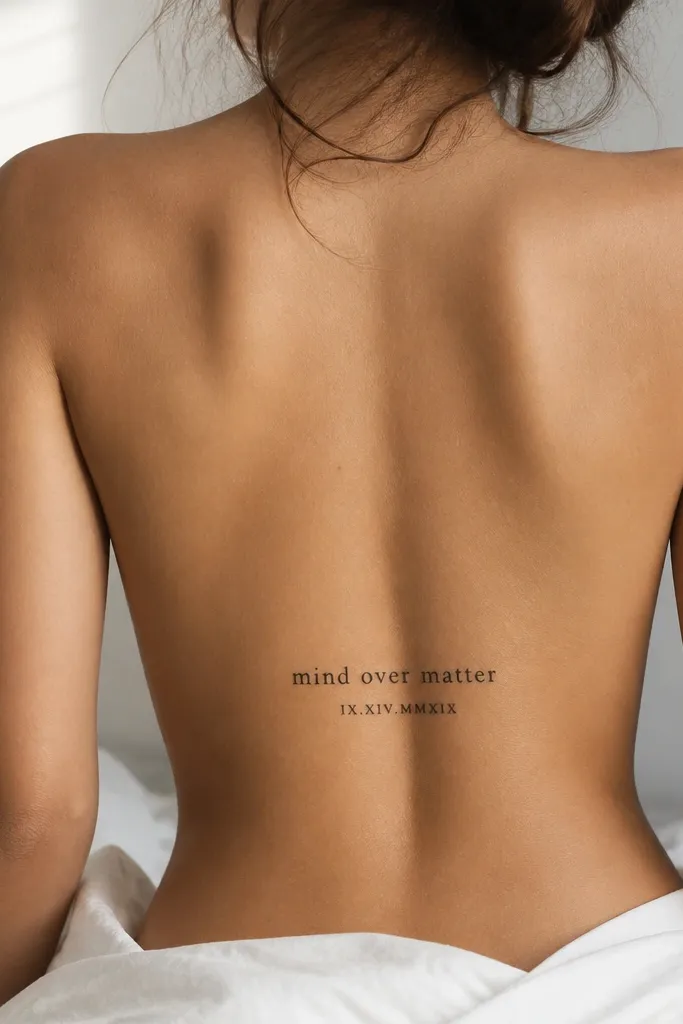
This combo looks styled because the numerals act like a second line of punctuation. It's also practical: numerals are bold enough to stay legible while the top word can be more delicate. I've seen this work best for anniversary dates, coordinates, or a meaningful year. The mix creates visual hierarchy without needing shading.
Use one short word line (about 3 to 5 words max) and keep Roman numerals about 60% the height of the main text. Place both lines centered, with the numerals sitting roughly 6 to 10 mm below the bottom of the word line. Keep everything within the same overall width so it doesn't spread into a horizontal banner.
Pro tipChoose numerals with thick serifs - thin numerals look pretty at first, then blur sooner.
AvoidAvoid long dates like 12/31/1999 in one block; split it or shorten the format.
5. Two-Line Quote with a Tiny Dot Divider
Two lines add structure, and the tiny dot divider keeps it from looking like random text. This is one of the most flattering layouts for the lower back because it controls width and gives the eye a natural path. I like this when the quote has a strong first and second half, like "stay" then "soft." The dot gives a neat, jewelry-like finish.
Keep the first line slightly longer than the second, so the phrase feels stacked instead of boxy. Place the divider dot about a letter-height below the first line baseline. Font should have clear letterforms; avoid script that connects everything.
Pro tipAsk your artist to test spacing by drawing the stencil over your favorite bra strap position - that's usually where your back shape will be most consistent.
AvoidAvoid adding decorative swashes around the dot; it turns into a cluttered underline.
6. Signature Name with a Small Heart Tail
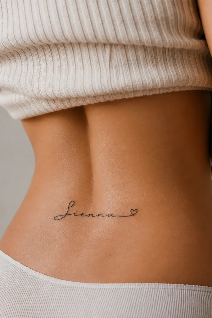
A signature reads personal fast, and that small heart tail adds softness without turning it into a cartoon. I like keeping the heart tiny - like the size of a pencil eraser head relative to the letters - because anything bigger steals attention from the name. This style looks great with minimal jewelry and clean outfits. It also ages well when the downstrokes are thick enough.
Pick a name length that fits within 8 to 12 cm total. Keep the heart tail attached at the end of the last letter, not floating separately. Place it centered, with the baseline just above the butt crease so it doesn't get stretched too hard.
Pro tipIf your script is very loop-heavy, ask for a simplified version that keeps the personality but removes three or four of the biggest loops.
AvoidAvoid a thick outline heart around the signature - it can look sticker-like after healing.
7. Calligraphy with Gray Wash Shadow Behind Words
Gray wash behind the words makes the phrase look dimensional, like it's sitting on your skin instead of printed on top. It also softens the contrast so the letters feel romantic rather than harsh. I only do this with clean calligraphy where the strokes are thick enough to hold shape. The wash should fade quickly, not form a solid block behind the letters.
Choose a calligraphy font with medium-to-bold strokes. Ask for a wash that starts about 2 to 3 mm outside the letter edges and fades into your skin tone. Keep the phrase within 7 to 10 cm wide so the shadow doesn't look like a smear.
Pro tipIf you're worried about fading, keep the main text fully black and let the gray be subtle - it heals softer, not bolder.
AvoidAvoid a heavy gray rectangle behind the text; it turns into a background stain.
8. Fine-Line Serif with a Thin Underline Rule
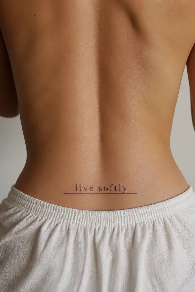
This looks like typography on a page, but tattooed to fit your body. The underline gives structure and makes the phrase look styled even without extra decorations. I like it when the phrase is short and punchy - fewer words read cleaner here. The serif shape also creates elegance without needing shading.
Use a serif font with clear counters (the holes in letters) so it doesn't blur into a solid mass. Keep underline length about 1 to 2 mm longer on each side than the outer letters. Place it centered, and keep it slightly higher than the butt crease so it doesn't stretch too much.
Pro tipAsk for the underline to be slightly lighter in the middle - it looks more natural and less like a ruler.
AvoidAvoid ultra-thin needle-only linework; fine lines without enough thickness fade unevenly.
9. Script + Mini Branch Accent on One Side
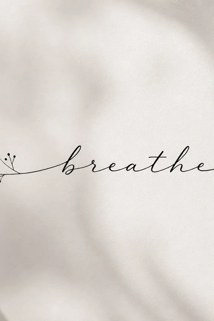
The mini branch adds motion and makes the words feel like part of a small composition. Keeping it on one side makes the tattoo look intentional rather than symmetrical-and-boring. I've done this with phrases like "be kind" and "stay curious," and the accent makes it look more "art" than plain text. The branch also helps hide slight imperfections because the eye follows the accent.
Keep the branch about 2 to 3 cm tall and place it so its top aligns roughly with the top of the tallest letter. Use dot leaves or tiny teardrop leaves - no detailed shading. Keep the phrase centered; the branch is the counterweight, not the main event.
Pro tipChoose a branch style that matches your font - if your script is smooth, keep the branch line smooth too.
AvoidAvoid lots of leaves or thick branches; it crowds the text and ages messy.
10. Word Array with Micro Dots Between Letters
These micro dots make the words look designed, not copied. They also create rhythm, which is why this style reads well even when the phrase is short. I like it with minimal fonts because the dots add personality without clutter. The effect is clean, slightly retro, and very "aesthetic" in real life.
Pick a phrase with 2 to 4 words, and decide where dots go before the session. The dots should be small and consistent - think pinhead size relative to the letter height. Place it centered, and keep the overall width under 8 cm so it stays crisp.
Pro tipAsk for dot placement to be symmetrical around the center letter so it looks balanced in photos from the back.
AvoidAvoid random dots every few letters; it turns into noise.
11. Two Words in Block Letters with a Curved Parenthesis
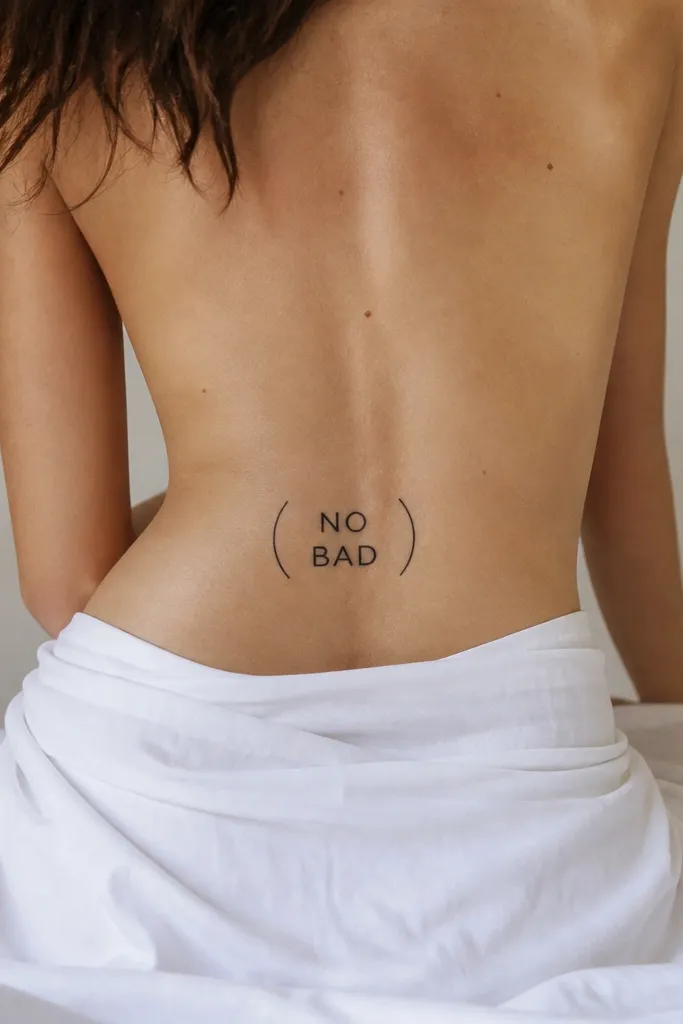
Block letters give you bold readability, and the curved parenthesis frames the words like a bracket. This is a great choice if you want "words" but still want it to look like artwork. I like the parenthesis in a single thin line, no fill, so it stays crisp. The framing makes the tattoo look planned even with only two words.
Choose exactly two words so the bracket doesn't look stretched. Keep block letters medium bold so they don't turn into a thick smear. The curved parenthesis should mirror the back curve, with ends pointing toward the hip line but not crossing it.
Pro tipIf you wear low-back tops, test how the bracket sits when you lean forward - it should stay centered, not slide to one side.
AvoidAvoid thick bracket lines; they overpower the words.
12. Handwritten Look with Uneven Stroke Intent
This is the "my friend wrote this on my notebook" vibe, but tattooed clean. The uneven stroke intent makes it feel human and personal, which is why it reads aesthetic even when it's just words. I prefer this when the phrase is short because the charm comes from the letter personality, not the length. Keep it black-only so it stays sharp.
Give the artist a handwritten reference (a photo of your actual handwriting) and ask them to keep the wobble consistent. Limit the phrase to around 3 to 6 words so it doesn't turn into scribble. Place it centered and slightly higher than you think so it doesn't stretch too much when you sit.
Pro tipWear a fitted shirt in the appointment so the artist can see how the stencil sits on your actual back shape.
AvoidAvoid copying a typeface that looks handwritten; it often loses the charm and ends up bland.
13. Arched Quote with Small Star at Each End
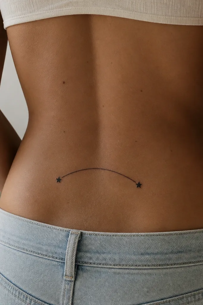
Stars at both ends make the arch feel finished. This layout is strong because it creates symmetry and gives you a clear visual boundary for the phrase. I like it with fonts that are readable at a distance - no overly curly script. The stars add sparkle without needing color.
Choose a quote that fits within 7 to 10 cm across. Place the phrase in an arc where the center sits about 1 to 2 cm higher than the ends. Keep star size small so they don't become the main thing. Stars should align with the ends of letters, not hang outside the tattoo area.
Pro tipAsk the artist to keep the star points crisp - healed soft stars look like dots.
AvoidAvoid uneven star sizes; mismatched stars scream "stencil copy."
14. Words Integrated into a Minimal Heart Outline
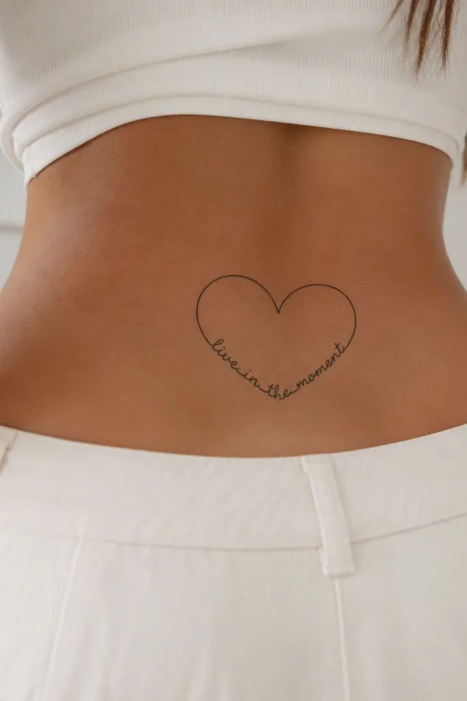
This one is romantic without being loud. The heart outline gives the placement a natural frame so the words don't drift or look random. I like using thin line art for the heart and medium black for the words so the text stays readable. The outline also helps the tattoo look "complete" from the side, not just straight-on.
Use a short phrase that fits inside the heart - usually 3 to 5 words. The heart outline should be thin and even, about the width of a pencil lead line. Place the heart centered, with the top curve sitting above the spine's natural centerline and the bottom point hovering just above the butt crease.
Pro tipIf you want extra neatness, ask for the phrase baseline to follow the inner curve of the heart so letters look like they belong.
AvoidAvoid thick filled hearts; they swallow the words as everything heals.
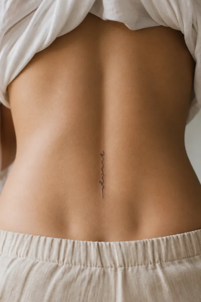
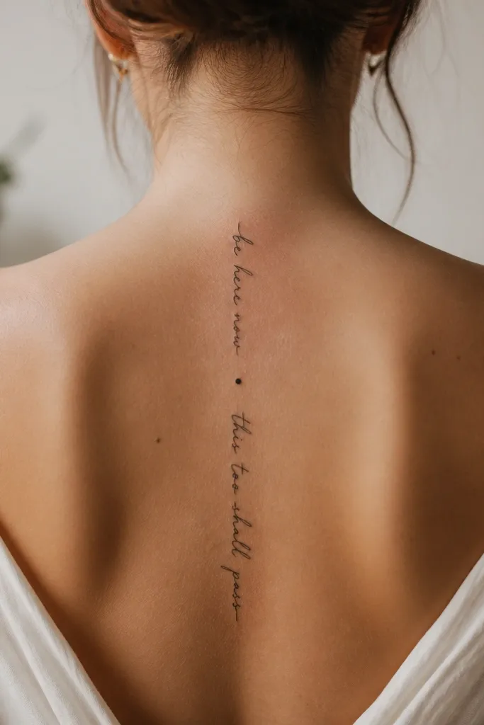
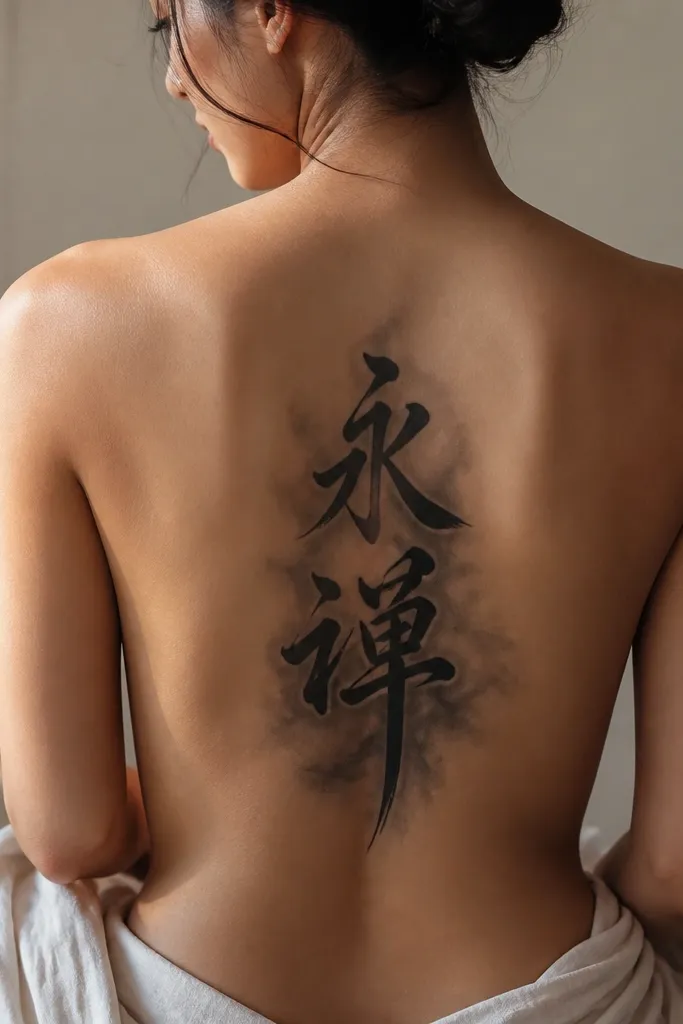
15. Vertical Column Words Along the Spine
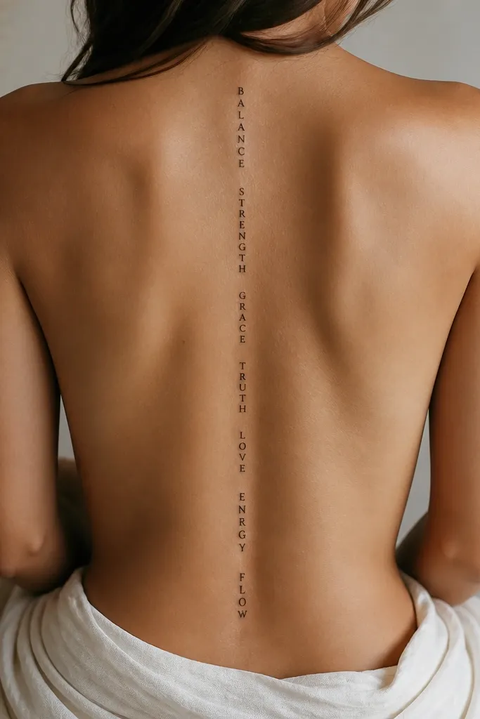
Vertical columns are rare, which is why they look more styled than the usual horizontal tramp stamp text. The spine alignment makes it feel intentional and keeps the tattoo flattering when you wear high-waisted jeans. I like it with one short phrase split into two or three lines, written in a consistent font. The vertical layout also hides the "stretch" issue because you're not spanning across the widest part of the hips.
Pick a phrase that fits into 2 to 3 lines when stacked. Keep each line about 2 to 3 cm long, aligned to the spine, with spacing between lines around 4 to 6 mm. Place the top line just below the bra band area on the back, then let the bottom end stop before you reach the widest hip flare.
Pro tipAsk for a stencil that you can check in a mirror while you're standing naturally - vertical text can look centered in a photo but off in real life.
AvoidAvoid long sentences; vertical columns only look good when the line lengths stay short.


