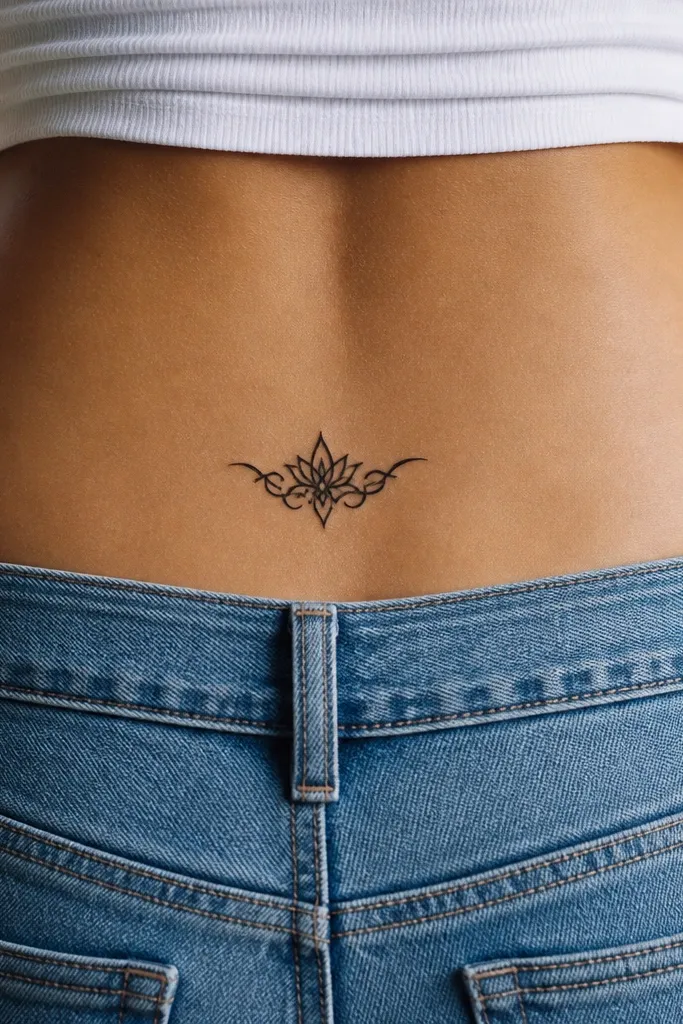
1. Mini Black Rose with One Green Leaf
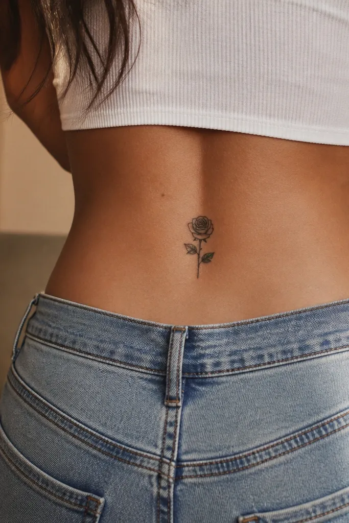
This works because a rose reads even when it fades. The black petals hold shape, and the single green leaf gives you that 2000s romance without needing heavy color packing. You get contrast against your skin tone, and the design doesn't rely on delicate shading that disappears first. It also sits nicely on the natural curve of the lower upper-back, which is where these tattoos usually live.
Ask for a rose about 3.5 inches tall with a width around 2.5 to 3 inches. Keep the leaf around 1 inch long and place it on the lower right side of the rose. Color choices I'd stick with: black for the petals and a muted forest green for the leaf, not neon.
Editor's notePut the rose's center slightly higher than you think, so the bloom stays visible even when you wear lower-rise bottoms.
One warningDon't request a heavily blended rose with lots of micro-shading - it fades unevenly on that spot.
2. Two Stars with a Tiny Moon Crescent Below
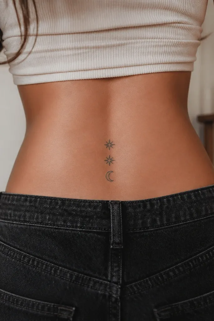
Stars and moons are the most forgiving 2000s motifs because they're geometric and bold. Solid fills keep the edges sharp, and the tiny crescent adds that early-2000s celestial vibe without needing gradients. When this fades, it usually fades evenly because there's less subtle tonal work. It also looks good in photos because the shapes read instantly.
Go for overall size of about 4 inches wide and 3 inches tall. Place the two stars about 1 inch apart, with the crescent centered under the gap by about half an inch. Keep everything in black ink; if you want one accent, use a very light periwinkle only in the crescent outline.
Editor's noteAsk the artist to slightly thicken the star outlines - it keeps the points from softening as you age.
One warningSkip thin, outline-only stars - they blur fast on moving skin.
3. Small Butterfly with Thick Outline and No Background
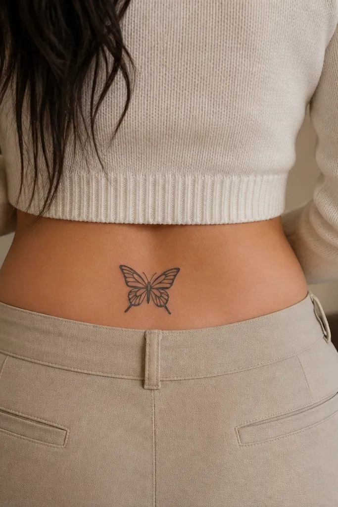
A butterfly is classic tramp stamp energy, but the low-maintenance version is the simplified one. Thick outlines keep the wing shapes crisp, and the internal line breaks give it structure without tiny shading. Leaving out a background prevents that "muddy" look you get when color packs too deep in one pass. It's also easy to touch up later because you're not relying on fading gradients.
Target size: 3.8 inches wide and 3 inches tall. Place it so the butterfly's body sits just above your waistband line, and angle it slightly so one wing points toward your right hip. For a 2000s feel, add a single pastel accent stripe (light lavender or pale baby blue) on the top wing only.
Editor's noteRequest symmetry checks on stencil placement - butterflies look off fast if one wing is a millimeter higher.
One warningDon't add a full dotwork halo or heavy background shading - that's the part that turns gray first.
4. Cursive "Love" with a Thick Underline Swash
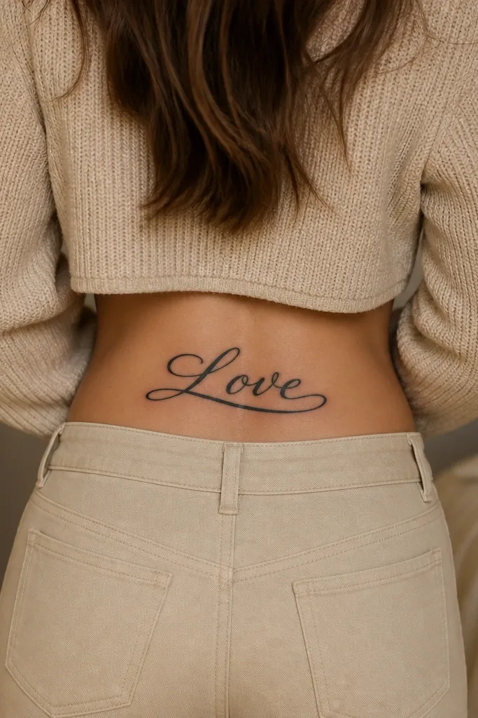
Script can be low-maintenance if the strokes are thick and the spacing is generous. A chunky underline swash makes the design look like the 2000s "ink on a curve" style, even years later. It also heals more predictably than micro-lettering because each stroke has enough ink to hold shape. I've seen thin script turn into a gray smudge on this area; thick script stays legible.
Keep the word width around 3 inches and height around 2 inches. Place it horizontally across the upper-back curve, with the underline swash sweeping toward one hip. Use solid black, no gray wash behind it.
Editor's notePrint the stencil twice and check it against your posture in a mirror - script looks different when you slouch.
One warningAvoid tiny cursive fonts with hairline strokes - they fade first and can turn unreadable.
5. Tribal-Style Flame Tips in Solid Black
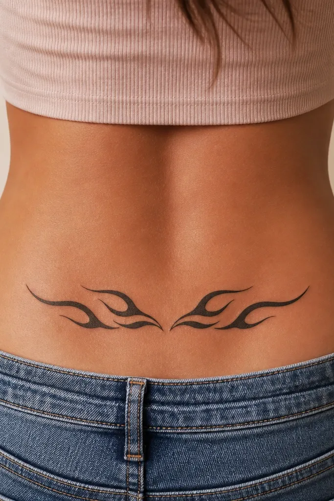
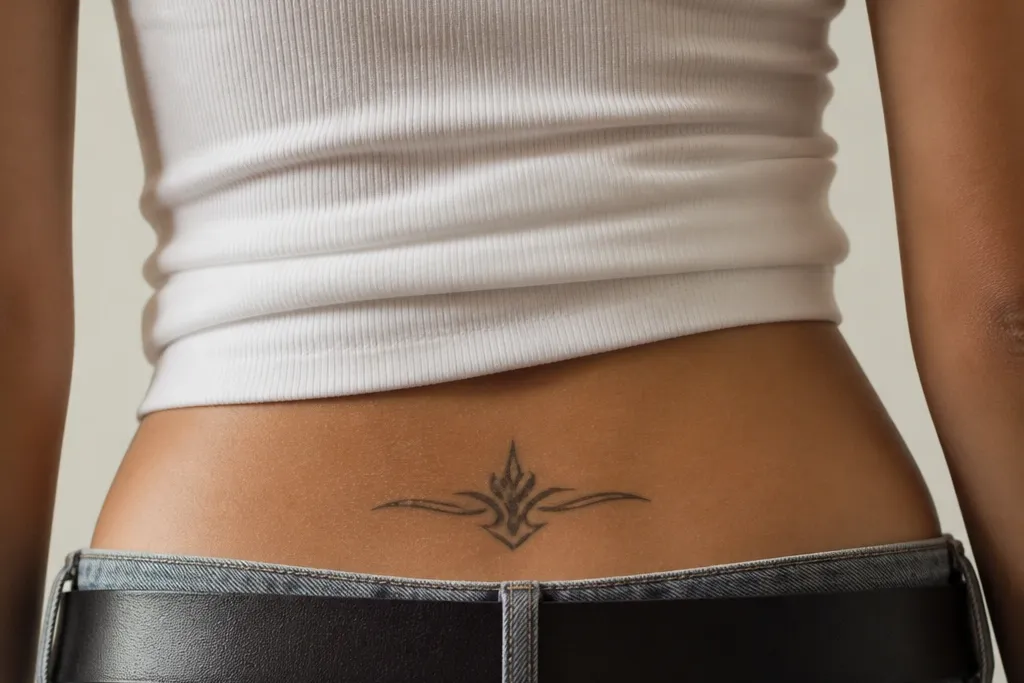
Tribal flames are 2000s-adjacent and surprisingly low-maintenance when they're solid. Negative space gives the design structure, so even if some ink lightens, you still read the flame silhouette. Because it's mostly black shapes, it doesn't depend on careful color blending. It also looks good with body movement because the edges stay defined.
Ask for a width of 4 to 4.5 inches and a height of 2.5 to 3 inches. Place the band slightly off-center so it hugs the natural curve, with the taller flame tips toward your spine. Keep gaps between flames around 1/8 inch in the stencil so it doesn't heal like one blob.
Editor's noteIf you want it to stay sharp, ask for slightly heavier line weight at the outer edges only.
One warningDon't choose a super dense tribal that fills every space - it blurs during healing.
6. Three Tiny Hearts in a Vertical Stack
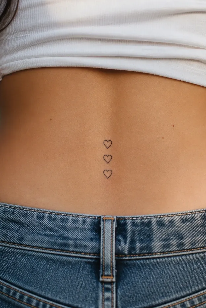
This is the "cute but grown" version of a tramp stamp. Hearts heal well when they're solid and not outlined thin. The vertical stack keeps the design tight and readable, even as the skin shifts. It also looks great under lingerie and swimsuits because it's small enough to stay crisp and centered.
Go with hearts around 0.65 to 0.75 inches tall each. The total tattoo height should land around 2.5 inches including small spacing. Place the stack so the middle heart sits at your waistband line mark in a mid-rise fit.
Editor's noteAsk the artist to keep the heart points rounded slightly - sharp tips can soften over time.
One warningDon't add a lot of shading inside the hearts - it's the first thing that fades into gray.
7. Vine Wrap with Two Leaves and a Small Rosebud
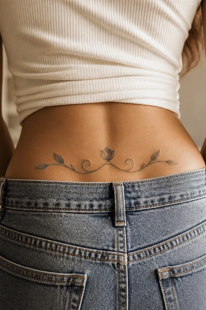
Vines look great in the 2000s style because they frame the body curve. This low-maintenance version works because the rosebud is small and bold, and the leaves are mostly solid. The vine line is medium weight so it doesn't disappear, but it's not so thick it turns into a black smear. It also gives you movement - the design looks alive even with minimal color.
Target overall size 4.5 inches wide and 3 inches tall. Put the rosebud at the top center of the vine loop, with leaves about 1.25 inches apart. If you want color, use a single muted green fill on one leaf only.
Editor's noteRequest a slightly thicker vine where it crosses the center - that area sees more friction from clothing.
One warningAvoid adding lots of tiny berries or dots along the vine - they blur and fade faster than you expect.
8. Butterfly Wing Outline with a Single Dot Accent
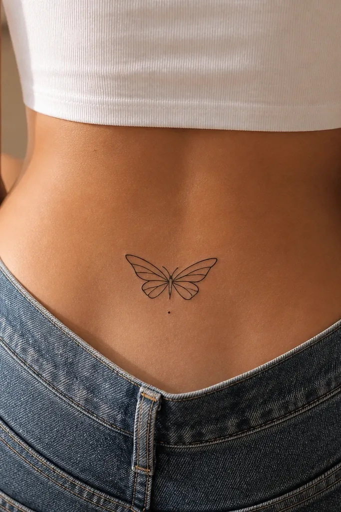
Outline-only tattoos can fade, but this one stays readable because it uses a sturdy outline and simple internal line structure. The single dot accent gives you that "2000s sweet spot" without turning the design into a color project. When the teal fades, the black outline still does the heavy lifting. It's also a good option if you're worried about color aging.
Keep it around 4 inches wide. Place it so the wings mirror your spine curve, with the center body at the top third of the tattoo. Use black for the outline and internal lines; add one teal dot no bigger than a pinhead.
Editor's noteMake sure the outline thickness is at least medium - ask for a line weight check on the stencil before they start.
One warningSkip super fine linework in this placement - it disappears faster under friction.
9. Barbed-Wire Heart with Clean Negative Space
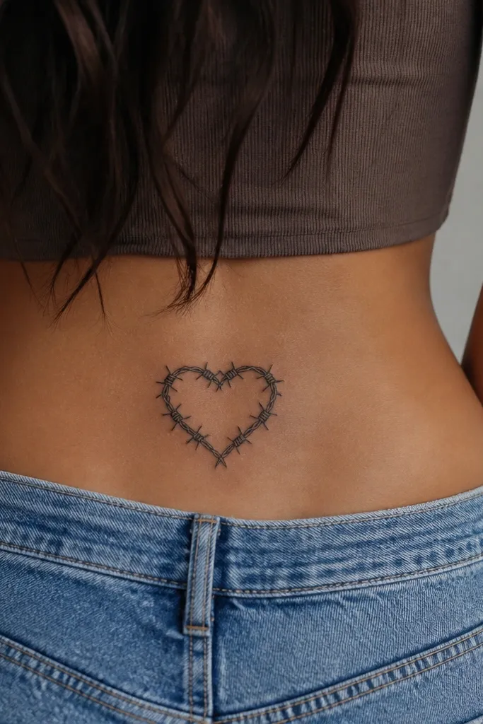
This hits the 2000s contrast between cute and edgy. It stays low-maintenance when the heart is defined by clean barbed-wire lines and the interior is mostly blank. Negative space keeps the heart from turning into a filled blob as it softens with time. It also looks intentional because the wire lines give it structure.
Aim for 4 inches wide and 3.5 inches tall. Place it slightly off-center so the heart leans toward one hip. Keep the barbs spaced evenly; stencil the barbs so they don't crowd the heart edges.
Editor's noteAsk for slightly thicker barbed-wire tips at the outer edges so they don't fade first.
One warningDon't add gray wash inside the heart - it dulls the contrast quickly.
10. Anchor with a Small Ribbon Banner
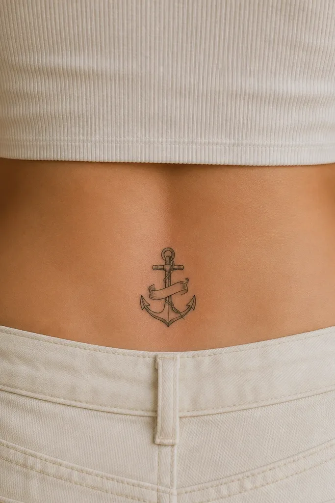
Anchors are simple, bold shapes that hold up in this spot. The ribbon adds that early-2000s "tattoo with attitude" look without requiring micro-lettering. Keeping the banner blank avoids readability issues if it fades. It also heals well because you're not relying on delicate gradients.
Choose size around 3.8 inches tall and 2.7 inches wide. Place the anchor's top ring about 2 inches above your waistband line. Keep the ribbon tails around 1.5 inches each and make them thick enough to read.
Editor's noteIf you want it to feel more 2000s, add a thin light-blue line only along the ribbon knot, not the entire ribbon.
One warningSkip tiny text inside the banner - it's the first thing to go.
11. Trio of Small Crosses with One Spark Dot
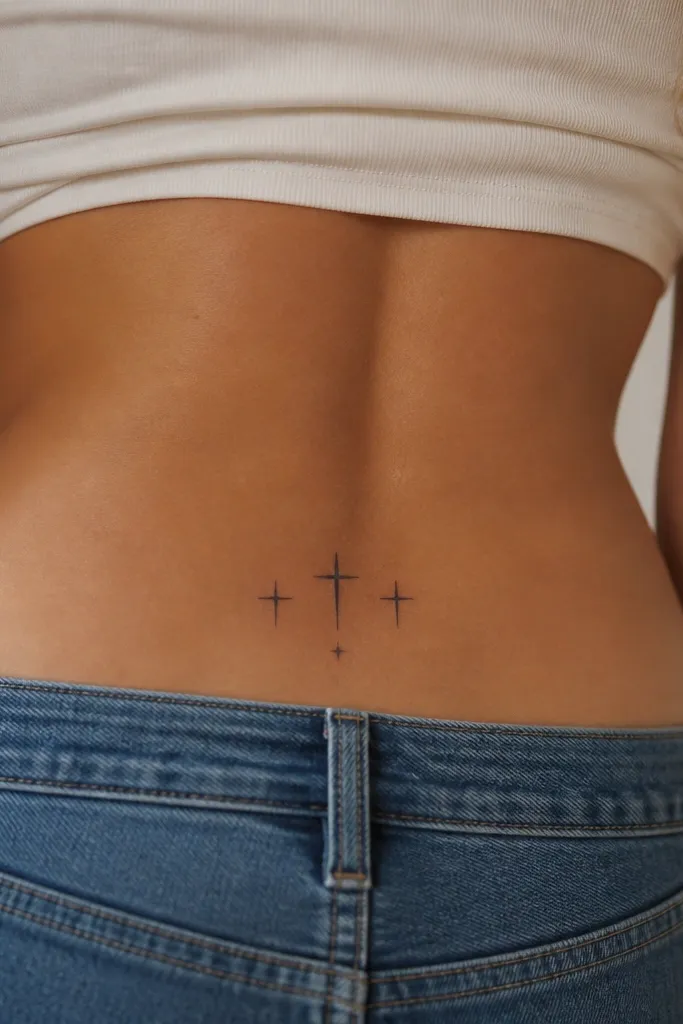
Crosses are all about clean geometry, and geometry ages better than fine shading. This design uses three crosses with consistent thickness, so it stays recognizable. The single spark dot makes it feel like a 2000s flash-art tattoo without adding clutter. It also works for people who want something spiritual that still looks cute under fitted tops.
Make the total width about 3.5 inches and height about 2.8 inches. Place the arc so the middle cross sits slightly higher than the outer two. Keep everything black; if you add color, use it only on the spark dot as a tiny pale gold outline.
Editor's noteTell your artist you want the crosses to be the same height - uneven crosses look accidental as they fade.
One warningDon't crowd the spark dot with extra mini stars - that turns into gray noise.
12. Sunburst Rays with a Small Center Dot
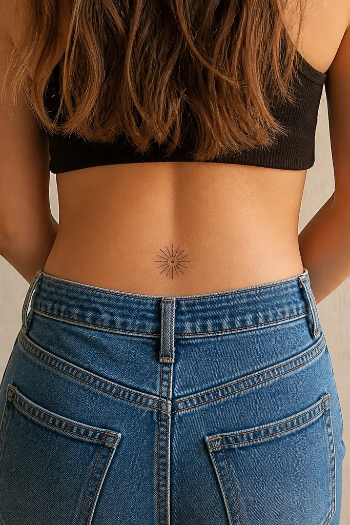
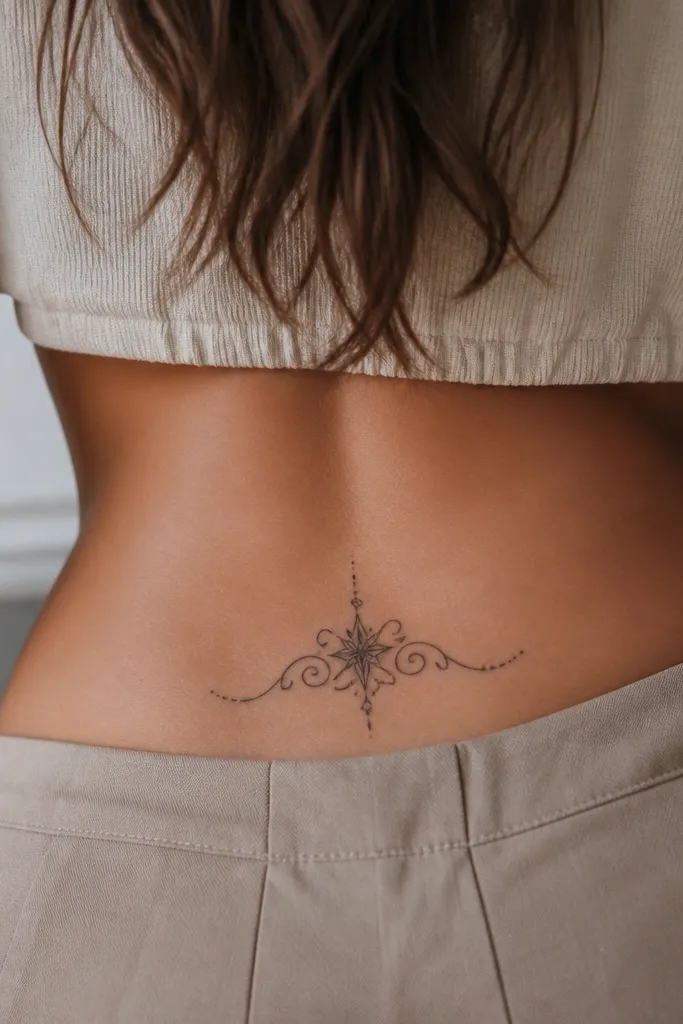
Sunbursts are low-maintenance because the design is basically bold lines. The center dot gives it a focal point, and the short rays stay readable from a distance. This is a strong choice if you want a 2000s "tribal-sun" vibe without spending time on gradients. It also looks good even if it fades slightly - the silhouette remains.
Pick a diameter around 3.5 inches. Place it so the bottom edge sits just above your waistband line, not down at the lower back. Keep rays evenly spaced and about 1/4 inch long in the stencil.
Editor's noteAsk for slightly thicker rays than you think you need - those thin rays fade first.
One warningAvoid long, skinny rays - they blur into each other over time.
13. Half-Sleeve Style Dainty Vines (But Small)
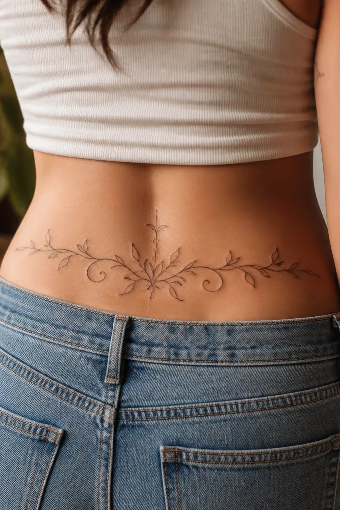
This gives the look of a bigger tattoo without committing to a large piece. The low-maintenance part is that the vines are thick enough to stay legible, and the rosebuds are simplified. You get that 2000s "girly but artsy" back vibe while keeping the ink manageable in healing. It also frames your waistline nicely when you wear low-rise jeans.
Keep it at 5 inches wide max and 3.5 inches tall. Place the cluster slightly higher on the back curve so it doesn't cut across your waistband when you sit. Use black only, and put the rosebuds at the far left and far right edges of the cluster.
Editor's noteRequest a stencil that maps the vines around your spine curve - don't let the artist place it flat.
One warningSkip tiny leaflets and dotwork - they fade unevenly and make the piece look tired.
14. Small Tribal Sun Behind a Heart
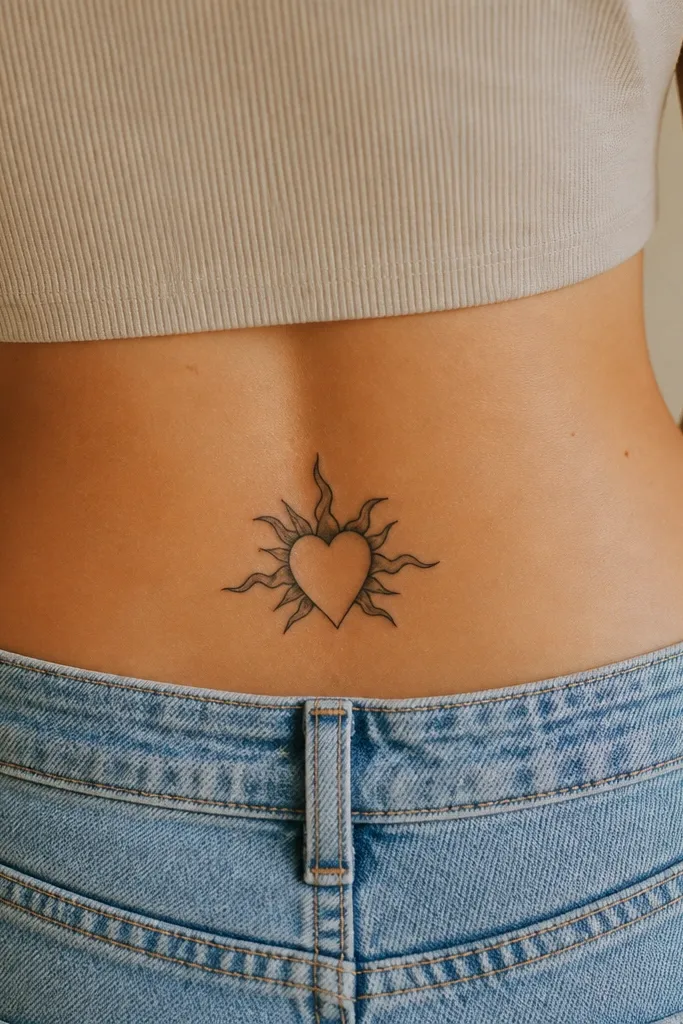
Layered shapes read well because each layer has a clear job. The heart is the main message, and the sunburst adds 2000s energy without needing color. Keeping the sunburst behind the heart avoids extra detail that would require more shading. As it fades, the heart stays the clearest element.
Aim for 4.5 inches wide and 3.2 inches tall. Place the sunburst rays only behind the top half of the heart so the silhouette stays clean. Use solid black for everything; keep ray count around 10 to 12 for clarity.
Editor's noteAsk for the heart outline to be slightly thicker than the sun rays so the main shape holds up.
One warningDon't add a lot of dot shading around the sun - it turns gray and looks dirty.
15. Clean Bow with a Tiny Star at the Knot
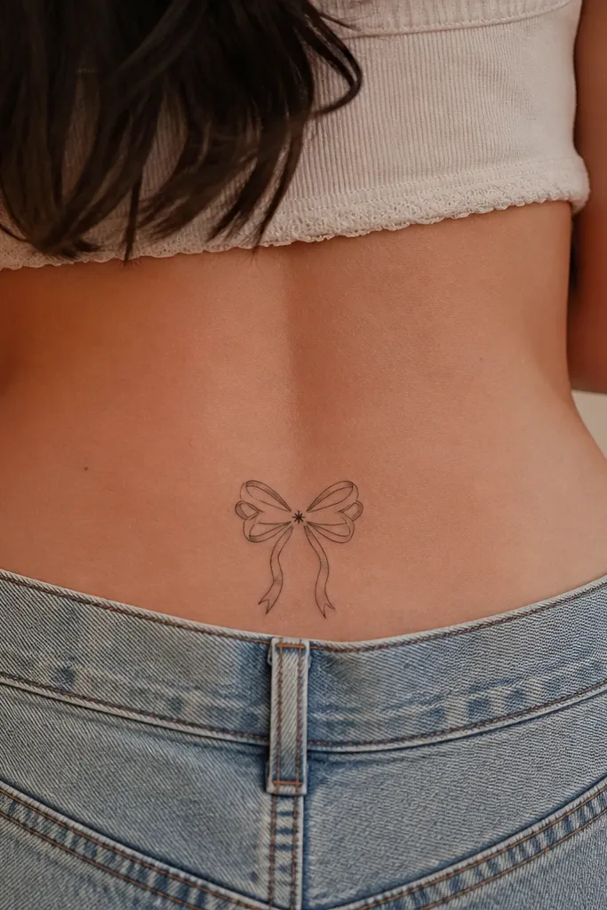
This is the "cute back tattoo" that still holds up. The bow is made of thick, smooth curves that heal predictably, and the tiny star adds that 2000s sparkle without requiring elaborate shading. It's also easy to keep low-maintenance because it's mostly outline + solid fill. When the ink softens, the bow shape remains obvious.
Target size 3.8 inches wide and 3 inches tall. Center it so the knot sits at the middle of your waistband line when standing straight. Keep the star about 0.5 inches wide and place it right in the knot.
Editor's noteHave the artist thicken the bow edges - they're the first part to blur with friction from waistbands.
One warningSkip ultra-thin bow lines - they fade faster than the star detail.
16. Single Scroll Banner with Thick Ends
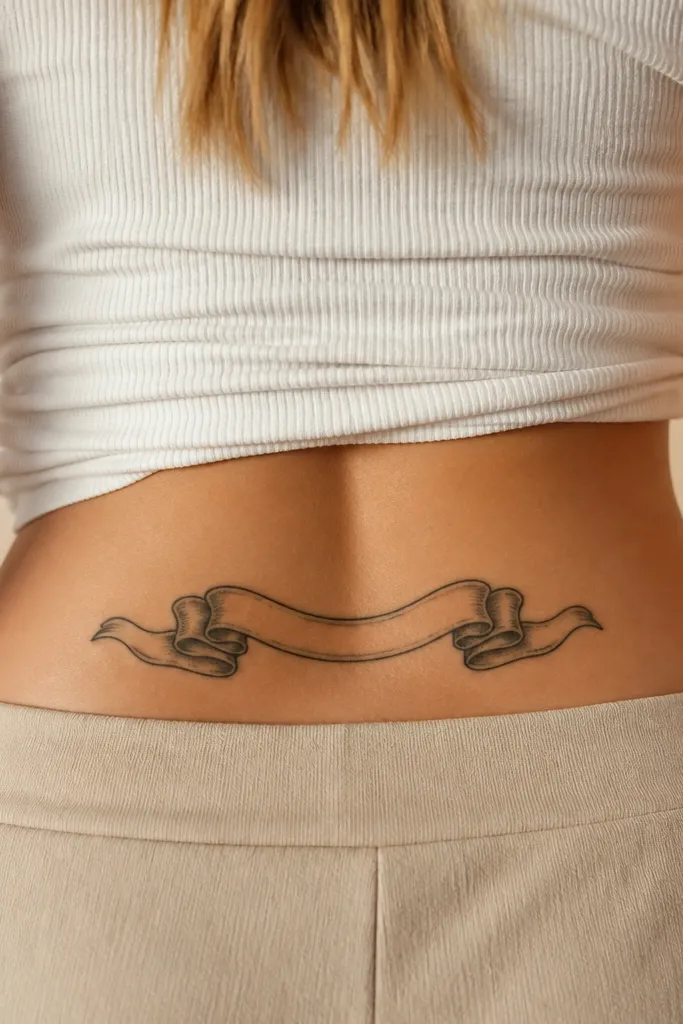
Scroll banners look very 2000s when they're bold and minimal. This design works because it uses thick ends and a clean negative space center, so it doesn't depend on tiny shading. It also heals well because there's less surface area filled with ink. You can wear it with confidence because it looks intentional even when it fades slightly.
Make it around 5 inches wide and 2 inches tall. Place it horizontally along the back curve, with the spirals toward your hips. Leave the center blank; if you want text, keep it to one short word in thick block letters no smaller than 0.25 inches tall.
Editor's noteIf you want the cleanest look, skip text and let the scroll shape be the whole point.
One warningDon't add lots of filigree in the center - that's where it turns into gray lace.
17. Small Rosebud with Two Tiny Spark Dots
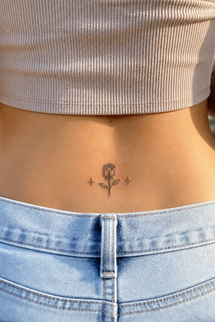
This is a "less is more" 2000s tattoo that still looks like you tried. The rosebud is the anchor, and the spark dots add the fun without extra lines. Spark dots are basically solid ink points, so they age better than delicate starbursts. It's also a good first tattoo shape if you want something feminine but not fragile-looking.
Keep overall size around 3.5 inches wide and 3 inches tall. Place the spark dots about 0.6 inches away from the rosebud on both sides. Use black only; if you want color, add a tiny muted red blush only in the bud center.
Editor's noteAsk for the bud outline to be slightly thicker than the internal curl lines.
One warningDon't place the sparks too close - they merge as the tattoo heals.
18. Vine Frame Around One Small Feather
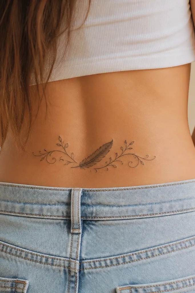
Feather tattoos can look messy if they're over-shaded, but a simple feather outline with a few internal ridges stays crisp. The vine frame gives you the 2000s "back detail" feel and makes the tattoo look designed, not random. The leaves anchor the composition so it doesn't float as it fades. It also photographs well because the center feather catches light.
Target size 4.5 inches wide and 3.8 inches tall. Place the feather tip pointing slightly toward your spine, with the vine curling outward toward your hips. Keep leaves small, about 1 inch each, and use black only.
Editor's noteTell your artist you want fewer internal feather lines than you think - three to five ridges looks cleaner in healing.
One warningSkip heavy gray feather shading - it turns smoky and loses shape.
19. Single Letter Initial with Curly 2000s Flourish
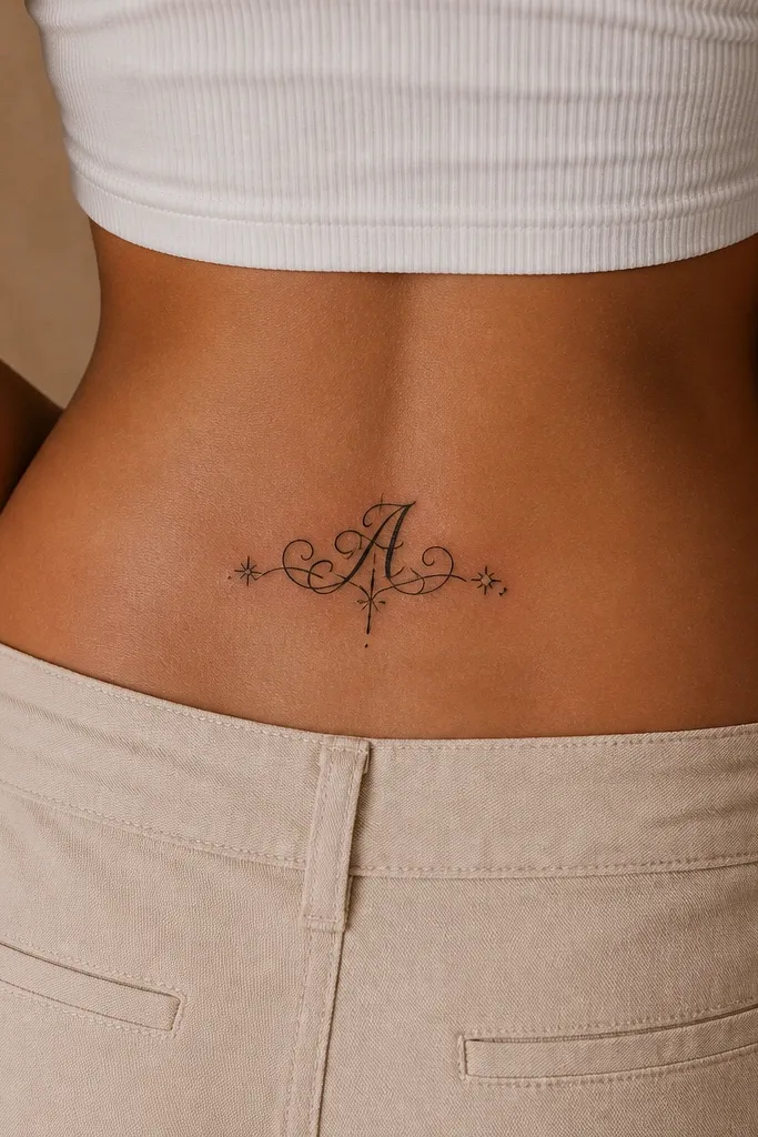
A single initial is low-maintenance because you can control it. When the letter is bold and the flourish is thick, it stays readable and doesn't rely on tiny details that blur. This also gives you that 2000s personal tattoo vibe without turning into a whole paragraph of script. It's especially good if you're worried about the tattoo aging with you.
Choose a letter height of about 2.5 inches, with the flourish extending another 1 inch outward. Place it slightly off-center so the flourish doesn't hit the spine too tightly. Use black ink only and avoid thin cursive letterforms.
Editor's notePrint the exact font you want and bring it to the appointment - the stencil font is where people get disappointed.
One warningAvoid tiny cursive initials - they fade into a shape, not a letter.
20. Tiny Bowtie with Two Short Ribbon Lines
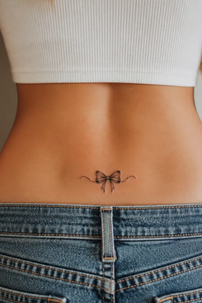
Bowties look playful and structured, which is why they hold up. This low-maintenance version uses short ribbon lines and a thick knot, so there's no fine detail to lose. It reads as 2000s fashion-inspired ink without needing color. When it fades, it still looks like a bowtie, not a smear.
Keep it compact: about 3 inches wide and 2.2 inches tall. Place it on the upper-back curve so the knot sits just above your waistband line. Use solid black fills on the knot and outline on the ribbon lines.
Editor's noteAsk for crisp corners on the ribbon lines - rounded corners can blur together as the tattoo heals.
One warningSkip long ribbon tails - they drag across friction points and blur.