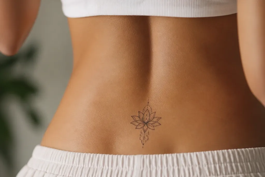

1. Micro Rosebud Cluster at the Upper Crease
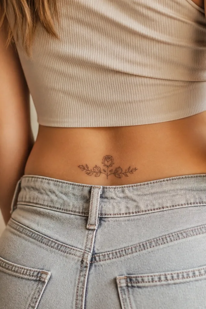
This works because rose shapes give you natural "separation" even when the tattoo is small. The black outlines define each petal edge, and the grey wash keeps the petals from looking flat. The negative space between buds makes the whole thing read as blooming, not crowded. I like it especially when the widest part sits along the crease line.
Size it to about 2.5 inches wide and 3 inches tall. Keep leaves thin and sparse - two to three leaf tips are enough. Ask for grey wash that fades toward the petal base, not a solid filled center.
Editor's noteIf you want it to pop under light, add one tiny highlight dot inside the top petal using white ink only if your artist is experienced with it.
2. Single Feather with a Tiny Compass Rose
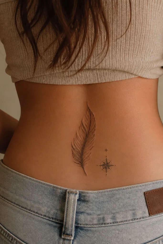
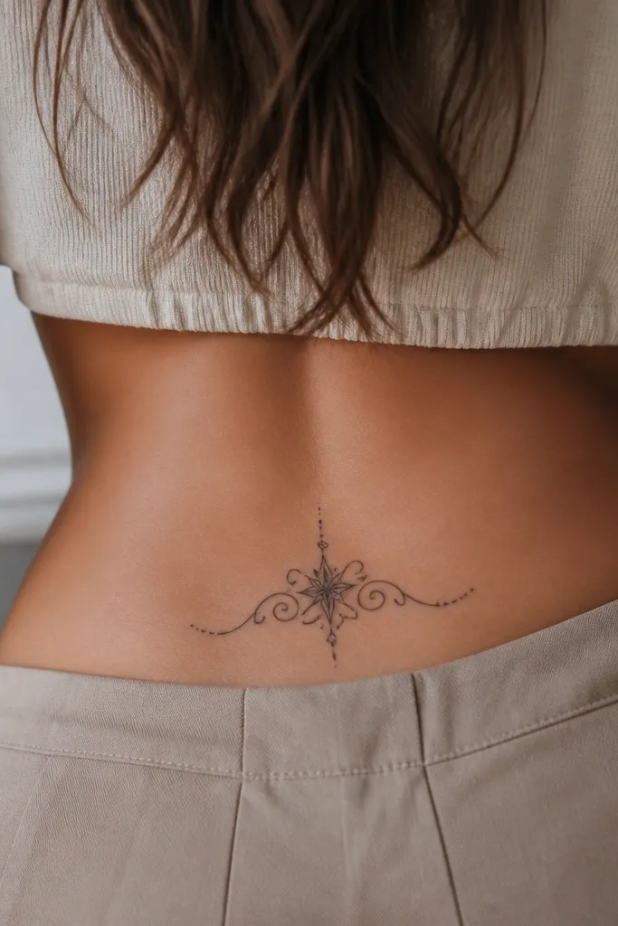
A feather silhouette is forgiving because the barbs create a built-in pattern. The compass rose adds structure, so the design doesn't look like a random mark. Thin linework keeps the feather airy, while the grey shading gives it depth without heavy fill. It looks especially good when the compass sits slightly tilted, matching your hip curve.
Aim for 2.75 inches long. Place the feather tip angled toward your spine by 10-15 degrees. Keep the compass rose under 0.8 inches across so it doesn't steal attention.
Editor's noteDo a quick stencil test with your hand on your lower back - if it shifts when you lean, the placement is too low.
3. Mini Baroque Scroll with One Teardrop Gem
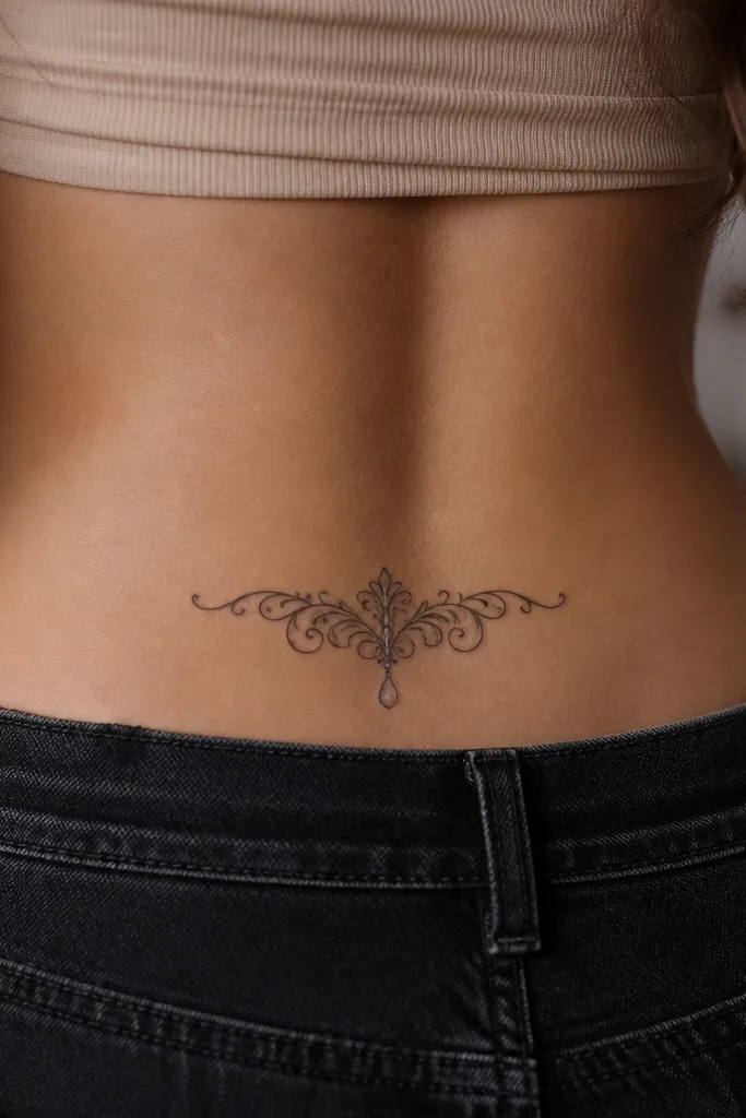
Baroque scrollwork looks fancy even small because it has lots of curves and natural "movement." The single teardrop gem gives you a focal point so the tattoo feels intentional, not decorative filler. Grey wash under the scroll adds a soft 3D effect. The gem can be left as a clean outline or filled with a tiny dark gradient.
Keep the scroll within a 2.5 x 3 inch box. Make the teardrop about 0.4 inches tall. Ask for shading that follows the curve - you want it to hug the scroll, not smear across it.
Editor's noteIf you wear low-rise bottoms, place it where the bottom seam hits beside the scroll, not through it.
4. Lavender Bud Outline with Tiny Dots
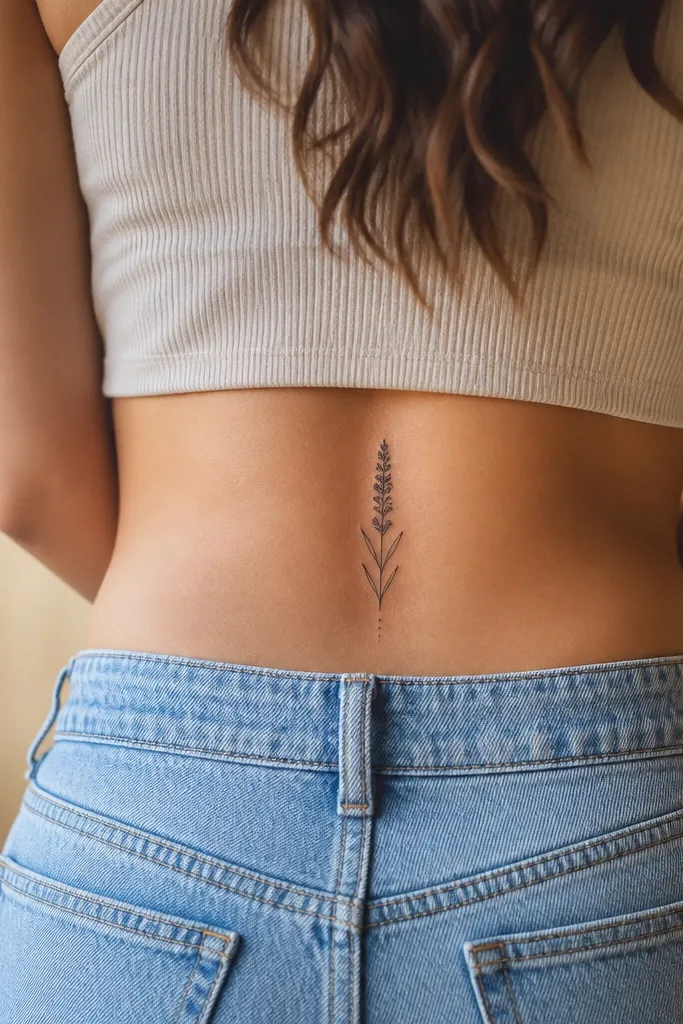
Lavender buds have a repeating texture pattern, so small tattoos still look detailed. The dot clusters mimic flower pollen and add visual density without needing big fills. Grey wash keeps the bud from looking like a sticker. It reads delicate but still structured because the outline is clean and continuous.
Target 2.25 inches tall. Place the bud so the stem points toward the side seam of your underwear. Keep dot size consistent - think pinhead dots, not blobs.
Editor's noteTo keep it crisp, ask for dotwork that stays separate at the edges, not merged into a solid mass.
5. Two Tiny Stars with a Crescent Moon
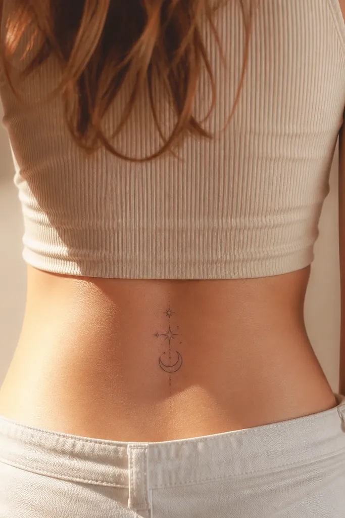
This one is all about balance. Stars are simple shapes that stay readable as they heal, and the crescent moon gives a clear silhouette. Light grey shading on the moon adds depth while the stars stay mostly line-only for sharpness. Off-center placement looks more natural on the body than perfectly centered designs.
Keep the whole piece about 2 inches wide. Make the moon the largest element at roughly 1 inch. Tilt the crescent 5-8 degrees so it follows your hip curve.
Editor's noteIf you want it to look "clean" years later, avoid heavy fill on the moon.
6. Micro Butterfly with Negative-Space Wings
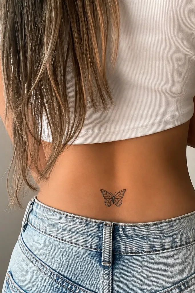
Butterflies can look messy when the artist over-shades. This version uses negative space to create wing patterns, so it stays crisp. The body gets a small grey wash for contrast, which makes the wings pop without thick ink. It's pretty in a way that doesn't turn into a dark patch over time.
Aim for 2.5 inches across. Keep the wings symmetrical but let one antenna curl slightly more than the other for a hand-drawn feel. Ask for thin internal lines that don't touch the outer border.
Editor's noteChoose a placement where your underwear won't rub the wings - friction blurs fine wing lines.
7. Small Heart Chain with a Single Broken Link
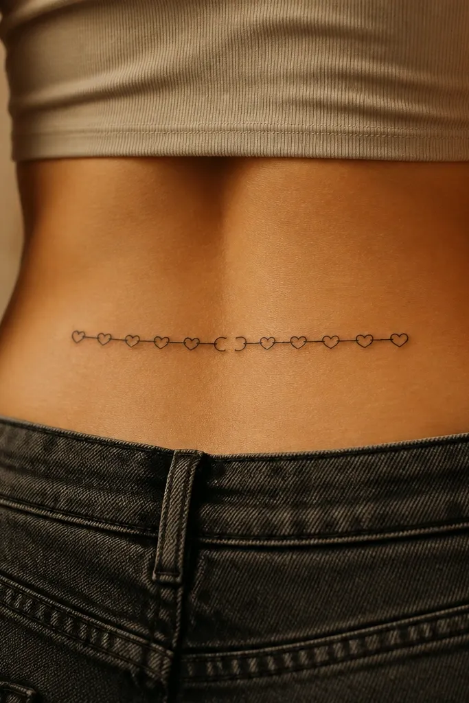
Heart chains read well at small size because hearts are instantly recognizable shapes. The broken link gives personality and prevents it from looking like generic filler. Grey wash under each heart makes it look like it sits on skin, not flat on top. The chain layout follows the curve of the hip so it looks "placed," not pasted.
Keep it around 2.75 inches long. Make each heart about 0.35-0.45 inches wide. The broken heart should be only slightly open - enough to show the story without ruining readability.
Editor's noteIf you want it to age well, keep line weight consistent across all hearts.
8. Mini Crescent Flowers in One Continuous Line
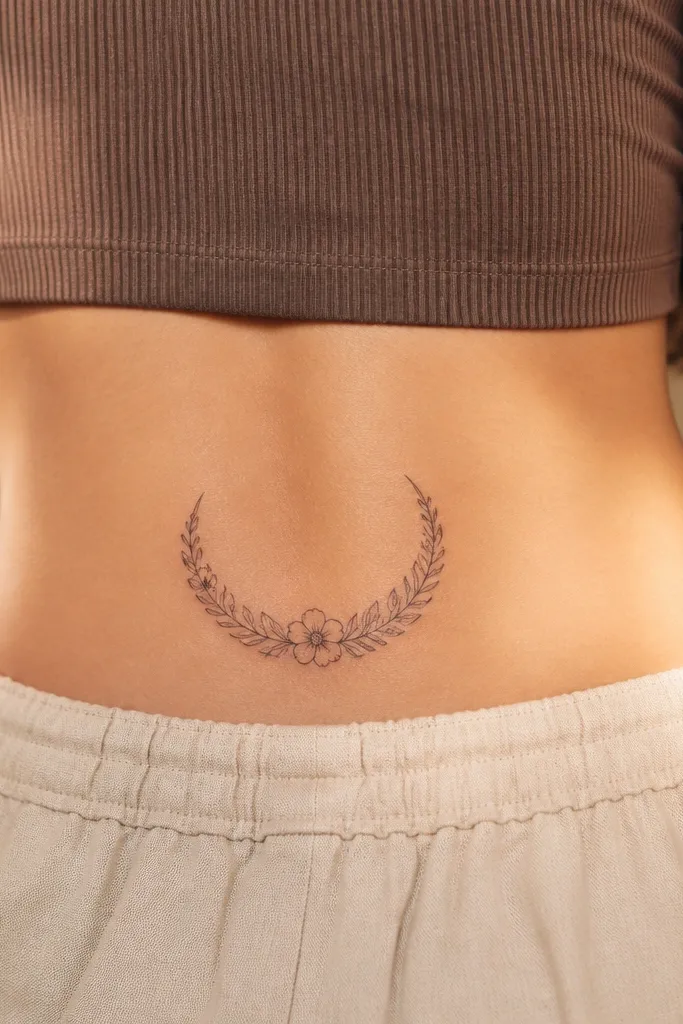
One continuous crescent gives you a clean silhouette that flatters the butt crease. Tiny flowers along the curve create detail without needing big shading areas. The faint grey at each bud adds depth while keeping the rest mostly linework. It looks elegant because the design has a clear boundary and rhythm.
Size it to 3 inches across at the widest point. Keep leaves small and pointed so the crescent stays airy. Ask for grey wash that sits under each bud like a shadow, not a full fill.
Editor's noteTake a test photo in a mirror wearing the underwear you'll actually use - the crescent should land above the seam line.
9. Tiny Hamsa Outline with Center Dot Shading
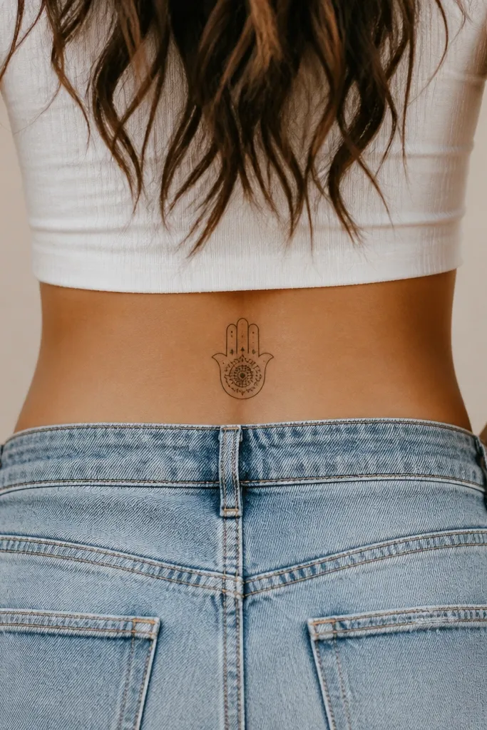
Simple hamsa outlines look great small because the hand shape is bold and the internal lines can be minimal. A center dot-shaded area adds texture without covering everything in thick black. It reads protective and pretty without becoming heavy. The placement on the hip curve makes the hand angle feel natural.
Aim for 2.3-2.8 inches tall. Keep internal lines to two or three - too many fine lines get fuzzy. Use dot shading only in the palm area and keep it tight.
Editor's noteAsk for a crisp stencil with straight edges on the hamsa outline so it doesn't look lopsided.
10. Micro Snake Coil with Pearl Dot Eye
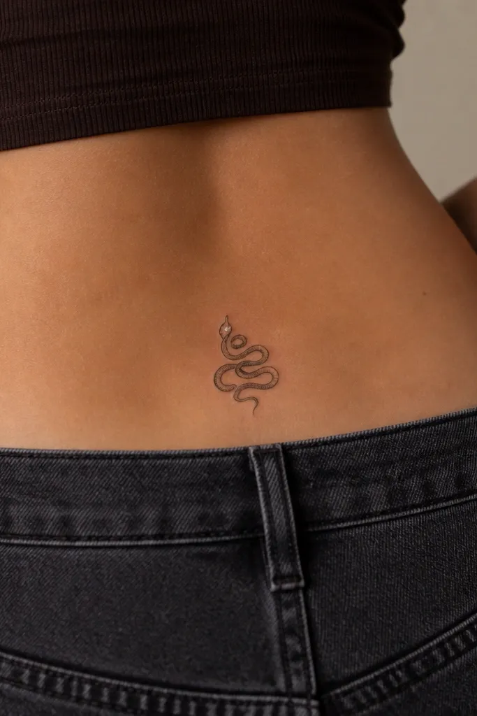
A snake coil works in small space because coils create natural layers. The grey segment shading gives depth and prevents the snake from looking like one flat scribble. The pearl dot eye makes it cute instead of aggressive. When the coil sits slightly off-center, it looks like it's tracing your body curve.
Keep the coil within 2.5 inches wide. Make the eye about the size of a small pinhead dot. Ask for shading that stays between line borders so the snake stays crisp.
Editor's noteAvoid thick fill on the body segments - thin segment lines hold up better.
11. Small Sunburst with Only 8 Rays
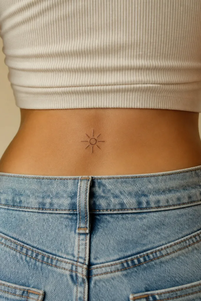
Sunbursts age well when they're simple. Eight rays keep the shape legible, and the circle gives you a strong anchor. Minimal grey shading under the circle adds a soft glow effect without turning into a dark spot. This looks playful and clean under clothing.
Size it to about 2 inches across. Keep rays evenly spaced and thin, not thick spikes. Place it so the circle sits parallel to the crease line.
Editor's noteIf your artist wants to add extra rays, ask them to keep it at eight for readability.
12. Mini Botanica Branch with Two Leaves
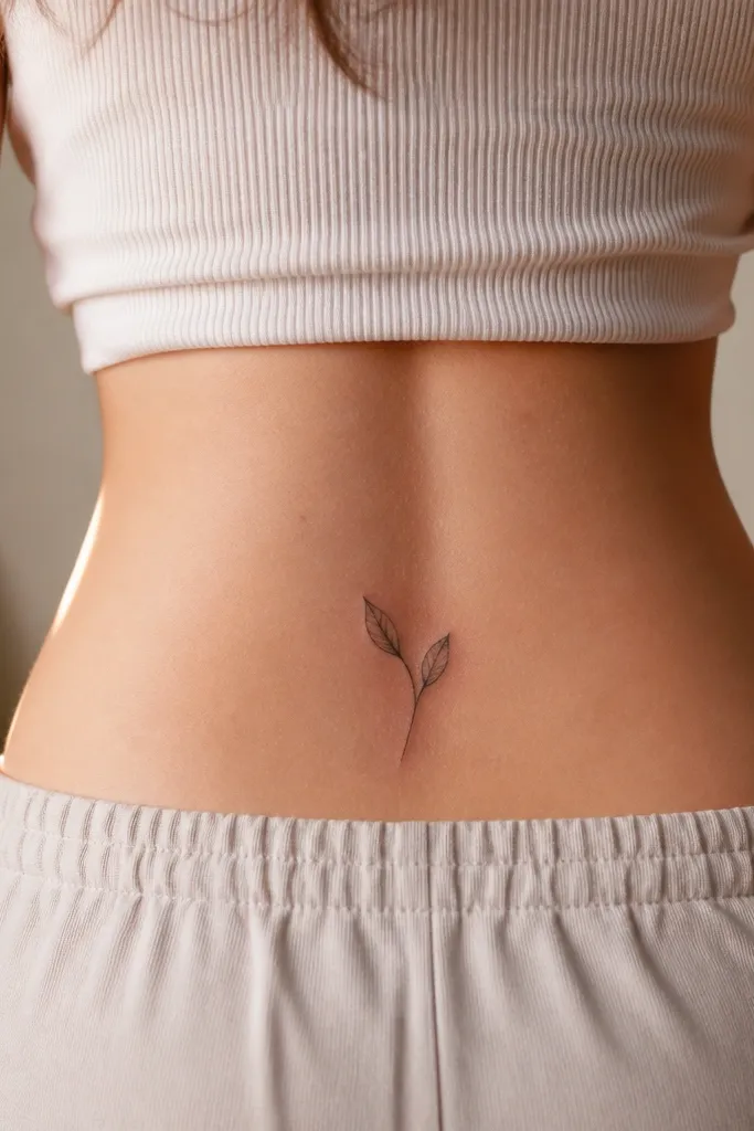
Two leaves is the sweet spot for small placement. The stem gives movement, and the leaves create a clear focal point. Light grey wash adds realism without heavy ink coverage. It looks thoughtful and modern because it's not trying to be a full bouquet.
Aim for 2.5 inches tall. Place the stem so it follows your natural hip curve, not straight across. Keep leaf veins subtle - two or three lines per leaf.
Editor's noteUse a darker outline and lighter interior shading so the leaves keep their shape as skin changes.
13. Tiny Wave Line with Micro Sparkle Points
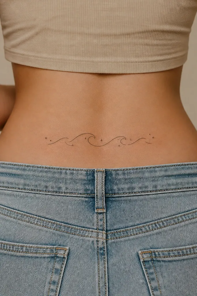
A wave line is perfect for small spaces because it's one clear curve. Sparkle points add charm and make it feel like motion, not a symbol dump. Faint grey under the wave gives a gentle shadow so it looks dimensional. The overall design stays light and readable.
Keep it 2 inches long. Place the wave so the crest faces inward toward your spine by a slight angle. Keep sparkles tiny and evenly spaced - too many makes it look like noise.
Editor's noteAsk for the wave line to be slightly thicker at the crest for a natural highlight effect.
14. Micro Lace Heart with Openwork Lines
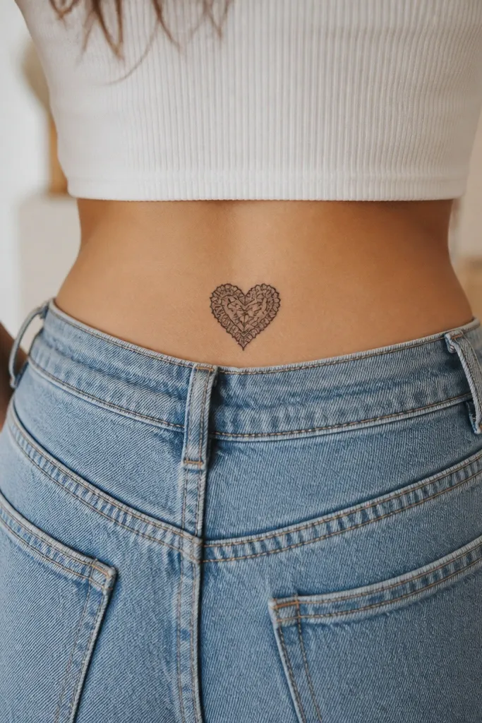
Lace hearts look detailed even small because the pattern is built from open spaces. The openwork lines create texture without requiring full saturation. Grey shading at the edges gives a soft depth effect that looks good in photos. It's feminine without being overly sweet.
Size it at 2.4 x 2.6 inches. Keep the lace pattern inside about half the heart so it doesn't crowd. Ask for clean linework - lace designs show every shaky line.
Editor's notePick a design where the openwork lines don't all connect; broken segments look more lace-like and age better.
15. Small Keyhole with Bow Knot
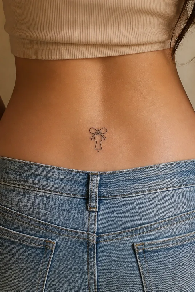
This is a cute, slightly mysterious tattoo that reads clearly at small size. The keyhole shape gives you a strong silhouette, and the bow adds softness. Grey shading around the opening makes the hole look deeper. Because it's mostly linework, it heals with crisp edges.
Keep it around 2.2 inches tall. Place the bow at the top so it sits under your underwear seam, not on it. Keep the bow loops small and symmetrical.
Editor's noteAvoid filling the keyhole completely with black - leave the opening line-only for a cleaner look.
16. Mini Moon Phase Ladder
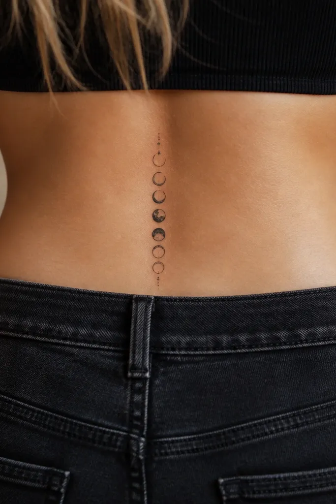
Moon phases are made of simple shapes that stay readable. A vertical ladder fits the natural height of the upper crease better than a horizontal row. Grey wash on the half and almost-full moons gives a soft gradient glow. It looks like a tiny astrology moment without taking over your whole back.
Target 2.5 inches tall. Space the moons evenly with a small gap between each phase. Keep the outlines thin and consistent across all three moons.
Editor's noteAsk your artist to stencil it while you're standing straight and slightly turned - the ladder should follow your body angle.
17. Micro Peony Outline with One Dark Center
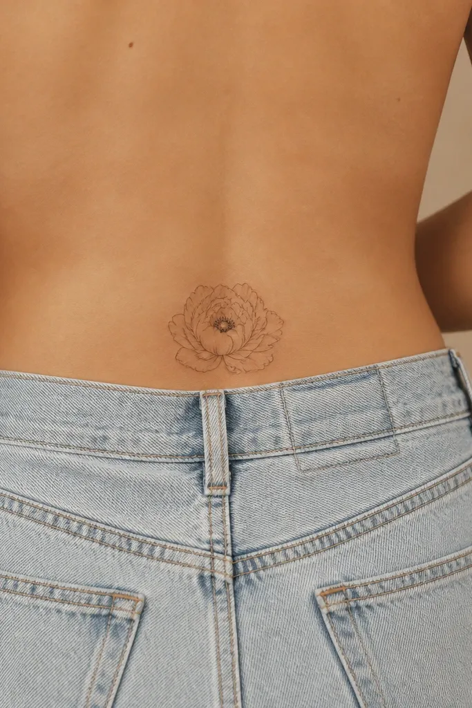
Peony petals create a layered look even when the tattoo is tiny. The trick is to keep most petals linework and use one dark center cluster for contrast. That way the flower reads as peony, not a scribble of petals. It photographs well because the center catches light and the petals stay airy.
Aim for 3 inches wide, 2.8 inches tall. Keep petals separated with gaps so they don't merge as ink settles. The center dot cluster should be about the size of a small pea in silhouette, not a heavy black blob.
Editor's noteIf you're prone to keloid scarring, ask for lighter saturation in the center.
18. Tiny Orchid with One Curved Stem
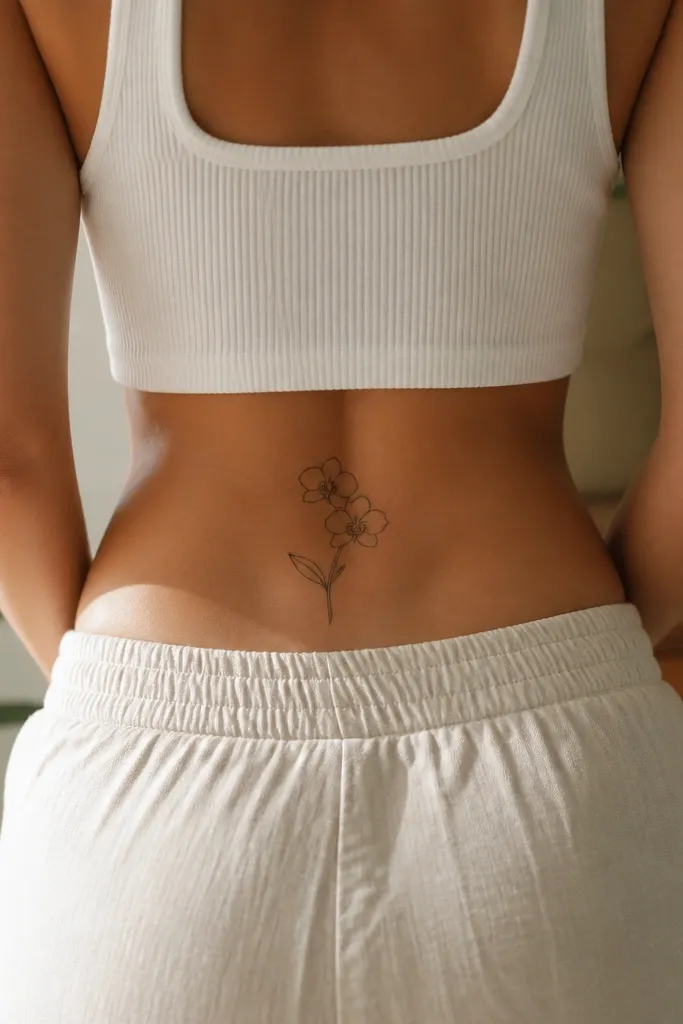
Orchids look detailed without being cluttered because their structure has clear parts. The center petal becomes your focal point, and the grey wash adds realism without heavy fill. A single curved stem makes it feel graceful and body-hugging. This tattoo also hides well when you wear swimsuits because it sits in the lower hip curve.
Keep it about 2.6 inches tall. Place the stem curve so it follows the side of your hip bone line. Keep shading under the petals, not across the entire flower.
Editor's noteRequest a slightly thicker outline on the center petal so it remains crisp over time.
19. Micro Cherry Blossom with 5 Petals
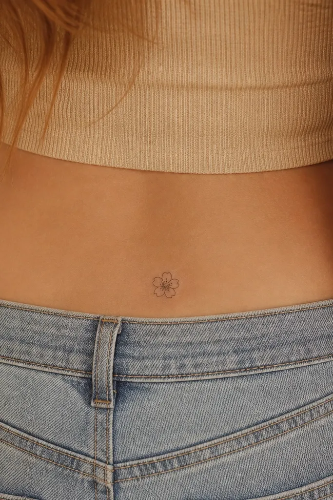
A single five-petal blossom reads perfectly at small size because the silhouette is simple and recognizable. The center dot cluster adds that soft, natural texture you want in floral work. Grey shading keeps petals from flattening out. It looks extra pretty when the blossom sits slightly angled instead of perfectly straight.
Aim for 2 inches across. Place it so the bottom petal sits closest to the crease line. Keep the center dots tight - no big empty center.
Editor's noteIf you want it more feminine, ask for the petals to have subtle tapering at the ends.
20. Small Butterfly Wing Fragment
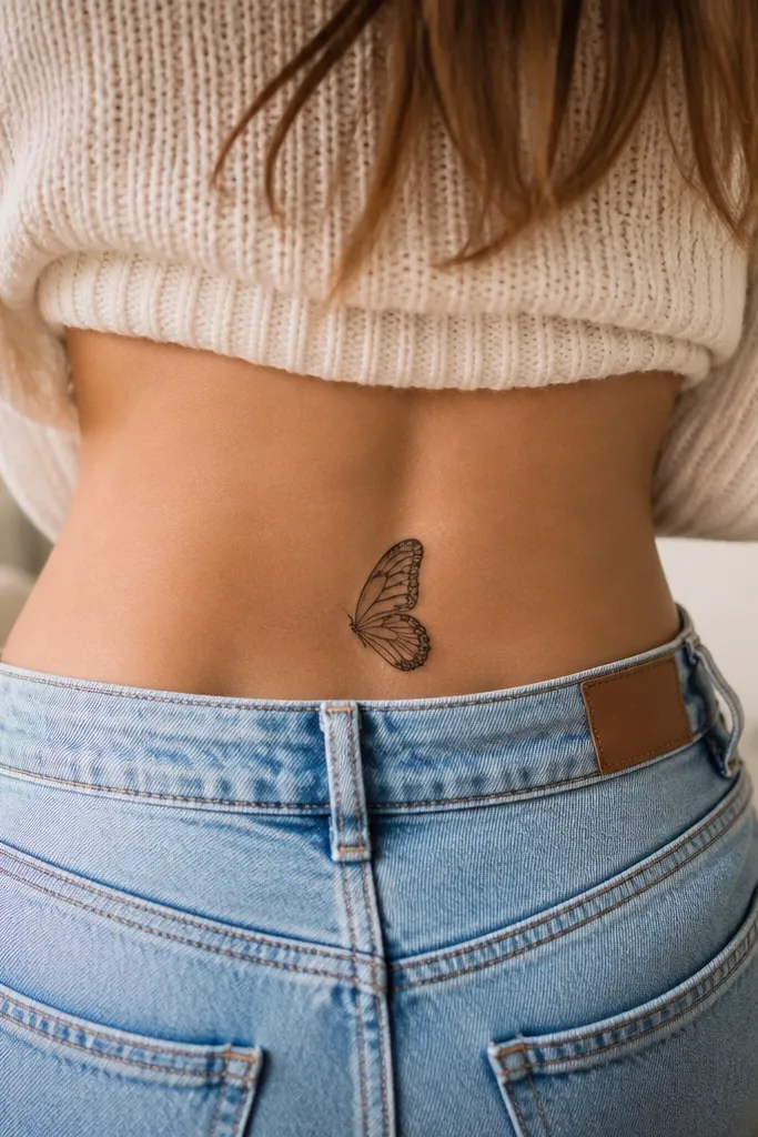
This is for people who want something artsy but still readable. Using only part of a wing gives you a strong graphic look that works in tiny space. Internal line patterns create detail without needing a full butterfly body. Grey shading is kept minimal so it doesn't turn into a smudge.
Size it around 2.3 inches long. Place it diagonally, with the widest part closer to your side hip. Make internal lines short and separated so they don't bleed together.
Editor's noteBring a reference photo of wing patterns - the artist needs to keep the geometry clean.
21. Mini Bow-Tied Ribbon with Dot Highlights
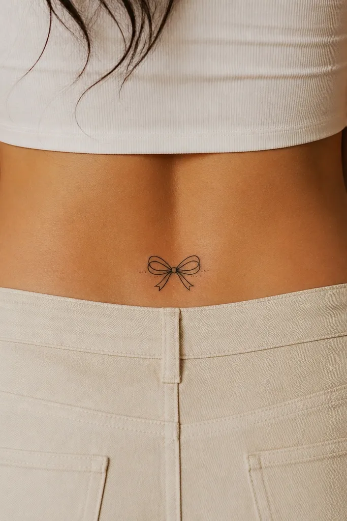
Ribbons look good small because folds create natural depth. Dot highlights add a cute, glossy feel without using heavy color. Grey wash under each fold makes the ribbon sit on skin. The bow knot gives you a clear focal point that stays readable from distance.
Keep it about 2.7 inches wide. Place the knot at the center of the crease and let the ribbon tails curve outward slightly. Ask for shading that follows fold direction - it should look like fabric, not smoke.
Editor's noteIf you sweat a lot, keep dot highlights minimal so they don't over-grab ink during healing.
22. Tiny Geometric Triangle with Micro Stars
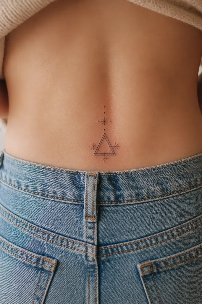
Geometric shapes stay sharp when the lines are clean and the shading is light. The triangle gives a strong graphic look, and the micro stars add sparkle without clutter. Grey shading keeps it from looking flat. Side placement makes it feel like a design on a page rather than a centered sticker.
Target 2.2 inches tall. Keep the triangle outline thin and the stars separated by small gaps. Place it so one corner points toward your spine by a slight degree.
Editor's noteAsk for a stencil with straight edges - crooked geometry shows immediately.
23. Mini Rose and Bud with a Thin Vine Wrap
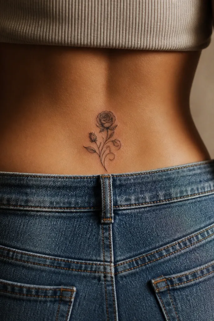
A thin vine wrap ties the design together and makes it look like it belongs on your skin curve. The rose gives the main silhouette, and the bud adds balance so it doesn't look top-heavy. Grey wash on the rose petals adds depth, while the vine stays line-only for crispness. This looks romantic but still modern because the vine is minimal.
Aim for 3 inches across and keep the vine wrap under 0.2 inches wide. Place the rose slightly higher than the bud. Ask for shading only on the rose petals, not the vine.
Editor's noteIf you wear high-cut underwear, keep the vine wrap inside the visible area so it doesn't get cropped in photos.
24. Small Moonlit Mountain Silhouette
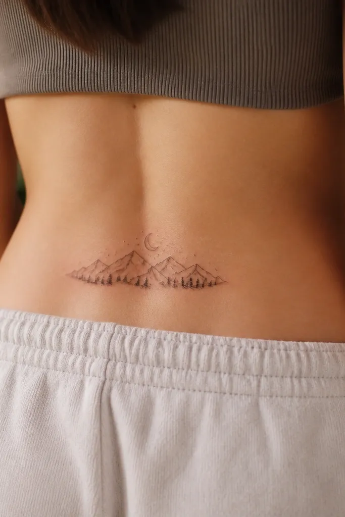
Mountain silhouettes look cinematic even when small because the shape reads fast. Thin contour lines add depth without turning the mountains into a dark block. The crescent moon ties the scene together and keeps it from looking like a random triangle. Grey contour lines catch light and make it feel layered.
Keep it about 2.8 inches wide. Place the moon above the highest peak so the scene stays balanced. Ask for contour lines that stop before the outer edges, so they don't blur together.
Editor's noteChoose a stencil size that leaves at least 0.3 inches of skin margin around the outline.
25. Micro Dandelion Puff with Seeds Trail
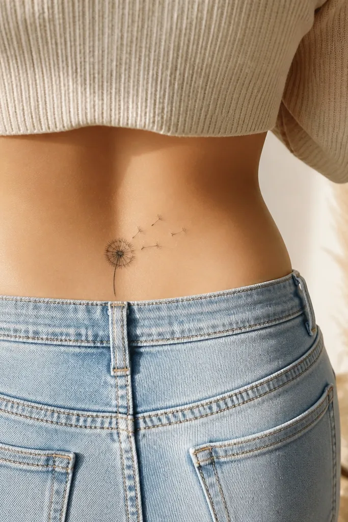
Dandelions are detailed, but the small-space version works when the puff stays compact and the seeds are minimal. The grey center gives a soft "breath" effect, and the seeds trail creates motion. This looks airy and pretty instead of busy because the seeds are spaced, not packed. Diagonal placement makes it feel like it's blowing across your body.
Aim for 2.6 inches long. Keep seeds to about 12-18 tiny dots/short lines. Place the puff closer to your spine and let the trail drift toward your side seam.
Editor's noteAsk your artist to keep the seed dots separate so they don't merge into a single dark cluster.